"Typefaces are like forks (Schriftistwieein Löffel)", this is Adrian Frutiger, the Swiss designer who created countless classic fonts such as Avenir, Univers Famous metaphor, "If in the afternoon I still remember the shape of the spoon I had at lunch, that spoon wasn't a good spoon".
If the spoon is the carrier of food, then the font is the carrier of content. How to choose a right font, the first thing to pay attention to is the different situations, so that the font can support the content behind it cleverly and without trace. In the following Chinese font design, we will introduce several common Chinese fonts of Song, Hei, and Art, and the occasions when they are suitable for use.
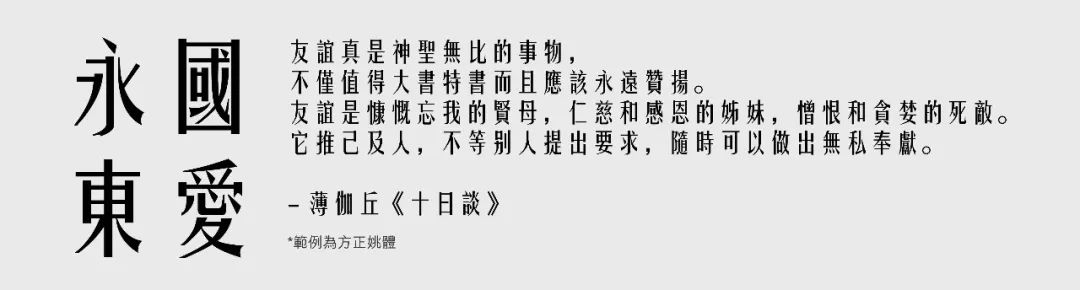
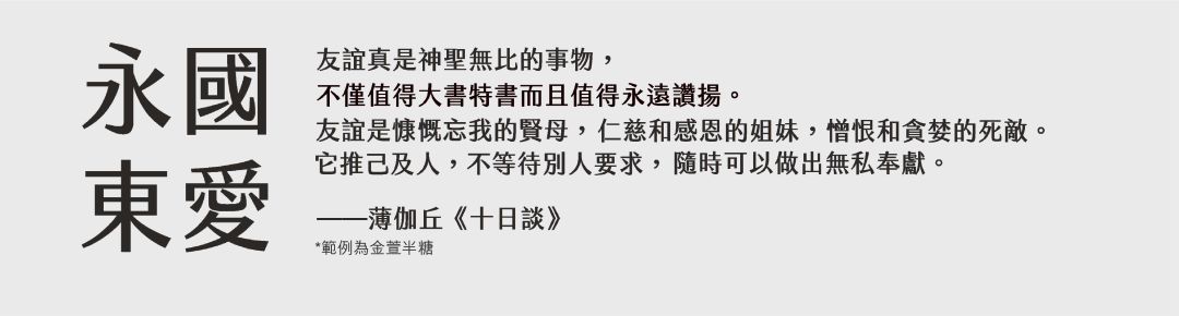
1. Song style, Ming style, Ming Dynasty style

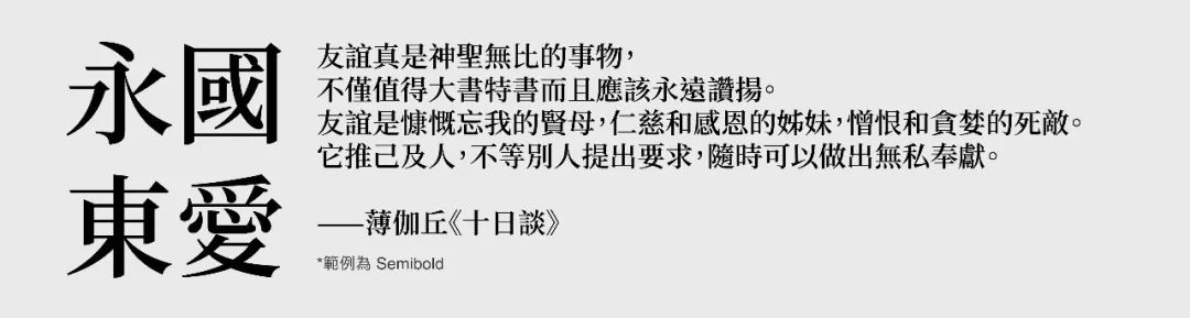
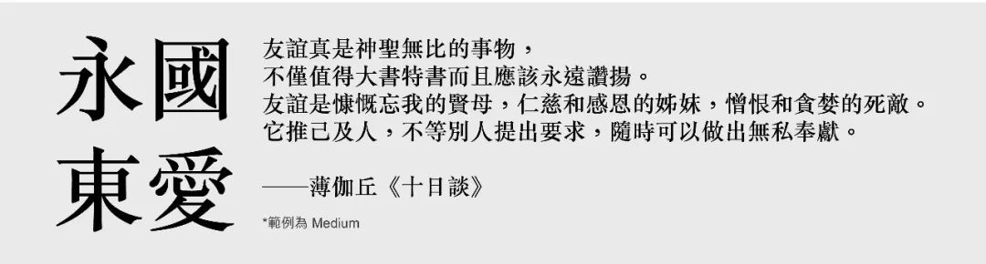
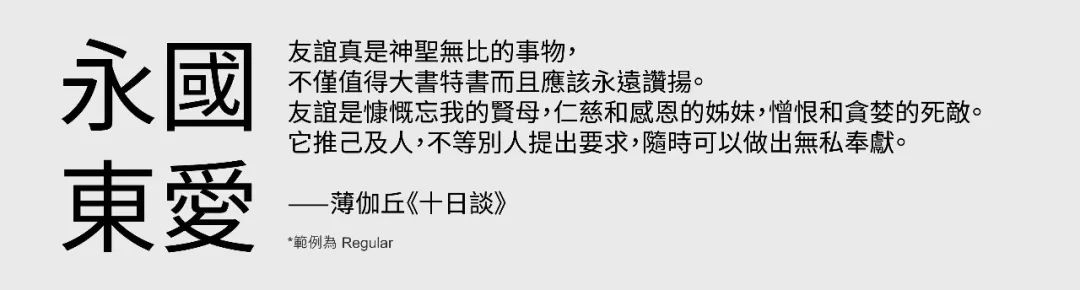
Song style has to start with its ancient history and complicated name. It originated from woodblock printing in the Song Dynasty, so it is called "Song style" in mainland China; it matured and prevailed in the Ming Dynasty and was introduced to Japan, so Japan It is called "Ming Dynasty style". In Taiwan and Hong Kong, "Song Ti" or "Ming Ti" are both called; but in fact, they all refer to the same typeface. Song style is characterized by thick vertical strokes and thin horizontal strokes, with decorative lines at the end, while retaining the structure of calligraphy and engraving, so Song style always gives people a literary, elegant and formal feeling. Compared with the black body, the Song typeface has more blank area, which makes the paper look "brighter" after printing. In addition, its thickness and thickness are uniform, and when reading a lot of text, our eyes will not feel quickly. Tired, so widely loved by newspapers, magazines and novels.
1-1 Siyuan Song Style
Song typeface suitable for screen display, say goodbye to tofu with missing characters (节) from now on!
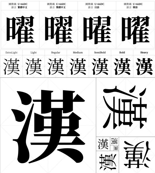
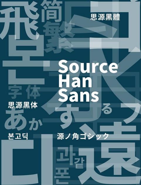
Siyuan Arial is a free, open-source font project jointly developed by Adobe and Google . It is modified based on the design of the Japanese "Otsuka Ming Dynasty Style". The details of the font, such as dots, 捺, and the triangular barb at the end of the horizontal stroke, have a strong sense of carving like the Japanese Ming Dynasty Style; the slightly thicker horizontal strokes Line, so that it has a very good screen display. What's even more rare is that Siyuan Song typeface has 7 weights, which is suitable for various situations, and it also supports different Chinese character standards in Taiwan, Hong Kong, China, Japan, Korea, etc., so that we no longer have to worry about missing characters. ) and worry about it.

1-2 Huakangli Song Style
Song typeface for multi-purpose printing with both Chinese and Japanese aesthetics

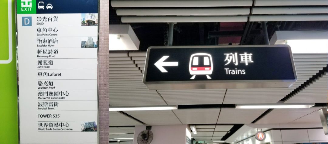
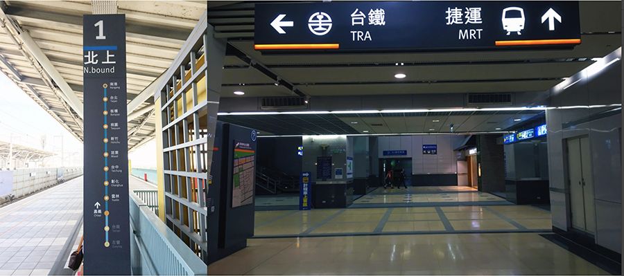
Lisong typeface was originally designed to adjust small size printing, and it is very suitable for the typesetting of a large amount of content. It has a slightly outstretched frame similar to the Japanese Ming Dynasty font, and the large blank area of the characters makes it very comfortable to read for a long time. In terms of details, the prominent bell mouth and rounded corners incorporate the common features of Chinese Song typeface design. Now it has three weights of thin, medium and bold, which can be extended to more situations, and Apple computers have built-in thin weights as early as2000 Li Song style. At present, its Chinese and Song fonts are also used in the space guidance system of the MTR. It is a rare subway system in the world that uses a large number of Song fonts for space guidance. You may wish to pay attention to it when you visit Hong Kong next time.
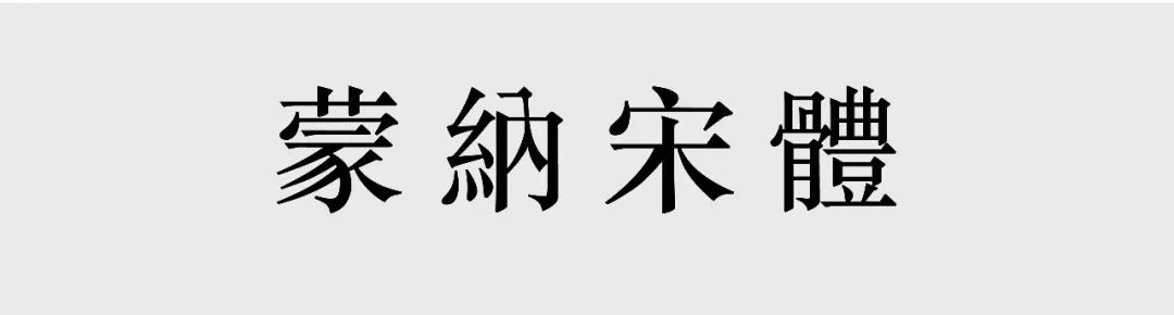
1-3 Mona Song
Arial for printing with a traditional flavor

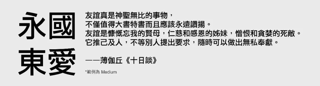
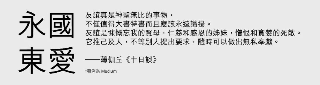
Mona Arial was inspired by the "Song Yi" and "Song Er Ti" typefaces developed by the Shanghai Printing Research Institute in the 1960s, and these two fonts It deeply influenced the Song style design after the founding of the Communist Party of China. Its skeleton is slightly retracted, and the detailed strokes have a tough style, which is very eye-catching. Such features make it look traditional, which is a Song style that is relatively rare in Taiwan. It is also suitable for typography with a lot of content such as magazine articles. The printing of small fonts can still be kept clear, and it has a light and tough feeling after reading for a long time.
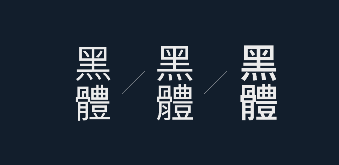
2. Black body
If it is said that Song typeface is a traditional printing font that originated from Chinese, then Hei typeface is the product of western power spreading to the east. The black body first appeared in Japan in the 19th century, and was designed under the influence of Western sans serif(Sans-Serif). The characteristics of the black body are relatively consistent thickness of strokes, less (or almost no) decorative lines, giving people a striking, modern, efficient and neat feeling. Compared with Song typeface, the black typeface with the same font weight has less blank area in printing, and the black typeface looks more eye-catching in printing, so it was mainly used for titles in the early days. In modern times, bold fonts with different weights and weights have come out one after another. On computer and mobile device screens, the characteristics of the black body allow us to still have good visibility even when walking and shaking.(Visibility) makes the black body wider deeply into our lives.
2-1 Siyuan Black Body
The black body suitable for screen display, a font partner that should not be missing in your computer.
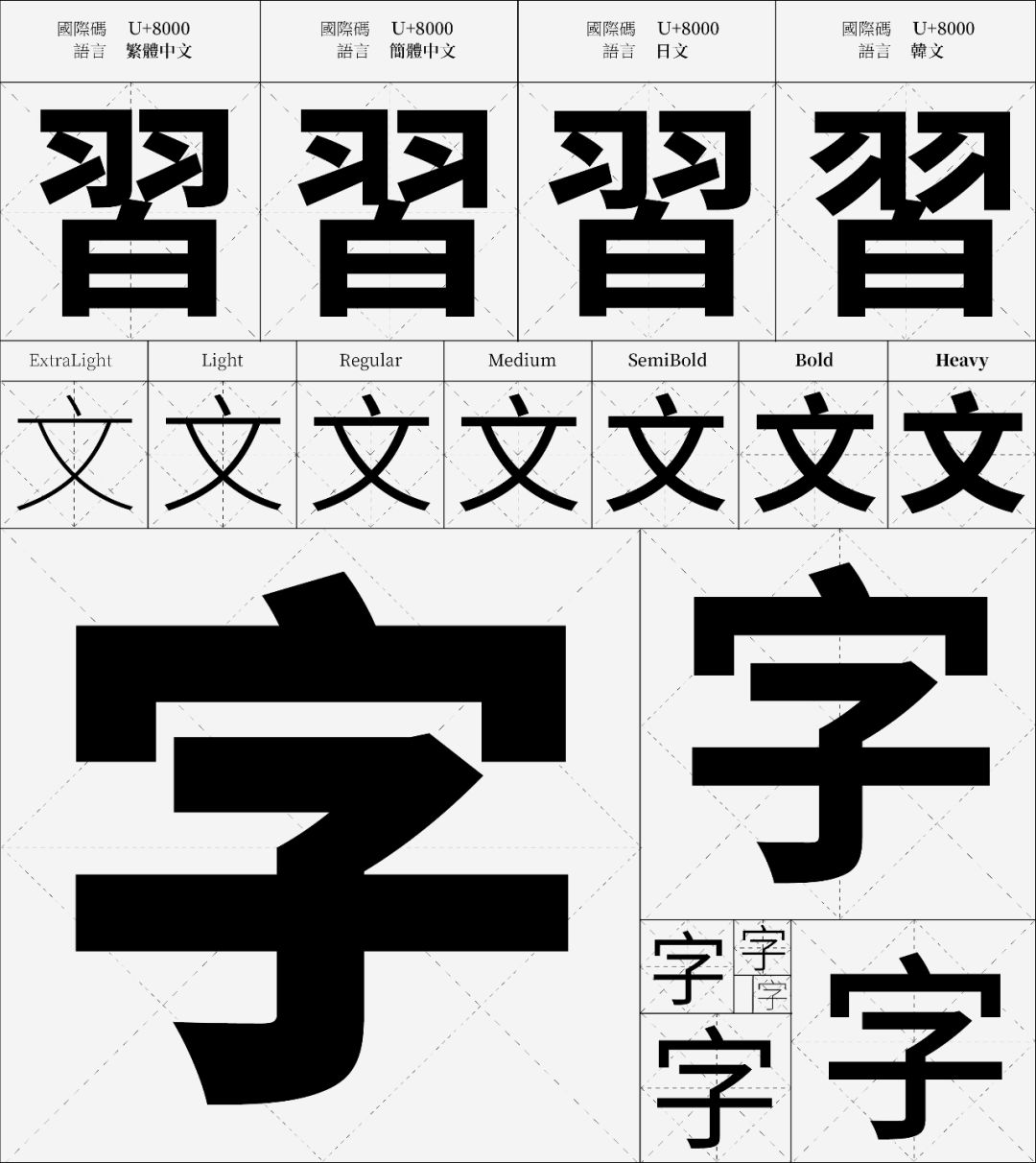
Siyuan HeiTi is also a free and open source font project jointly developed by Adobe and Google . Its design is modified based on the design of the Japanese "Otsuka Gothic" (小冲ゴシック). It has design features similar to Kotsuka Heibody: a slightly flared frame that makes it feel neutral, modern yet traditionally elegant. It has 7 font weights like Siyuan Song, and supports different Chinese character standards in Taiwan, Hong Kong, China, Japan, Korea, etc. It is a font partner that should not be missing in your computer.

2-2 Huakangli Blackbody
Modern, rational black font, suitable for print or screen display
Li Heibody has a moderate, impartial skeleton and center of gravity, and there are no small decorative lines of traditional Heibody in detail design, making it look very modern, rational and full of design sense. It has three different weights of thick, medium and thin. The line height and the space in the cavity of the overall typesetting are properly controlled, and it is sometimes used as the content of a magazine. In addition, Li HeiTi is also the system font of Apple Computer from 2000 to 2009, and at that time span>WindowsXP system font Xinming is better in terms of visibility and aesthetics; in addition, if you still have an early iPod , maybe you can still see it.
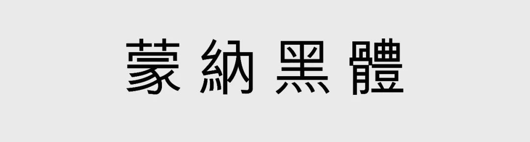
2-3 Monochrome
The appearance of a black body, the traditional skeleton.
Mona Black is very common in Hong Kong. It can be seen everywhere in the space guides, travel briefings, newspapers and magazines in the former airport. It is a black body with a retracted skeleton, which looks similar to its sister Mona Song; in addition, it also has very exaggerated detail design, such as dots and Na, which still retain the curves of traditional calligraphy, making it It is very recognizable. Although it has a traditional skeleton and details, it does not lose its sense of modernity. This feeling has made many commercial companies like to use Mona Blackbody to design and promote. In Taiwan, the main space guidance system in the high-speed rail station is a combination of Mona black body (Chinese) and FFMeta (English). Both fonts have subtle stroke processing, and this design can be said to be quite successful in terms of legibility(Legibility), which is the most important aspect of space guidance.
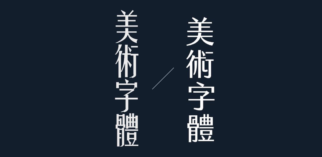
3. Art fonts

Art fonts often have some unconventional features, which may be groundbreaking, or may also combine the characteristics of Arial and Helvetia. This may not be so practical for typography that generally focuses on content, but if some of the fonts are used as titles, they have unexpected good effects.
3-1 Yao Ti
Slender figure, a bit arrogant, but also a bit elegant personality

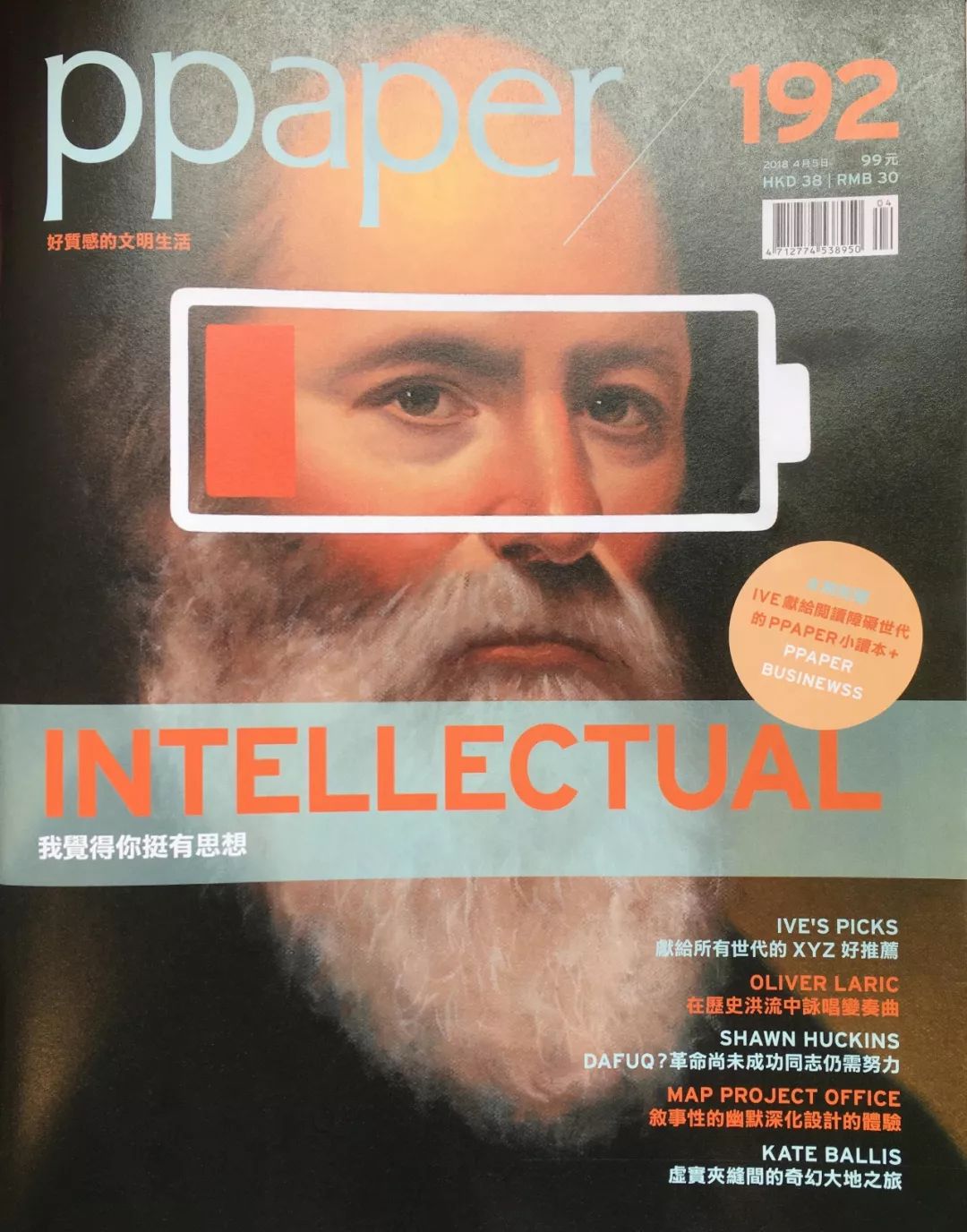
Yao Ti was created by Yao Zhutian of Zhonghua Book Company in the 1920s in the 1920s. It was originally a copper plate printing font. Its characteristic is that it has the same horizontal strokes and dots as the bright body, but the vertical strokes have a little bit of the characteristics of the black body. The slender, exaggerated shape makes it look elegant and ostentatious. In the era of the Cultural Revolution, Yao style was used on a large number of big-character posters and political slogans, which was particularly eye-catching and constructed the spirit of that era.
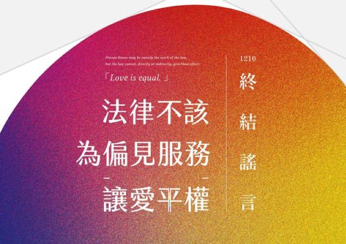
Nowadays there are many digital fonts in Yao style, and Founder Yao style designed in China is one of them. Recently, in Taiwan's LOGO, advertisements or major social movement occasions, we can often see it because of its dramatic design effect.

3-2 Jinxuan body
Small and fresh flavor from Taiwan. How much sugar do you want? The choice is yours.
Finally, we would like to talk about Jinxuan Ti, which has been popular for a while. Jinxuan font was developed by the Taiwan team JustFont (that is, the word) and raised funds online. Just like the Western Optima font (the Western font used for station names of Taipei subway stations) combines the design features of serif and sans-serif, Jinxuan combines the vertical thickness and horizontal thickness of Song typeface , and the black body has no serif characteristics. He has five weights, and the corresponding names are two-point sugar, light sugar, four-point sugar, half sugar, and eight-point sugar, which are very interesting.
In recent years, we have also seen the emergence of Jinxuan style on many occasions, such as packaging, copywriting titles, and even slogans on social movement occasions. It is also very interesting that it is widely used.

Conclusion
The above are some classic Chinese fonts that we think everyone should have. Some of them are enduring and have been with you for decades; some of them are rising stars, and their influence in the future cannot be underestimated. . They usually have a personality that can be used in different situations and can make your design more beautiful.
Article shutterstock
Article collection: @字体设计
Articles are uploaded by users and are for non-commercial browsing only. Posted by: Lomu, please indicate the source: https://www.daogebangong.com/en/articles/detail/Word%20Friends%20Must%20Have%20%203%20Practical%20and%20Beautiful%20Chinese%20Typography%20Charming%20Design%20Begins%20with%20Character%20Selection.html
 支付宝扫一扫
评论列表(196条)
测试