@刘柏坤KUN: In the last issue of "Want to make a Chinese-style font design? I summed up 4 rules! 》We let the font design blow up a strong Chinese style. I don’t know if you have mastered the "cheats" in it. It doesn’t matter if you think it is difficult. Remember: if you want to practice this skill, you must practice more! This article is a cute style font, a few simple tricks to make your font cute! Get ready to accept this wave of dry goods.
Meng Meng Da is talking about the state of the font. Simply put, it is a cute cartoon type of font style, such as mother and baby, children are often used, so what are the ways to design a cute font? Is there any point to pay attention to?
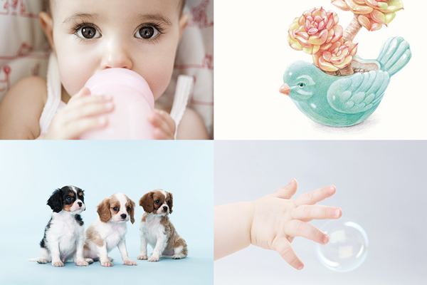
In real life, we often describe babies as fat and cute, puppies as naive and adorable, and succulents as plump and cute. So what gives them the attribute of cuteness? In a brief summary, I think it is the following three points: fat body, cute shape, and delicate demeanor (eh... so nasty)! It just so happens that the three-element structure, strokes, and details of font design are ingeniously related to the above three points.
1. The basic characteristics of cute fonts
a. Loose structure
Arrange the position of the strokes of the whole character properly first, that is, establish the structural relationship first. Many friends "cut out the strokes" from the beginning, and push back each stroke. In this way, without planning and predictability, it is easy to have nowhere to place the strokes Condition;
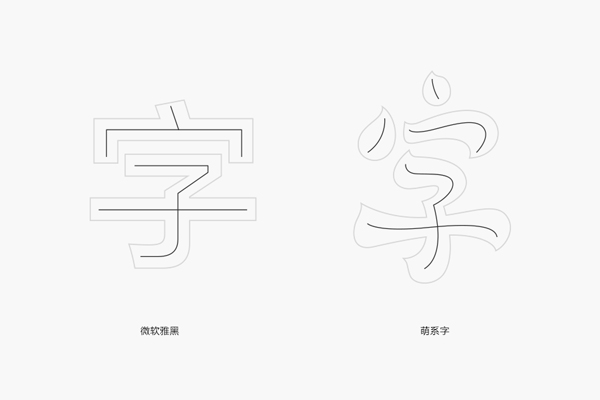
Different from the usual standard characters, the structure of this type of font should be more relaxed and playful, and the direction of the strokes is no longer completely horizontal and vertical. ;
The structural space should be as loose as possible, that is, enough space should be reserved between the strokes. The purpose of this is to lay a good foundation for the filling of the strokes in the second step, because similar to this type of font The stroke settings are relatively thick.
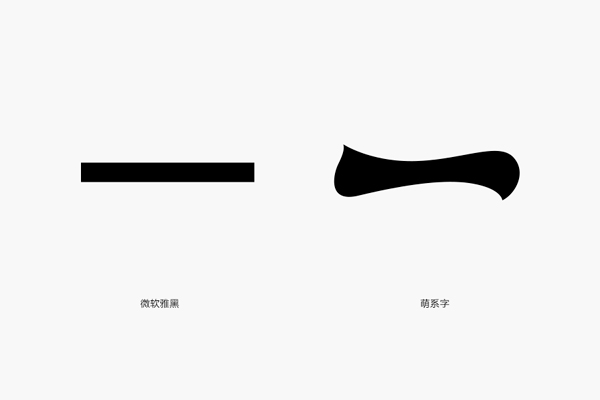
b. The stroke setting is smooth
This is a very important part, which determines whether the word is cute or quite cute! This point will be analyzed in specific cases below. First, let’s talk about the basic points of attention in stroke setting.
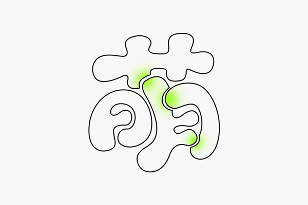
First of all, the stroke setting must be fat! fat! fat! In the first step, we have reserved a lot of space for the construction of the structure. Many friends are reluctant to thicken the strokes, resulting in the entire character being empty and skinny. Why are you so cute when you look pitiful?
The thickening of the strokes does not mean that there is no change in thickness. The thickness of the strokes should be appropriately changed according to the structural space, so that the font will be more dynamic; the transition of some curves should be natural and soft, which is very important Affects the quality of fonts to a certain extent;
c. Detailed modification is concise
The detail modification of this type of font is mainly reflected in two places. One is that some graphics related to the meaning of the word can be applied to the font to play a role of emphasis; the other is that the superposition and cutting of some strokes can be used reasonably Cutting, too complicated details are not suitable for this "simple" font, so the simplest superimposition and cutting are just right.
2. Classification of cute fonts
To be honest, there is really no strict classification standard for this type of font, so it is difficult to make a clear classification for this type of font, so I decided to use "cute value" as a fuzzy classification. The more red hearts, the more cute, the purpose is to give everyone Sort it out for a more intuitive understanding. (Special note: The text of this case is all presented in the form of blocks. Words composed of simple line segments can also be very cute, and the principles are interlinked, so we will not break it down, please know)
a. Cute value | ❤❤❤❤❤
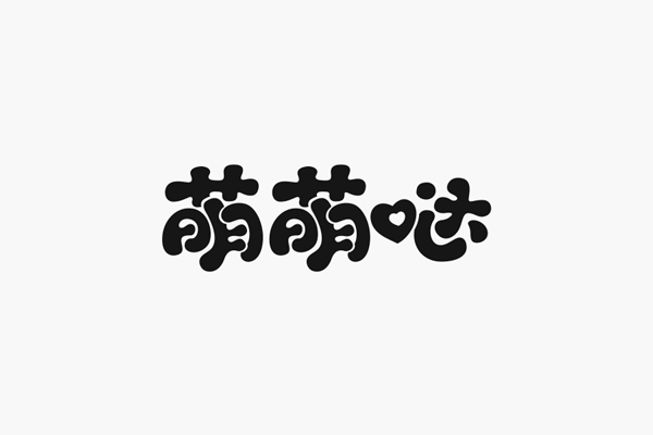
The rounder the overall strokes, the more affinity the font will have. In the next few sets of examples, please pay attention to the visual difference brought about by this change.
The above picture can clearly summarize the following characteristics: the starting and ending of the strokes are round, and the middle of the line is slightly thinner, so that there is a layer of thickness change on the stroke; there is no complete Horizontal or vertical strokes, and even many strokes with great curvature, conventional right-angled corners become large rounded corners. The purpose of this is to increase the affinity of the font, which looks more cute and cartoony.
In addition, a little detail is made in the position where the strokes are dense, that is, the strokes are superimposed before and after. There are two advantages: one is to make the font space more breathable and the structure more reasonable. Rich;
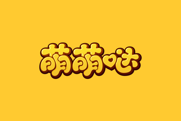
We can appropriately increase the "thickness" of the font and add the assistance of color to make it more complete. There are only four simple layers in the picture above, highlight and main characters plus two layers of dark coffee base, pay attention to the position and function of each layer, of course, the color is generally bright and bright.
b. Cute value | ❤❤❤❤
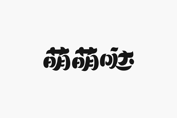
Compared with the previous set of words, did you find any difference? That's right, it's mainly reflected in the form of starting or ending the strokes. The strokes of the characters in the picture above are still plump, but they are no longer round and round like the first group of characters, and there are more small sharp corners. You will find that there seem to be a lot of details, which is more complicated in comparison. It is still cute, but it seems to be a little less natural and no longer pure.
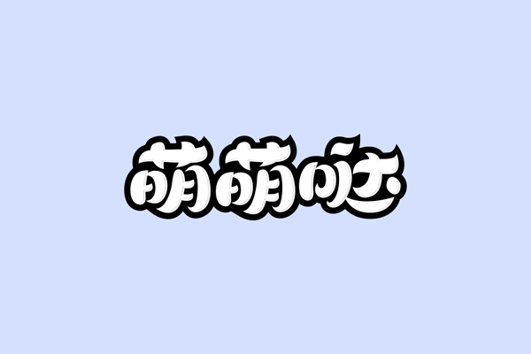
The structure of the cute font is flexible, and the width and height of the text can vary with the text structure, but it should not be too wide; because this group of characters already has a lot of details, there is no extravagant superposition of strokes deal with.
c. Cute value | ❤❤❤
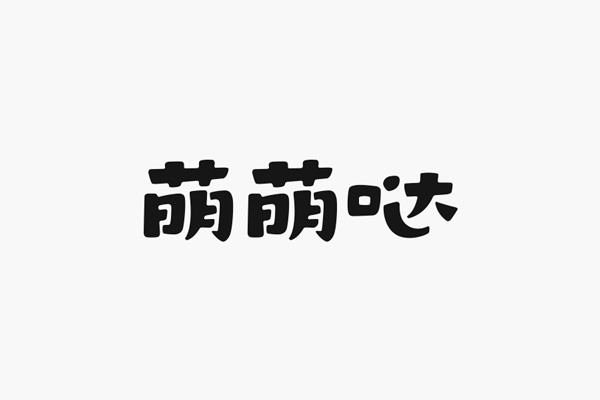
Does the stroke look more regular all of a sudden? There is no full and round arc before, and it is replaced by regular lines. It is said that rules are not completely "rule-abiding", and it is still not completely horizontal and vertical. Childish feeling; the part of the cute characters has been treated with a bit of playful broken pens, and the parts of the left and right hooks actually have some shadows of Song style strokes, which play a role of reconciliation;
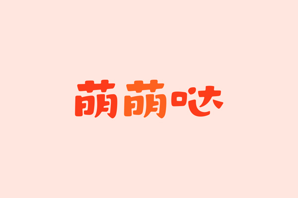
The strokes should be subtracted as much as possible. You can observe from the treatment of the last character "辶". Basically, two strokes have been taken over. Why do you do this? Just imagine, if the strokes maintain the original twists and turns, the demand for space will increase, and fat strokes may not be tolerated; complexity is not a child's personality label.
d. Cute value | ❤❤❤
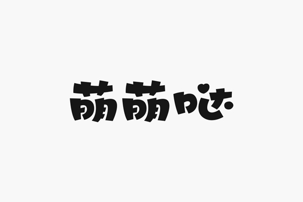
The beginning and end of the pen are all at right angles, why is it still the cuteness of the three hearts? You need to know that the determinant of "cute value" is not just a certain point. Although the characters in the picture above have right-angled parts, the structure is still lively and loose, and the strokes are still round and smooth, which should be flexibly adjusted according to needs;
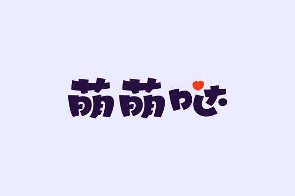
Some dots in the strokes can be directly replaced by dots, which can play a good role in adjustment. Try not to use regular perfect circles. For example, in this group of characters, except for dots, the use is related to the meaning of the word The simple graphics are also a good choice.
e. Cute value | ❤❤

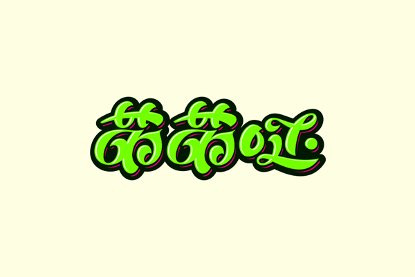
This processing method has a strong sense of handwriting. The strokes are simplified but also connected. If the connected strokes are removed, is it similar to the second group of cases?
The reason why I took out this set of characters is to tell everyone that there is no right or wrong way to complicate or simplify the strokes, but the effect presented will be very different, and it must be accurately determined according to the needs.
Summary
Under the condition of the same basic structure, the different forms of strokes and the degree of complexity determine to a large extent how cute a font is; this article only lists five spans of cuteness It is a typeface, but every interval, slight changes in structure, strokes and details will show a variety of fonts!
Lovely people, make cute characters. Come on~
Articles are uploaded by users and are for non-commercial browsing only. Posted by: Lomu, please indicate the source: https://www.daogebangong.com/en/articles/detail/With%20a%20few%20simple%20tricks%20the%20font%20can%20also%20be%20cute.html

 支付宝扫一扫
评论列表(196条)
测试