Click on the top blue word, Set me as a star ☆ bar

Why learn typography? Since the beginning of the year, I have received this question from some word friends one after another. I will share it with you again today.
Because design work requires it? Does the boss like Party A? Because the current brand LOGO is popular with text style? Movie posters and e-commerce promotional pages for marketing promotions pay special attention to fonts? Can the use of compelling fonts on product packaging attract the attention of buyers in the first place? Graphical text, no need to spend money to take pictures, no more fear of infringement pictures, can use designed text to solve the visual needs of the screen? ... This is a problem caused by the needs of the current market.
It is not difficult to see that with the continuous improvement of public aesthetics, everyone's pursuit of design sense has become indispensable, making "font" a necessary trend in visual communication design.

When discussing font design, we should be clear about the difference between font design and font design.
The design of the font library needs to pay more attention to the wide range of readability, recognition, unity, and promotion. In the design of the Chinese font library, more than 6,700 fonts are used as a set, which can meet the basic application needs. And such a high-quality font design often takes more than half a year to complete, and it may even take a year or two. Obviously, font design requires a huge and systematic teamwork, and not all independent designers have the conditions to try.
The fonts in fonts are often used in sentences and short passages, and it is difficult to meet individual design needs. At this time, a customized font design is required. It is different from font design. The formulated font design is artistically processed and sublimated The font, compared with the uniform, stable, and less individual fonts in the font library, the Chinese character structure and graphic charm displayed by the font design are more unique and personalized.
In visual design, fonts are almost always used. Fonts are the most basic design element and an indispensable expression tool in design, such as posters, packaging, signs, books, advertisements, film and television...even in environmental design All visible font applications. In addition to the basic function of accurately conveying information, fonts also need to be endowed with beautiful shapes to make their visual communication stronger and richer, and to attract users' attention.
The application range of font design is very wide. I roughly divide common font design application environments into:5 categories, such as signs, packaging, posters, advertisements, and books . In order to facilitate everyone's understanding, I have selected some works of some outstanding designers to explain to you. In addition, there will be a message at the bottom of the article.
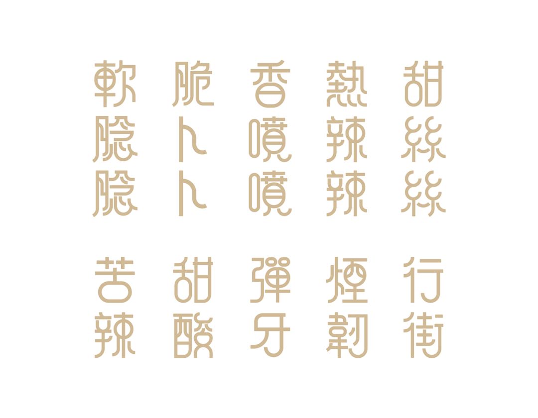
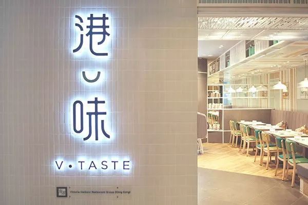
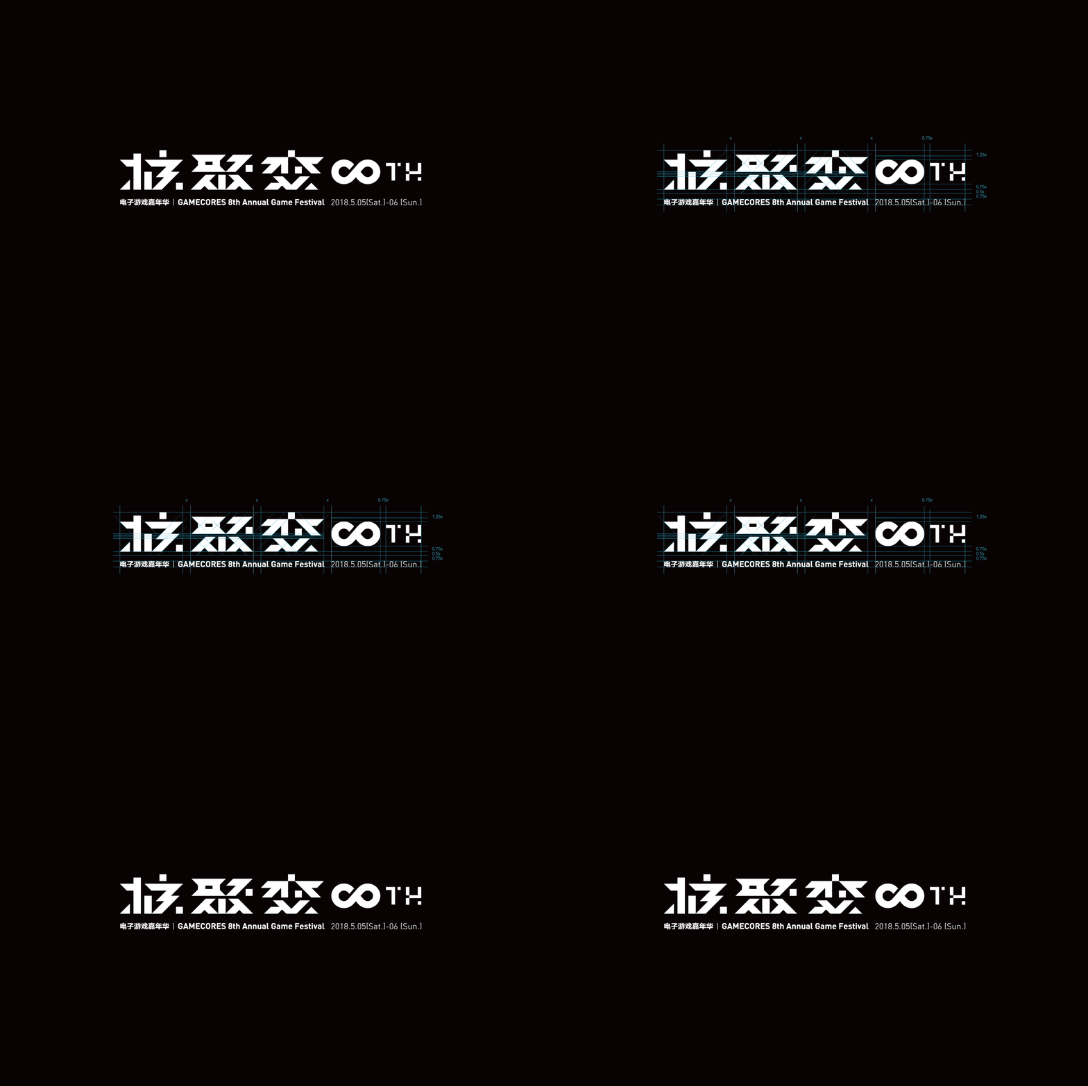
A brand must have a logo, and the logo is the core symbol of the brand. As far as brand design is concerned, font design can be applied as a brand logo, which is both graphics and text.
Logo>
◢
Client: Victoria Harbor Restaurant Group
Designer: margaretcheung & beckwong (AsiaOneCommunicationsGroup)
Creative Director: Nang
Interior Design: PURGE Ltd



Copyright©CKYM
The font design can directly reflect the attributes of the brand's industry. For example, in the cosmetics and skin care products industry, slender and elegant fonts are mostly used, and the financial industry mostly uses fortitude and steady fonts. Such font design can convey effective information to users from the subconscious. The elements in the font are used in print advertisements, packaging, products , and even its application in decoration permeates the image of the brand.
◢
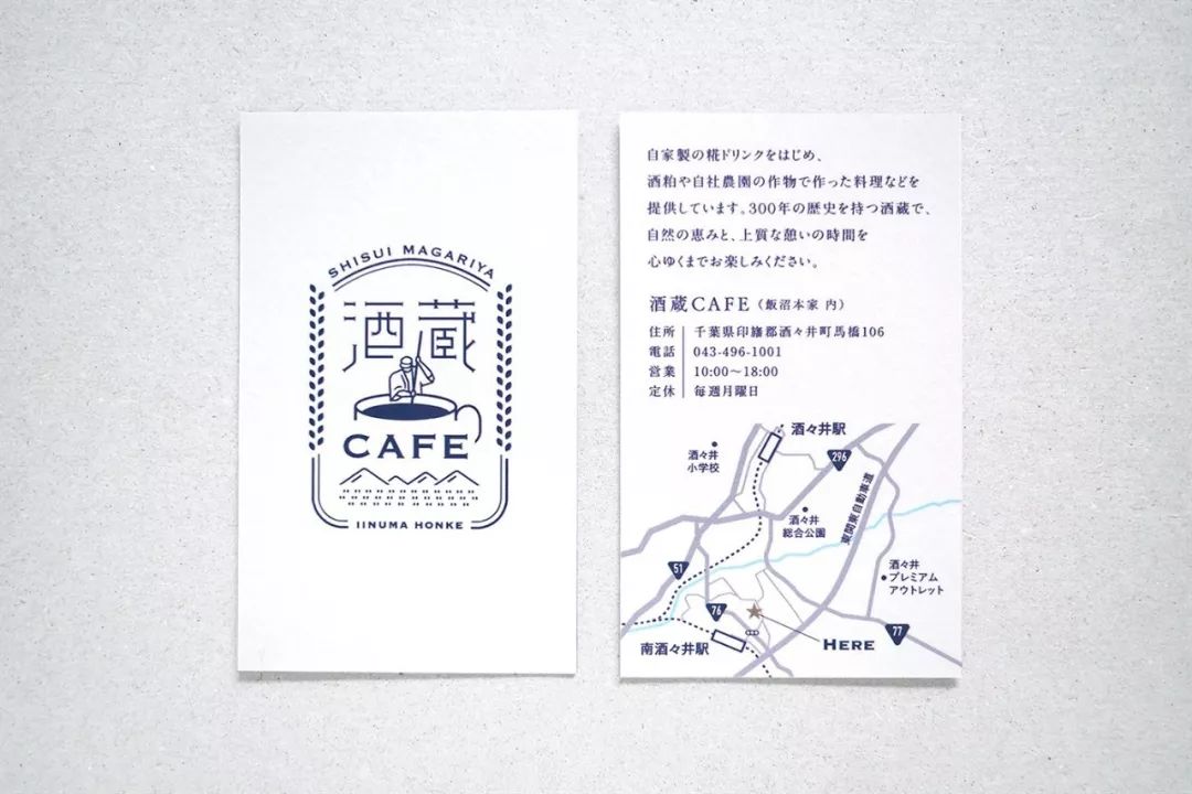
Client: IinumahonkeInc.
Design: MasaomiFujita/tegusuInc.
Photographer: YoshiroHayakawa
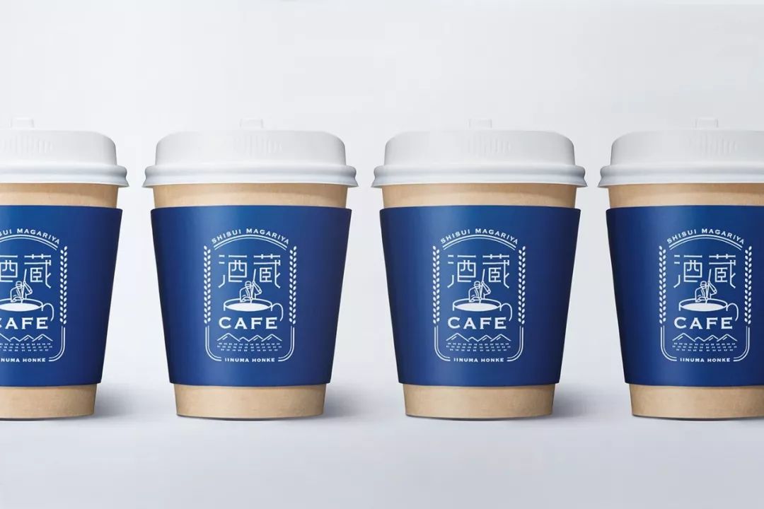
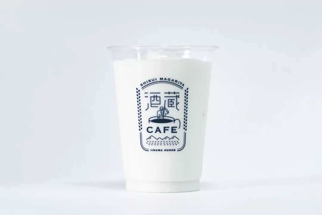
Copyright© MasaomiFujita/tegusuInc.
◢
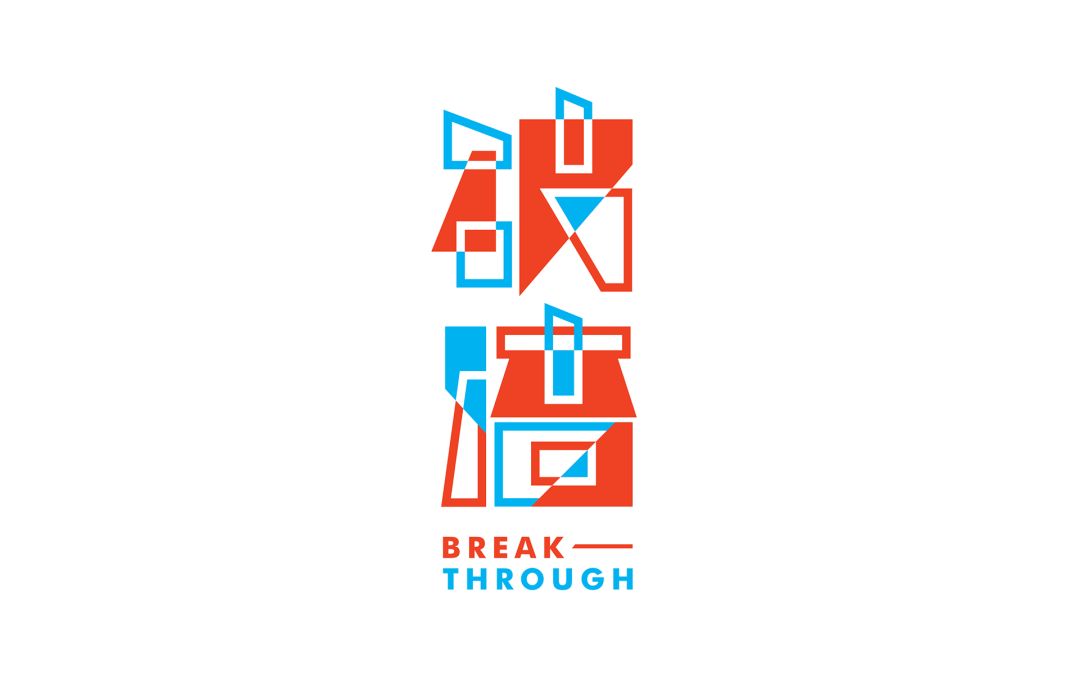
Client: "TEDxNTUST Annual Conference"
Designer: ChiunHauYou
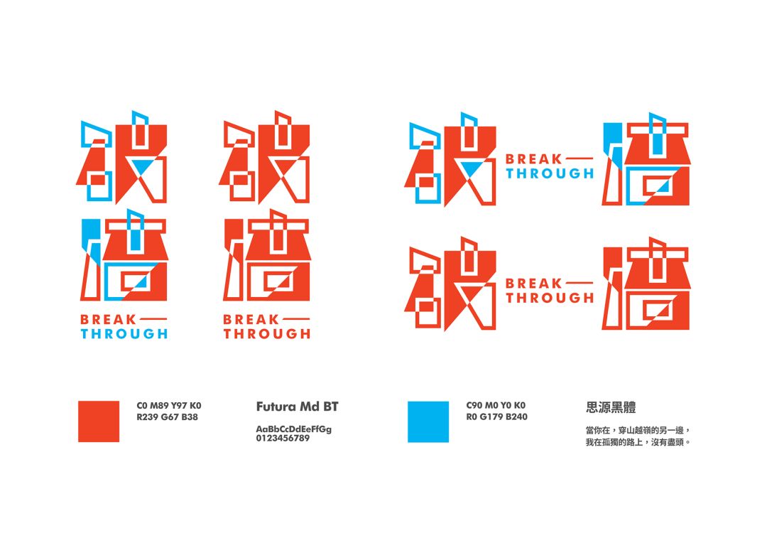
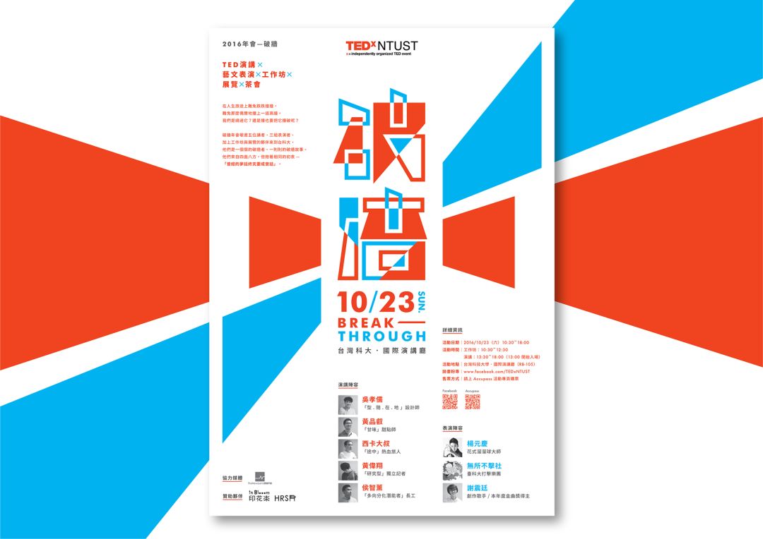

Copyright© ChiunHauYou
◢
Client: Chunhua Qiushi
Design: Holycowdesign
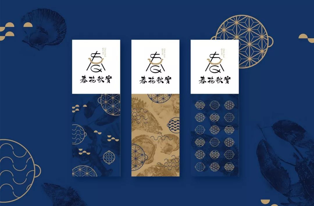
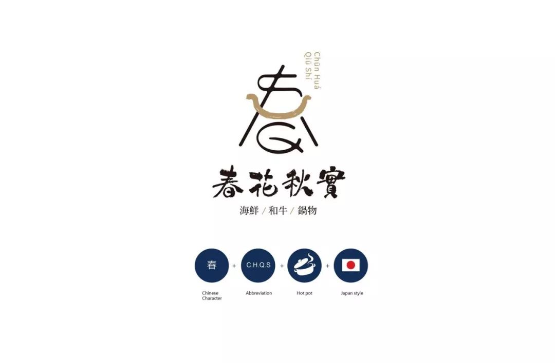
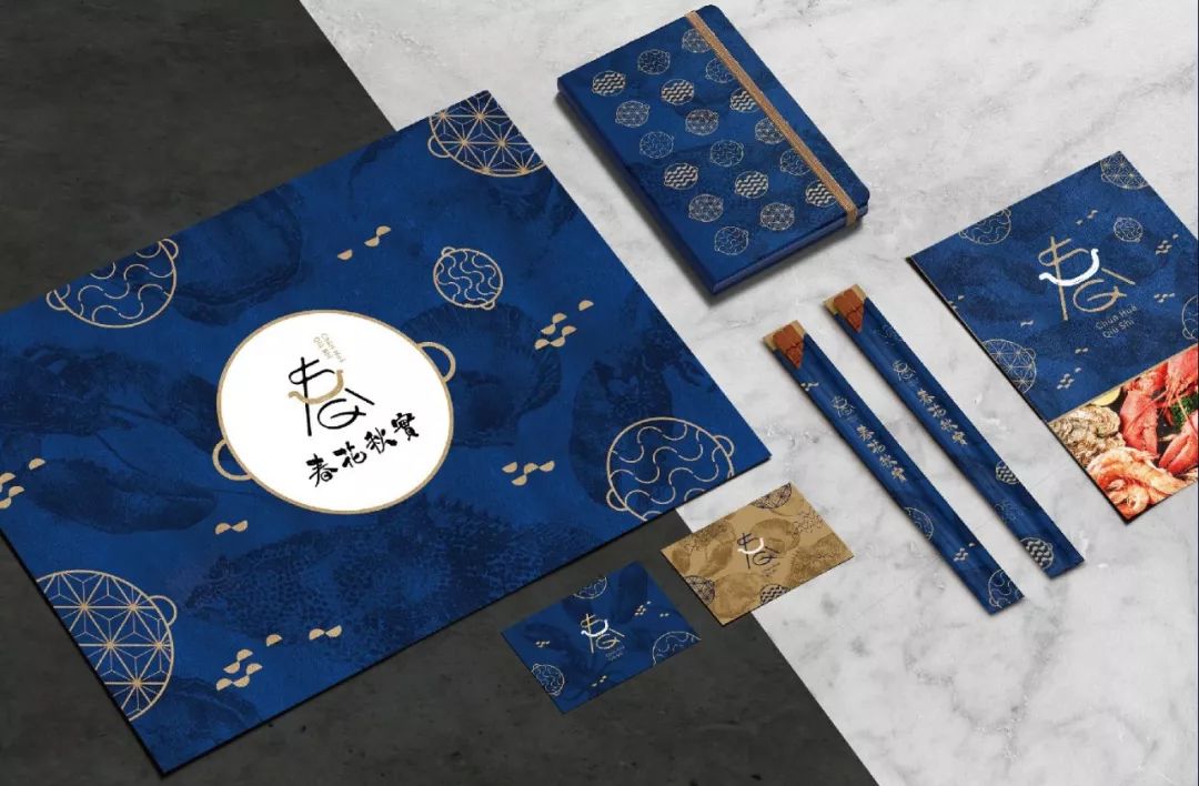

Copyright© Holycowdesign
◢
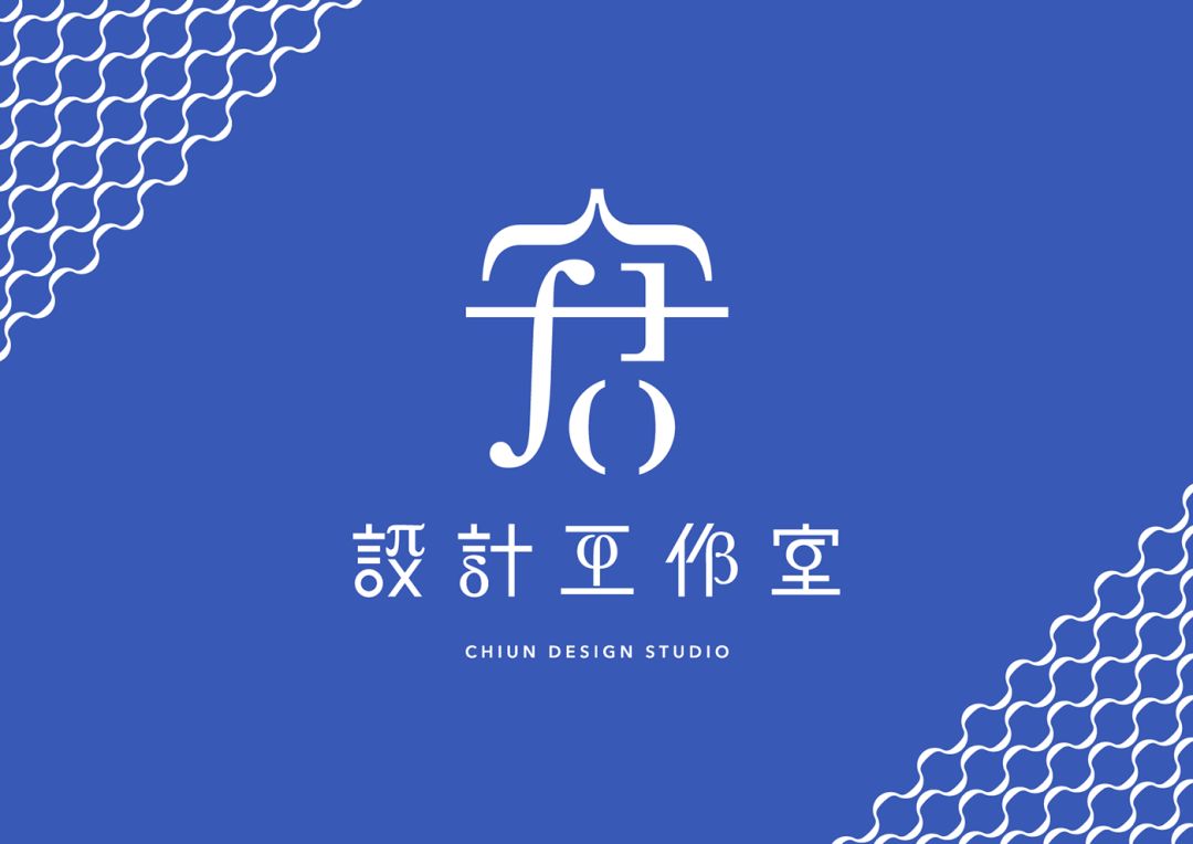
Client: 宭 Design Studio - Identity Design
Designer: ChiunHauYou
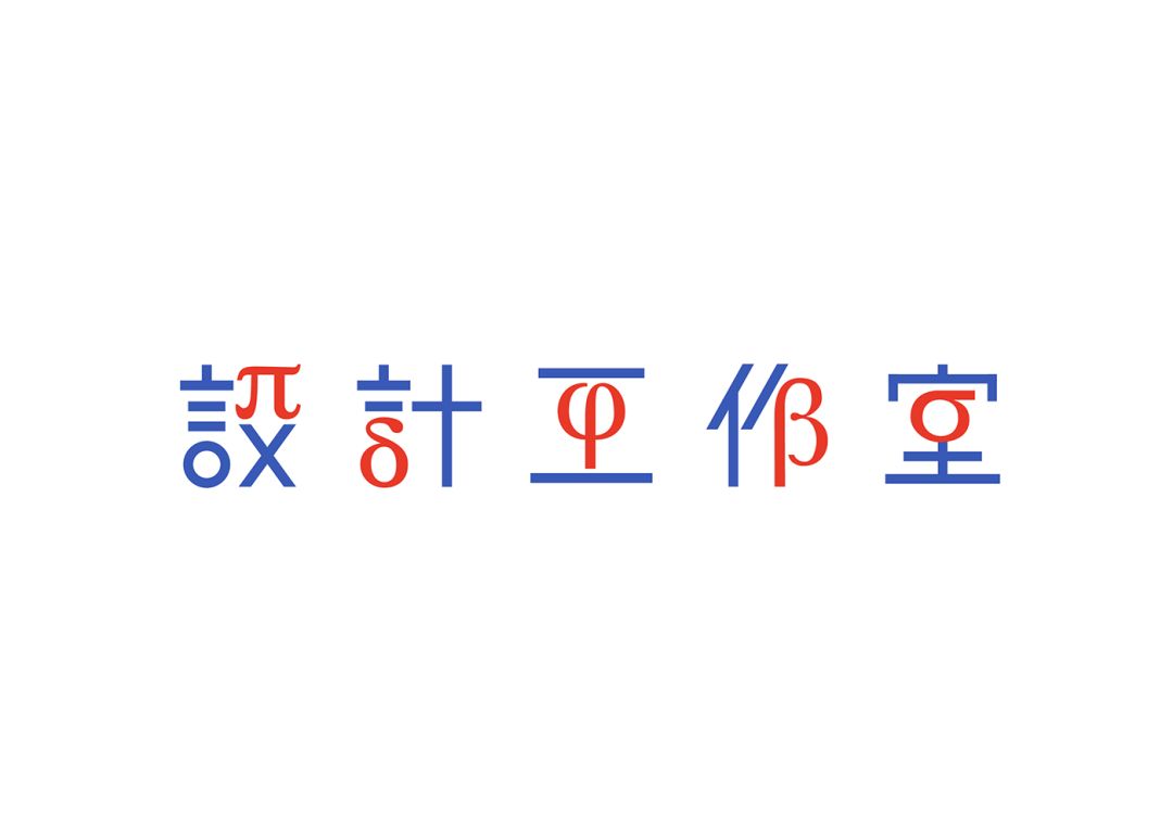
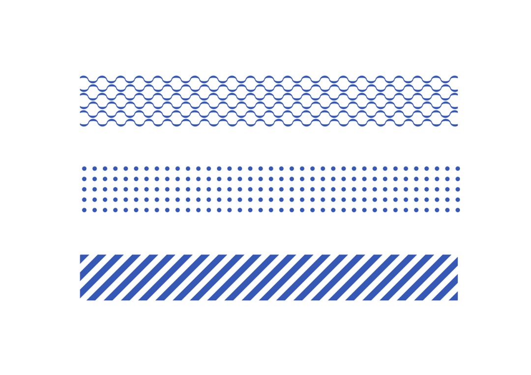
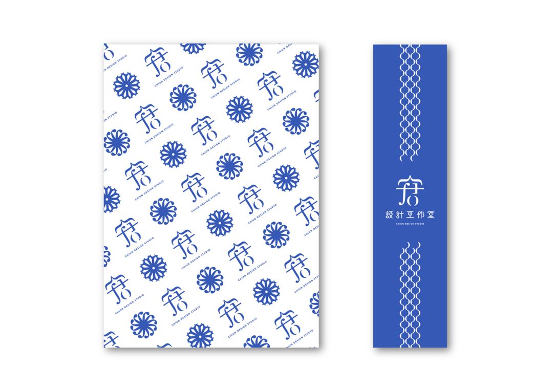

Copyright© ChiunHauYou
LOGO, which is designed with fonts, not only faces a wider range of audiences, but also has a more direct communication.
Packaging>
In the product packaging, font design is indispensable. Fonts are an important visual element in the communication of packaging information, and well-designed fonts make product packaging attractive.
◢
Customer: KushimaAoifarm Co., Ltd.
Designed by: MILTZ
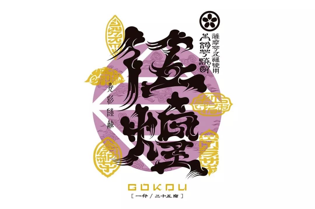
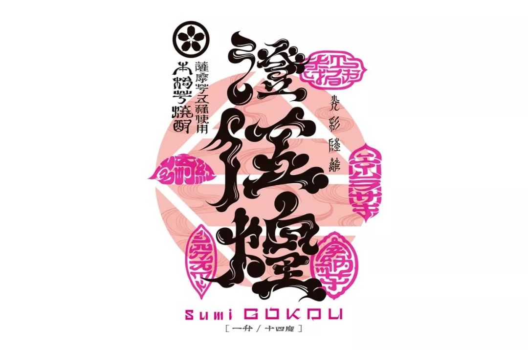

Copyright© MILTZ
◢
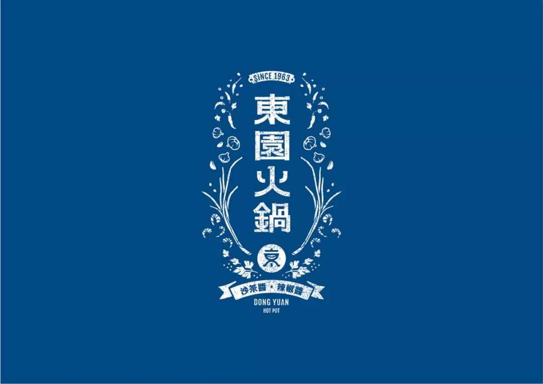
Client: Dongyuan Hot Pot
Design: AntlersArtisans
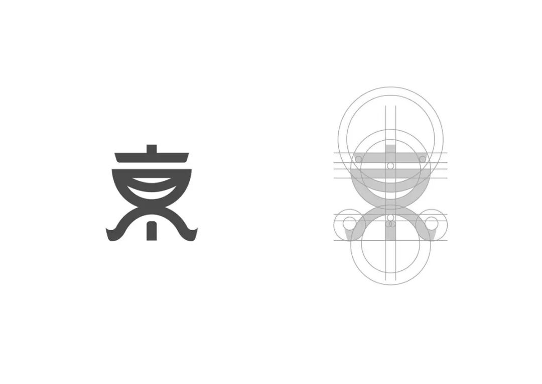
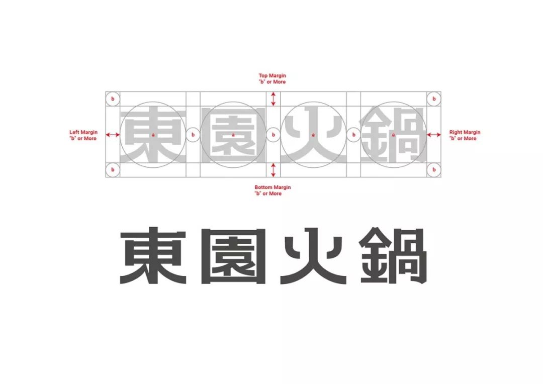
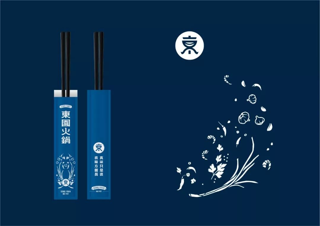
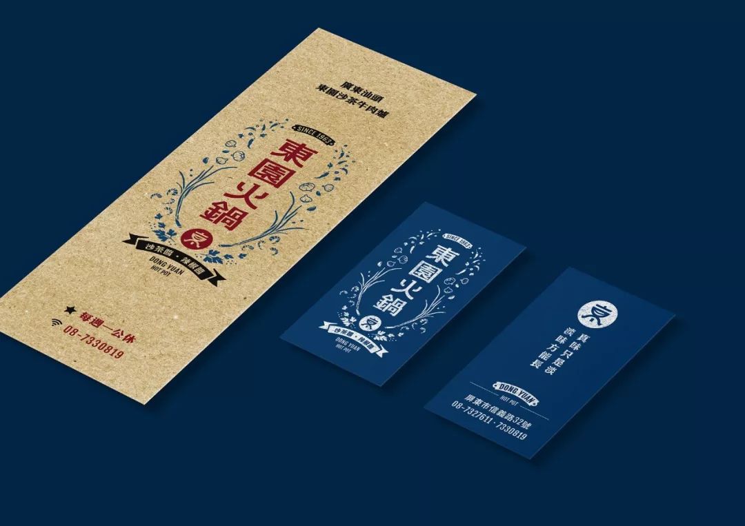

Copyright© Antlers Artisans
Poster>
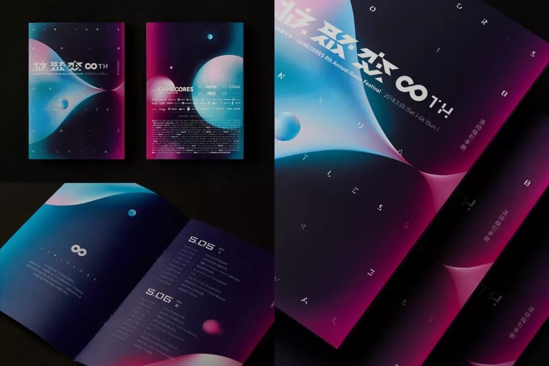
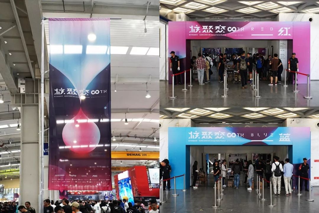
Posters have three major functions, advertising, art and cultural communication. Excellent posters often have a high level of design, and the use of design elements such as graphics, text, and color complements each other, enhancing visual expression and at the same time possessing unique artistic charm.
◢
Client: Jihe (Beijing) Culture Media Co., Ltd.
Art Direction: TsengGreen
Designer: Li Yimei IMeiLee
Photographer: Qian Shangyun MoChienPrint: Li-Yiprinting|Li-Yiprinting
Copyright©Zeng Guozhan
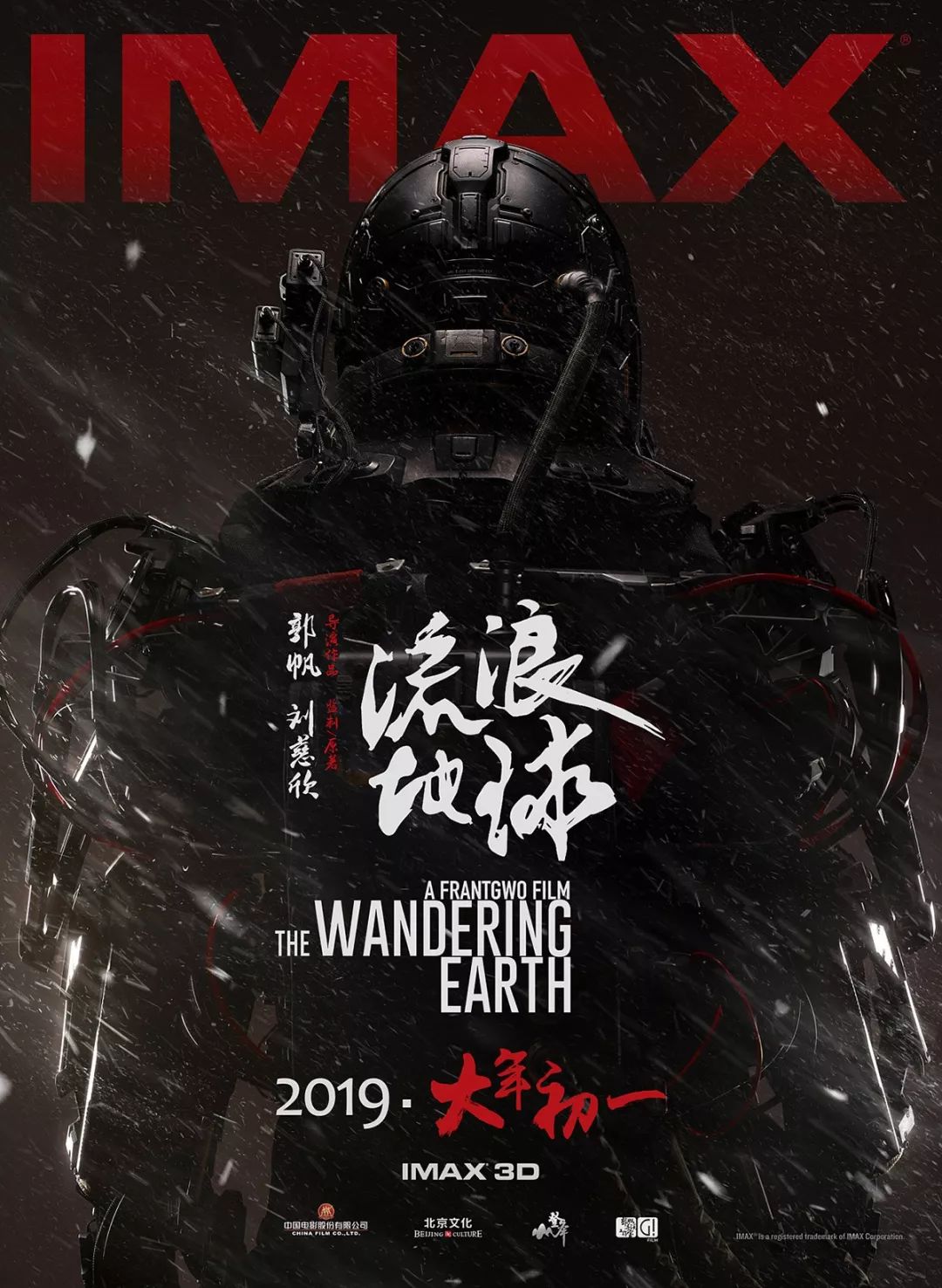
If you only use fonts in fonts, it is often difficult to achieve the ideal effect of highlighting the theme. At this time, designers are needed to design fonts by themselves. Those occasional and personalized font designs are most commonly found in posters for film and television, games, and themed events.
◢
Beijing Zhaoli Visual Culture Media Co., Ltd.Project: Zhaoli johnny Daxin Bi Yujuan jamie Fu Yang
Art Director: Zhao Lijohnny
Synthesis: Zhao Li, Johnny Daxin, Bi Yujuan, Jamie Fu Yang
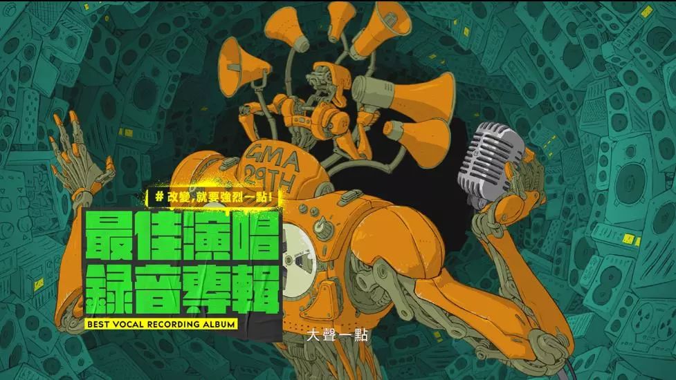
◢
Client: Ministry of CultureVisual image coordinator: JLDESIGNVideo music design: MUSDM.comAudio effect cooperation: DearPostAudioProductionLtd.
Illustrator s design: Mr.PIZZA!Dynamic design n: WildDesign Chen Zhiyu IdaChen/Wu Yuwei PhilWu/Hou Siyu Szu-YuHou
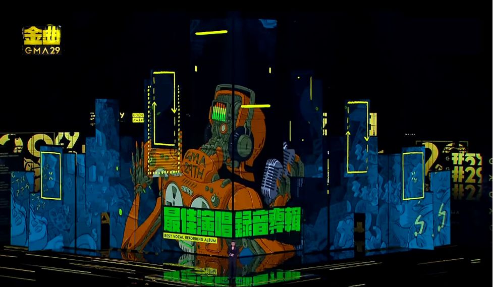
About more font designs used on movie posters:
The poster of "My Neighbor Totoro" in China designed by Huang Hai is really healing
Huang Hai spent half a year making two posters for Zhang Yimou's latest movie
Interpretation|The font design on the movie posters released in August will show you enough!
Books>
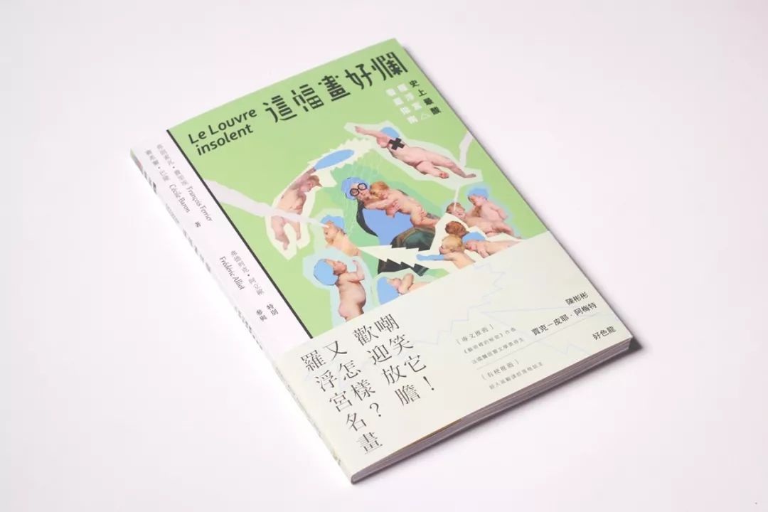
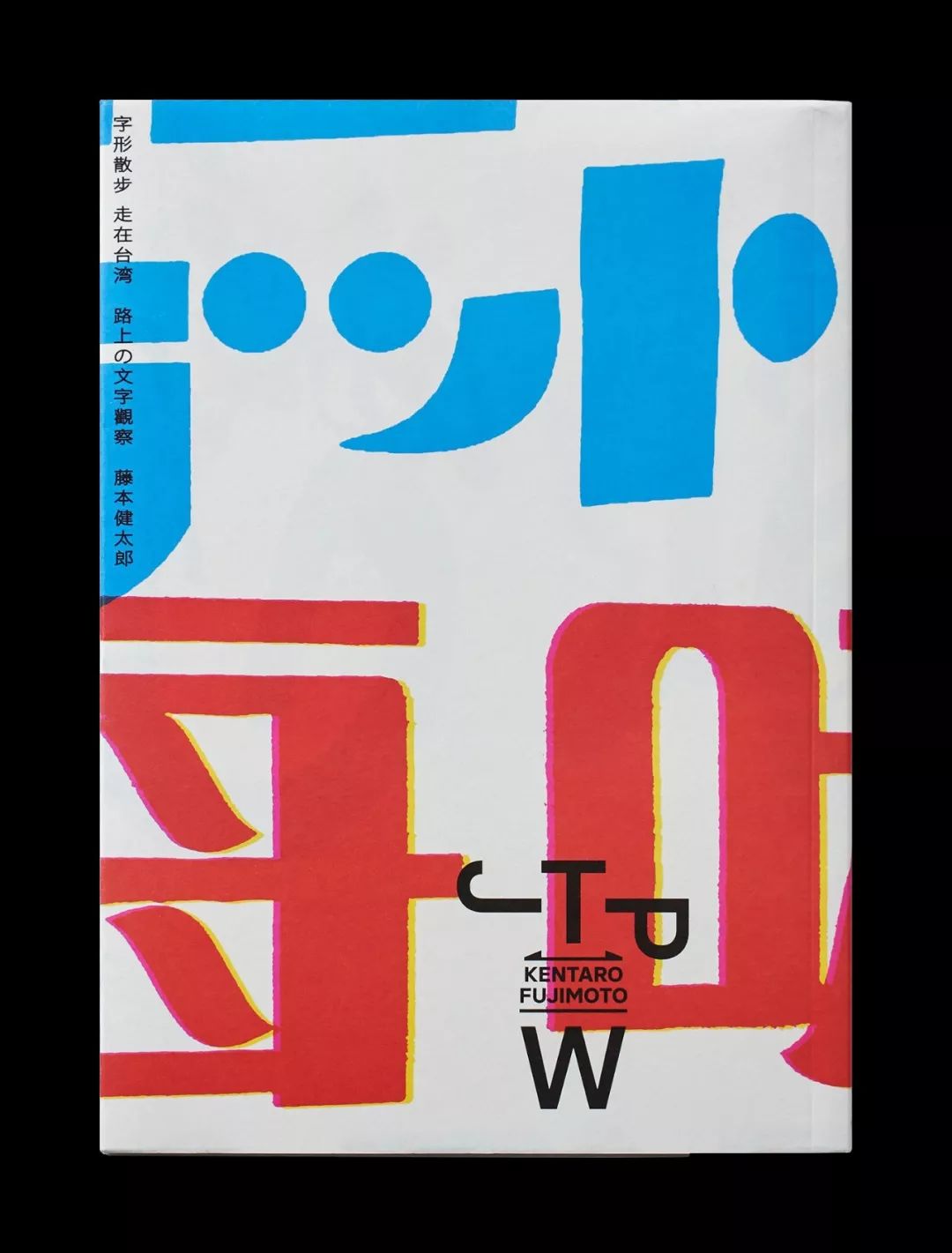
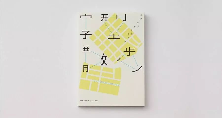
Books cannot be without font design. The font of the text should follow the principle of smooth reading, the font changes should not be too complicated, and the arrangement of the text should conform to the reading habits of the language so that readers can quickly recognize it. As for the title of the cover of a book, as the primary element of the cover, quick recognizability is even more important. The font design is reasonably matched with colors, so that readers can capture the visual information at the first time, and the title of the book is designed as the primary element of the cover, which will help readers judge whether to pick up the book and read it, so as to decide whether to buy it.
◢
Designer: Guo Xinxiang
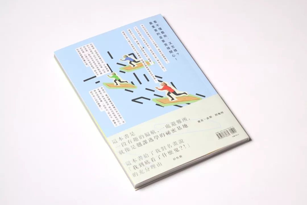
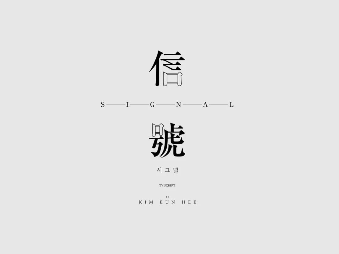
◢
"Signal: Original Screenplay" book cover design
Designer: Zhu Chenyi
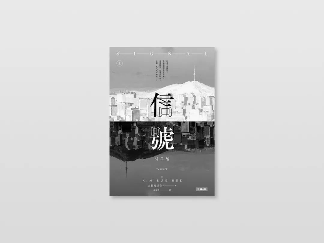
Copyright©Zhu Chenyi
◢
Client: FacesPublicationsDesigner: Wang Zhihong
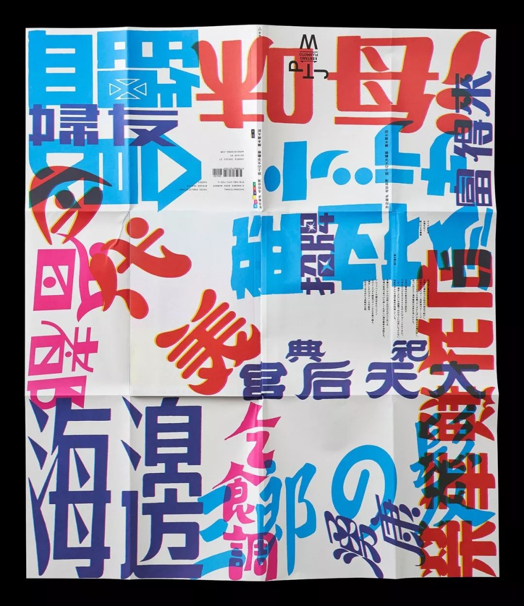


Copyright©Wang Zhihong
About the use of more font design in book cover design:
How to design a good book cover? Check out his work
A font design idea for a book cover
Text typesetting is very important in book album design
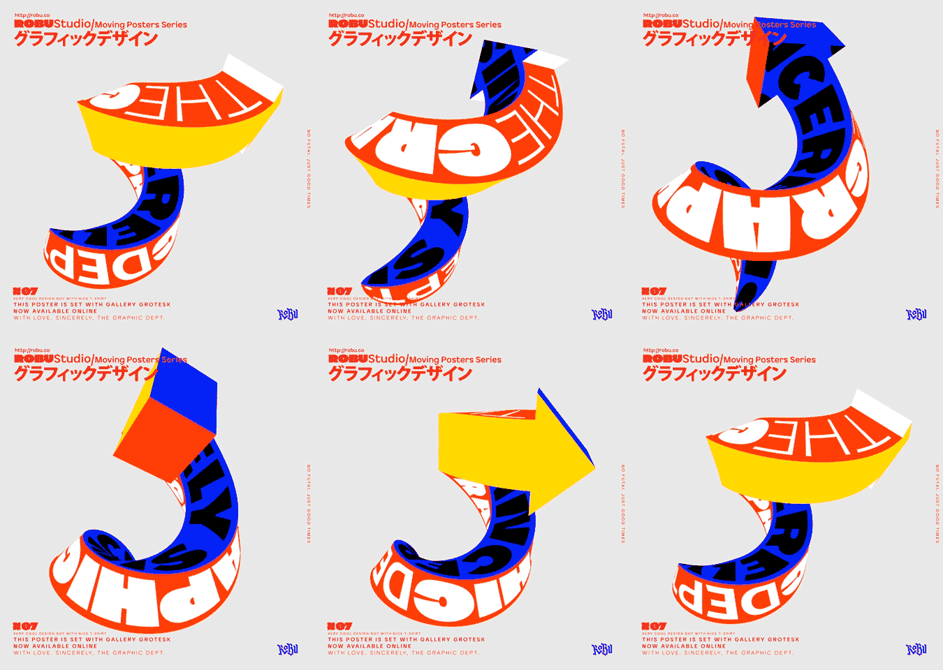
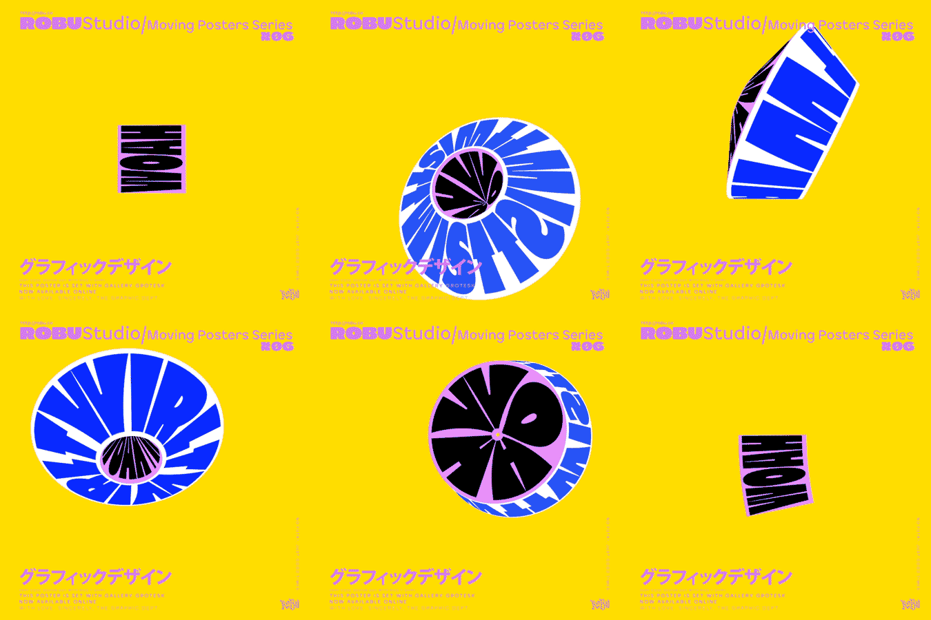
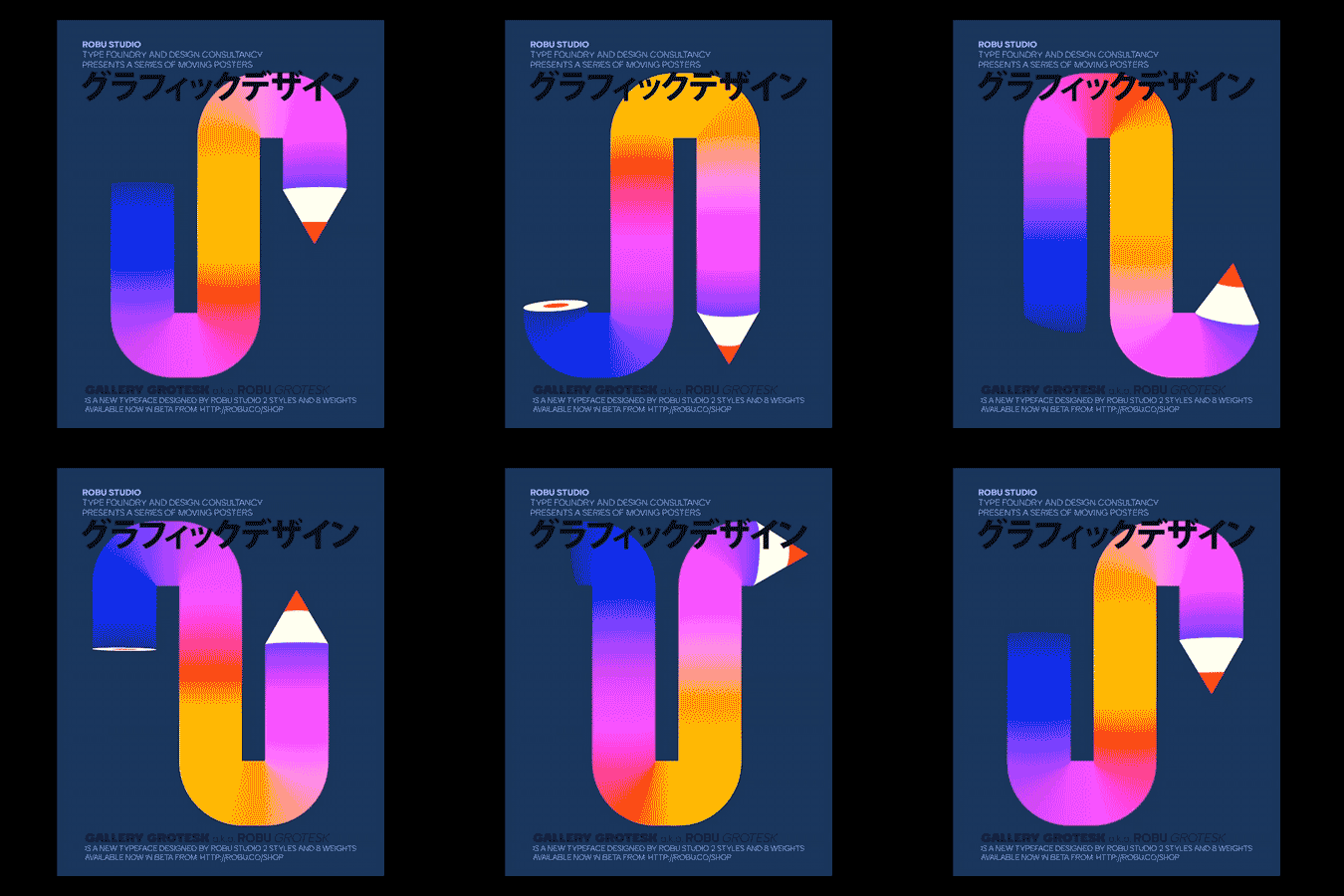
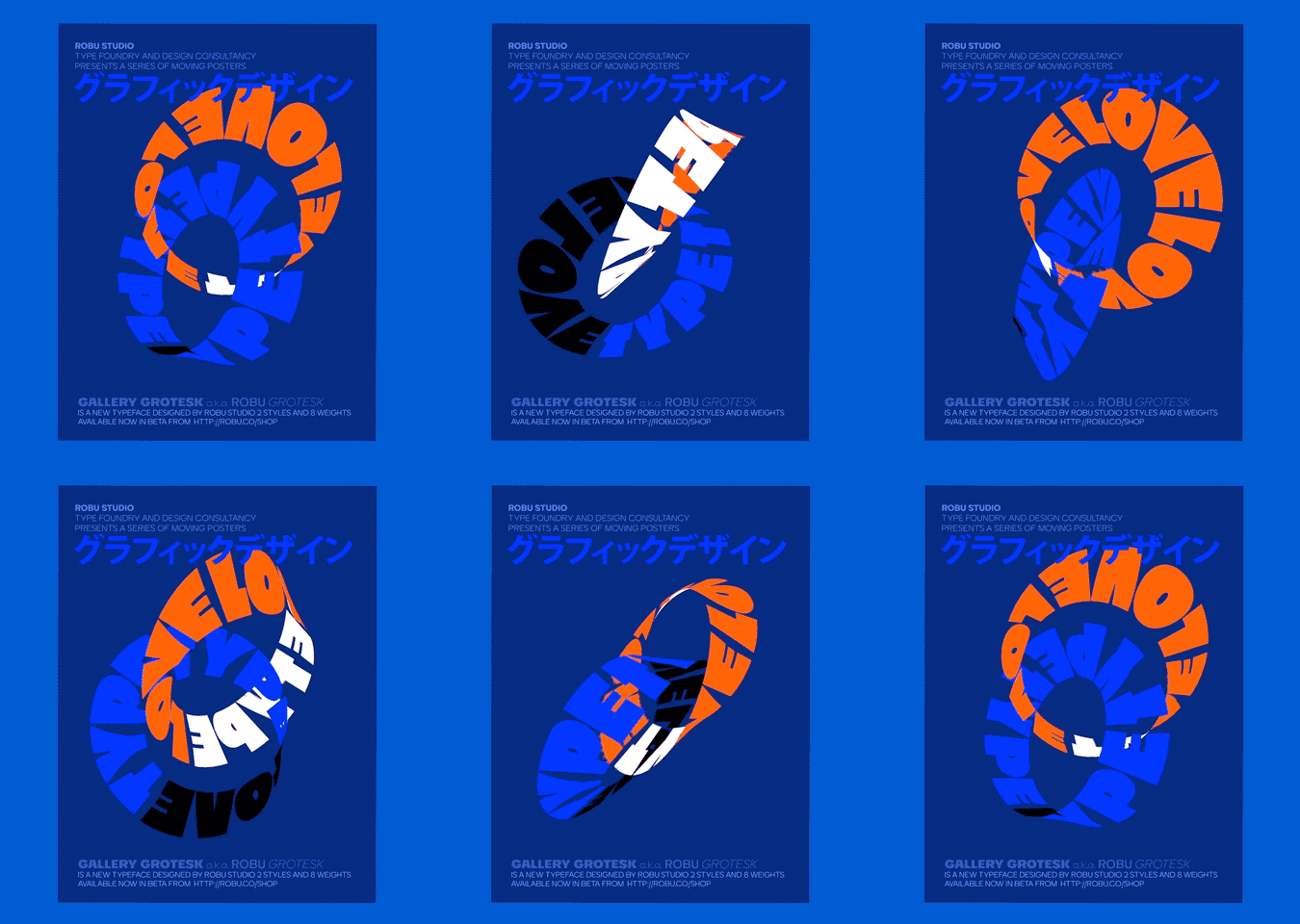
With the emergence of new media, the carrier of design has changed from the original paper media to the current screen display. As a basic way of communication, fonts are also changing their role, and there are more and more font changes. Now e-commerce posters, mobile phone theme fonts, dynamic fonts, and posters are beginning to appear, aiming to give users more visual Experience and sensuality.
◢
Tmall 2018 Double Eleven
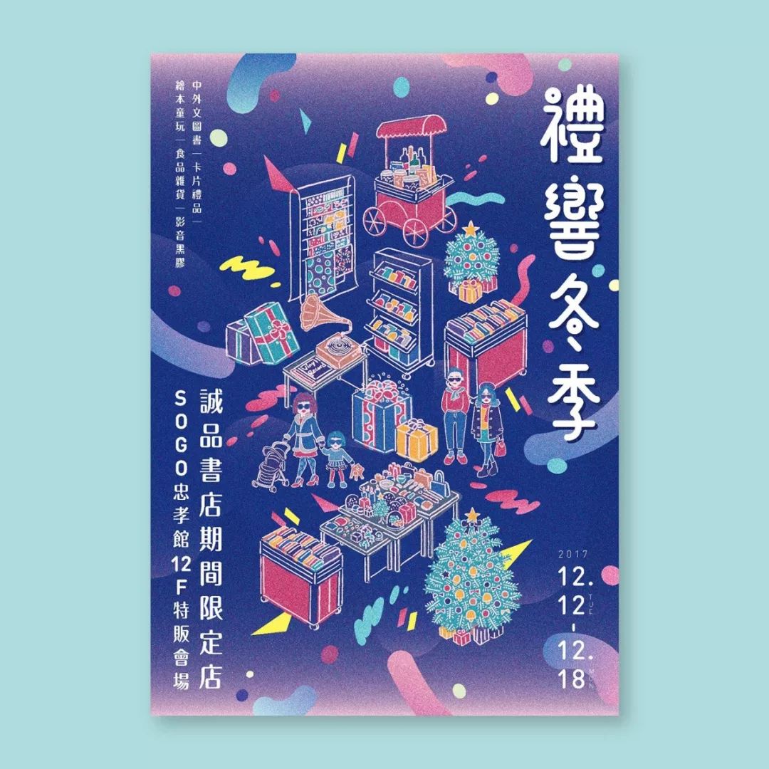
◢Eslite Bookstore Poster
Designer: Yun-FangHo
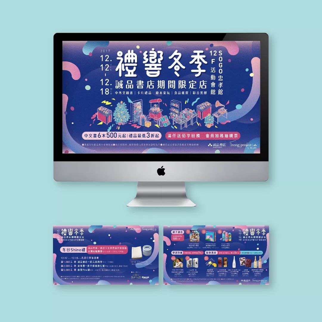
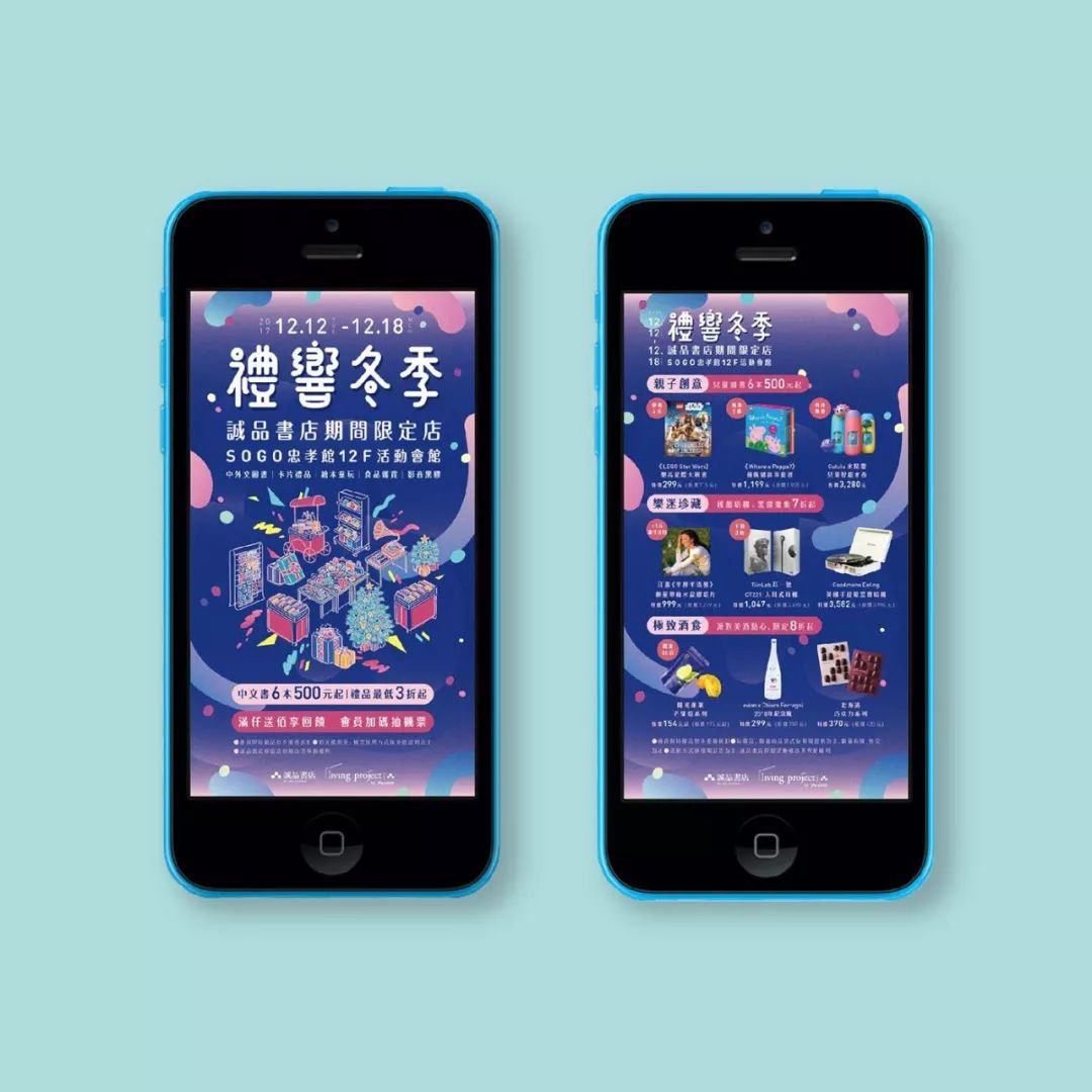
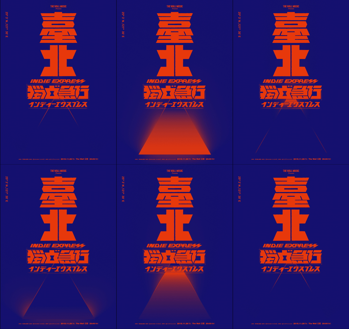
Copyright©Yun-FangHo
◢
Client: TheWallMusic/This Wall MusicDesigner: Zeng Guozhan>
Animation Design: PhilWuPrinting: Li-Yiprinting/Li-Yiprinting
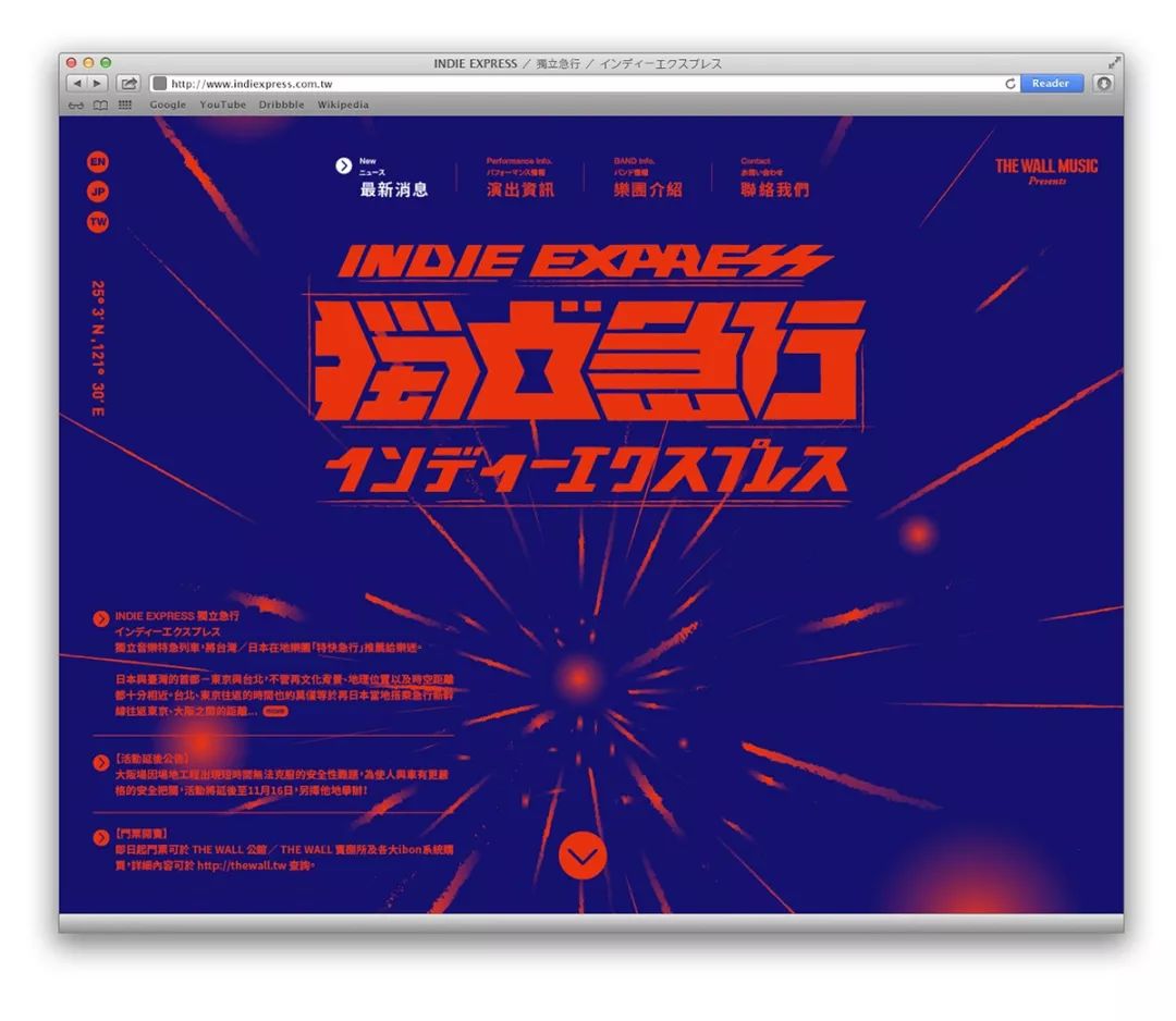
 Copyright©Zeng Guozhan
Dynamic Typography>
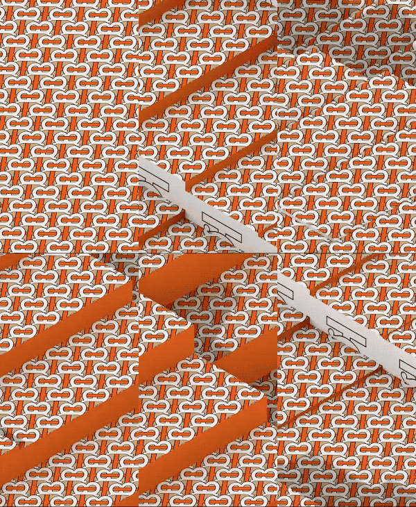
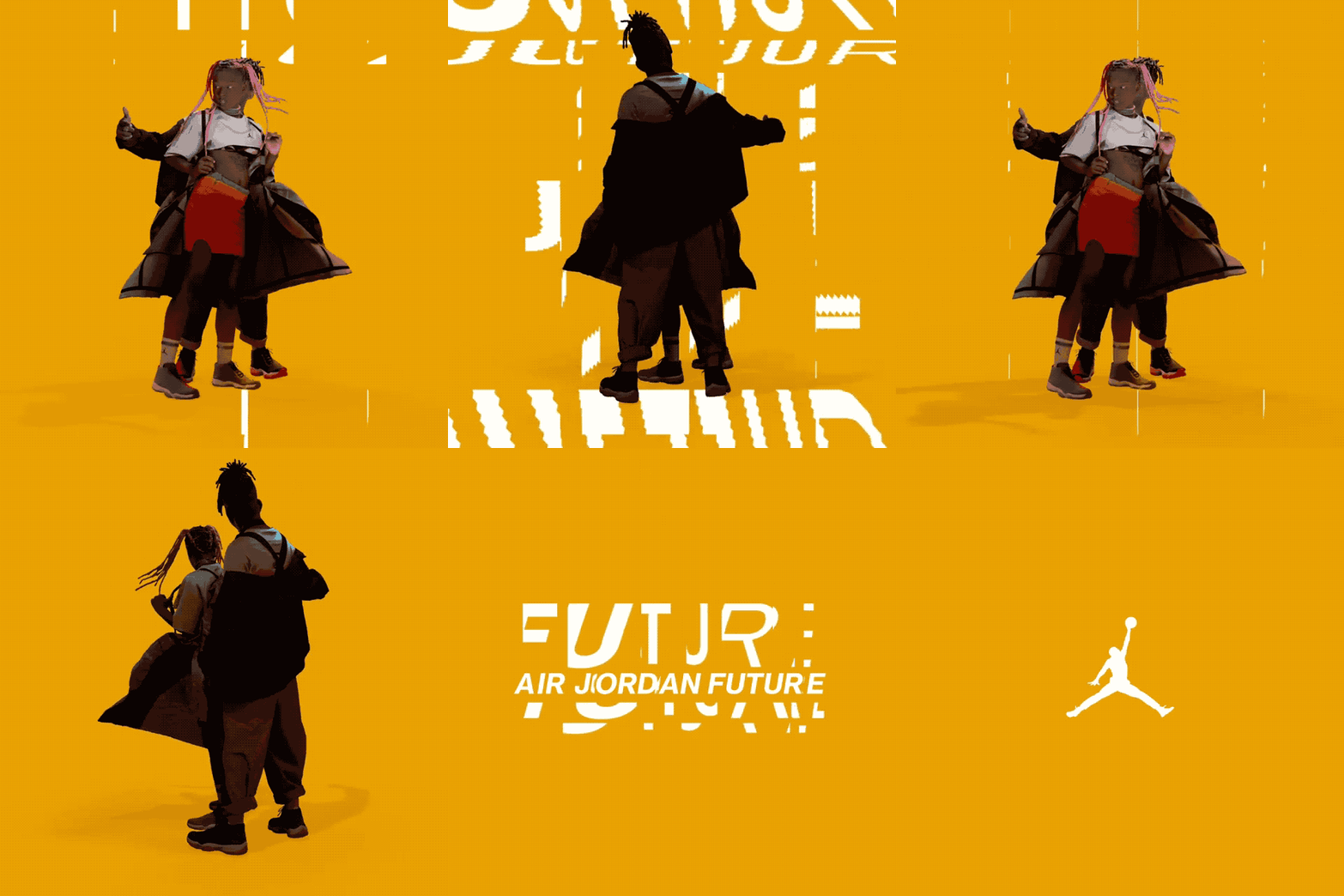
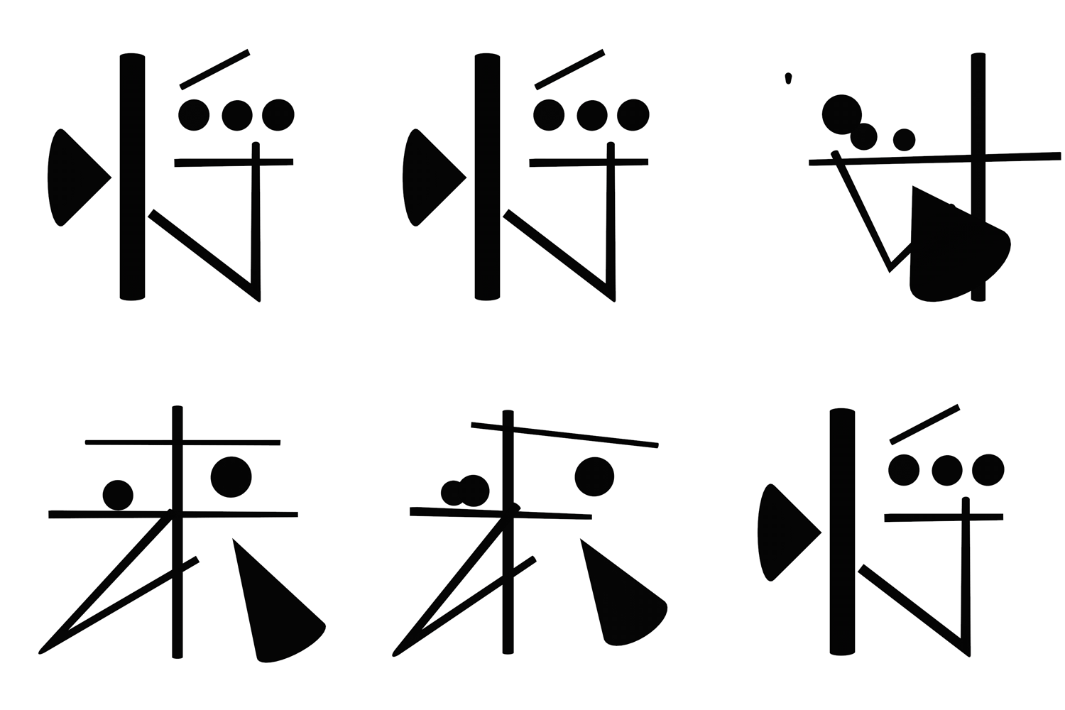
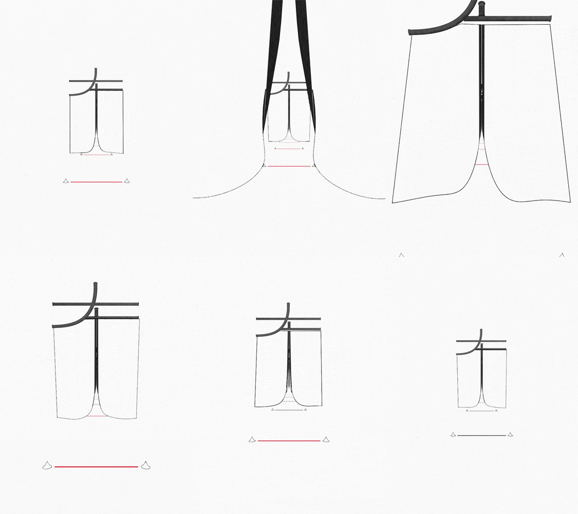
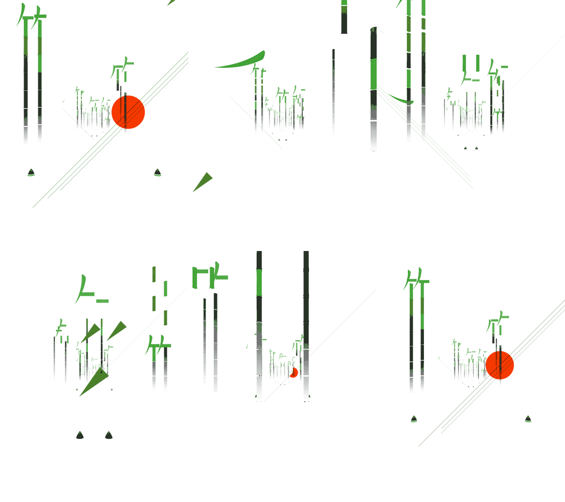
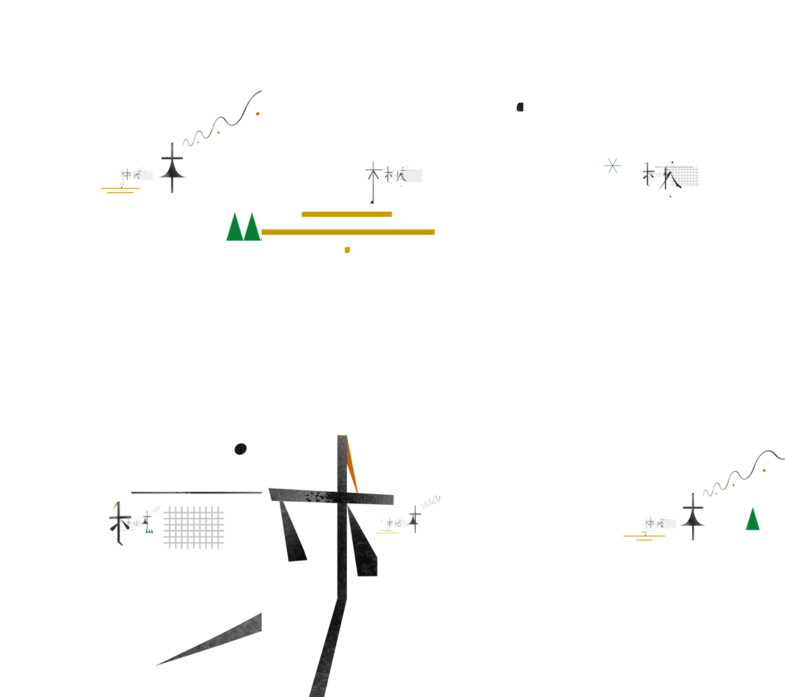
As mentioned in the previous article "Four Design Skills You Need to Learn in 2020", "moving" will be a popular trend in the future, both in brand LOGO and UI/UX. Simple graphics "move", which can increase the conversion rate and keep the viewer's attention on the graphics for a longer time. At the same time, it is also mentioned that font design will become larger and larger in typesetting in order to meet the current society that pursues rapid information quantification.
“ more modern information
The more we strive for speed”










Articles are uploaded by users and are for non-commercial browsing only. Posted by: Lomu, please indicate the source: https://www.daogebangong.com/en/articles/detail/Why%20learn%20typography.html

 支付宝扫一扫
评论列表(196条)
测试