"Tchia" is a very unique open world game. The prototype of the game world is the real French overseas territory, New Caledonia in the South Pacific. As the music plays in the game, players will realize that all the character dialogue is dubbed in French and Drehu (one of the oldest dialects of New Caledonia), and know that the development team has poured great enthusiasm into it. However, players may encounter an unexpected thorny problem in the game, that is, the text in the option menu cannot be read clearly at all.
In fact, it might not be fair to name Chia by name, given the sheer number of accessibility options it offers players. But as a new game, Chia's problems reflect a growing trend in the industry in recent years: text in video game user interfaces is getting smaller and harder to read .
Why does this happen? What is the solution? Accessibility consultant Ian Hamilton and lead designer Ridley Crane of type studio Lettermatic have their own take.
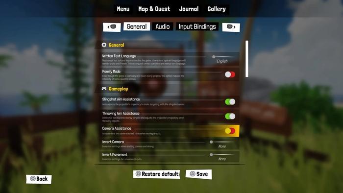
The console version of "Chia" menu interface, for most players, the reading experience is terrible
Ignoring requirements
"In terms of accessibility experience, players often complain that the text is too small. This is the most common complaint." Hamilton said. In addition to the game industry, some other fields also lack understanding of typography and its application, and do not follow the basic design principles, but this problem is particularly obvious in game products. Although the game focuses on visual effects, text is still one of the main ways to communicate with players. If the text is illegible, many information in the game may be missed by the player.
Hamilton believes that display devices are part of the reason why the game's text has become smaller and smaller. "The previous screen resolution was not as high as it is now, so 'small text' is not technically feasible." As the screen resolution of various monitors gradually increases, and console gamers have larger TVs, smaller fonts Clearer rendering has been achieved, and game developers are keen to take advantage of this, but it is also easy to design text that is too small, making it difficult for players to read.
Hamilton gave an example: "In a common living room environment, a person with normal vision uses a typical screen device with a text size of at least 28px (1px represents a pixel on the screen) at a resolution of 1080p."
However, reading is not an objective experience. For sighted players, 28px text size is enough, but visually impaired players may need larger text. Crane said that for this reason, he recommends designing UIs for games with more visual effects in mind, and that "typography should be adjustable."

The font size can be adjusted in some games, but sometimes the difference between standard subtitles and extra large subtitles is not obvious
Some people think that this is not a difficult problem, and developers only need to make the font size larger. But things are not that simple. Once developers change text size, thickness, character spacing, or line spacing, it will have a major impact on the UI-such as aesthetic damage, text rushing out of dialog boxes or buttons, or even incomplete display.
During the production of "Alitalia 2", the solution of the development partner Lettermatic was to use multiplexed fonts (Multiplexed Fonts). It doesn't scale up or down like traditional fonts, and takes up the same amount of space whether it's regular or bold. "We're very pleased with the partnership with developer Double Fine Productions," Crane said. "In the game, we see typography as a flexible experience that changes based on player preferences, rather than being forever static."
Regardless of the effect, "Italian 2" thought of more in UI design
Sadly, similar collaborations are rare in the games industry, and few development teams turn to agencies familiar with accessible typography for advice or assistance. As time goes by, in game products, small font size quickly becomes the norm...
"The way contemporary game developers design and build UIs is not what they intend," said Hamilton. Hamilton points out that, in addition to a lack of understanding of the basic principles of typography, many developers are ignoring the simple fact that, That's the environment in which they make their games, which bears little resemblance to the environment in which players play them. "
Developers sit and work in front of large high-definition monitors, but few gamers play games in such an environment. “Many players are using Switch or Steam Deck to play games. PC players’ monitors are only 4 times larger than handheld players. The situation of console players may be better. Most of them sit in the living room and play games, facing about 70 inches of TV. machine, but the distance between the player and the TV is 3 to 5 meters.”
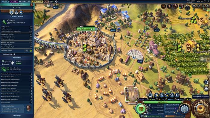
The various menus in strategy games are often very complicated, and the text is too small to be fatal (the picture shows "Civilization 6")
Game development teams often don't adequately test against these environments. Even on the Switch, developers didn't put much effort into making sure the text was still legible in handheld mode. “Certain studios do have a living room-like environment, but in the many places I’ve been to over the decades, there’s only one studio that has that kind of setup, and maybe the company doesn’t want or think to offer that kind of space and TV and other equipment."
This means that during the production of the game, the development team basically does not specifically test the text size-in a sense, they throw this task on the player. Designers should fully consider the actual environment in which users use the product, rather than design according to the product development environment, but many industries are making the same mistake. For example in the printing industry, some designers never even actually print their work to see the final result.
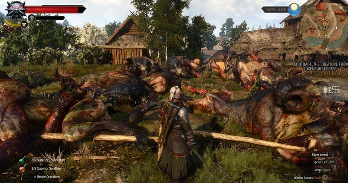
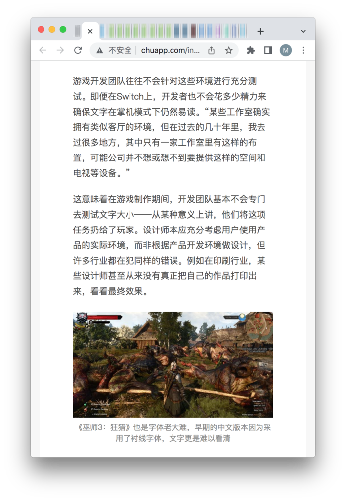
"The Witcher 3: Wild Hunt" is also a big problem with fonts. The early Chinese version used serif fonts, and the text was even more difficult to read.
How to improve
So, how can game developers improve the status quo? Hamilton suggested they learn from web developers. More than a decade ago, as mobile web browsing became more and more common, web developers had to find ways to improve their designs and ensure that their websites displayed clearly on mobile screens. To achieve this goal, web developers adopt responsive design.
"Go to a few of your favorite websites on your computer and try changing the window size," says Hamilton. "For most websites, when you make the window bigger or smaller, the page layout changes, and always It can adapt to the reading space." Nowadays, the webpages of most websites can intelligently detect the screen width and adapt to different templates, so as to present better display effects on screens of different proportions and sizes on monitors, tablets and mobile phones . Hamilton believes that game text should also respond to the screen and resolution used by the user, so as to cater to the player's more subjective personal experience, rather than blindly improving the so-called objective readability.
Crane added that game developers should consider adopting accessible or responsive fonts early in the project, rather than wait until the last minute to rework these things. "Because in the layered towers of visual design, they are located at the bottom, and the whole body is affected by a single hair."
Touch music web version automatically adapts to the effect of mobile phone reading
Like developers, game media also need to consider text size to help players understand whether the game is suitable for them, and to urge developers to make changes in this regard. Hamilton pointed out that even if reviewers are unwilling to criticize issues such as too small text, they can still show screenshots including UI in the review to help players make informed purchasing decisions.
In the game industry, everyone should work hard to build a more accessible future, including developers, player communities and media. In any case, the text size in many games is really not good enough, which makes it difficult for players to read the information, which greatly affects the game itself and the playing experience.
This article is compiled from: eurogamer.net
Original title: "Why do so many modern games have tiny text?"
Author: Geoffrey Bunting
Articles are uploaded by users and are for non-commercial browsing only. Posted by: Lomu, please indicate the source: https://www.daogebangong.com/en/articles/detail/Why%20is%20the%20text%20in%20the%20game%20getting%20smaller%20and%20smaller.html
 支付宝扫一扫
评论列表(196条)
测试