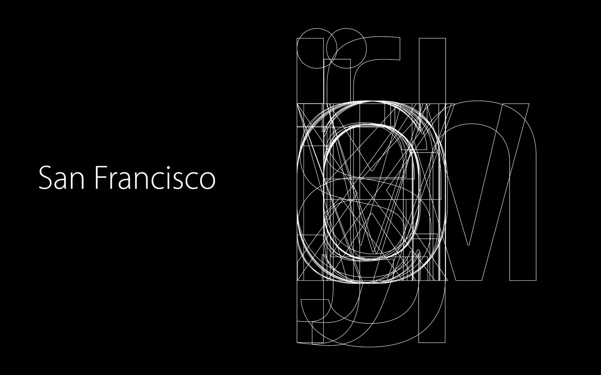
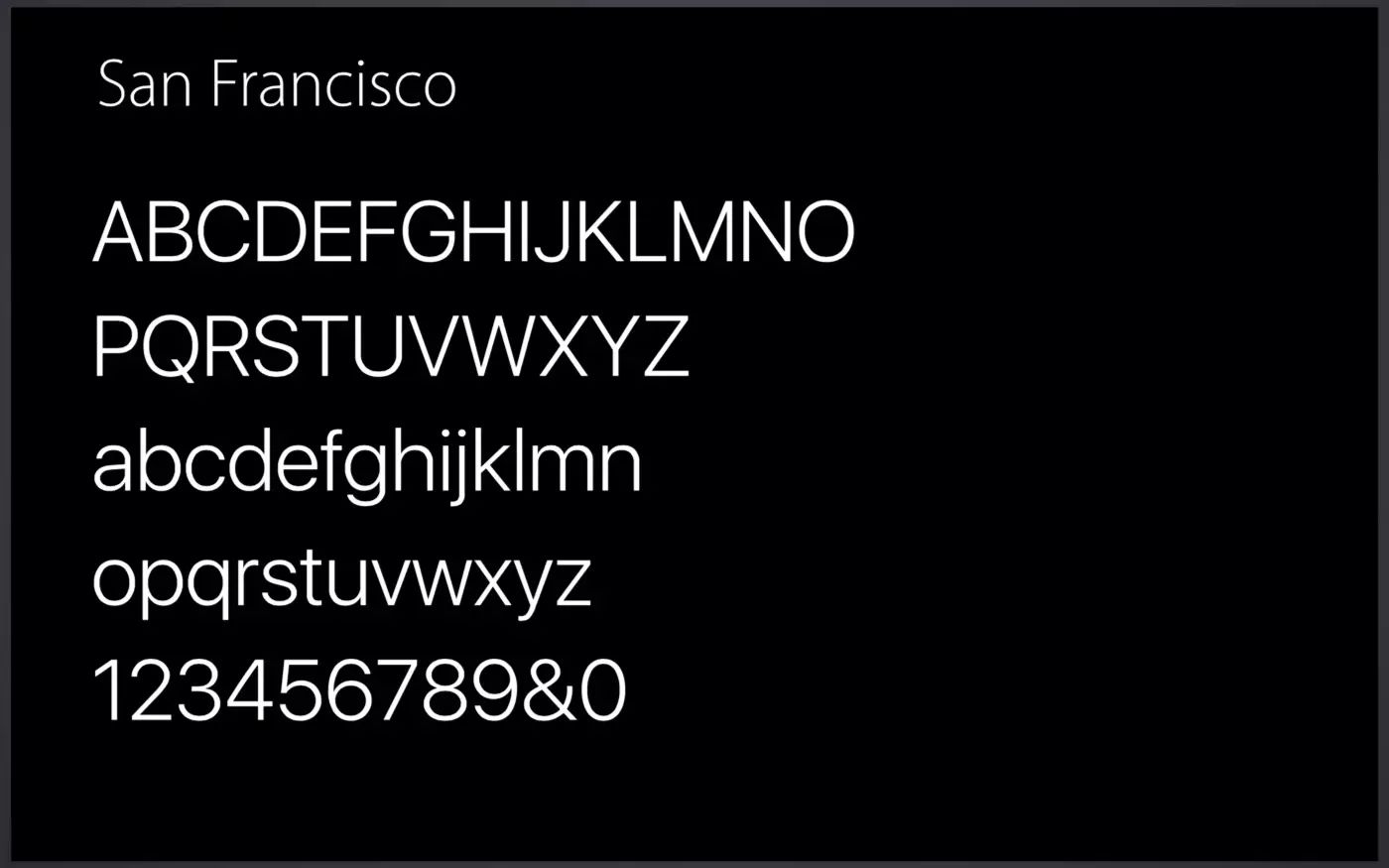
Why is Apple ditching the world's most famous font? Apple has been using one of the most famous fonts in the world, Helvetica Neue, for the past several years. However, over time, Apple decided to adopt a new font, the San Francisco font, in its products.

Good product, perhaps you have seen many. But the exploration and thinking behind a good product may not be known to many people.
In this column, you will know how "product people" create, provide better user experience, and affect the lives of thousands of people.
We select high-quality content to provide you with a special product perspective. If you have good article recommendations, or want to contribute, please contact appsolution@ifanr.com.
Reply to "Morning Reading" in the background of WeChat AppSo to get a collection of articles.
Mr. A’s Guide: Since the release of Apple Watch in 2015, Apple has started to replace it in its own products. San Francisco font, and later became the official font of all Apple software systems.
AppSo (WeChat public account AppSo) shared this article today to tell you what are the advantages of Apple's San Francisco font, so that Apple finally gave up the world's most famous and popular Helvetica.
Since the release of iOS 9, the iOS system font has become Apple's San Francisco font, replacing the Helvetica Neue used since iOS 7. 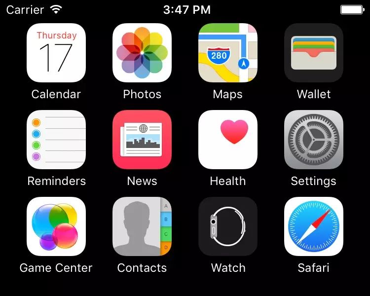 Helvetica (top), San Francisco (bottom)Prior to iOS 9, the San Francisco font was used in the Apple Watch. Today, San Francisco is the unifying font across all Apple platforms: Apple Watch, iPhone, iPad, Mac, and Apple TV.
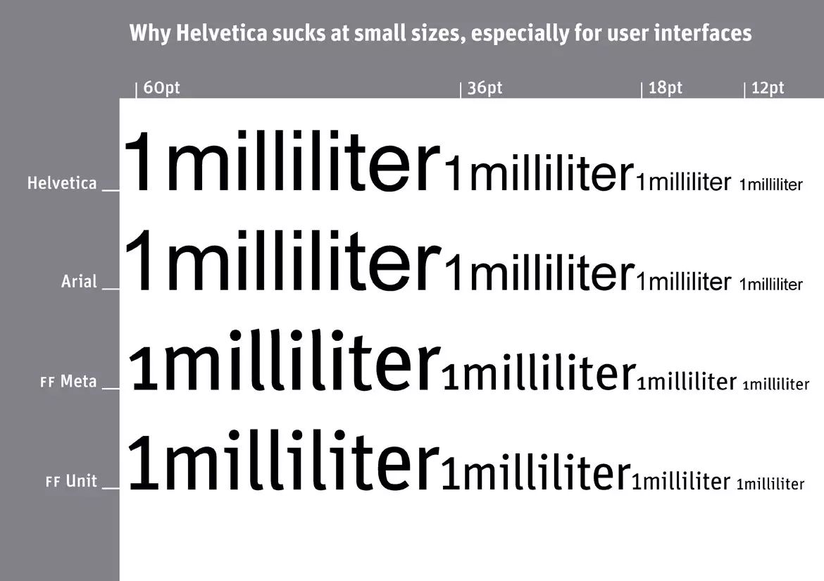
 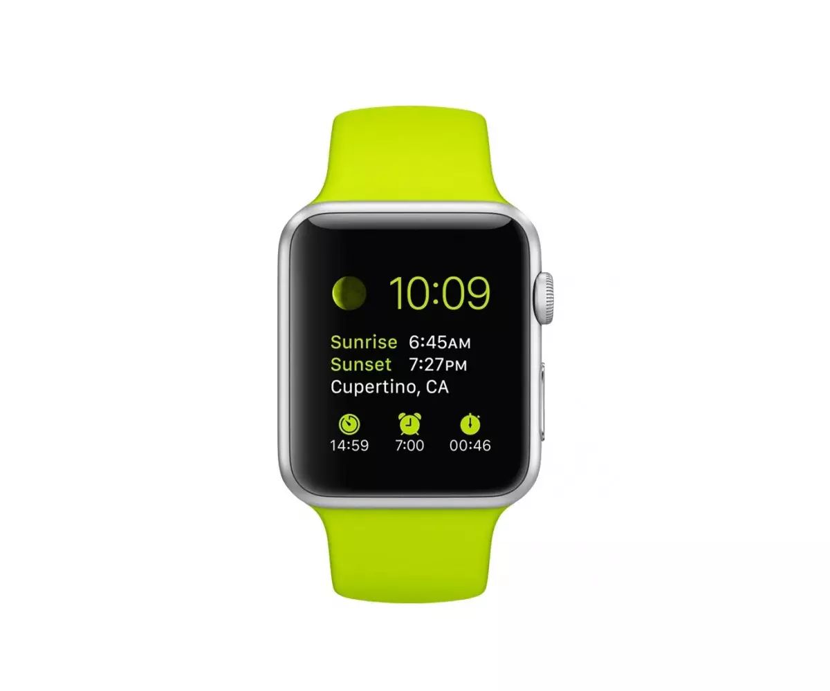 Apple WatchSince the first iPhone, Apple has used Helvetica as the system English font. And starting with OS X Yosemite, the font of the OS X system has changed from Lucida Grande to Helvetica. So, why did Apple finally abandon Helvetica, the most famous and popular font in the world? Small size Helvetica is too delicateIt is said that Helvetica is not suitable for small size. When OS X Yosemite changed the system font to Helvetica, many designers claimed that Helvetica was not suitable. If you type Helvetica text in small font size, you will find easy The readability is very low and appears blurry. Some text overlaps and is illegible. It is said that Apple designed the San Francisco font precisely to make small text easier to read on the Apple Watch.
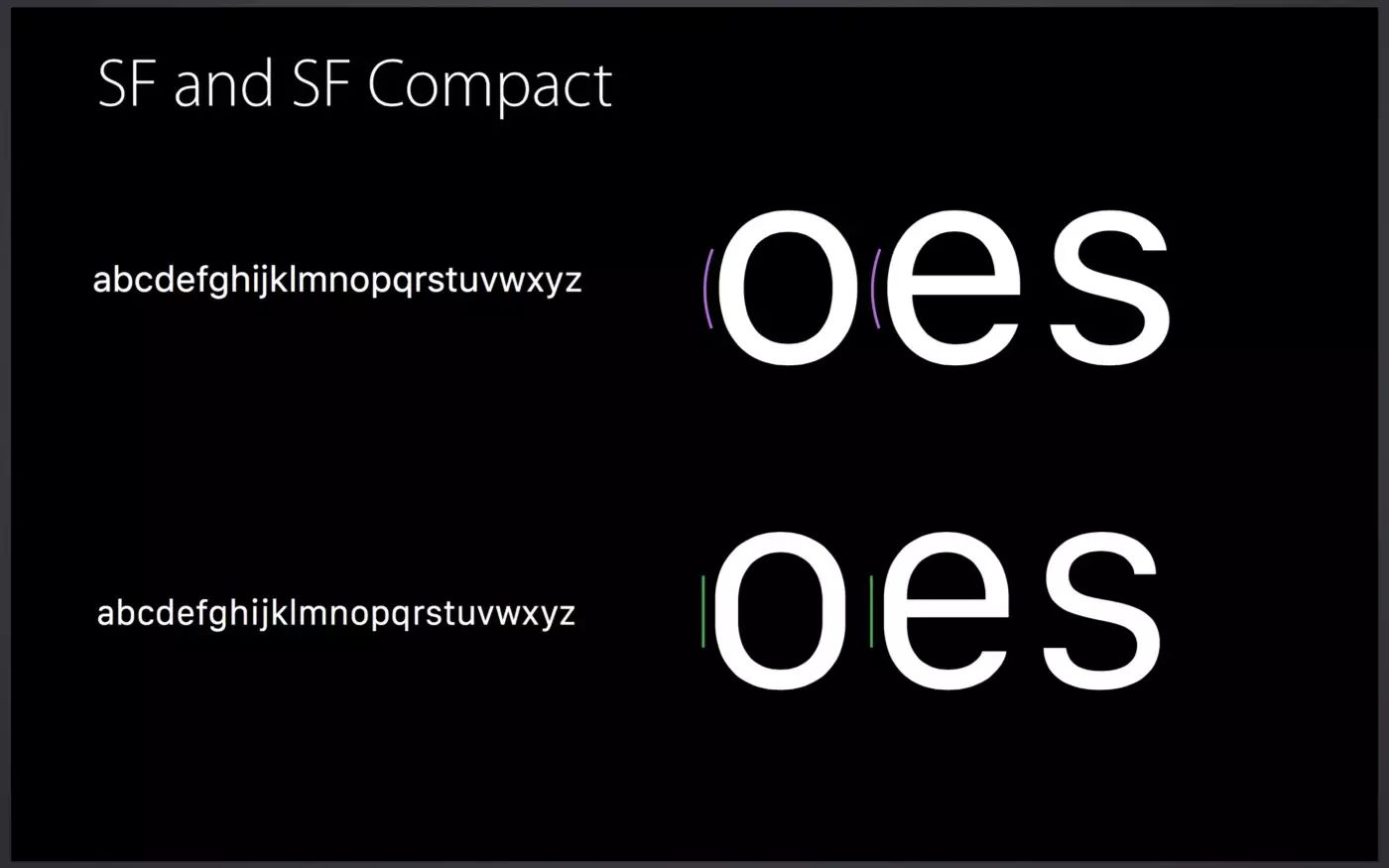
  Small letters overlapBut these days, small screen devices have higher resolution than print, and text on an iPhone isn't as small as it is on an Apple Watch. Why did Apple change the system fonts for iOS and Mac OS X, not just for Apple Watch? San Francisco is more than just a fontSan Francisco has many highly legible features. Actually the San Francisco font is not the same on Apple Watch and iOS/Mac. Font family "SF" for iOS / Mac and "SF Compact" for Apple Watch. You can see the difference in rounded letters like "o" and "e": the vertical lines of SF compact are flatter than those of SF.
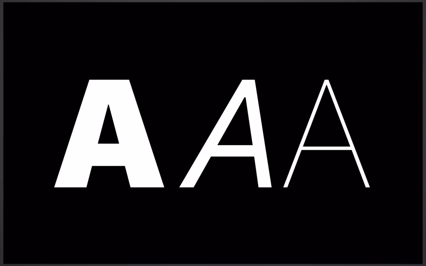
 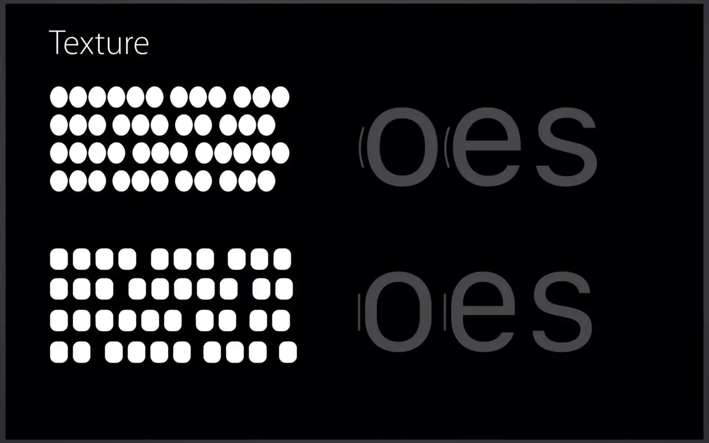 SF and SF CompactThis difference makes the text of SF Compact have larger letter spacing, so that small devices such as Apple Watch have higher legibility sex. Moreover, SF and SF Compact are divided into two sets of sub-font families, called "Text" and "Display". This is what Apple calls "visual size." Text fonts are used for smaller text, and Display fonts are used for larger ones.
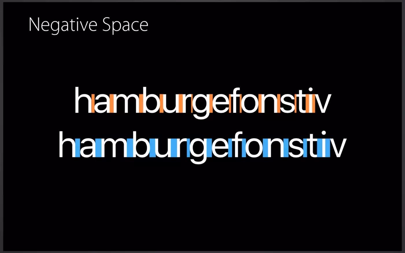
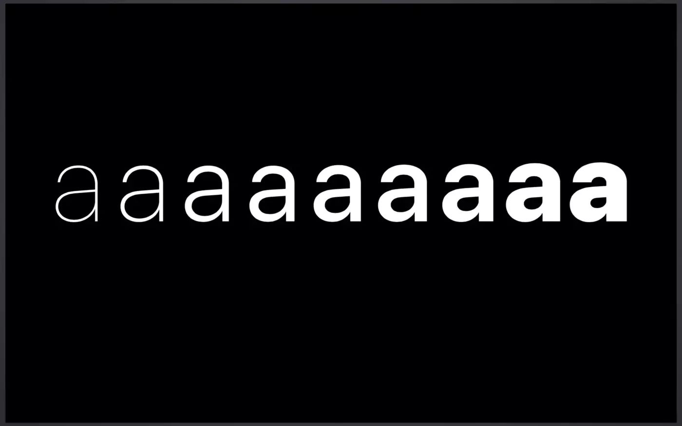
 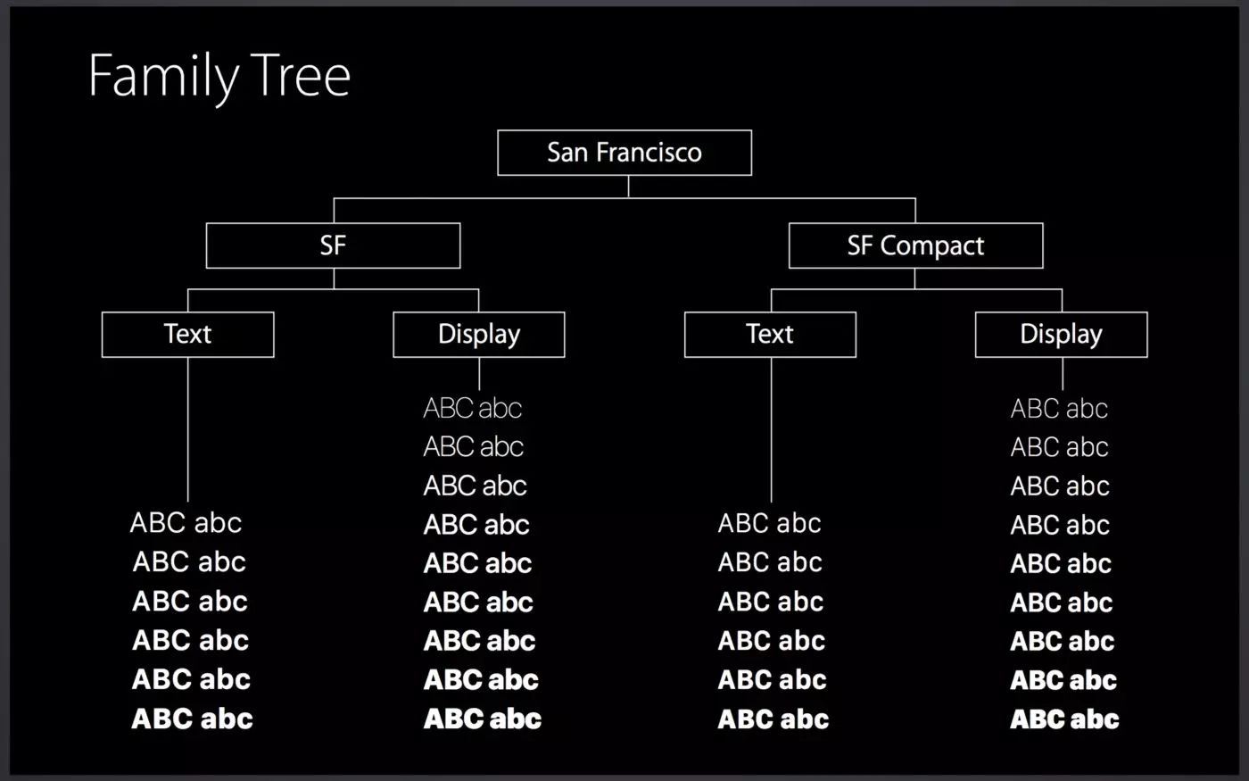 San Francisco font familyAs I mentioned before, Helvetica is an unnatural (or sans serif) font where two adjacent letters "overlap" together, Letters like 'a', 'e', and 's' look similar at small font sizes.
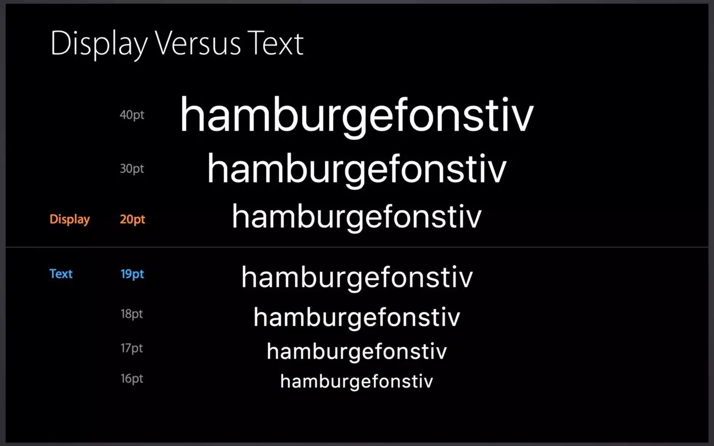
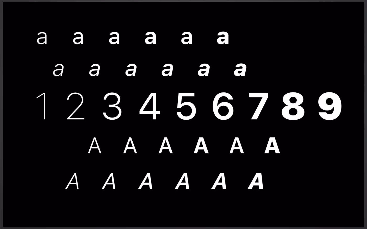
 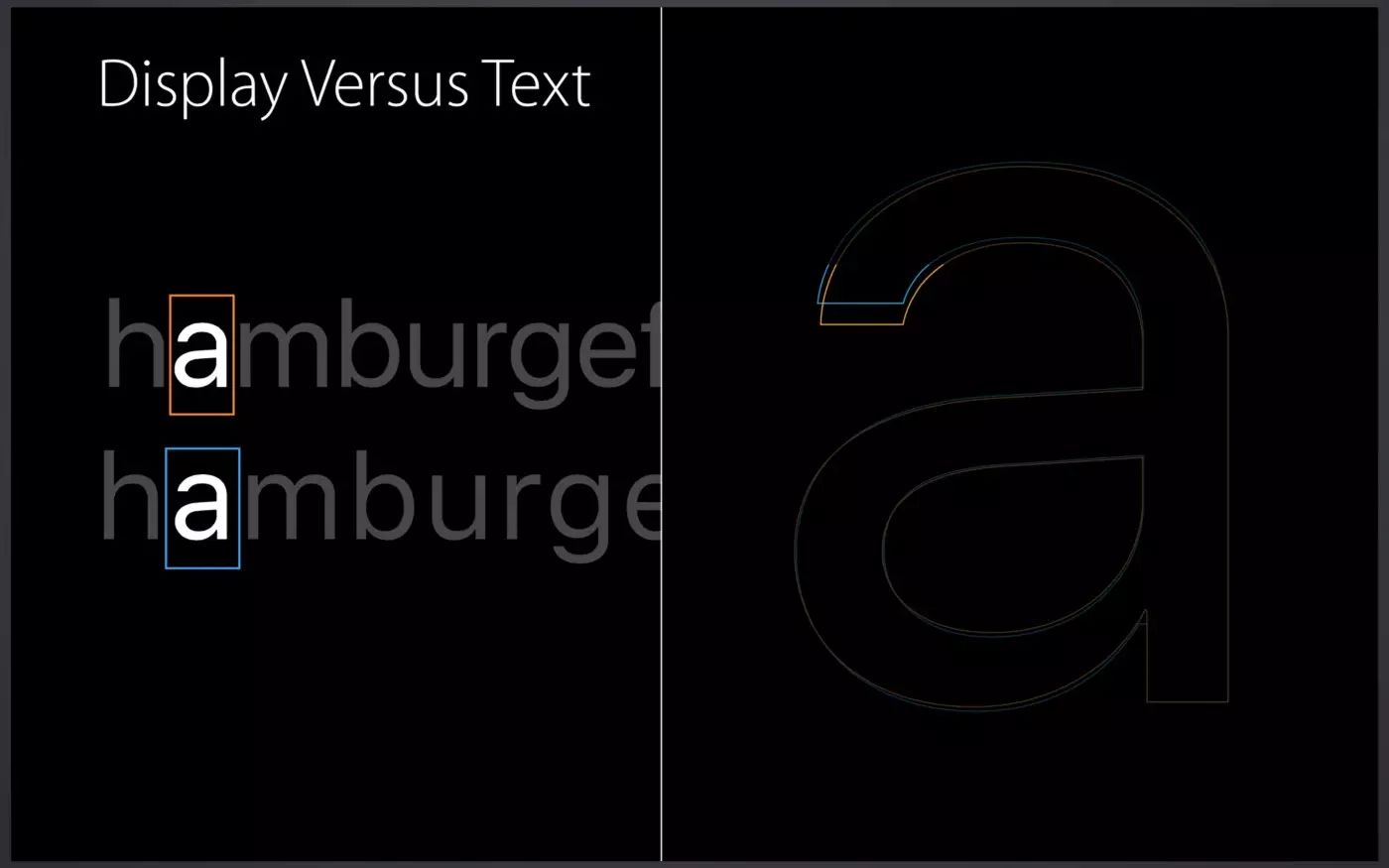 Display and TextThe San Francisco Text font used for small type is designed to have larger kerning than the Display font. The font size of the Text font is also larger for legibility on small screens. San Francisco font is dynamicA major feature of San Francisco font is that it organizes text dynamically, and the system will automatically switch Display / according to the font size Text font. Specifically, 20pt is exactly the limit. Designers and developers don't have to worry about which font to use. For example, set the system default font for UILabel, and the system will select the appropriate text for you.
 One thing that stands out to me about the San Francisco font is the way it displays the colon (:). Normally, the colon will be placed exactly on the baseline, so it is not vertically centered when placed between numbers. In the San Francisco font, it is automatically centered vertically.
 vertically centered colon
San Francisco font is a font for the digital ageAs you can see, San Francisco font has been carefully designed,in order to make any font size, any device are easy to read. Helvetica, which was replaced by the San Francisco font, was born in Switzerland in 1957, when there were no electronic devices. Even today, Helvetica is widely used by many companies as a corporate font, and there is no doubt that it will be used as a great classic font in the future. San Francisco, on the other hand, is a modern typeface: It dynamically changes text according to the environment. This is a "digital native" typeface for the digital age. Author | Akinori Machino
Original title: The Secret of the Apple’s New San Francisco Fonts
Translator | Cola Orange, UI/UX Designer
The article is authorized to be transferred from "Coke Orange", the original title: The secret of Apple San Francisco font
Original link: https://colachan.com/post/3463
This article was translated and produced by AppSo, which makes mobile phones easier to use. Follow the WeChat public account AppSo, and reply "fonts" to download two beautiful Chinese fonts from Google Link. 
Articles are uploaded by users and are for non-commercial browsing only. Posted by: Lomu, please indicate the source: https://www.daogebangong.com/en/articles/detail/Why%20is%20Apple%20ditching%20the%20worlds%20most%20famous%20font%20%20Inspiration%20Morning%20Reading.html

 支付宝扫一扫
评论列表(196条)
测试