I believe that most people have done PPT. However, everyone's level is different, and the effect of the PPT made will naturally be different. Some people's PPTs feel very expensive at first glance. Why is this? Today we will take a look at how the expensive PPT is made.
1. Why do other people’s PPTs look so expensive?
First of all, we need to understand why other people's PPTs are always inexplicably extravagant.
1. Style
The nobility of PPT is first reflected in its style. In different occasions, choose different PPT styles and set a tone for PPT, which will make your PPT more professional. There are three commonly used PPT styles at present:
Flat style:

The picture comes from the Internet
Gradient style:

The picture comes from the Internet
Three-dimensional style:
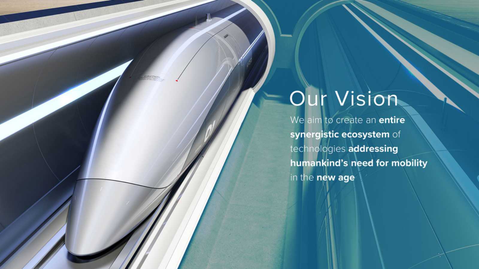
The picture comes from the Internet
2. Logic
After setting the tone, another focus of PPT is logic. It is mainly reflected in the layout of PPT, which reflects the depth and breadth of the designer's thinking, and is a kind of inner nobility. So how to reflect it in PPT?
A PPT may take a few minutes to more than ten minutes. How to get readers to your point in a short time is the key to doing a good job in the catalog page and transition page. The content page can clearly indicate the main content of your entire PPT, while the transition page can remind the key content.
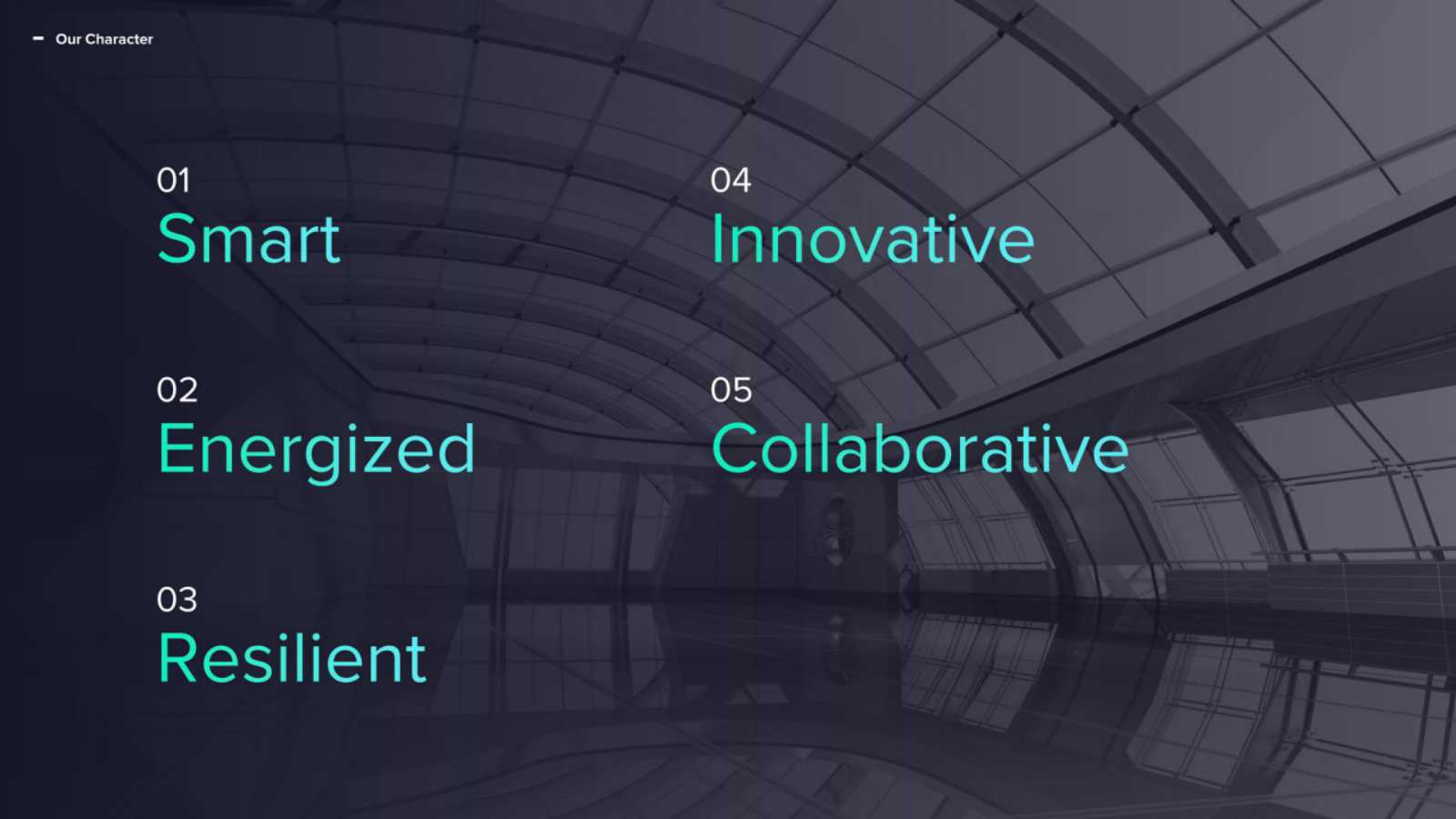
The picture comes from the Internet
2. Advanced PPT production skills
Knowing the nobleness of PPT, let's take a look at how to make a noble PPT.
1. Use masks
Mask is a commonly used tool for processing pictures in PPT. It can enrich visual effects, present text more clearly, and have a more sense of design.
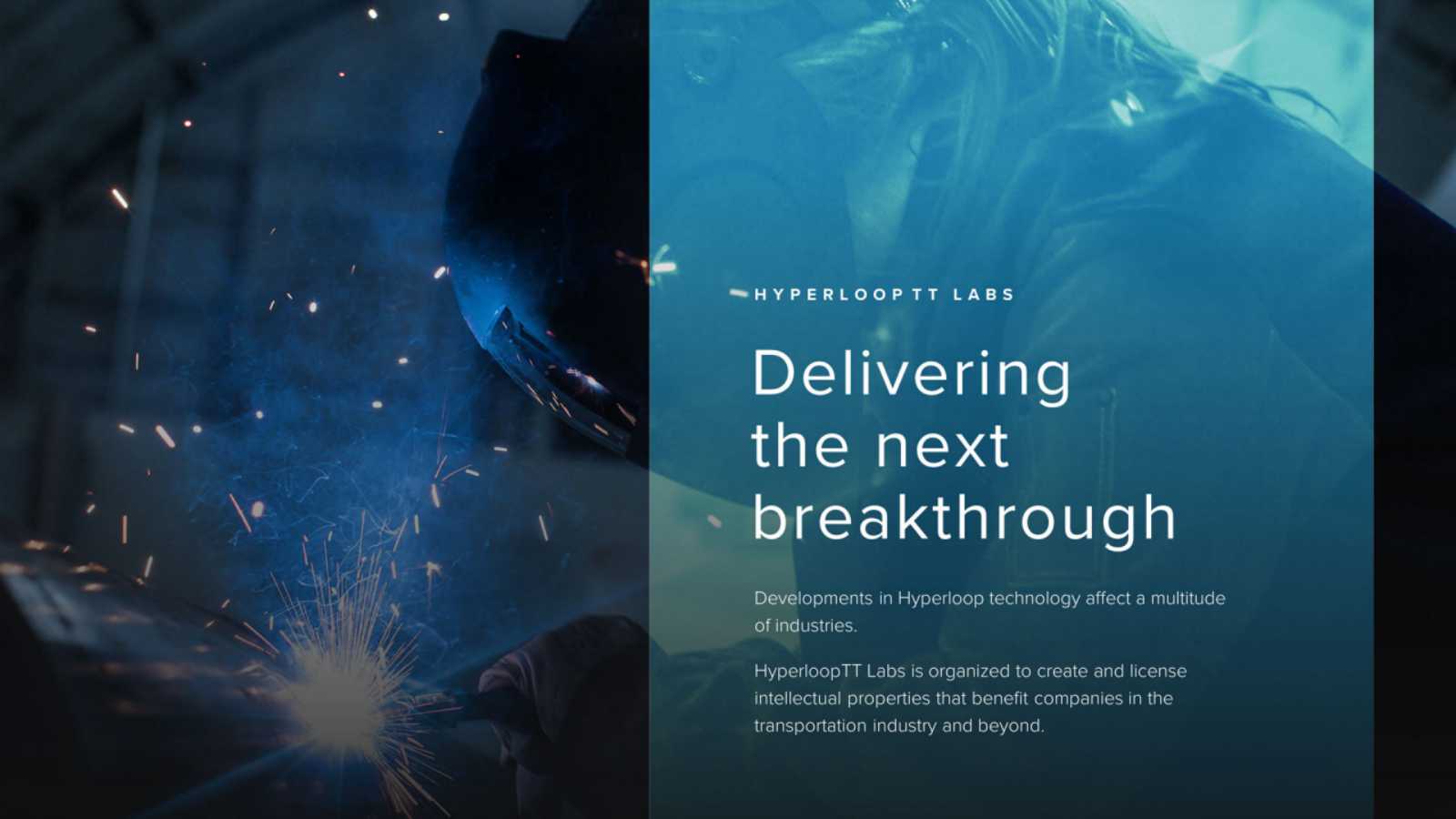
The picture comes from the Internet
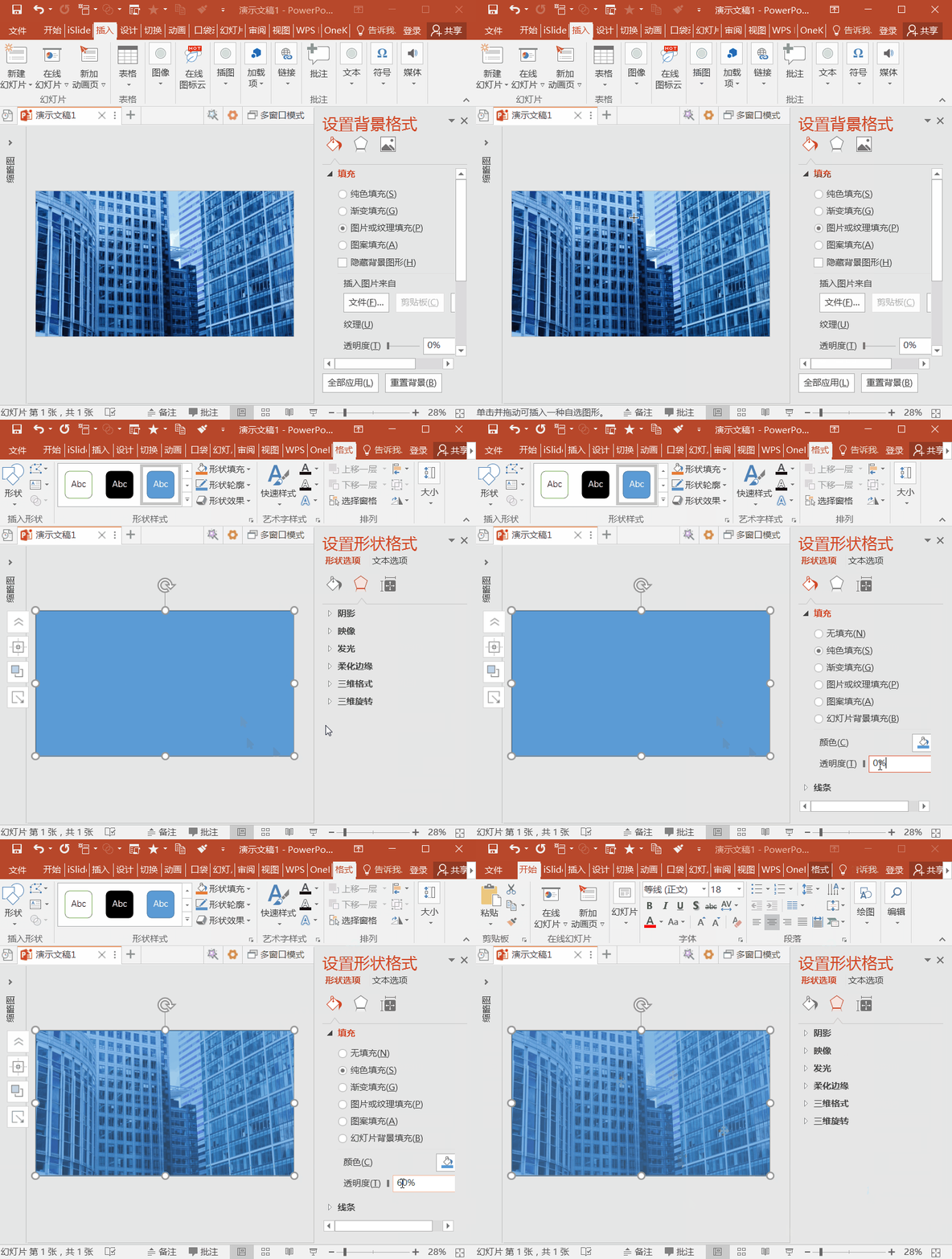
So, how to make it? it's actually really easy. We only need to insert a rectangular shape on top of the background image, spread it all over the image, and set an appropriate transparency for it to create a mask effect.
2. Boolean algorithm
The Boolean algorithm in PPT is also a commonly used image processing tool. There are 5 ways to use it, which can be combined and matched with pictures and text.
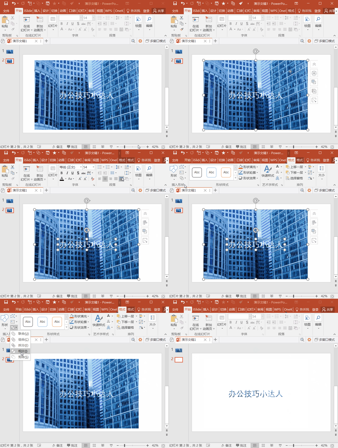
3. SmartArt
SmartArt is a very practical typesetting tool, which can quickly typeset graphics and texts to enhance logic and aesthetics. We can make graphic displays like this through SmartArt.
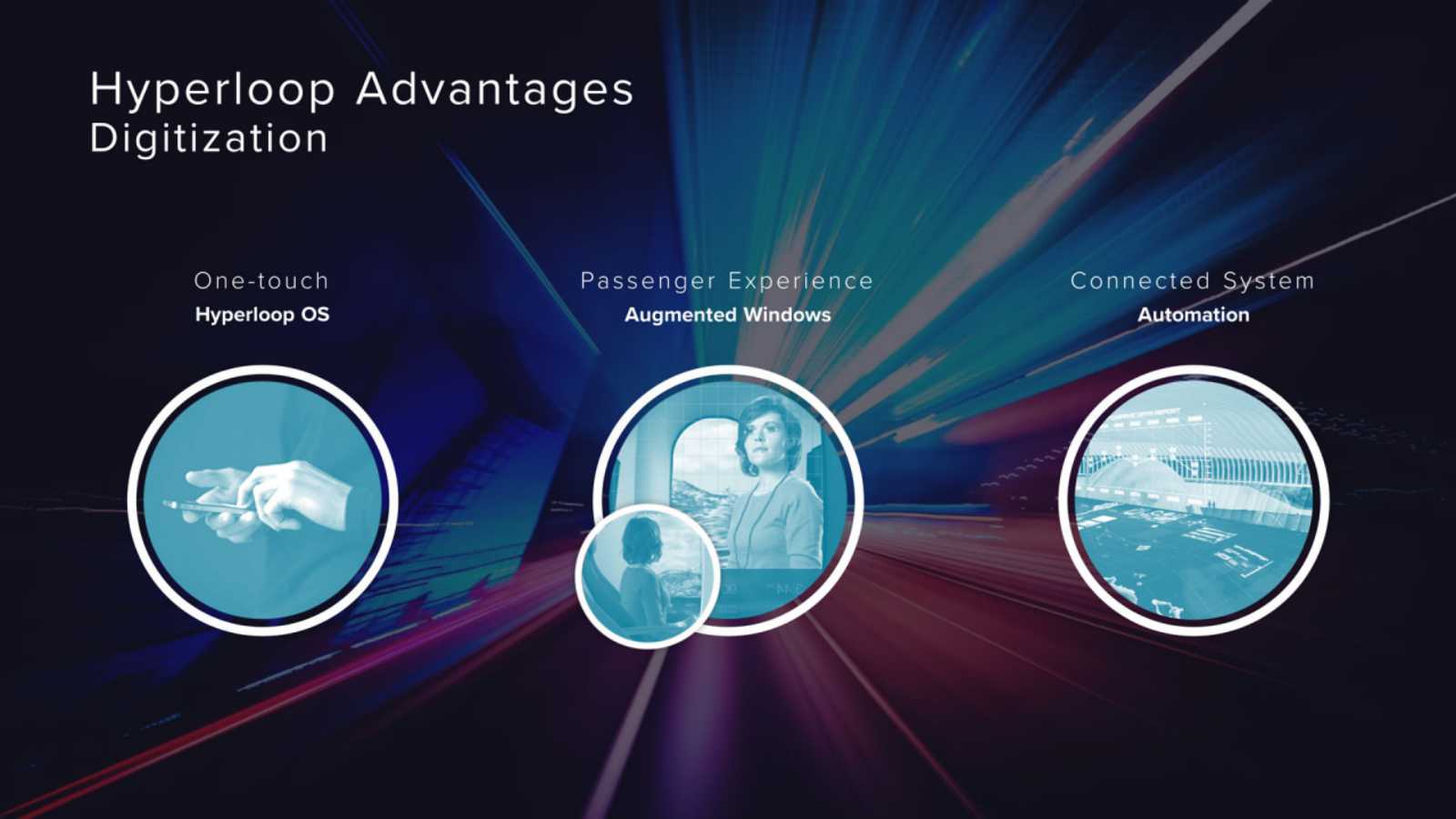
The picture comes from the Internet
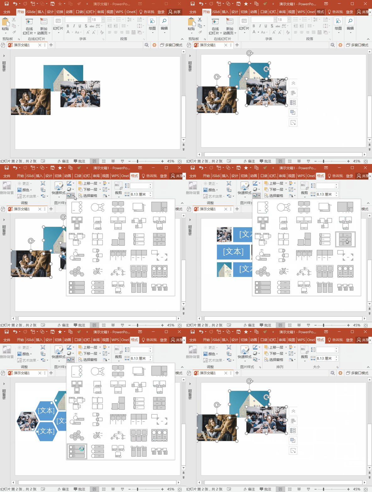
There is also this kind of photo wall that looks very advanced, which can also be made through SmartArt!
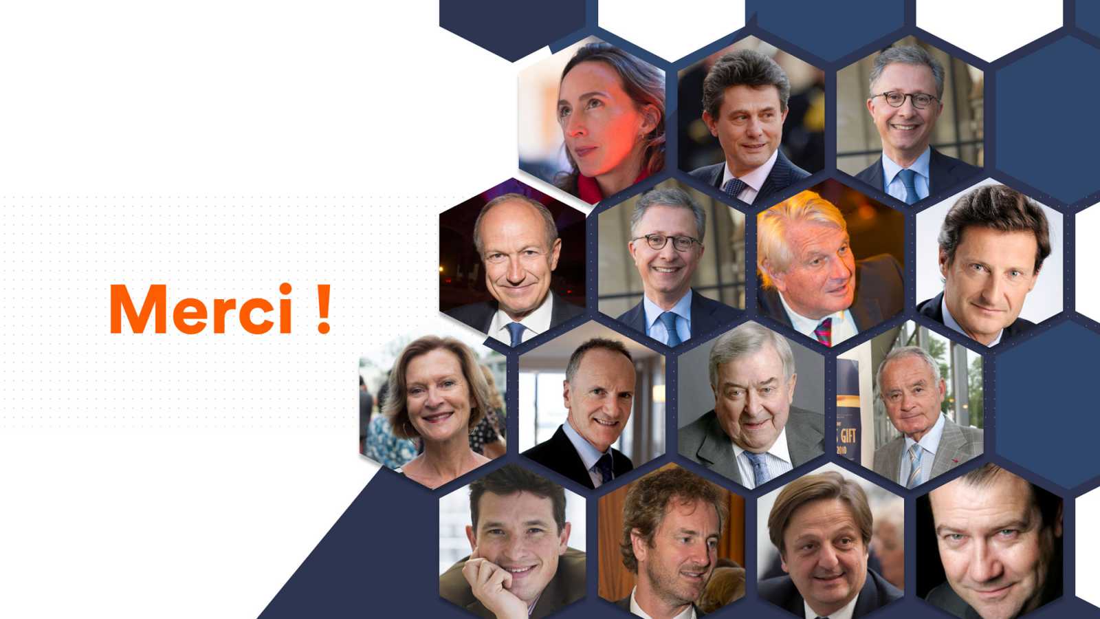
The picture comes from the Internet
How to do it:
After inserting the picture, select the picture, click "Picture Tools--Format--Picture Layout" and choose the style you like.
Three, PPT material website
Making a PPT sometimes takes a long time. Let's take a look at some practical tools that can effectively save time.
1. Color matching website
One of the difficulties in PPT is color matching. For those who don’t know how to match, how to use color blocks reasonably to reflect the sense of design? We can use color matching websites. Here are two useful color matching websites:
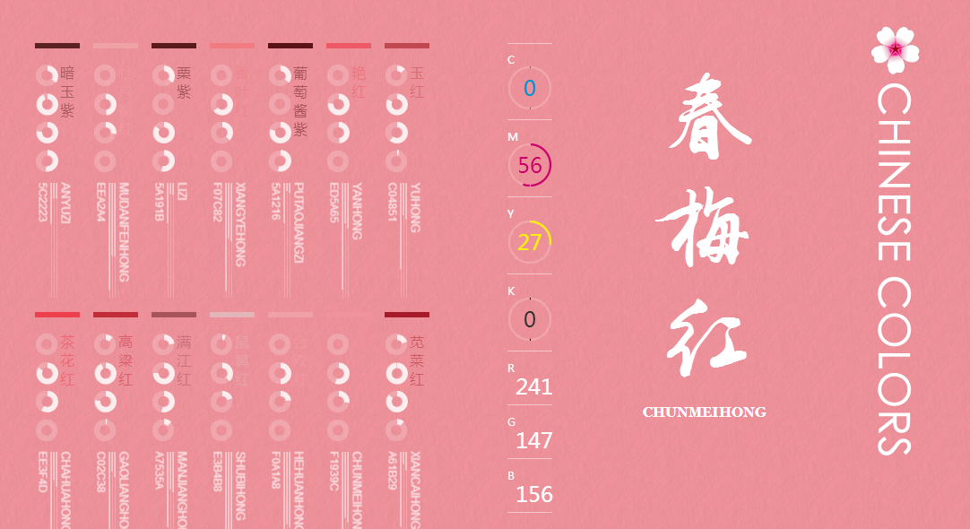
Chinese color
If you are a friend who prefers Chinese style, then you must not miss the website of China Color, which provides various ancient colors, each of which is classy and elegant.
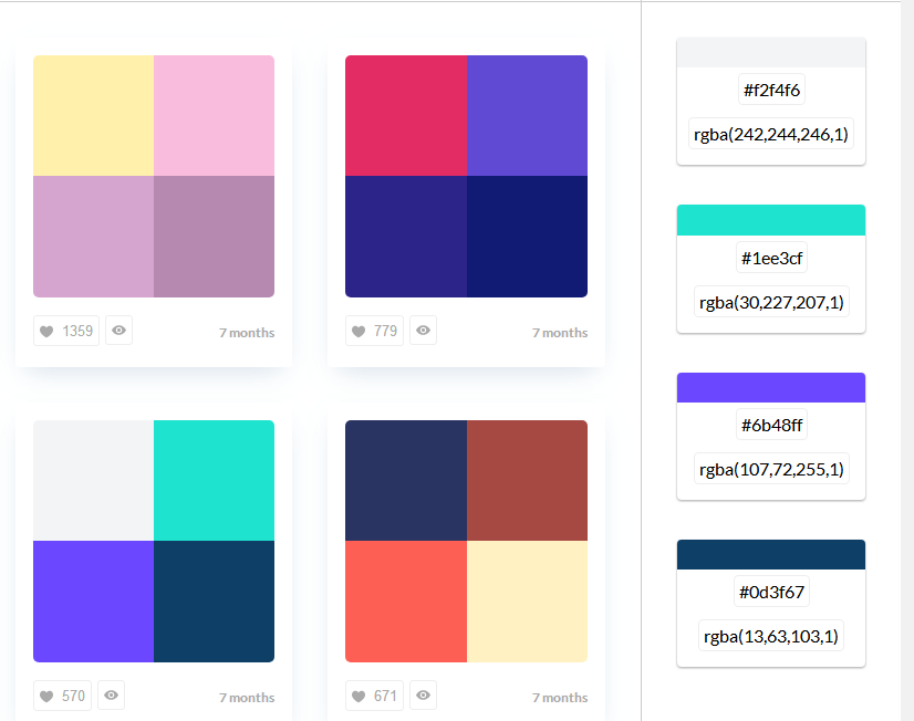
ColorDrop
A professional color matching website, give priority to color schemes for you, click on a specific color, you can view the color value, and then go to the PPT settings, very convenient.
2. PPT template website
Of course, if you feel that it is too troublesome to make by yourself, then we can also use templates to help, and recommend a template website for everyone——Office Resource Network.
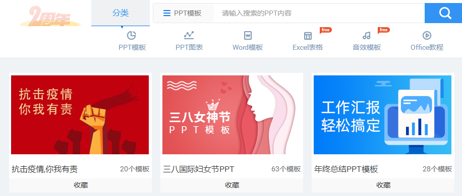
It is close to the facts, and the templates are updated very quickly. For example, for the upcoming March 8th Women's Day, you can find a lot of templates on it.
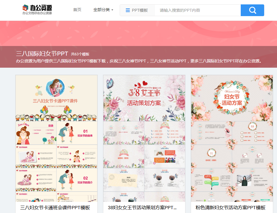
In addition to the templates, there are also a large number of PPT chart templates. If you need to use data in the production, you can also download the templates from the above.

Well, the above is all the content of today, I hope everyone can help everyone.
Articles are uploaded by users and are for non-commercial browsing only. Posted by: Lomu, please indicate the source: https://www.daogebangong.com/en/articles/detail/Why%20do%20other%20peoples%20PPT%20look%20expensive%20How%20is%20a%203000plus%20PPT%20made.html

 支付宝扫一扫
评论列表(196条)
测试