Josh Collinsworth's blog post "Never use px as a font size" discusses why you should never use pixels (px) for web fonts A unit of size [1]. The author points out that px values are static relative to the font size of the container, browser or user. Regardless of the user's font preference, when you set a value in static pixels, it overrides the user's choice, replacing it with the exact value you specify. This means that if your stylesheet uses pixel units, it can be difficult for visitors to your site to read.
The author therefore recommends using relative units , such as em, rem, or percentage, not pixels. These units are scaled based on the user's font size preference, providing better accessibility and readability. Especially when designing responsive websites, relative units can improve cross-device compatibility. By using relative units, designers can ensure that websites display at the appropriate font size across devices and browsers [1].
Here is the text:
In the world of web development, there are Many misconceptions circulate, and persist even when they have been refuted many times. "External links should always open in new tabs" is a good example. CSS Tricks explained this in detail (in short: mostly wrong) almost a decade ago, but it still seems to be around in some corners.
Case Proof: In CSS, px , em or rem The idea that there is no functional difference between units is a misconception I've heard over and over again, so I thought I'd post here to fix it.
We want to be very clear: in CSS The units used in definitely matter. And when settingfont-size should try to avoid using px .
What units are we talking about and what do they do?
As we discuss Why you should avoid usingpx as font-size Before, let's make sure we're all clear which units we're talking about, and how they behave in general.
px
px is short for pixel...although it's not really a pixel anymore in most cases. In an era when displays were usually a relatively predictable low-resolution pixel ratio, such as 1024×768, < span style="color: #EF7060; --tt-darkmode-color: #EF7060;">1px usually equals one actual pixel on the screen.
Screen usage is called A dot matrix of colored light pixels to display an image. A pixel is a single point of colored light on a display; the smallest possible "point" that the hardware is capable of representing. This is what I mean in this section as a "literal", "actual" or "device" pixel; a pixel in the physical world.
However, when With the advent of high-resolution (sometimes called "retina") screens, devices started packing more pixels into a smaller space, and those physical device pixels became tiny. Browsing the web on a high-resolution screen, if 1px in CSS still corresponds to a literal device pixels, then it would be very difficult to even read anything, since the pixels themselves are rapidly shrinking. After all, modern smartphones have even higher resolutions than HDTVs.
So now, 1px usually corresponds to the size of an enlarged "scaled" pixel, not a literal pixel on actual hardware. In our CSS, something 1px may take up multiple physical hardware pixels, and we don't have any pure CSS way to specify a literal device pixel. But that's okay because they're usually too small and we don't want to deal with them.
An example: iPhone Pixels on the 14 Pro are so tiny, 16px is literally a device pixel size that's roughly equivalent to a 2pt typographic font size. Good thing the browser scales them for us!
Most cases Now, these don't really matter in the context of this discussion, but I think it's good to know. The important part is: 1px is equal to whatever the browser considers a single pixel (even in It's not really pixels on a hardware screen).
em and rem
This brings us toem and rem , they are similar to each other. Moving on to a tidbit that isn't strictly related, but still fun: "em" is a typographical term that actually predates computers by decades. Typographically, a em equals the current font size.
If you set the font size to 32pt ("pt" is another old typographic term still sometimes used), then < span style="color: #EF7060; --tt-darkmode-color: #EF7060;">1em is 32pt. If the current font size is 20px , then 1em = 20px.
On web pages, the default font size is16px. Some users never change the default, but many do. But by default, 1em and 1rem will all equal 16px.
“Em” initially Refers to the width of the "M" character, which is where the name comes from. But now it refers to the current font size, not the dimensions of a specific glyph.
Difference between EM and REM
To differentiate the two:1rem is always equal to the browser's font size, or more precisely the font size of the html element. rem stands for "root em", and the root of a web page is <html> tag. Therefore, 1rem = document font size. (By default this is 16px , but can be overridden by the user.)
On the other hand,em is the font size of the current element. Look at the CSS below:
.container { font-size: 200%;}p { font-size: 1em;}Considering the above CSS, .container The paragraph inside the element will be doubled in size. This is because 1em means "current font size", in .container, it is 200%. 1em × 200% = 2em (default is 32px ).
However, < span style="color: #EF7060; --tt-darkmode-color: #EF7060;">.container Paragraphs outside the element will still be 1em for normal font size (defaults to 16px ).
If we are in the CSS above Change em to rem , then the font size of all paragraph tags will always be the browser's default size, no matter where they are.
font-size: 1em is equivalent to font-size: 100% . em and % units are not always equivalent in other contexts; for example, width: 1em and width: 100% are likely to be very different since the percentages are based on the width of the parent container rather than its font size. However, as far as the font-size attribute is concerned, % and em is the same.
To summarize:
- 1em is the font size of the current element.
- 1rem (root em) is the font of the document size (i.e. the browser's font size).
Ok, so that's what units are and where they come from. Now let's answer why it matters which unit you use.
Why this all matters
The misunderstanding emphasized again is: Since1em and 16px are equal, so it doesn't matter which unit you choose important. This seems reasonable; if 16px = 1rem , it doesn't seem to matter which way the input is chosen.
Remember, em and rem are relative; by default they are both (finally) based on the browser's font size.
2rem is browse twice the size of the font in the darkmode; 0.5rem is half that, and so on. So if the user changes their preferred font size, if using em and rem , all text on the site changes accordingly, like it should. 2rem is still twice the font size; 0.5rem is still half that.
In contrast,px values are static. 20px is just 20px . When setting a static pixel value, it overrides that selection and uses the exact value specified, regardless of the user's font preference size.
Critically speaking, this means So if your stylesheet usespx anywhere you set font-size , then any text based on that value will not be changeable by the user.
That's a very bad thing. It is inaccessible and may even prevent someone from using the site at all.
Therefore, while there may be some valid use case to explain this behavior, but it's definitely not the default behavior you want.
This is also to avoid using Very good reason to set font size in viewport units like vw or vh. They are also static and cannot be overridden by the user. At most, a value like calc(1rem + 1vw) is probably acceptable because It still contains rem as a base. Even so, I recommend using clamp() or media queries to set min and max values, because screen sizes Often far beyond what we expect or test.
Beyond font size differences
Okay, now let's talk about when we don't specializefont-size property, px and em / rem how to change.
Developers usually scale the page to Test it out, and I think that's where the misunderstanding at the center of this article comes from. When you zoom, everything will be scaled (in or out), in this case select px or em / rem as your CSS unit usually doesn't matter. As far as scaling is concerned, both behave the same way. And most developers with good eyesight probably won't realize there's more to it. However, the tricky questions are:
even beyond< span style="color: #EF7060; --tt-darkmode-color: #EF7060;">font-size , px also behaves the same as em and rem is different.
px unit still Associated with the scaling value of the pixels on the screen. em and rem is tied to the font size of the document, not the zoom or scale of the page.
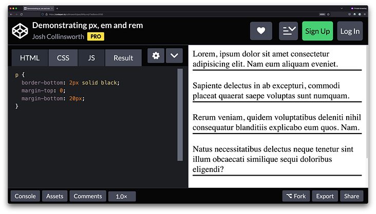
For a demonstration, see this CodePen :
https://codepen.io /collinsworth/pen/WNyvvqY
HTML CSSResult Skip Results IframeEDIT ON<p>Lorem, ipsum dolor sit amet consectetur adipisicing elit. Nam eum aliquam eveniet.</p><p>Sapiente delectus in ab excepturi, commodi placeat quaerat saepe voluptas sunt numquam.</p><p>Rerum veniam, quidem voluptatibus deleniti nihil consequatur blanditiis explicabo eum quos. Nam.</p><p> ecati similique sequi doloribus eligendi?< ;/p><p>Eos quidem iure debitis dolorum repellendus ab incidunt ipsam suscipit, autem consequuntur?</p>p { border-bottom: 2px solid black ; margin-top: 0; margin-bottom: 20px;}We have several paragraphs with 2px borders, and a 20px margin between them. Note that we use px units for both.
If you zoom in or out, the element The size and distance remain relatively constant. That is: the more you zoom in, the thicker that line gets, and the more space there is between paragraphs.
For convenience, here is a Screenshot, showing 400% zoom of the same pen. Text, lines, and spacing are all 4 times larger; they remain the same size relative to each other:
When it comes to scaling, < /span> px , em or rem There is no real difference. But zooming isn't the only way users can make a site more usable.
As mentioned earlier, users also Default and/or minimum font sizes can be specified. When they do, the features start to diverge.
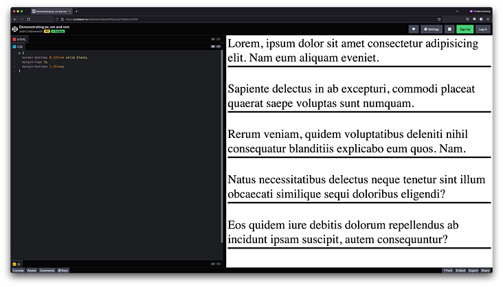
In the screenshot below, I Firefox's default font size has been set to 64px . take a look:

Align the text in the screenshot with the Compare the text above. Note that this time, the lines are not getting thicker and the margins between paragraphs are not increasing proportionally. Only the text itself gets bigger. Because both border width and margin are set in px, they stay the same and don't scale.
But note that if you put CSS px in the rem value, you will find that the lines and spacing have indeed become larger! (zh-Hans)
So, the summary here is:
- The px value does not scale when the user changes the font size.
- The value of em and rem will vary with the font size Adjusted proportionally.
If you want an interactive demo that ties all of this together, check out the final CodePen; adjust the sliders at the top to see the effect of modifying the document font size on various elements, based on the CSS units. https://codepen.io/collinsworth/pen/KKepeMQ
Which one to choose
So, knowem and rem will scale with font size, but px value will not, so what should we do? Should we never use px ?
Although I think if you choose this way, you'll probably be fine, but I still think px has its purpose.
We know that when the user adjusts the font size hourspx the value does not change, which means that the pixel unit is actually some aesthetic element good choice. Maybe we have some spacing that we don't want to get bigger when the font size gets bigger. (Maybe it doesn't make sense to allow it to scale to a larger size if it's a big chunk of negative space by default.)
Maybe there are some border sizes we don't want Changes, or decorative elements on the page created with CSS, don't look as good at larger font sizes. Maybe we don't want the padding to bloat as the font size increases. In all these cases, px is still a good choice.
I personally recommend usingrem to set all sizes. I only add em. I wouldn't use px anywhere except for design elements that explicitly don't want to scale with font size.
Never use< Set font-size in /span>px units unless you are very sure what you are doing , how it behaves, and whether it's still accessible when you do.
Important note about media queries
For the same reasons as all of the above, it is important to avoid @media Use px in query ; when the user zooms, it will work fine, but media queries using px will be in It fails when the user sets a larger font size by himself.
@media (min-width: 800px) { /* Changing font size does NOT affect this breakpoint */}@media (min-width: 50rem) { /* Changing font size DOES affect this breakpoint */ }This is because as the font size increases, 50rem changes according to user preference into different values, while 800px does not.
It is likely that when we Large breakpoints When writing CSS, we consider that there is enough screen space for the element to expand. This may not be the case if the user has set a very large font size, set the media query to rem instead of px helps us avoid this assumption and respond to user preferences.
I came across this site The problem; I set all breakpoints on px. However, when I make the default font size larger, my media queries become unresponsive because they still only look at the pixel width of the screen. So I still have a tiny sidebar stuffed with huge illegible text because I'm not taking user preferences into account. Immediately after that, I changed to rem and the problem was resolved.
In short: in media queries, unless you are sure you know how setting your own font size in the browser will affect your users, avoid usingpx .
Original: https://joshcollinsworth .com/blog/never-use-px-for-font-size
Articles are uploaded by users and are for non-commercial browsing only. Posted by: Lomu, please indicate the source: https://www.daogebangong.com/en/articles/detail/Why%20You%20Should%20Never%20Use%20px%20to%20Set%20Font%20Sizes%20in%20CSS.html
 支付宝扫一扫
评论列表(196条)
测试