Click on the blue word above Zero Design▲Subscribe
From LOGO Master ID: logods
Introduction: In the past, many friends said in the background: Try changing to Chinese if you have the ability? It seems to say that Chinese typography is ugly. This is a big dissatisfaction. Although English characters are relatively uniform and orderly, the richness and thickness of Chinese characters are also very advanced. Today I found some multi-angle Chinese layout designs for you to see Chinese beauty!
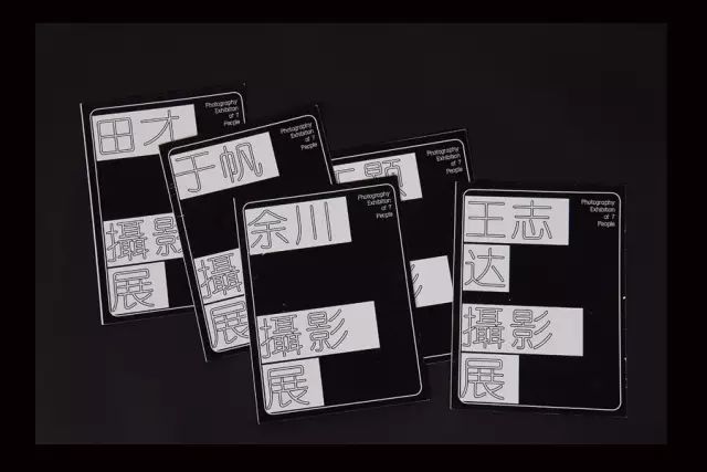
Look at the film festival material design first

(Is this typesetting cultural enough? The layout is handled well, and the integration of application and graphics is perfect)
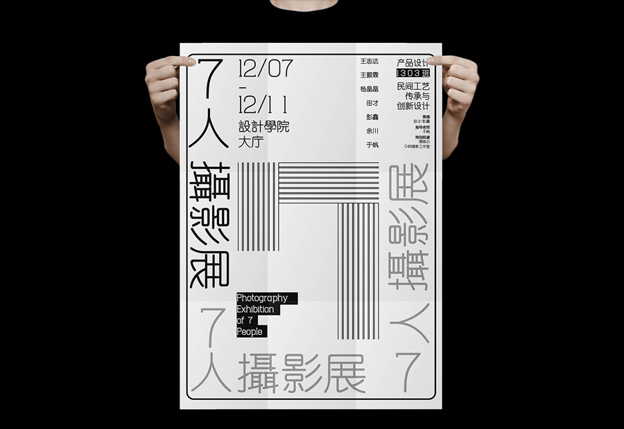
Look at the Chinese poster layout again
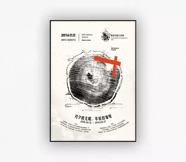
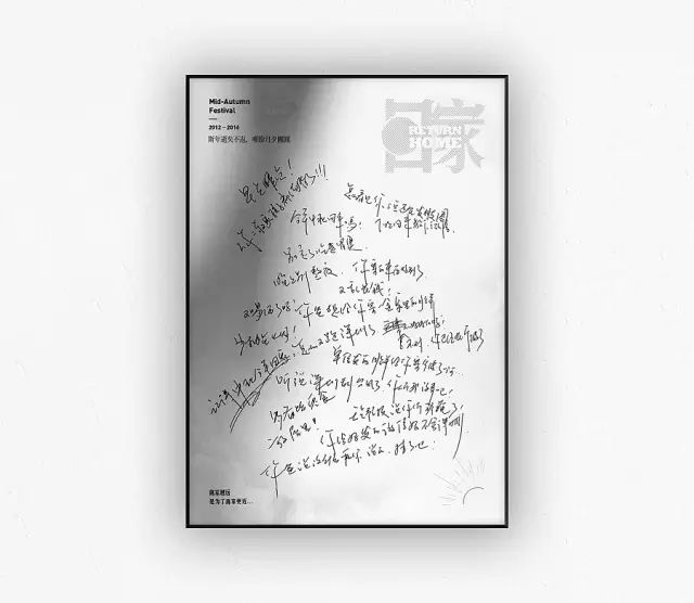
(Did you see that, real masters can arrange their own handwritten fonts with a sense of design)
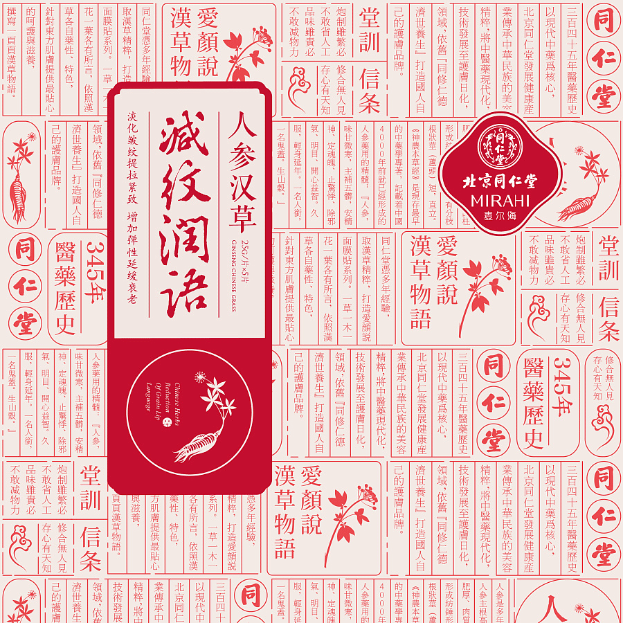
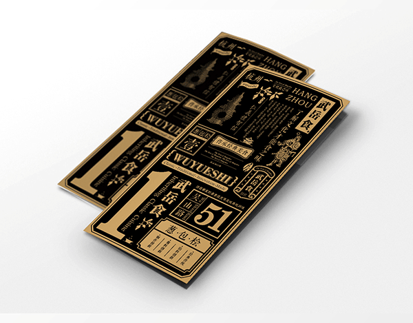
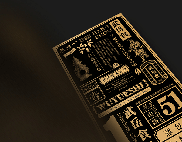
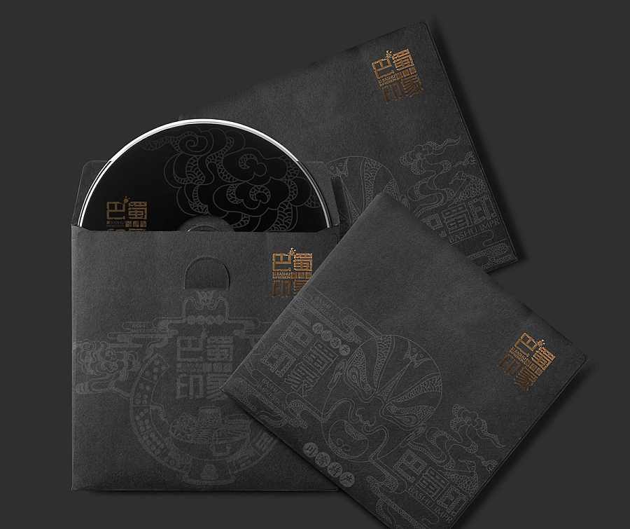
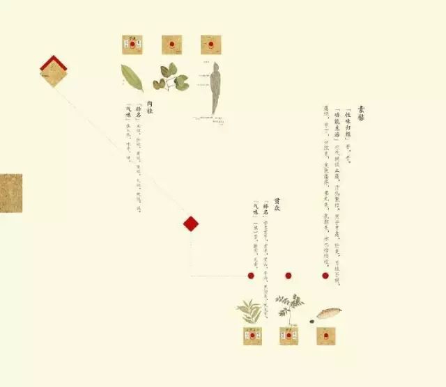
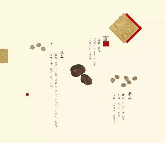
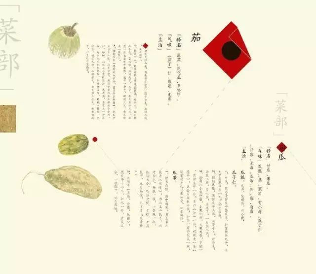
It is also beautiful when applied to the packaging! ! !
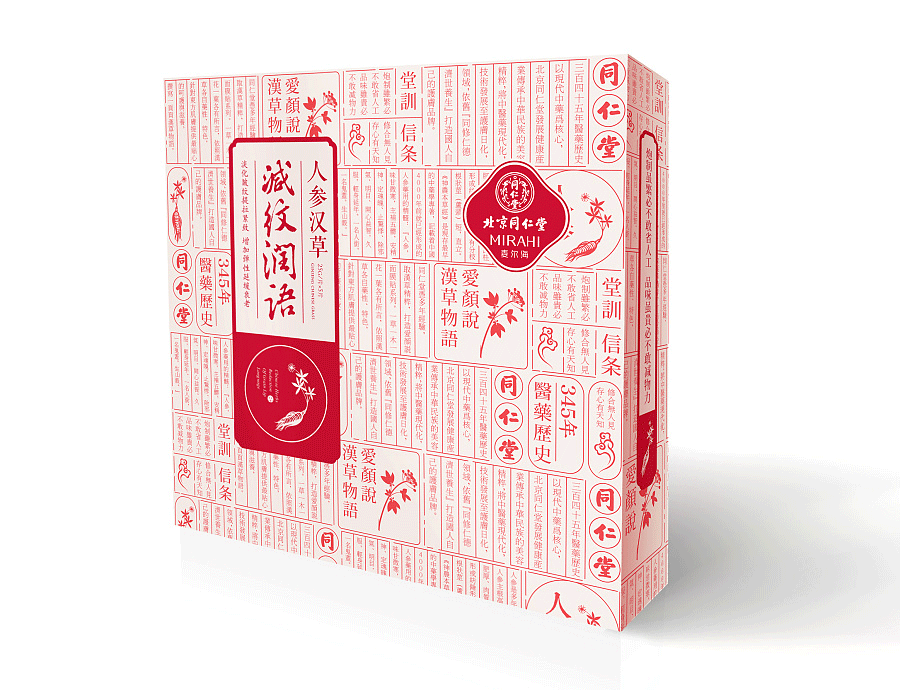
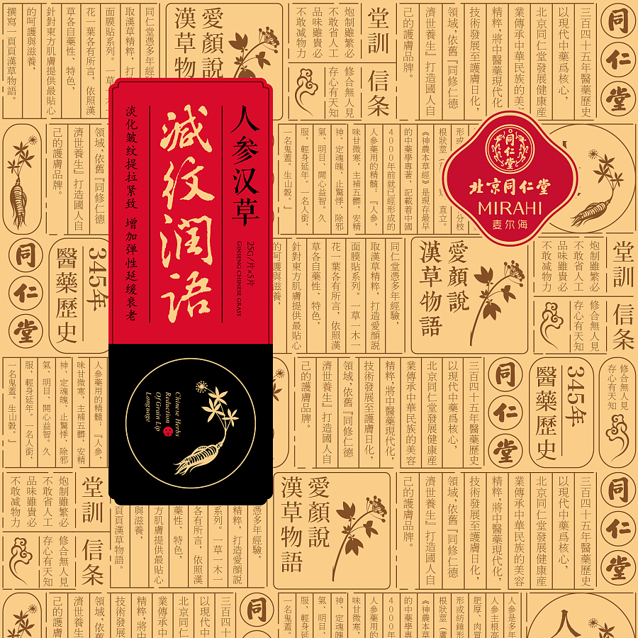
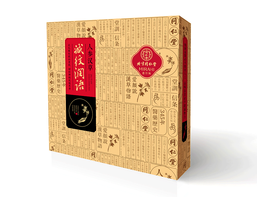
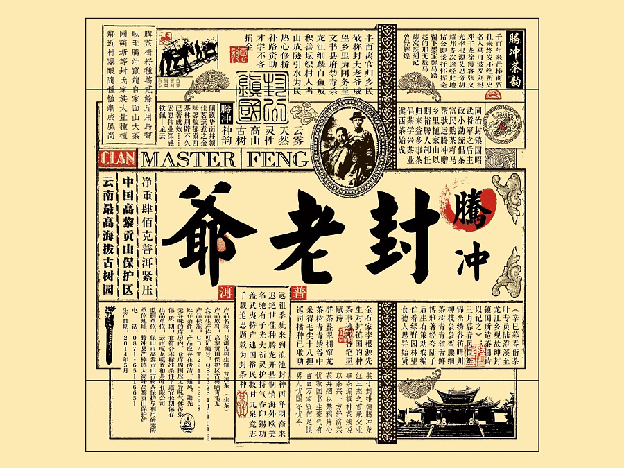
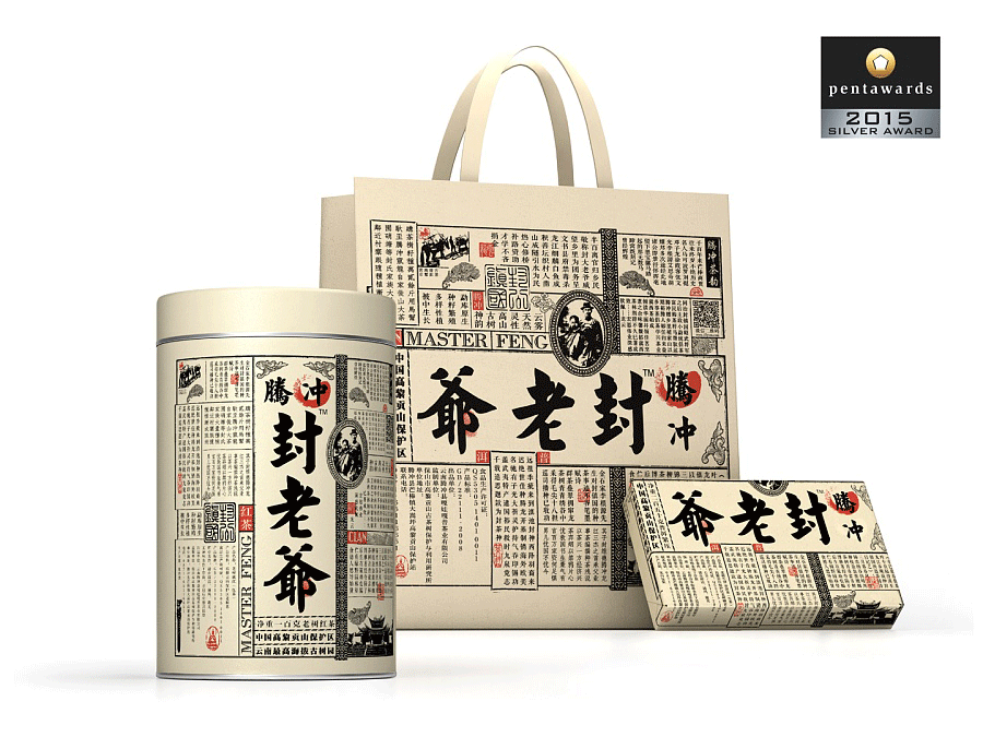
(Chinese font combined with Western sense of form, all of a sudden the taste is high-end)
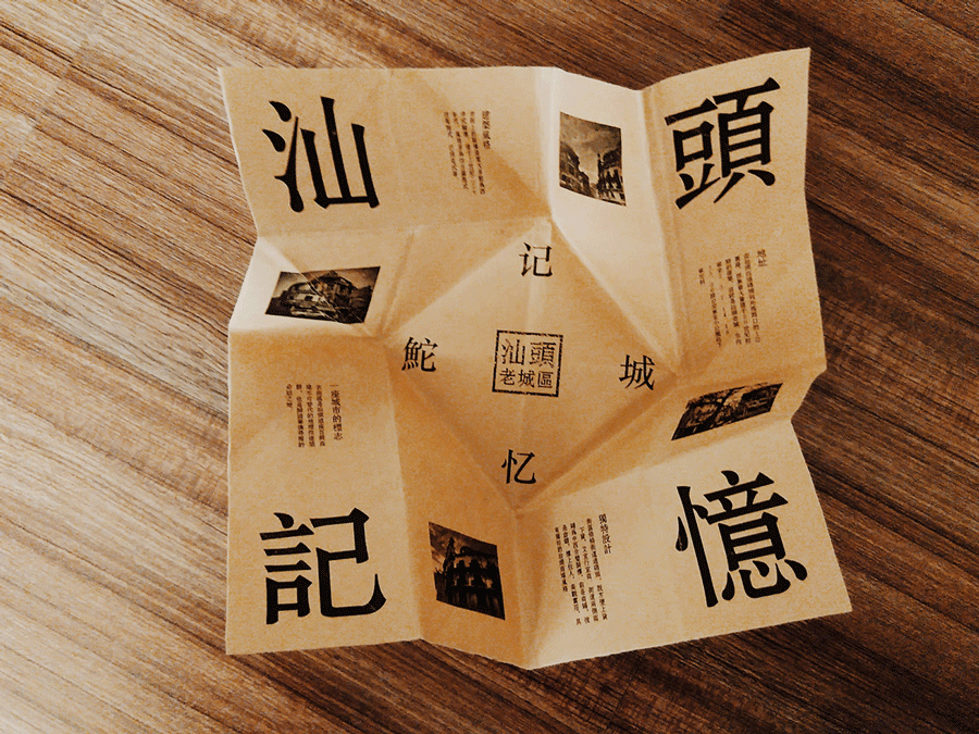
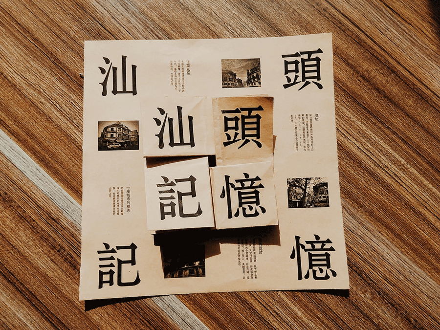
Chinese typesetting on the folding page is also very tasteful


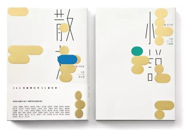
The Chinese magazines in Hong Kong are also very foreign

Nie Yongzhen’s full Chinese cover design is also very modern

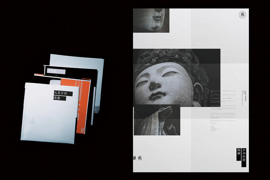
The Chinese typography of these other outstanding designers is the aesthetic interpretation of Chinese
Isn't such a "Chinese style" layout more beautiful than foreign folding pages?

Which one of the above Chinese typography is not beautiful?
 Without English, the design with all Chinese characters is international enough?
Comments from LOGO Master: After all, whether it is layout design or brand design, it does not mean that speaking English must be foreign or popular. No matter how beautiful the English font is, it can be ranked in front of Xiaobai Old-fashioned, so it all depends on the skill of the designer, the comprehensive ability in processing information logic, screen elements, word distance, font size, color, sense of order, etc. I used to think that the low is because the country's comprehensive strength is not enough, and all aspects cannot keep up. On,Now if you still think Chinese is low, it’s just because your design is not perfect yet!
Come read it aloud with me:

QQ group for designer communication:
Junior group: Designer-32 group: 313786390
Intermediate group: Designer-46 group:194149742
Advanced group: Designer-37 group:232185075
Great God Level: Designer-31 Group: 311863549

Recommend WeChat
Heart Vision ID/shijuein(long press to copy)
Zero Design ID/designil(long press to copy)
Articles are uploaded by users and are for non-commercial browsing only. Posted by: Lomu, please indicate the source: https://www.daogebangong.com/en/articles/detail/Who%20said%20that%20the%20Chinese%20font%20layout%20is%20not%20goodlooking%20it%20is%20because%20your%20design%20is%20not%20perfect.html
 支付宝扫一扫
评论列表(196条)
测试