From web design, online ad design, billboard design to business card design, the designs we encounter every day have something in common.
What do I want to express? One of the most basic components of graphic design - the effective combination of text and images. While writing a catchy phrase over a beautiful photo may seem like an easy design solution, getting the perfect result right is more difficult than expected. You don't have to worry, with the combination of graphic and text skills introduced in this article, you will have skills that can be applied to almost any design project.
01. Consider layout

Improper positioning and arrangement of text and images can create a bad effect or even break the design. If the text is too small and the background pattern will distract the viewer, your design will not communicate effectively or be visually appealing.
But text is only part of the equation, as are images. How can images be better reflected in your designs? You should pay attention to the following two points:
The composition of the image. Whether you're using a self-photographed image or an accompanying image, make sure to leave it with a good white space for text.
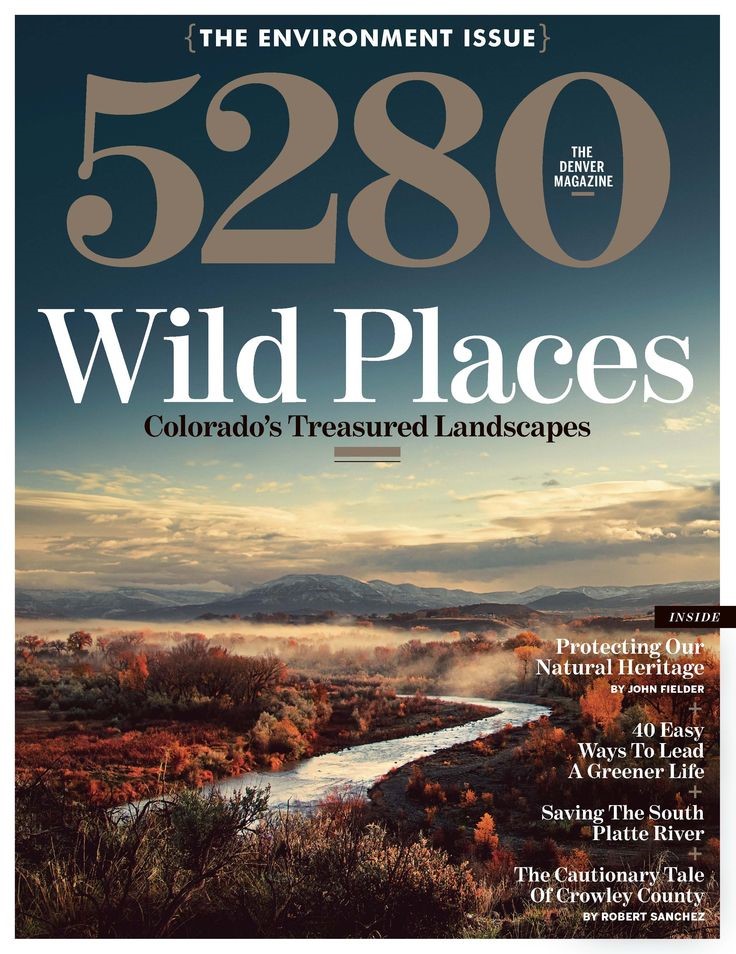
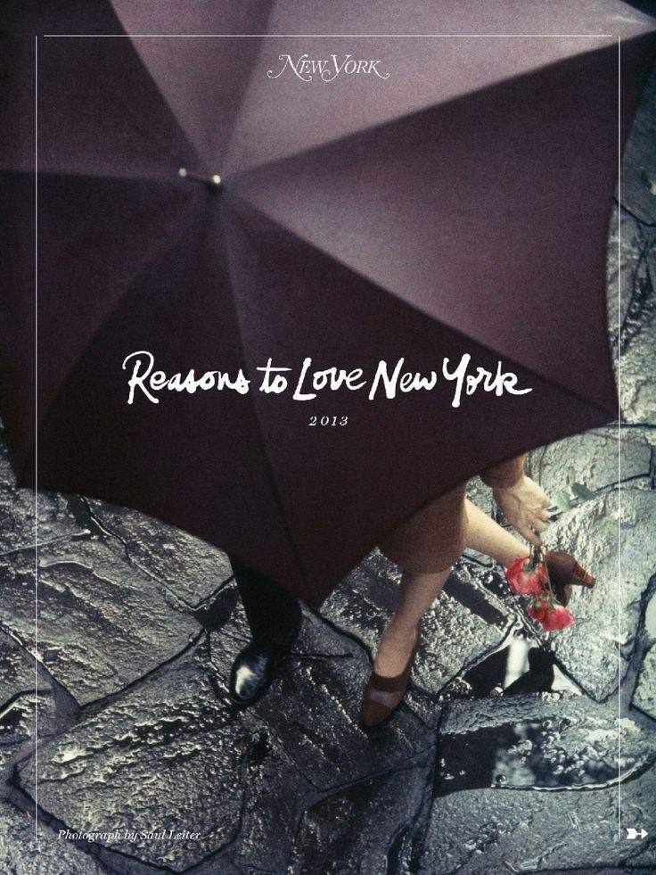
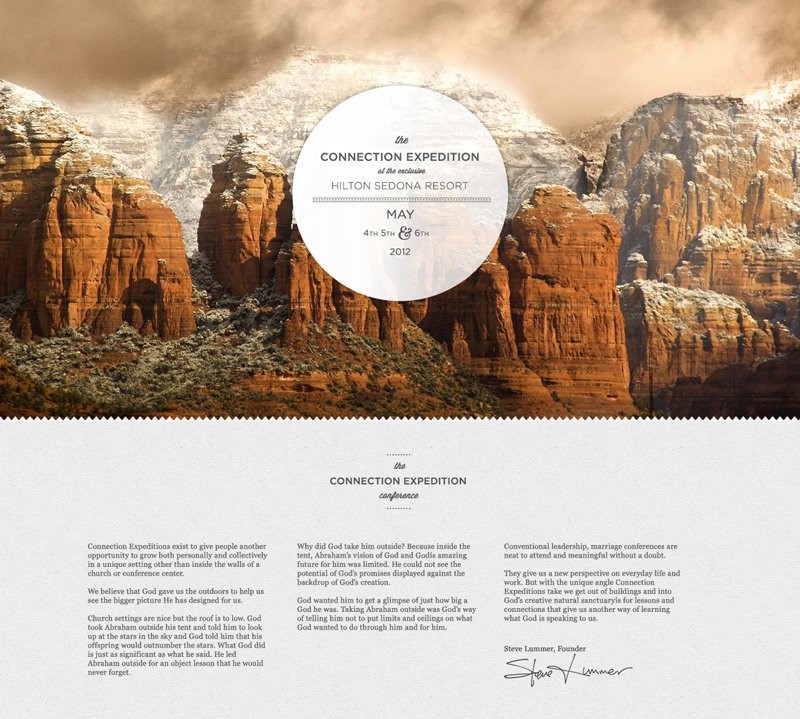
For example, this magazine cover uses a vertically oriented landscape photo with plenty of sky in the background. Typically, a photo of a large area of sky or nature is used as the background image of the text, which provides a convenient layout position for the text so that your text stands out.
When composing a full-page design created from a combination of images and text, the design is not just a part of it, the overall layout is considered. With a captivating image and an effective message organically combined in one full-page layout, you can think of this approach this way, but be careful to ensure the flow, otherwise the result may not attract much attention or Not getting the kind of result you want.
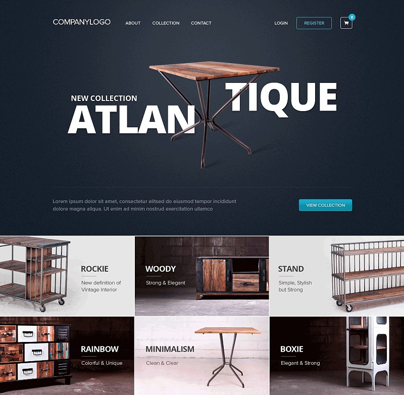
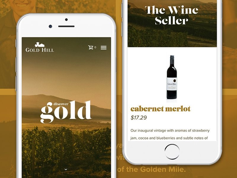
Here's a way to use an image and text to create complementary typography pieces. Aligns the text so that it conforms to the shapes present in the image. Notice how the header of this website layout takes a creative approach to aligning the text, and its placement showcases images of the products being advertised. This continues in the image grid below the header, where blocks of text and product photos are equally balanced and spaced from each other.
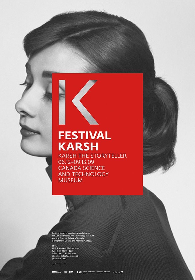
Another approach is to think about composition from a broader perspective than just having an image as a background with text on top. These two can be modified in many ways, giving you more room for creativity. For example, the layout below directly relates the subject matter of the text to the image by cropping the photo into a specific, recognizable shape.
This one features a different cutout method, where the letters are shaped as if they were cut out of a picture.
02. Establish a visual focus
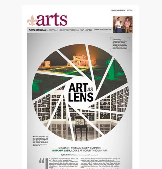
One of the elements of a good layout composition is to have a visual focus that serves as the starting point for navigation of design works and attracts the eye. In a layout that includes images and text, you need to decide which image is more important, make it the visual focal point, and make it stand out through color, size, position, or other characteristics.
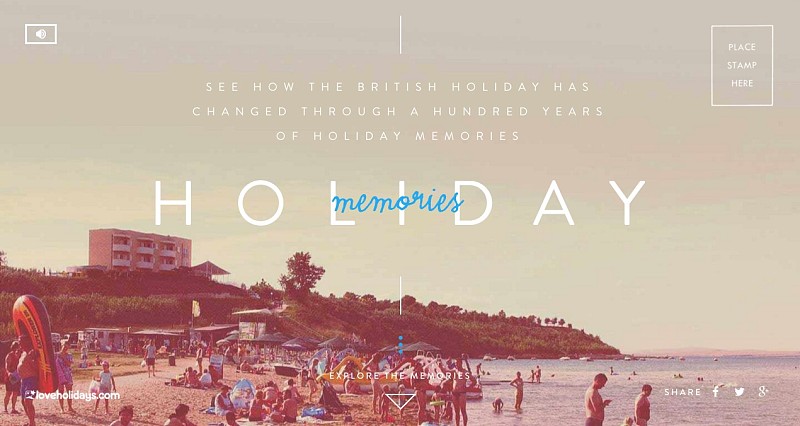
The design draft below brings the image of the resort into the focus of people's attention, which may be suitable for a travel website. The image is the most visually appealing because of its value (it's the darkest part of the layout, while other parts are lighter) and size (it spans the full width of the page). But you don’t want the rest of the design message to get lost, so the use of shapes and vertical vertical lines in the photo helps draw the viewer’s attention back to the text, a bright, fluid blue font, Focus your eyes there.
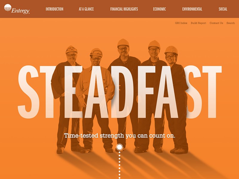
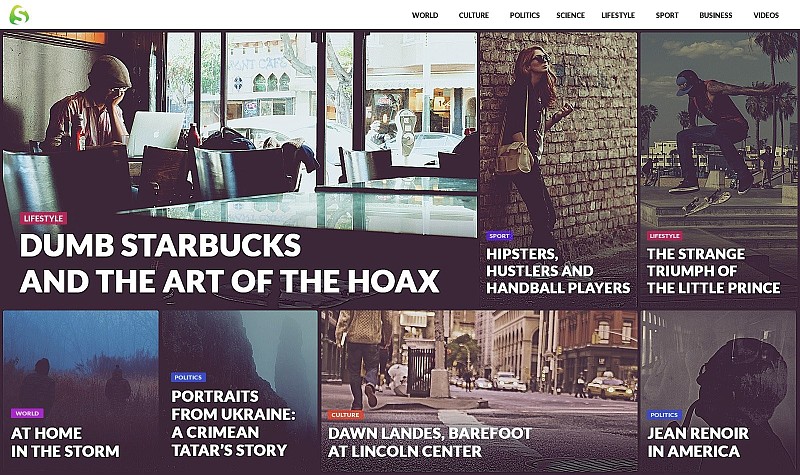
Instead, the web page below takes the text as the visual focal point, displaying it in bold, uppercase font and overlaying the image with a transparent color overlay. However, text and images have been arranged using a layered effect that connects the two elements and forms a dynamic composite.
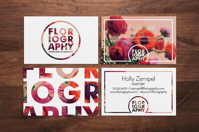
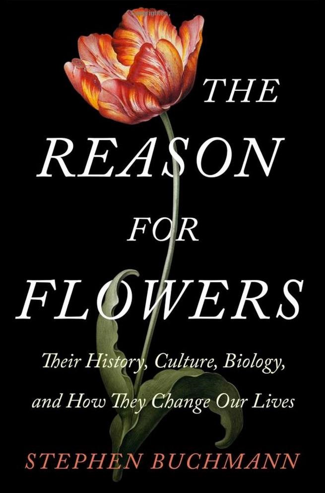
Perhaps words and images are equally important and need to be visually combined into a cohesive overall layout. The book’s cover design achieves this effect by literally interspersing the title text around the image of the flower, interspersing the two so that the viewer notices them at the same time.
03. Achieving Balance
Let's look at another characteristic of good layout composition: balance. It's like a seesaw, with a child on one side and an adult on the other, and because one side is too heavy, it will lose its balance. The layout is the same.
We're not talking about visual focus, we're talking about visual weight, about poorly done designs. Maybe too much content is placed in the layout or cluttered, maybe all the content is squeezed to one side of the layout, maybe no attention is paid to spacing and alignment. Any of these problems, and more, can throw your design out of balance.
For simple designs with only text and images, like some of the web designs and book/magazine cover designs we have seen, balance becomes especially important. The fewer elements in the layout design and the simpler the layout, the easier it is for bad layouts to appear.
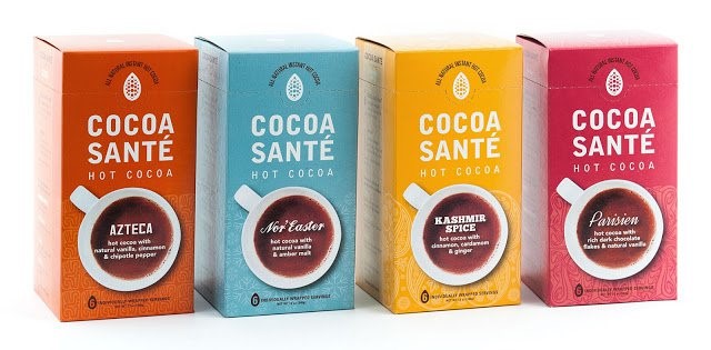
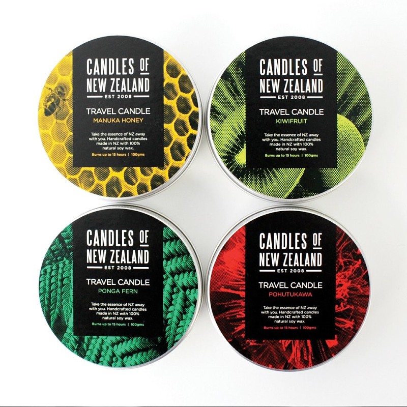
On the packaging below, the brand name and the image of the coffee cup below reflect a good sense of balance. Both are roughly the same size and connected by a shared color. The images themselves provide more space for text, and are used to convey the unique names and ingredients of each product within them.
And this design is just balanced by the placement of the text on the photo. If the text is also placed on the right side of the image, the layout will have double focus (outlines of people in the photo and white text), leaving a large blank space on the left, which is clearly wrong. For now, the left and right sides have equal visual weight, so the design is balanced.

04. Choose Images Wisely
In a design project, images play a bigger role than making a nice background image. It can provide context, tone, and emotion to your designs. When these images closely match or support your text message, it will be easier for you to communicate with your audience. So unless you're intentionally creating some visual contradictions in your design, it's best if the image fits the text (and vice versa).
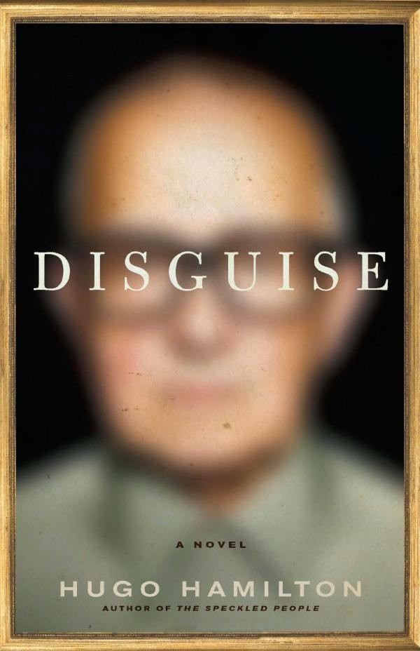
This is an interesting example of this concept. Placing text over the human eye in blurred images reinforces the idea of camouflage, which is the title of this book. All of these design elements come together to create a composition where the relationship between text and imagery is clear and visually interesting—they fit together fluidly.
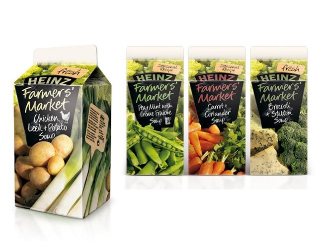
Take this packaging again, what better way to communicate that your product is fresh and healthy than with colorful photography of crispy, tender vegetables? Also, the copywriting supports the concepts of "fresh", "farmer's market", "seasonal". Images and text work together to convey the same message.
05. Create a suitable background image for the text
As briefly mentioned earlier, creating a space for the text to be seen and read easily is an important step in the process. There are two main ways to do this:
Select a blank image. This goes back to our first little tip. Photos with large, sharp areas, blurred or soft focus, are the best candidates for placing text. This is because placing text on top of a highly-sharp image can make the text look less legible or even impossible to read.
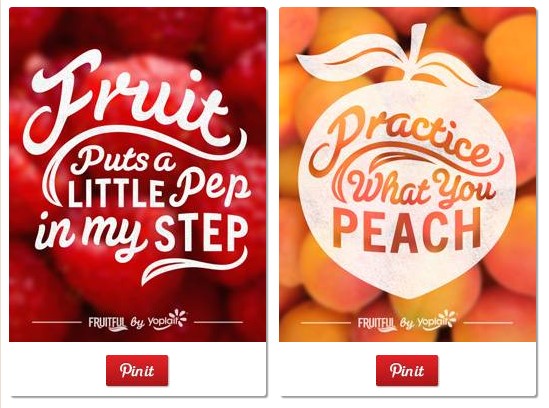
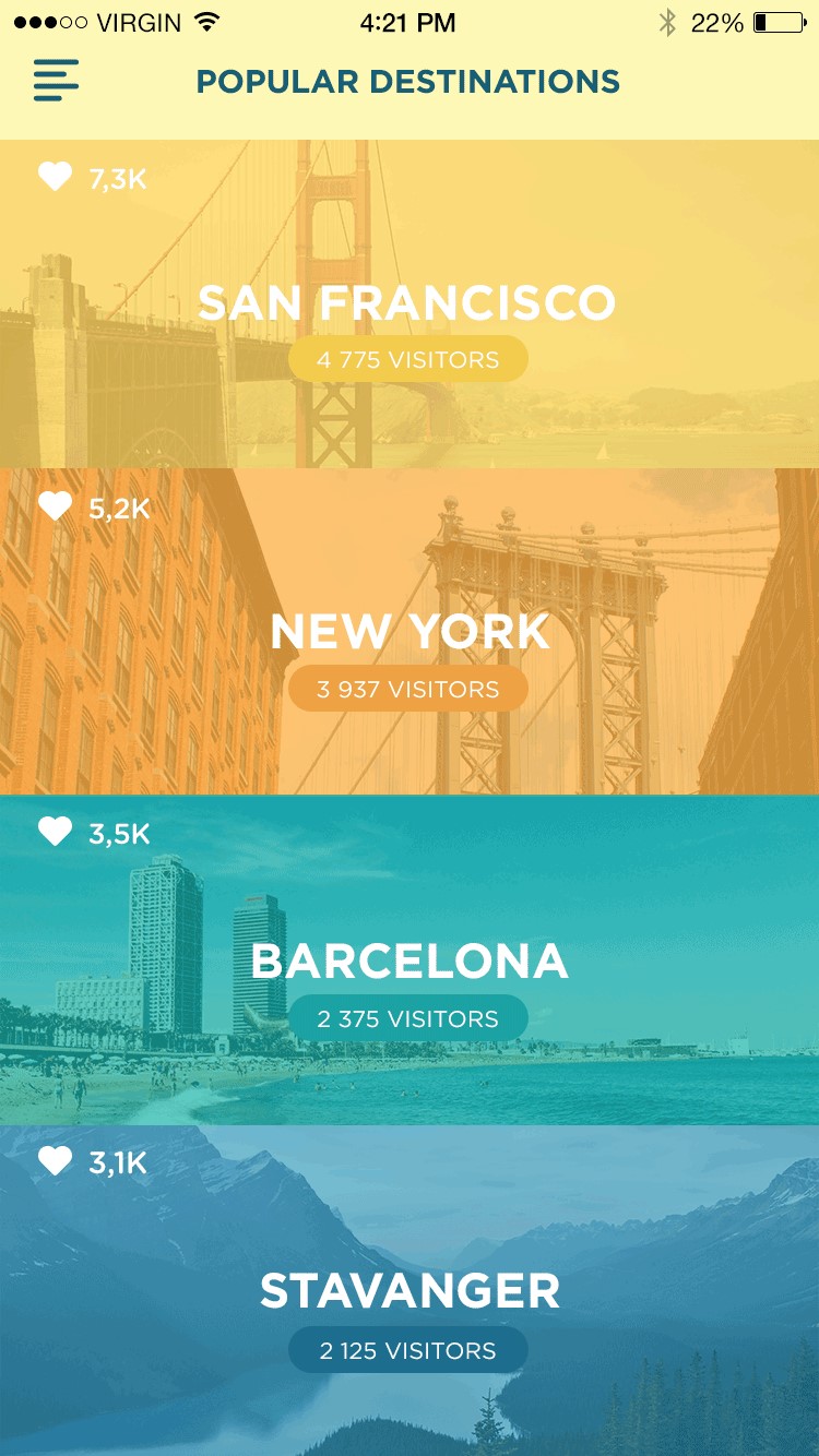
For example, these social media images are blurred when used as background images, and the images are still recognizable, and the typographic information on top is also clear.
Edit or add effects to the image. Let's say you've found the perfect image for your project, but it doesn't fit the text on it. Maybe it doesn't have any clear spaces, or maybe it has a lot of interesting detailing. You can still use it, you just will have to put in extra effort to help your text stand out. There are many ways to do this, including:
•Add a background shape: A solid or transparent shape that only contains the text portion of the image is a common solution.
• Transparency the entire image: Blocks of transparent color that cover the entire image can help the image fade out details so that the text can be seen clearly on the layout.
• Lighten or darken images: Sometimes you can edit images yourself to help text stand out if you don't want to add extra elements to your layout.
Here, the photo has been darkened to help the white text really stand out:
And in the images below, while some of the photos are already very dark, notice the black gradient at the bottom of each image, which provides some extra support for the text:
06. Enhance visibility through color and contrast
Now that you only have one graphic shape to choose from, you want to make sure the text stands out, especially if you don’t use background shapes or other techniques to assist. Using color and contrast are two of the best ways to do this.
Use color. When choosing a color scheme for your design, you can take a number of approaches when it comes to which colors should be used.
•Coordinate Your Colors: For a very harmonious and cohesive look, try pulling colors directly from your images to apply to your text.

• Opt for Opposites: For a more dramatic look, try more contrasting color combinations. As in the design below, blue and orange, or purple and yellow are used in complementary color pairings.
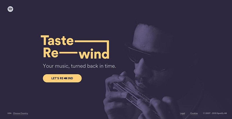
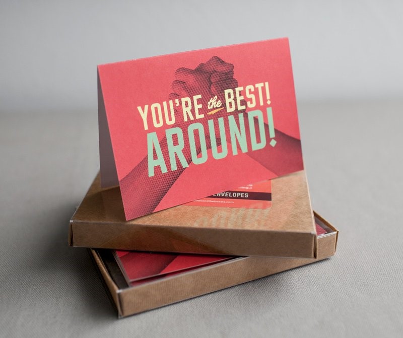
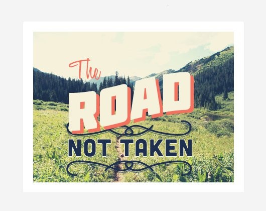
Use contrast. Contrast can be achieved by color (as in the previous example), or by characteristics such as size, shape, position, etc. The postcard design below uses all of these approaches: the salmon pink contrasts with the cool blues and greens in the photo; the size of the words contrasts with each other; so does the letter shape of the font choice; For contrast (the slope of the hill in the photo). All of these choices create a visually interesting composition and help the text stand out.
More revelations
Finally, let's look at some designs that combine some of the techniques we've discussed so far to good effect:
like the flyer below design:
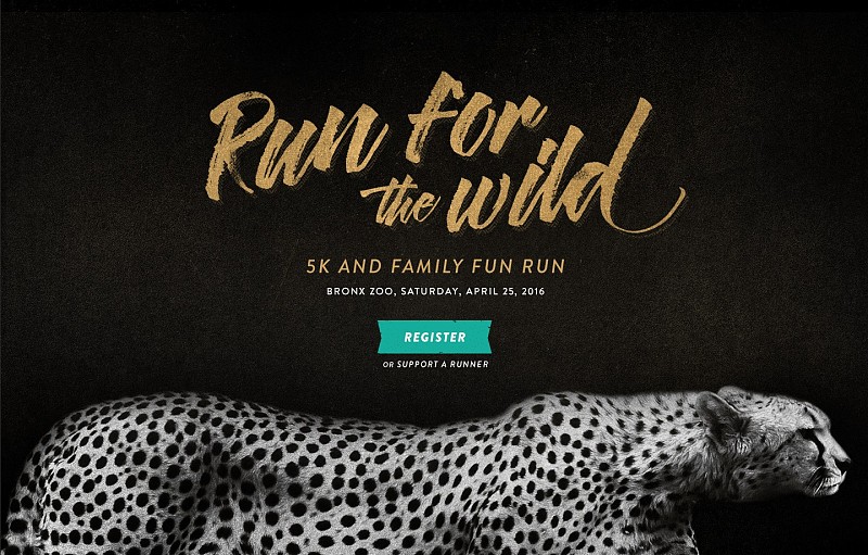
1) is characterized by a blank text area with a blurry image at the top of the text (maybe the image here has been desharpened);
2) The color of the text elicited from the photo (note the turquoise hue on the men's shirt).
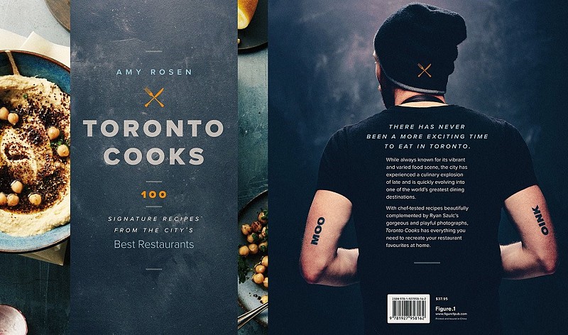
This book includes:
1) Use a textured background shape on the cover;
2) On the back cover, there is a photo of the back of the character as a blank area, and the shape of the text is consistent with the image;
3) Text with contrasting colors (blue and orange, another pair of complementary colors).
This web design:
1) Composition design with vertical balance;
2)Based on visual style and theme/message, text/image complement each other.
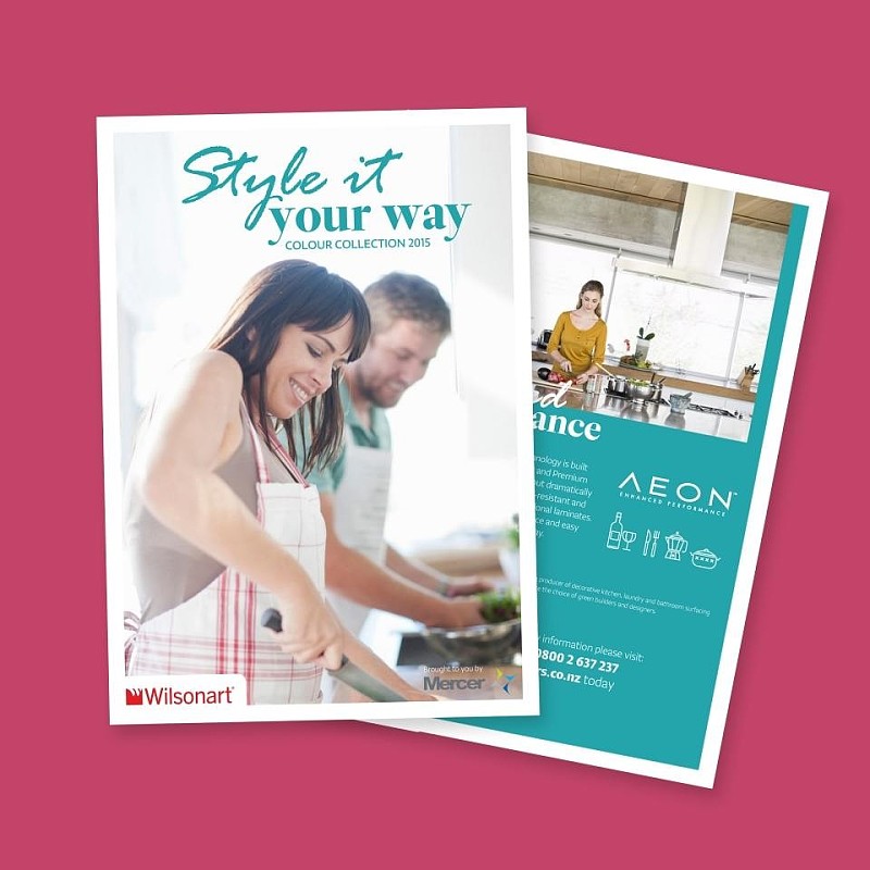
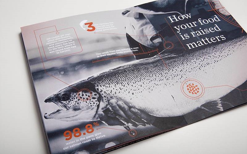
This catalog covers:
1) Balanced layout;
2) Images and text work equally - the image shows the company's product in action and the text explains its benefits.
This manual:
1) Use places other than the visual focus of the image to place text;
2) Use of color to make certain text stand out.
Articles are uploaded by users and are for non-commercial browsing only. Posted by: Lomu, please indicate the source: https://www.daogebangong.com/en/articles/detail/Whether%20it%20is%20a%20poster%20PPT%20or%20magazine%20cover%20design%20graphic%20layout%20skills%20are%20inseparable.html
 支付宝扫一扫
评论列表(196条)
测试