> The author of this article|Ge JunStation Cool> I used to be very busy in the company, and a sign was released in 5 minutes. Hehe, if Party A heard it, would it be very scary? In the end, it really decided on this plan. Not much nonsense, this sharing is to let everyone how to spend Make a good design in less time, spend more time, pretend to be deep, pick up girls, spend time with family and children, travel and see the world...
>">
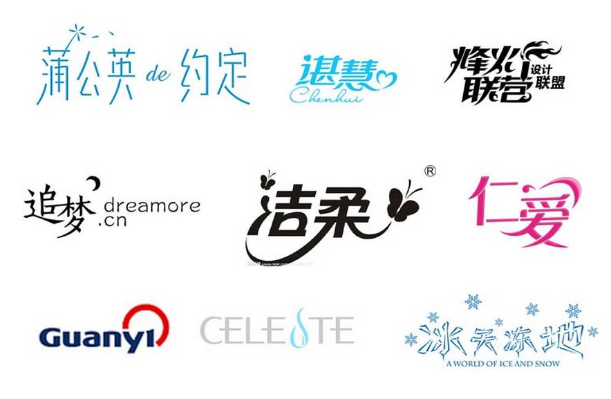
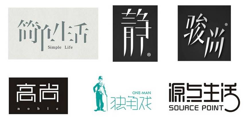
Micro font design is to use the least number of strokes in the design, try to use as little skeleton framework of the font as possible, and strive to make the best effect. If you happen to use the design of a great god, please bear with me .
> Trick one, consecutive strokes
Lianbi is the place where characters can be connected together, or it can be connected by two characters.>
In short, just connect them together. >
 >
>
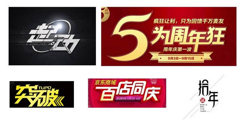
> Trick Two, Stealing the Leap>
Crafting a beam and changing a column refers to changing one or more strokes of one word or multiple characters into a graphic, and the graphic can be a circle,>
Star,Curve or symbolic graphics, once you change the whole, it will be a little bit brighter. >
 >
>
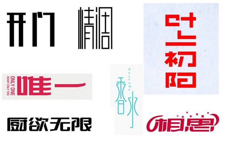
> Trick three, add basic graphics
Adding basic graphics refers to adding good-looking graphics from the top, do not touch the word itself, once you add graphics,>
The words are enriched, and you can feel it immediately. >
> Trick Four, Sharing Strokes
> Trick five, missing arms and legs>
Trick Six, Cake Cutting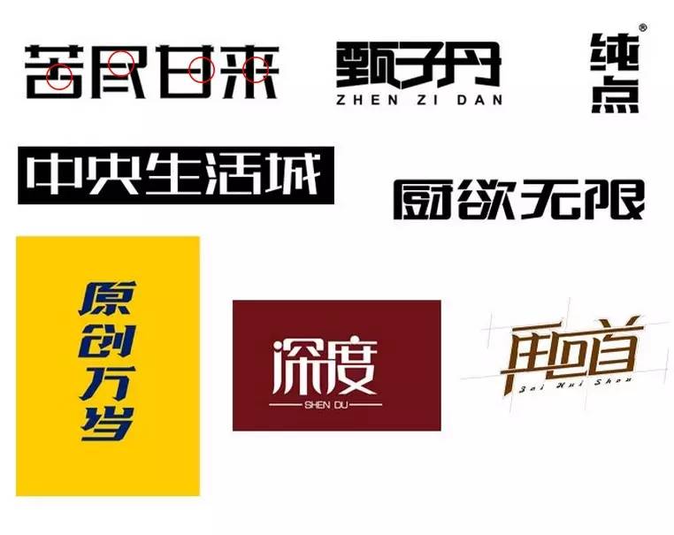 >
>
When it’s okay, cut the font east and west, and the feeling will be cut off when you cut it. >
Trick seven, lengthen a stroke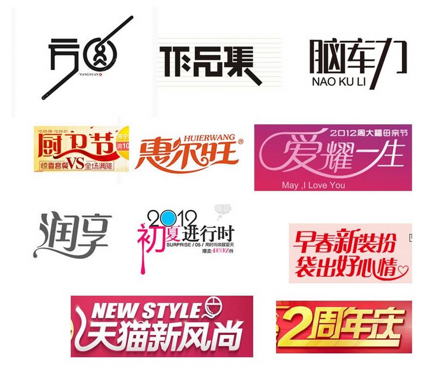 >
>
To lengthen a stroke means to lengthen the end of a word or a certain stroke. >
 >
>
> Trick Eight, Dislocation>
Misalignment refers to the arrangement of two or more characters up and down, so that the font has a sense of rhythm. >
> Trick Nine, grow taller, become shorter
refers to making the characters taller or shorter as a whole. Note that the font deformation cannot be stretched directly>
Trick Ten, Stroke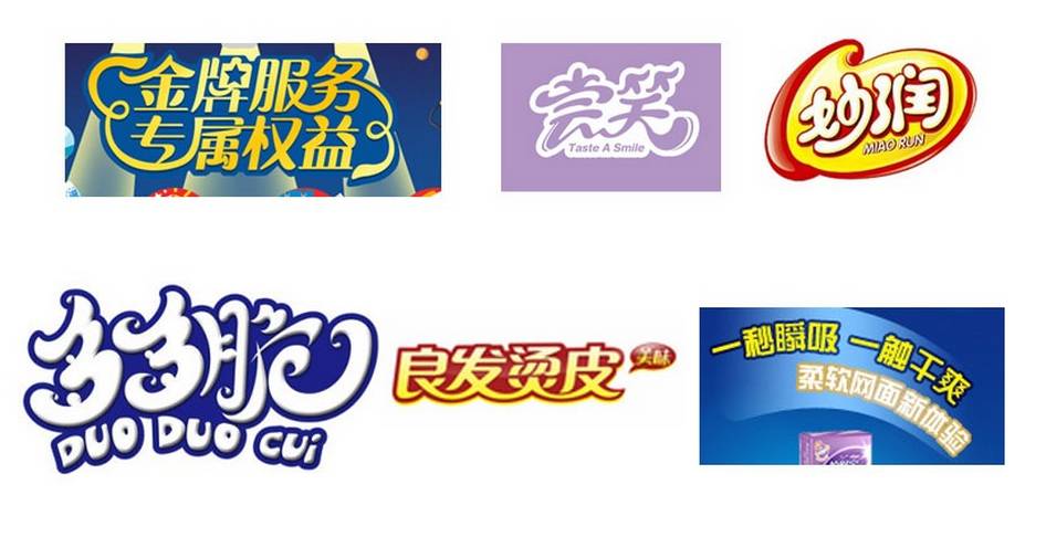 >
>
Use strokes to make the font as a whole, the effect is better and more impactful. >

——————end——————
Follow us and send Taobao design tutorials regularly
We will accompany you warmly on the road of Taobao art! >
Articles are uploaded by users and are for non-commercial browsing only. Posted by: Lomu, please indicate the source: https://www.daogebangong.com/en/articles/detail/When%20you%20have%20no%20idea%20about%20font%20design%20you%20can%20take%20a%20look%20at%20these%2010%20tips.html
 支付宝扫一扫
评论列表(196条)
测试