"Xie Wangxin: In the absence of diagrams, what kind of layout should be created by geometric shapes so that it will not appear strange. Are there any obvious cases for reference?"
""
This question is very good. I have really thought about it for a long time. We all know that in addition to text, there are mainly shapes and pictures in the page elements of a slideshow.
If there is no picture, it means that the shape should at least function as a part of the picture.
In fact, in essence, adding a shape should not produce a strange feeling. If there is a strange feeling, it must be that you have not thought clearly about the role of this shape in the page.
So what we have to think about is: "If there is no picture, what role does the shape play in the slide?"
1. Planning the overall layout
(Such as: Figure 1, @黑色的风)

Often when summarizing the role of shapes in a slideshow, the first thought is to decorate the page, but in my opinion it is not.
I think his most important first role is to "plan the overall layout".
How do you understand this? Let's take a look at the first case. There are no pictures in the whole work, all of which are composed of shapes. We can see that: the cover is composed of gradient shapes covering the entire page, and the shape of the catalog page is distributed On the top of the page, the shape of the transition page is distributed on the left side of the page, while the inner pages are unified with a theme of the current page in the upper left corner.
So when we see the shapes spread out on the left side, we know it's a transition page; and we don't just randomly place the shapes at the top of the page (because that's how the catalog page is laid out).
In the entire slide, the position of the shape in the "specific page" is fixed. This feature divides the slide work into a regular structure.
2. Visually express the logical relationship between the contents
(eg: Figure 2, @Vista Creative)
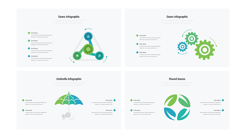
The shape or color block itself cannot express the logical relationship, but when they are visualized into a certain object, we can feel the meaning contained in it.
For example, in the picture in the upper left corner, we can see that three hubs are rotating around a gear, so we all know the meaning of "three elements drive one element to grow";
The picture in the upper right corner is three gears, then we know that these three elements are interlinked and indispensable;
The picture in the lower left corner is an umbrella. We can imagine that these four elements are common components, which may bring some support or protection to the theme of this page. Every content is a component of this protection. part;
The shape in the lower right corner is an ordinary circle formed by four leaves, which does not seem to have much meaning, so we know that these four contents are juxtaposed together. But although it doesn't show much meaning, it is much better than listing these four contents separately.
3. Highlight the key content and create a sense of hierarchy
(eg: Figure 3, @simple design studio)
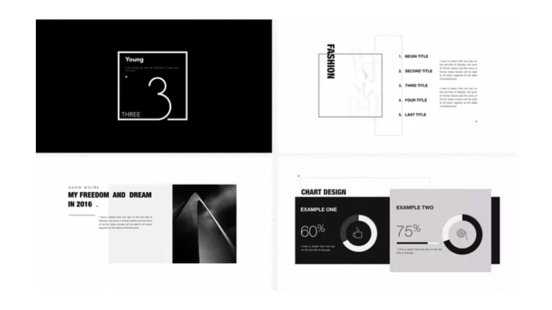
For the important content on the page, we can emphasize it by adding color blocks. This usage is widely used in magazines, just like we will use color pens to scribble on the corresponding text when we draw the key points of the exam.
And creating a sense of hierarchy is the case on the page in the lower right corner of the picture. We see that the gray color block has a certain extension on the black color block, which makes us feel as if the gray color block is closer to us than the black color block.
In this way, we can put more important content on the gray color block, so as to play an emphatic effect. We will also see this kind of modification on many forms.
4. As an icon to symbolize content
(eg: Figure 4 @Vista Creative)
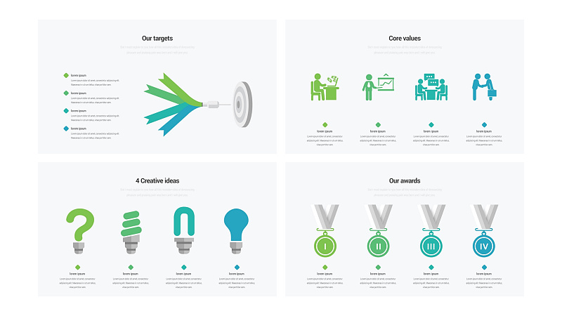
Since there are no pictures, another good way to avoid monotony on the page is to add icons.
We often encounter some pages with a lot of text, and we definitely can’t put them on the page like a Word document, but even if we refine it into 4 to 5 paragraphs of text with serial numbers in front, we still feel that “not enough High-end, not refined enough."
We see that the four elements of the picture in the upper left corner form a dart pointing at a target, then we can imagine that these four points are actually "the four elements of breaking through the goal", or our "four goals";
On the upper right are four villain icons in different scenes, which can indicate our "four major roles" or our "four major businesses";
In the lower left corner are icons related to four light bulbs, which may be our "four creative ideas" or our "four creative points";
In the lower right corner are four gold medals, but the numbers 1-4 are written on the gold medals, so this is obviously our "Four Great Honors".
5. Map
(eg: Figure 5, @Dublin Design)
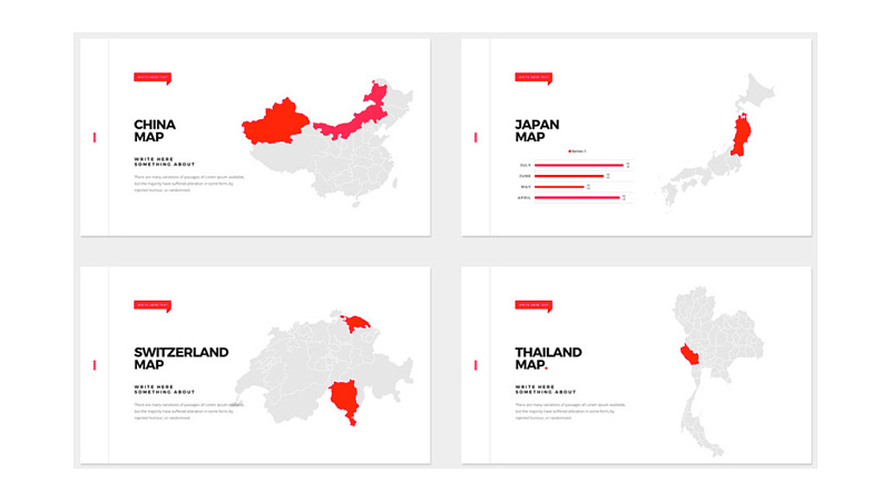
This kind of usage is almost necessary in specific scenarios. When it comes to content related to places, we all need to insert a map shape into the page to illustrate the specific location.
We all want to make the page less monotonous, that is, to increase the layout rate of the page, and not let the entire page be composed of text. Then when telling the content of the place, it is a matter of course to use a map to assist in the explanation.
6. Break through the monotony of the page
(Such as: Figure 6/7, @言示家居, Behance)
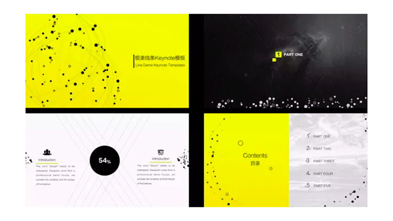
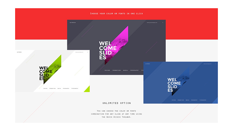
The sixth function of the shape is to break the monotony of the page. The specific method is to add a lot of small embellishments to the page.
We see that it doesn't matter if these shapes are missing in the page, but with these elements, the whole page will be much richer.
It should be noted here that the shape as an embellishment generally gives this work a certain meaning, so let’s not talk about the reason for the color matching, the setting of the shape can make the page have a certain temperament.
For example, dots and lines will make the whole work appear light, and if the use of inclined color blocks can make the whole work have a sense of movement and speed.
7. Anthropomorphism creates personality and humor
(eg: Figure 8, @Vista Creative, @Simon_阿文)
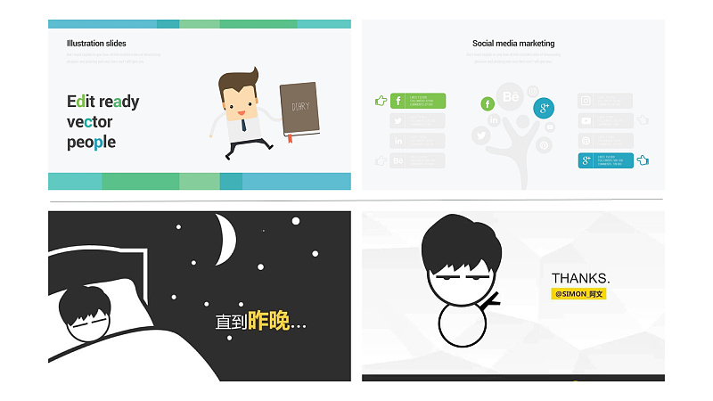
This example abounds, and there are many ways to anthropomorphize in slideshow tutorials that work well but are often overlooked. We have seen the two cases in the first half, both of which can have a business feeling. This is a flat application, which makes the audience feel very substituting when they see this page of slides.
The two cases in the lower half have a sense of humor.
Before, a group member asked me to recommend "the way to make him stand out in the self-introduction PPT", and I introduced him to use shapes to draw personal shapes in the PPT screen. Drawing with this shape will have an anthropomorphic As a result, the entire interface seems to be talking to you, and this expression will be much more vivid.
However, it should be noted that it cannot be used in more formal occasions. At the same time, if the manual effect of the drawing is not very good, it is not recommended to use it, otherwise there will be an embarrassing cold field effect.
The above shapes and functions are arranged in order of importance from high to low. The first five are functional functions, and the next two functions are used as icing on the cake, so the order of mastering should also be the first one to learn The role is the most important, followed by gradually decreasing.
Attachment 1: Heretics mentioned four unknown functions of shapes in the new book "PPT Design Thinking", among which the views are quite agreeable, and those who have bought the book are welcome to check it out;
Attachment 2: There are more ways to complement each other with shapes and pictures. Although this problem is limited by the condition of no picture, it is also feasible to add pictures to many parts. For example, adjust the shape to be translucent and add pictures.
It took me 6 hours to write the article, and I liked it to tell me that I had read it, and I sent a message to communicate.
This article was published by "Tang Shuai" on June 9, 2017.

Articles are uploaded by users and are for non-commercial browsing only. Posted by: Lomu, please indicate the source: https://www.daogebangong.com/en/articles/detail/When%20there%20are%20no%20pictures%20in%20the%20PPT%20how%20to%20break%20the%20monotony%20through%20the%20layout%20of%20geometric%20shapes%20Multipicture%20case.html

 支付宝扫一扫
评论列表(196条)
测试