
Text|Serious Beaker
Edit | Serious Beaker
Preface
As the core element of writing art, font is not only It is not only a tool for text transmission, but also a carrier of culture and aesthetics. In the early part of the century, particularly the Renaissance, Arts and Crafts, and Modernist periods, a number of influential typography styles emerged. These font styles represent the characteristics of the social background and cultural atmosphere at that time, and reflect people's pursuit of art and aesthetics.
This article aims to conduct an in-depth analysis and discussion on the three main font styles in the early century. Through the comparative study of humanist typefaces during the Renaissance, decorative art typefaces during the Arts and Crafts Movement, and geometric typefaces during the Modernist Movement, we can reveal the influence of social backgrounds and cultural atmospheres in different periods on font styling styles. influences, and explores the importance of these styles in the fields of design and art.

Renaissance Humanist Typeface
1. Font features
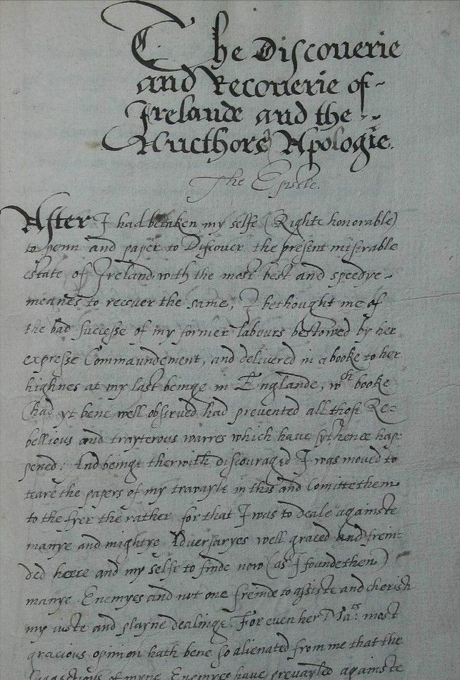
Brilliant strokes: The strokes of the humanistic font are clear and crisp, and the lines are smooth, reflecting the author's careful conception and handling of the font structure and proportion.
Elegant proportions: Humanistic fonts focus on the proportion and balance of fonts, pursuing a beautiful and harmonious visual effect. The height, width and spacing of the letters are precisely adjusted, giving the typeface a dignified and comfortable feel.
Significant temperament: Humanistic fonts strive to present a classical and solemn temperament. The strokes and structure of the font have been carefully crafted to give people an elegant and noble feeling, which is consistent with people's pursuit of ancient culture during the Renaissance.
2. Representative works and influence
Jenson's Roman: Nicolas Jenson was a famous renaissance book printer and typeface designer Teacher, the Roman script he designed is considered a classic of humanist fonts. The structure of this typeface is precise and elegant, and it has had a wide influence on the type design of later generations.
Italic type of Aldus Manutius: Aldus Manutius is an Italian literary A typographer and publisher during the Renaissance, his Italian script became an important representative of humanist typefaces. This typeface is full of movement and vividness, which provides an important reference for the handwriting style font design of later generations.
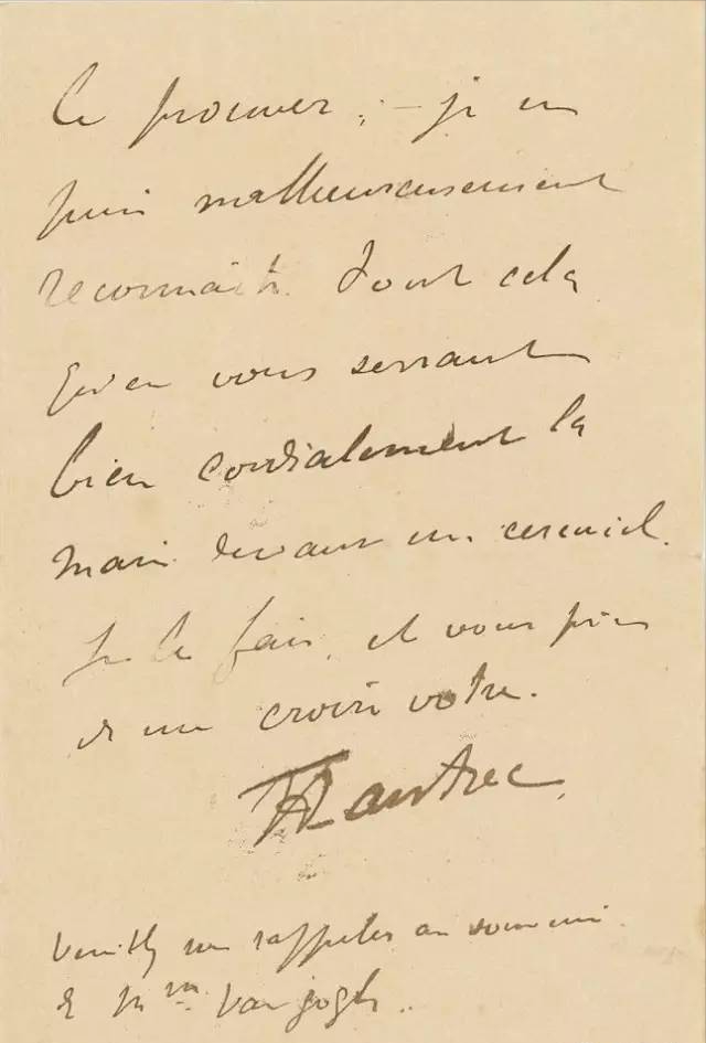
These representative works of humanist fonts were not only widely used in printed publications at that time, but also provided important inspiration and reference for later generations of font design. Their elegant, dignified style and precise control of font ratio provide valuable experience and reference for future font designers. The influence of humanist fonts goes far beyond the Renaissance period, and continues to this day, becoming an indispensable and important element in the field of font design.
Renaissance humanist fonts hold an important place in the history of type design. Its bright strokes, elegant proportions and solemn temperament condense people's pursuit of ancient culture and the return of humanistic spirit during the Renaissance. These font representative works have had a profound impact on the font design of later generations and have become classics in font design.
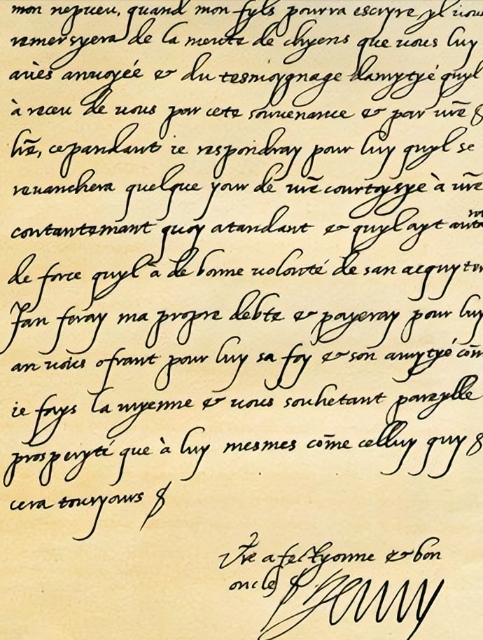
Through in-depth research and understanding of the characteristics and development of humanist typefaces, we can better understand the historical evolution of typeface design and the influence of society and culture, and provide insights into the innovation of contemporary typeface design. Useful reference and inspiration.
Art Deco font during the Arts and Crafts movement
1. Font characteristics and styling
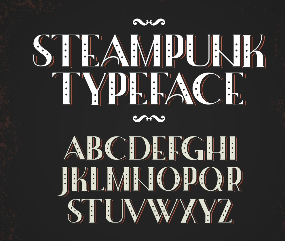
Exotic style: Art Deco fonts often draw on artistic elements of different cultures and times, such as ethnic art, oriental art, etc., forming a variety of font styles.
Decorative details: decorative art fonts pay attention to the details of fonts and decorative processing, and often use complex patterns, flowers, curves and decorative decorative elements to make fonts unique and artistic sense and decorative effect.

Free form: Art Deco fonts pursue freedom and individuality in form, often displaying peculiar shapes and non-traditional glyph structures. The shape and arrangement of fonts often have the artist's unique creativity and expression.
2. Representative works and influence
Berner Type by Peter Behrens: Peter Behrens, a German architect, designer and artist, designed the Berner Type Lens is considered a classic of Art Deco typefaces. Characterized by curved lines and ornamental elements, this typeface showcases Behrens' unique vision for form and ornament.
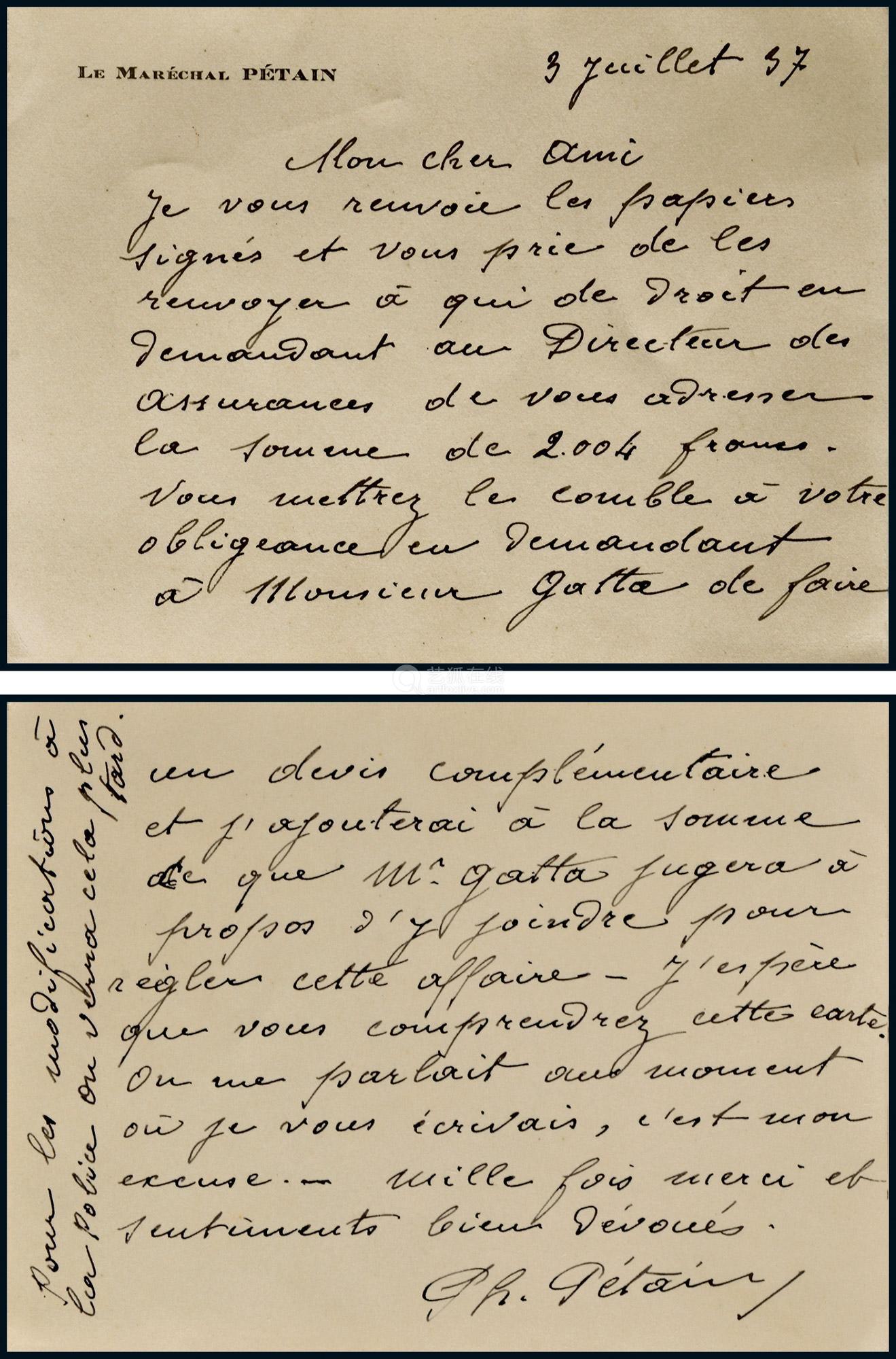
Charles Rennie Mackintosh's Mackintosh Font: Charles Rennie Mackintosh was a Scottish architect and designer, his Macintosh typefaces are known for their distinctive lines and geometric shapes. This typeface combines decorative curves and geometric elements for a unique modern art style.
Geometric typeface during the modernist movement
1. Font characteristics and styling
Geometric shapes: The glyphs of geometric fonts are mainly composed of straight lines, circles and simple geometric shapes, emphasizing the accuracy and regularity of the form. This simplified glyph structure gives the typeface a clean, simple look.

Pure lines: Geometric fonts often use lines of uniform thickness, avoiding decorative elements and stroke changes. The precision and consistency of the lines give the typeface a modern and technological feel.
Functional design: Geometric fonts emphasize functionality and practicality, and focus on the readability and visual effects of fonts. The spacing and proportions of the letters are precisely adjusted, making the typeface highly adaptable in typography and visual communication.
2. Representative works and influence
Halder von Constantine's Futura:Designed by Halder von Constantine (Paul Renner) Constantine is considered a classic of geometric fonts. Based on simple geometric shapes and pure lines, this typeface has a clean, modern look and is widely used in different design fields.

Alberto Bavalo's Bauhaus: Alberto Bavaro (Herbert Bayer) is a German Bauhaus A designer from China, whose Bavaro body embodies the Bauhaus school's design philosophy of pursuing simplicity and functionality. With defined geometric shapes and consistent line weights, this typeface became one of the great icons of modernist design.
These geometric fonts represent works that break through the limitations of traditional font design, through Clean shapes and pure lines express the spirit and pursuit of functionality of the modernist movement. Their simplicity, purity and functionality provided new ideas and inspiration for type designers in later generations. The influence of geometric fonts exists widely in modern design and has become one of the important means of expressing modernity and sense of technology.

The similarities and differences of styling styles
1. Font features
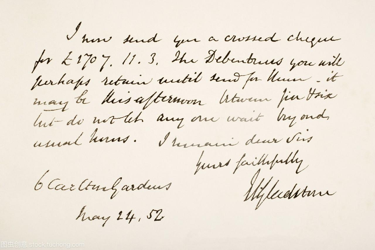
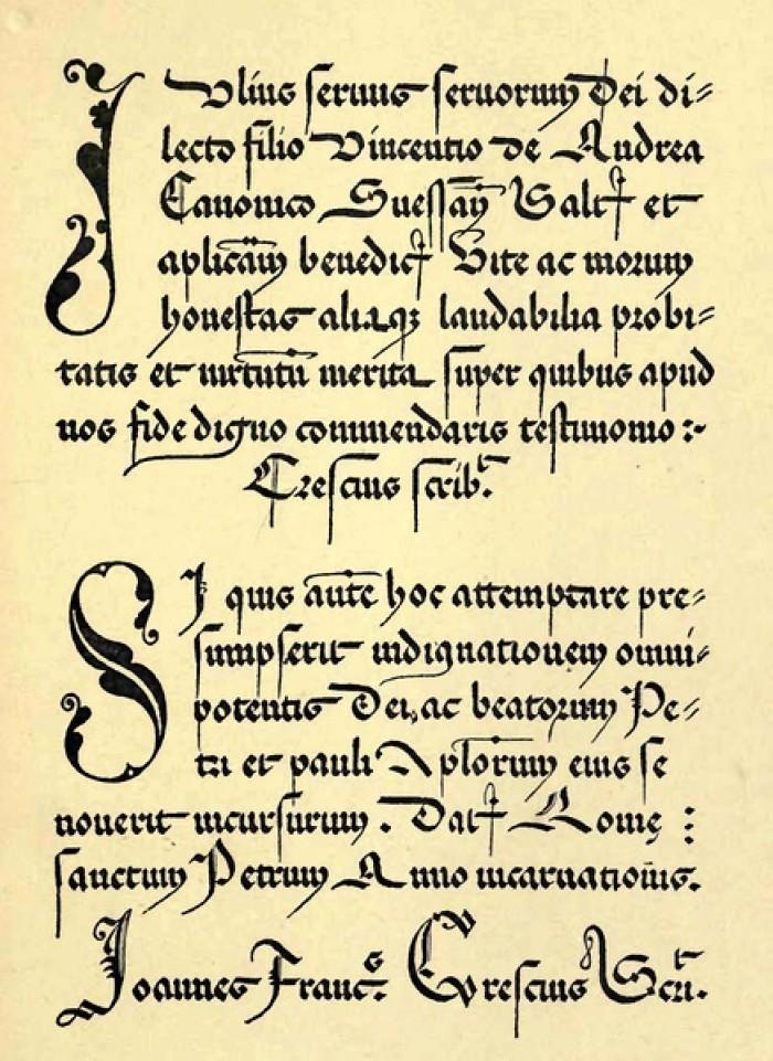
Humanistic font: Humanistic font focuses on imitating handwriting style, emphasizing humanistic spirit and natural and smooth strokes. Its glyphs often have curves and serifs, showing elegance and solemnity.
Art Deco fonts: Art Deco fonts pursue uniqueness and individuality, emphasizing decorative details and decorative elements. Its glyphs often have complex patterns, flowers and decorative decorative elements, presenting peculiar shapes and artistic features.
Geometric fonts: Geometric fonts focus on simplicity and geometric precision. Its glyphs are mainly composed of straight lines, circles and simple geometric shapes, presenting a pure and simple appearance.
2. Design concept and style
Humanistic font: Humanistic font emphasizes the pursuit of ancient culture and the return of humanistic spirit. It embodies the imitation and inheritance of handwriting art, pursues a natural, smooth and elegant style, and has a certain historical and traditional meaning.
Art deco fonts: Art deco fonts emphasize individuality, decoration and artistry. It draws on the artistic elements of different cultures and times, incorporates a variety of decorative elements and artistic styles, and pursues unique and artistic effects.
Geometric fonts: Geometric fonts focus on formal precision and functional practicality. It embodies the modernist movement's reflection on traditional concepts and the pursuit of functionality, emphasizing simplicity, purity and precision in geometric shapes.
3. Visual effects and application fields< /strong>
Humanist fonts: Humanist fonts usually have an elegant, dignified look and are suitable for formal, dignified occasions such as books, newspapers, certificates, etc.
Art deco fonts: Art deco fonts have decorative and artistic features, and are suitable for occasions that require unique expression, such as art displays, posters, and artwork covers.
Geometric font: Geometric font has a simple and modern appearance, suitable for modern application fields such as technology, design, advertising, etc., emphasizing the communication of functionality and visual effects.
Three main font styles in the early century in terms of font characteristics and design concepts There are obvious similarities and differences in the field of application. Humanistic fonts pursue natural and smooth strokes and solemn style, decorative art fonts focus on decorative and artistic performance, and geometric fonts emphasize simple geometric shapes and functional designs.
By comparing and analyzing them, we can better understand the characteristics and application fields of different font styles, and provide rich creative inspiration for font design.
Influence of social and cultural background
1. Social and cultural background influence of humanistic font
Humanist fonts emerged in the Renaissance period, and the social and cultural background of this period had a profound impact on it.

Renaissance humanism trend of thought: During the Renaissance period, people’s enthusiasm for ancient culture and pursuit of humanism prompted people to imitate and learn ancient handwritten calligraphy. This spirit of pursuing nature, smoothness and elegance directly influenced the formation and development of humanistic fonts.
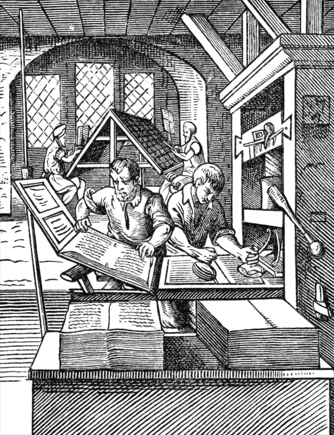
Popularization of printing: The development and popularization of printing during the Renaissance made book publishing more convenient, and the design and typography of fonts became an urgent need. The emergence of humanist fonts is closely related to the technical development of printing, and the limitations of printing technology have also had an impact on font design.
2. Social and cultural background influence of Art Deco fonts< /span>
Art Deco fonts emerged during the Arts and Crafts Movement period from the end of the 19th century to the beginning of the 20th century. The social and cultural background of this period had an important impact on it.
Industrialization and artistic rebellion: The process of industrialization brought about mass production and standardized products, while the Art Deco Movement, as a rebellion against this mechanized production, emphasized craftsmanship and individual expression. Art Deco typefaces were designed for uniqueness and artistry, reflecting a resistance to standardized typefaces.
The integration of art and design: the Art Deco movement advocated the integration of art and design, pursuing the beauty of art in all aspects of life. The design of decorative art fonts incorporates a variety of decorative elements and artistic styles, making the fonts have the nature of works of art.
3. Social and cultural background influence of geometric fonts
Geometric fonts emerged during the modernist movement in the early 20th century, and the social and cultural background of this period had a significant impact on it.
Industrialization and scientific and technological progress: The period of the modernist movement coincided with the period of rapid industrialization and technological progress. People began to rethink the relationship between art, design and life, pursuing a simple, pure and functional way of expression. The simplified shapes and geometric forms of geometric fonts are a response to this social change and technological progress.
Rationalism and functionalism: The modernist movement emphasizes rationalism and functionalism, pursuing the precision and practicality of form and function. The design of geometric fonts emphasizes the accuracy of form and the practicability of functions, which is in line with the pursuit of practicability and functionality under the trend of modernism.
Author's point of view
Through the three main font styles in the early century By analyzing and comparing them, we can deeply understand the design concepts, aesthetic pursuits and social and cultural backgrounds behind them. This provides valuable enlightenment and creative inspiration for contemporary font designers, enabling them to better understand and use different font styles, create rich and diverse font works, and promote innovation and creativity in font design develop.
References
[1] Xu Jiachen; Yang Qiaochu. Analysis of the application of creative fonts in poster design under the new media environment [J]. Science and Technology Wind, 2022(34)
[2] Li Jingqiu;Wang Jingru. Based on the background of Sino-British international aviation, font emotion deconstruction and cross-cultural communication design[J]. Journal of Bengbu University, 2023(01)
[3] Zhang Song. Experimental font performance characteristics of non-digital techniques in the digital age[J]. Art Research, 2023(02)
[4] Yang Xinzhong. Debate on Calligraphy Fonts and Writing Fonts in Computer Fonts[J]. Creativity and Design, 2021(06)
[5] Hu Jianfen. Font and Pattern Design "Five Blessings at the Door" [J]. Printing and Dyeing, 2021(12)
Articles are uploaded by users and are for non-commercial browsing only. Posted by: Lomu, please indicate the source: https://www.daogebangong.com/en/articles/detail/What%20were%20the%20three%20main%20font%20styles%20in%20the%20early%20Middle%20Ages.html

 支付宝扫一扫
评论列表(196条)
测试