
The typesetting font of the portfolio seems to be a small element, which seems insignificant, but it also seems to be one of the most troublesome problems for students.
In the illustrations of the portfolio, plane graphics are often used as a means of expression. In addition to the works presented in different techniques, styles and styles in the portfolio, there is also a special but easily overlooked part among the elements connecting various diagrams, techniques and models, that is, fonts, which can effectively greatly improve typography and performance. Today we will talk about some principled techniques for using fonts in portfolios.
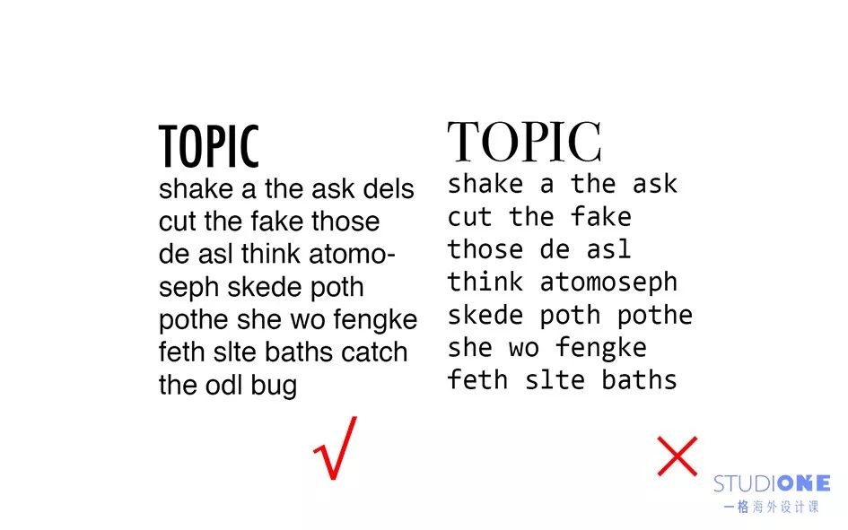
01
Use regular fonts as much as possible, curly fonts are not used to read information most of the time< /span>

Headings or paragraphs written in cursive or irregular fonts are strenuous for the reader. Among them, the ComicSans font has been widely criticized. This font basically appears in books for children under the age of 10. Therefore, unless you are a graphic design professional and have enough ability and time to balance the relationship between these fancy fonts and graphics, it is not recommended to use it. 02
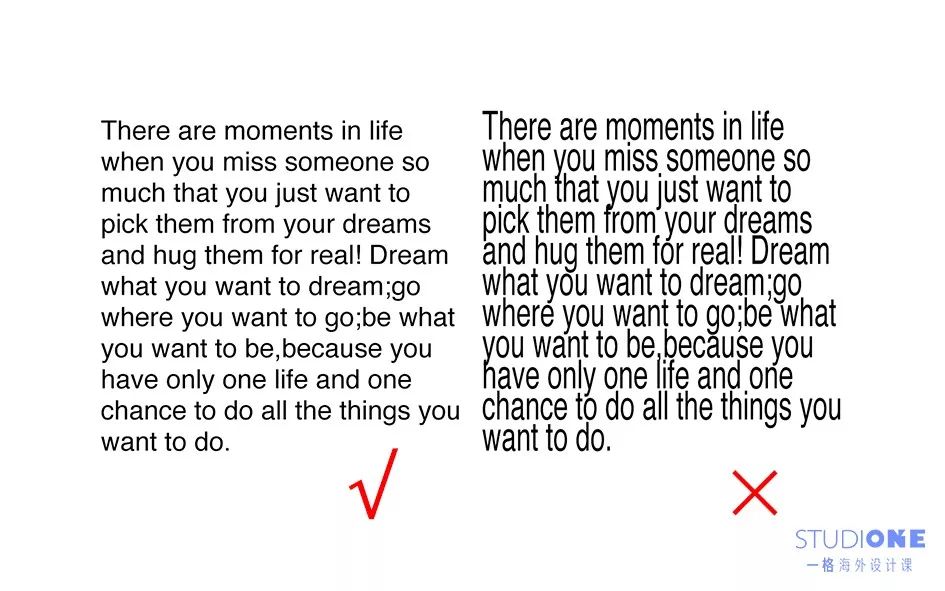
There should not be too many fonts in a portfolio, and they should be as similar or unified as possible
Under normal circumstances, it is not recommended to have more than 3 fonts in a portfolio, and no more than two in a text block, because too many fonts appearing at the same time will make the portfolio lack of integrity and make the Blocks of text look messy, and the same principle applies to font size.
03
If you use two fonts in a text block, please choose a matching or similar font

Usually, the fonts are divided into title fonts (thicker) and body fonts (thinner), so that readers can distinguish primary and secondary relationships
04
The hierarchical relationship of fonts should be handled well and logical
The main title, subtitle, and text have a corresponding primary and secondary relationship. During the typesetting process, please give readers a reasonable visual logical relationship according to different fonts, which will affect the reading order of the admissions officer. 05
The height and width of the fontDon't adjust it arbitrarily< /strong>
Each ready-made font is conceived by previous designers through experience and aesthetics. A slight modification will make the font lose its original beauty. If you must change the text to match the graphic, try changing the font or fine-tuning the typography.
06
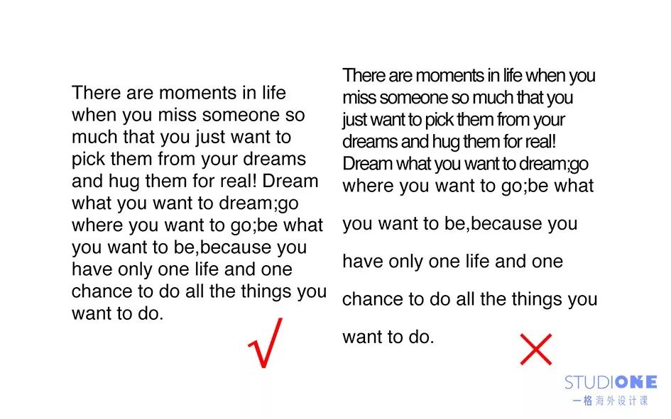
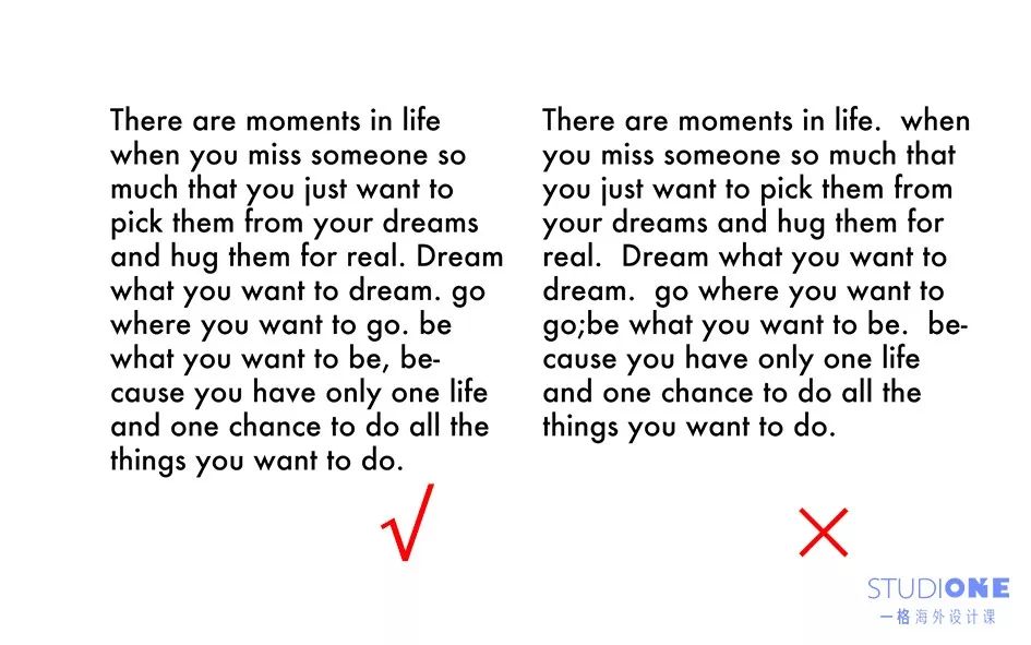
Don’t adjust the word spacing and character spacing casually, the line spacing should be reasonably selected according to the situation
The distance between words and the distance between letters, please try to keep the default. Usually the adjustment will make reading difficult, and even ambiguity will occur in severe cases. Line spacing is used to adjust the density of text, it is recommended to use 1.5-1.8 times the line spacing. Excessive line spacing will cause readers difficulty in reading. The double spacing is often used for writing suggestions and questions in the thesis required by the professor, and it is not suitable for portfolios.
07
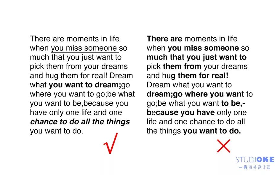
Appropriate usebold, italic and underline
If there are many important information in a text that need to be marked, you can try to use different marking methods (bold, italic, underlined). Single and repeated use of one method will cause readers to lose focus or cause confusion.
08
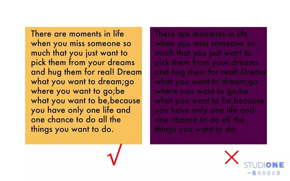
Adjust the font color to fit the background color

Sometimes the text will appear on the drawing, please choose an appropriate font color so that the text will not be confused with the background, and will not cause trouble to the reader.
09
Know the rules for using symbols in English, especially quotation marks
The rules for the use of symbols in Chinese and English are different. In English, there are no book quotation marks. The title of the book is indicated in italics, and the quotation marks indicate quotations.
10
In English, the space after the period is a character interval of an English letter

Because the space in English means the character interval of one letter, and the space in the Chinese input method is the interval of two characters, so many people will not be used to the space distance after the English period, please follow the rules of English text.
11
Try to avoid justified paragraph formatting

Alignment at both ends will make the space between some words too large, which will make reading difficult and affect the integrity
12
Reasonably control the white space in the text
English paragraphs usually have some irregular white space at the other time of alignment, please adjust the width of the text appropriately so that the white space will not be too abrupt
13
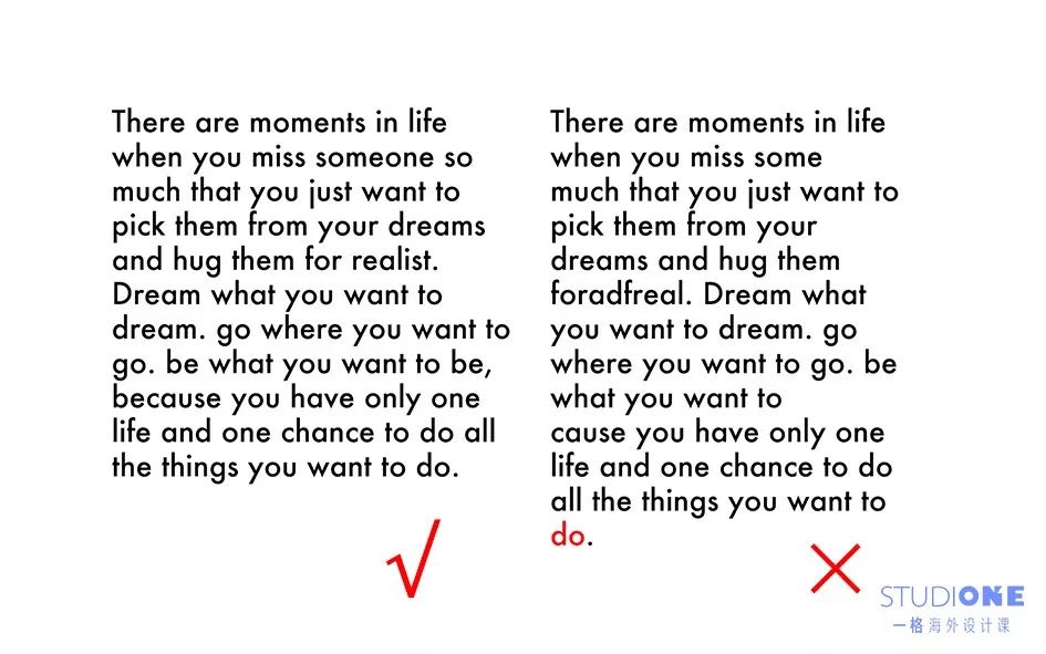
No single words in paragraphs other than headings
14
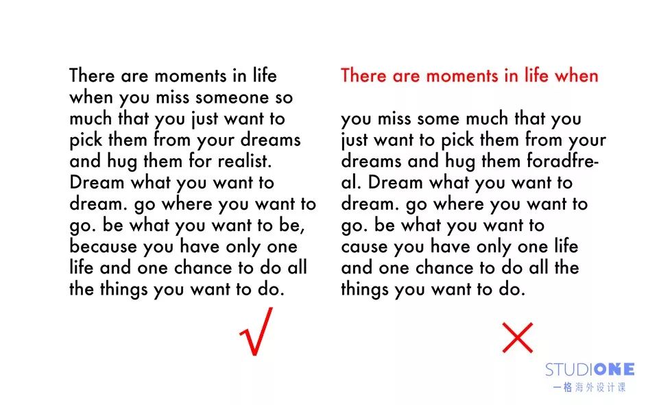
The position of the blank line should be reasonable
Blank lines can be used to distinguish logical relationships between paragraphs, but if not used properly, they can be misleading.
15
Finally, we selected some font models that are often used in professional drawings and icons in architecture
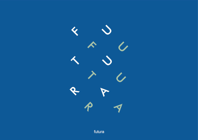
Futura

Inspired by Bauhaus techniques, this typeface uses straight lines and curves to bring text into balance. However, it is not recommended to use this font in long texts as it can exacerbate visual fatigue.
Bauhaus
This font is mainly suitable for headings and subheadings.
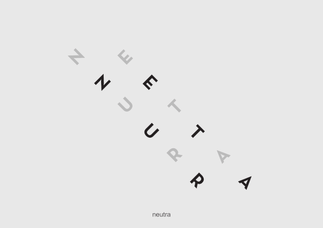
Neutra

This font is highly used in architecture and design work, and is as popular as Futura font.
Bodoni
This font is characterized by high-end artistic beauty, but please use it with caution. Due to its combination of lines and bold letterforms, it is also not recommended for long texts, but can be used as a strong accent, such as titles and details.
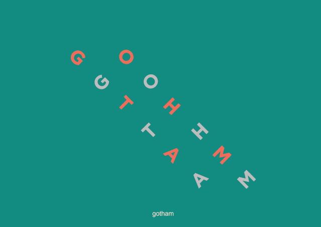
Gotham
This typeface is widely used in publicity due to the idea of credibility conveyed by its lines.
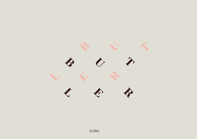
Butler
This font style is between Bodoni and DalaFloda, and is composed of curvilinear and modern font styles. Suitable for titles and logos.
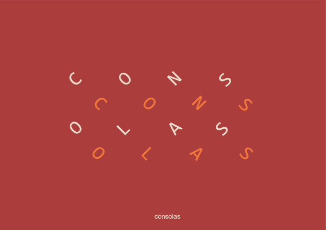
Consolas

This font is more suitable for long texts, ideal for architectural competitions and university display boards, and even text boxes in flat details. The lines are clean and beautiful, and the proportions are appropriate. Read for a long time without getting bored.
Helvetica
This font has no serifs, and the design is neutral and simple, suitable for long text reading.
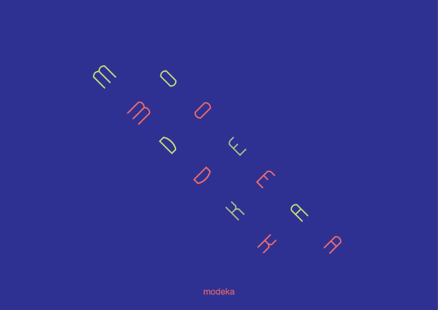
Modeka
This font is recommended for headings, subheadings and text details.
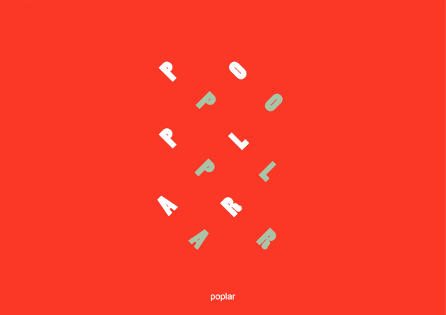
Poplar

This font presents its strong character and layout, suitable for headings, subheadings and text details.

Click to read


|
|
|
|
|
|


2019@ShanghaiStudio
SupportOne Grid Overseas Design Class
If you are watching, please let us know?
Articles are uploaded by users and are for non-commercial browsing only. Posted by: Lomu, please indicate the source: https://www.daogebangong.com/en/articles/detail/What%20tricks%20and%20tricks%20are%20there%20in%20the%20use%20of%20English%20fonts%20in%20the%20portfolio.html
 支付宝扫一扫
评论列表(196条)
测试