Text | Dou Lai say
edit| say
From the inspiration of the mechanical device in the movie "The Mechanic", the characters are not old-fashioned, they can be extracted from ancient immortal inscriptions, and combined with ultra-modern artistic techniques , corresponding to the imagined Egyptian character culture.
This kind of surrealism echoes the ancient characters, and it is also a symbol of modern and modern characters.
As early as the film world of the late 1930s, some forms of this "family" were considered typical typography of the Western genre.

What is linearity?
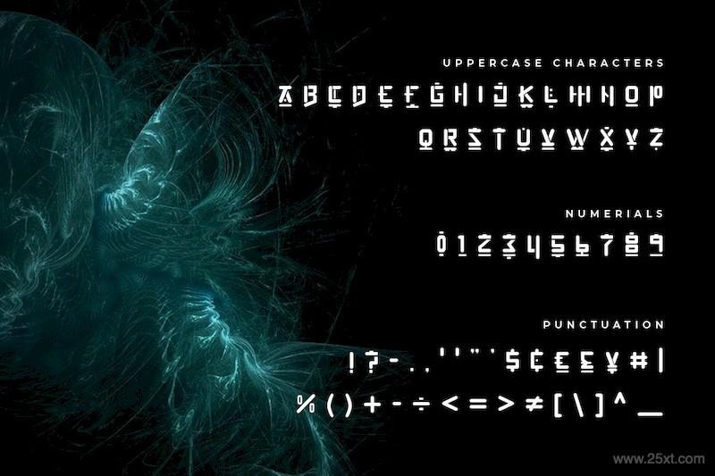
Linear typographic types generally correspond to sans serif characters in modern typography.
As David Rotter explains: "Their connotations are objective, neutral or simple, Suitable for business information, scientific or technical presentations, graphic design and modern art."
Since they are very readable, so it often appeared on the curtains of early movie titles, so that people can see the basis of linear typeface. But in the modern context, with the trend back to minimalism, they began to be gradually used in the typography of movie titles starting in the 1950s.
Calligraphy inspired character family
Cut
The cutouts are elegantly composed of characters inspired by carvings in stone (Greek-Roman temples) and metal (ancient coins). They have a rigorous, harmonious and serious quality, and these characters are used like Triangular wheelbase markings on chisel cuts.
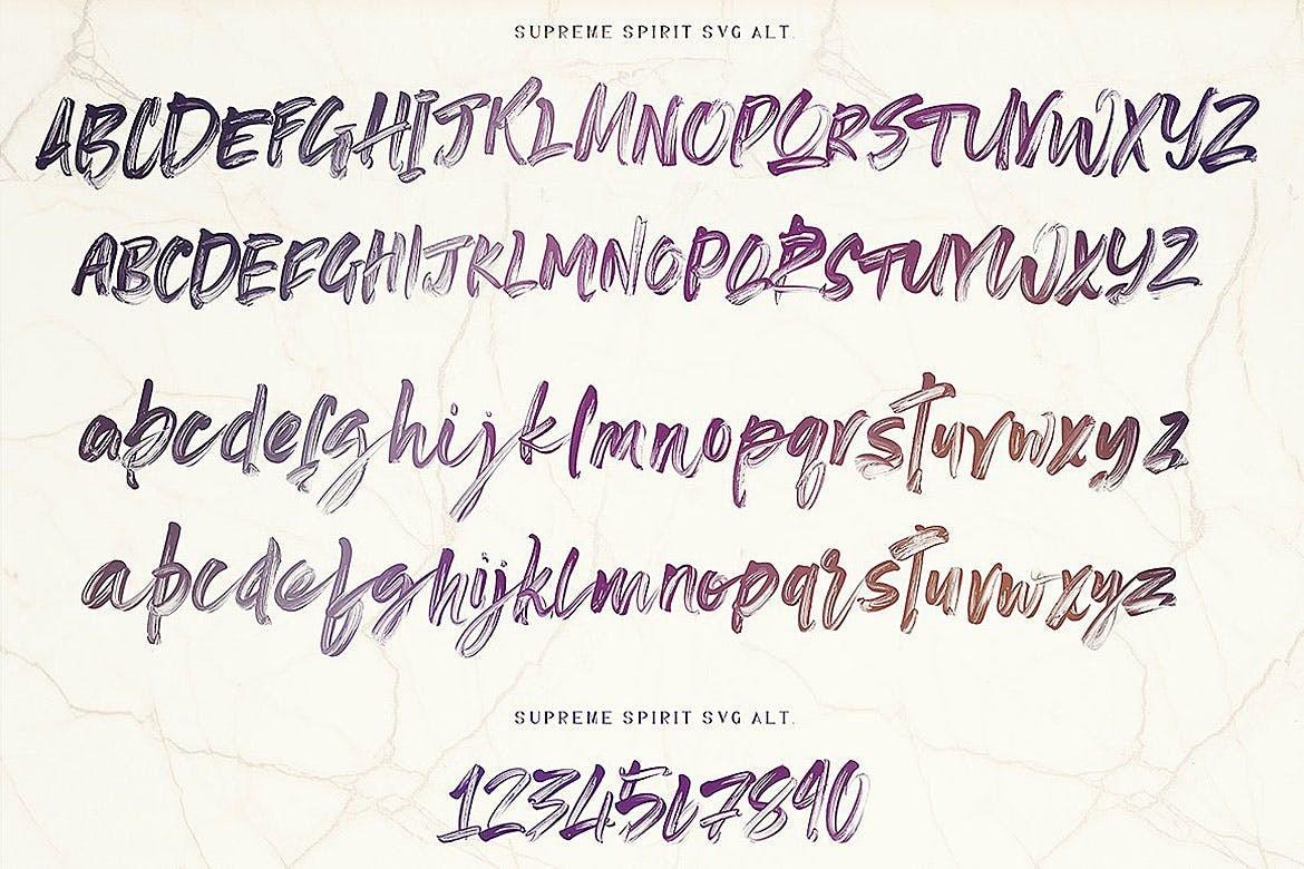
Script
Handwriting fonts are inspired by calligraphy written with a pen, or quick handwriting, also known as "cursive script". The effect of each character is usually linked to the next character, giving the script a a dynamic impression.
Manual
Manual refers to a family of characters whose drawings are inspired directly by gestures, so that different gestures form the main direction of their creation, and the variable gestures also mean that these drawings are more "artificially constructed".
Unlike scripts, manuals are generated from handwritten characters, but they also include all fonts from pre-typesetting text, such as gothic and German black curly typeface. On the other hand, modern characters in textbooks are mostly hand-drawn rather than computer-generated.
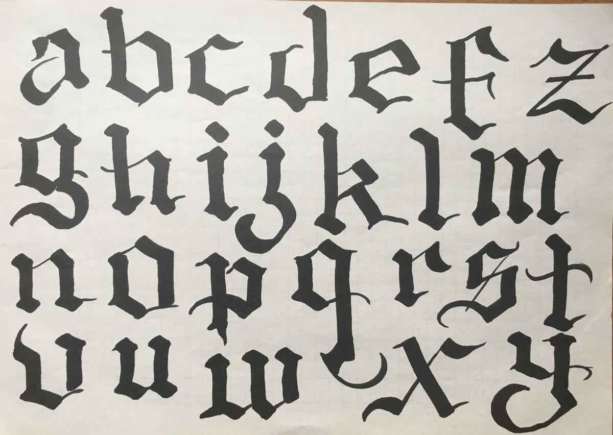
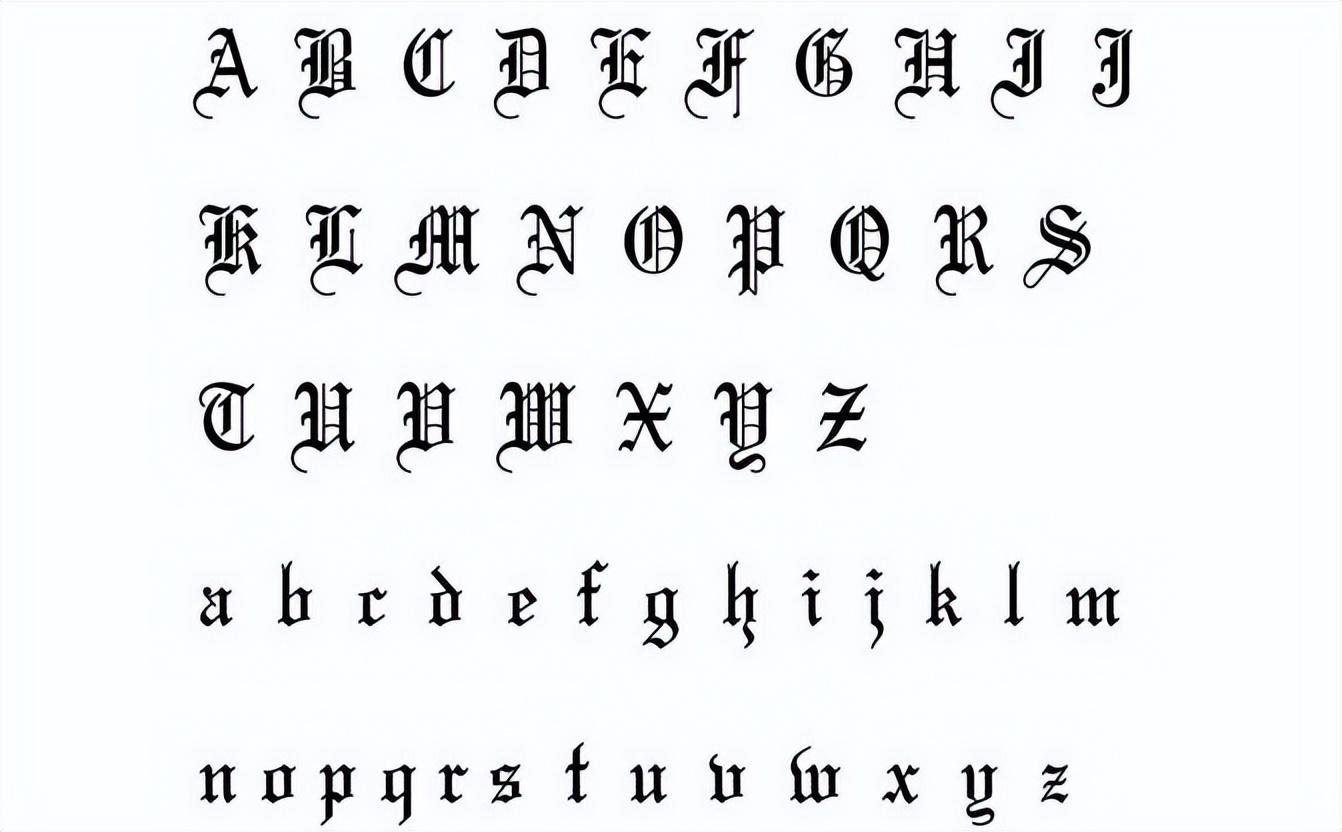
Fracture (Gothic/Black Letter)
Gothic scripture inspired by Medieval decorating style, also known as "Block", "Gothic", "Old England", "Black" or "Broken".
Especially in the past, Gothic typography and naming were considered a peculiarly German trait.
Roxanne Joubert said: "This type has been used in the German printing industry since its inception. Around 1933, some avant-garde and opponents of Nazism also used it. This type."
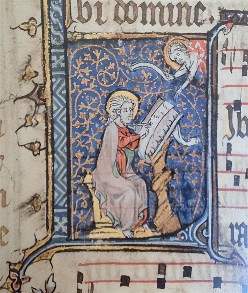
Thus, the Gothic alphabet is sometimes considered expression of German nationalism.
(author's point of view) This is why many German films , such as the German horror film "Vampire and Virgin Blood" directed by Harald Leiner in 1967, both use the Gothic style for a reason.
Furthermore,besides typographical diversity, it is worth noting that there are some decorative styles inspired by cultural or social movements of the time, which are featured in the film title are often used in the design of , the most famous of which are "Art Nouveau" and "Art Deco".
In Art Deco typography,curves are replaced by diagonal and artistically reversed curvilinear compositions.
Art Nouveau style typography is not fixed, there are arc Yes, there are also curves and inverse curves. It is essentially a decorative style, which is just an attempt at Decorative value of prominent curves in letters.
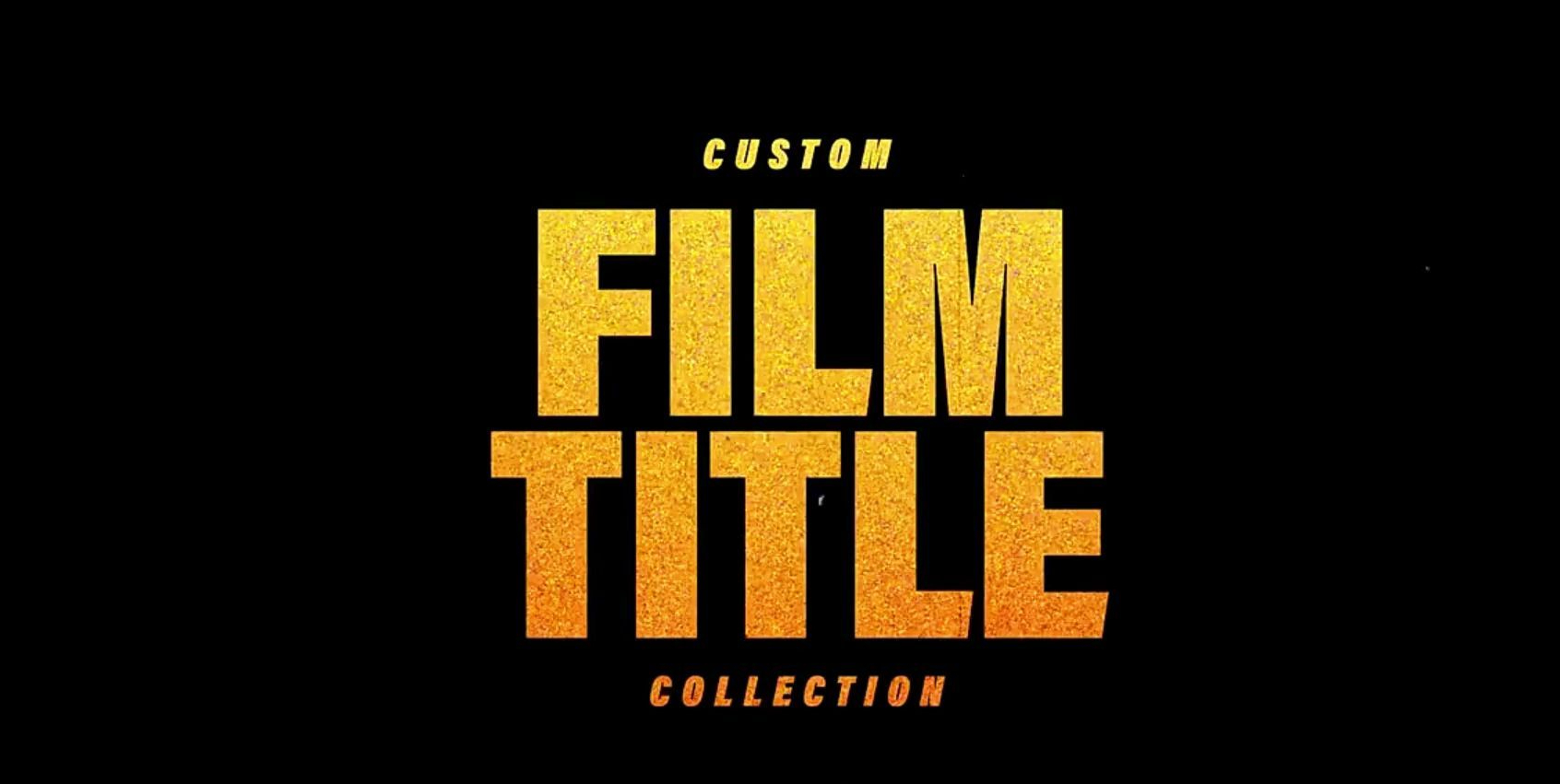
Typesetting options for movie credits
A film's credits list is intended to highlight its background and theme.
Here, fonts can be a powerful tool to achieve this goal, When designing a movie title, choose a character and justify it is difficult, and the most important thing to keep in mind about the different uses of fonts is to make the typography more on-topic.
(author's point of view)When we The issue of legibility is also evident when it comes to typographical choices for films, as Leon Neil Durie said: Text should take into account its visibility and the time it takes to read, and the choice of characters should be influenced by it.
One of the major problems faced by film letters shown in theaters prior to the use of more sensitive film was its poor sharpness, which was caused by printed copies, and Caused by light eroding the corners of letters during projection.
In fact, the way universal characters are typeset in subtitles is a common process. For example, in Francis Ford Coppola's "Tetro" in 2009, the incandescent shots were shot in this way.
The choice of roles was the result of many discussions with the director. For example Stephen chose Serbian, a classic and elegant character created between 1964-1967 .
(author's point of view)As before As stated, certain types of character personalities, each type of copywriting, convey a specific style. And the choice of font and typographic style can have a big impact on a movie. In this regard, some directors pay special attention.
Among them, Roman Polanski is a representative. He commissioned designer Wayne Fitzgerald in 1974 to create a very precise type of characters for Chinatown. "I wanted an artistic opening that would foreshadow the retro feel of the film," he explained.
In "Macbeth" in 1971, Polanski chose this style for historical reasons.
He said: I really wanted to find the original typesetting of the first edition, and I tried my best to see this edition with my own eyes, until one day, by chance, I After seeing and touching the first folio of "Macbeth" in the home of an English aristocrat, I then used it to design the typography for the film.
Alexander Telsky states that Roman Polanski Pay special attention to the use of title typography in your opening remarks. This attention to detail,especially in film, requires research into a character's historical, cultural, and social origins to avoid mistakes beforehand.
Mark Simonson in the movie "Los Angeles" points out that Curtis Hanson's 1997 "Confidential" is a 1953 newspaper, "in Black and the universe as the title, this typesetting style was not common in the United States in the sixties strong>.
The disproportionate typography of the 2002 film Gangs of New York directed by Martin Scorsese tells a story set in the 19th century, "Future of the Future" (1988 ) were engraved in marble. Alice Rothdown explains: "How to choose the right font has become a problem. Proper typography will be another issue."
Gerard Blanchard, French sculptor and typographer, explains Saul Bass' difficulty in choosing by writing a sketch letter, "They are both The alphabet of aesthetics is also the alphabet of reality."
Finally, we will explore this further as the typographical choice of film genre can be decisive.
Color
The color of typography is also very important, because it can evoke emotions, have cultural symbols, and even convey personal thoughts and feelings. For example, Red represents danger in Western countries, while in some Eastern cultures it symbolizes joy. Readers are often sensitive to the color of typography, for example, the darker the typography, the more serious the text looks.
Color plays different roles in composition, both conveying information and creating visual impact. Color combined with typography allows the different text elements to be visually united beyond the contrast and clarity it brings to the composition. On the other hand, in the context of visual communication, the choice of color is very important.
From a word readability point of view, the correct use of color is important. In addition, the readability of text depends not only on font and body copy, but also on contrast with the background. Because the whiteness of the screen is brighter than paper, and the screen fonts are made of light, it looks thinner than it actually is.
(author's point of view)Therefore, A typeface should always be tested against a background, because its actual effect depends on the combination of colors. Regarding the use of text on an image background (photo, illustration or film), the color contrast between the text and the font must be considered to ensure readability and aesthetics.
The author's point of view:
Based on the above changes in the layout of animation special effects Exposition, I want to talk to you here about two basic elements of animation—"Motion and transform". So as to help us better understand the connection between character classification and visual effect communication in movie alphabet typography.
In general, Animation is composed of two elements: motion and transformation of. Movement is the change of place of production, like the effect of a rigid object moving from one place to another. Transformation is changing the object itself (color, shape, etc.) without changing its position. In many cases, animation is a combination of these two motion elements.
For example, the motion of a clock wobble is a combination of acceleration and periodic motion. Situations where the speed or direction is unpredictable are considered chaotic motion, such as particles dispersed in a flame.
Transitions can appear much more complex than the motion of rigid objects. Movement is achieved by changing the units that make up the whole object, while transformation is achieved by changing the shape or position of certain parts.
Here, we only consider two basic factors, color change and geometric shape change. Like other visuals, the hue of typographic graphics can be changed by adjusting saturation and shading.
A change in opacity, on the other hand, refers to a change in the visibility of an object, for example, a fade effect represents a change in the opacity of an object. This is very common in motion typography because it allows for smooth transitions between movie scenes.
Geometric shape transformation refers to changing the structure of a shape, for example, geometric changes such as size and angle. Modifications to shape structures can be partial or total.
For example, changes in perspective, texture, shape, distortion, are local changes. If the letter "a" is broken into pieces, partial changes can also be made while maintaining its general outline. But when the letter "a" is geometrically modified to the letter "B", its definition is completely changed in the change of geometry.
All these movements and transformations can be used alone or in combination, resulting in millions of varieties. For example, the combination of random movement, shape, opacity, and structural variation creates a sense of strangeness in the "Se7en" title.
In Tadpole's generic sequence, the letters appear to swim in water like a school of fish or tadpoles. In this context, the letters gradually form the name, but soon fly through the window of the car. This way of movement is realized by 3D digital animation, so that the audience has a new feeling in the visual experience.
Therefore, in some specific cases, we can also convey another typographical language through the movement of letters and words. And this is what we want to convey, the visual effect of static and dynamic changes in the background is different.
references
Li Xiaoyun. From Function to Form Beauty——Analysis of Film Opening Text Design[J]. Art Grand View, 2017(02):136-137.
Luo Qing. Graphics, Text, Movement——A Study on the Expression Techniques of MG Style Film Title Design[J].Design,2016(21):128-129.
Zhu Yanhua.The Visual Charm of Word Image in Movie Poster[J].Art Appreciation,2016(01):136.
Kang Jing. Graphic Text Design in Movie Posters[J]. Film Review, 2013(19):.2013.19.043.
Wang Weiyin. Graphic Design of Movie Poster Text[J]. Film Literature, 2012(10):155-156.
Articles are uploaded by users and are for non-commercial browsing only. Posted by: Lomu, please indicate the source: https://www.daogebangong.com/en/articles/detail/What%20is%20the%20connection%20between%20the%20character%20classification%20of%20film%20typography%20and%20film%20visual%20communication.html
 支付宝扫一扫
评论列表(196条)
测试