Reading Before this article, please click "Follow", which is not only convenient for you to discuss and share, but also brings you more sense of participation. Thank you for your support.
Text | Dou Lai Shuo
Edit | Dou Lai Shuo< /span>
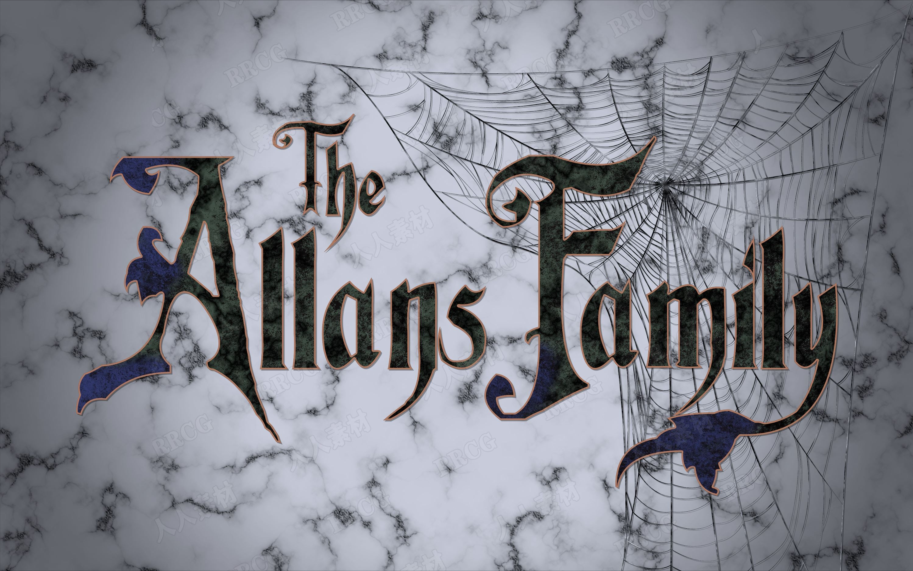
Title Project for Movies
In the past ten years, the lettering of the title has been repeated Becoming a trend, but this time more in line with the theme of the film, generally with acceptable graphic and aesthetic aspects.
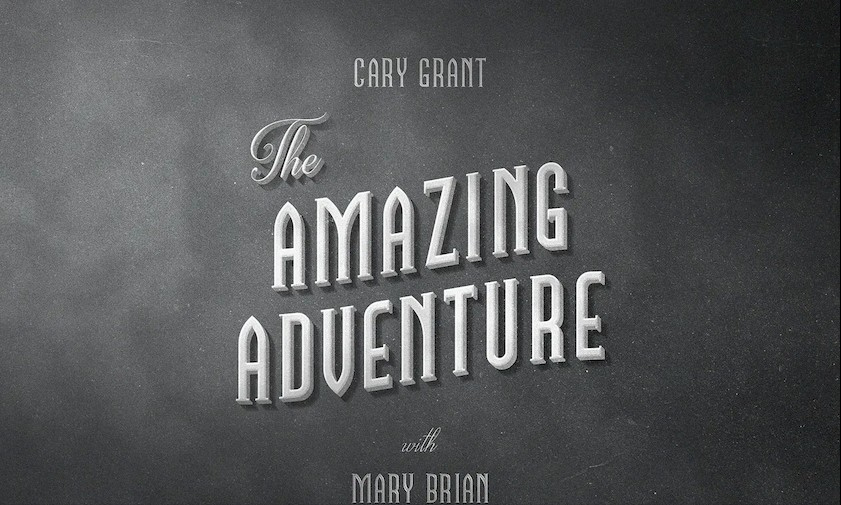
In addition, can also see the Typefaces, which were modified to create new visual identities in movie titles. In this respect we can cite those in Alfred Hitchcock's 1972 "Frenzy".

They just use a wireframe texture to customize themselves, or Jack Hill's 1973 coFFy with two capital "F"s in the middle of the word and the rest of the letters All lowercase. In this theme, it is worth mentioning Ridley Scott's 1979 "Alien".
It was designed by Richard and Robert Greenberg and is the basis for a version of Futura's geometric typeface, in the linear category, with large spaces drawn between letters. During the 1970s, filmmakers recognized the importance of personalized typography in their films , and thus a greater interest in crafting an instantly recognizable identity.
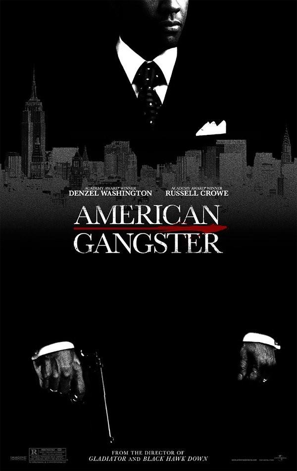
These logos may be used equally for all promotional elements of the film. In this decade, we have the God the Father logo and the Star Wars logo, and the design of the font of the same name, inspired by these fonts. Among those titles that have chosen to be lettered in an informal style, we can mention Francis Ford Coppola's "Apocalypse Now" released in 1979.
The informal style of the title perfectly matches the oppressive atmosphere of the film. In addition, this typeface also became the basis for designing the typeface of the same name.
1980s headline font
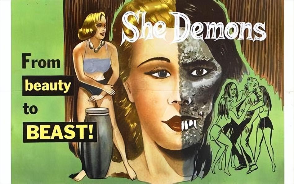
The 1980s marked another return to something simpler. While most headlines have a certain amount of originality in their typography, they're far less crazy than in previous years. In other words, in this decade, we have only seen handmade fonts based on fairly serious typography, except of course for comedy, action or fantasy films, which change the character of the titles.
For example, we note the trend of embossed typefaces with metallic effects, used in the late 1970s in the title of the Australian film "Mad Max", written by George Miller (1979) directed. Other fantasy styles with color tolerances were evident in some movie fonts of the time.
For example, Spielberg's "Indiana Jones" in 1984, Robert Zemeckis' "Back to the Future" in 1985, John Huston's "Prizzi's" in the same year honor". One of the most impressive films of the decade is the British film directed by Terry Gilly" Brazil", it is colorful and glorious.
The font of the title in the 1990s
In the early 1990s, it is the same as the title of previous years What keeps the typographical atmosphere consistent is that the book title fonts are consistent to a certain extent, and the book title fonts are also very similar. Although the fonts involved in headings vary considerably, there are no particularly innovative and striking ideas in the typography of headings, instead, The title is presented in a relatively repetitive, often seen style.
While the computer has found its place in the design and lettering of movie titles, it doesn't seem to be meeting the aesthetic needs of its typography. On the other hand, due to the ease that technology has brought to this industry, some mediocrity has replaced the originality of hand lettering. Few titles boast of bringing something new to the table.
However, Ingenuity does not necessarily rhyme with efficiency, as Soberness doesn't necessarily rhyme with nothingness. We could also say that titles from the 1990s were generally less popular than titles from the 1960s and 1970s. Besides, many of them don't want to keep a low profile anymore.
Although the typographic trend is to dominate the title, this started in some genres in the mid-1980s, but it continued in a broader sense until the late 1990s. Once again we see the title that takes up most of the surface of the screen. However, especially since the middle of this decade, some have come out in the opposite way.
The title is much smaller, which benefits the overall title scheme aesthetics. The best example of this is Joel Cohen's 1996 film "Fargo," which looks both effective and elegant, with very small fonts without serifs and between letters There are big differences.
And Mike Newell's 1997 "Donnie Blasco", designed by Kyle Cooper: His subtitles (relative to frame size ) are superimposed on an impressive close-up image of both eyes. Saul Bass, on the other hand, hasn't changed his taste for small typography, and he's still notable in Martin Scorsese's Cape Fear and Casino.
In 1995, other typographic styles began to appear in the design of headings and title fonts. This style is defined by the well-known characters, grunge effects and frayed and cut silhouettes. As we explained earlier, "dark" typographic style has actually been used in various graphic art prints, but rarely on movie screens .
This style is reflected in the title typography of the three films in 1995. In Michael Mann's "Heat," the Title, Elegant, but Not Very Flashy, is in uppercase linear letters with slightly broken outlines, looking like an old-fashioned font.
In Todd Haynes' British-American film Safety, The title is surrounded by blurred outlines and incomplete framing, reminiscent of a buffer effect; It lights up intensely white and then red, like a flashing warning light inside a car, warning of something wrong.
The style of this end credits spreads a new trend in the art of film typography, especially in the horror genre. It should be noted that usually (except for some cartoon titles) the movement of animated titles superimposed on the movie image is very limited: they either move forward or backward, or in vertical, horizontal or diagonal directions up through the screen.
Even Saul Bass used these usual action forms in his titles during this decade, such as Martin Scorsese's "Good Guy" in 1990 ;Synchronized with the noise of the car, and with simple graphics and linear characters, titled from right to left The panorama of moves across the screen like a speeding car.
In "Cape Fear" in 1991, the title appears on a reflected image shimmering in the water, the typeface is based on a linear typeface, as if broken, and Move slightly on the horizontal axis in the middle. The character modification in this title is consistent with the image of the background wave, but it disappears in the image without any movement.
From 1999, there seems to be a tribute to the typography of titles from different periods. Most movies these days don't ignore their titles. Even with simple, minimalist and existing fonts, typography is becoming more and more effective and generally has a Accepted Aesthetics.
Heading fonts from the 2000s
Also, from the late 1990s to the present, on a black background Genre reflections in credits typography are greatly reduced by the trend towards classic end credits styles with simple typographic characters. For example, we see movies, like comedies or westerns, with raw typography without any specific choices corresponding to genre.
Today, although movie titles obviously haven't really changed movie typography, they're effective enough. They are produced in existing or modified typefaces, simple, informal typefaces or manuscripts , do their original work without too much noise within the framework of contemporary visual requirements.
Author's point of view
On chatting After finishing the meaning of the title text of the title, let's take a look at the director of "Seven Deadly Sins": Kyle Cooper.
Kyle Cooper, born in July 1962 in Massachusetts, USA, is a designer and director, Mainly engaged in theme songs. He received his M.A. in Graphic Arts from the Yale School of Art, where he studied graphic arts with renowned graphic designer Paul Rand.
In this regard, he explains: As an academic, I have honed my vision and abilities, and although I am very rigorous, my studies have opened up new horizons for me. world, and has led me to meet exceptional mentors and educators who are still on my mind as I work.
However, I really regret that I didn't understand what I know today,that at Yale, like many young graphic designers, I thought I knew better than I Much more is actually known. Back then, I was rather anxious to debate storytelling and the concepts my mentors were trying to teach me, like how to think about and make beautiful, well-crafted things.
Every day, I am nourished by wisdom, but until now, I have not started to use it. Cooper released his first theme song in the late 80's. He was one of R/GA's creative directors when he created the opening sequence for the psychological thriller Se7en. After the success of the end credits, Cooper left R/GA, where he had worked for seven years, to start Imagination Force.
According to "Wired" report, this is a veritable "Hollywood fashion design store", and there are still more than 70 directors, art directors, designers, animators, editors, screenwriters and producers people work there. Cooper is also the founder of Prologue Studios in Los Angeles, where he now sings solo.
He has worked with some of Hollywood's foremost filmmakers including Oliver Stone, Brian De Palma, Terrence Malick, David Fincher and many more. He is now a member of the International Graphics Federation and has been awarded the title of "Royal Designer for Industry" by the Royal Society of Arts in London. Cooper has become an icon of the genre and a role model to inspire a new generation of sports design.
Cooper, humble but always meticulous, always stays true to his roots when describing the end credits art: "I think you have to be a designer first...". Regarding the considerable success of the Cooper title, director Zack Snyder pointed out that even some filmmakers refused to work with him because he was "The man who made the title better than the movie itself".
Others praised his sensibility in creating openings that truly belong on film. In fact, although Cooper is not the first designer to have this creative space, he is one of the most recent characters to incorporate this contemporary air into the design of movie titles. However, Cooper's career has not been limited to designing generic drugs.
In 2001 he directed "New Hong Kong South" feature film. He has also served as a visual effects supervisor on films such as Julie Taymer's "The Tempest" in 2010 and the 2008 Errol Morris documentary " standard operating procedure".
Arguably, the climax of Kyle Cooper's illustrious career was the end credits of the film "Se7en", wherein the end credits he presented a unique, Modern, fresh style.
After reading this article, please follow + comment, so that you can quickly get more exciting content.
references:
1. Chen Xihua. "Numbers in Film Titles and Cross-Cultural Communication" [J]. Film Literature, 2011(05):140-141.
2. Li Ying. "A Brief Analysis of the Application of Words in Movie Poster Design" [J]. Film Review, 2009 (04)
3. Sugawara Yoshino. "Sound and Words: A Preliminary Study of Media History for "Understanding" Films" [J]. Journal of Beijing Film Academy, 2019(01)
4. Liu Jiangkai. "Light and Shadow Text: Film Adaptation of Contemporary Literature and Its Overseas Reception" [C]. The World Value of Chinese Culture——"The Third Pole Culture" Collection (2016)
Articles are uploaded by users and are for non-commercial browsing only. Posted by: Lomu, please indicate the source: https://www.daogebangong.com/en/articles/detail/What%20graphic%20and%20aesthetic%20changes%20have%20the%20films%20title%20plans%20undergone%20over%20time.html
 支付宝扫一扫
评论列表(196条)
测试