Ten Top Tips for Slideshows Last Five: 6 . Appropriate use of graphics; 7. Use good color; 8. Choose a good font; 9. Use video and audio; 10. Take some time to browse. The following is the top ten tricks about slideshows brought to you by the editor, I hope it will be helpful to you.
Ten top tips for slideshow
Sixth 丨 Appropriate use of charts
Always ask yourself, "How much detail do I need? "Speakers are often deeply disturbed by charts containing excessive data. There are several ways of displaying data in a chart, here are a few things to keep in mind:

A丨Pie chart: used Show percentage. Limit the number of pieces to 4-6, and use a different color or pullout to highlight the most important piece.
B丨Vertical bar chart: used to display the quantity changes over time. The number of items is best limited to 4-8.
C丨Horizontal bar chart: used to compare quantities . For example, compare a company's sales performance across 4 territories.
D丨Curve chart: used to show the trend of change. For example, this simple graph shows our sales performance rising year over year. The direction of the arrow points out: Our future is bright!
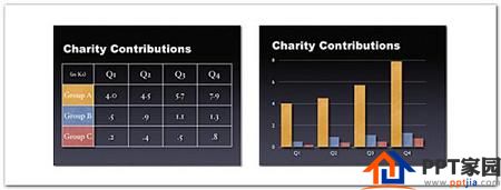
Generally speaking, tables are suitable for side-by-side comparison of data . However, the form lacks visceral punch. For example, if you want to show that your contribution is significantly greater than the other two, this is best shown in the form of a bar graph (below right). However, if you want to try to hide that your contribution is lower than everyone else's, the table can be presented in a safe, unassuming way.
Seventh丨Use good colors
Color can evoke emotions in people. Color is full of emotion. The right use of color can increase persuasion and motivation. Research shows that using color can increase interest in learning and enhance comprehension and memory.

You don't have to be an expert in color theory, But as a business person, it is good to know some color knowledge. Colors are divided into two categories: cool colors (such as blue, green) and warm colors (such as orange, red). Cool colors are best used as background colors since they appear to move away from us into the background. Warm colors, on the other hand, appear to be moving closer to us and are therefore often used as the color of objects in the foreground (such as text). Not surprisingly, then the most common color scheme for PowerPoint slides is a blue background with yellow text. You don't have to feel bad about using this color scheme, you can choose to use variations of those tints.
If you are in a dark room (such as lobby), then a dark background (dark blue, gray, etc.) with white or light text works well. But if you're presenting with most of the lights on in the room (highly recommended), then black or dark text on a white background works much better. In a well-lit room, a screen image with a dark background and light text tends to bloom, but a light background with dark text looks much better.
Eighth丨Choose a good font
You should choose fonts carefully as fonts can transmit subtleties Information. The same set of fonts should be used throughout the slide presentation, and no more than 2 complementary fonts (for example, Arial and Arial Bold). Make sure you understand the difference between Serif fonts (for example, Times New Roman) and Sans-Serif fonts (Helvetica or Arial). Serif fonts are used in text-heavy documents. Serif fonts are easier to read at smaller font sizes. However, when projecting on a screen, Serif fonts tend to be blurred due to the relatively low resolution of the projector. Sans-Serif fonts are usually the best fonts for PowerPoint presentations, but try to avoid Helvetica fonts that are everywhere. I often choose to use Gill Sans because it's a typeface that sits between Serif and Sans-Serif and is a professional, friendly "conversational" typeface. No matter which font you choose, make sure your text is legible.

Ninth丨Using video and audio
Use video and audio where appropriate. Using video clips to show concrete examples can speed up the active cognitive process, which is the natural way people learn. You can use video clips in PowerPoint without leaving the software or adjusting a video recorder. Using video clips not only better illustrate your point, but it can also create a change of pace in your presentation and keep your audience interested. You can also use audio clips (such as interview recordings). However, avoid embedding poor-quality sound effects (such as horn sounds or applause when switching slides) into your slides. Adding redundant sound effects to an animation can annoy viewers.

Tenth丨Take a moment to browse
According to the segmentation principle of multimedia learning theory, when the information is People understand it better when presented in small chunks or fragments. Close the normal view of the slideshow and open the browse view, you can see the logical flow of the presentation. In this view mode, you can decide whether to decompose a slide into 2-3 pieces, so that your presentation has a more natural logical flow and process, and you can also grasp the shape of the entire presentation according to the audience's point of view, You can also check for extraneous content that needs to be removed to enhance visual clarity and improve communication.
Conclusion丨To summarize, let's A quick recap of ten top tips for creating slideshows.
#1 丨Keep it simple
Second丨Use less bullets and text
Third, use less switching and building objects (animation )
Fourth 丨 Use high-quality pictures
Fifth, adopt a visual theme, but avoid Use PPT template
Sixth丨Appropriate use of charts
Seventh丨Use good colors
Eighth丨Choose a good font
Ninth丨Using video and audio
Tenth丨Take a moment to browse
All content, this exercise is done, you are in the PPT The design world can shine through the future!
Articles are uploaded by users and are for non-commercial browsing only. Posted by: Lomu, please indicate the source: https://www.daogebangong.com/en/articles/detail/What%20are%20the%20methods%20of%20making%20PPT%20slides.html
 支付宝扫一扫
评论列表(196条)
测试