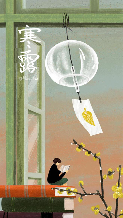
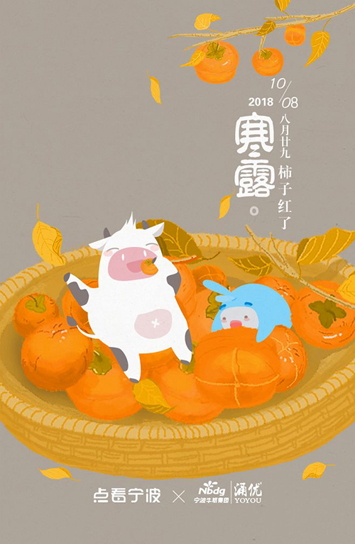
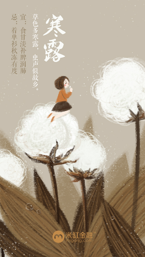
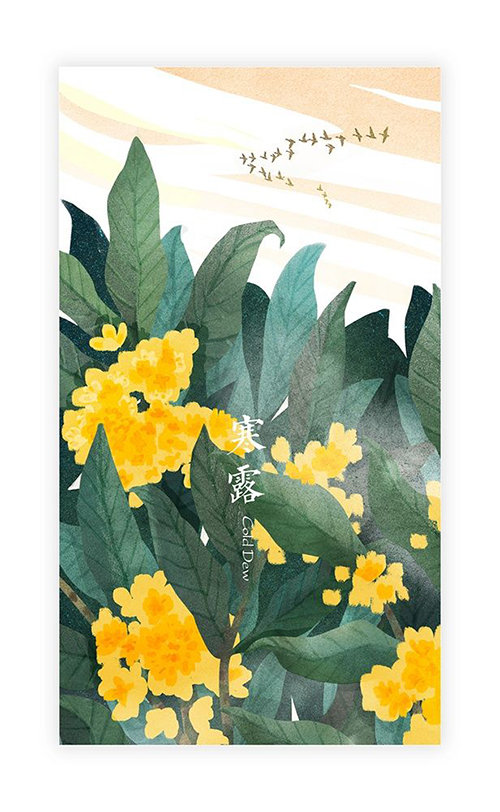
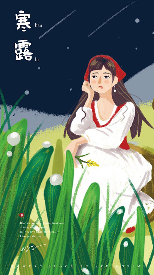
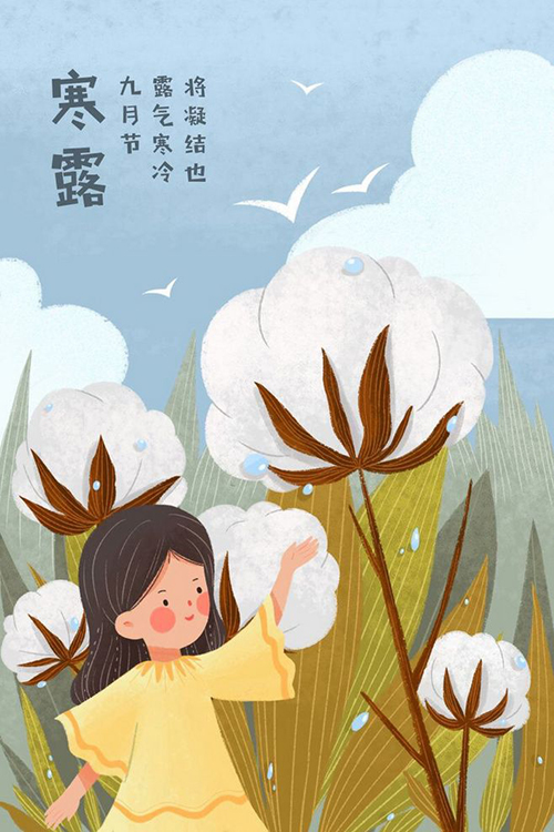
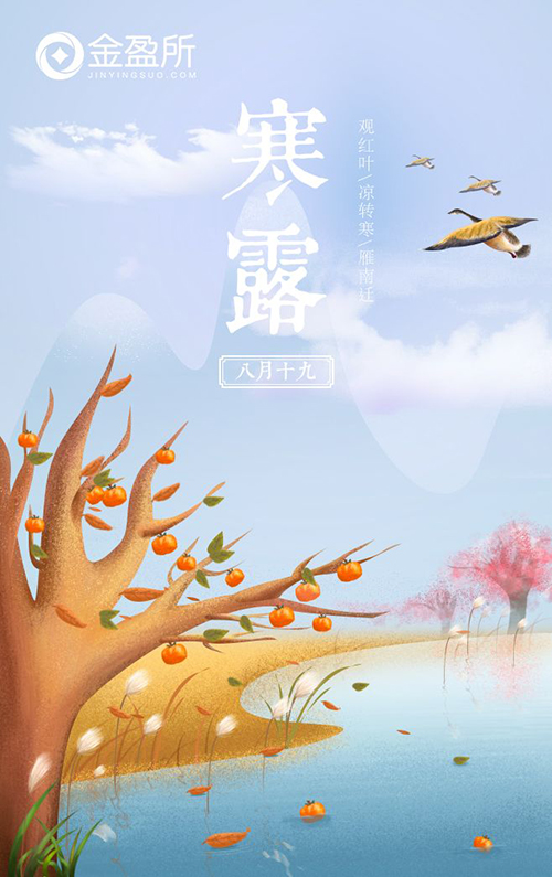
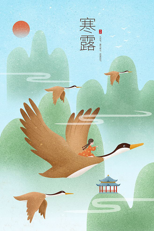
The seven-day National Day holiday just passed away without a sound, and the editor also lingered. Presumably, the designer was still rushing to draft after returning to the city last night. The cold dew splash screen design requested by the director was short of words. Compare the splash screen pictures of each company with yours, do you feel that the will is brighter than the past?
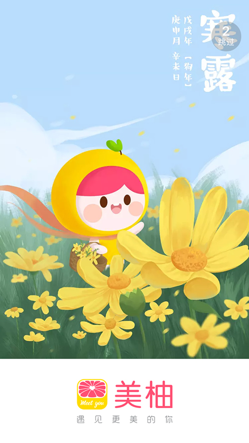
The font in the picture is similar: Hanyi wheat body
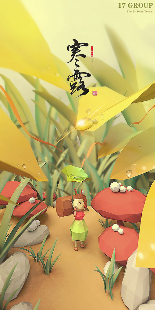
The font in the picture is handwritten, similar to: Hanyi Hanshi Bold Simplified

The font in the picture: Huakang POP1 font
The font in the picture is similar: Founder handwriting-Du Huitian Hard Pen Simplified

The font in the picture: Fangzheng Xiangli Simplified
The font in the picture: Ye Genyou Tekai Simplified
Font in the picture: Fangzheng Qingkai

The font in the picture: Cai Yunhan innocent doll calligraphy

The font in the picture: Huakang thin gold body
Font in the picture: Font Steward Fang Meng
The font in the picture: Kangxi Dictionary

The font in the picture is similar: Zikutang Qingkai

The font in the picture: square and thin circle
Note: All pictures in this article are from the Internet
Articles are uploaded by users and are for non-commercial browsing only. Posted by: Lomu, please indicate the source: https://www.daogebangong.com/en/articles/detail/What%20are%20the%20fonts%20that%20the%20designer%20of%20the%20Hanlu%20splash%20screen%20design%20is%20thinking%20about.html
 支付宝扫一扫
评论列表(196条)
测试