
Study set subscription number
Design dry goods to prevent water injection
Click to watch the video version


In design learning, learn more about relevant history, It allows us to gain new insights while understanding old things and old things, so as to add bricks and tiles to everyone's comprehensive ability. For this reason, we have specially developed a series of history course columns for designers. Before, I have told you about the history of Chinese characters and the history of modern Chinese calligraphy. Today, we may wish to further broaden our horizons and explore the development of Western fonts together.

We all know that the number of western fonts is very rich , and now has already exceeded the volume of tens of thousands. However, although there are many options, many people don’t care about the story behind the font, but even a seemingly simple font has many interesting details.

For Chinese characters, we can still know the general style of writing What about the evolution trajectory of Western languages? In fact, there are also many things that can be said about Western fonts.

As a professional designer, if you only know "Sans-serif" and "serif" are definitely not enough. In addition, we often hear Gothic, cursive, etc., what role do they play in the development of Western languages?

If we observe carefully, we will find that even For the same type of serif, we can also see many different characteristic points. What kind of relationship do they have with history?

For example, let's look at these three serifs In fact, the angle of their central axis has changed significantly, and these three fonts actually represent several different styles and historical periods of serif fonts.
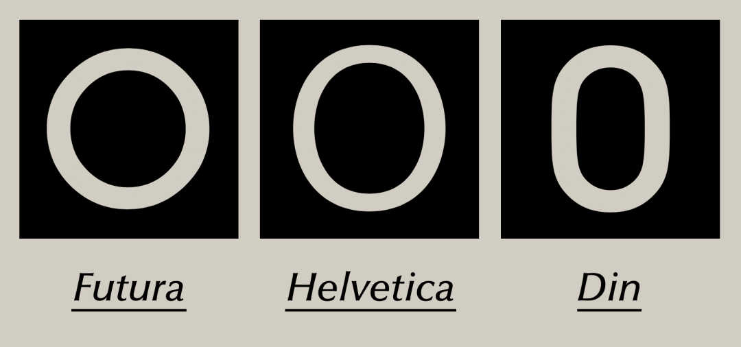
Uniquely, for sans serif fonts, this The three fonts with different appearance characteristics also represent an era or a style. If we can fully understand these changes in details, it will be much easier to control the design of various styles.

In addition, now when we choose a When using fonts, you can switch between uppercase and lowercase at will, but in history, there are actually uppercase first and then lowercase. It would be unprofessional if we misused lowercase when designing an image of a time period with only capital letters. Although there is no absolute right or wrong, making mistakes because of ignorance must be an amateur performance.

In addition to switching between uppercase and lowercase, many fonts are providing regular At the same time, it also provides Italian italic to enrich your typography choices. This slightly slanted font actually appeared as a separate font at first. Similarly, if we use Italian italics when we are working on a project with a background in which italics has not yet been born, it is easy to make a joke.

It is not difficult to see from the above examples that Whether we are doing typesetting work or brand design, we need to understand the history of some western fonts to make us appear more professional. In a small way, we can avoid many low-level mistakes. In a big way, it will make us The connotation of the design stands out. Therefore, it is necessary for us to learn more about Western fonts, and understanding these is equivalent to expanding our arsenal as designers.
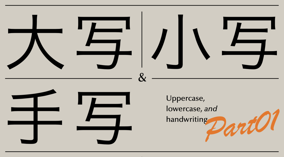
As mentioned earlier, in history, uppercase and lowercase letters in Western languages did not appear in pairs at the beginning. There is a sequential order of appearance.

The font type that appears first is called "Empire Capital ", which is an inscription font from the Roman Empire. Appeared around the first century BC. During this period, no lowercase letters appeared.

The representative of this type of font is "Trajan " font. We can see that it is not equipped with lowercase letters, which is also in line with the characteristics of the times.
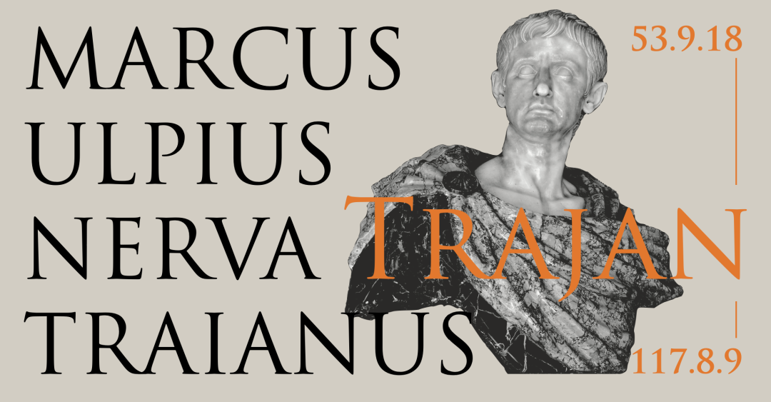
The name of the font "Trajan" is It comes from an ancient Roman emperor with the same name. Because the name is relatively long, we call him "Trajan" for short. Trajan made outstanding military exploits during his reign, and the territory of the Roman Empire reached its peak under his rule.

In order to commemorate the victory of this war, the Romans built a monument. And it is the inscription on the base of this 44-meter-high large column that has become the iconic text of "Empire Capital".

Later, the above words were reproduced as The "Trajan" font we see now. But we need to pay attention, this font is not carved directly on the stele.

For example, let's look at the letter "P ", it is done by three strokes. The craftsman has the shape of each character in mind, and then uses a flat-tip pen to draw them one by one in order, and finally carves them according to the drawn characters.
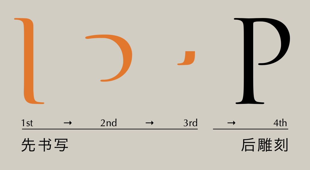
From this step we can know that although the imperial capital It looks simple and elegant, but it is not a purely engraved character. In fact, observing the details of the strokes, you can see many characteristics that can only be formed by writing.
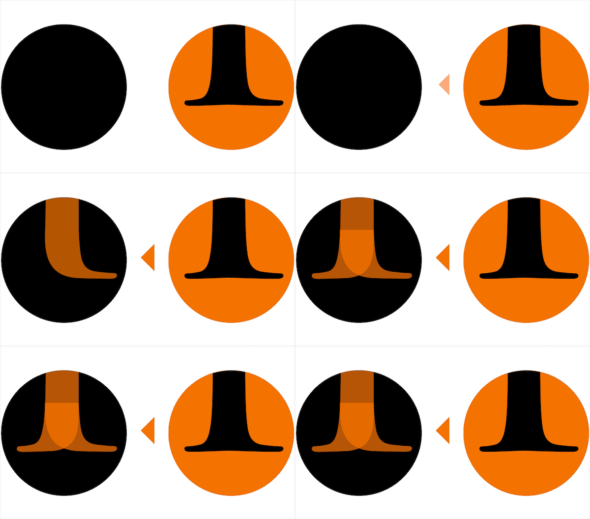
For example, if we reverse the process of serif formation here, it is because of writing that a small groove is formed, and this kind of belt Serifs with small grooves are also one of the characteristics of this type of font.

When it comes to writing, we can go back to the preface of the article The problem of the central axis of the letter mentioned in the article. In fact, the different angles of the central axis are also caused by writing.

For example, the letter O, it is written with a flat pen Written in two strokes. Different pen tip angles will lead to the thinnest part of the stroke, that is, the position of the starting pen and the pen down position are different. For example, when the pen tip angle is changed to 90 degrees, the thinnest part may be in the middle, but it is basically invisible. It's just the font that starts at this position.

The writer only needs to choose according to the style of imperial capital A suitable tool draws two arcs in sequence, so that a complete letter O is completed, and so on for the other letters. Therefore, the angle of the axis is closely related to the angle of the pen tip when writing.
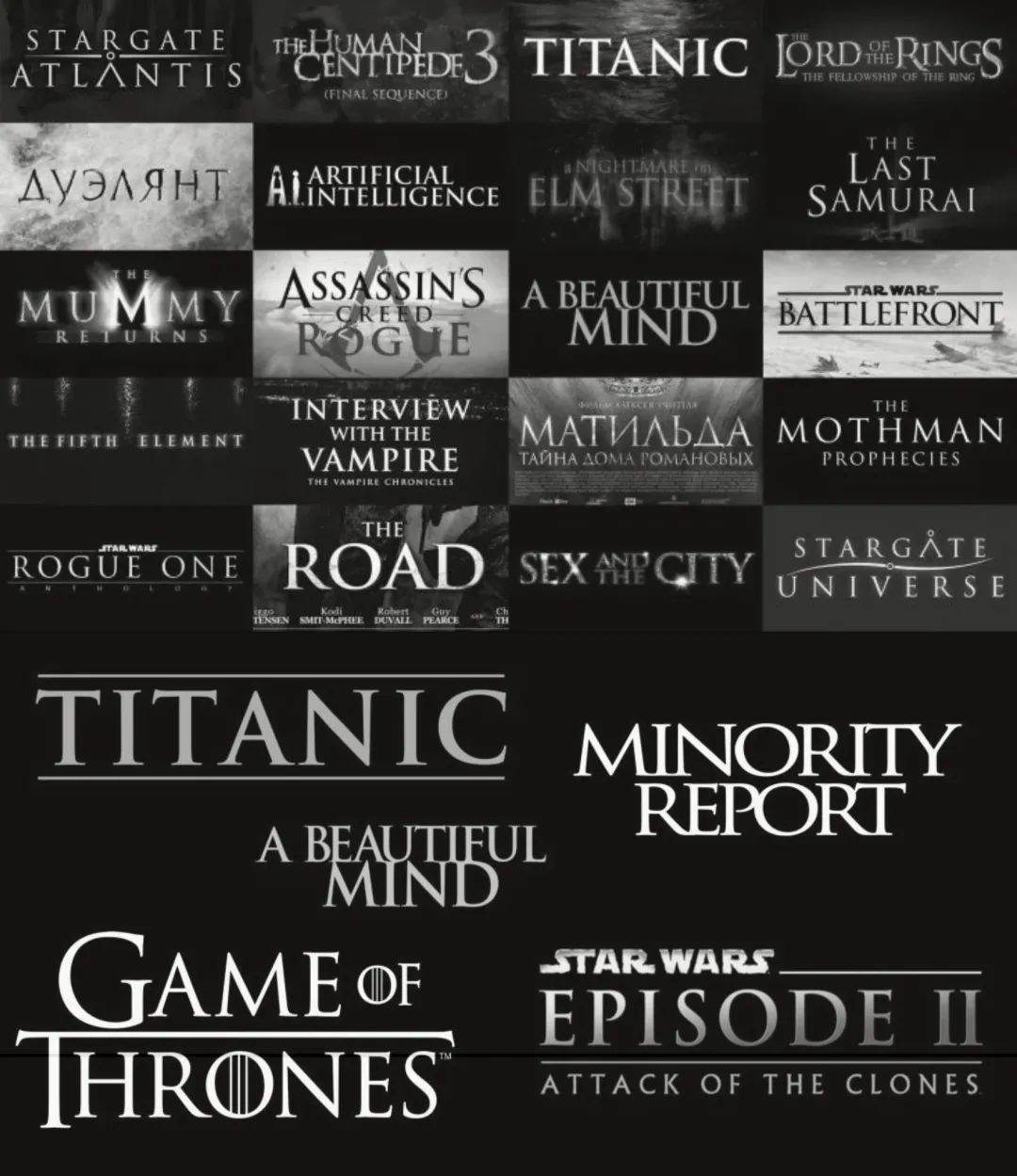
Talking back to Trajan, this font is really It is a font that is very popular in the movie and game industry. As long as the background of the theme is a little old, has an epic flavor, or the theme is a bit grander, it is basically difficult to go wrong with this font. For example, here are the familiar "Titanic", "Game of Thrones", "Assassin's Creed" and so on.

There is also a MOBA electronic sports game "DOTA2 "It is also the prototype that uses "Trajan" as the standard word of the Logo. Extracting the logo and comparing the original font, we can find that the logo of "DOTA2" here is almost exactly the same as Trajan, only some personalized modifications have been made in the place of the letter "A".

So, whether to choose the font of this period style You must be careful with lowercase letters. For example, although the "Stempel Schneidler" font is designed with lowercase letters, it actually belongs to the font of this era. This is what we need to pay attention to when designing applications.

After talking about uppercase, let's talk about lowercase birth. Carolingian lowercase is a font composed entirely of lowercase letters. At this time, the time has come to the 8th century AD.

We can see that, except some letters are not the same as the lowercase letters we are familiar with now, the others are almost the same . It can be said that Caroline lowercase itself has a unique retro charm.

Charles the Great is the king of the Carolingian dynasty in the Frankish Kingdom . He greatly expanded his territory, unified the Germanic ministries, and was crowned by the Pope as Emperor of Western Rome, changing from king to emperor. Charlemagne called together scholars from all over Europe to revitalize academic literature and art while unifying the centralized power and maintaining the legal system. This period of cultural prosperity is known by historians as the "Carolingian Renaissance".
Charles the Great called the eminent monk Alcuin from York and promoted him to Abbot of Saint-Martin in Tours. Alcuin opened a copying room in the monastery and began to develop new typefaces.

Actually, before Carolingian lowercase Some lowercase letters appeared, such as the semi-uncial script developed from the uncial script of the late Roman era. Alcuin continued to improve on the basis of the semi-Ancial body.

In the end Alcuin developed a brand new font , which is Carolingian lowercase. At this point, the lowercase letters are very close to what we use now.

Today, the application of Carolingian lowercase is actually It is rare, and related font products are also rare. This "Carolina" is one of the few replica fonts.
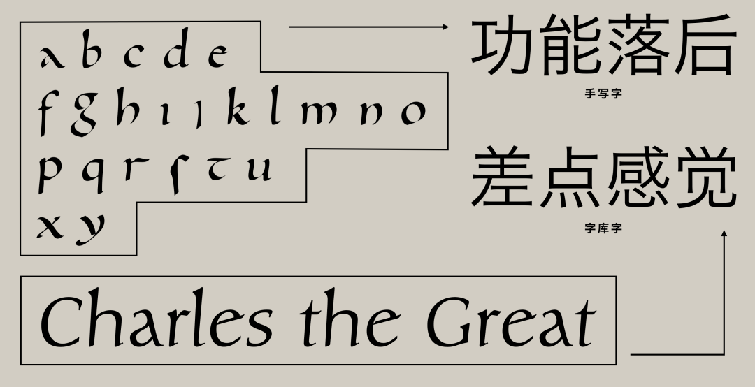
Maybe a handwritten version of Carolingian lowercase, put Up to now, the functionality has been relatively backward, and the font library products have neither the taste of the past after all, nor are they modern enough, and they appear ambiguous. That's probably why it's so rare these days. However, Carolingian lowercase actually has many subsequent changes.

Let's turn the time to the 14th century, when The familiar Italian italic was born. Of course, the Italian italic we are talking about here also belongs to a separate font, or a specific style of writing. It is not a family member in various font products now.

Now we know that Empire capitals determine capital letters The writing standard has been used until now. But Carolingian lowercase, while very close, is still not quite the same.
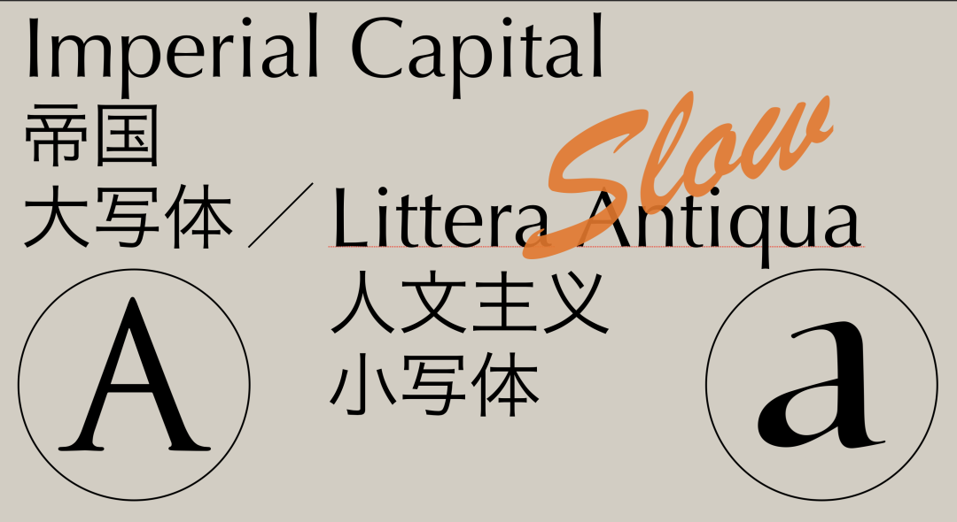
So it has further developed to the humanistic lowercase, The clear cursive script established the basic structure of lowercase letters, defined the shape of handwritten and printed characters, and complemented the Renaissance movement of the time. However, after all, it was further modified because the writing speed was too slow.

In the end, Italian italic was born in this context , invented by Nicolae Nicoli, saves time and effort, and is also made official by the papal court. The history of human laziness is always so strikingly similar, and our regular script and running script are also called experts.

If you just look at the word "italic", you always feel There is nothing wrong with calling italic, but we are more accustomed to calling it "Italian italic". The reason is that all the letters are slightly inclined, which is the first major feature of this book.
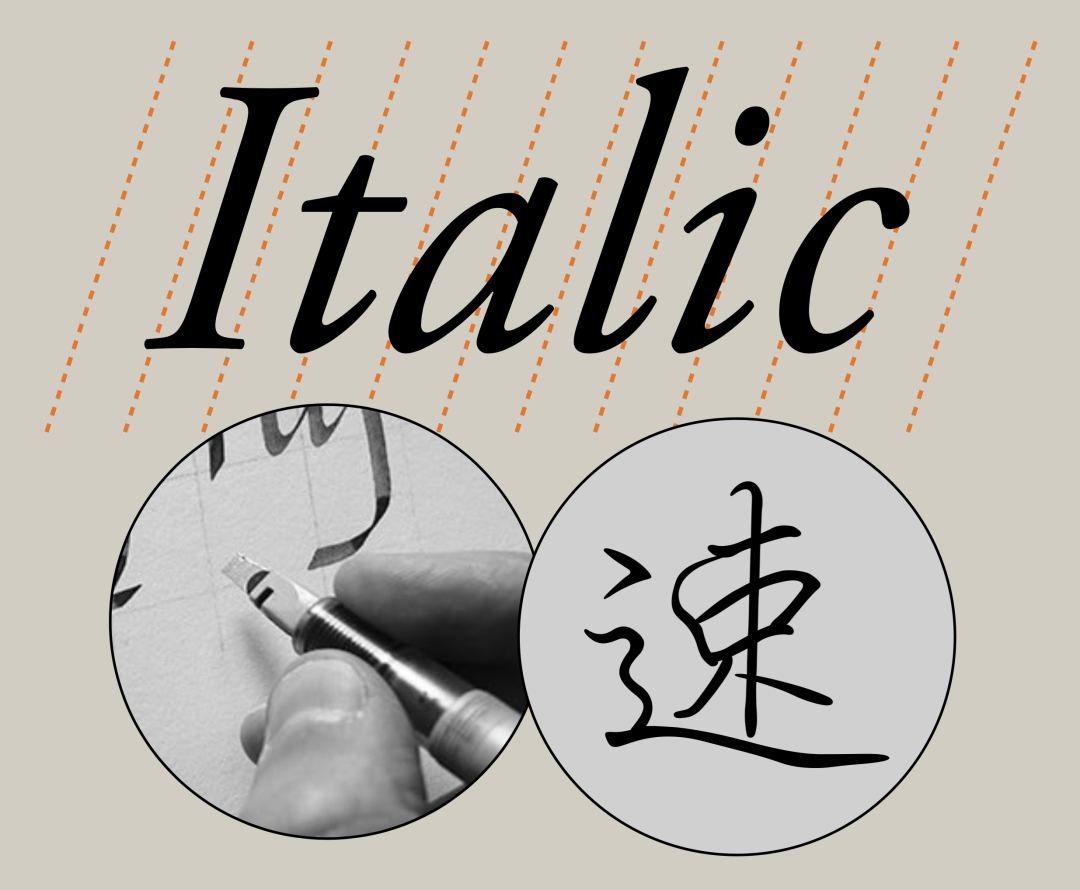
The reason is not difficult to find, when we When writing, in order to pursue speed, this kind of inclination is bound to occur, not only in Western characters, but in fact, Chinese characters are also the same, except that the strokes of Chinese characters are slanted upwards, but not structurally.
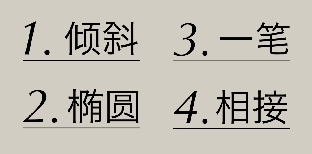
In addition to the right slant, there are several other Italian italics an obvious feature. Their keywords are: ellipse, stroke, and connection.

Let's talk about "ellipse" first, through the routine in the figure From the comparison between the font and the Italian font, we can see that the original circular strokes in the letters tend to be oval under the Italian italic font.
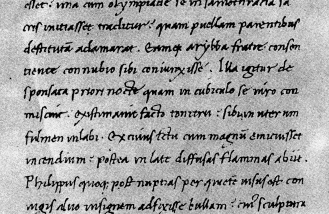
As for "one stroke" and "connection", Let's put it together. Looking at this Italian manuscript, it is not difficult to find that many letters can be written with one stroke for the convenience of sketching, and many letters are also connected with consecutive strokes.
Understand the origin and characteristics of Italian font, and distinguish the common font families now Italic and Oblique just got easier.
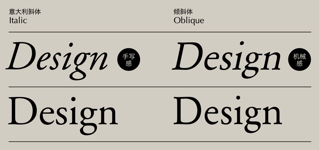
For the convenience of vertical comparison, we can take them out respective regular bodies. First of all, we can see that although both types of italics have the characteristics of a slight slant to the right, Italian italics naturally has a handwriting feel due to birth reasons, while ordinary italics just mechanically slant the text. It can be said that one kind of inclination is natural, and the other is forcibly added.

Looking vertically, we find that the same The Italian italics in the typeface appear to have thinner strokes than the conventional one, and the length of the overall printed text group will be shorter. It is not difficult to imagine that if Italian font is suddenly used in a body of regular font, it will be very eye-catching.

Compared with the normal oblique body, There is no change in the thickness of the strokes, and the length is basically the same. After all, this is simply a slanted treatment of the words.
The application of Italian italics in design is very rich, we can Let’s briefly talk about it from two aspects. First, let’s look at the application cases.

Italian italics is now a member of the font family, in The frequency of appearance in the design is still very high. It is difficult for us to say that Italian italic is used out of a certain temperament, because there are too many fonts containing Italian italic, so it is impossible to find out the rules of style. Rather, the application of Italian italics in design first enriches the family system of various font products.
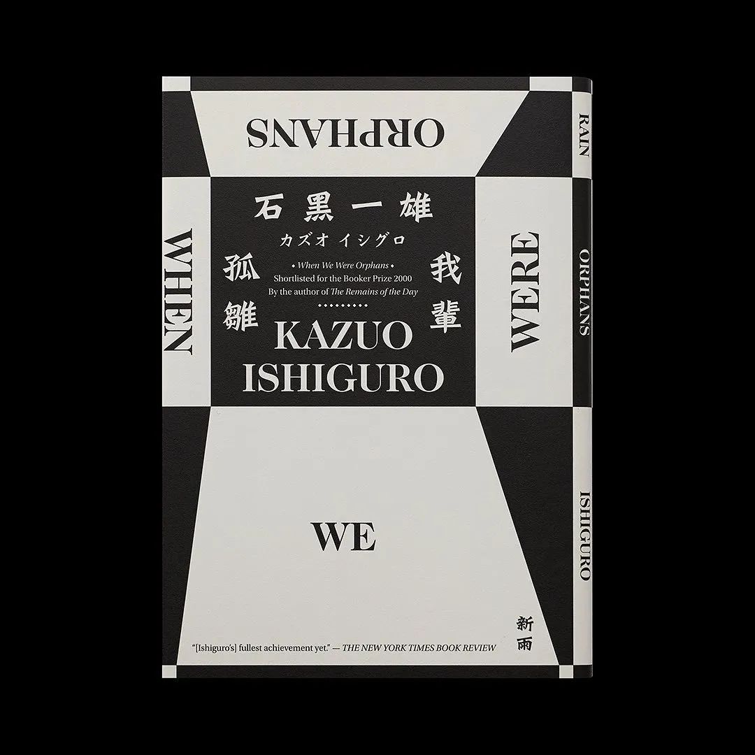


? Swipe left to view case details
Of course, Italian fonts do have some magical effects in design For example, when arranging text, the use of Italian typeface can produce rhythmic changes with the regular typeface without changing the font size, weight, and color to achieve a contrasting effect. Making good use of it can make the layout more layered, and without breaking unity.
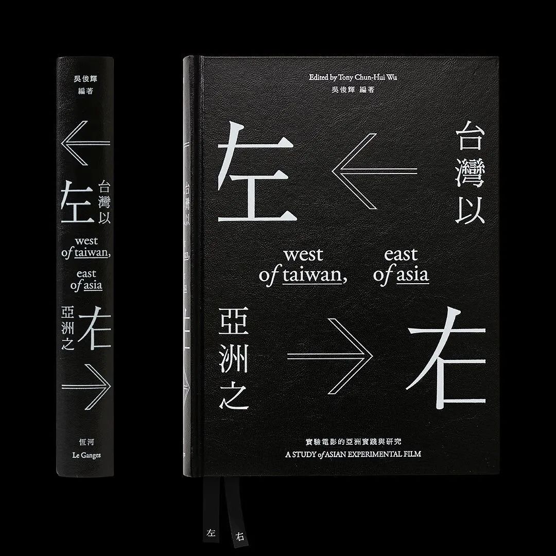

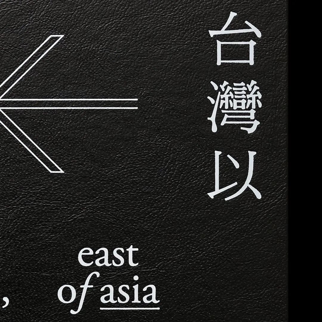
? Swipe left to view case details
In addition, we can also see Many excellent works, when faced with some words such as "of", "the", and "a" that appear in short sentences, often replace these words with Italian italics to distinguish them from other words with more practical meaning. In fact, the effect of contrast is also used here.
In addition to the application in design, for Italian italics, we also need to know When it needs to be used in English layout is also very important to us as designers. If we talk about an active beautification mentioned above, then what we will talk about next is a basic requirement.
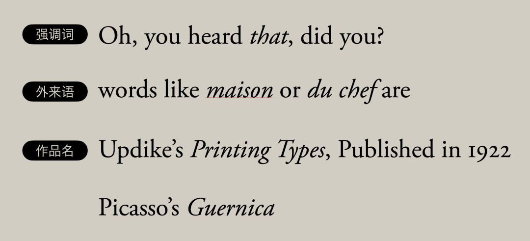
We need to know that Italian fonts are in English, usually It will be used when expressing emphasis, marking foreign words, and expressing the title of a work. If you encounter these situations in your work, you must pay more attention. Of course, we are not a big English class after all, so let’s stop at this part.

Let us go back to the river of history, the front Having said that, italic was once favored for its ease of writing quickly. Later, people also made printed matter by engraving the writing norms of Italian script through copper plates. The pointed engraving knife for engraving copper plates has a narrower tip than the pen tip and a larger inclination angle, which gave birth to a new writing style.

It is the copper plate flower decoration body, from the perspective of birth factors , it is a writing style that was born out of printing.

The fundamental innovation of the copperplate curlicue is to put all the It is a practical writing style that is very easy to write quickly, so it has become popular all of a sudden, especially in business activities, and has gained a good reputation.

At the same time, this artistic font is also It suddenly won the favor of the upper class at that time, and was widely used in private letters and business contacts. Eventually copper curlicue replaced humanist writing systems including italic.

Even now, the application rate of copper plate flower decoration is very high Tall fonts, we can often see this font in invitations or menus. If you want to reflect the elegant temperament, it can be said that one can use one.
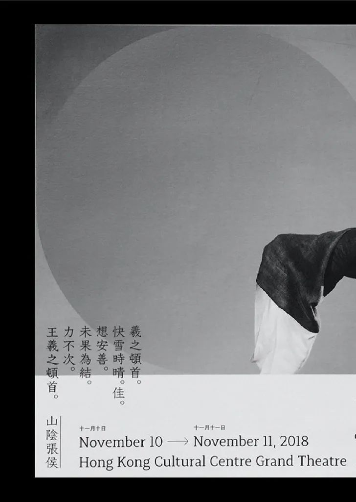
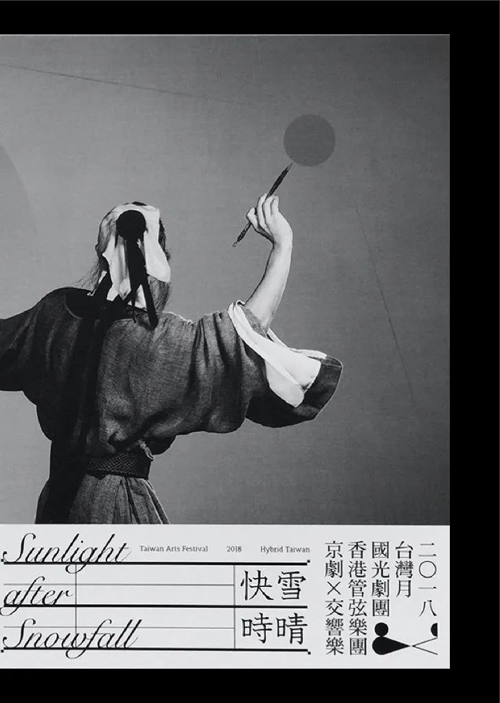


? Swipe left to view case details
It is not limited to handwriting, font products with copperplate cursive It is also very rich. For example, this Snell roundhand is one of the classics, and it can also be seen in the design works of masters.


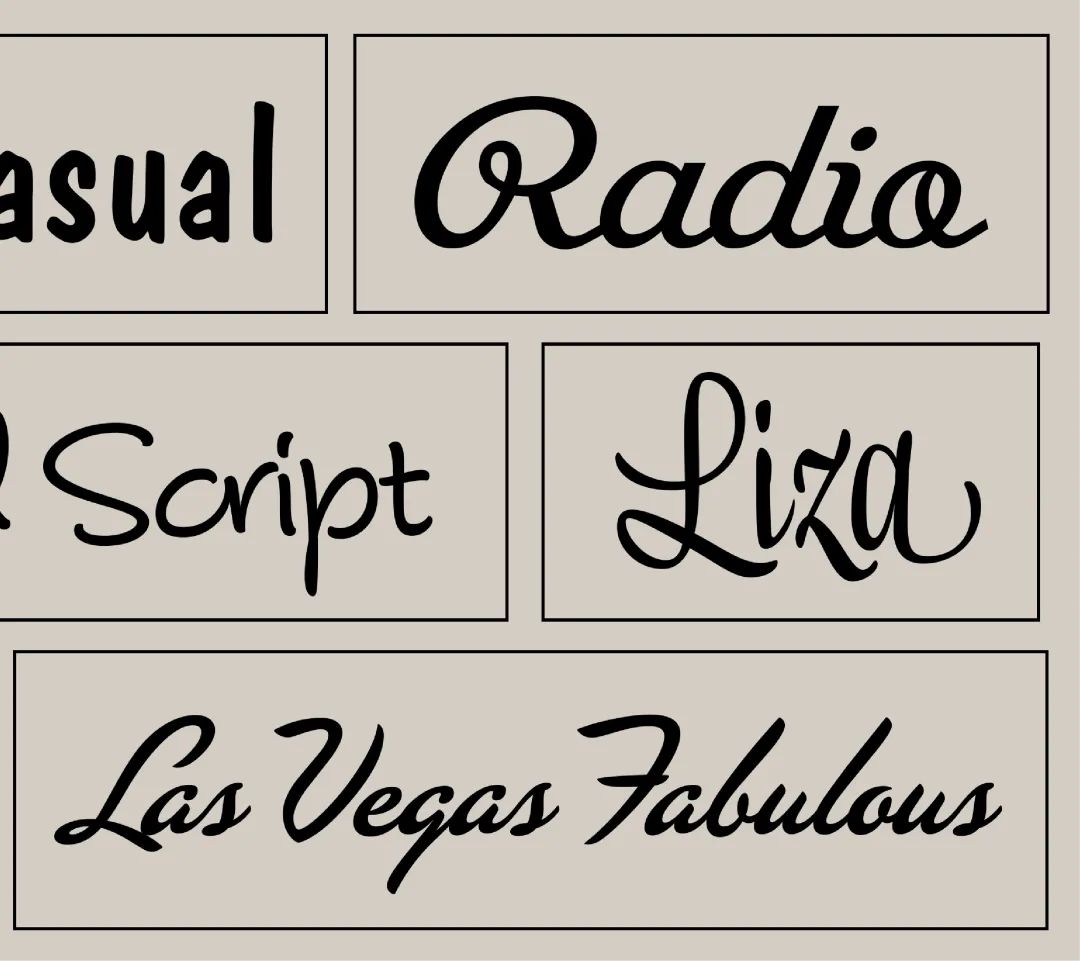
? Swipe left to view handwriting cases
Of course, when it comes to handwriting or cursive, in fact There are many, many more in the entire history of Western language development. Due to space constraints, we cannot go into detail here. If you are interested, you can also write a separate article on handwriting.
Careful students must still remember that we mentioned earlier that Carlo Lin lowercase has many developments in history, so the humanistic lowercase and Italian italic are just a branch of it. Then in the next chapter, let us unlock another way of adding dots to Carolingian lowercase. That is the familiar Gothic font.

The name of Gothic font is quite complicated, and there are also some in China Called Gothic, these are all transliterations of Gothic. In addition, this type of font will be collectively referred to as Black letter.

So we must first be clear, when seeing or listening When it comes to Gothic, most of the cases should refer to the writing font on the left that originated in the 13th century, but in Japan and Korea, Gothic means that it actually represents sans serif or bold .
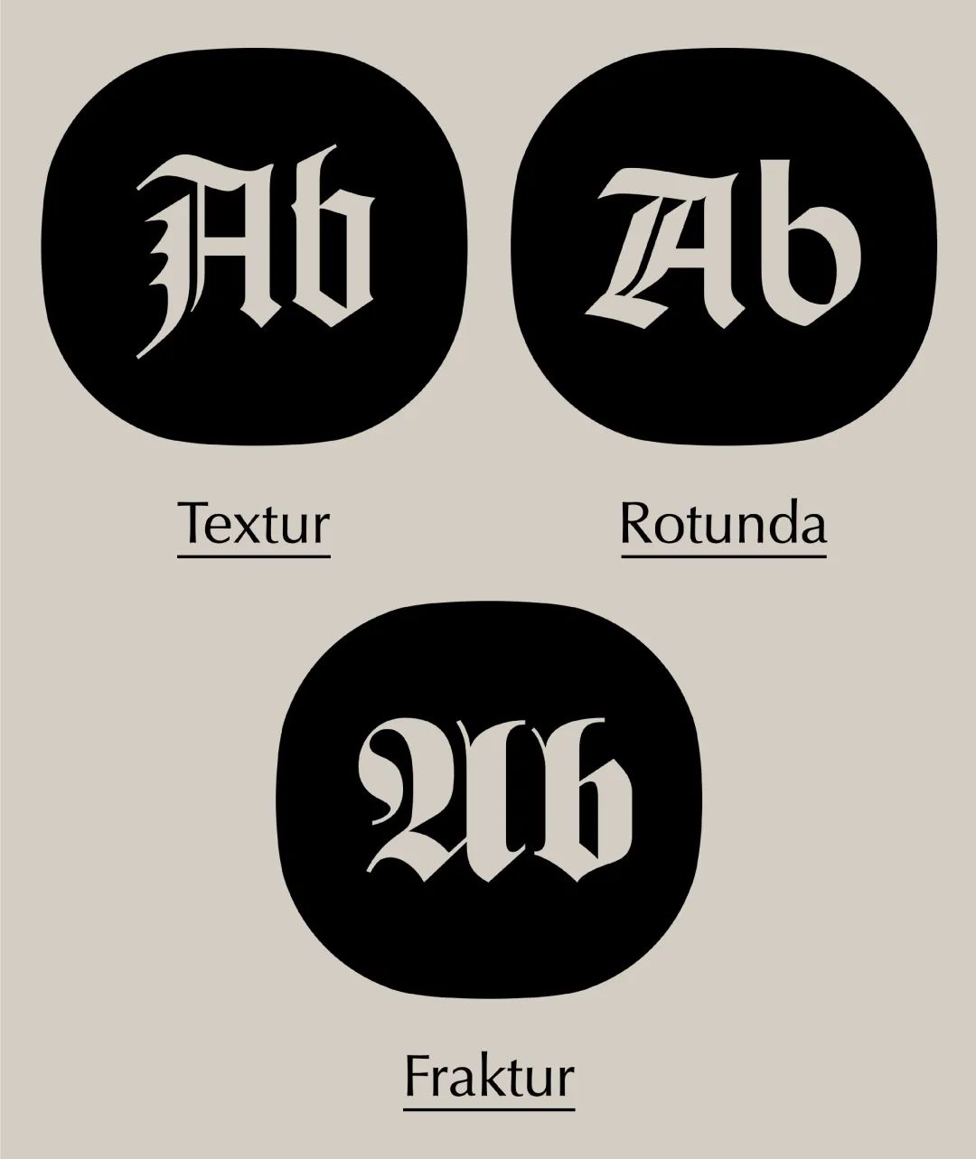
Except for the early Gothic font that has not yet been developed, and The later sketch forms, Gothic can generally be divided into three types: Textur, Rotunda, and Fraktur, each of which has its own distinctive characteristics.

First of all, let's look at the first type, Textur's literal It means plain weave, uniform thread size cloth. Indeed, the typeface gives the impression of being as neat as the warp threads on a loom. Just looking at the display fonts here may not have a deep feeling.

But when we see that this book uses the Textur font "Forty-two Lines Bible", the feeling will be more profound. This is a metal movable type printed by Johannes Gutenberg based on the Textur script written by the scribes at that time, and the "Forty-two Lines Bible" made with this movable type has become a printed matter produced by Gutenberg synonymous with.
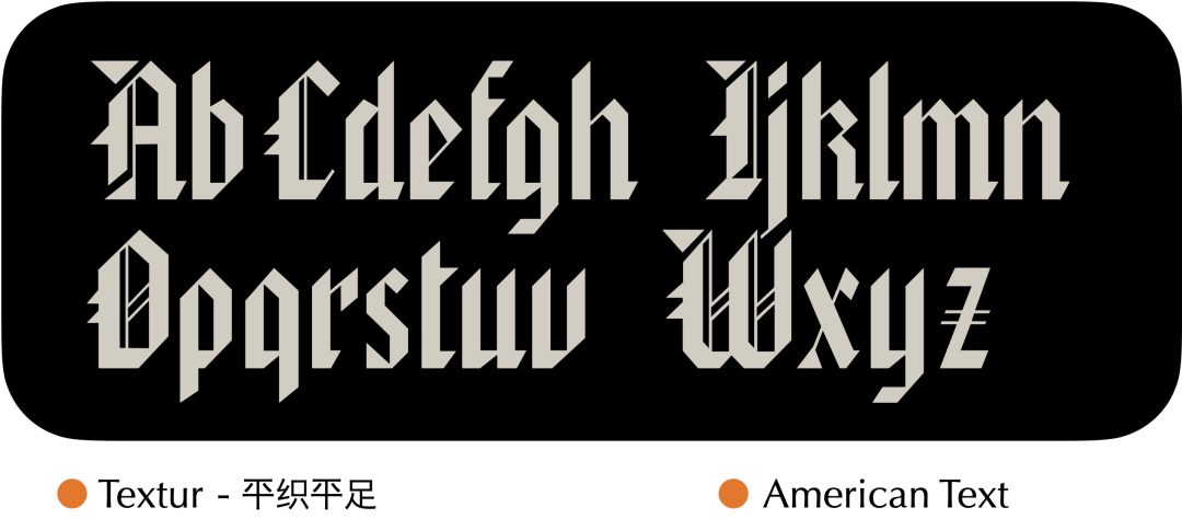
Textur also has another flat footed style, As the name suggests, the previous letter bodies and descenders were diamond-shaped, but this style is cut flat. Other than that, the overall style is not much different. The feeling presented by the display font here is more geometric.

And this book was written between 1325 and 1335 "Ruterer Psalter", the font in it is a typical plain weave flat foot. It is not difficult to see that, as a writing script, the plain-woven flatfoot looks very neat and beautiful. However, the relative difficulty and time-consuming of writing will also increase, so in the late Gothic period, its usage rate began to decrease, and it was only used for larger and important books. until the invention of printing.
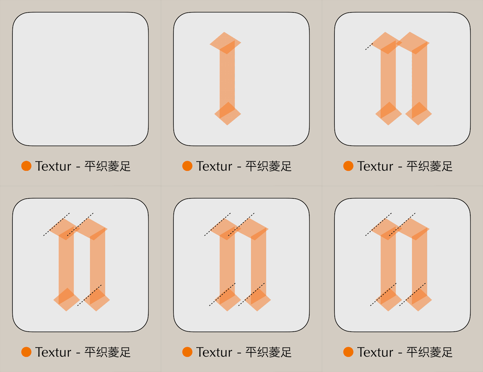
We can simply look at the two styles How the font is written. When writing, keep the correct stroke order, which is basically consistent with the angle of the pen tip.
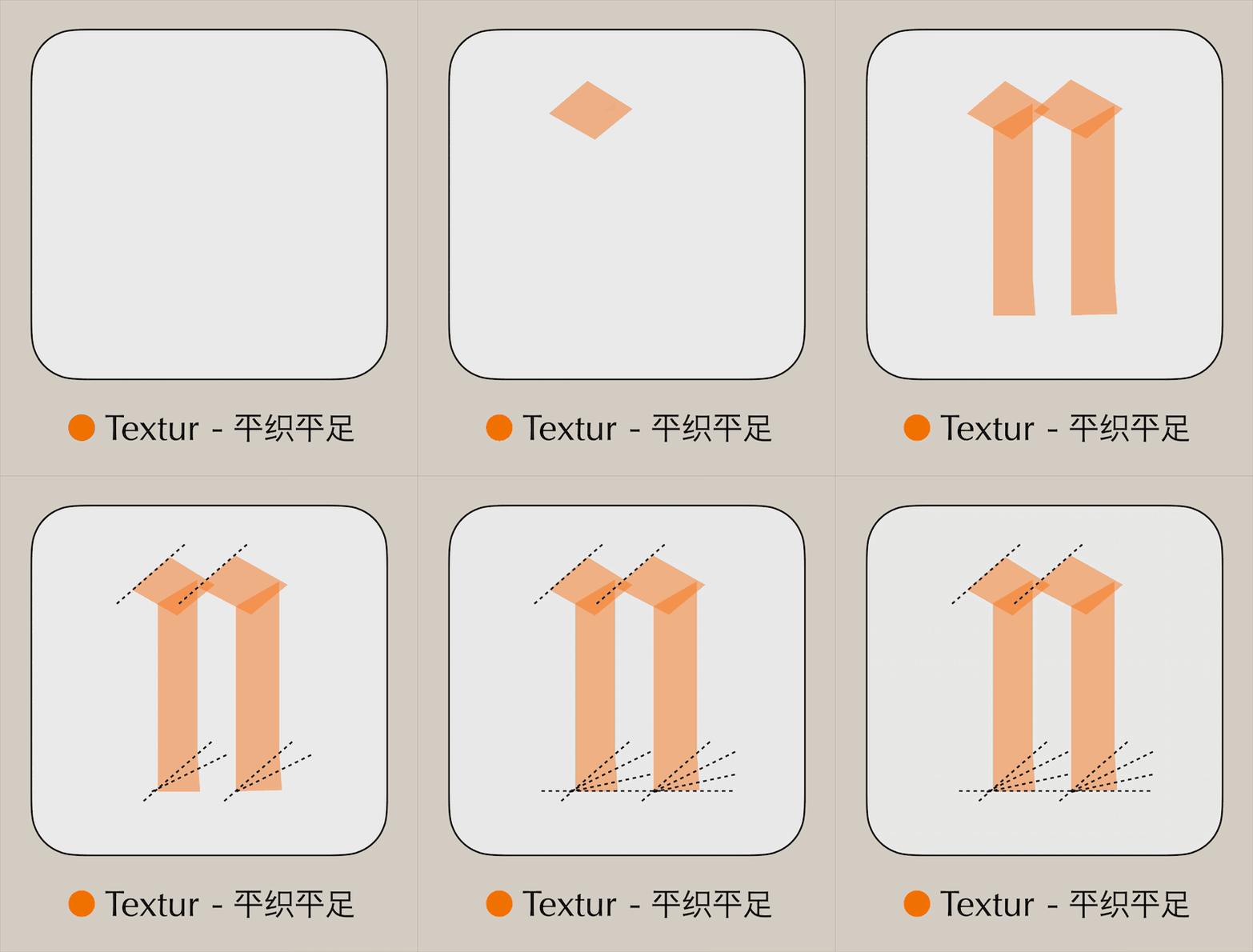
However, when writing plain woven flat feet, for To write flat feet naturally, the tip of the pen will gradually change its angle at the end of the stroke until it is flat, so the end of the stroke will become slightly thicker. Of course, the method of writing flat feet is not limited to this one, so we will not introduce more here.
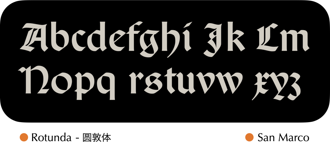
Then look at the second type - Rotunda, this The class font is equivalent to simplifying Textur and turning the strokes into circles, so it is also called round Gothic, which was very popular in Italy at that time. It is not difficult to see that its ascenders and descenders are short, and the word width is slightly wider.
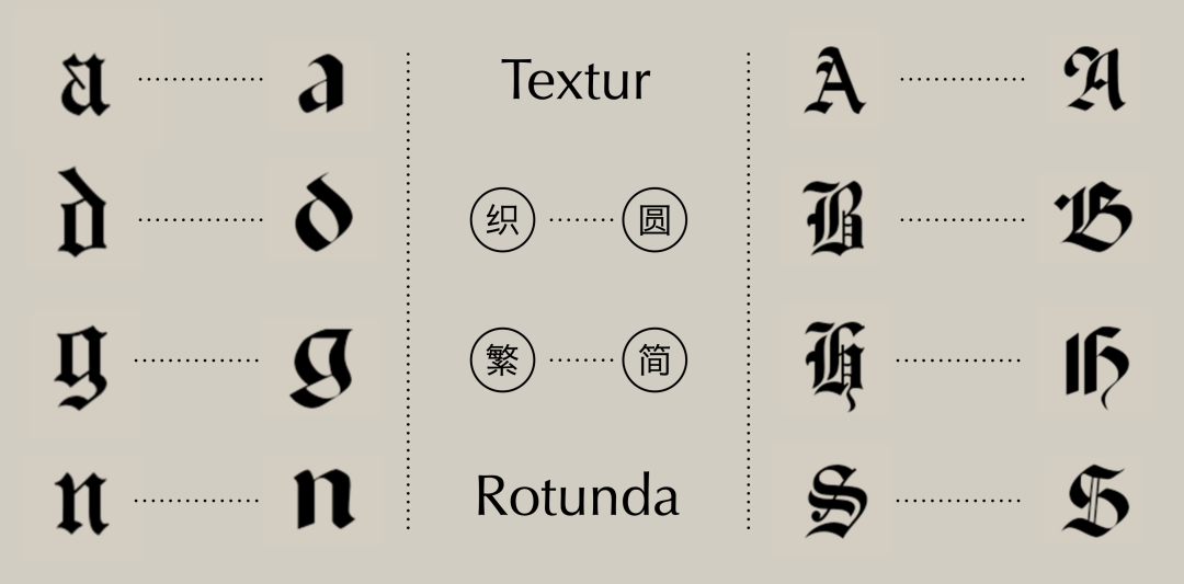
Through a simple comparison, it is more convenient to see Considering the differences between them, from Textur to Rotunda, whether it is capital letters or small letters, many stroke details have been omitted. If the former feels more solemn and formal, then the latter is relatively relaxed.
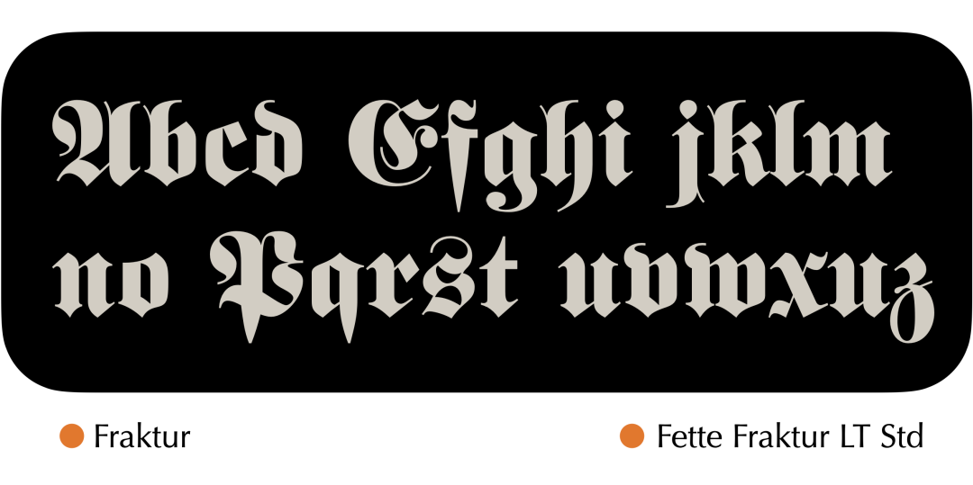
The third Gothic type is Fraktur. This type of font differs from Textur, which has all vertical strokes, in that its strokes are characterized by rounding on one side and vertical on the other.
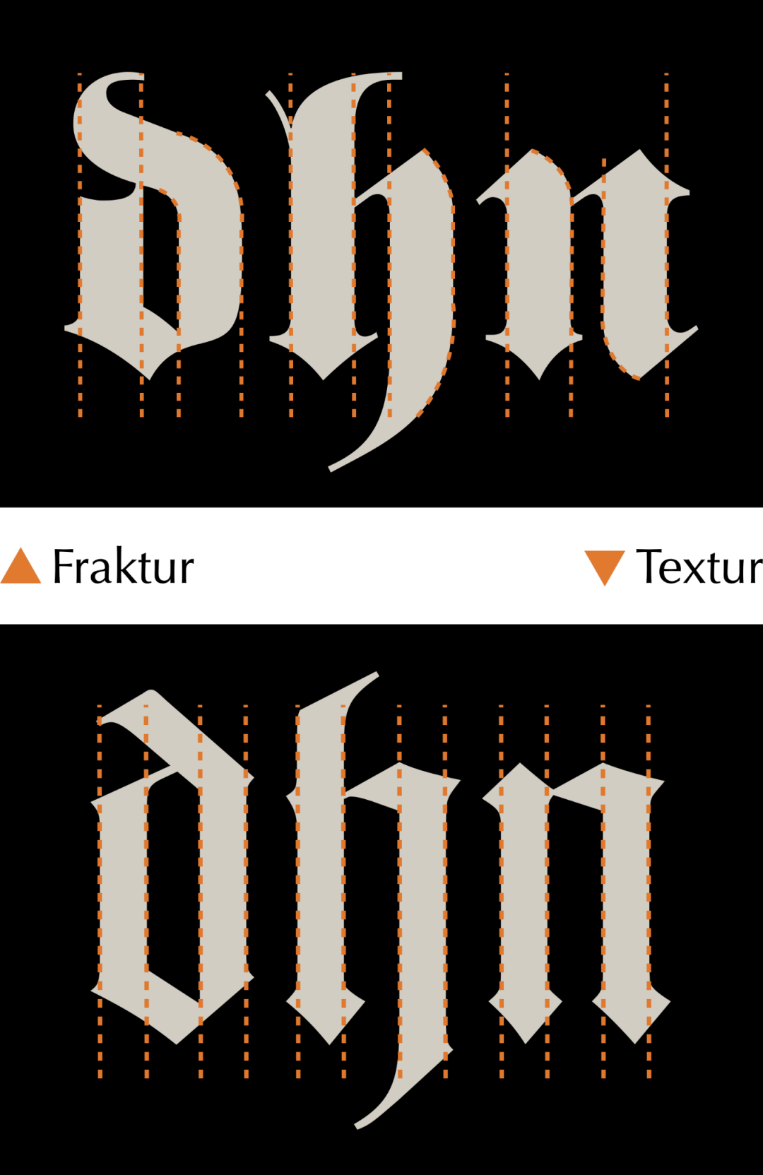
For example, here we use two fonts with corresponding styles , Comparing the three letters d, h, and n, you can find the difference between straight and straight changes at once.

It is also worth mentioning that, in addition to the In addition to the three types of Gothic, there is actually a Gothic that was born for sketching, which is the Bastad font we see now.
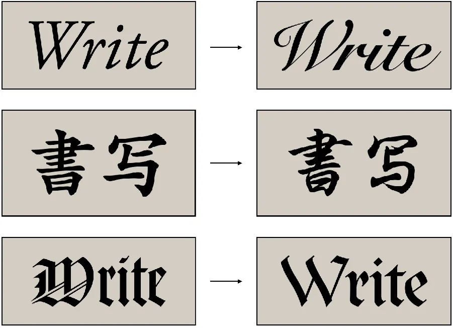
From the previous Italian body to the copper plate flower body, from From regular script to Xingkai, and then to the Bastard font here, it is not difficult to find that in the context of handwriting, the more formal a writing style is, the easier it is to generate a corresponding sketch font to achieve high efficiency. handwritten purpose.
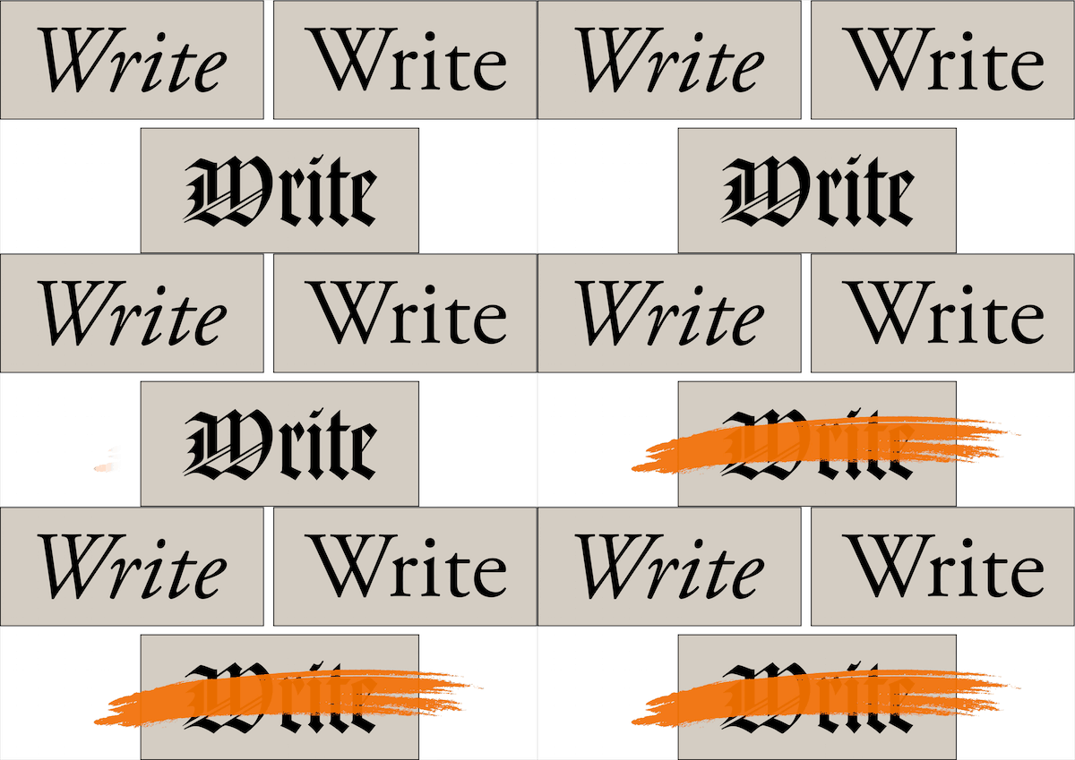
Let's talk about Gothic again, Gothic after the 15th century Font was gradually replaced by Roman font and Italian font, and did not become a mainstream font. Fortunately, Gothic did not disappear. In Germany, it was used as the standard font for text until the middle of the 20th century. And as a type of Western calligraphy, we can still see that the Gothic script maintains an active vitality.


? Swipe left to view case details
In modern design, there is also no lack of Gothic figure. The most common, of course, is in the packaging of various alcoholic beverages. We know that many types of wine were born in Europe, and it is easy to create the atmosphere of the packaging by using the characteristics of the Gothic body itself.
Using appropriate text in the design is easy to give people a product that is very orthodox I feel that in addition to using Western languages for wine products here, you can also add some Japanese to the packaging of beauty products, or use some Korean in cosmetic and plastic surgery advertisements, all of which are the same.

In addition, we can also deeply feel Western fonts have brought many new possibilities to the design of Chinese characters, which is what we often hear "Western Chinese use".


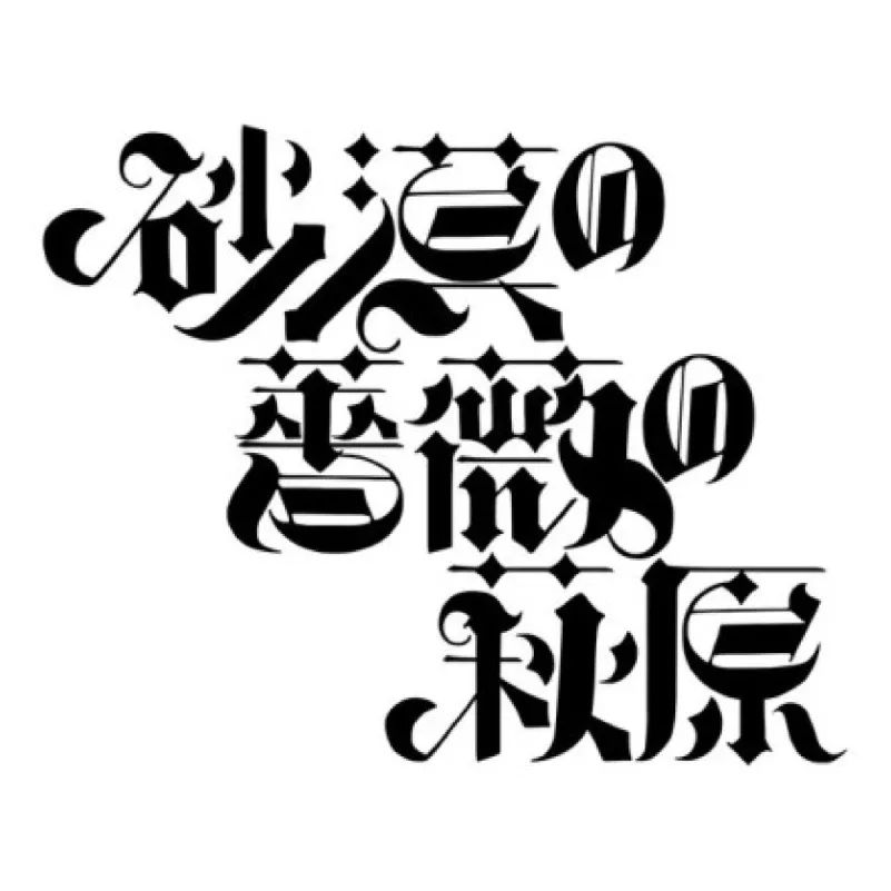
? Swipe left to view case studies in Western and Chinese
For example, according to some stroke characteristics of Gothic font, And the basic structure of Chinese characters, we can get a unique font similar to the one in the picture. Next, we can also try it according to this feeling.

Let's first draw a Gothic that suits our wishes Body draft, here you can choose your favorite style.

Of course, if you want to write Western fonts, you can also You need to bring your own dedicated flat-tip pen. Believe me, owning this pen opens up a whole new world of doors.

Come back to business, it is more suitable to choose one in the draft In this process, we need to make sure that our strokes are set uniformly, and we cannot completely follow our own writing manuscripts, after all, the writing will not be completely consistent.
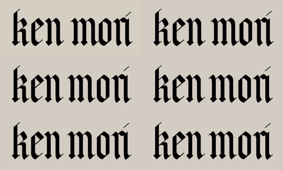
Adjust the word spacing again, and the English part is complete . Next, we can design Chinese characters according to the characteristics of the Gothic font drawn here. You can also use pen and paper to make a draft first.

When drawing, pay attention to keeping certain English features Matching degree, good unity should also be maintained between Chinese characters. Of course, it doesn't have to be exactly the same. Sometimes the more restrictions there are, the harder it is to have unexpected wonderful performances.

Finally combine Chinese and English together, a simple In Western languages, it is completed with a case, which can be said to be simple and full of decorative effects. For this type of font, we can completely apply it to scenes such as brand logos or event posters. If you are also bored with common fonts, you might as well try it yourself.
Okay, this time the history of Western fonts This is the end of the article. Today we mainly talked about the birth of uppercase and lowercase in Western fonts, as well as some fonts such as Italian, Copperplate, and Gothic that originated in the era of handwriting. Then next time, I will further introduce the evolution of serif and sans-serif in the printing era, as well as a detailed introduction to the types. Interested students may wish to keep paying attention, then we will see you next time, bye!
The reference materials for this article are as follows:
"Western Fonts" by Akira Kobayashi
"Roman, Italic, and Sans-serif——The Formation of Western Typefaces" by Kinichi Imada
The Art of Western Calligraphy by David Harris


Guide to previous tutorials:


Since the WeChat official account has changed the push mechanism, tweets are no longer pushed according to the timeline. In order to watch our tutorials and articles in time in the future, see Remember to click "Looking" after finishing the article. If you like our articles, this will be our greatest encouragement and support.
Articles are uploaded by users and are for non-commercial browsing only. Posted by: Lomu, please indicate the source: https://www.daogebangong.com/en/articles/detail/What%20about%20Western%20fonts%20How%20to%20use%20it%20Part%201.html

 支付宝扫一扫
评论列表(196条)
测试