There is no focus hereDesign
There will beuseless and interestinglittle things
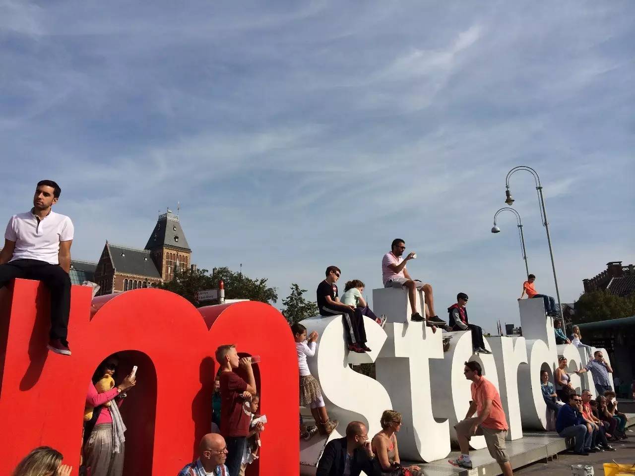
Picture: I went to Amsterdam for the first time in autumn and took a break in the square between the Rijksmuseum and the Van Gogh Museum
People naturally love words
When in Eminem
People from all over the world look at these giant letters
I don’t know what to do, and I climb up one after another...
Make the letters cute and beautiful
is a difficult thing
And in Asians
The Japanese are probably the best at the meticulous design of Western letters
This kind of thinking has also spread to Hong Kong and Taiwan
So if you see the design bookshelf in their bookstore
Design Considerations for Western Fonts
Must be an important part
Of course there are many books in this area
So from this topic
Extract some similar and interesting points
I believe these points can also be used in daily design
If so
We are going to kill some
Ugly slides and posters contributed
Greatness in the present age and benefit in the future!
01
Solemn and serious
Sometimes it is more official to design an event poster and tagline
It should be a bit majestic and "unattainable"
About this point, our way of investigation is rather earthy
Just to see the faces of those luxury goods
You will find that some brands will give you a natural feeling of looking great
For example, the letters of LV are different from those of UNIQLO and H&M
LV's trademark looks like this
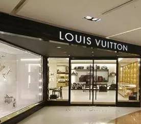
Picture: A certain LV store in Qingdao
Then I cut out the font Futura Medium to which LV belongs
The arrangement looks like
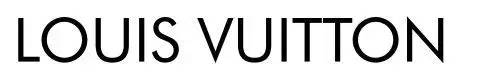
Hey, it doesn't feel right, it doesn't look like... Carefully observe the LV and the pictures I put out, what's the difference?
Actually, the answer is simple because you want to create a sense of majesty and solemnity
An easy way to do this is to make the font wider

Well, it seems like there are too many now
If you have time to look at the fronts of PRADA and BURBERRY, you will find that it seems to be the same thing. Widen the distance to create a formal feeling. This tradition has existed since the Greek and Roman times. They all did this in temples.
Picture: I have seen this kind of tepid design on the streets of Amsterdam...The lowercase letters are also serious and beautiful
And Futura Medium, the font used by LV, is also a very common font and another most common font that can embody such a solemn feeling is Trajan which can also Create high-end effects such as
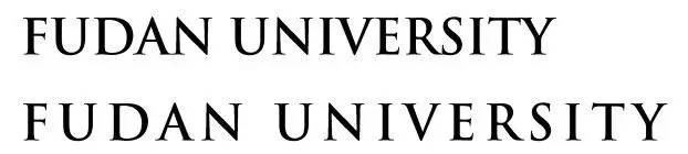
Look at the two titles above, although the former one is already very beautiful, but is the force of widening the spacing a bit higher?
And carefully observe the above-mentioned two fonts, the Futura series and the trajan series, and their common features are also simple. The letters that should be stretched apart are very wide, such as N is big and O is round, while E and S are relatively tight. This is also the case. Observe a way to make the font look better, thank the designers for their efforts
02
Standard and Trust
Compared to the fonts with different letter widths discussed above, there is another font in history. The width of each letter is exactly the same. This font was once widely used in official documents of the US government. I believe programmers are familiar with it.This is courier Its characteristic is that it is old-fashioned and has a feeling of being typed out by a printer-that is, the very old printer controls the characters to be all the same width, so all the typefaces must be this font!
I'll marry whoever gives me a fun old German typewriter and a roll of brown paper!
In a nutshell, when you present government documents and legal provisions after the Industrial Revolution and before the Vietnam War on ppt, and when you write some code information related to programmers, you can consider using it to show Oh
In particular, the bloody historical truth is displayed in courier, which gives people a cold feeling, which is more terrifying than the bloody hula font.

03
Fashion and Urban
This section is lazy because it is very similar to the first section of this article
In order to create a sense of solemnity, you can lengthen the words, so what kind of feeling can you create by shortening the words?
Still using the Futura series of fonts mentioned earlier to display
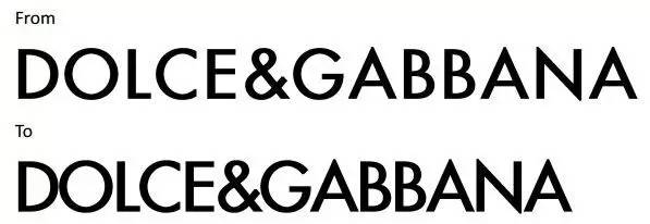
Have you found it... narrowing the same font can easily show a feeling of "young urban upstart" and also high-end, but compared with LV and PRADA, it is much younger
This method is still suitable for high-end venues, such as graduation receptions of university colleges. I think this is the only way if many entrepreneurs with entrepreneurial syndrome do it-their brands will not look so cheap up
This fashionable youth is obviously different from the "young" like Zara... In other words, I took a class for half a year in Spain, the hometown of Zara, and heard a Frenchman keep saying in a brand management class that Zara is purely the choice of a bitch...
Little bitch can also look good and cut!
The specific operation is discussed in the next section
04
Young and classic
This section will start to mention serifs. Simply put, serifs are the decorative lines of words
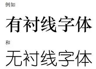
Serifs are naturally particular about serifs, whether there are serifs or not.
Then, an excellent brand will often make its own fonts for its own needs, modify them to meet their own needs and create a feeling they like
For example, a chocolate company named Godiva (although in my opinion Neuhaus is the best!) As a semi-luxury product, it wants to feel luxurious and high-end but not too domineering. After all, it is for food...so it Transformed the font trajan mentioned above and cut off the serifs of the letters to create a strange effect
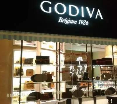
Picture: A GODIVA store in Wuhan
That's it -
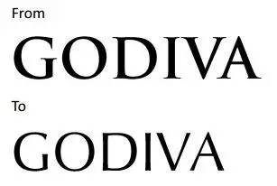
This font is very similar to optima nova titling, which can create a high-end but pleasant and sweet effect This font is also very French, and it is widely used on shop fronts in downtown Paris
Another example of manipulating serifs is Vogue, which did not cut off the serifs but made the serifs extremely thick and thinAnd this font is called Didot< /span>
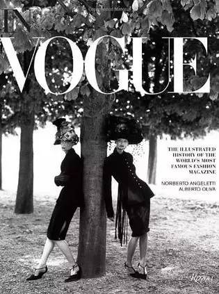
No found! Is the feeling of the little bitch coming out?
Looking at Zara again, is it obvious that the serif is also there!
So the next time you need to make a design for a light-hearted girly event title, remember to get the serifs of the fonts right. Thick ones make them thicker, and thin ones make them thinner!
For example, on White Day, fonts with serifs will not be bad
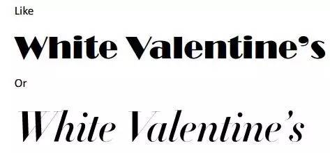
The top is the standard Broadway font The bottom is didot, isn’t it very bitch and magical?
05
Information and friendliness
This section is very simple. It is to draw everyone's attention to the design of some "prompt information". For some necessary guide signs, warm reminders, what kind of font can give people a more easy-going, humble and friendly feeling
Of course, those fonts that make you unaware of their existence For example, Helvetica Light, which is also the most common prompt font for Apple mobile phones
For example, a trash can in a venue should of course be designed as "I'm here to wait silently..." instead of "I'm here! Shoot me!"
So changing the suggestive sentence to be gentler is of course a point to reflect a person's quality
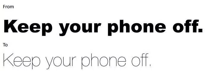
Isn't it much better?
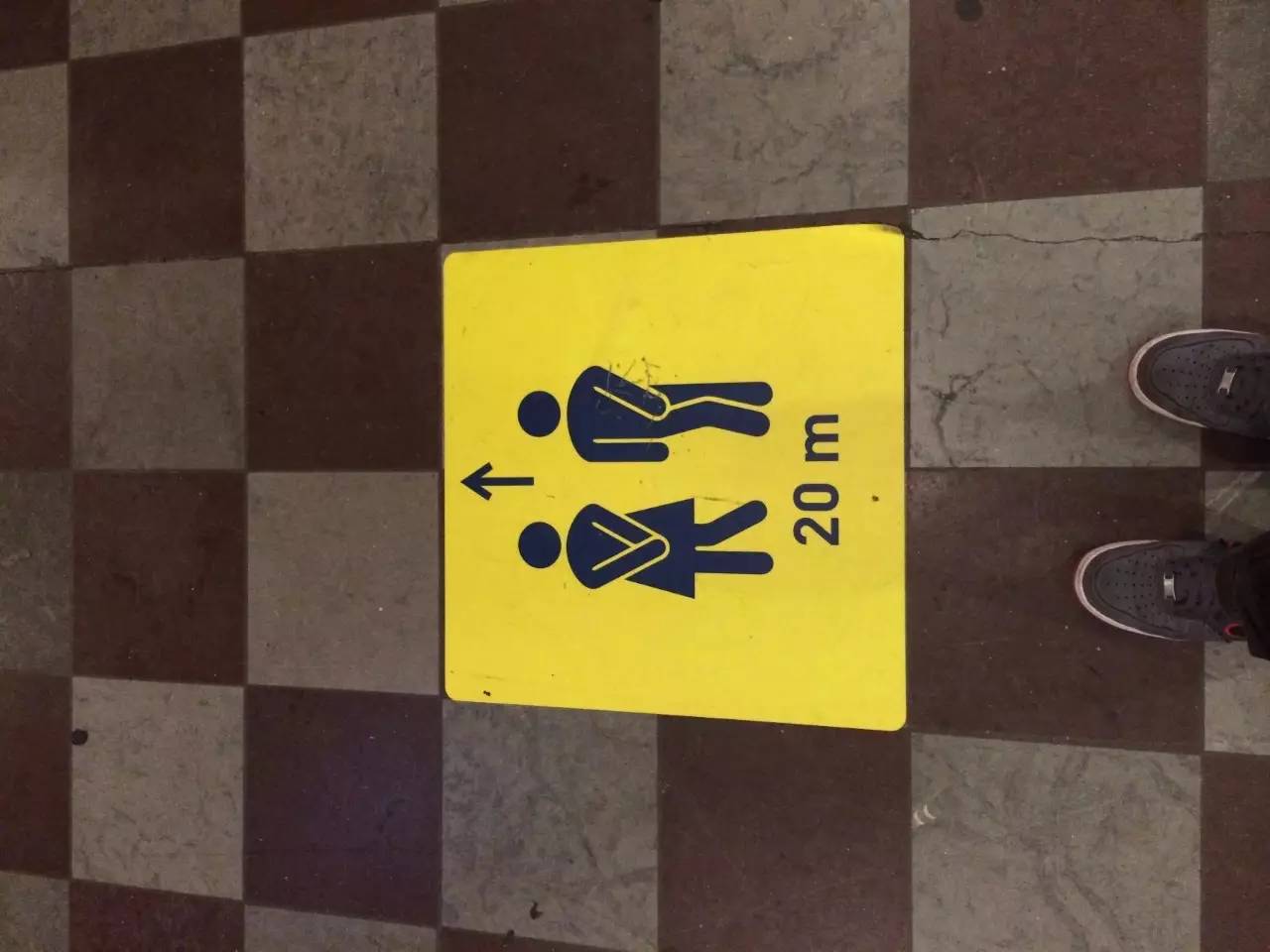
Look at another example of a gentle font
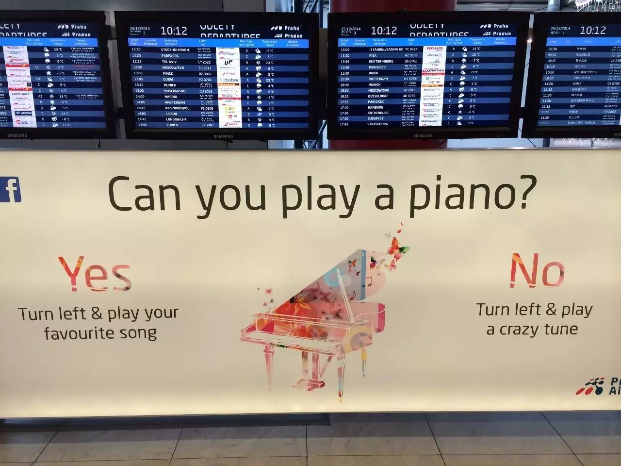
Picture: The public welfare facilities in the Prague airport terminal are very interesting activities. Don’t use such hard fonts as Arial and Futura
06
World Peace
In the last section of this party, we will eventually face a major problem, that is "what to do when people are lazy", so this section introduces some common bad street universal fonts
First of all, the Gill Sans series, which has a good evaluation, can basically hold the title of the PPT on any occasion, no matter what kind of poster it is. This is really very good for a font. Good review
Naturally looks beautiful in different occasions
The second type is Arial and its Helvetica. Basically, it can be used in official documents. It’s too common, so I won’t show it here
The third type is Calibri, which is the preferred font of many companies for ppt. It is also very common, so there is no picture
The last one is of course Times, especially Times New Roman This is basically equivalent to Song typeface in today's West in China. There is nothing to say, I have seen it countless times
But for many brainless friends, I still have to say one more thing. When writing a formal paper and need to submit it, Chinese is usually Song style, but English must be changed to Times. Don’t use Song style. It’s really ugly. The following two The first one is an absolute disaster
Usually, all kinds of finished products in Chinese are handed over to me. Once it is found that the numbers and English are in Song typeface...
Get out of here now! ! Take it back and rework it! !
07
Exclusively in Germany!
Okay, let me finally summarize the local characteristics of various parts of Europe
When traveling in Europe, it is easy to be attracted by the fonts of various places. Fonts are basically hundreds of years of cultural inheritance, which has created different usage habits in different countries. Even if the appearance is separated for a long time, you will definitely think "ah, I saw this font in Heidelberg/Paris/Prague/..." when you see it in the future!"
So when you have some designs corresponding to different cultures that need to be completed, it must be a good choice to invoke the memory in your heart
People who make fonts have feelings, and people who read materials will also have empathy
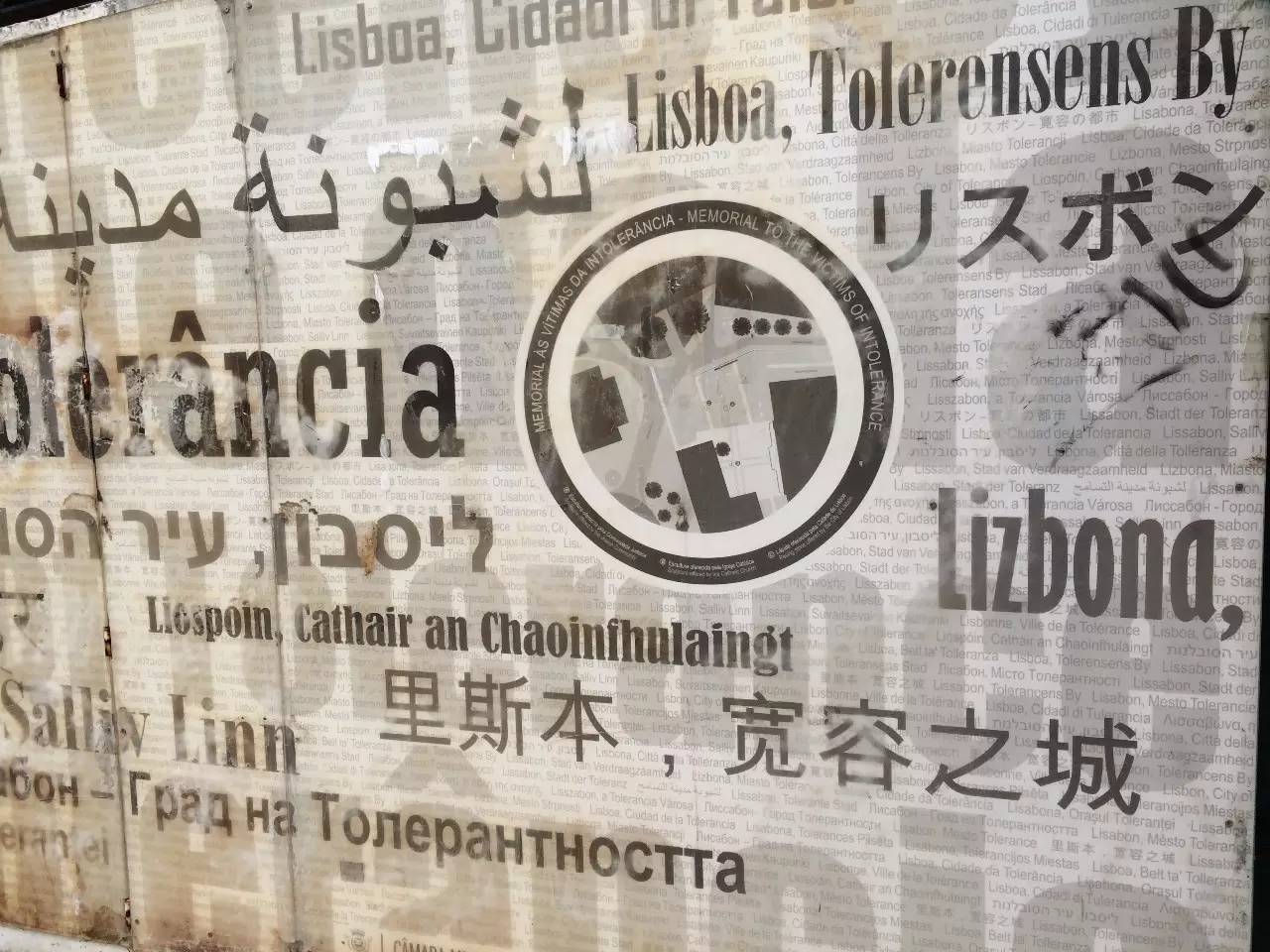
Picture: Traveling in Portugal alone in Lisbon. The wall is a collection of fonts from various countries. Their Chinese fonts are also well selected
Let’s start with Germany. Various types of ancient characters are naturally the number one feature of Germany. You can still see them in various newspapers and beer until today
This kind of word is very difficult to read, but it is really very beautiful, so you must use it with caution
In the 20th century, Germany was rapidly modernized. At this time, the DIN series of fonts began to expand rapidly. If you have been to German stations, high-speed farms, etc., you must have seen DIN fonts. Of course, the Nordic countries also will often use
Picture: The bathroom floor instructions seen at Goha Central Station when traveling in Denmark Look carefully and find that it is a DIN font with a square head
Of course DIN also has a round head. The round head is more common and cuter. In practice, you can use Volkswagen (this word also means "public") instead
This type of character is also used for signage. It is round and cute, and it is very convenient and fast for old masters to paint on the wall. Therefore, we can see that this type of round-headed Western character has evolved into Japan. It has a cute round head and it is very common everywhere
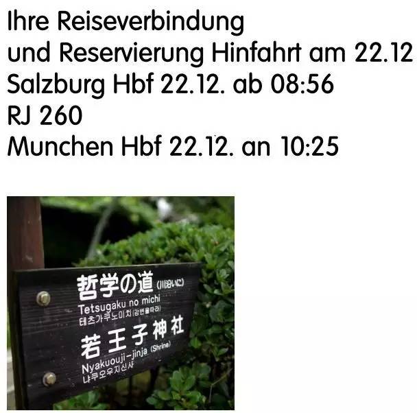
The picture is located in the famous Nishida Jitaro Philosophy Road in Kyoto, Japan
In recent years, it has gradually begun to transform to Helvetica. The most obvious example is Lufthansa

In addition, this is also the official font of Deutsche Bahn DB and subway stations in many places
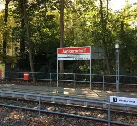
Picture: When I was in Cologne, I took the stop sign at the subway station downstairs at Bobo’s house
08
Exclusively in the UK!
Actually, there are many printed fonts in the UK, but most of them look similar to Times, so I won’t say more, and I can’t remember
Just to remind you that Plantin is a good example of replacing Times to avoid aesthetic fatigue and look as good as Times
This typeface appears extensively in British printing
Haha, this sentence as an example is probably the happiest for a fourth-year university student
09
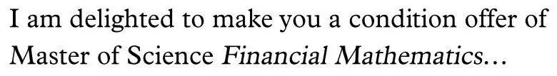
Exclusively in France!
France invented many strange fonts, such as Metropolitaines, Bernhard Fashion, most of them are strange
Picture: Here, the words used in some subway entrances in Paris are simply strange
However, there are still beautiful fonts used in daily life in France, such as the Futura series and optima nova titling series introduced earlier
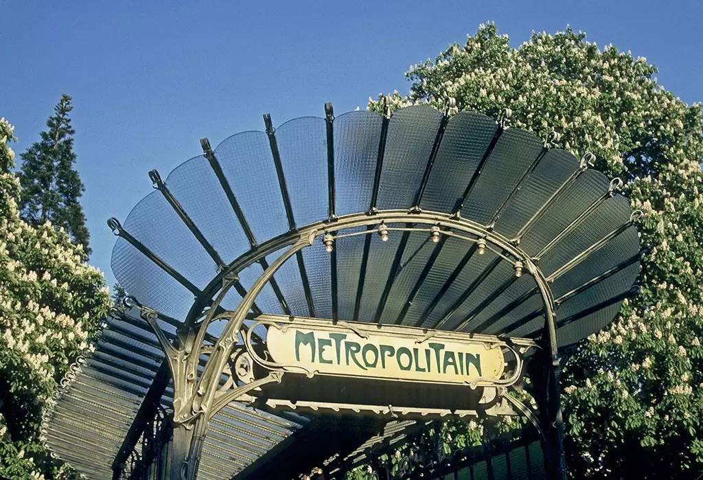
The last thing I want to introduce is Parisine, a special font for Paris Metro platforms! (You should know the name)
And my classmates in Paris must be very familiar with this font, because in all fairness, the display of the platform name is still very good-looking and distinctive
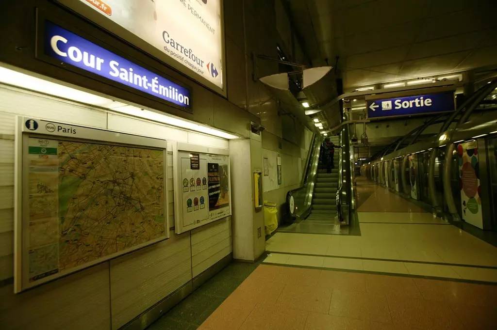
Above: Metro in Paris
At least it is more interesting than the stereotyped straight style of Spain...

(Above picture: In contrast, Barcelona Metro Line 3 Catalla Plaza Station in Spain, it is vaguely visible that the font design is a transformation of Arial with a round accent)
So when you take the subway in Paris, there are actually many ways to confirm that you are in Paris——
You know you're in Paris when you pass certain platforms and the smell of excrement is strong lol
When you see the dignified, beautiful and serious Parisine font displaying the station name in the subway, this is also Paris. < /span>< /em>
++How nice to use good-looking and easy-to-read words in the article++
- END -
A hypocritical
A troublesome person
chattering
Selling his useless stories
Useless convenience store
sorry too lazy
So there is no QR code
Back to the top of this page
You can close the account number
Thank you
If you want to share it
Articles are uploaded by users and are for non-commercial browsing only. Posted by: Lomu, please indicate the source: https://www.daogebangong.com/en/articles/detail/Western%20fonts%20in%20copywriting%20design.html
 支付宝扫一扫
评论列表(196条)
测试