The human eye will have certain optical illusions about the length of lines, parallel lines, line division, line height, horizontal weight and vertical weight, line thickness, pen shape, font shape, font area size, font literal size, etc.
Fully applying this optical illusion to font design can make the radicals in the font combine with each other, the font shape is dignified, neat and beautiful, the size is uniform, and the strokes are standardized and unified.
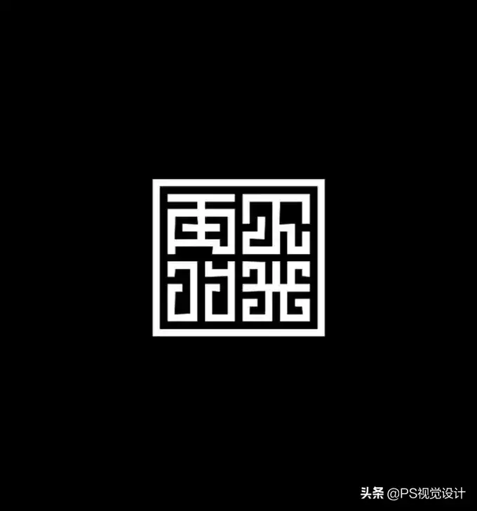
The Illusion of Segmentation
In geometric figures, graphic elements of the same size, due to different segmentation methods, will make people feel that the shape and size have changed differently, which is the illusion of segmentation.
Generally speaking, the more you divide an object, the wider or taller it will appear. Due to the illusion of division of font strokes, the structure of dividing glyphs horizontally or vertically can increase the height or width of characters in perception.

For example: characters with horizontal multi-strokes should be tightened up and down; characters with vertical multi-strokes should be tightened left and right; and the visual center of characters with upper and lower structures is above the geometric center, so that the visual illusion of the human eye can be adjusted, so that The visual centers of individual characters or the entire font are consistent.
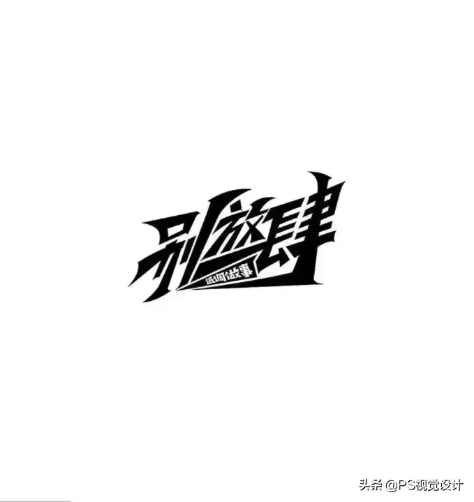
Illusion of height and low
When observing an object, although you know that the height and width of the object are the same, you always feel that the height is larger than the width. This is the illusion of height.
When designing fonts, it is necessary to carry out the processing of "tightening at the top and loosening at the bottom, small at the top and big at the bottom". Only when the center line is placed on the visual center line can one feel comfortable. The height of the central point reflects the philosophy and aesthetics of the Chinese people. It follows the principle of "tightening at the top and loosening at the bottom" of Chinese calligraphy, and the "movable type" printing font also follows this principle.

Illusion of heavy horizontal and vertical light
For fonts of the same width, vertical lines appear thinner and horizontal lines appear thicker; oblique lines are in between. This illusion is called horizontal weight and vertical lightness.
For example: commonly used fonts Bold Song, Main Text Song, Hei Ti, Fang Song, and Kai Ti. Due to the different uses of various fonts, they have different horizontal and vertical thicknesses.
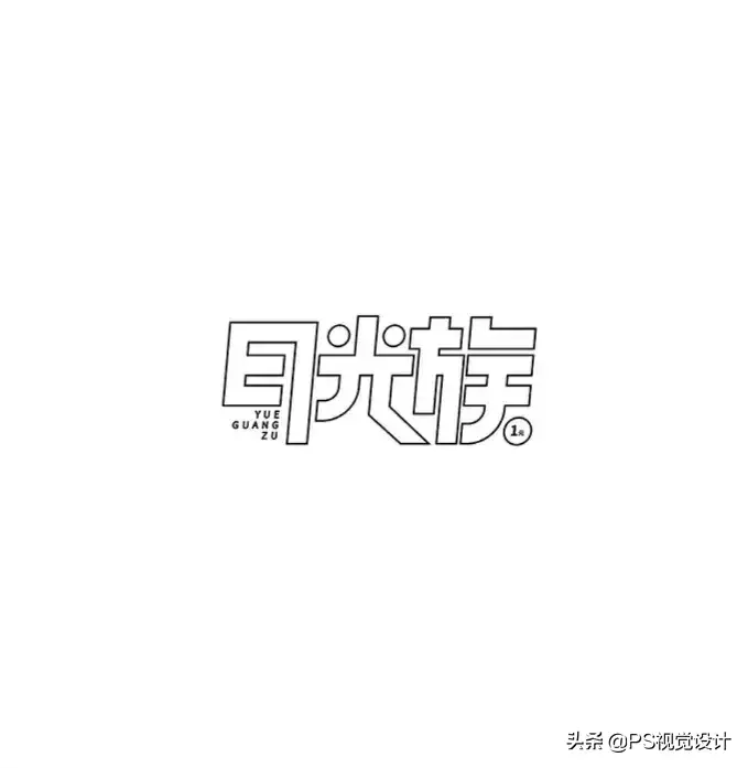
① Bold Song is a more eye-catching font suitable for titles.
②The main body of the Song Dynasty is mainly used for the inner text, and the thickness difference is the smallest in the Song style.
③The bold font is also mainly used for titles. The fonts are originally horizontal and vertical, and the thickness is relatively close, and the thickness is not much different.
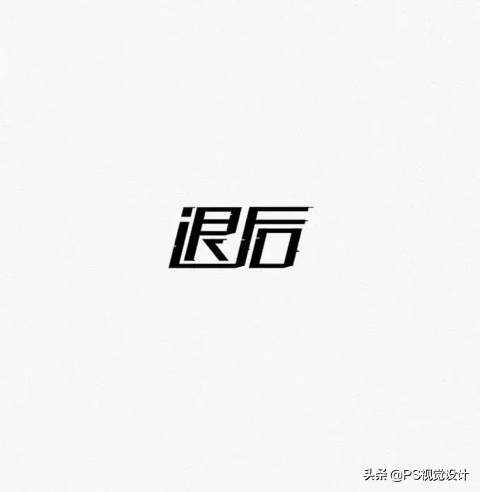
④ imitation of Song Dynasty is also used as the inner text, and the horizontal and vertical paintings are similar in thickness.
⑤Regular script is mainly used for inner text, its outer outline is curved, and the horizontal and vertical strokes are similar in thickness, but the vertical strokes are always slightly thicker than the horizontal strokes. Bold Song fonts have the largest difference in horizontal and vertical thickness, and the text Song has the smallest difference.
When designing fonts, vertical strokes should be slightly thicker than horizontal strokes to conform to human vision
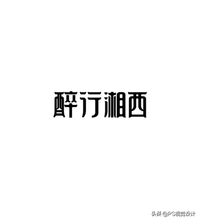
Illusion of thickness
Thickness is determined by black and white. The number of strokes in a certain size grid increases and decreases, and the black and white degree also increases and decreases.
This not only needs to consider the thickness of the strokes, but also pay attention to the distance between the strokes. By adjusting the thickness and density, when the characters with few strokes and the characters with multiple strokes are arranged together, the thickness, density and black and white are balanced in total.
That is to say, the harmony of thickness and thickness in the optical illusion is achieved by the ratio of black and white. The following aspects should be paid attention to when dealing with stroke thickness.
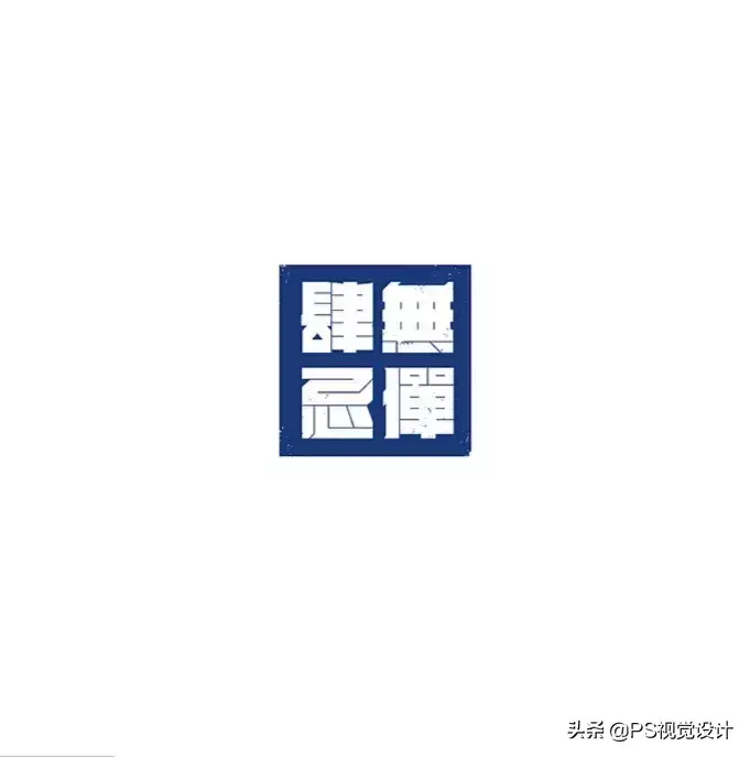
1. In terms of black and white. Because the strokes of Chinese characters are different in simplicity and complexity, if the same thickness is used, those with more strokes will appear black, and those with fewer strokes will appear white, resulting in the feeling of slender with fewer strokes and thick with more strokes. Therefore, changing the thickness can adjust the black and white of the characters.
2. In terms of length. For lines of the same thickness, the longer they appear, the thinner they appear, and the shorter they appear, the thicker they appear. In a character, the main stroke should be long, and the secondary stroke should be short; the periphery should be long, and the inside should be short; places with many white areas should be long, and places with many black areas should be short.
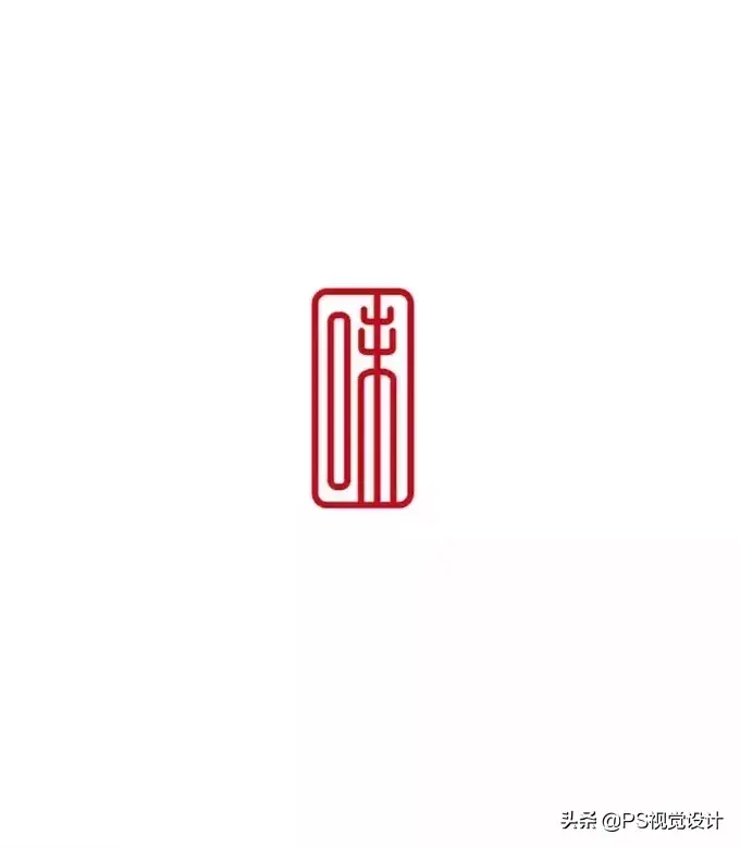
3. In terms of thickness. Words with many strokes are thinned, and words with few strokes are bolded. When adjusting primary and secondary, internal and external strokes, the main strokes should be thick and long, the secondary strokes should be thin and short; the internal strokes should be thin, and the external strokes should be thick. The characters that intersect with the left and right strokes horizontally and vertically have high blackness at the intersection, and the strokes are easy to black and blurred, so they need to be thinned.
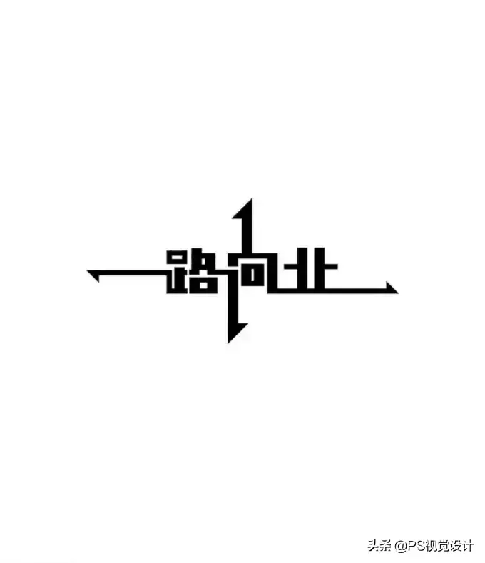
Glyph Shape Illusion
Although the characters written by some people conform to the characteristics of the stroke structure of the characters, when you read the whole text, you will find that the characters are large and small.
As the area of the glyphs varies, the visual size will be produced. In order to achieve visual consistency, optical illusions should be used to adjust the glyphs. Chinese characters generally have:
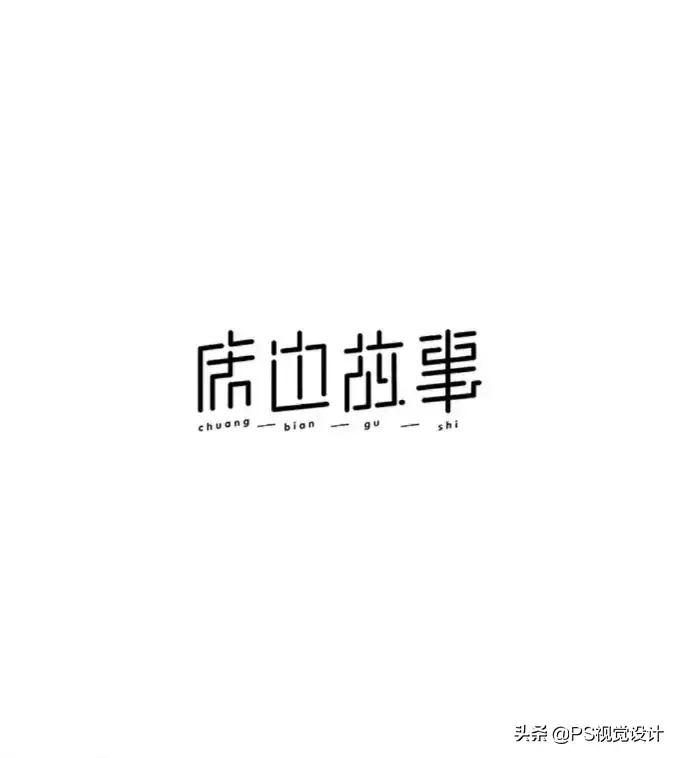
Square, such as "mouth, solid, whole" etc.;
Trapezoidal, such as "把, and" and so on;
Pentagon, such as "Tai, Shi" and so on;
Hexagons, such as "Chuan, Shen, Yong", etc.;
Pin characters, such as "Pin, Lin, Nie" etc.;
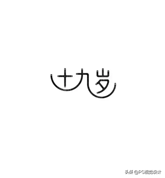
Rhombus, such as "ten, umbrella, order" etc.;
Triangles, such as "Ding, Le, Bu" etc.;
The character shape of corpse, such as "corpse, evil" and so on.
The font of the square fully enclosed structure is significantly larger, followed by trapezoid, pentagon, and hexagon, followed by character font and corpse font, and the smallest is rhombus and triangle. If it is written according to the square grid around the strokes, it will definitely cause the characters to be of different sizes. The solution is to appropriately shrink the characters with a fully enclosed structure, and use the non-such characters to support the square grid according to the size of the area.

The number of strokes is different, and the inner white is also different, and the amount of inner white will affect the size of the characters. Generally speaking, the more divisions with the same area, the smaller the inner white, that is, characters with larger inner white appear larger, and characters with smaller inner white appear smaller. There are also two aspects that should be paid attention to in terms of inner white shrinkage:

① All-inclusive characters should be indented differently on each side, with more left and right, less up and down, and more down than up, so that it conforms to people's visual habits and maintains the long shape of Chinese characters. features.

②Attention must be paid to the shape of the inner white. For the same two shapes, since the inner white is tall (longitudinal rectangle), the outer square will appear tall; the inner white is flat (horizontal rectangle), then the outer square will appear flat.
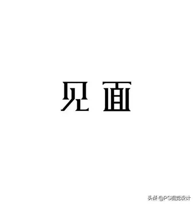
Generally speaking, the illusion of font size mainly focuses on two aspects: font and inner white. These principles are also suitable for the application of radicals and individual characters. The font size should be handled in accordance with the theme of a well-proportioned, harmonious and unified font
This article comes from the Internet, the copyright belongs to the original author, and it is for reference only!
More original PS, font, logo design tutorials, after commenting on this article, reply to the tutorial by private message to receive!
Articles are uploaded by users and are for non-commercial browsing only. Posted by: Lomu, please indicate the source: https://www.daogebangong.com/en/articles/detail/Want%20to%20do%20font%20design%20do%20you%20know%20these%20precautions.html

 支付宝扫一扫
评论列表(196条)
测试