
 >>-->
>>--> >>
>>
Wang ZhihongのFonts and Chinese Design
wangzhihong Wang Zhihong
Wang Zhihong, a new generation designer from Taiwan, was born in Taipei in 1975. Since 2000, he has undertaken design projects with his personal studio, focusing on graphic design, covering various books, movies, and performing arts activities and other promotional materials. He cooperated with the publishing house in 2008 and 2012 to create his own INSIGHT and SOURCE book series, with the theme of design and art, and introduced such as Sato Kashiwa, Araki Nobuyoshi, Hara Kenya, Kusama Yayoi, Yokoo Tadano, etc. of the works. Design works have won the gold medal of the Golden Butterfly Award at the Taipei International Book Fair for six times, the Hong Kong HKDA Design Awards Kasai Kaoru Judging Award and the Silver Award, and were selected for the Tokyo TDC.
Japanese font and Chinese design
—
Careful Choices in Difficult Environments
Recalling the old days when I was still earning a living from graphic design work, I would be worried when I encountered a case that was purely Chinese (Note: In Hong Kong, designers received many cases from Europe and the United States; of course, even For local customers, English is also necessary), because the handling of Chinese fonts and lines is often very poor, and the shape is rigid, except for the few sets of fonts that are well-known in the family, basically no one is using them- This is the current state of the Hong Kong design industry. What about in Taiwan?
"Life in the sea! Yokoo Tadano's Autobiography, Book Typesetting and Posters of "White"; Kyogoku Natsuhiko's "Private Talk" and many other works, as well as the most recent "Symbol Empire", "Walking in Fonts", "Clothes - Yohji Yamamoto" Wait, maybe the topic is not interesting, but from the stairs of Dunnan Eslite to the door, the books that are attractive and full of design sense will always contain his works.
Wang Zhihong can be regarded as one of the most outstanding designers of Chinese character design in the Chinese circle.
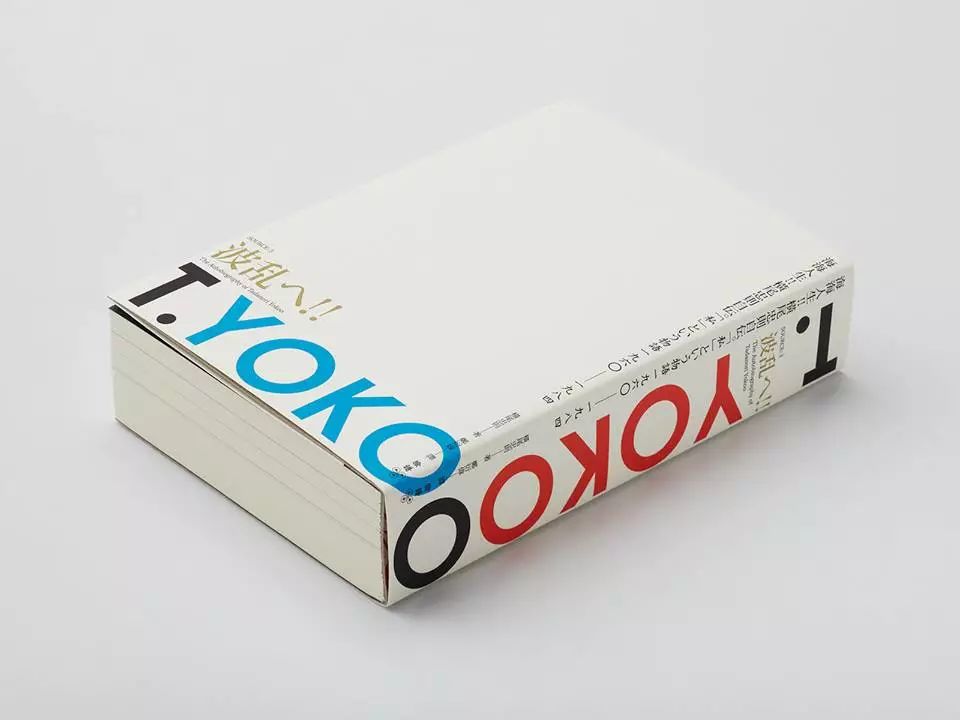
《Life in the sea! Yokoo Tadano Autobiography", Yokoo Tadano, 2013

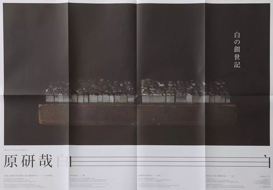
"White", Kenya Hara, black version poster, 2012
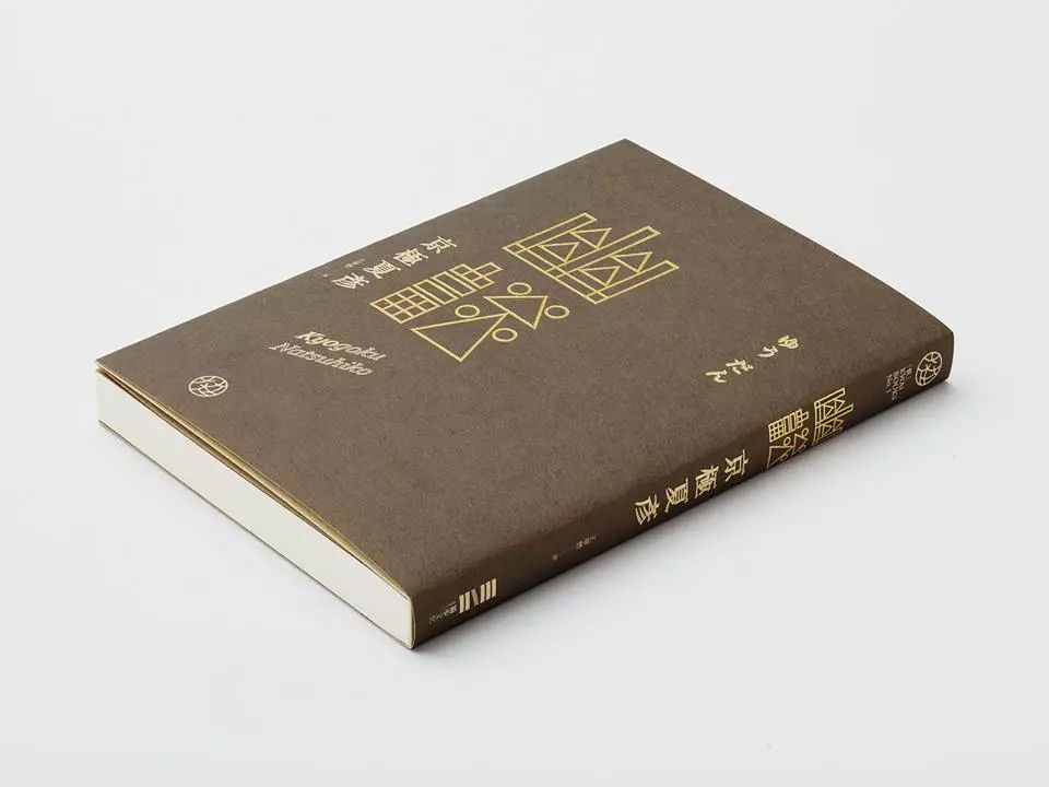
"You Tan", Natsuhiko Kyogoku, 2012
Font Walk, 2014
"Clothing", Yohji Yamamoto, 2014
Facing the lack of Chinese characters
—
From my own observations, I found that in the past two years, Wang Zhihong has used Japanese fonts a lot, especially in titles. This made me wonder whether this has something to do with the basic quality differences between Chinese and Japanese fonts. So I asked Zhihong directly.
Are Japanese fonts really that easy to use? (laughs)" I "questioned". "I don't have many Chinese fonts on my computer. I believe there are some good fonts in mainland China and Hong Kong, but I don't have them. (Laughs)" Zhihong said.
Speaking of fonts, Zhihong thought about it again, and his expression was a little more dignified than before. "Well, I think it was about 2003 when I first used Japanese fonts. No one taught me to do this. It's just that when I encounter difficulties, I will naturally develop a set of corresponding methods—whether this method is orthodox or not. ’ he laughed. "Taiwan's Chinese fonts are not good at handling the details. When the text needs to be enlarged, the shortcomings will be exposed. I found that there were many Chinese characters available in the Japanese fonts. Although it is not enough for typesetting, it is enough to make the main title of the cover. , that’s why we started to use Japanese fonts.” Zhihong’s opinion should resonate with many design colleagues.

The development of Chinese fonts takes a very long time. Instead of waiting for a good font to be born one day, most designers have used their own creative measures to continue to maintain the highest quality products for customers and works. Compared with designers in other languages, Chinese typesetting and Chinese design have never been a good job. Every designer who can design an excellent Chinese design in the current severe text environment is worthy of our respect.
At that time, I aspired to engage in font design (internal font design, bright font, black font design), and I also noticed this phenomenon. I hope that one day, I can change the problem of "Chinese fonts are difficult to use, and the details are not good". One day, we will no longer have to worry about Chinese fonts. Our native language and local design will finally bring us a sense of security at work.

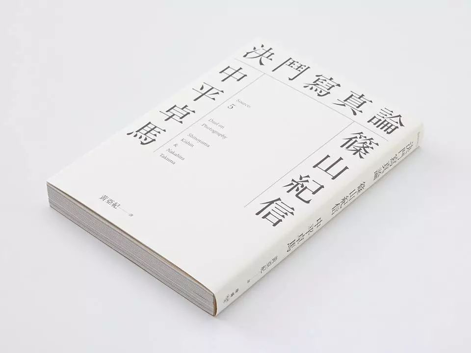
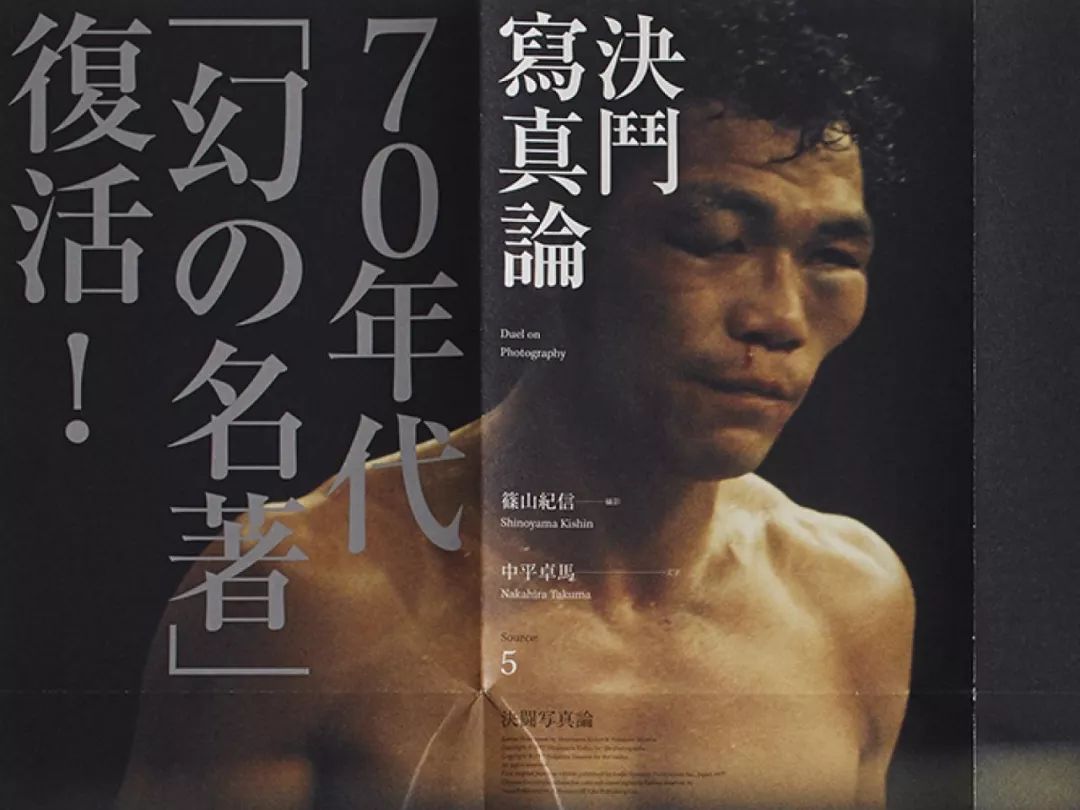
"Duel Photo Theory", Kishin Shinoyama, Takuma Nakahira, 2013
We need too many "easy to use"
Good durable font
—
Wang Zhihong's work will also involve other languages, such as Japanese and Owen. I also want to know some of his abstract thinking and skills on Chinese fonts. Chinese is really bad! Owen is easy to read and easy to type. As long as you have the right fonts in hand, you can quickly conceive a good layout. A large number of or huge Chinese characters is not easy to design, it depends on the characters themselves.
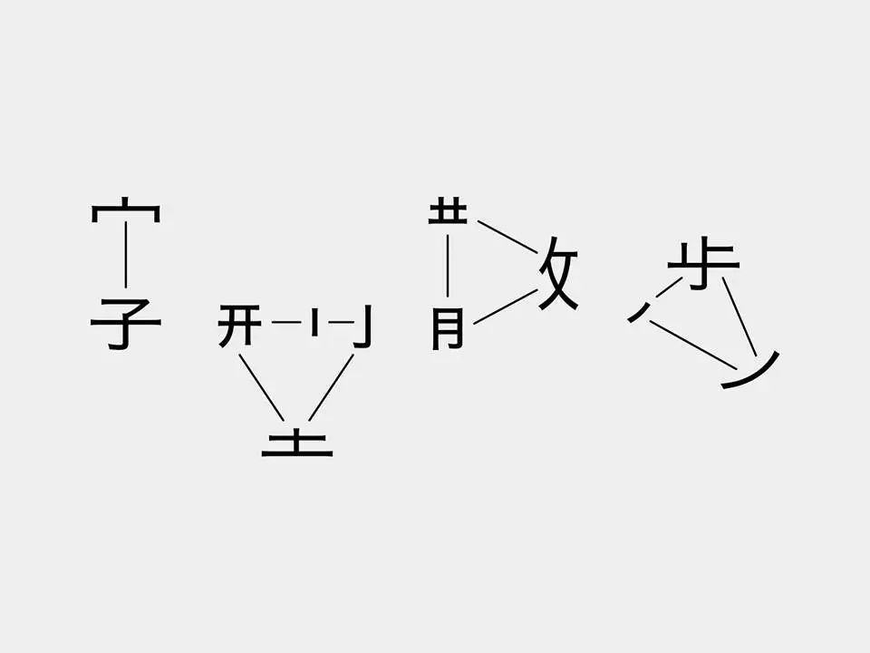
Whether the arrangement is good or not, you still need to try your luck to see which words you encounter. If there are two or four characters in a square shape, it is a problem.
If you want to arrange Chinese well, you must be able to understand the shape of the characters in your hand and how to "cook" them. "Just like the word "Ling" is prismatic, and the word "Book" is rectangular, etc. Whether you create or use "Chinese characters", you must take these points into consideration.
Wang Zhihong also believes that we need a lot of good fonts that are "easy to use" and "worthy of use", as if it is a never-ending requirement. He also emphasized the ability to have some fonts with a tight central palace and obvious Chinese patterns, especially boldface.
Chinese characters are square and square, with many and heavy strokes, making it difficult to symbolize. We also often need to deal with bilingual (Chinese-European collocation, Chinese-Japanese collocation, etc.) structures, which adds a lot of difficulty to our implementation.
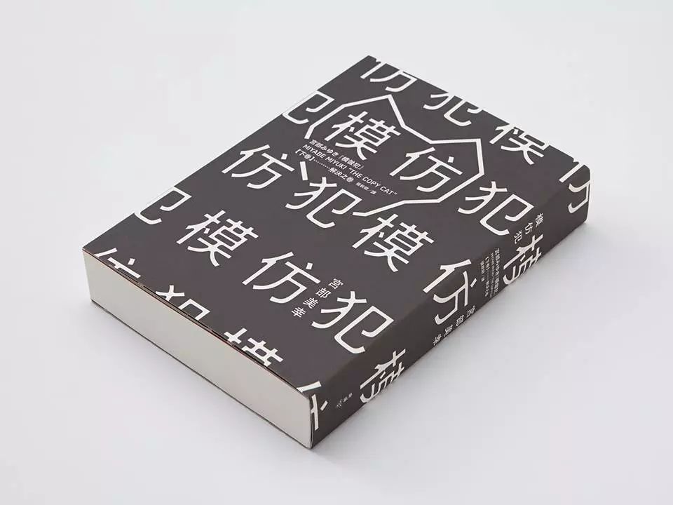
"Imitation Criminal", Miyuki Miyabe, Hakusho cover edition, 2013
Chinese font creators, users, and readers
gap in expectations
Today's Chinese characters are boxy, and there are many technical considerations behind them.
In addition to the recognition and readability of small font size (inner text and comment size), it is more considered by developers and manufacturers in production, rather than by the wishes of users and readers.

In the era of movable metal type, a heavy Chinese font can move ten thousand characters, a large number of metal firing and engraving, it can be imagined that many people need to cooperate to make it happen. If Chinese characters are displayed in the form of squares, then the overall style will be easier to unify with a single standard, and it will be easier for employees with different cultural backgrounds and knowledge levels to cooperate in the quality inspection. The beauty of Chinese fonts lies in the individuality of the characters. Lost after being restricted. Even with the liberation of character-making software and technology today, this malpractice still remains unchanged.
As for stroke design, etc., in the past, masters of character creation were craftsmen, and they only belonged to the working class in the factory. They may be familiar with the lines of strokes or the structure of characters, but they need to adjust the fonts to meet the expectations of graphic designers and users. , in today's view, it should be the job of the font designer.

The Copycat, Miyuki Miyabe, black book cover, 2013
Even if there are many flaws in Chinese, it is enough to implement the beauty
Break down all barriers
—
Even if we understand that there are reasons behind it, it is difficult to completely change this situation due to the obstacles to the operation of the industry and the fact that most people have "adapted". "I said. "Is this a fact, or is it a cognitive distortion? It's difficult to clarify for a while. Regarding the Chinese font, Zhihong expressed emotion.

However, he did not take a rejection attitude like me. After all, before the problem can be completely eradicated, life must be lived, work must be done, and the aesthetics in his heart must be passed through various methods. Sample works to implement. "Finding a typesetting foundation that meets the standards and takes into account the beauty of Chinese is something I have been implementing." This is not something that can be solved by refusing to use foreign languages. All text structures and typesetting methods should develop in a natural evolution. We just need to keep paying attention to quality in the process.
Isn’t carrying out one’s own pursuit of beauty the secret of Zhihong’s success from being discharged from the army and being rejected by many resume letters to being alone today? As long as the pursuit of beauty is clear, you will use all the methods at hand to achieve what you want.
Note: The above content is reproduced from Hanwentang (founded by Hong Kong font designer Xu Hanwen, a Facebook community dedicated to the promotion of Chinese fonts, especially traditional Chinese fonts.

Wang Zhihong's recommended fonts for daily use
Chinese font
Font|Hua Kang Ming Ti photo by>

Font|Mona Changsong photo by>
Font|Founder Yao style photo by>
Japanese font
Font|Ryuaki Fukasawa photo by>
Font|Hiraiya square body, Hiiragi round body photo by>
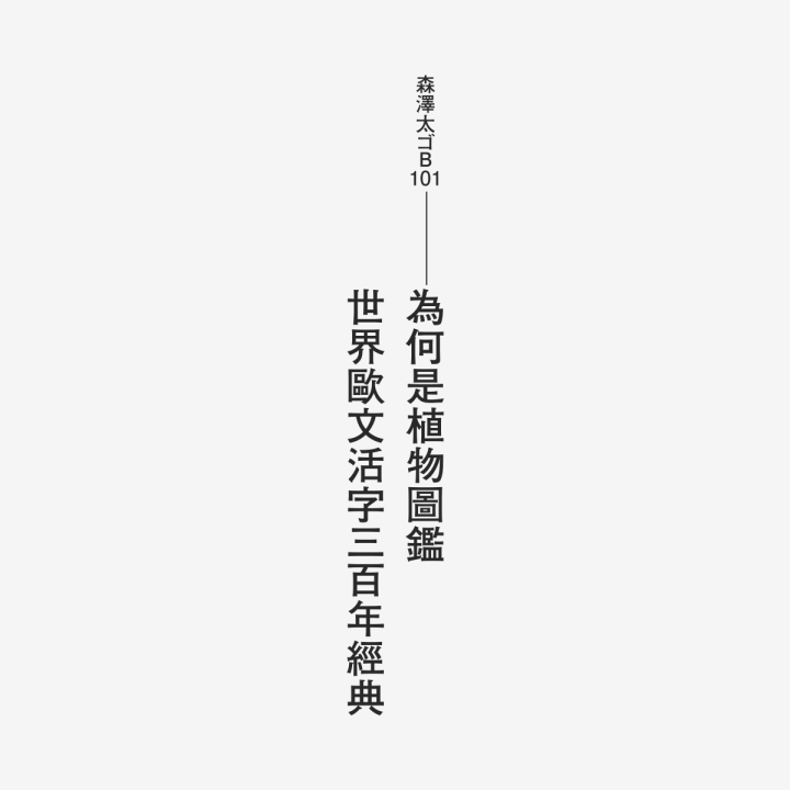
Font|Morisawa Taiゴ B101 photo by>
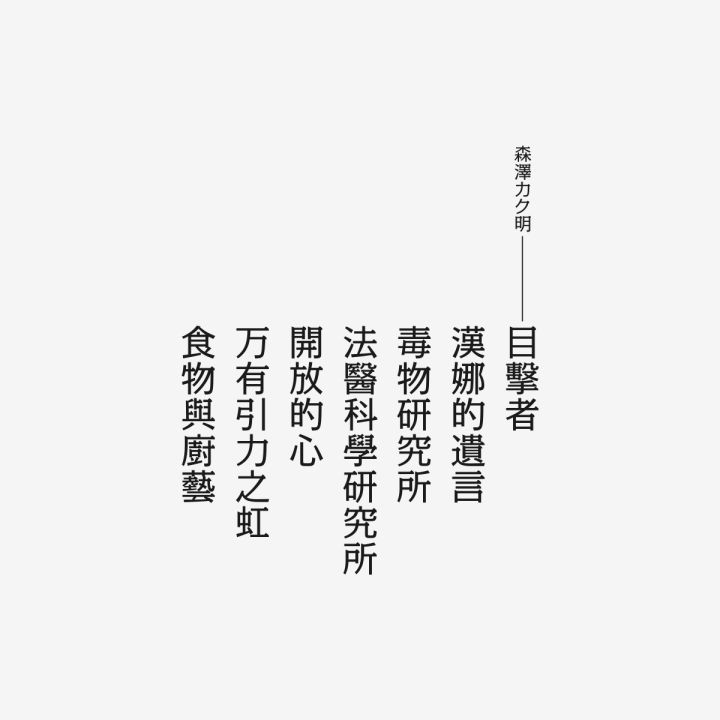
Font|Kakuming Morisawa photo by>
Western fonts
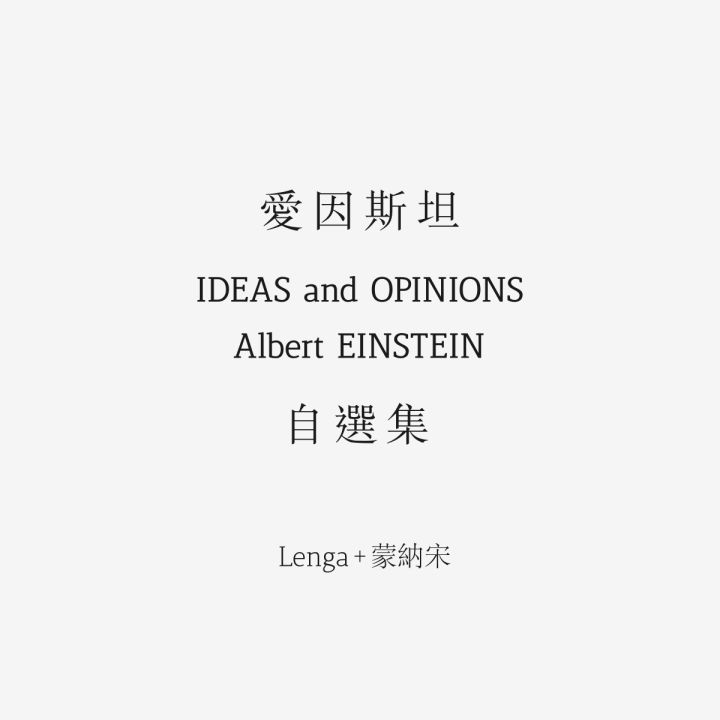
Font|Lenga+Monasong photo by>
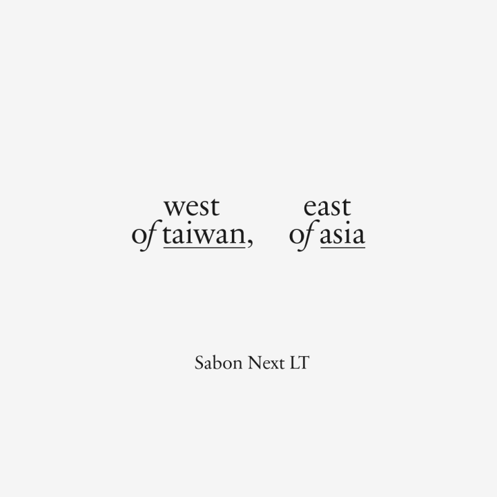
Font|SabonNextLT photo by>

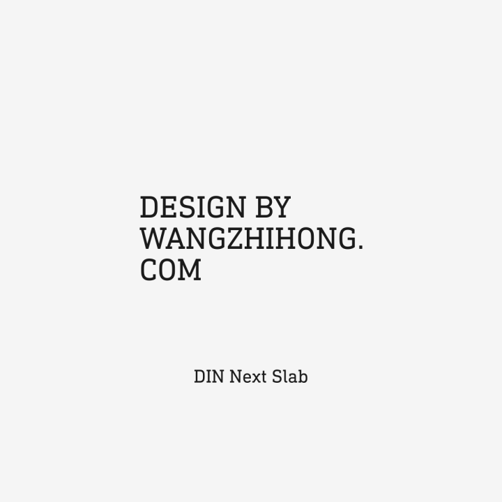
Font|DINNextSlab photo by>

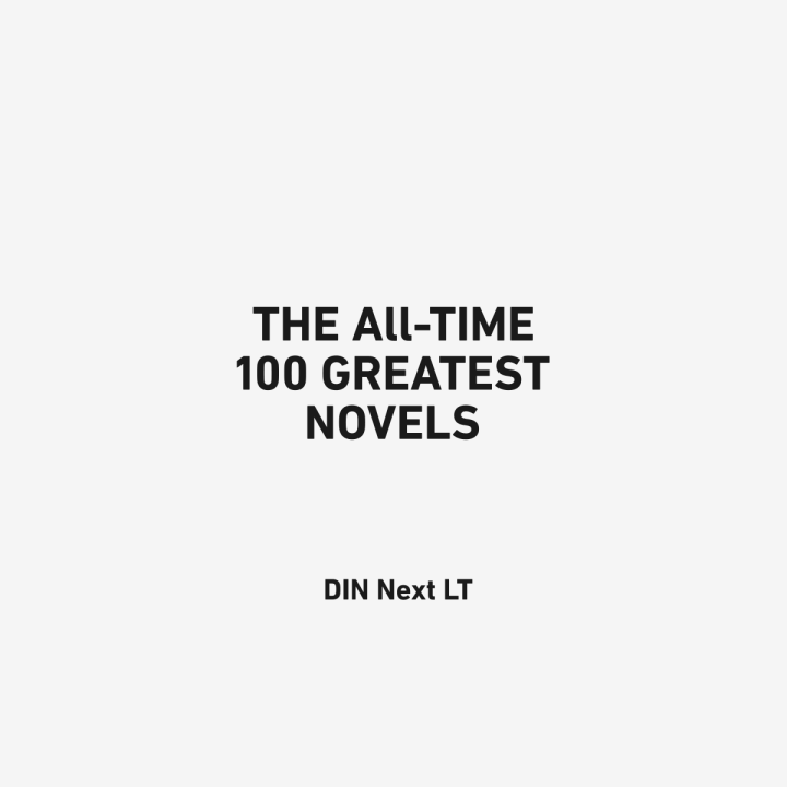
Font|DINNextLT photo by>
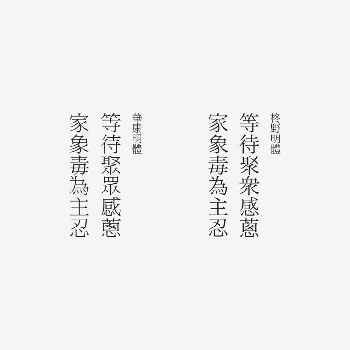
If you feel that the font of "Huakangming" is uncomfortable, you can choose "Hiragino Mingchao (ヒラギノ明朝)" instead.

Font|Huakang Mingti Hiiragi Mingti photo by>
INFO
wangzhihong.com/Project
zh-cn.facebook.com/wangzhihongstudio
The End
Copyright©2018 TYPESCHOOL
ALLrights reserved.
Take you to know the latest Type information in the world, share all the fashion behaviors about fonts, please pay attentionTypeschool
Recommended
Past Featured
▼
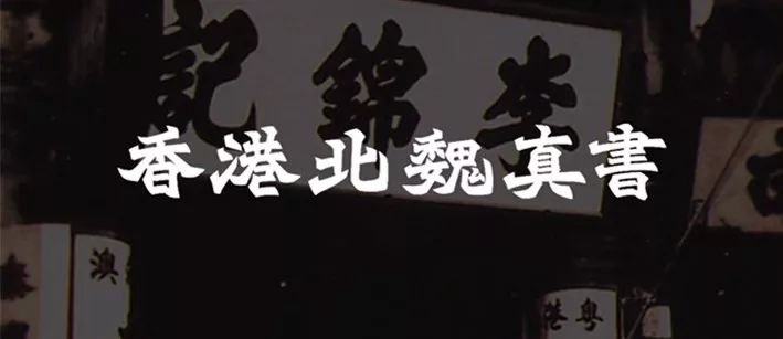
Northern Wei Zhenshu, a font that was once popular in Hong Kong.
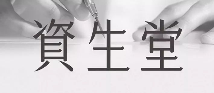
Shiseido|Shiseido's unique font that has been around for nearly a hundred years
Articles are uploaded by users and are for non-commercial browsing only. Posted by: Lomu, please indicate the source: https://www.daogebangong.com/en/articles/detail/Wang%20Zhihongs%20font%20and%20Chinese%20design.html
 支付宝扫一扫
评论列表(196条)
测试