- Picture and text skills
"Charts" can present complex data in an intuitive and vivid way, allowing people to see the changes in the data more clearly.
There are many types of charts, so how to insert charts and what style of charts should be inserted?

▪How to insert charts:
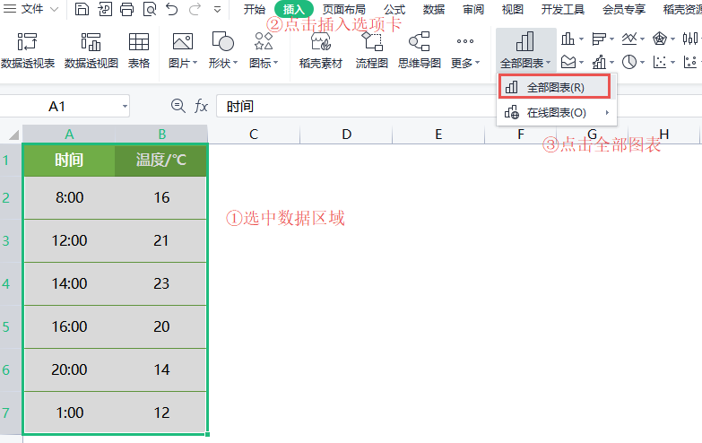
Select the data area and click the "Insert" tab< /span>-"All charts" button, Select the desired chart and click to insert it.
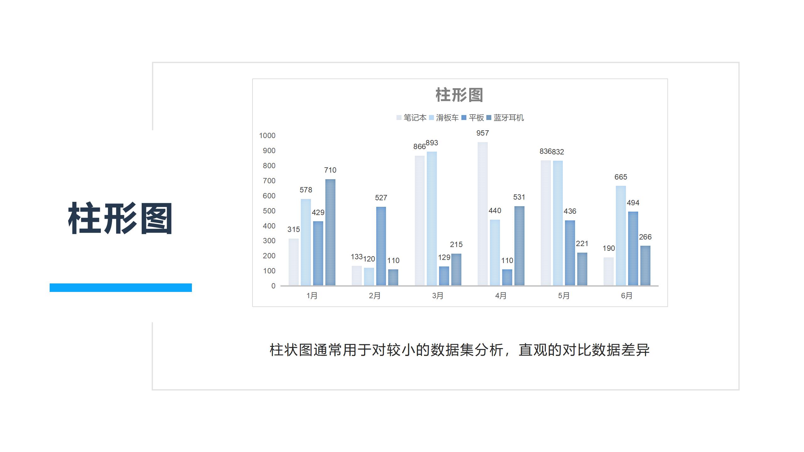
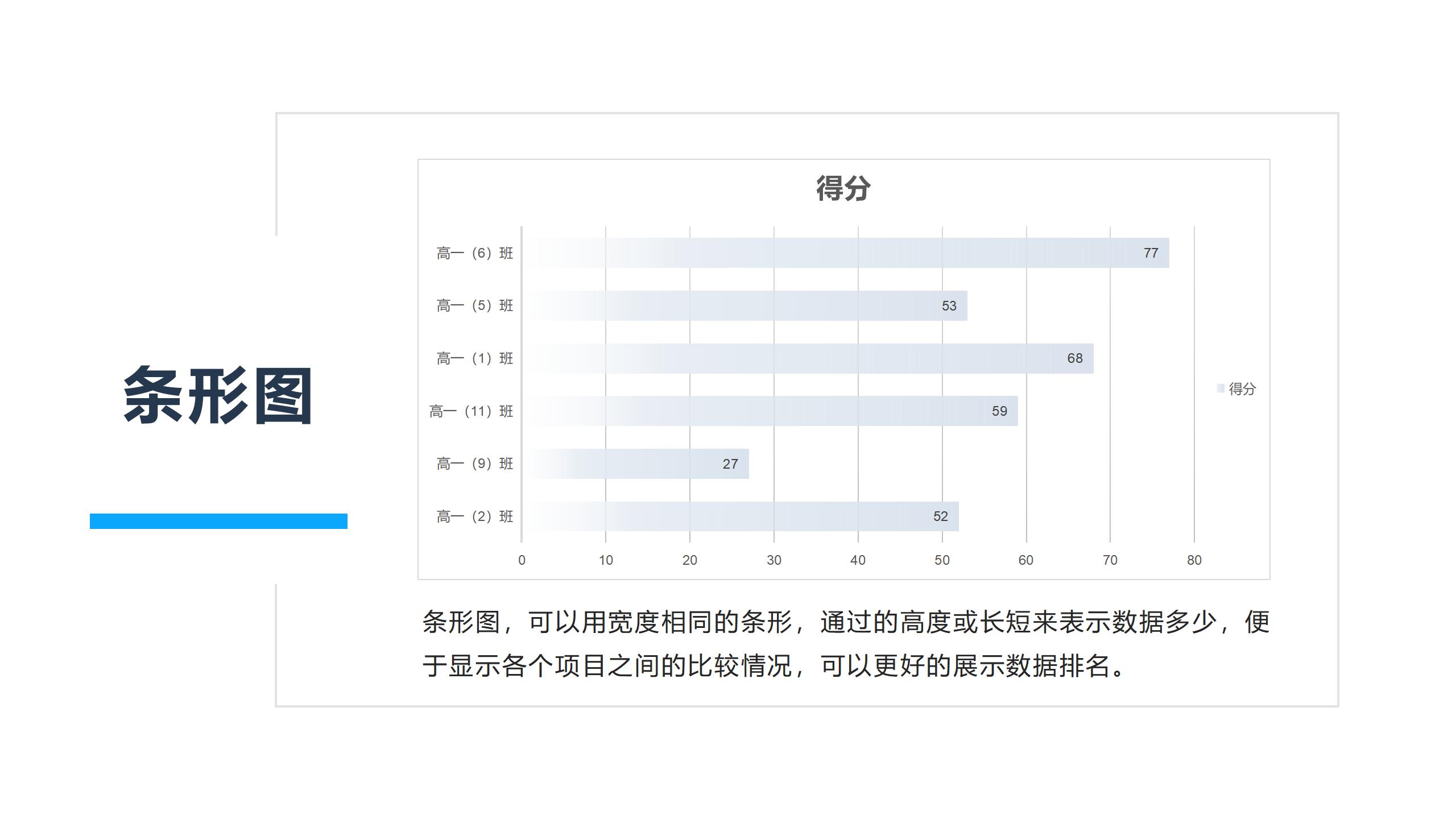
▪Bar charts are common in tables One of the chart styles, usually used for analysis of smaller data sets, Intuitive comparison of data differences.
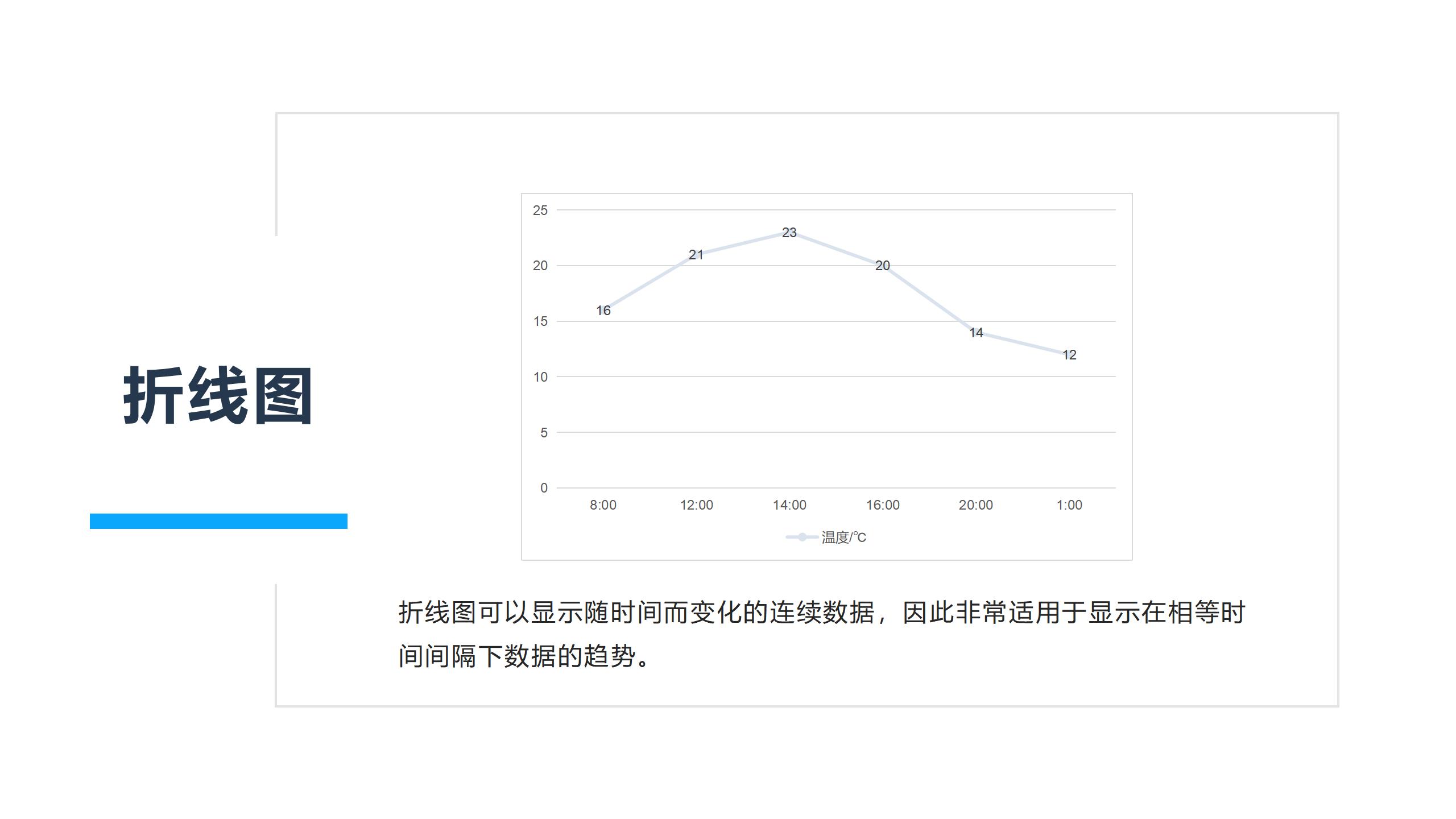
▪ Line charts can display continuous data that changes over time, so they are very suitable for displaying equal Trend of data in time intervals.
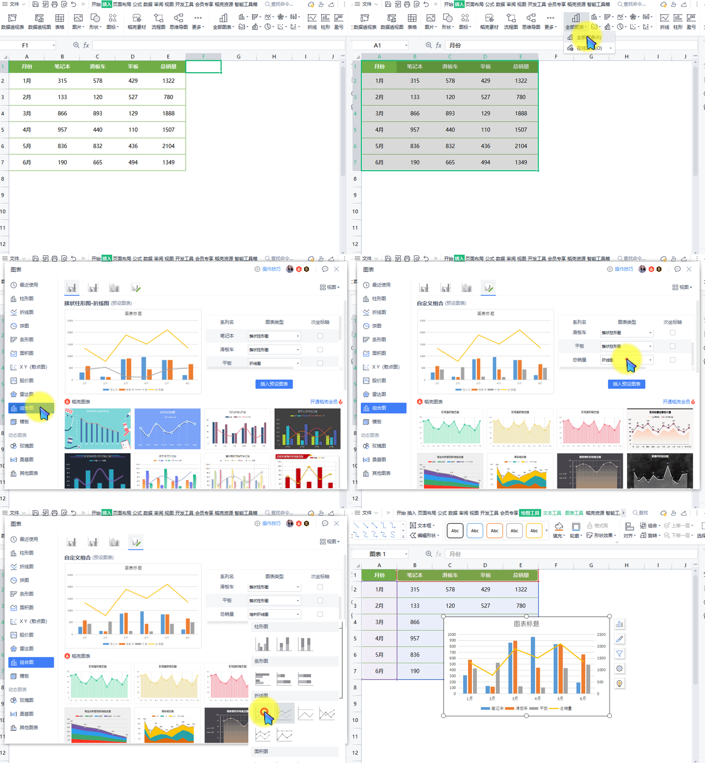
▪If you want to combine different charts together, you can use a combination chart.
Take this data table as an example, select the data area, and click the "Insert" tab-"All Click the "Chart" button and select to insert "Combined Chart".
Set the chart type and axis position corresponding to each series to insert a combination chart.
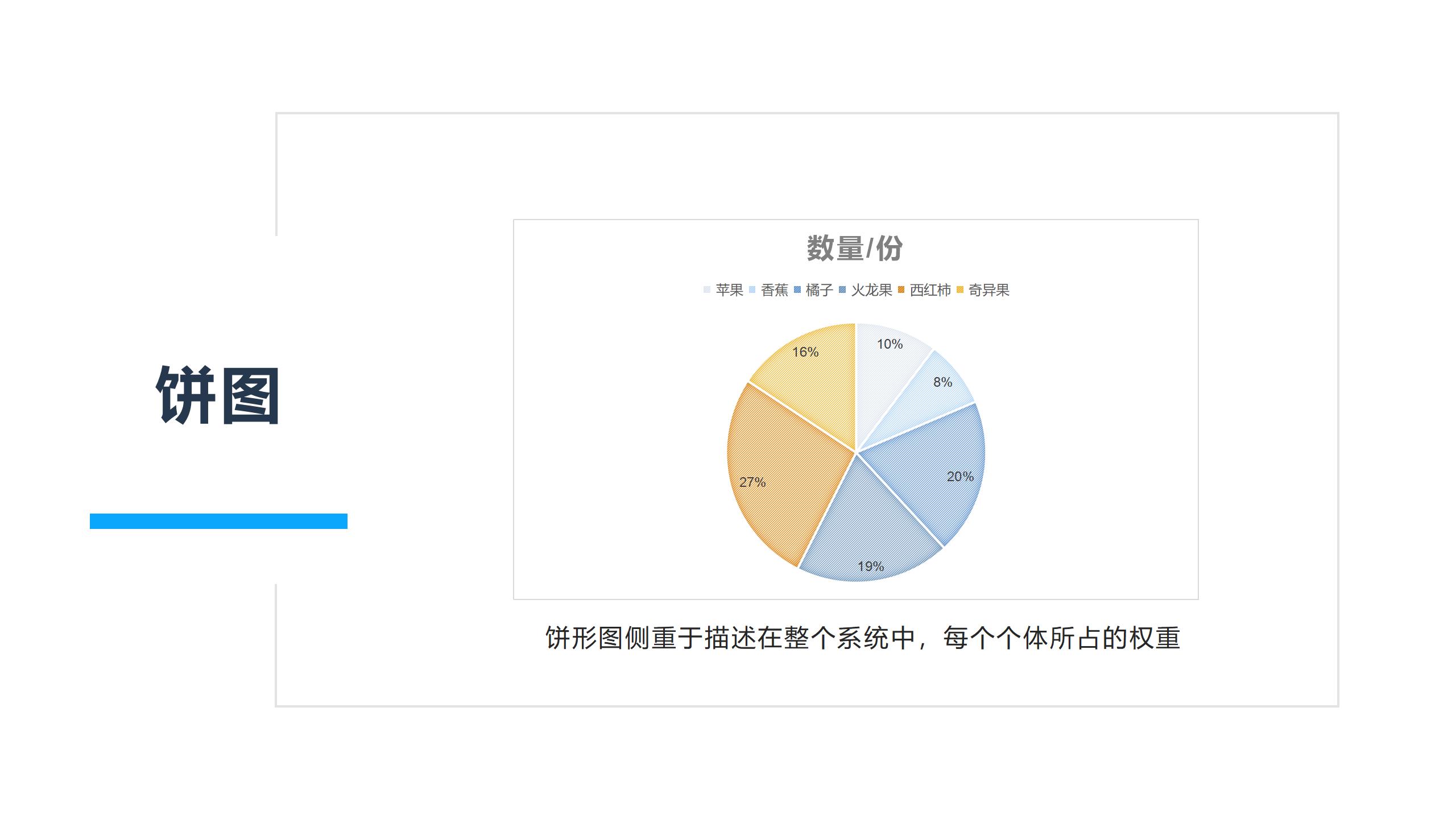
▪Pie chartFocus on describing the weight of each individual in the entire system.
▪Bar chart can use bars with the same width to represent the amount of data through the height or length.
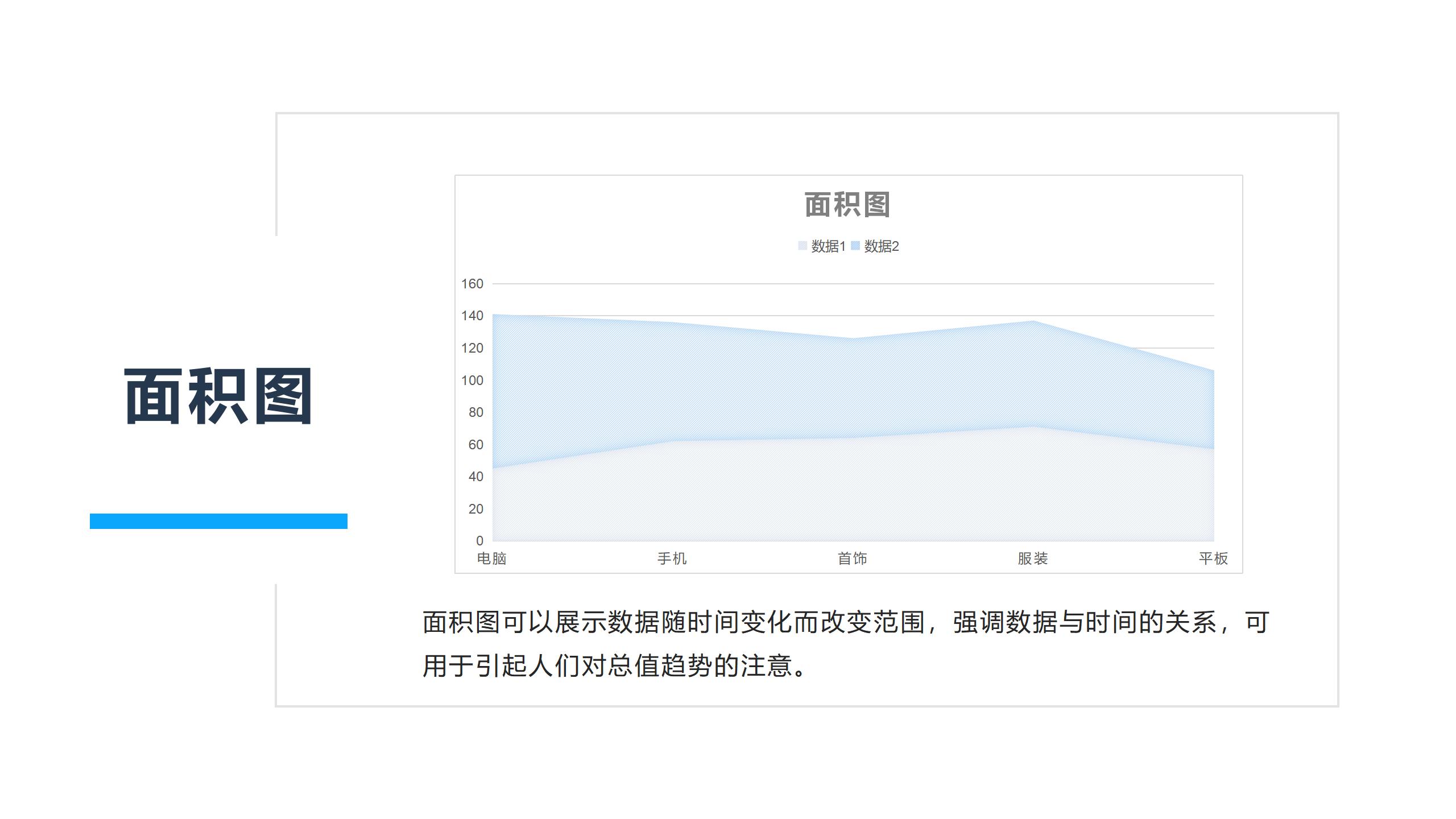
▪The area chart can show the changing range of data over time, emphasize the relationship between data and time, and can be used to draw people's attention to the trend of the total value.
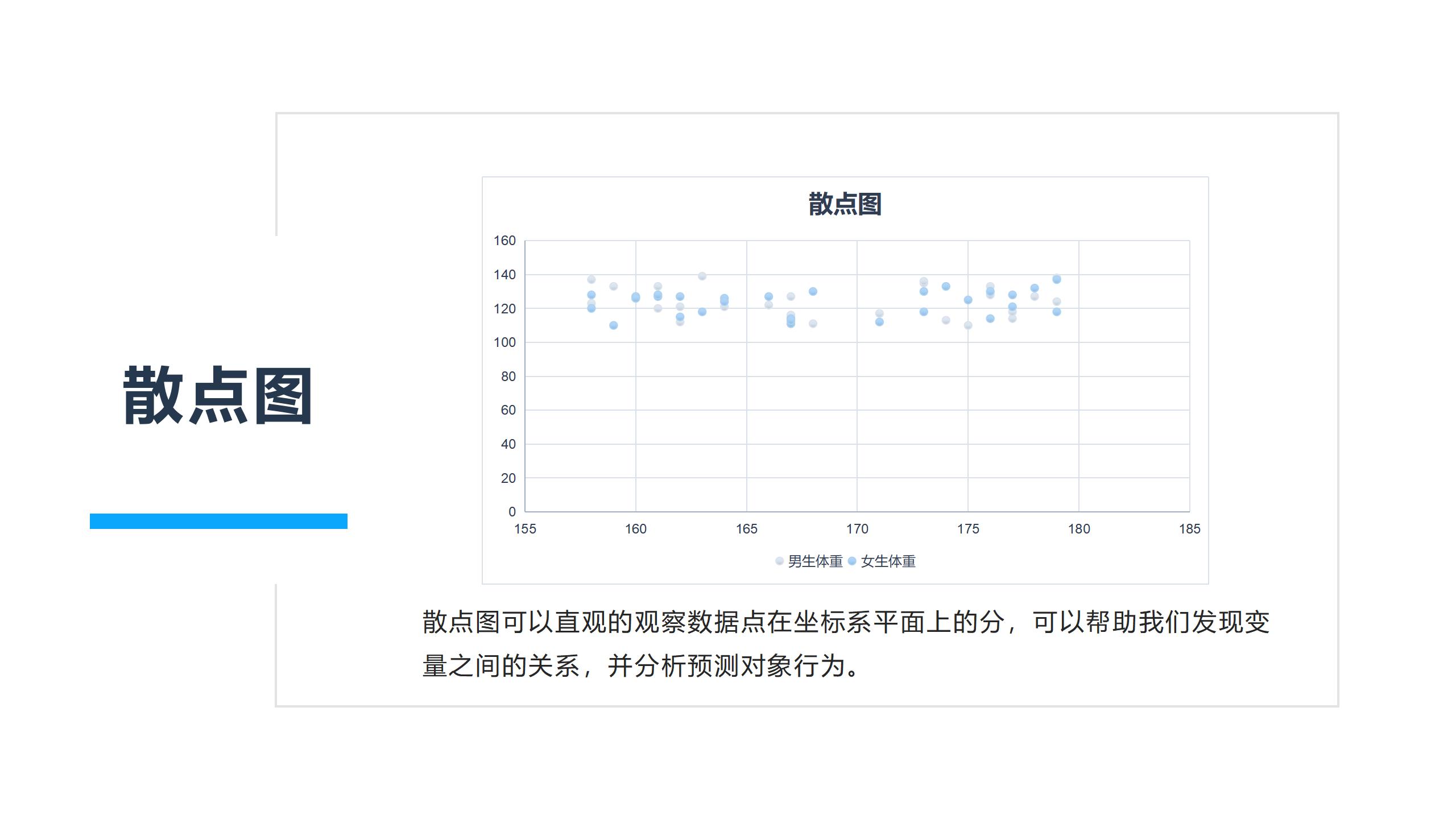
▪ Scatter plot can visually observe the distribution of data points on the coordinate system plane.
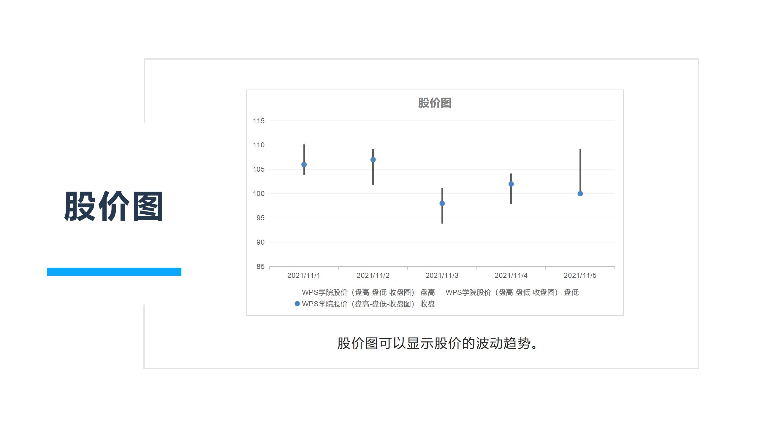
▪Stock price chart CanDisplay the fluctuation trend of stock prices.
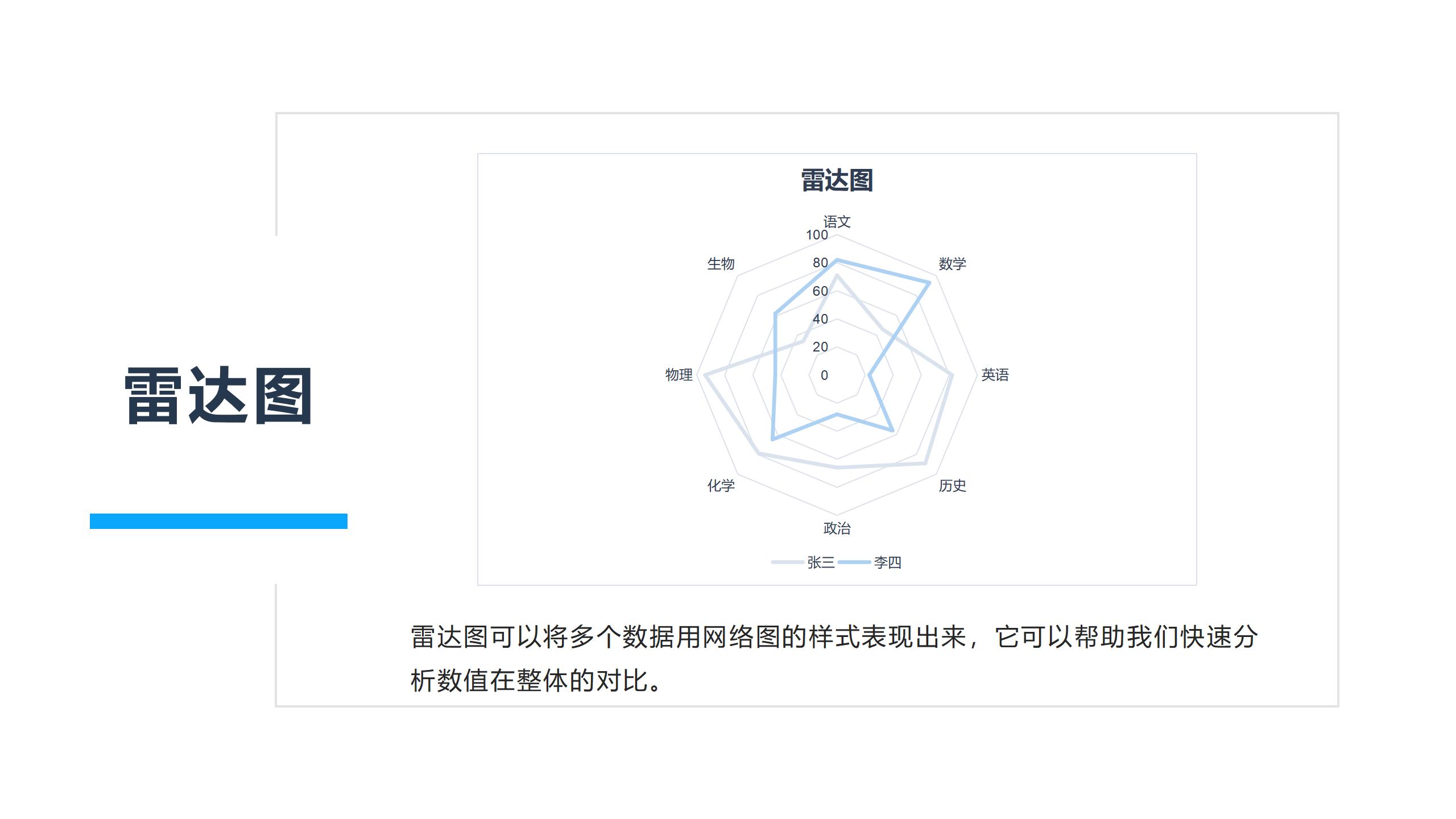
▪Radar chart can express multiple data in the style of network diagram.
More learning tutorials about charts can be found atWPSSearch for the keyword "chart" in the academy.
Articles are uploaded by users and are for non-commercial browsing only. Posted by: Lomu, please indicate the source: https://www.daogebangong.com/en/articles/detail/WPS-biao-ge-tu-biao-chu-bu-jie-shao.html

 支付宝扫一扫
评论列表(196条)
测试