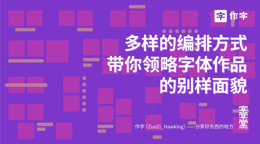
Different layout methods will bring different appearances to fonts. Let’s take a look at excellent font design works first, and intuitively see that they create different atmospheres for font design works through different layout methods. Of course, the pros and cons of font design are also very important. The main focus of this article is the Chinese and English layout rather than the font design itself.
The design works in the picture below are basically from Japan, Taiwan, and Hong Kong, because their arrangement method is relatively novel, and at the same time it does not lose the sense of simplicity~
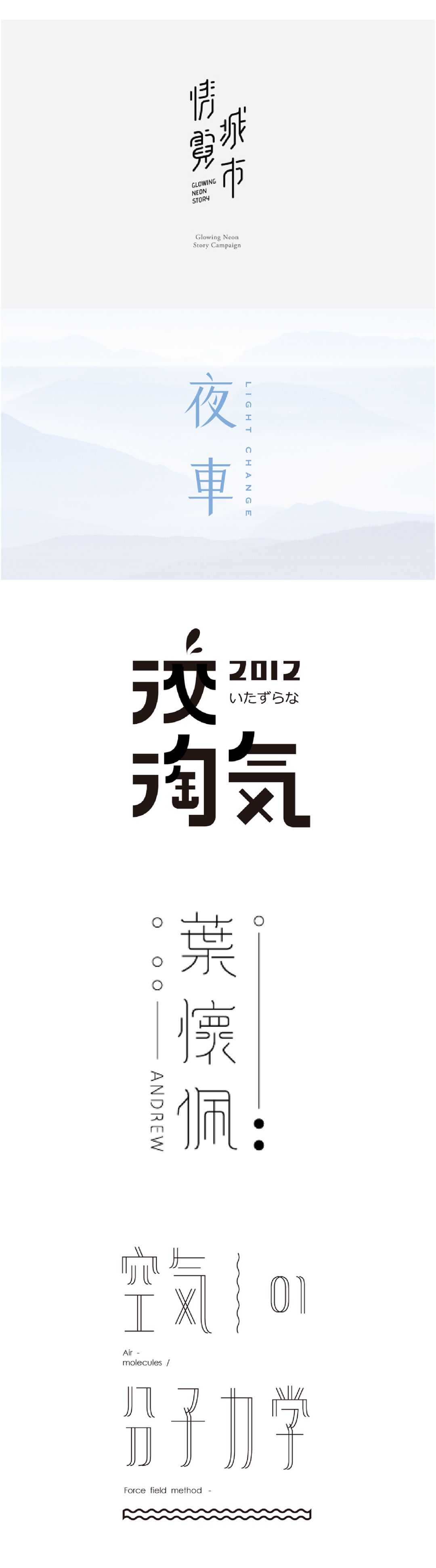
After seeing the good stuff, let's get down to business! Some common layout methods are sorted out, displayed intuitively in the form of diagrams and cases, and grouped simply by word count, so let's go!
First of all, it is the most common horizontal layout method, which is relatively correct.

is also a horizontal row, which enhances the sense of form of the work through interspersed English.
Slightly more flexible dislocation arrangement, using English to fill in the blank space.
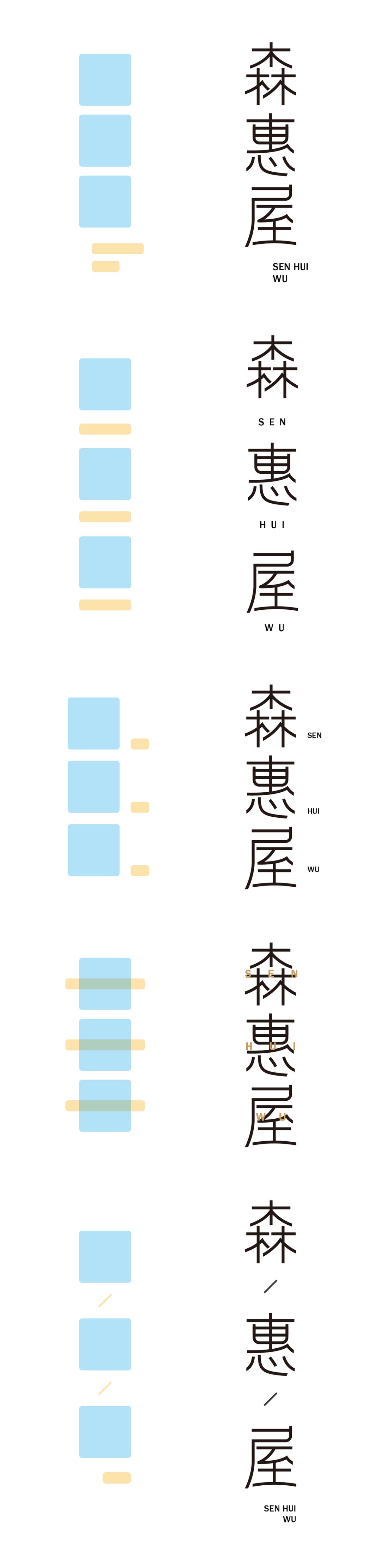
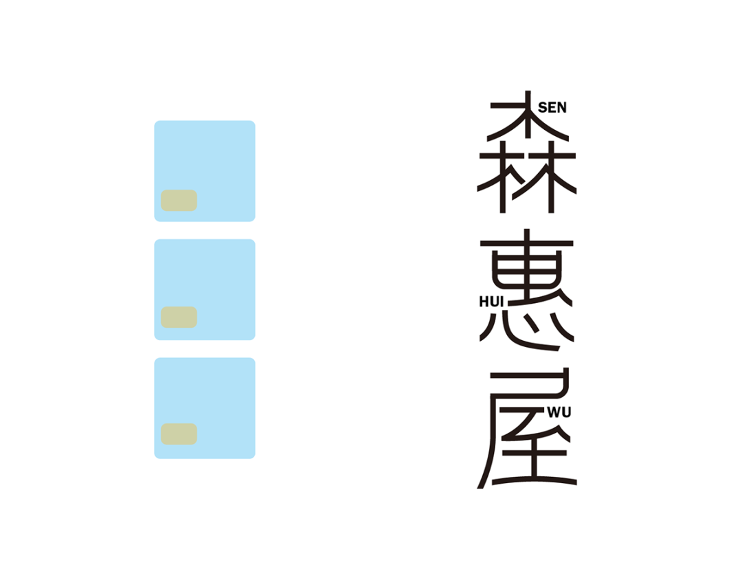
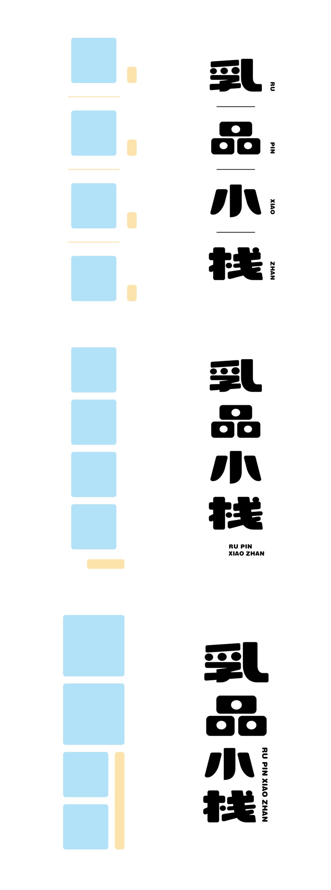
The next step is to arrange vertically, which is actually to vertically arrange horizontally.
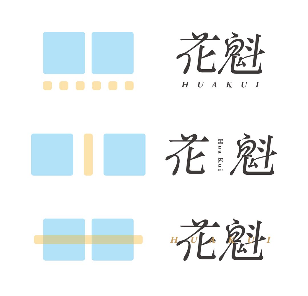
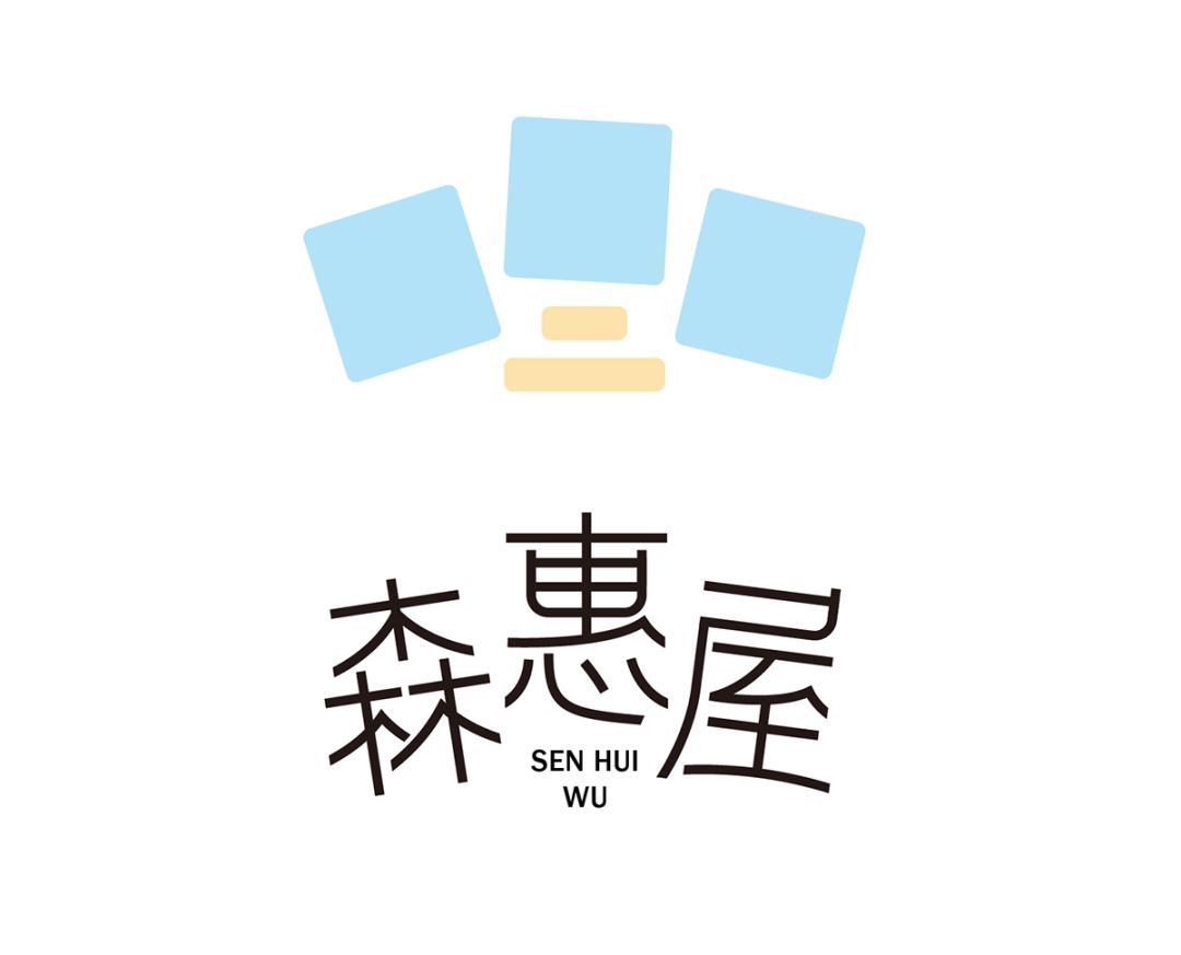
The layout of the three characters is more flexible than the two characters, and some size comparisons can be made Play the role of emphasis! (Friendly reminder: Some common layout methods shown above will not be listed below.)
The way of dislocation arrangement is very similar, and they all use English to fill in the blank space.
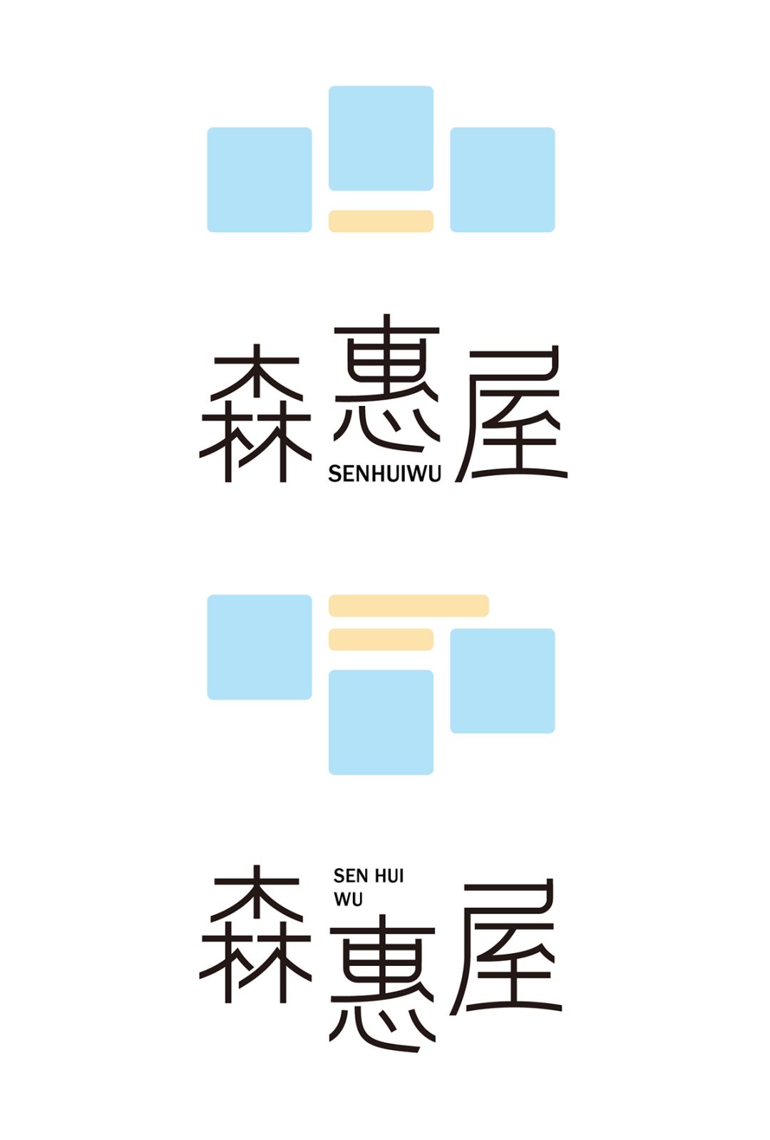
There is also a way of dislocation arrangement, that is, the complementary relationship between characters makes them more integrated through the complementary relationship between strokes. This flexible way is very common in cartoon-type glyphs.
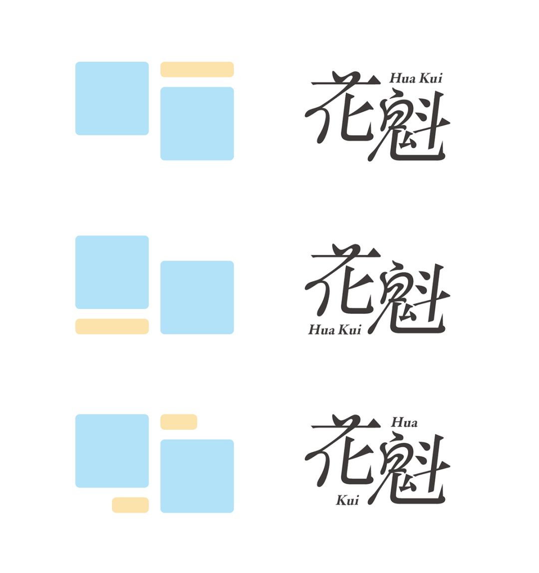
The following are also listed separately. (Because this time the focus is on the layout method, the case only uses a unified font to indicate)
The arrangement of -like Tian characters can be observed from the following figure. Small English can enhance the sense of form. The reason is that the reduced English will exist in the form of dots or planes. Elements of form are the way to add form.
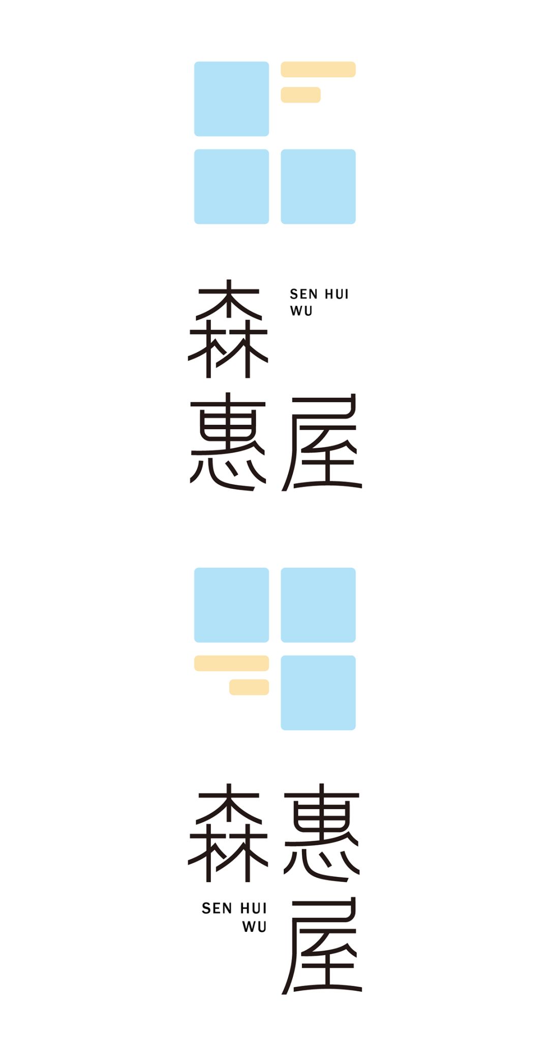
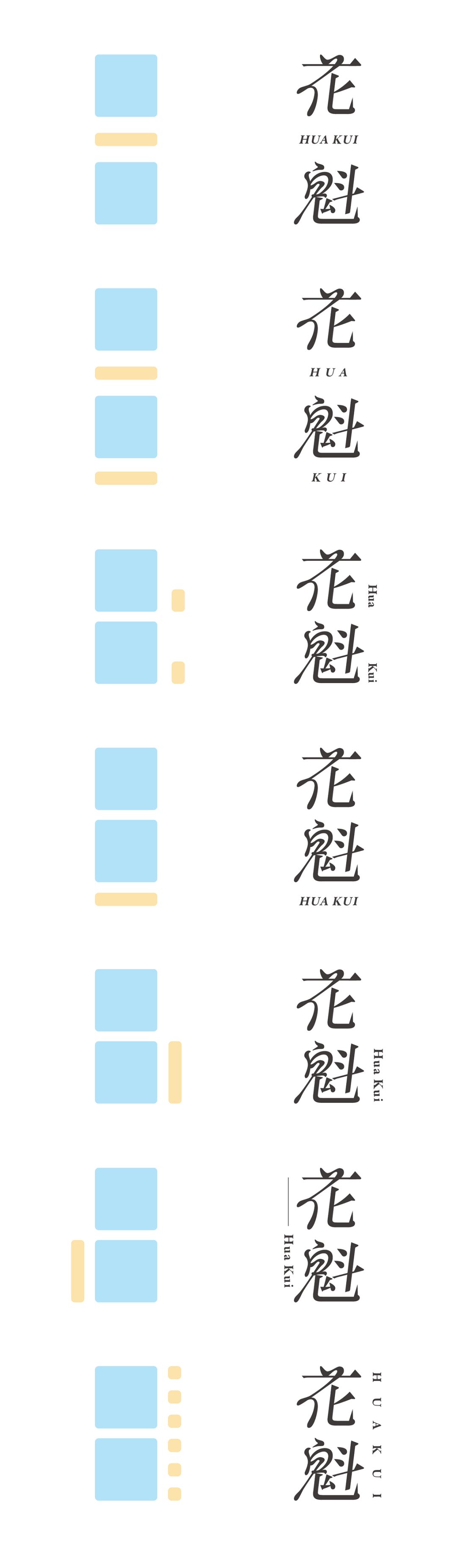
The following is the vertical arrangement.
Use English and glyph fusion, pay attention to the fusion should be harmonious, not too far-fetched.
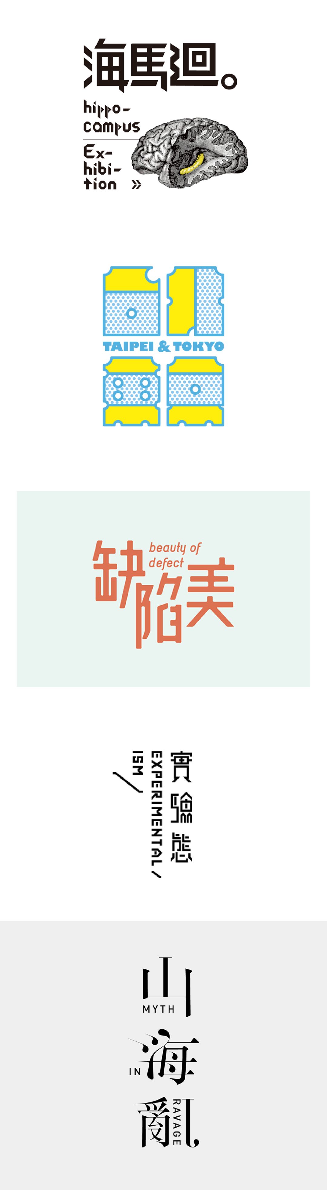
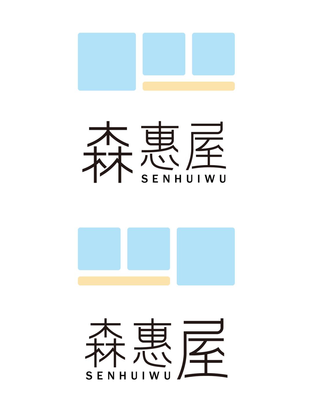
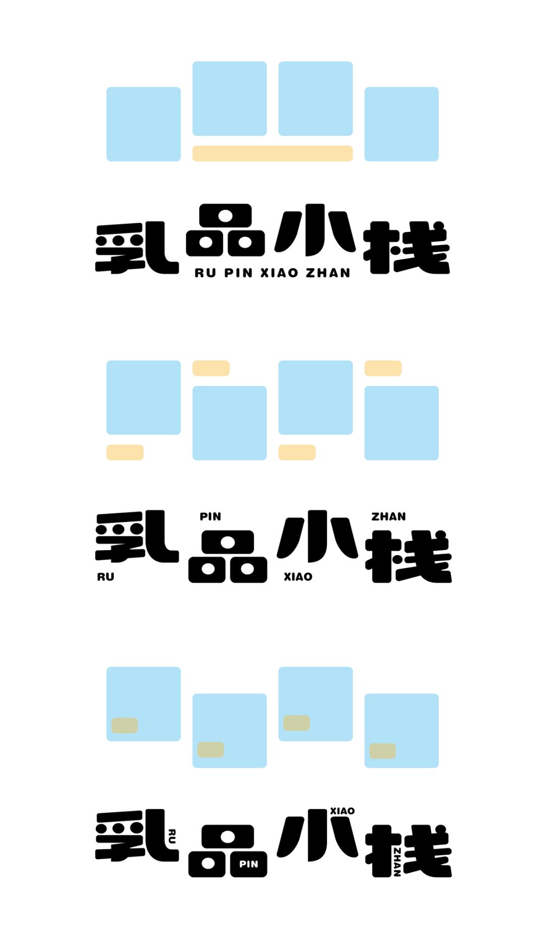
The arrangement of the four characters is more diverse, starting from the most common horizontal arrangement.
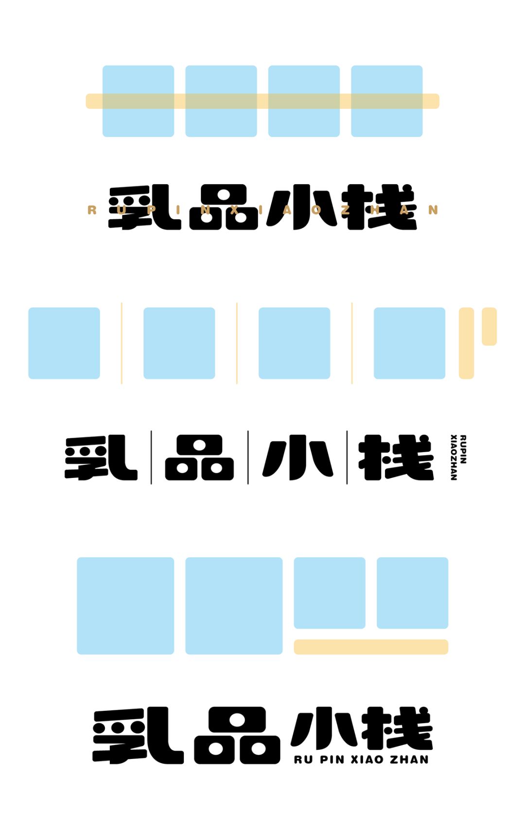
The misplaced layout makes the font more lively and vivid.
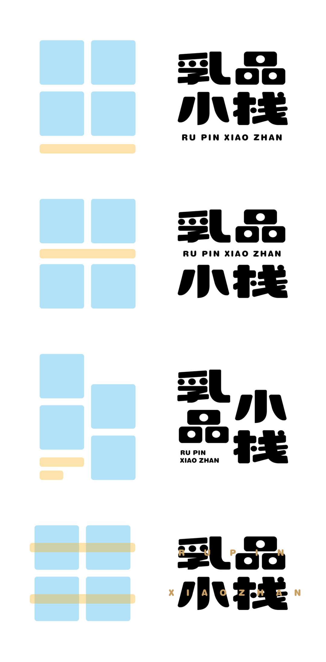
The arrangement of Tian characters makes the font look more integrated.
In the arrangement of matt characters and misplaced form, the first character is always at the front, which is in line with people's reading habits.
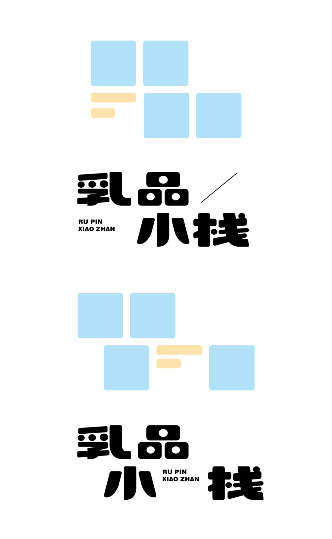
Adding misplaced forms to the arrangement of Tian characters and adding lines is a way to increase the sense of form.
To sum up, we have shown you the commonly used layout methods from two characters to four characters. It can be clearly seen that different forms bring different appearances and characters to the glyphs. When you receive a font with certain attributes or characteristics When designing requirements, not only the font design itself is very important, but also the way it is arranged.

end
Source: ZuoZi (id:ZuoZi_Hawking)
Articles are uploaded by users and are for non-commercial browsing only. Posted by: Lomu, please indicate the source: https://www.daogebangong.com/en/articles/detail/Various%20fonts%20and%20LOGO%20arrangements%20collection.html
 支付宝扫一扫
评论列表(196条)
测试