Editor: Green Onion Author: I am Design Wet
Net comprehensives are getting more and more popular now. The time of the last font class collided with the summer of the band. I deeply felt that many students were entangled between attending class and listening to the band. Listening to class or entertainment, survival or destruction ,This is a problem.
This time we will talk about how the variety show logo is completed. Many students have actually discovered that this type of program logo is generally completed with fonts as the main body, and easy dissemination is the biggest feature. The final effect is often completed by adding c4d to the font. Everyone is excited. Do you want to talk about c4d by the way? No, you go, roll as far as possible (smile)
Generally, when a topic is given, an experienced designer will immediately reflect what tonality the font should be, that is, what style will be more appropriate.
Then there are some keywords in my mind. Sometimes these keywords need to be independently associated, sometimes they are given by customers, and sometimes they are compared with the same type of queries in the same industry. It's all possible.
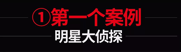
Then the key words of this topic are: reasoning, investigation, crime, murderer and so on. Then the resulting style should be sharp and a little mysterious.
The first step, we first build a basic black body, a basic skeleton.
Three parts are also determined: thickness, basic structure, basic serif (the most basic stroke decoration)
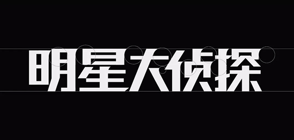
The second step is to start deformation from the stroke features.
I added some complicated stroke decorations, sharp and cruel (the strokes don't look like axes, sickles and awls).
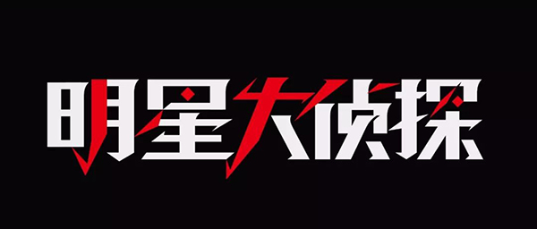
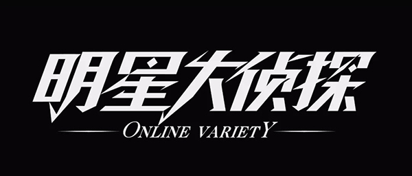
The third step, tilting, has a sense of movement or progress.

The fourth step is simple typesetting and adding English.
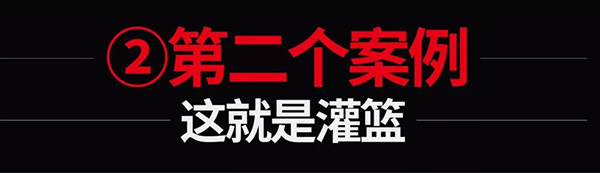
I also followed this show at the time. Although I am good at basketball and still stuck in the three-step layup after practicing for a long time, I was still very passionate watching it.
Therefore, the key words should be: youth, passion, sports, speed, etc. It is of course difficult to turn these keywords into a specific stroke style, and requires a more accurate awareness. To put it bluntly, it is experience.
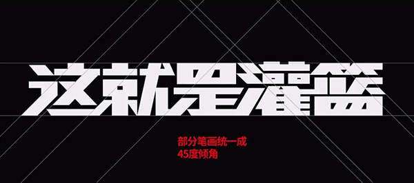
The first step, we first build a basic black body, a basic skeleton.
This time I am going to use the method of uniform angle, so strokes with angles such as dots, strokes, and strokes can be partially made into 45 degrees.
Why some and not all, because some strokes are forced to be 45 degrees, which is very awkward and even difficult to achieve.
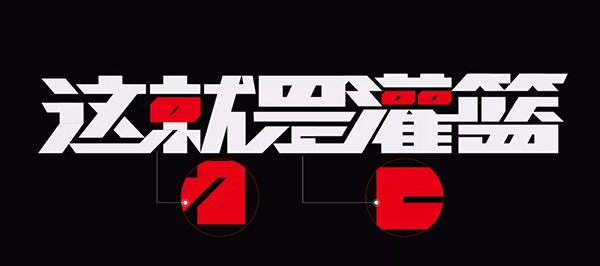
The second step is to improve some and do stroke cutting. Form a complete unity with the previous 45-degree strokes.
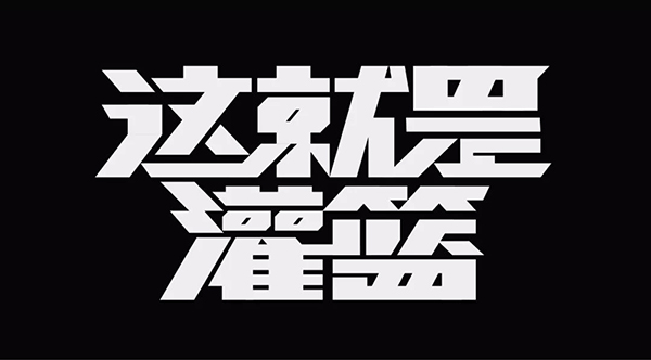
The third step is to change to another typesetting method. When the strokes are thicker, the two-line typesetting appears more compact.
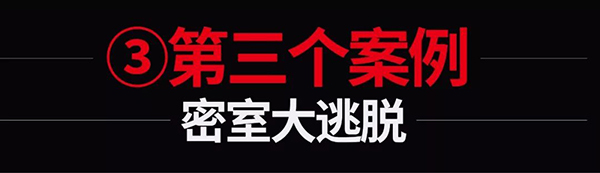
To some extent, this topic feels very close to the first topic, and it also needs to rely on reasoning, clues, etc. to outline the style.
But there are still differences. Compared with the first topic, this topic is a secret room and escape, so it is closed and eager to escape. Naturally, the overall atmosphere is more depressing. A thicker stroke can make the atmosphere more dull.
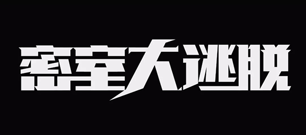
The first step, we first build a basic black body, a basic skeleton.

The second step is the connection of strokes. It is easier to form a sense of connection between words and characters, and it is holistic, rather than individual characters.
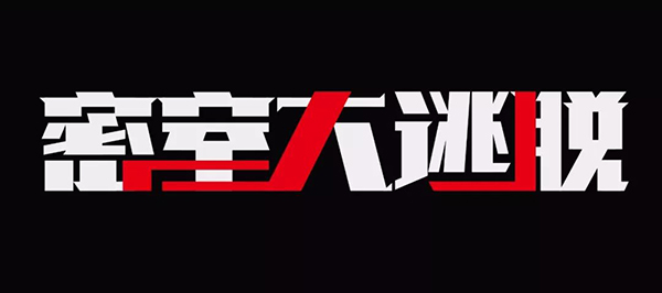
The third step is to try other typography methods to make the whole more rhythmic.
I am here to make the strokes of large characters more free. But I think it can be better, try two-line layout again.
The fourth step, try to typesetting again. Two lines of staggered typesetting (the second case uses two lines of staggered centering), add English and other text, and it's done.

The last one is to make a movie title. In recent years, movie posters have often designed movie titles, which has almost become a common practice. Of course, there is the problem that the fees for genuine fonts are relatively expensive. Sometimes it is cheaper to find someone to design than genuine fonts.
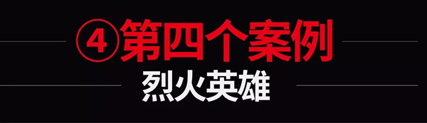
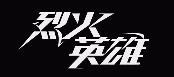
So how should the topic of fire heroes be solved? In fact, this topic is quite representative. On the one hand, Agni gives people the feeling of curves and the shape of flames. On the other hand, the hero gives people the feeling that they should be silent and stable. Then you need to combine these two factors.
The first step is still to build the infrastructure.
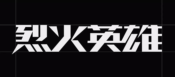
The second step is to change some of the basic strokes so that it has a sense of shape close to the flame. Remember not to be too concrete. It is not necessary to draw a ball of flames to blend in. It would be too rough. It is best to simplify it into strokes one by one. Create a general atmosphere.
I also use other techniques here. Such as stroke connections.
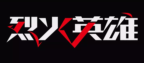

The third step, tilt, is done. In addition, I also tried a different typesetting method, which is also possible.

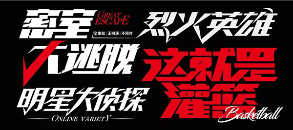
Comprehensive display of all cases
Articles are uploaded by users and are for non-commercial browsing only. Posted by: Lomu, please indicate the source: https://www.daogebangong.com/en/articles/detail/Variety%20show%20logo%20design%20you%20will%20do%20it%20after%20watching.html
 支付宝扫一扫
评论列表(196条)
测试