Foreword
For the various calligraphy styles of the brush, although there are many calligraphy font resources on the Internet, after trying it, you will find that the effect is not very satisfactory. The main reason is that the charm of oriental calligraphy has its own uniqueness and its own irreproducibility. It would certainly be a good thing if we could write such a font, but it would take a long time to sharpen. Therefore, today we will share the method of using AI to design brush fonts with a splatter feel.
Source of inspiration
A video shared by a designer from HK. He provided many good methods of designing brush fonts. I selected some excellent techniques in it and added and deleted them appropriately.
Font preparation
STEP 01
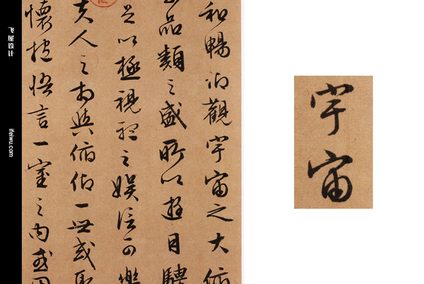
Calligraphy first needs to have a certain font skeleton. There are many ways to build font skeletons, which are introduced in many font designs, so I won’t repeat them here. The font of the brush is quite special, so you can use the font resources on the Internet to choose a more suitable font to start, or you can filter from the works of some ancient calligraphers.
Here I choose the two characters "universe" in the "Rowling Cursive "Red Cliff Fu" written by Wen Huiming, a calligrapher of the Ming Dynasty, to express the entire creative process. His calligraphy style is vivid and gentle. The choice of font here directly affects the subsequent design. So, how to start is the source.
STEP 02
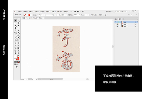
Drag these two words into the newly created document, create a new layer, and lock the layer below. On the new layer, use the pen tool to draw the outline of the font. In order to see it more clearly, here you can turn off the fill and only keep the stroke.
Stroke reshaping
STEP 03
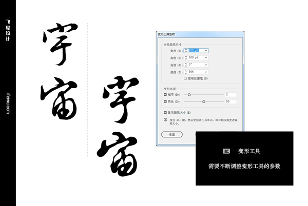
After determining the basic shape of the font, you can turn off the stroke and turn on the fill. Start working creatively with this glyph. The first tool we're going to use is the "Warp Tool". The Warp tool can change the shape of a path object, changing the appearance of the font based on what you do.
The processing here can be done arbitrarily, double-click the small icon of the deformation tool, and a panel of deformation tool options will pop up, and various operating parameters can be set. The most used here are details and simplifications. At the same time, hold down the ALT key on the keyboard and use the left, right, up and down movements of the mouse to change the size of the tool, and to adjust the parameters in the panel.
This process makes the strokes slightly "rounder".
STEP 04
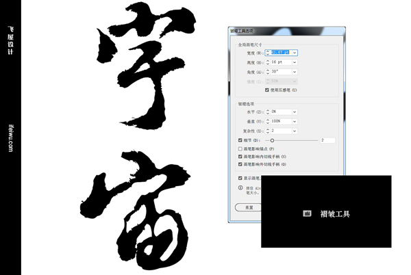
We're going to take the existing strokes a step further with the Pucker Tool, a step that transforms the sharp, smooth edges of the strokes into a splattered texture that resembles ink soaking onto rice paper. There are two most important points in the use of "fold tool", one is the size of the fold tool, and the other is the direction of the fold tool. It also requires you to constantly change these attributes during the creation process in order to make adjustments according to the actual situation.
Although it is a deformation treatment, it must also follow the writing rules of calligraphy itself, which must require the designer to have some understanding of the handling of the brush. (Widely dabbling, no harm~)
STEP 05
If you are still not satisfied with the current font, you can continue to use the wrinkle tool and the deformation tool together. Here if you make further "exaggerated" adjustments to the fold tool and deformation tool. If you are not sure about the direction, you can also adjust the direction of the font to make the operation easier.
The position and size of the font can also be changed to suit our styling layout.
Polishing and styling
In order to make the glyph look more individual and enhance its charm, you can also do the following processing.
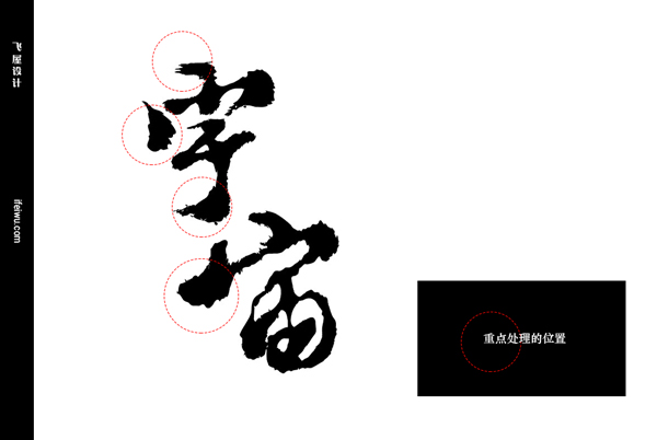
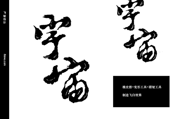
STEP 06
Add some brush "flying" to the strokes, here you can use the "Eraser" tool. The size of the eraser can be adjusted according to the font, the purpose is to create some blanks here, and then use the wrinkle tool and deformation tool to change the shape of these blanks to make it more natural and vivid.
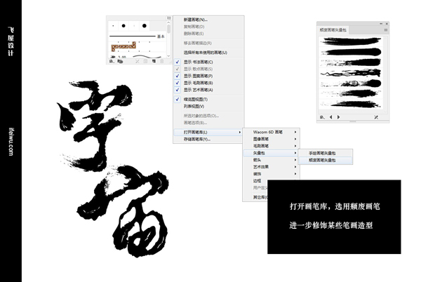
STEP 07
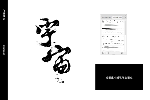
For some strokes in the font, you can also use the brush tool to "draw" the special shape of these strokes. The brush here needs to open the icon in the upper right corner of the brush panel, [Open Brush Library > Vector Pack > Decadent Brush Vector Pack], there are many optional art brushes that can be used to modify strokes in this brush library.
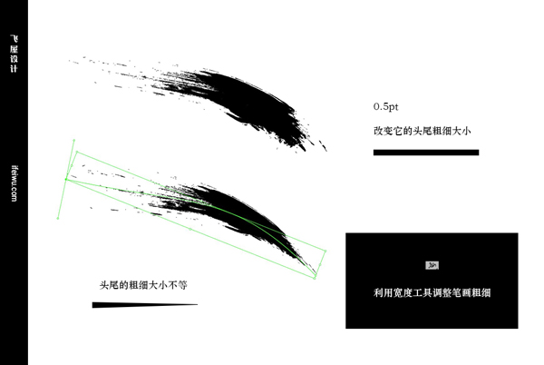
You can also adjust the thickness of the brush to suit your overall structural needs. A stroke can be adjusted for different strokes using the width tool.
STEP 08
Finally, expand the appearance of the strokes added in the previous step and merge them with the original strokes. It should be noted here that the stroke after expanding the appearance will leave a blank border, which is also a path object, which needs to be selected and deleted here to merge with the original stroke.
In addition, continue to add some ink dots to the font to restore it more realistically. Still using the brush, open the [Ink] art brush in the brush library. We can see at a glance which brushes are suitable for ink dots. After the ink dots are shaped, these ink dots are further expanded and filled with the same color as the font, because the color of the art brush itself of these inks is not completely pure black.
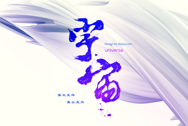
Final effect
Here I use gradient overlay to show the final effect.
Articles are uploaded by users and are for non-commercial browsing only. Posted by: Lomu, please indicate the source: https://www.daogebangong.com/en/articles/detail/Use%20AI%20to%20design%20splatter%20brush%20fonts.html
 支付宝扫一扫
评论列表(196条)
测试