Before, I wrote an article about typography. In it, I put forward a point of view, saying that in PPT, there are no more than three common typeset forms.
respectively:

In today's article, Let's talk about the second type, the process Typesetting method:
When it comes to process typesetting, some friends may not understand it, but I believe that you must have done a timeline page, and this is the type of process typesetting.

Timeline is the most typical process page
Of course, there are many more, such as these, As long as it is used to express the order of the page, it is counted as this category.
For example, like a system architecture diagram:
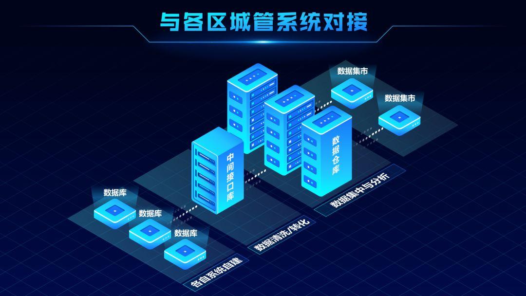
Or time planning that often appears in planning PPTs:
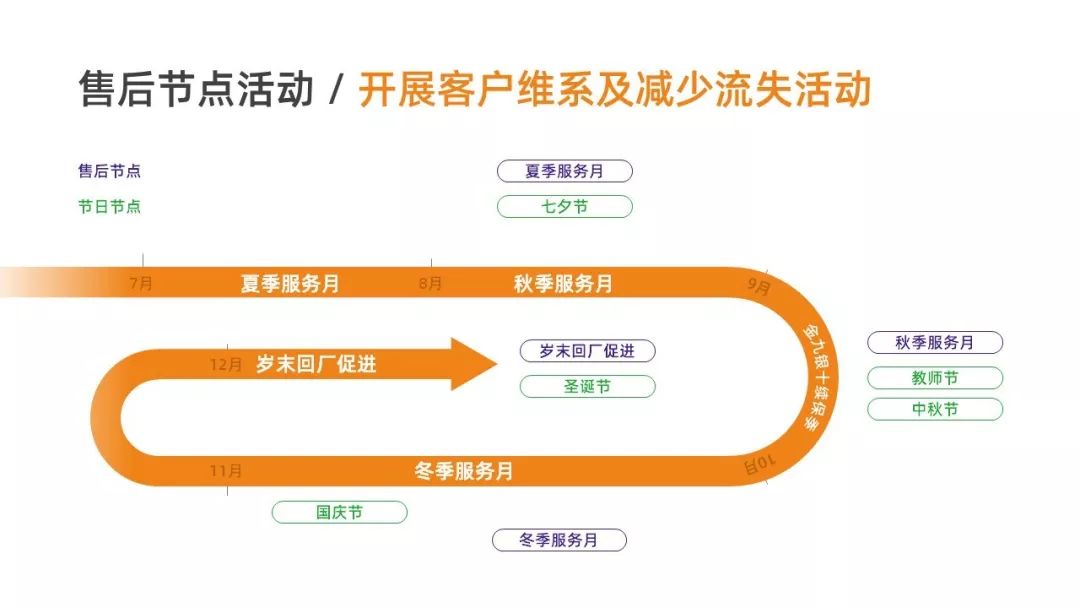
So here comes the problem
How should we design a flow-type page layout?
There are two points here, you need to pay attention to it:
01. In line with normal reading order
Let’s briefly explain first, what is the reading order?
Plainly speaking, it is to look at where first, and then where to look.
For example, on this page, our normal reading order must be from left to right, right?

For another example, let’s look at such a PPT:
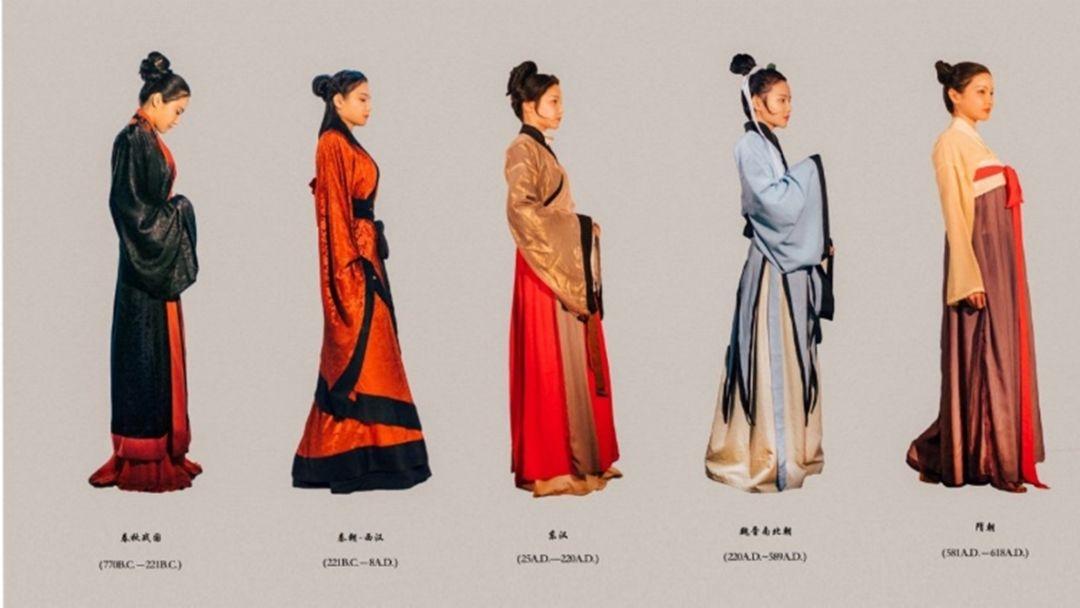
Its reading order must also be from left to right. This is the habit we have cultivated:
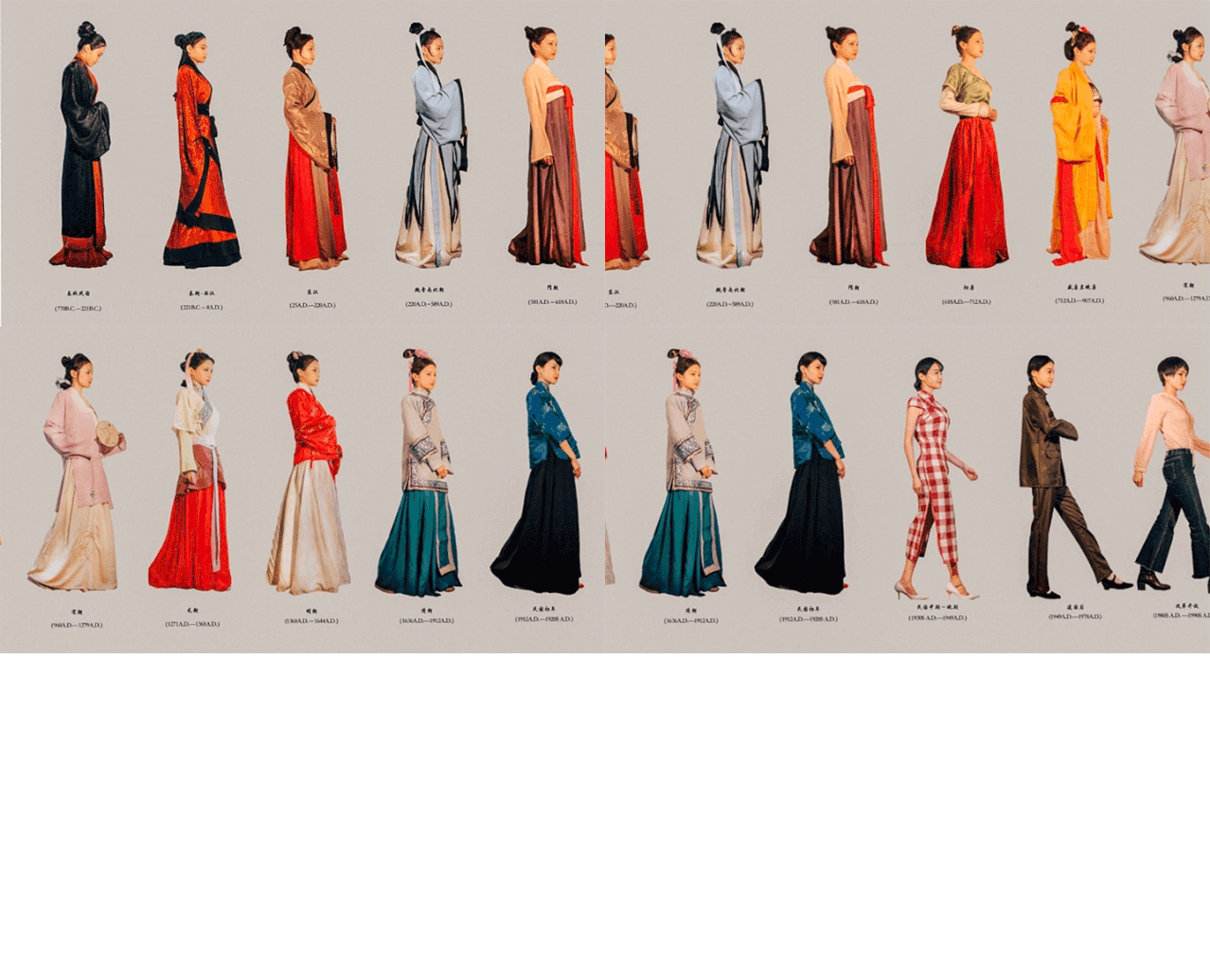
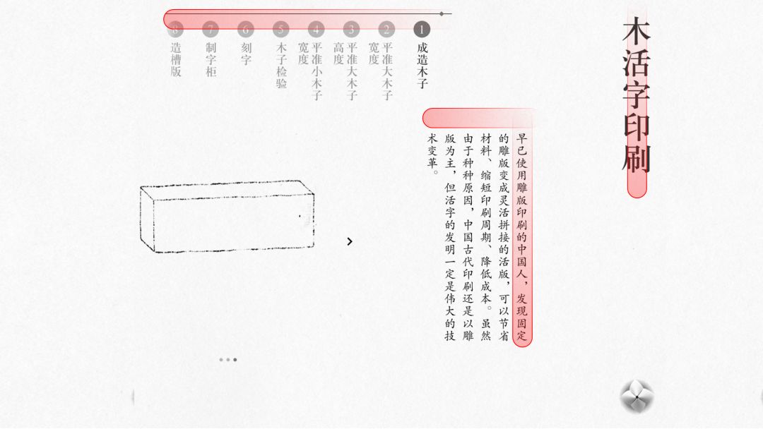
But if we switch to ancient books, what is our reading order?
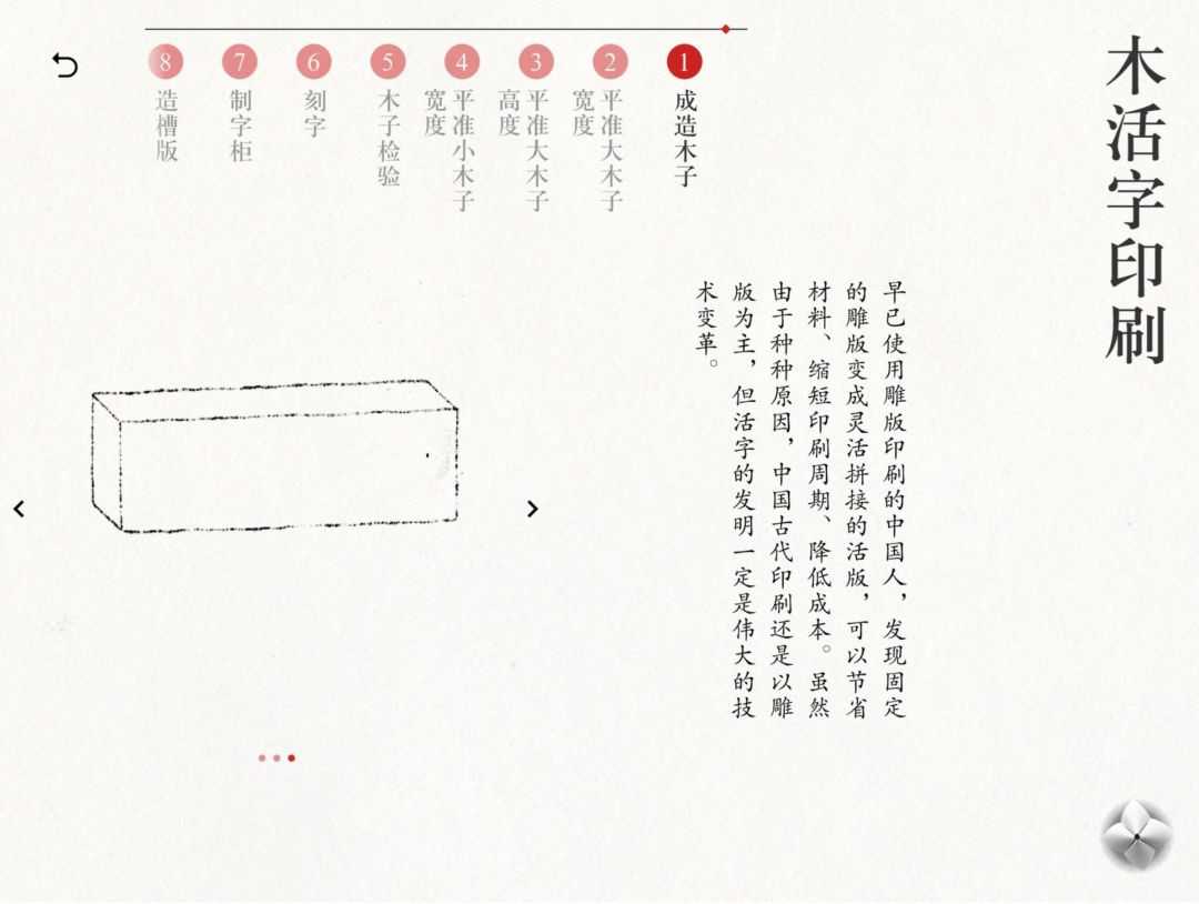
It might look like this:
In PPT, there are about four common reading sequences:
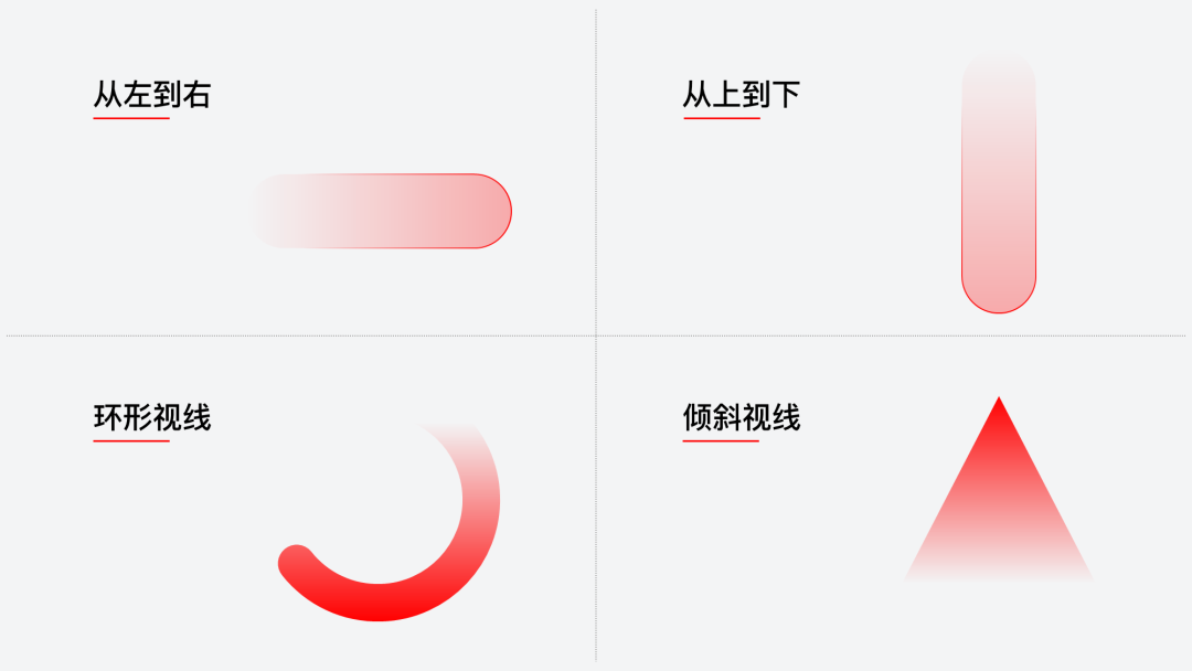
When we design a flow-type PPT page, we must have a clear reading order.
02. Distinguish between main line and sub line
As I said earlier, the so-called process page is the sequence used to present the content.
If the process relationship in the content is relatively simple and belongs to the form of a single thread, the main line and the secondary line are not involved:

But if the process relationship in the page is more complicated, then we need to distinguish this point:
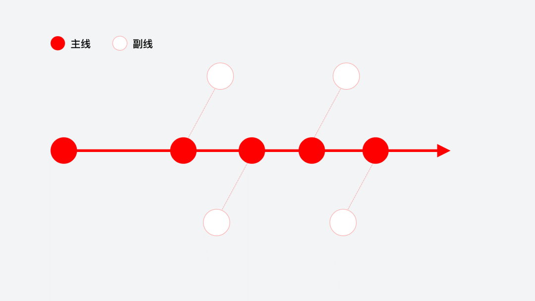
The reason why many people's flow charts are not good is that There is no clear main line.
For example, on this page, can you see the process relationship here, what exactly is it?
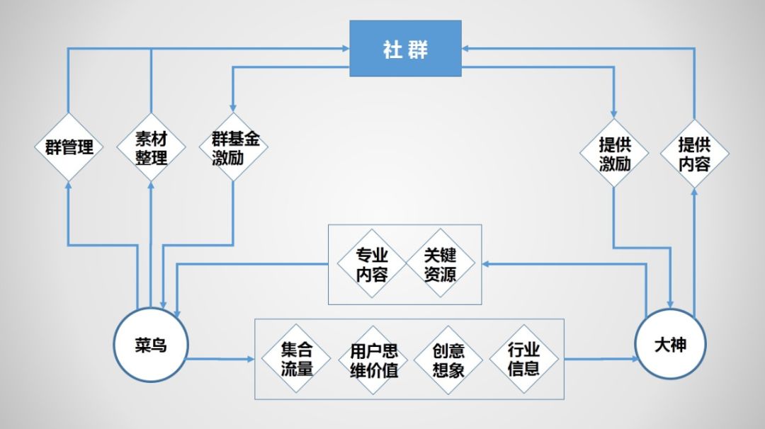
But what if there is a page like this now? Will it be much clearer?
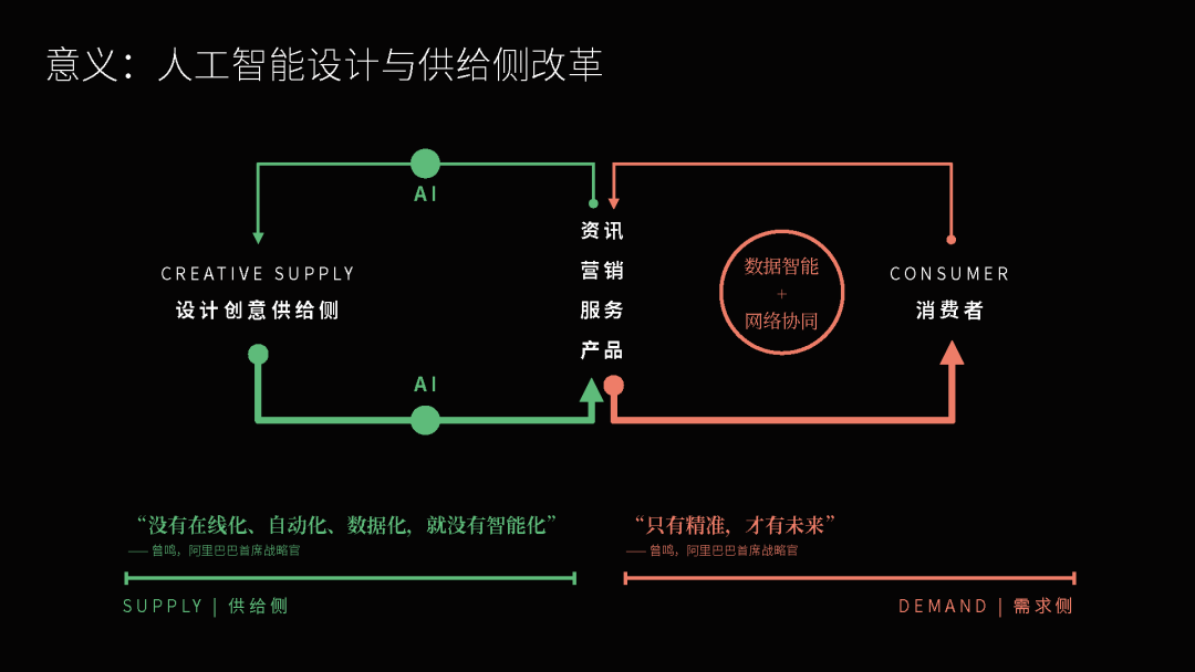
Or is this the case? Will it be much clearer?
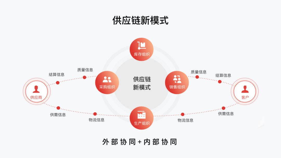
In PPT typesetting, the method of distinguishing the main line and the sub-line is usually There are several:
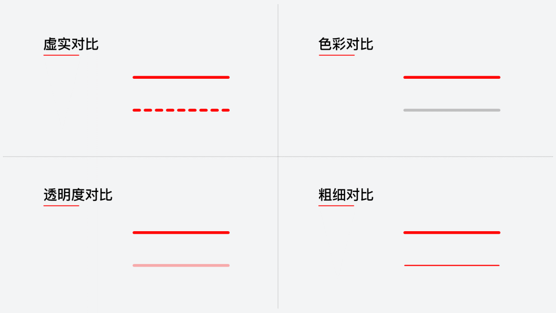
Pretty easy to understand, right?
Next, in order to let everyone better understand these two principles, we will use two actual cases to better understand.
Case 1
For example, let's start with a single-threaded PPT page. If it is it, how should we optimize it?
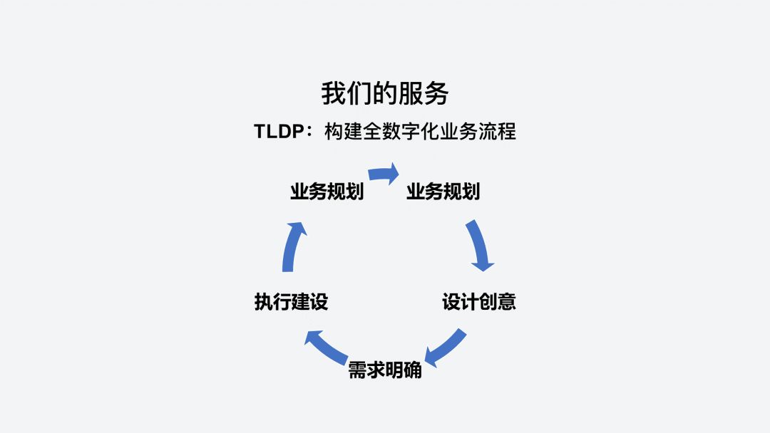
First of all, let's sort out its process relationship. Very simple, it is an ordinary cycle process:
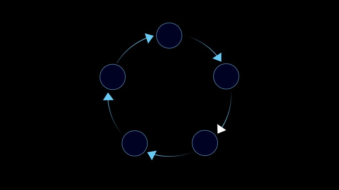
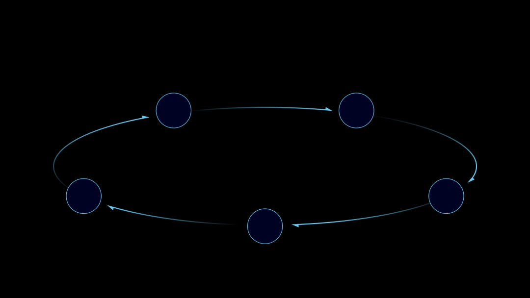
However, if the flowchart is placed on the page like this, it will affect the typesetting of the title. So, we flatten it:
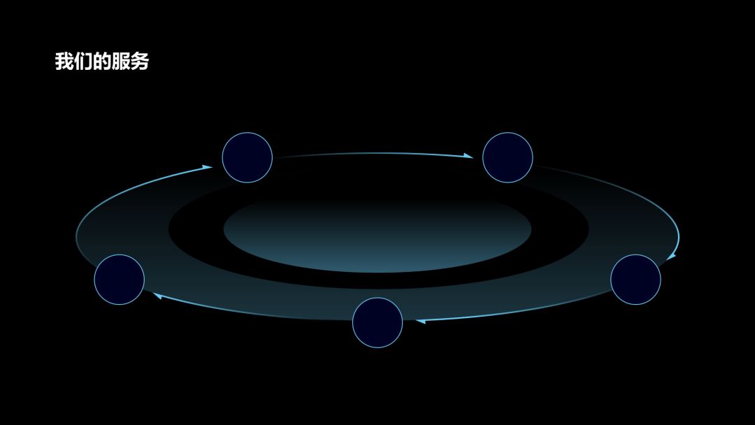
Next, we can add some rings to further enhance the relationship between its processes:
Then, add relevant content and icons to the PPT page:
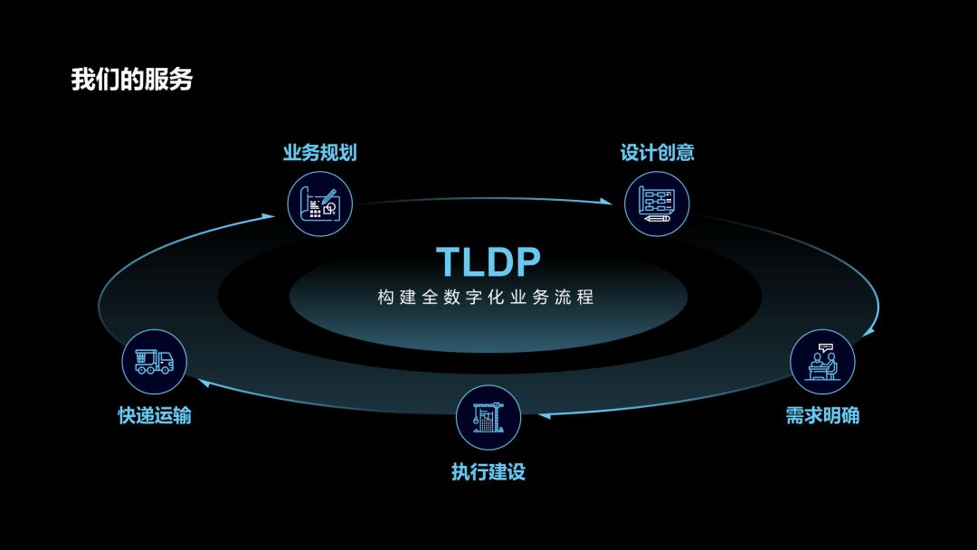
Finally, because the content is a digital business process, in order to present a visual feeling, we can add a background image:

Case Two
This is a one-page PPT case I saw on the Internet. Compared with the above example, it has a more complicated process relationship.
So how do we optimize?
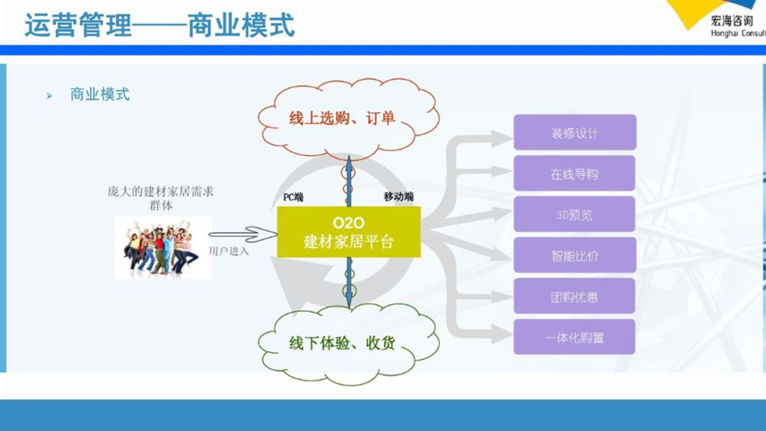
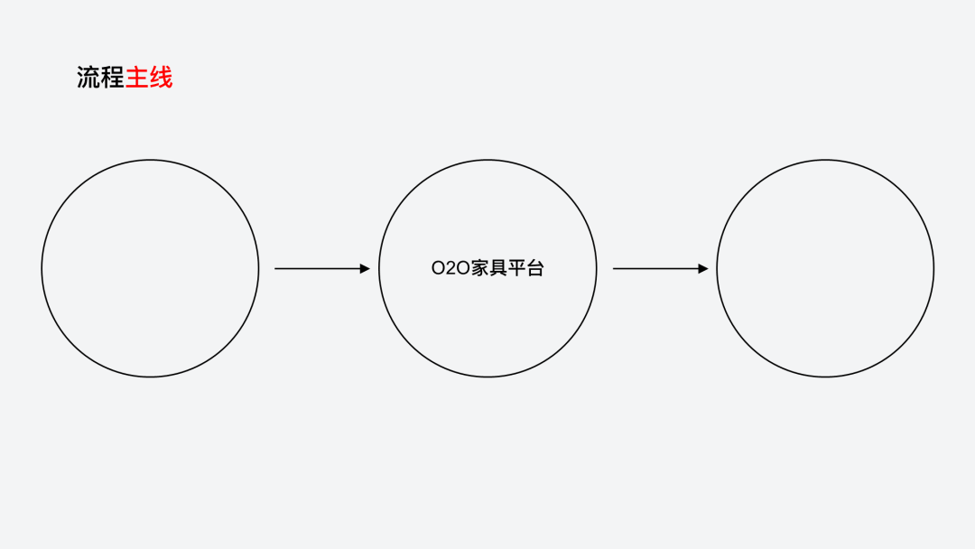
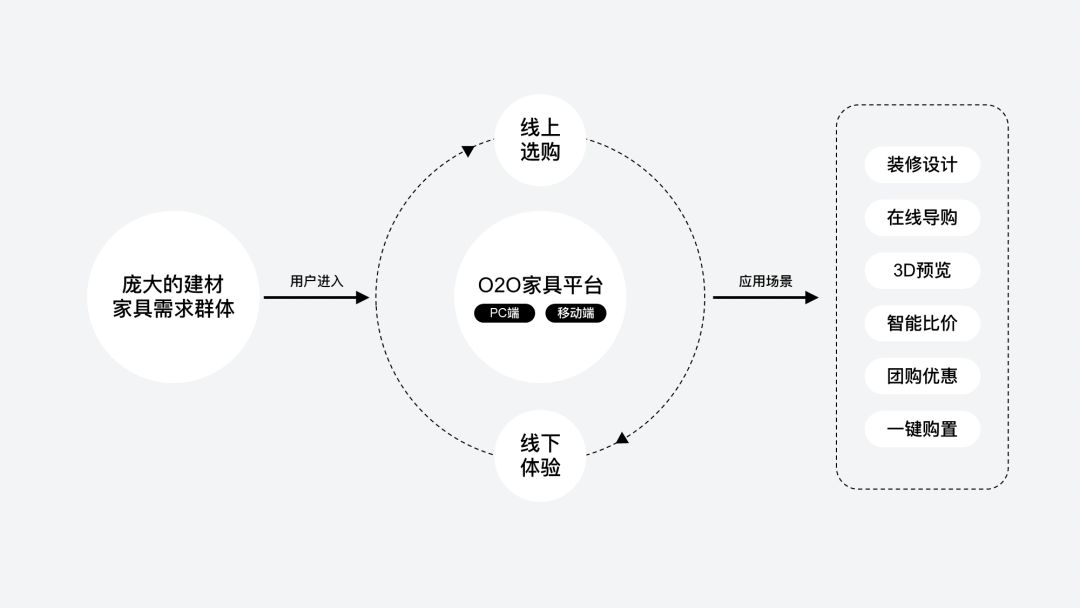
First of all, sort out its main process, which is a progressive relationship, probably like this:
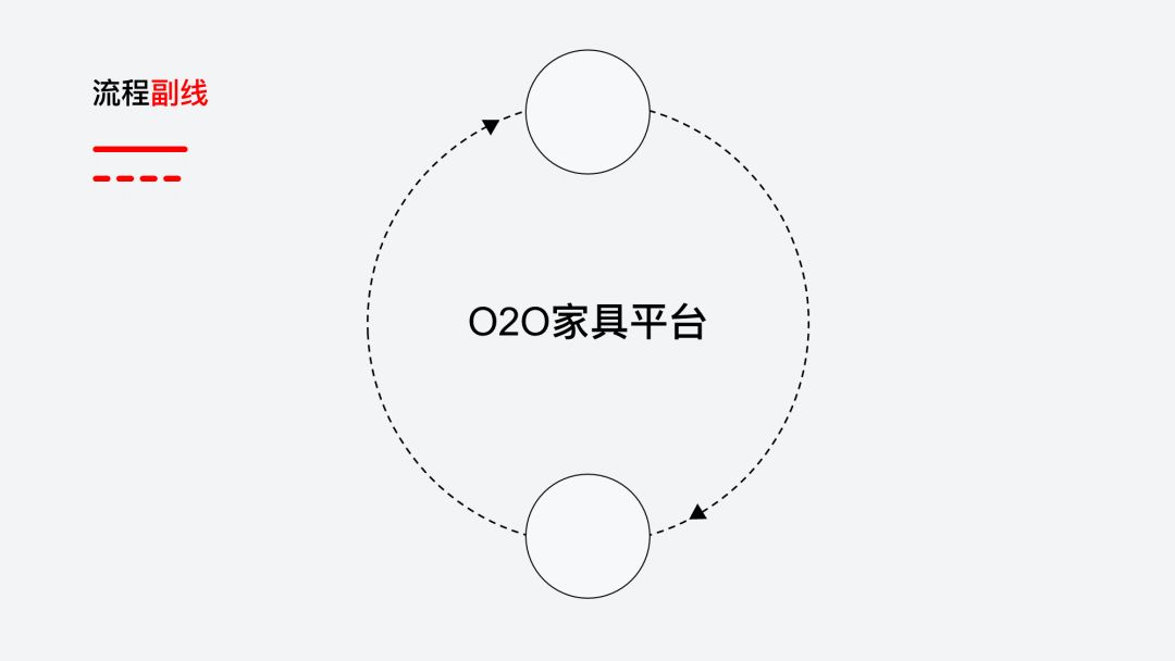
In addition, in the middle part, there is a sub-line process, which is a circular relationship.
We can use a dotted line to distinguish it from the main line:
Next, we fill the corresponding content in the corresponding graphics, it looks a bit like this time, right?
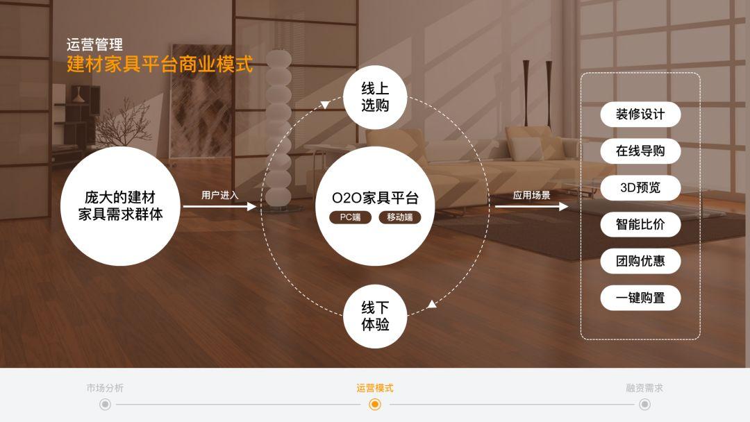
Finally, we find a suitable background image and put it on the page:
Above, I hope it can inspire everyone.
If you have any questions, you can also communicate in the comment area~
Articles are uploaded by users and are for non-commercial browsing only. Posted by: Lomu, please indicate the source: https://www.daogebangong.com/en/articles/detail/Unexpectedly%20I%20used%20these%202%20points%20to%20easily%20get%20the%20PPT%20flow%20chart%20it%20is%20really%20simple%20and%20practical.html

 支付宝扫一扫
评论列表(196条)
测试