

On October 15, the famous American graphic designer, Typography guru Ed Benguiat has died at his New Jersey home at the age of 92. The "New York Times" and the New York School of Visual Arts, which had close contact with him, issued obituary notices one after another.

Benguiat is an American plane A member of the Design Association AGI and the former chairman of the New York Type Directors Club (New York TDC), he has designed more than 600 fonts in his life. In 1989, he was awarded the Gold Medal for Excellence awarded by TDC in New York for his outstanding achievements in font design. Fredric W. Goudy Award presented. The designer's contribution to the font design industry is still vivid, and Design360° is here to briefly review his design career.

*1920s -1940s
From jazz drummerto learning design
Ed Benguiat was born in 1927 in Brooklyn, New York Grew up in an ordinary family. My mother is a driver of the Red Cross, and my father is the design director of Bloomingdale’s department store in the Lower East Side of Manhattan. At the age of 9, the most toys he owns are pens, paintbrushes and drawing tools from his father.
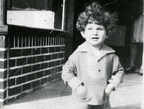
2-year-old Benguiat
Until I was 10 years old and received a gift from my father Benguiat fell in love with drumming. After serving in the Air Corps during World War II, he picked up the jazz musician again,with musicians such as Stan Kenton and Woody HermanPlayed together with the ensemble, became a prominent jazz musician, and threw himself into finding opportunities to play in various underground clubs and bars in New York.
Until one time to gomusician When the trade union paid dues, Benguiat saw the old man attending the worship service and thought that his future might also look like this, so he decided to become an illustrator. The club where he performed at that time was located near Fifth Avenue, and there was an art workshop on the street with the slogan "Be an Artist", which attracted him to the new experiment in the field. At Paul Standard's advertising studio school, Benguiat tried painting, typography, design, typography and calligraphy, re-following his father's footsteps into design path of.
In the TDC interview, Benguiat mentioned the club 3DEUCES that performed in New York
In an interview with TDC, Benguiat said I saw the connection between my early music career and later doing design. "Music to me is about putting notes in the right order so they're pleasing to the ear, and it's the same with graphic design, you need to put things in the right order to make them look pleasing," he says.
*1940s-1960s
Redesigning the logo for The New York Times after graduation
After graduation, Benguiat has published in various Agencies, studios and advertising agencies as designers. With the accumulation of experience, he got the opportunity to serve as the deputy visual director of the fashion magazine "Esquire" in 1953, and opened his own design studio in New York.
In 1962, he joined the first batch of using photography technology Photo-Lettering Inc., a font factory that produces commercial fonts and lettering, served as the layout design director, designed more than 400 fonts for it, and designed or redesigned fonts for various types of customers LOGO, Ford , Estee Lauder, AT&T, "Playboy" and so on are all his cooperation objects.
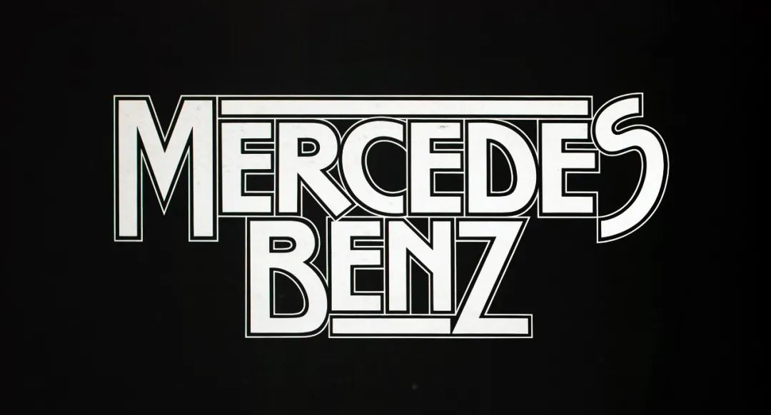

Benguiat has participated in Ford and Mercedes-Benz LOGO design
In 1967, the New York Times Louis Silverstein's art director was given the task of retooling the newspaper's masthead, when he redrawn the new logo on graph paper and hired Benguiat to perfect the design. This redesigned LOGO for The New York Times also made Benguiat known to more people.

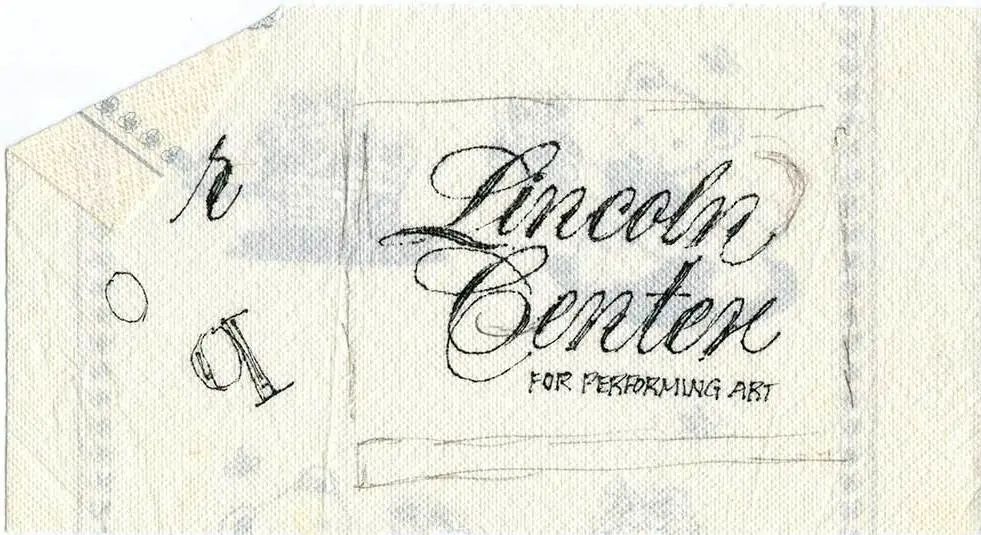
New York Times redesign manuscript
Benguiat did not follow the idea of the art director Instead of completely changing the design of this LOGO, I chose to repair it and revise the details. He felt that the LOGO itself was already too iconic, and no one would recognize it if it was changed, so accepting this and modifying it was the best choice for Benguiat.
Benguiat, who was born in hand-painted LOGO, often takes a year Time to develop a font, this kind of personal design experience also gave him a deeper understanding of the complexity of fonts. New York Times editor Neil Genzlinger described, "Benguiat understands thata successful design is not only about the shape of individual letters, but much more about the spacing between letters. And He knew that what looked good on a computer screen might not have the same effect when the type was scaled up to billboard size."
*1960s-1970s
Teach as you design
Push fonts to market
In the mid-1960s, Benguiat started at the New York School of Visual Arts Teaching for nearly 50 years. It is his achievements in typography and logo redesign and his contribution to teaching that make him a highly respected figure in the industry. However, Benguiat's influence on the design world does not stop at the design part, he also participated in promoting fonts to the market, and was valued and used by more industries.

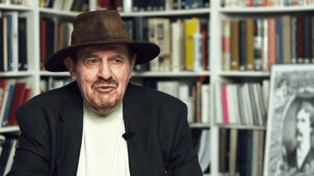
Benguiat is teaching
In 1971, Benguiat joined a company formed by designers Herb Lubalin, Aaron Burns and Ed Ronthaler ——The International Typeface Corporation (International Typeface Company, referred to as ITC), and ITC jointly opened the font production industry. ITC was the first company on the market to provide services to type designers, and they were also the first batch of designers who intended to market their type designs to the market.
While working here, Benguiat designed a series of classic fonts, including Tiffany , Benguiat, Benguiat Gothic, Souvenir, Korinna, Panache, Modern No. 216, Bookman, Caslon No. 225, Barcelona, Avant Garde Condensed, etc. After becoming Vice President, he partnered with Lubalin to create ITC's acclaimed magazine, U&lc.


Benguiat typeface design manuscripts and manuals in the archives of the School of Visual Arts Collection
1975-1977 In an interesting tidbit, Benguiat, who was living in New York at the time, often dined at the same New Jersey restaurant as film director Woody Allen. One morning Allen asked Benguiat what typeface he should use for his upcoming movie, and Benguiat recommended him a Windsor font that he didn't design himself. Windsor has been used in Woody Allen's films ever since.


*1970safter
From Stephen King Horror Titles to Stranger Things Titles
With the font design in different fields Popularized, the font designed by Benguiat began to appear in the title designs of various movies, such as the 1968 science fiction film "Planet of the Apes (Planet of the Apes)", 1972 "Super Fly (Super Fly)" and 1997 by Jackie Brown, directed by Quentin Tarantino.


"Planet of the Apes", "Super Fly", "Dangerous Liaisons" movie titles or posters The fonts are all from Benguiat
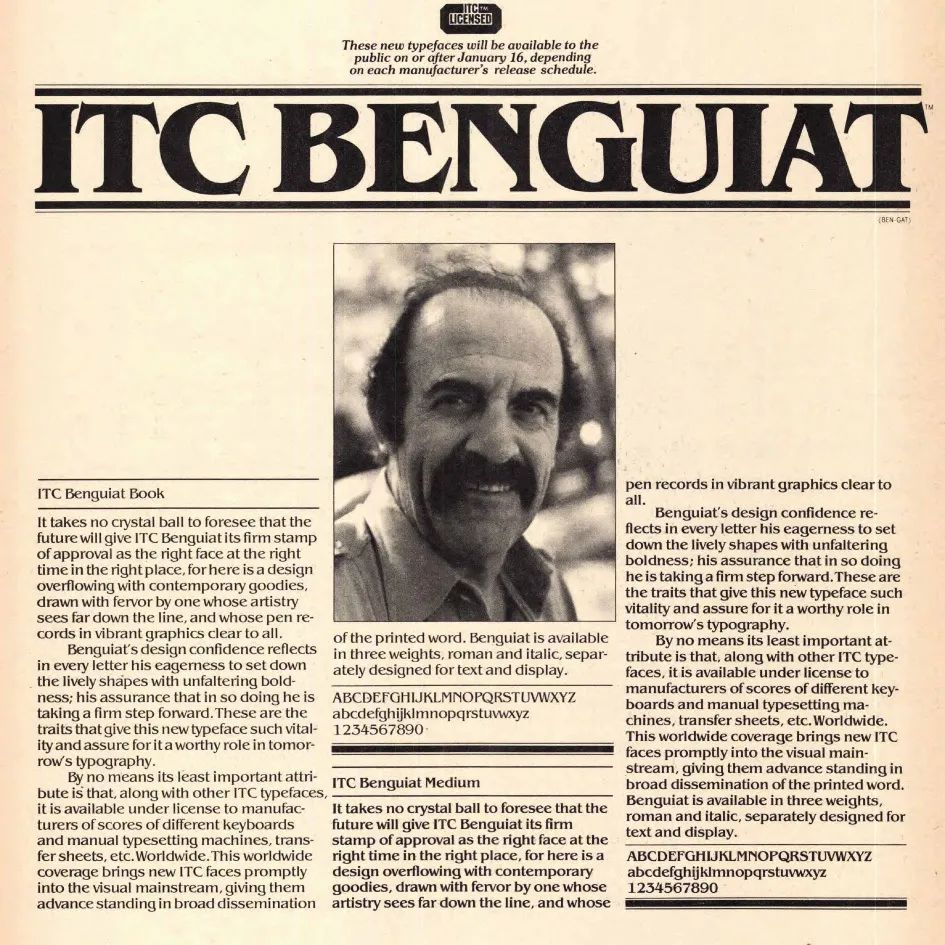
But Benguiat is in ITC The most popular typeface created during this period should be ITC Benguiat, which was first released in 1978.
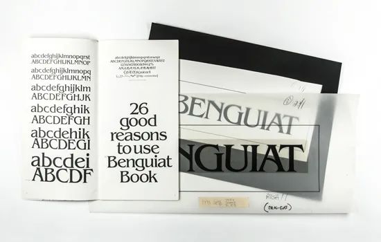
ITC Benguiat design manuscript
Benguiat was going to create a A beautiful and easy-to-read typeface, but in the early 1980s, this typeface became a favorite of the famous horror novelist Stephen King,Appearing on the titles of many of his early novel covers, from "The Witch Carrie, The Shining, and then IT... These novels using ITC Benguiat on the cover title are not only collected by a large number of book fans, but also give this font an exclusive layer of horror.


Stephen King Novel Cover< /span>
Recent years Later, the American drama "Stranger Things" built on the trend and story of the 1980s chose this font again for the opening and title design. This American drama redesigned and used it in different ways and styles, and brought the ITC Benguiat font back into the public eye again, allowing more young people to recognize the designer.

Benguiat once said that fonts in the 1980s It wasn't difficult to catch on, since there were only about 15 system fonts available to the general public at the time. It can be seen from films such as "Dangerous Liaisons" and "Stranger Things" that this Benguiat font with the same name was not just a short-lived popularity in the 1980s, but has been popular since then until the 1990s and even now.
In addition, the 1987 science fiction film "Star Trek: Part II Next Trek: The Next Generation" and the copyright notice at the beginning of all Paramount Pictures VHS tapes can be seen in this ITC Benguiat font.

The title font of "Star Trek" is also ITC Benguiat
This popular and used The font case is enough to illustrate the classicity of Benguiat's design. He once talked about the understanding of font design like this, "I don't think the font must be readable. It should be beautiful. (I do not think of type as something that should be readable. It should be beautiful.)” The adherence to this design philosophy is especially rare in the world of typography that emphasizes readability.
Benguiat once said in an interview , "Doing something for a long time doesn't mean you've done it well, it just means you've been doing it for a long time. Whenever I finish a piece, I still have 'could have done better' (No matter when it's finished, I still say, 'should-a, could-a, would-a.')."
Sources
http://www.typeroom.eu
http://adcglobal.org
http://www.nytimes.com
https://archives.sva.edu
https://www.rit.edu
edit& Typography | Chips and Yogurt
Proofreading | Roni, Xintong


Articles are uploaded by users and are for non-commercial browsing only. Posted by: Lomu, please indicate the source: https://www.daogebangong.com/en/articles/detail/Typography%20master%20Ed%20Benguiat%20passed%20away%20He%20designed%20more%20than%20600%20fonts%20many%20of%20which%20have%20been%20popular%20since%20the%201980s.html
 支付宝扫一扫
评论列表(196条)
测试