
Text/Contributed by Zhu Chenyi
Creative fonts are decorated, changed, and processed on the basis of basic fonts. It is characterized by getting rid of the constraints of basic fonts and strokes to a certain extent, and using rich imagination according to text content. , flexibly reorganize the glyphs, and make larger free changes, so that the spiritual meaning of the characters can be strengthened and full of appeal. 
Font Ideas
When we have mastered the basic rules and drawing and writing methods of basic fonts, we can create novel and meaningful creative fonts by using rich imagination and skilled expression skills. This is not an unfathomable thing, as long as you think a little, you can get the joy of unexpected shape and creation. However, although the idea of creative fonts has a side of free play, it also has the characteristics of subject conditions and fonts. 
Shape changes
The appearance of Chinese characters is a single square, commonly known as square characters. Therefore, the shape changes of creative fonts are most suitable for squares, rectangles, flat squares and oblique squares. Sometimes other different shapes can be used as appropriate, but circles, rhombuses and triangles violate the characteristics of square characters and are not easy to recognize. Generally, they should be used with caution. They can be arranged horizontally or vertically, obliquely or radially. Shapes, waves and other shapes are arranged, but no matter how they are arranged, they must be regular, otherwise they will feel messy and loose. 
stroke variation
The main objects of stroke changes are sub-strokes such as dot, left, right, pick, hook, etc., and their changes are flexible and diverse. The main strokes have less horizontal and vertical changes. Generally, there is only a slight change in the length and thickness of the strokes. Therefore, to master the changes of strokes well, the main thing is to pay attention to the changes of secondary strokes. In the change of strokes, we must also pay attention to certain rules and coordination, and not become too complicated or have too many shapes, otherwise it will be varied and weak, which will make people feel bored and lose the meaning of font design. Recommended reading: Change and invariance of font design! Seeking change while maintaining stability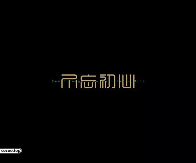
Structure Changes
That is to consciously exaggerate, shrink, or move some strokes of the characters to change the center of gravity of the characters, so as to make the composition more compact, the font more unique, and receive novel and eye-catching effects. Chinese characters are complex and simple, and it is not easy to match them well. In order to obtain a beautiful and unified font, you can use the method of increasing, decreasing, or complex, and stick figures, which is to make the simple strokes in a line of text complicated Some, the characters with complex strokes should be simplified. This kind of processing must be appropriate, with the principle of not losing the original shape of the characters, otherwise it will be deliberate to show off and increase or decrease arbitrarily, but it will not be easy for people to understand. 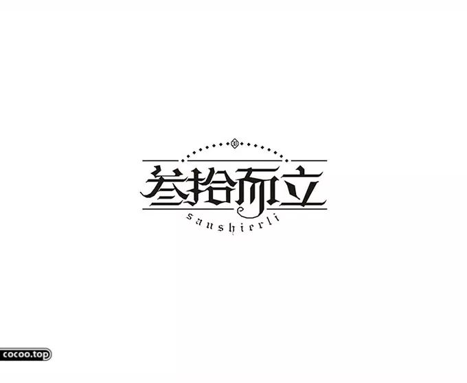
Typography Tips
According to different decorations, changes and artistic techniques, it can be summarized into the following design techniques: 
hollow
is a font that draws the outline of the text with lines and leaves a blank space in the middle. It is suitable for Song, Hei and various fonts. The outlines of extra-bold fonts sometimes coincide or overlap. In addition, the horizontal of Song If the line is kept in a hollow shape, sometimes it feels too thick, so the horizontal line can be kept in the original single line shape. 
Internal line
is to leave a space for lines in the text, which often produces different feelings according to the thickness, number, position and difference of the lines. But pay attention to whether the inner line breaks the text into fragments and affects the integrity of the font. Generally speaking, the inner line font is more suitable for thick fonts. For thin strokes, such as Song typeface, it is more difficult to draw horizontal lines, so it is necessary to use Another way to behave. 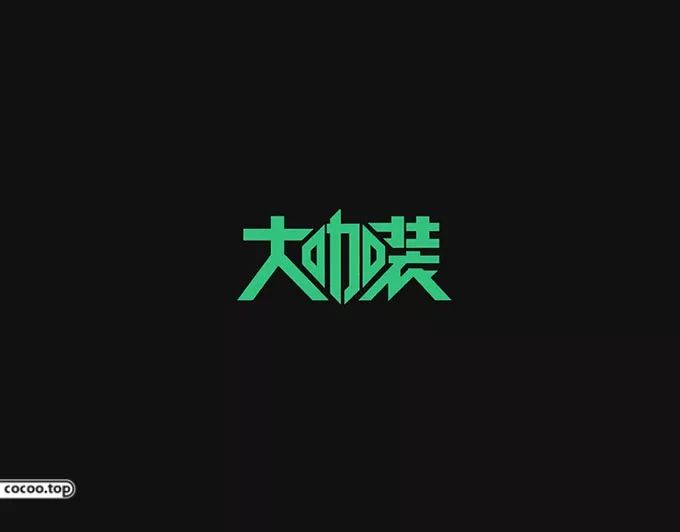
broken pen
The strokes of the text are cut, shifted, disassembled, torn by hand, or have gaps, etc., so that they will feel broken, broken, moth-eaten, rough, etc., which can often arouse great shock in the soul. But no matter what method you use, if you don't have a good font as a prototype, you won't be able to produce a good sample. 
Fictity
Using the changes of dots and textures, it produces a font with alternating virtual and real. The design of this type of font can first draw the outline of the font, and then paste the screen dot or textured paper to show the shape of the font, which is simple and convenient. Of course, it is also possible to draw dots or lines directly on the text to make it produce virtual and real effects. 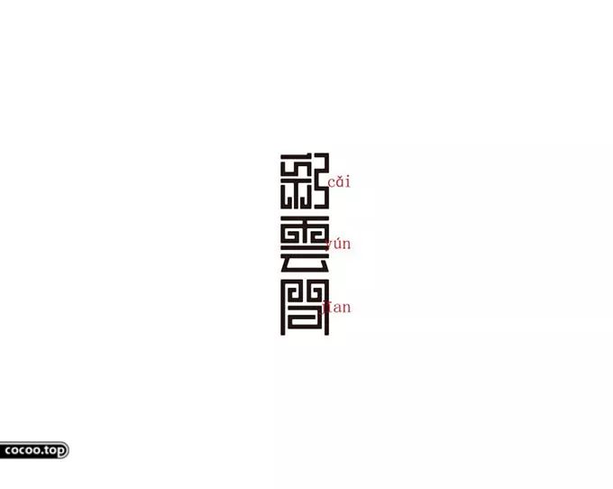
single
It is like a font formed by bending a wire, also known as "one stroke into characters". This kind of font is quite difficult, and it is not easy to write complex characters in one stroke, so you need to know the simple method, omit the details, and keep the original appearance of the font. In addition, attention should be paid to the direction of the lines, which are natural and continuous, giving people a sense of fluency. Single-stroke fonts often use round bold as the prototype. 
Fold Ribbon
seems to be formed by bending strips of paper or cloth. It is easier to express the horizontal and vertical lines of this font in straight lines. The expression of oblique lines is richer, which can strengthen the special effect of the folded strip. However, fonts with complex strokes are more difficult. The characteristic of the folding font is the zigzag part, through the turning and changing of the lines, it shows the difference between the surface layer and the inner layer, and brings a feeling of softness or hardness. 
overlap
is a font with overlapping strokes or overlapping characters. Extra-thick fonts are often used in design to make the overlapping of radical strokes inevitable, and to properly organize their order according to the situation, so as to produce a strong artistic effect. Overlap the main strokes, or each other, but not for overlap's sake, just right. 
connection
The connection between characters can break the constraints of square characters, and recombine them into a new form that is lively and beautiful, with coherent and unified fonts, but if you connect them in straight lines without thinking, it will feel flat and monotonous. When designing, choose connectable parts or common strokes, and conceive according to the content and characteristics of the text. The strokes can be long or short, and the font can be large or small, so as to produce balance and symmetry, contrast and unity, and a rhythmic beauty. 
Distortion
is a distorted font created by changing the coordinate grid or using a computer. First, in the square frame, write prototype fonts such as Arial, Hei Ti, etc., and draw 10 equal parts of vertical and horizontal coordinate lines in the frame, mark the code, and then draw the frame to be deformed, any shape can be used , also draw 10 equal parts of coordinate lines in the frame, mark the code, and finally draw them in the deformed frame according to the position in the square frame, which becomes the required font. 
Typeface Guidelines
①Starting from the content,Although the strokes and shapes of characters have no attributes, they can reflect the meaning and meaning of words through people's hands and brains and different methods of drawing and writing. attributes. The design of creative fonts can only achieve the effect of strengthening the spiritual meaning and appeal of words only by starting from the content and achieving the perfect unity of art form and text content. Recommended reading:The shape of the font is beautiful! Tangible, sound, meaningful
②It should be easy to recognize.Font design not only requires aesthetics, but also considers whether it has easy-to-read performance. Although creative fonts can be changed to a greater extent. However, the changes in the structure of characters and basic strokes should still conform to people's habit of recognizing characters, and should not be too far apart. In terms of application, it is generally only suitable for names or short sentences with fewer characters. 
③Unity and completeness,Because the change of creative fonts is relatively free, it is particularly important to emphasize the unity and completeness between characters. Some people only rely on their personal preferences. Although they decorate each character gorgeously in a picture, they don't pay attention to the interrelationships between them and lack "universal characteristics". The result is chaos and no harmony at all. 

Articles are uploaded by users and are for non-commercial browsing only. Posted by: Lomu, please indicate the source: https://www.daogebangong.com/en/articles/detail/Typography%20Tips%20Expressive%20in%20shape%20unique.html
 支付宝扫一扫
评论列表(196条)
测试