There is really no inspiration for the font design. I choose the old font as the material to design a new font. Take the word “honesty” as an example:
1. We can first search for some seal characters on the Internet as reference materials.
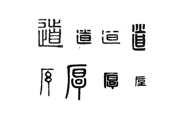
2. Referring to the stroke direction in the picture above, some elements can be extracted. The most important thing is to ensure the recognizability of the font. For example, we can’t use it directly under the word "thick", "Dao "The two dots in the upper part of the word are also. First of all, make a font with a slender structure and a heavy weight. Here, in the AI software, use the pen tool to draw. Note that the same strokes can be copied directly.

Step 3. According to the stroke direction of the seal script, optimize the stroke structure. For example, for "日" and "目", we can refer to the form of seal script to make the above strokes protrude. When sketching, you can use the scissors tool to cut off the closed part of the day, and then use the pen tool to add anchor points to extend it. To make the font more rounded, open the Stroke panel and change the Caps of the font to dots.

4. Adjust the corner size of the font. Many friends can’t find this. Note that this can only be found in versions above cc. It is a very convenient function. You can adjust the corner size as you want Tune. The size of the corners here does not have to be exactly the same, as long as they look comfortable.

5. Finally, we need to typeset the font, which will make your font design more aesthetic. Add a vertical English and stamp material. I added a variegated background in ps.

6. We can also make a form of flattening the font and lowering the weight of the font. Note that it is not a simple flattening. It is necessary to adjust the strokes one by one. For example, the two points of the word "道" will change here. It becomes a dash, so that the font looks more balanced.

7. Adjust the corner size of the font, the final effect is as follows:

Summary: The above fonts still lack a lot of details, just to share the method with you, hoping to help you.
Articles are uploaded by users and are for non-commercial browsing only. Posted by: Lomu, please indicate the source: https://www.daogebangong.com/en/articles/detail/Typography%20Inspiration%20%20The%20Past%20Serves%20the%20Present.html
 支付宝扫一扫
评论列表(196条)
测试