Click on the "blue word" above to follow this official account
Simplification of strokes
Simplifying strokes, or omitting strokes, refers to ingeniously simplifying certain strokes in fonts without affecting recognition. Through this method, fonts can appear concise and novel.
Being good at discovering the structural characteristics of strokes, daring to try and experiment, is the first step to simplify strokes. In the same font, may have different stroke structures, all of which provide a simplified design environment for strokes, but after repeated operations and observations, we have tochoose the most suitable and beautiful one The strokes are changed, not changed as soon as they can be changed, and simplified as they can be. Stroke simplification is to properly "reduce" the font. For design needs, in order to improve the personality and characteristics of the font, we must think carefully, and delete what can be deleted.Reserve What must be kept must be retracted and retracted appropriately.

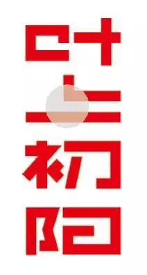
In the above examples of fonts, there are different stroke simplifications at different stroke positions. For example, in the case of "Mushang", although the simplification of the middle part of "Shang" only retains a vertical and a horizontal turning, such changes are recognizable, and such changes are also in line with the meaning and temperament of the font itself Essence
The law of stroke simplification
The simplification of strokes is not just to "subtract" and change the fonts, but under the premise of a specific design theme, uses the method of simplification of strokes to work on the subtleties to highlight the whole and highlight the theme.
In the process of cutting strokes and leaving space for omitting, although the strokes we cut have disappeared, if we choose a suitable cutting part for , the surrounding strokes of the top, bottom, left, and right are also natural and smooth. Even if the position is blank. When we see this character, such blanks are negligible, and we will fill it up during the reading process according to the conventional form of strokes, which adds to the The fun of drawing.
Take the four characters "Great Wisdom Ruoyu" as an example. In these four characters, many stroke details have been simplified. After these positions are marked, the looks excessive, but it is not. These simplified processes form a An overall tacit understanding and echo enhances the sense of design in an all-round way, and also highlights the original meaning of the idiom.
The font strokes are diverse, but from the perspective of stroke simplification, after a simple arrangement, we can understand that this method is also regular in use.
1. Cutting strokes
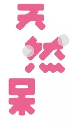
2. Omit strokes
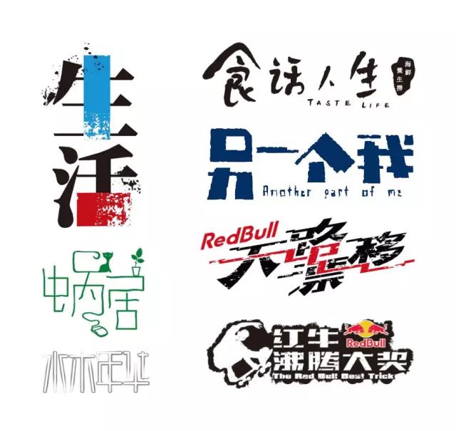
Whether it is cutting strokes or omitting strokes directly, it is a streamlined treatment of strokes. The so-called "simplification" means not to simplify things in a hurry, but to be refined, sophisticated, selective, and make the fonts simple and beautiful under the premise of being recognizable.
Summary
In the design process, as the design steps gradually deepen and the design ideas gradually mature, we must learn to capture the characteristics of strokes, and learn to discover some commonalities between characters. By analyzing these characteristics Summarize and refine the commonality, and then simplify the design of the whole.
Smart use of the brush tool
Using AI to design fonts, rectangle and pen are the most commonly used basic methods. Through the arrangement and transformation of rectangles, through the outline and adjustment of pen lines, we can design commonly used fonts. The "brush tool" mentioned in this article is different from the above methods. Using the "brush" effect in the font is a means of modification. The "brush tool" in AI has many different categories, and under each category, there are many kinds of brushes to choose from. Therefore, using the brush tools and brushes skillfully,can enrich the font modification methods and make the fonts changeable.
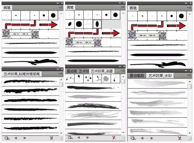
How to use the brush tool
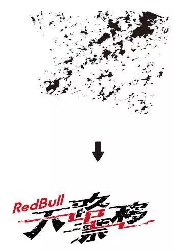
There are many categories of brush tools such as calligraphy, watercolor, and ink. We can choose one or more brush effects according to the content of the font and the characteristics of the strokes, and through repeated comparisons and adjustments in thickness, until it is suitable and appropriate.
The upper brush is a brush in the chalk charcoal pencil, covering the font, forming a mottled effect.
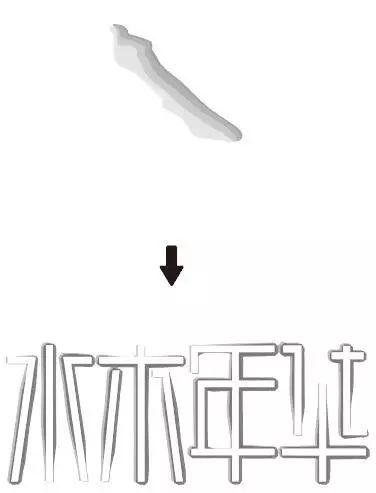
The upper brush is a brush in watercolor, which strokes the font , forming an ink effect.
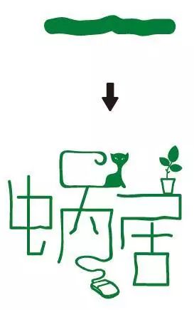
The brush above is a certain brush in calligraphy. After replacing the pen lines in the original font of , the strokes appearlazy and casual.
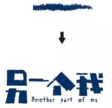
The upper brush is a certain brush of chalk, charcoal and pencil. After stroking the font, it makes the font moredifferent.
Summary
Different software has different characteristics, and there are different tools for us to use and play. After we fully understand a certain tool, can make it a powerful weapon for our design and creation. This is true for the brush tool, but it is true for other tools as well. After we use the rectangular character-making method to complete the basic glyph, we can use the brush to cover, cut, stroke, etc.; After completing the basic glyphs, we can also use brushes to replace and modify them. The same brush, used in different places, will have completely different effects, the key is to use it bravely and skillfully.
Extended reading
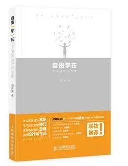
The above pictures and texts are excerpted from: "Free "words" in font design and creativity"

Author Author: Liu Bingke
Publisher: People's Posts and Telecommunications Press

Number Arts Society
WeChat public account ID: szysptpress
Click "Read the original text" to buy directly
"Free Words" in Font Design and Creativity"
Articles are uploaded by users and are for non-commercial browsing only. Posted by: Lomu, please indicate the source: https://www.daogebangong.com/en/articles/detail/Tutorial%20%20Design%20%20Font%20Deformation%20Meter%20%20Simplification%20of%20strokes%20and%20skillful%20use%20of%20brush%20tools.html

 支付宝扫一扫
评论列表(196条)
测试