

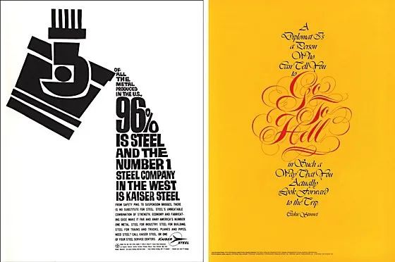
60 Years of Typography

Typography is an important tool for every visual communicator.
There have been many revolutions in the process from hot metal to photo to desktop publishing
But the original intention of the revolution remains the same:
Make written language legible; more engaging; satisfying the viewer's needs
"Communication Arts" magazine compiled and collected the past 60 years
A selection of writing and commentary from font fanatics

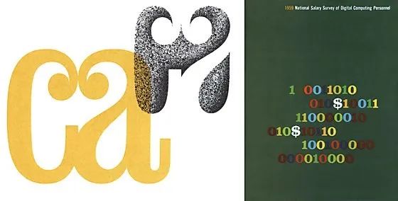
Mid-twentieth century
"Typography is an art that requires imagination, intuition, common sense, and an understanding of certain basic rules and letterforms."
"I don't think typography is an end in itself,
But it is part of the overall message.
So for me,
Creativity, copy, art and typography go hand in hand. ”
Otto Storch McCaw 1962
Late twentieth century
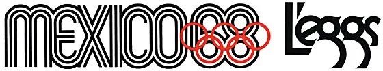
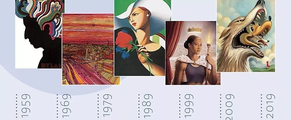
Left:1968 Summer Olympics logo. Designer: Lance Wyman
Right:L'eggs logo for Hanes Hosiery, 1970. Art Director/Designer: Roger Ferriter;Writer:Tom Tom Carnase; Designer: HerbLubalinAssociates.
"When I do a book cover or any wrapping, it's art to me.
The truth is that it enhances the aesthetics of a product,
Boosted sales. ”
Alan PeckolickAlan Peckolick Graphic Design Company 1971
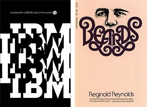
Left:1969 IBM Rochester Design Center poster. Designer: Walter Lund/Gary Springer; Art Director: Thomas Cole Thomas Coleman
Right:Book cover by Harcourt BraceJovanovich, 1976. Designer: Alan Peckolick;Art Director: Harris Lewine; span>Design Firm:LSC&P Design Team
"Dadaism influenced graphic designers in two important areas:
It frees typography from its straight line constraints,
reinforces the cubist idea of type as a visual experience. ”
Allen Hurlburt 1977
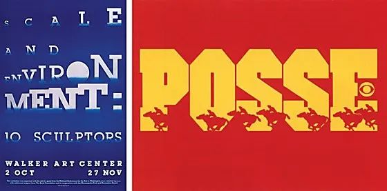
Left:1978 Walker Art Center exhibition poster. Designer: James Johnson
Right:CBS television network promotion, 1978. Designer: Alan Brooks;Art Director: HermanAronson/BillSnyder
“Because typography is at the heart of design and communication,
When people because of the apparent efficiency of other systems
When giving up high-quality fonts,
It affects us all. ”
Nathan Felde Machine Tools Ltd. 1978
"If you cover up the font on your work,
If the overall work still looks good,
Then the font itself is not very good,
Either it's in the wrong place. ”
Robert Overby 1979
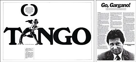
Left:Launch of the newspaper "Diarario do Paraná", 1980. Art Director/Designer/Illustrator: OswaldoMiranda
Right:Wall Street Journal commercial, 1983. Art Director: BoZaunders;Writer/Creative Director: Jim Johnston;Advertising Agency JimJohnstonAdvertisingInc.
"For me,
Bembo is a classic Roman style font with a long history;
If I were stranded on a desert island with only one typeface,
That's it. ”
Roger Black The New York Times 1983
Left:1987 Entertainment Technology Competency Manual. Art Director/Designer: MitchellMauk; Design Firm: MaukDesign
Right:Bloomingdale poster, 1988. Art Director/Designer: Robert Valentine;Creative Director:JohnC.Jay; Illustrator: Neville Brody
"Laser typesetting for your Macintosh.
This is a real font, but not real typography. ”
Wendy Richmond 1987
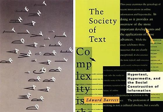
Left:Alfred A. Knopf, Inc. book cover, 1988. Designer/Illustrator/Calligrapher: Fred Marcellino; Art Director: SaraEisenman
Right:MIT Press book cover, 1989. Art Director: Diane Jaroch
“In terms of novelty in typography,
From the center to the extreme is only one step away.
Any fool can make a typography that didn't exist before. ”
Matthew Carter Bitstream Inc. 1989
Late twentieth century

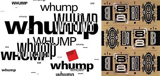
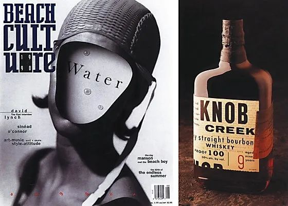
Left:The cover of "Beach Culture", 1990. Art Director/Designer: David Carson;Photographer: GeofKern;GeofKern; span>Design Company: Carson Design Company
Right:Jim Beam Brands Co. Packaging, 1992. Art Director/Designer: Sharon Werner; Design Firm: Duffy Design Group
“Helvetica is always used by those who have no sense of typography,
Abused by people who have no sense of structure.
For example, classic typefaces are meant to be centered,
The meaning of Helvetica often stands for left alignment.
So when you center Helvetica,
You are dead wrong. ”
Massimo Vignelli (VassielliVignelliAssociates) 1990
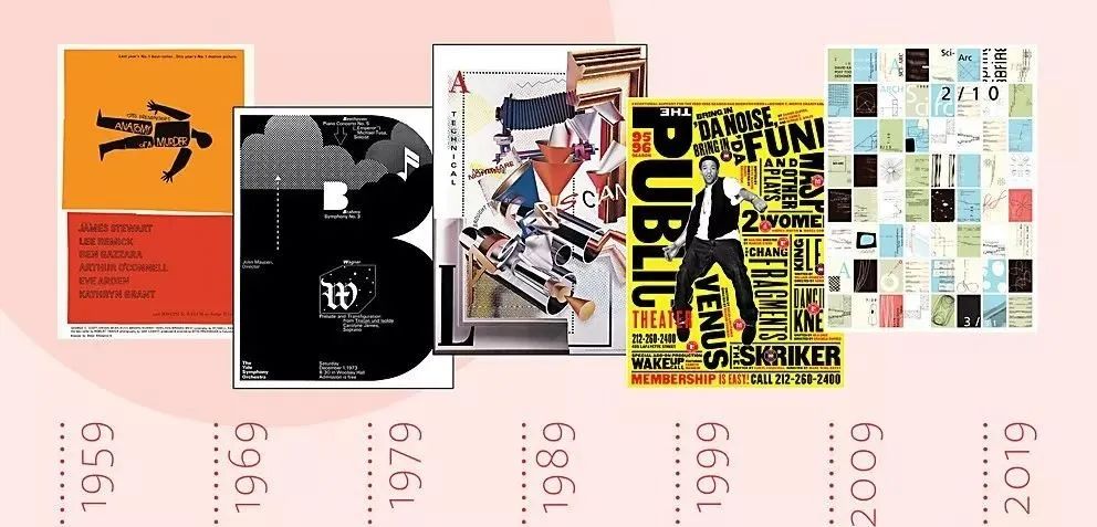
Left:1996, Public Theater poster. Designer: Lisa Mazur/PaulaScher;Art Director: PaulaScher; Photographer: Richard Avedon;Designer: Pentagram Design
Right:1998, Swiss Army brand print advertisement. Art Director: Monica Taylor;Writer: Dylan Lee;Creative Director: Greg Bokor/Jim Garaventi;Photographer: Geoff Stein; Advertising Agency: MullenAdvertising
“We work more budget-consciously than anything else.
When people talk about our not breaking away from tradition,
They are talking about their heritage,
without realizing that something new is happening here that requires its own set of standards. ”
ZuzanaLicko "Immigrant Typeface" 1992
"Vertical emphasis in sans serif fonts affects readability.
Using Caslon (Caslon) font works can get a sense of reading,
Setting Helvetica font content will get attention. ”
David Lance Goines St. Cytronis Publishing 1999
21st Century
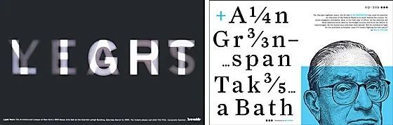
Left:The Architectural League of New York Poster, 1999. Designer: Michael Bierut/Nicole Triss; Art Director: Michael Bierut;Michael Bierut; span>Design Company: Pentagonal Star Design
Right:GQ Open Design, 2005. Designer: KenDeLago; Design Director: Fred Woodward; Illustrator: span>Noli Novak
"Cookbooks always start with "Choose the best ingredients,"
The same goes for choosing fonts. ”
Jonathan Hoefler Hoefler and Freire Jean 2004
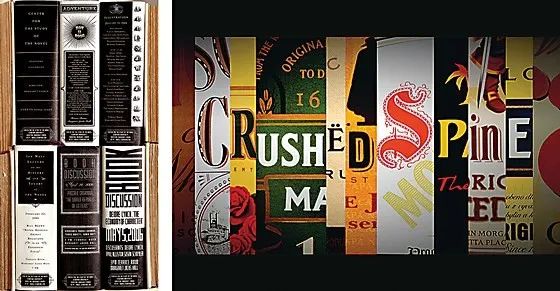
Left:Stanford University book discussion poster, 2006. Art Director: Jennifer Morla; Designer: MorlaDesign.
Right:MalterserAmbulanceService TV commercial, 2007. Art Director/Creative Director/Director: Christian Mommertz; Writer/Executive Creative Director: Stephen Vogel ( Stephan Vogel);Chief Creative Officer: DelleKrause;Ad Agency: Ogilvy & Mather Frankfurt
"Proper scaling is the holy gate of typography.
like pulling baba on the floor
Or the French kiss your mother,
This is a rule that few designers are willing to break. ”
Ellen Lupton Maryland Institute of Art 2008
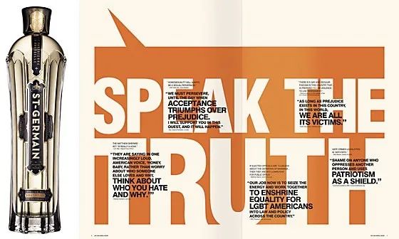
Left:CooperSpiritsInternational packaging, 2007. Designer/Creative Director: Steve Sandstrom;Illustrator: AntarDayal;Designer:SandstromDesign
Right:Human Rights Campaign Pamphlet, 2011. Designer: SuchaBecky; Art Director: JakeLefebure/PumLebebure; Designer: DesignArmy
"Nobody gets rich designing typefaces.
In fact, until recently,
Designing typefaces is also a classic way to lose money. ”
Allan Haley Monotype 2009
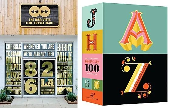
Left:826LA entrance sign, 2014. Designer/Art Director: StefanG.Bucher;Writer: MacBarnett/JonKorn826LA/J.RyanStradal; span>Design Firm: 344Design, LLC
Right: "Chronicle Book" postcard set with the initials dropped, 2016. Art Director: Kristen Hewitt
“ComicSans is the Frank Lloyd Wright, Picasso, Hemingway and Mozart of graphic design.
For those who don't know what graphic design means,
It means "graphic design". ”
Mitch Goldstein Rochester Institute of Technology 2015
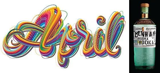
Left: AIGA Los Angeles lettering works, 2017. Designer: Ana Gómez Bernaus; Art Director: Jessica Arana
Right: Graton Spirits Company LLC Packaging, 2018. Designer/Design Company: Stranger&Stranger
"Like fashion, typography surrounds us,
It is inseparable from everyday life.
Society cannot function a day without letters,
We probably shouldn't go out without clothes either. ”
Elizabeth CareySmith 2018
END© This article is organized from
CommunicationArts Website and the Web
Compiled by Hiiibrand
Reprinting without permission is strictly prohibited
Welcome to repost~
Related Links
-60 years of graphic design, the same in all changes -
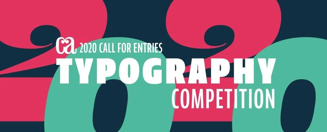
-2020 CommunicationArts Font Design Contest Winner Announcement-
/ Recent Games /
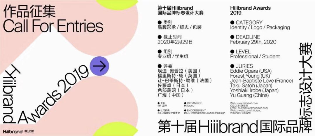
HiiibrandAwards2019 The 10th Hiiibrand International Brand Logo Design Competition Global Call ▼
Deadline Deadline: February 29, 2020 How to participate< /strong> A) Online submission http://www.hiiibrand.com/competion.php?act=goods_list&id=42 B) Email Submission postmaster@hiiibrand.com
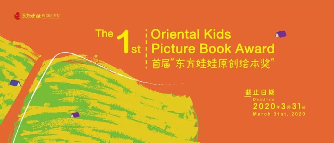
The first "Oriental Doll Original Picture Book Award"
The 1st OrientalKids PictureBookAward
Call for Papers Deadline
March 31, 2020
How to enter
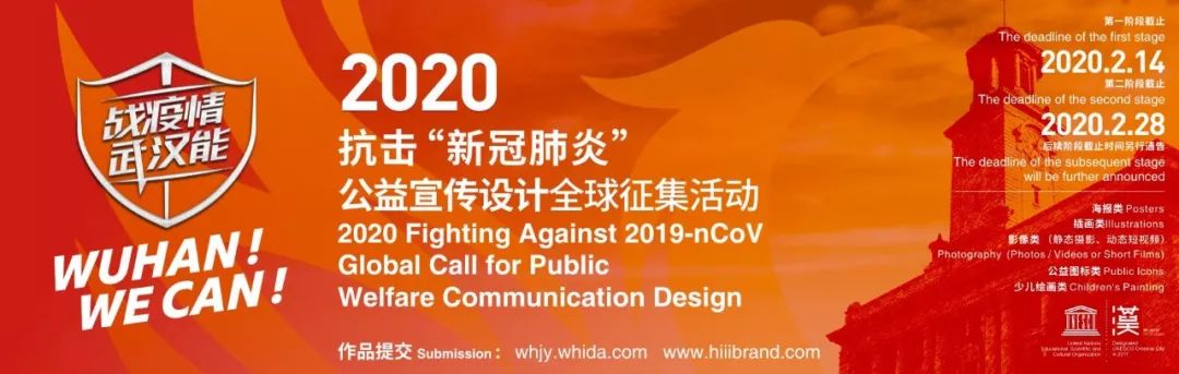
1. Sample book delivery (recommended method) Prepare sample booklet, complete and print registration Form, sent together to2nd Floor, No. 60, Gaoloumen, Xuanwu District, Nanjing, < span>Oriental Doll Original Picture Book Award Organizing Committee Office, Tel: 025-83220812 2. E-mail submission Please send the following files to the submission mailbox : dfwwbookaward@163.com 3.Online submission Register and log in to www.hiiibrand.com, Submit entries online through the website. Wuhan can fight the epidemic! WUHANWECAN
2020 Fight against "New Coronary Pneumonia"Global Call for Public Welfare Design< /strong> 2020FightingAgainst2019-nCoV GlobalCallforPublicWelfareCommunicationDesign Deadline for Call for Papers The deadline for the first phaseFebruary 14, 2020
Second Phase Deadline February 28, 2020
How to enter 1. Call for official websitewhjy.whida.com
2. Co-organizer Hiiibrand (Hi! Brand)
official websitewww.hiiibrand.com

Articles are uploaded by users and are for non-commercial browsing only. Posted by: Lomu, please indicate the source: https://www.daogebangong.com/en/articles/detail/Tracing%2060%20Years%20of%20Typographic%20Changes.html
 支付宝扫一扫
评论列表(196条)
测试