Click on the topblue word,Set me< /span>Set as a star☆Let's

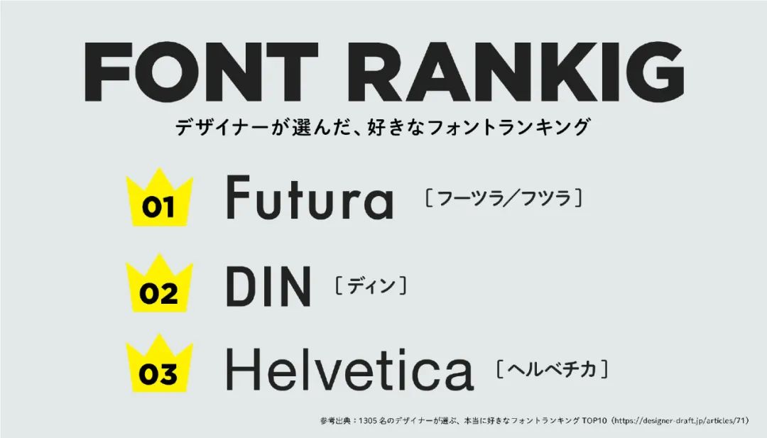
Today's Font Ranking is a ranking of favorite fonts chosen by active designers, which has become a designer's must-have draft of the year, and then デザナビ made it into a picture.
Not surprisingly, Futura, DIN, Helvetica were the top three.
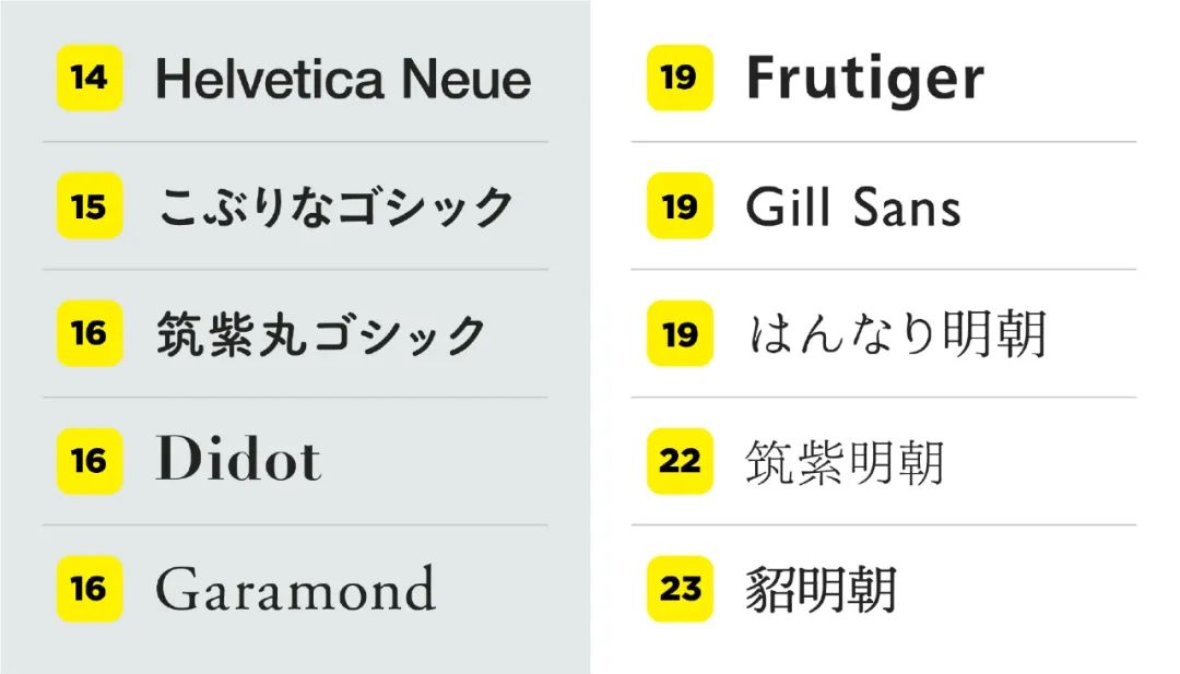
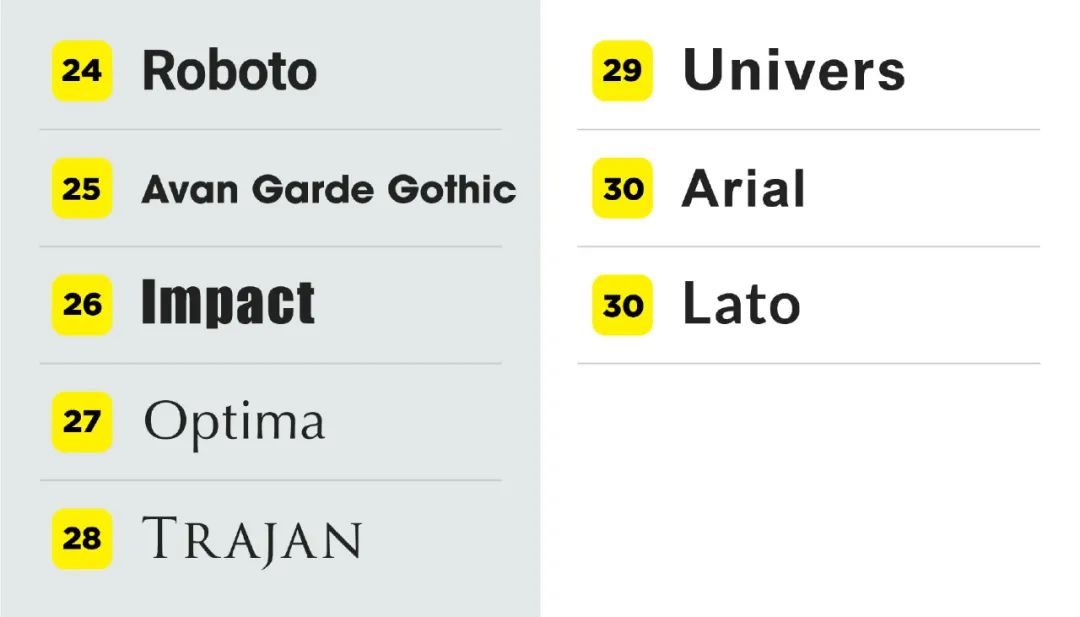
Take a look at the full list.
img by twi:wkwdesigner
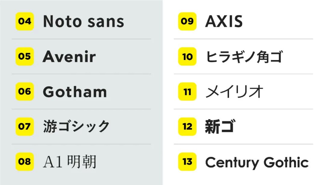
These fonts can be said to be very popular and popular in Japan! The top ten are excerpted, to share with you and get to know each other again. Then start at number 10!
No. 10 Hiragino Kakugo


Even though it is a new face, this font is familiar to many outside of Japanese designers. It is installed as a standard font on macOS and iOS, and is a standard Japanese font.
No. 9 AXIS
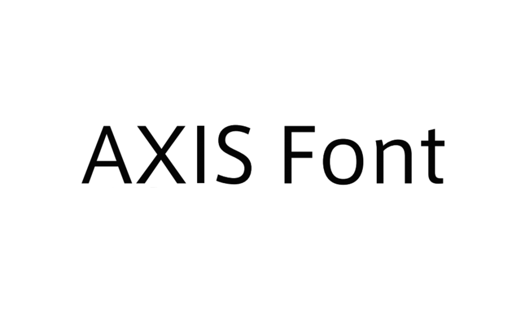
The TOP10 itself has been in decline in the rankings since its last debut, but has made it to the list twice in a row. The font design is simple and the weights are well prepared, so I think it gives the impression that it can be used easily. AXIS was used in Japanese web fonts on Apple's official website a long time ago.
No. 8 A1 Ming Dynasty
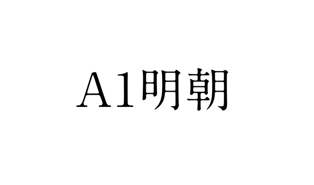
A1 Mincho moved up from 11th last time to 8th! The Japanese Mincho font finally ranks in the TOP10! Congratulations! This font is also used in the logo of the movie version of "Your Name", which may be a font you have never used and seen.
No. 7 游ゴシック
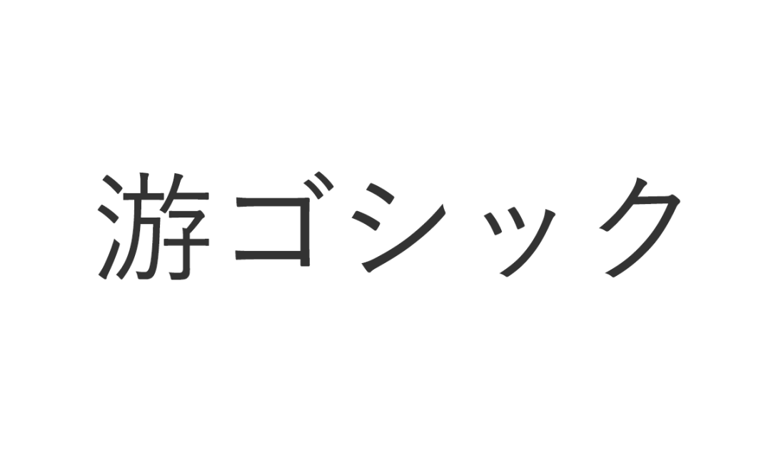
Yougoshiック rose from 9th to 7th last time! Produced by Ziyou Workshop, the Chinese name is You Hei Ti, and the English name is Yu Gothic. You ゴシック is displayed in the font selection menu. Since Yu Gothic UI, a derivative font of Yu Gothic, becomes the system font of Windows 10, it gives the impression that the number of websites set as font-family has increased, so it is not a fairly common font. It is sold by Jiyu-Kobo.
No. 6 Gotham
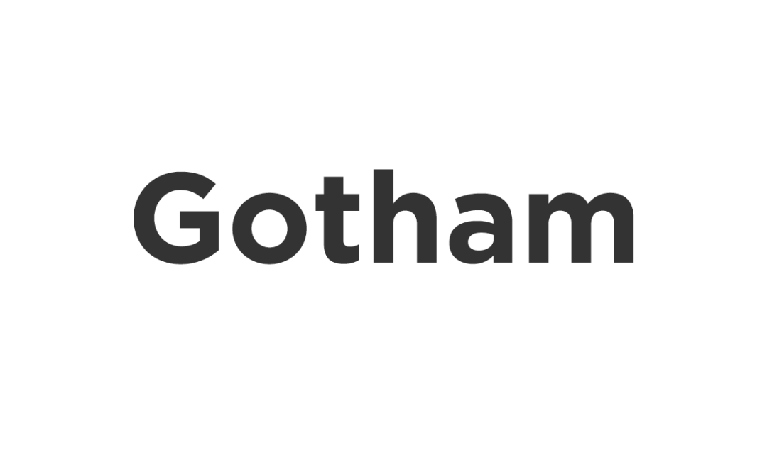
Gotham is number 6! Same as last ranking. The strokes of this font are relatively thick, the font is correct, and it has a good visual sense. This font was applied to its fonts and news by Netflix, including the PR website of former US President Barack Obama in the presidential election. Gotham has been favored by many designers. Of course, this is also one of the standard fonts for designers.
No. 5 Avenir / Avenir Next
5th place goes to Avenir! It dropped 2 places from its previous position of 3rd. Avenir Next's character set is perfect and supports all European countries that use the Latin writing system, as well as other languages such as Greek and Heli.
No. 4 Noto Sans
Noto Sans comes in fourth! It fell out of the TOP10 last time, and finally returned this time! The font was jointly developed by Google and Adobe, and the basic design was created by Ryoko Nishizuka, a senior designer on Adobe's font development team. Noto was developed as a web font, and it seems to have become the de facto standard. Its font structure is harmonious and beautiful. Most importantly, it has a wide range of applications and can be used as an advertising font and book typesetting font.
No. 3 Helvetica
No. 3 got about twice as many votes as No. 4. Helvetica is a widely used Western font, designed in 1957 by Swiss type designers Eduard Hoffmann and Max Miedinger. Helvetica is also the default font for Apple computers, and Microsoft's commonly used Arial font also comes from it.
No. 2 DIN
DIN also came in second this time! Since it was used in the logo of "TOKYO 2020" for the Tokyo 2020 Olympic and Paralympic Games, it seems that it has been gaining popularity recently. In the past year or two, it may have come up more often. Each letter of DIN is strictly aligned to the vertical and horizontal grids, and the width of the letters is also regulated, without any extra decoration, which gives it a bit of geometric beauty.
No. 1 Futura
First place goes to Futura! Inspired by Bauhaus, it is a sans-serif geometric font designed by Paul Renner in 1927 and is one of the most successful and widely used English fonts in the 20th century. Even now, more than 90 years after its release, it is still used as the basis for various typefaces. Futura has been adopted by many places, such as Louis Vuitton, Calvin Klein, Red Bull and other well-known companies have adopted Futura.
Finally, interact.


Articles are uploaded by users and are for non-commercial browsing only. Posted by: Lomu, please indicate the source: https://www.daogebangong.com/en/articles/detail/Top%2030%20favorite%20fonts%20as%20voted%20by%20designers%20Futura%20DIN%20Helvetica%20top%20three.html
 支付宝扫一扫
评论列表(196条)
测试