First: [Yuanjie Ming Dynasty style] strong tension, can be used as titles and large characters, quite eye-catching and quite effective

Originated from the Ming Dynasty font, it is a free Japanese font based on "Siyuan Song Typeface" ("Sourceノ明朝" in Japanese) and added a destruction effect to make it the closest to the readable state. According to the designer, the font has With great tension, he "twists" until it is almost unreadable to the human eye, however, this allows for an epic sense of drama.
Second: [Yuan Lumen/Traditional] Traditional Chinese fonts with cadenced strokes in traditional printed style.

Yuan Lumen is derived from But Ko, the administrator of the Taiwanese font society "Zi Hei", based on the modification of "Si Yuan Song Type Traditional Chinese Font". Although the font modification is automatically performed by a computer program, the difference can be clearly felt after some detailed adjustments As a result, the strokes of the source lumen body have been adjusted to make the font look more powerful.
Third: Fang Zheng Kai Ti] Founder free font, suitable for cultural promotional design

Fang Zhengkai is a font that many people like to use. It is very delicate and beautiful. This font is thin and strong and has a lot of light and heavy contrast. It is light and natural, stable and beautiful, and its style is beautiful and ethereal. It is suitable for cultural promotional design and business Brand advertising and product packaging design.
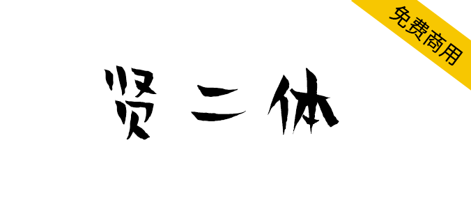
Fourth: [Xian Erti] Hanyi's first free font, jointly launched by Beijing Longquan Temple Animation Center and Hanyi Font Bank
It is often said that words are like people,
Horizontal, vertical, left, right,
Every stroke is the interpretation of thoughts,
Writing is like practicing,
To make a set of fonts is also to cross oneself and cross people.
Beijing Longquan Temple Animation Center × Hanyi Font
The second body of the virtuous is online
Xian Erti is a commercial free font jointly launched by Beijing Longquan Temple Animation Center and Hanyi Font.
There are other fonts, you can go to the website to check it yourself
URL: PM me: 1

Articles are uploaded by users and are for non-commercial browsing only. Posted by: Lomu, please indicate the source: https://www.daogebangong.com/en/articles/detail/Today%20I%20recommend%20PS%20free%20commercial%20fonts%20100%20types.html
 支付宝扫一扫
评论列表(196条)
测试