Hi, friends, I'm Xiaomu.
I found that if a person is very good at a certain skill, he tends to have a kind of inertial thinking after a long time.
What kind of habitual thinking?
For example, for me, because the PPT is not bad, after a long time, I feel that all PPTs should be so good-looking. Everyone should understand something as simple as "PPT alignment"…
But it turns out that I am the modern version of "why not eat minced meat", which should be dragged out and tied up + soaked in a pig cage...
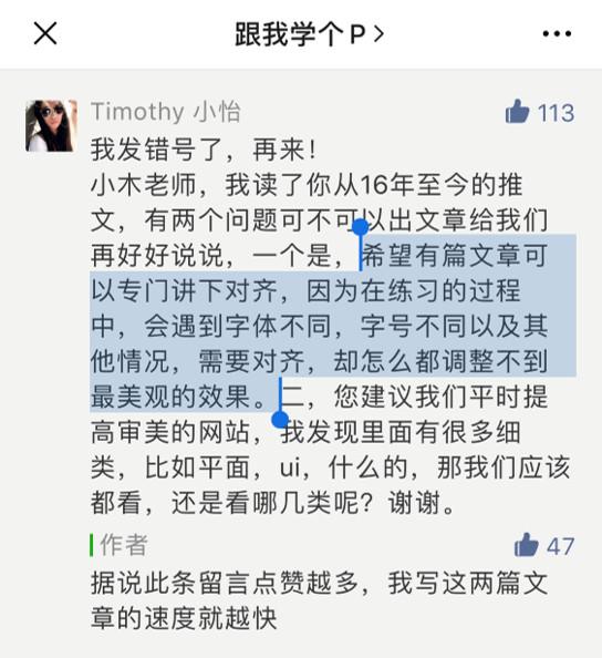
Due to the power of the pig cage, today I will write a systematic article to answer Xiaoyi’s first question:
- What is alignment? Why align?
- How to do alignment in PPT?
Finally, a warm reminder that the length of this article is as long as my own leg hair. If you can see the last one, I may consider plucking two original leg hairs for you.
What is alignment? Why align?
In PPT, alignment refers to placing multiple elements according to certain rules.
The translation is: you can place elements along a straight line, or you can place elements along a curve. In short, don’t treat elements like socks and just throw them around.

Align along a straight line
Align along a straight line
Align along the curve
Align along the curve
These straight lines or curves can be collectively referred to as reference lines, and they can either have solid lines like the above, or have no solid lines like the following:
Invisible guides
Invisible guides
Invisible guides
The above are all kinds of weird alignment poses.
The biggest advantage of doing a good alignment is that even if you don’t need a high-end design, the PPT will look full of order and design!
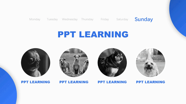
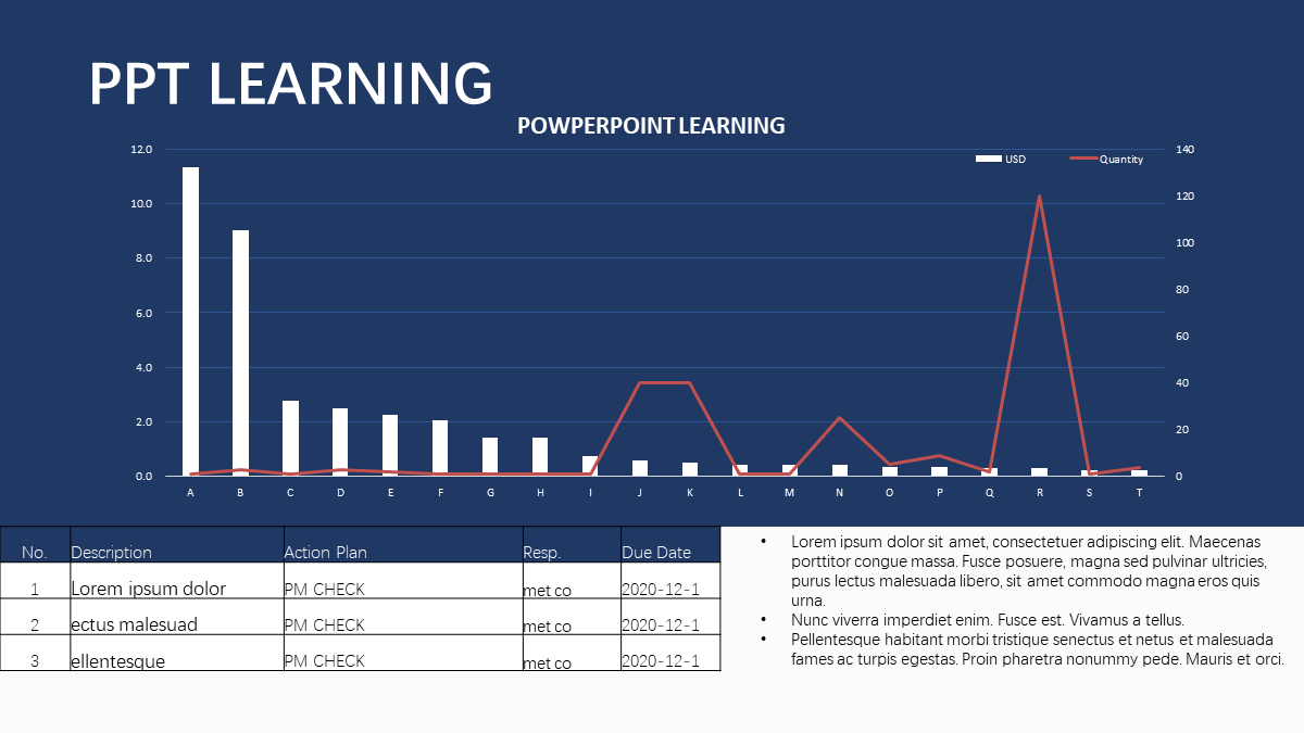
for example.
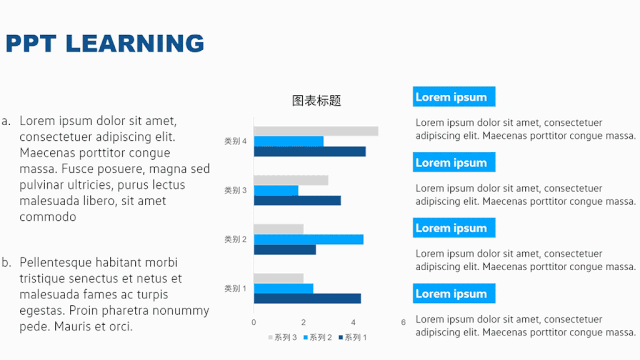
In the PPTs of many consulting companies, there are usually a lot more content than ordinary PPTs. Even in this crazy situation, just using good alignment skills can make the PPT look very beautiful and professional:

before alignment
before alignment
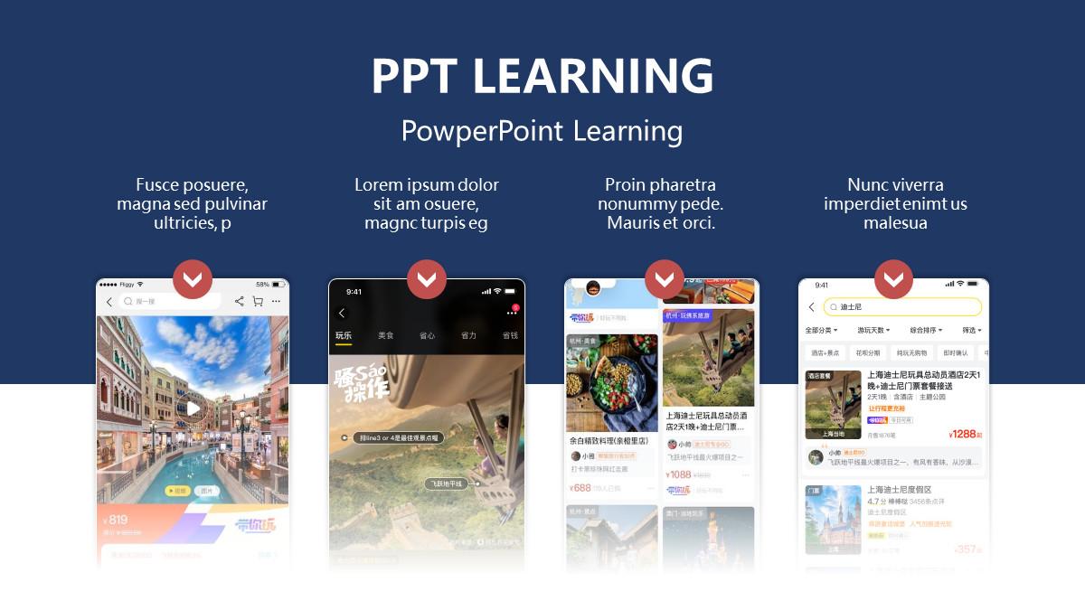
After alignment
After alignment
From the above analysis, you can see that the alignment in the PPT is indeed like a square dance leading dancer, so now the question is: how to do the alignment in the PPT?
How to do alignment in PPT?
PPT is different from the coquettish cheap stuff like posters. Posters usually only need to be made on one page, while PPT needs to be done on many pages.
Therefore, when doing PPT, you should not only look at a certain page (micro perspective), but also understand it from the "overall perspective" of the entire PPT (macro perspective).

From a single page to see
From the overall perspective
Does this micro and macro theory sound like it's very difficult to understand!
Don’t panic, I think I was in the same mood as you are now when I first heard the phrase “Indecision in Quantum Mechanics”. Later, I found out that I was just fooled by bloggers like me. up.
1. Look at the alignment from the perspective of a single-page PPT
The so-called "single page angle" refers to how to align each element in each page of PPT.
Here I will divide it into two parts, which are the common alignment methods in each layout and alignment thinking.
1.1 Common alignment
There are generally two ways to align elements, one is strict alignment along straight lines, and the other is roughly aligned along curves.
1.2.1 Align along a line
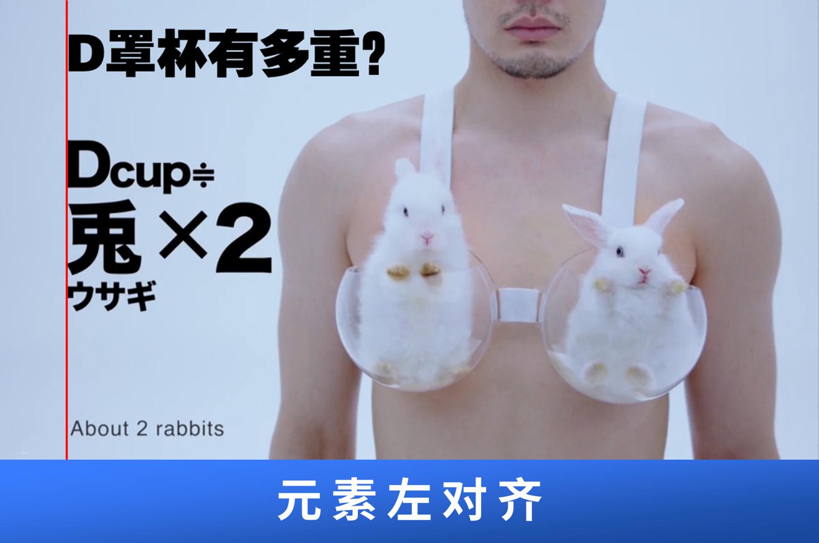
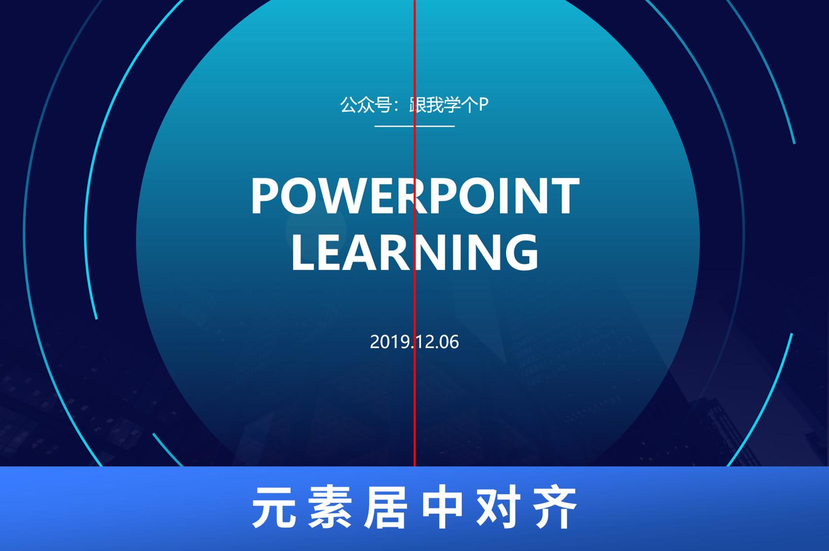
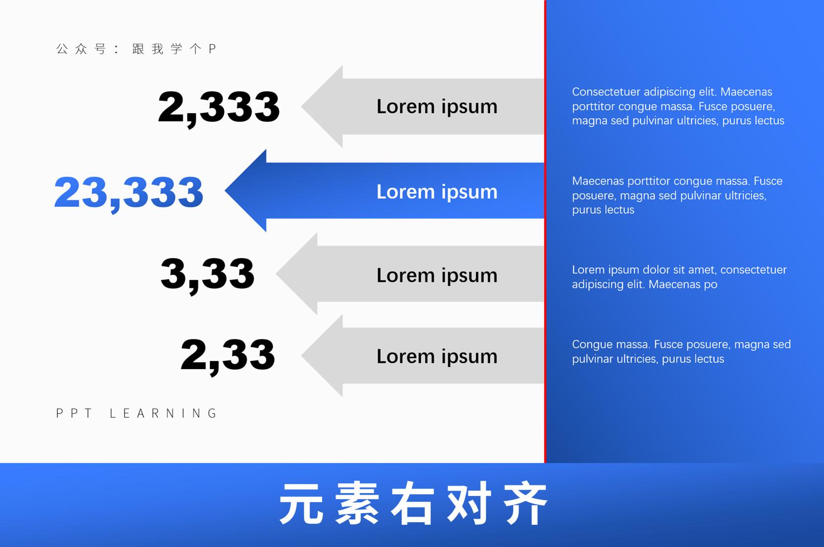
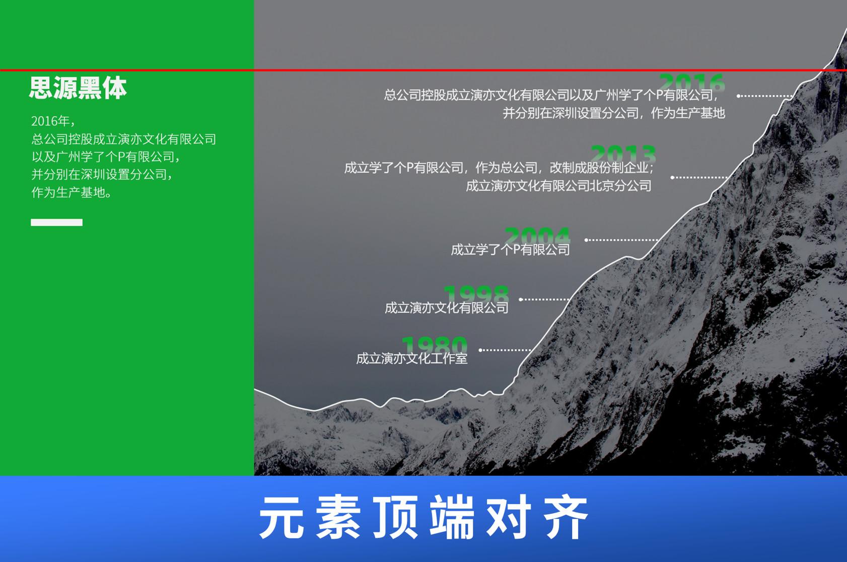
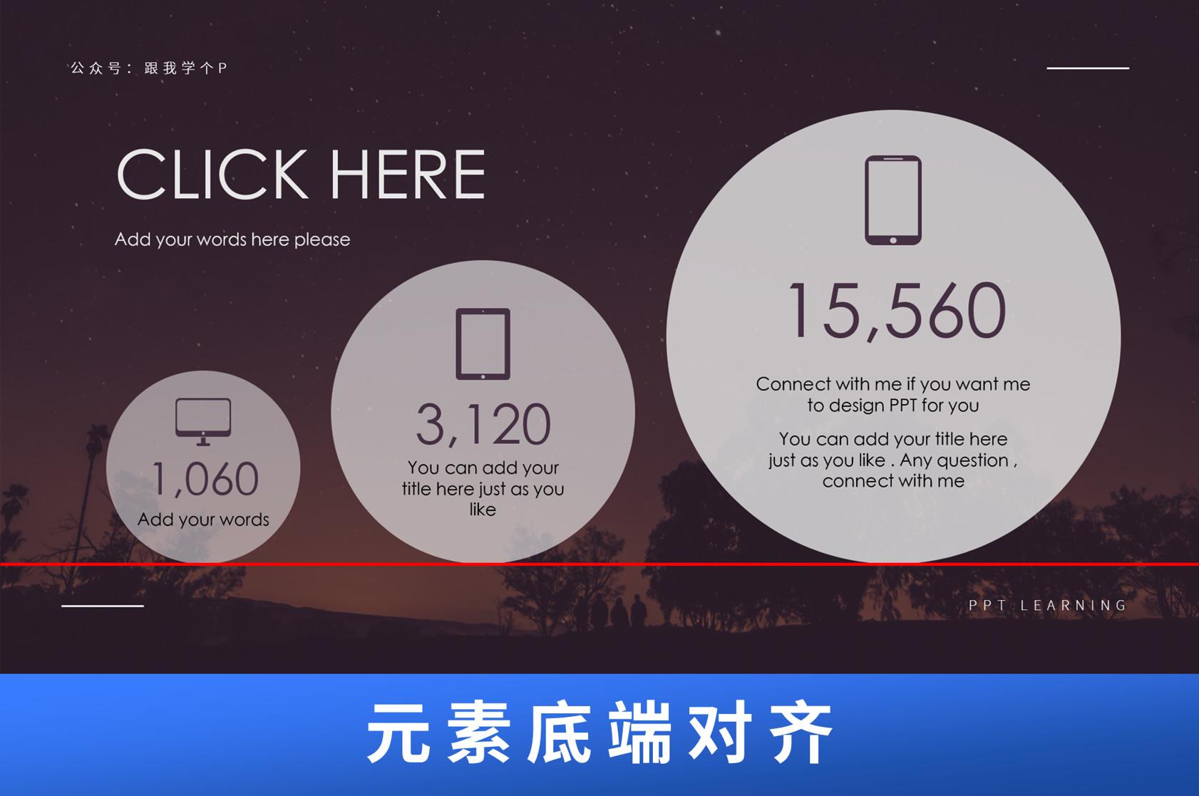
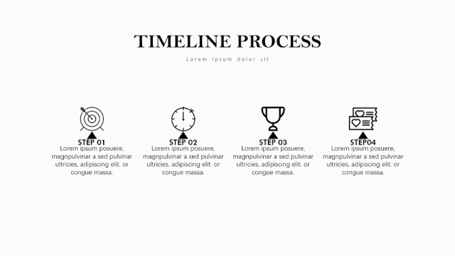
Alignment along a straight line is the most common alignment method. Generally speaking, there are five alignment methods: left/center/right/top/bottom:
Of course, in addition to vertical and horizontal lines, there is another way to align along slanted lines:
1.2.2 Align along curve
The so-called alignment along the curve is generally the following two forms.
One is to distribute elements along wavy lines:
The other is to distribute elements along an arc:

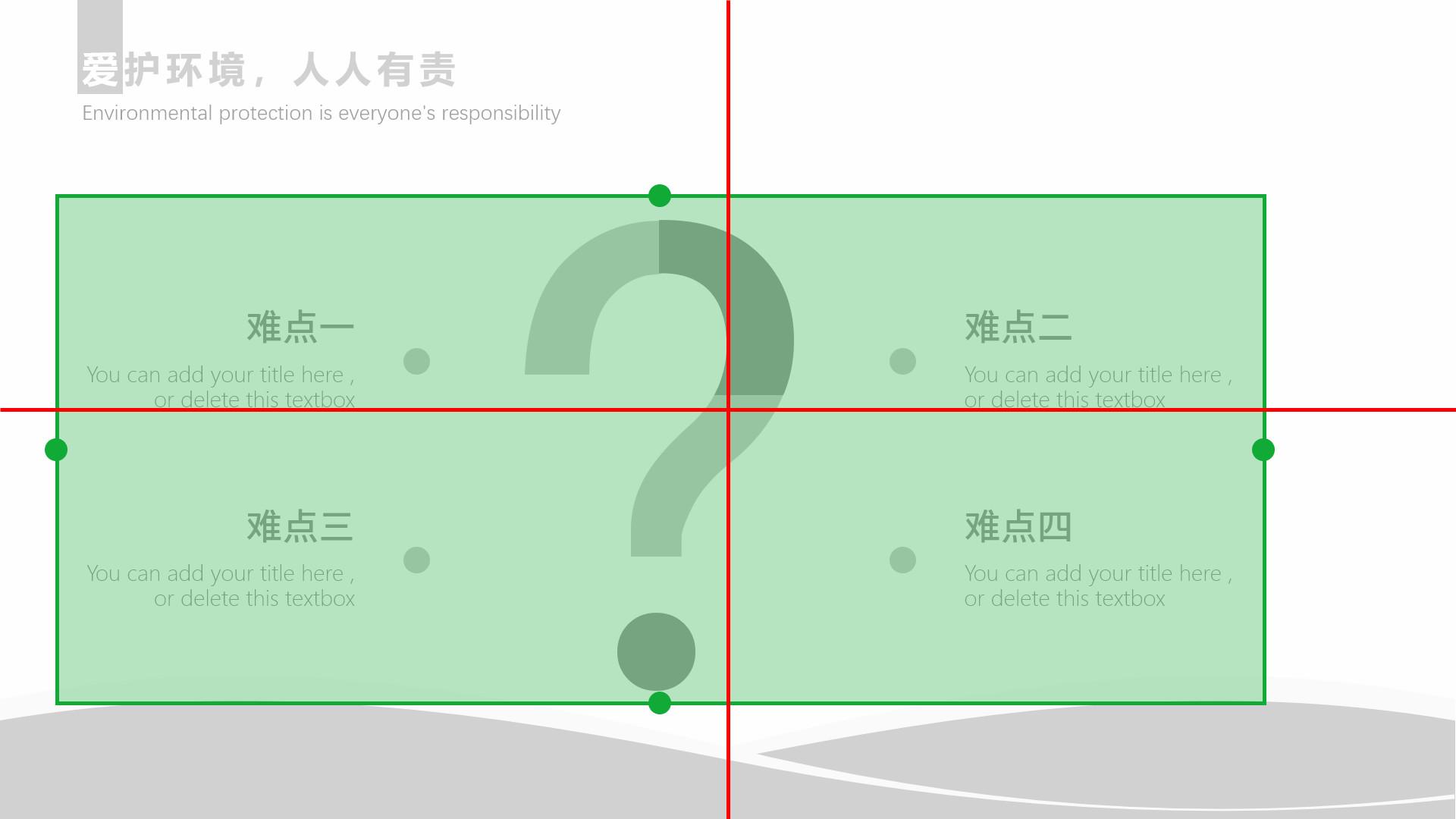
From the above examples, you can see that whether it is a straight line or a curve alignment, you can find a very obvious alignment axis.
In other words, you can check whether your alignment is in place by checking "whether the axis is obvious".
In addition, here is a little alignment trick that only fast men know:
Except for some special alignment methods that need to be aligned with the naked eye (such as the one above), left/center/right/upper/bottom alignment can be achieved with one-click alignment using the [Alignment Tool] that comes with PPT:
Motion image demonstration
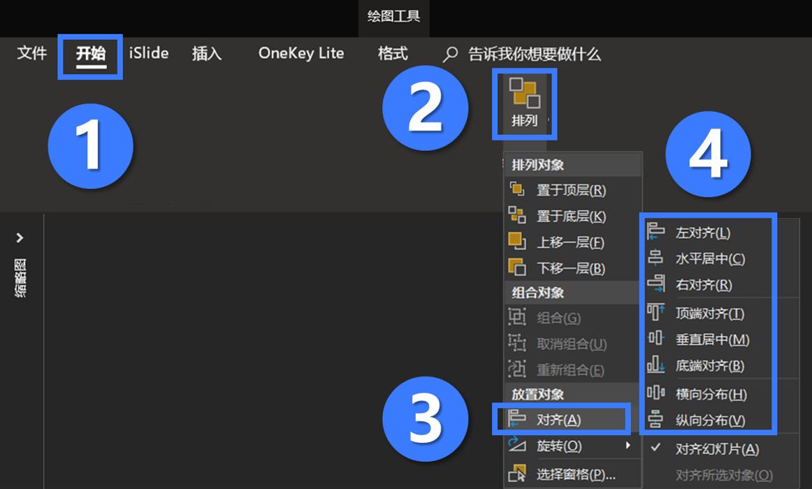
【Alignment Tool】Where can I find it? how to use?
First, use the mouse to select multiple elements that you need to align, and then click [Start] - [Arrange] - [Align] - select the alignment method you need:
If it were an ordinary person who wrote the knowledge point of "how to align", it is estimated that the work would be finished here, but I am different. I have a lot of hair and can afford it...
So after talking about the common ways of alignment, let's take a look at what other alignment thinking needs to be understood.
1.2 Align related thinking
Summarizing my many years of experience in installing P, alignment thinking can be divided into three types: thinking in the middle, thinking of keeping the distance between cars, and thinking of either aligning or dying.
If you think these thoughts sound a bit strange, that's normal, because I made up these names.

However, although the names are not serious, they are better than each other!
1.2.1 Overall centered thinking (to the middle)
The so-called overall center alignment refers to treating the main elements of the page as a whole and making the whole in the center of the page:
The advantage of this is that the layout will no longer have the feeling of "somewhere is very empty, and somewhere is very crowded" shifting the center of gravity:
The overall center of gravity of the manuscript is biased towards the lower left corner
Of course, it does not mean that all layouts must be centered and aligned. Sometimes deliberately not centering can also create a beautiful effect that the six relatives will not recognize! for example:

The layout is not centered, but still looks good
The layout is not centered, but still looks good
Of course, this kind of "intentional" behavior must be based on the fact that you have already understood the rules, otherwise you will not call it intentional, but a blind chicken messing around...
1.2.2 Keep the distance thinking (keep the distance between cars)
Just aligning elements is not enough, you have to ensure that there is a uniform and appropriate spacing between elements, so that the elements do not look too crowded:
Now let’s look back at the two PPTs of the consulting company at the beginning. It is because the two aspects of alignment and spacing are well done at the same time, so even if this PPT has a lot of content, it does not affect its damn charm. !
1.2.3 Extreme Thinking (align or die)
The extreme thinking here does not really refer to the meaning of "If the PPT is not aligned, you can die"...
Extreme thinking means that when typesetting PPT, you either let all elements have a clear alignment, or let them not align at all:
The alignment is clear
Intentionally misaligned
All in all, don't be ambiguous when aligning, but try to be as obvious as possible, otherwise it will be misunderstood as your typographical error:
The alignment is ambiguous
This extreme alignment thinking can be used to answer Xiaoyi’s question about text alignment at the beginning of the article.
When typesetting text, you either want the text to be completely aligned, or you can have the text to be completely misaligned:

The text is fully aligned
The text is completely misaligned
The above is the content of "how to do alignment in a single-page PPT" (alignment method + alignment thinking), let's take a look at the details of alignment from the perspective of the entire PPT. Give away your precious hair!
2. Look at the alignment from the perspective of the entire PPT
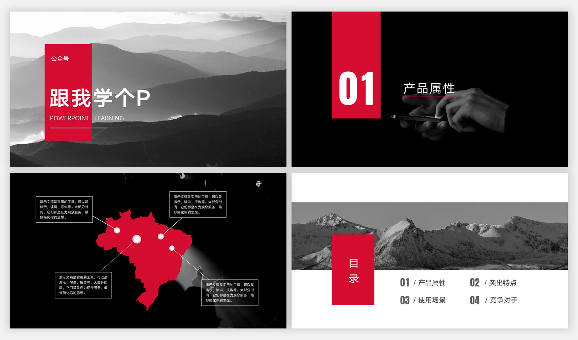
In a PPT, whether the style of each inner page is uniform (the style includes header + footer + background) will ultimately determine the degree of uniformity of the style of the PPT.
PPT with inconsistent style
Unified PPT style
In the matter of unifying the PPT inner page style, alignment can play a big role.
So how does it unify the style of the inner page?
Start from two aspects: one is the header and footer, and the other is from the margins.
2.1 Unify the position of header and footer
The header generally includes the title and logo, and the footer generally includes the page number and other information:

When the number of PPT pages is relatively large, you'd better use a unified header and footer for each inner page.
Of course, you can design the header and footer whatever you want, as long as you can make them maintain the same style and position in each inner page, so that it can be better maintained The unity of PPT style.
This is "maintain alignment" from a macro perspective. In addition to the header and footer, the margins of each PPT page also need to be consistent.
2.2 Uniform margins
Page margin refers to the distance between the edge of the PPT page and the content.
Determining a uniform page margin for all pages has two advantages. One is to make the page look less crowded:
The second is to make the layout style of PPT look more unified:
Now you may have two questions: How to specify the margins of the layout? How wide are the page margins?
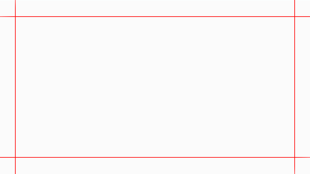
First of all, pull out four reference lines in the PPT to specify the page margins.
Secondly, there is no fixed value for the width of the page margin. If the content of the page is more, the page margin can be narrower, otherwise, it can be wider, just grasp the size by yourself:
Less content means wider margins
More content, narrower margins
Unified page margins and unified header and footer are "alignment" in the overall sense, and the purpose is to create a visual symbol for PPT that can permeate the entire PPT.
You can simply understand this visual symbol as "a certain sense of uniformity", which can make the overall style of PPT look more unified.
Now let's summarize the above 3,000 words + 53 pictures of vomiting blood!
- Alignment refers to placing elements according to certain obvious rules;
- Maximum alignment The advantage is that it can make the PPT look full of order;
- Common alignment methods include straight line alignment and curve alignment;
- >Alignment thinking includes overall centering, maintaining spacing, and extreme thinking;
- Unified headers, footers, and unified margins can be regarded as alignment in the overall sense;
- strong>
- You can use [Alignment Tool] and [Reference Line] to assist in alignment.
If you can see this, please accept my thanks...
Alright, I’m going to stock up on a few boxes of Shenbao Tablets first, the doctor said that if every article I write is so long and coquettish, it’s easy to cause infertility…
Let's continue to show off in the next issue... more cheap...
I'm Xiaomu, I'm with my brother, I'm useful for P!
Welcome to follow Xiaomu's official account "Learn a P with me"!
Articles are uploaded by users and are for non-commercial browsing only. Posted by: Lomu, please indicate the source: https://www.daogebangong.com/en/articles/detail/Tiantian%20emphasizes%20that%20you%20must%20be%20able%20to%20align%20when%20doing%20PPT%20The%20question%20is%20how%20to%20align.html
 支付宝扫一扫
评论列表(196条)
测试