Source: Youset.com
Author: Xiaobai
Link: https://www.uisdc.com/90s-tv-series-logo-font
The 1990s was the last decade of the 20th century, an era of rapid economic development, unprecedented prosperity in art and technology, and an era when the Internet began to become popular and gradually changed people's lifestyles. With the emergence of digital design tools, the traditional graphic design approach has ushered in new opportunities and challenges. New technologies and new trends of thought brought many experimental and innovative visual effect explorations at the time, and various trendy design styles were constantly being defined.
Although the logo design is only a small part of the graphic design, it fully reflects the designer's skill and the aesthetic taste of the industry at that time. We might as well take a glimpse of the popular trend of American font design in that era from the logo design of the most popular classic American TV series in the 1990s.
Gabriel Weiss – Friends
"Friends" is one of the most popular dramas in the history of American TV dramas. From its broadcast in 1994 to its tenth season in 2004, the ratings of each season were among the top ten in the year. In the play, six friends living in Manhattan, New York, have gone through ten years of ups and downs hand in hand, which is a precious memory that accompanied a generation of Americans growing up. At the same time, as a classic and necessary material for Chinese people to learn spoken English, "Friends" also carries the youthful memories of many Chinese youths.
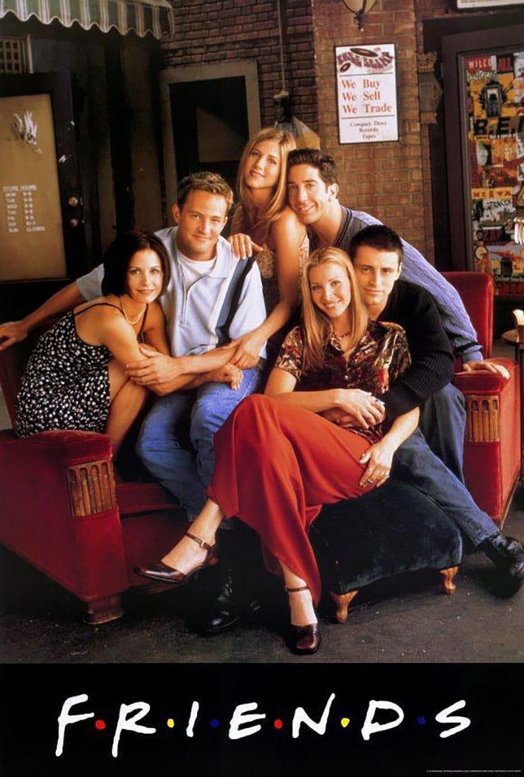
Handwritten font design was very popular in the United States in the 1990s, and the logo of "Friends" is a typical example of this design style. This handwritten font called Gabriel Weiss is relaxed and casual, which fits the positioning of the "Friends" life sitcom. In addition, the logic behind the logo design is also very interesting: the 6 colored dots separating the 7 letters of the word "Friends" just symbolize the 6 friends characters in the play, which perfectly echoes.

Font download link: Gabriel Weiss https://www.fontke.com/family/208023/
X-Files – The X-Files
The antique-level classic American drama "X-Files" is an enlightenment drama for many post-80s and 90s about American dramas with science fiction themes. Although it is relatively old, whether it is the scope of knowledge covered by the plot, the classic dialogue of the characters in the play, or the depth of the portrayal of human nature, it is far higher than the level of the same period or even many current science fiction films.
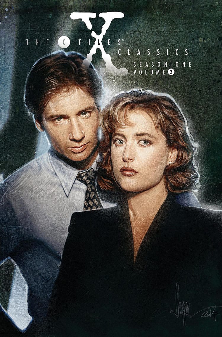
The logo design of "X-Files" is also very careful, simulating the effect of text printed on a typewriter to echo the concept of "files". The mottled strokes perfectly display the mystery of the sci-fi suspense drama. It is a classic representative of the logo design of American TV dramas in the 1990s.
Different from the retro texture of the mottled monospace font of the letter "X" in the logo, the most used title font in "X Files" is a thin, neat, angular sans serif font, full of strong future and sci-fi. The font of the title and the font of the logo form a strong contrast in temperament, which happens to echo with the rules of font combination and complement each other.
Font download link: X-Files https://www.dafont.com/xfiles1.font
Simpsonfont – The Simpsons
"The Simpsons" (The Simpsons) is an animated sitcom that everyone is familiar with. It was produced by the Fox Broadcasting Company in the United States and was named one of the greatest TV shows of the 20th century by Time magazine. Through the description of the life of the protagonist Homer's family of five, it humorously satirizes American culture and society from multiple perspectives in a funny way.
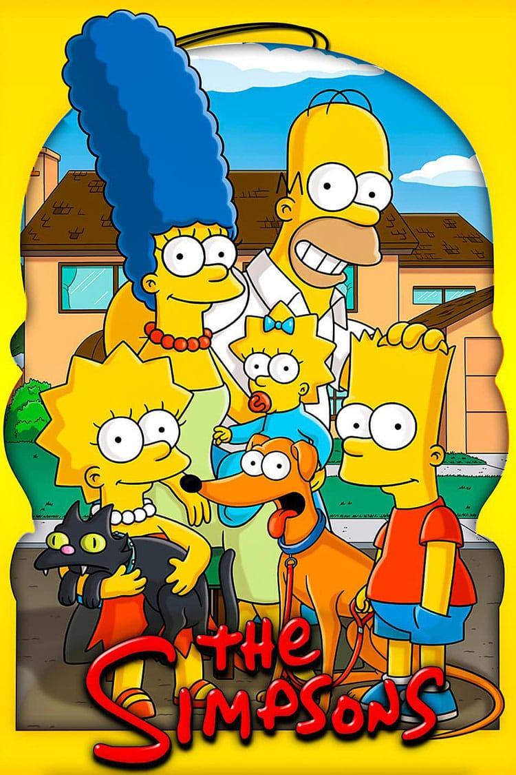
The logo font design of "The Simpsons" is a typical Matt Groening-style design. As the author of the comic, Matt designed this set of logo fonts that perfectly fit the characters of the Simpson family. The mixed form of upper and lower case fonts adds personality to the presentation of the logo. The bubble font effect created by black shadow and highlight style is very early digital design style. The playful font looks like the characters in The Simpsons jumped out of the screen and wrote the words themselves.

Font download link: Simpsonfont https://www.dafont.com/simpsonfont.font
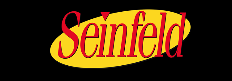
Gloucester – Seinfeld
"Seinfeld" (Seinfeld) produced by NBC TV broadcast a total of 180 episodes from 1989 to 1998, telling the ordinary life of four ordinary people without fancy clothes or extraordinary talents. Unlike other sitcoms, "Seinfeld" is a true show with no theme and no main line. Perhaps it is precisely because of its "about NOTHING" characteristics that it shows the truth, which has received unanimous praise from critics and audiences, and has been named "the greatest drama series of the 21st century".
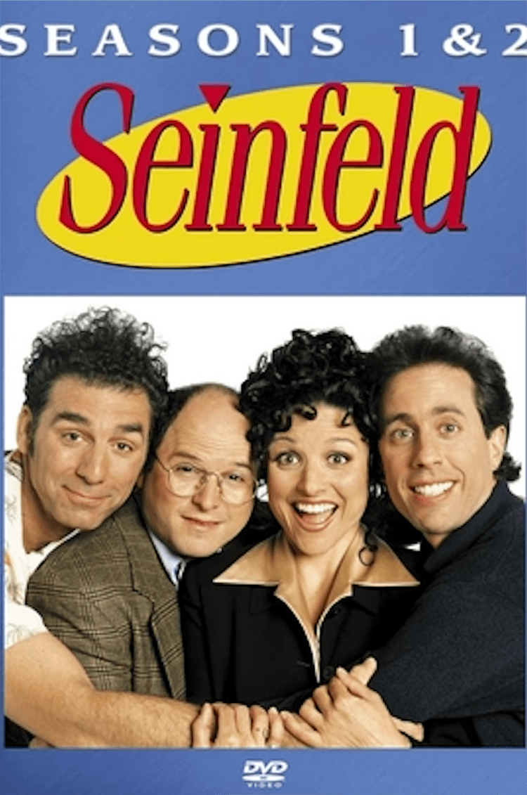
Gloucester, the logo typeface for Seinfeld, was designed by Monotype and was a classic typeface that was fashionable at the time. The italic form of the font is used in the logo, which adds liveliness and fun to the design effect. The yellow oval background sets off the red text, and the dot of the "i" letter in the word Seinfeld is replaced with a triangular shape, so that the overall logo design finds a good balance between seeking beauty and expressing humor. The design technique of superimposing shadows on the text also reflects the pursuit of the design trend at that time.
Font download link: Gloucester MT Extra Condensed https://www.myfonts.com/fonts/mti/gloucester-old-style-mt/
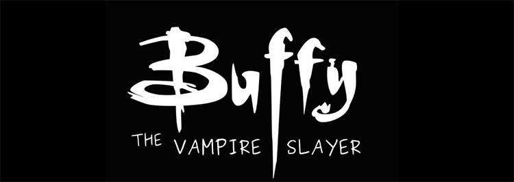
Buffied – Buffy The Vampire Slayer
Compared with the current shows of the same type, "Buffy the Vampire Slayer" has long been surpassed in terms of visual effects and story background settings. However, as an early vampire-themed youth drama, there are still many remarkable things, and it is also a classic in the youthful memories of many early American drama fans.
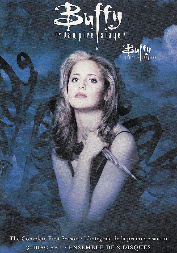
The logo "Buffy" of "Buffy the Vampire Slayer" is a typical font design style of the 90s. During this period, due to the emergence of new digital design software, people began to pursue more decorative and aesthetic font design styles, rather than being limited to classic neat and simple fonts. The font of Buffied is a typical Gothic font, with a mysterious and grotesque temperament, which makes people naturally associate it with the vampire story, presenting a sense of story with the font design.
Font download link: Buffied https://www.dafont.com/buffied.font
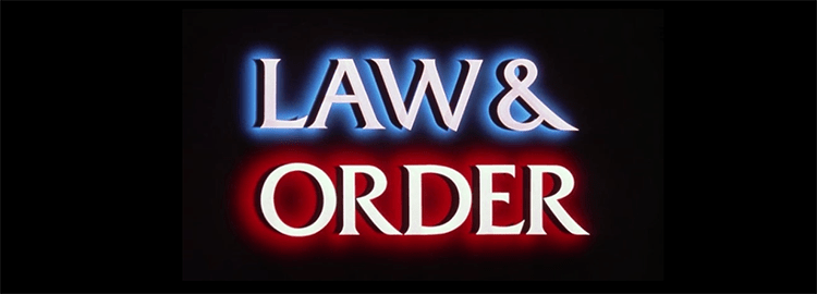
Friz Quadrata – Law & Order
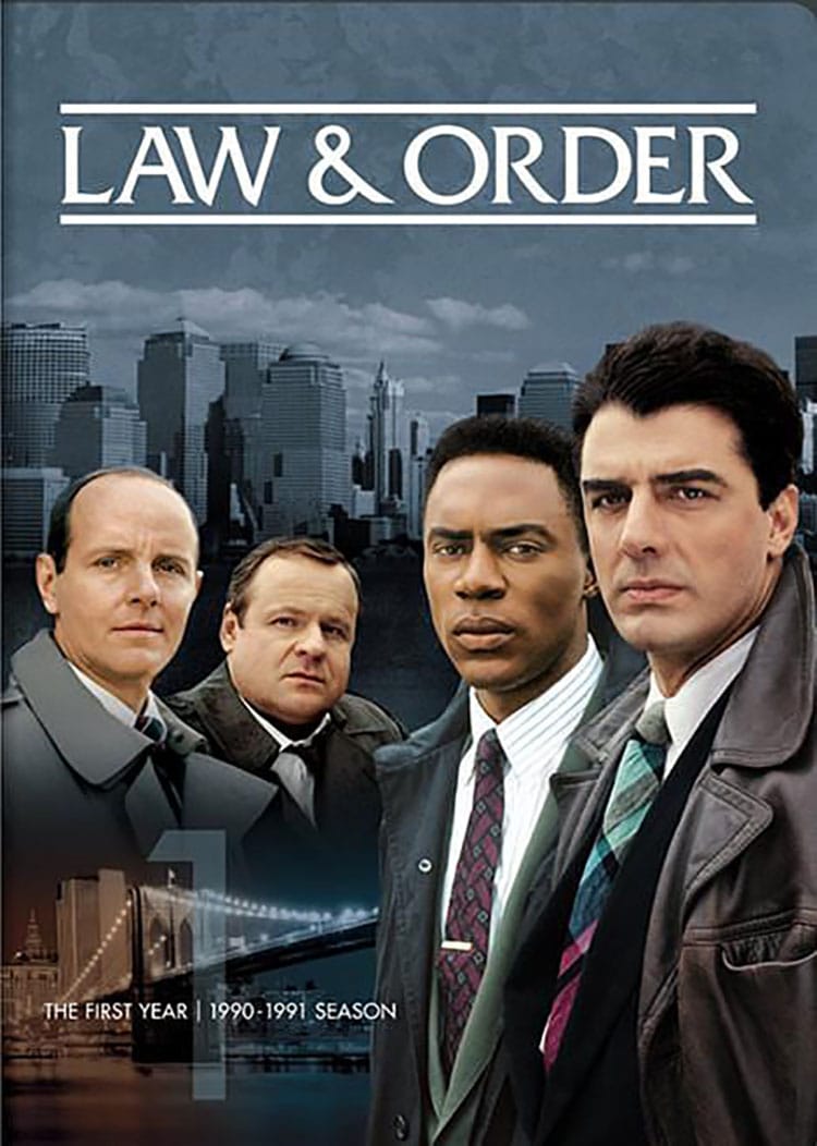
"Law & Order" (Law & Order) is a long drama about the stories of New York police officers and prosecutors. It was broadcast from 1990 to 2010, with a total of 20 seasons and 456 episodes. It integrates police and criminals with legal and political dramas. It is rigorous and true, and it solidly tells the case and analyzes the moral ethics and legal principles behind it. The story is based on real life and directly hits the sensitive propositions of the society at that time. It can be called the most magnificent drama series in the history of NBC and even in the history of American film.
The logo "Law & Order" of "Law & Order" uses the rigorous and elegant font Friz Quadrata, which meets the aesthetic needs of the temperament of legal dramas, and looks official and rational. The logo design uses the effect of 3D three-dimensional characters and adds colorful luminous styles to the characters, which is a unique character design style in the 1990s. The two sides of the law and the courts are impressively symbolized by the glowing shades of red and blue in the text.
Font download link: Friz Quadrata https://www.myfonts.com/fonts/adobe/friz-quadrata/
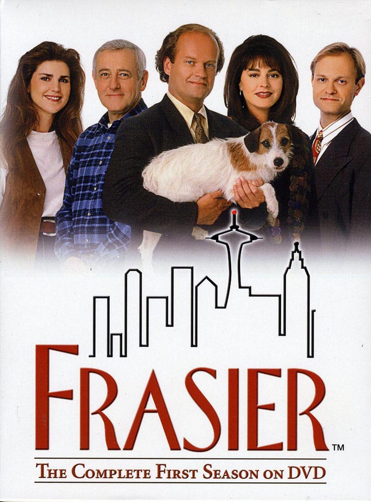
Florentine – Frasier, "Family"
Just as "I Love My Family" created a precedent for Chinese sitcoms, "Frasier" (Frasier), which was broadcast in the same year on the other side of the ocean in 1993, is also a pioneer of American sitcoms. This TV comedy, one of the greatest in American history, has accompanied Americans for 22 years. The show revolves around the family story of a Boston psychiatrist named Frasier. I believe that the jokes formed by the contrast between psychology and the real world will bring you another kind of fun different from "Friends".
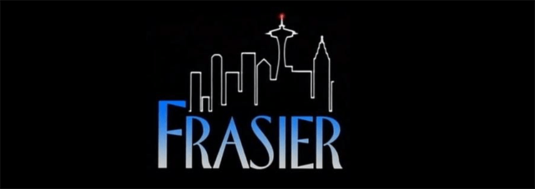
Some critics once said that the logo of "Happy Family" can be regarded as one of the best logo designs in the American drama industry in the 1990s. Just like the logo of "Seinfeld" has a good sense of seriousness and sense of humor, Florentine's slender font and lively and changeable corner treatment make the logo design of "Happy Family" also serious, relaxed and humorous There is a balance between emotions. In different versions of the logo, whether it is a gradient effect or a three-dimensional style with monochrome superimposed black shadows, they are all unique word effect processing styles in the 1990s. The city pattern outlined by a single line is combined with the text logo, which seemed modern and fashionable back then.
Font download link: Florentine https://www.fonts.com/font/urw/florentine/regular
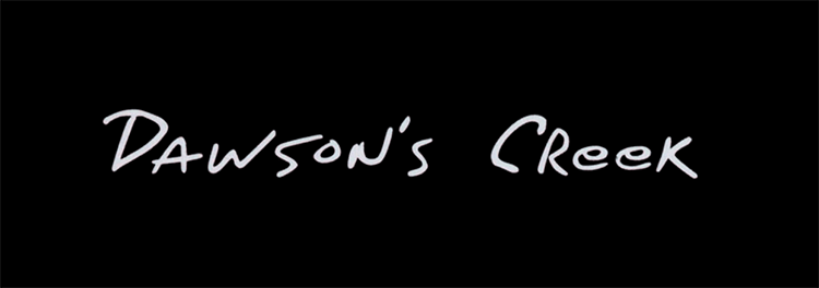
Fontageous Rendition – Dawson’s Creek
"Dawson's Creek" (Dawson's Creek), known as the "American Youth Growth Textbook", started broadcasting in 1998 and then continued to broadcast for six years. This old-fashioned youth romance drama revolves around the adolescent growth story and emotional entanglements between four high school buddies. Different from many youth dramas full of deceit and hormones nowadays, "Age of Love" is pure, innocent and beautiful.
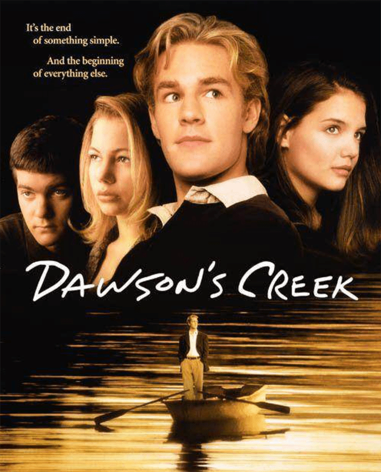
Like the logo design of "Friends", the logo font design of "Age of Love" also conforms to the handwriting trend popular in the 1990s. But different from the relaxed and casual font style of the former, the Fontageous Rendition used in the logo of "Age of Love" looks more youthful and immature. This font is like the handwritten text on a sympathy book, or the handwritten text on a small note secretly passed by an ignorant teenager in a high school class to a girl he likes. The design of the text cleverly conveys the atmosphere and emotions of a youthful love drama.
Font download link: Fontageous Rendition https://fonts2u.com/fontageous-rendition.font
By @-SoleilDu-
Articles are uploaded by users and are for non-commercial browsing only. Posted by: Lomu, please indicate the source: https://www.daogebangong.com/en/articles/detail/Through%20these%208%20fonts%20a%20glimpse%20of%20the%20LOGO%20design%20style%20of%20American%20dramas%20in%20the%201990s.html
 支付宝扫一扫
评论列表(196条)
测试