(Start Front-end Encyclopedia to improve front-end skills< span>)
Author:A Zen in Hanshui Temple
https://segmentfault.com/a/1190000022851543
1, -webkit-line-clamp
can limit the content of the block container to the specified number of lines. And after exceeding the number of lines, display '...' on the last line
This is a normal display
display: -webkit-box; /*value must be -webkit-box or -webkit-inline-box*/
-webkit-box-orient: vertical; /*value must be vertical*/
- webkit-line-clamp: 2; /*The value is a number, indicating how many lines to display in total*/
overflow: hidden span>;
This is the display after adding line-clamp
https://developer.mozilla.org/en-US/docs/Web/CSS/-webkit-line-clamp
2, all
Resets all attributes except unicode-bidi and direction to their initial values, or inherited values.
all: unset; /*initial | inherit | unset*/initial Changes the value of all attributes of the element to the initial value.inherit changes the value of the element to the value inherited from the parent element
unset If the value of the element's attribute is inheritable, reset it to the inherited value of the parent element, otherwise it will change to the initial value.
3, box-decoration-break
https://developer.mozilla.org/zh-CN/docs/Web/CSS/box- decoration-break
4, caret-color
is used to define the color of the caret cursor (caret), the caret cursor mentioned here is the one in the editable area of the web page, The blinking vertical bar | used to indicate exactly where the user's input will be inserted.
caret-color: red;
5, clip-path / shape-outside
The clip-path attribute uses clipping to create the displayable area of the element. The part inside the area is displayed, and the part outside the area is hidden. Similar cropping also has clipPath of svg.
The value of clip-path has the following graphics
inset(xxx): cropped to a rectanglecircle(xx): cropped to a prototype
ellipse(xxx): Cropped to an ellipse
polygon(xx): clipping to polygon
none: no clipping
Preparation before the example
<div
 style='width: 500px; height: 500px;text-align: left;background -color:gray;color:white'
>
 <img
 class= 'clip-mode'
 style='float: left; margin:20px'
 src='https://interactive-examples.mdn.mozilla.net/media/examples/balloon-small.jpg'
 width=' 150'
 />
 We had agreed, my companion and I, that I should call for him at his house,
 after dinner, not later than eleven o' clock. This athletic young Frenchman
 belongs to a small set of Parisian sportsmen, who have taken up “ballooning”
 as a pastime. After having exhausted all the sensations that are to be found
 in ordinary sports, even those of “automobiling” at a breakneck speed, the
 members of the “Aéro Club” now seek in the air, where they indulge in all
 kinds of daring feats, the nerve-racking excitement that they have ceased to
 find on earth.
</div>
do not crop
clip-path: none;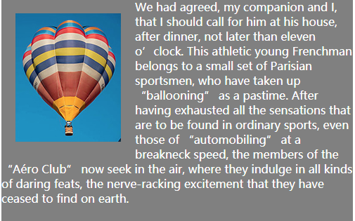
Circular cropping
clip-path: circle(40%); //The radius is 40%, and the center of the circle is the center by default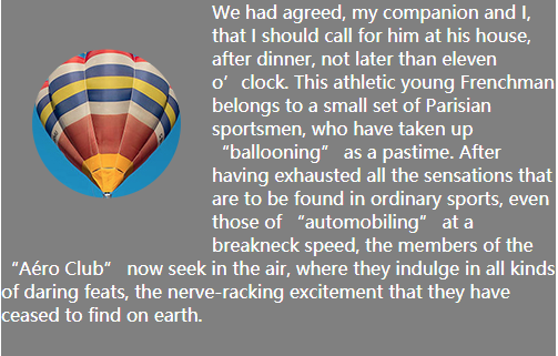
Ellipse clipping
clip-path: ellipse(130px 140px at 10% 20%);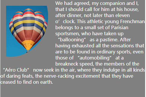
Polygon clipping
clip-path: polygon(50% 0, 100 span>% 50%, 50% 100%, 0 50%);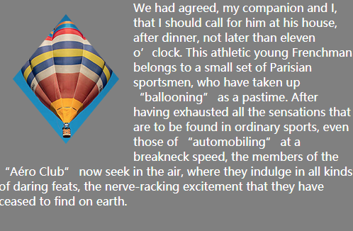
We can see how the above graphic is cropped, and the invisible frame outside is always a rectangle, that is to say, the text is always surrounded by a rectangle.
So is there a way to make the text stick tightly around the cropped graphics?
Yes, use the shape-outside property
shape-outside defines a possibly non-rectangular shape around which adjacent inline content should wrap. By default, inline content surrounds its rectangular margin;
Default rectangle wrapping
clip-path: none;
shape-outside: none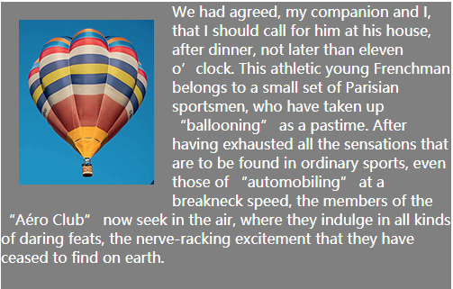
circle around
clip-path: circle(40%);
shape-outside: circle(40%);
Ellipse Surround
clip-path: ellipse(130px 140px at 10% 20%);
shape-outside: ellipse(130px 140px at 20% 20%);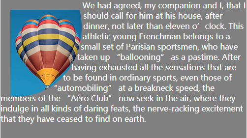
Variability Surround
clip-path: polygon(50% 0, 100 span>% 50%, 50% 100%, 0 50%);
shape-outside: polygon(50% 0, 100% 50%, 50% 100%, 0 50%);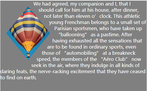
Of course, you don't have to use circular wrapping on circular clipping, you can use polygonal wrapping on circular clipping, and diamond wrapping on polygonal clipping. In short, there is no relationship between these two, and they are not pairwise matched. It's all up to you, define yourself
6. object-fit / object-position
The object-fit attribute specifies how the content of a replaceable element should fit into the box it uses to determine its height and width.object-position attribute to specify the alignment of the content object of the replaced element within the element box.
Note: The replaceable elements include iframe, video, embed, img, and some are also replaceable elements in the case of features, option, audio, canvas, object
Preparation before the example
<div style='width: 300px; height: 300px; background-color:gray;'>
 <img class='clip-mode' style span>='height: 100%; width: 100%;' src='https://interactive-examples.mdn.mozilla.net/media /examples/plumeria.jpg'>
</div>
The picture must be set to 100% width and height, that is, it must not exceed the parent container before setting object-fit, otherwise it is meaningless.
fill The picture will be stretched and deformed, and the width and height will be stretched to 100% of the parent container to fit the parent container
object-fit: fill;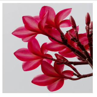
contain The picture will not be deformed, and the picture will be scaled according to its own proportion. The whole picture will be placed in the parent container, and the shorter side will have an auto-filled blank.
object-fit: contain;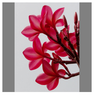
cover Cover The picture will not be deformed, and the picture will be scaled according to its own proportion. The whole picture will be placed in the parent container, and the shortest side of the picture will be included in the parent container as the benchmark. the longer side will overflow
object-fit: cover;none and the width and height of the parent container It doesn't matter. Display the most original aspect ratio of the picture, take the "center" of its own picture as the base point, and place it at the "center" position of the parent container.
object-fit: none;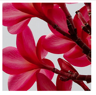
scale-down The size of the content is the same as one of none or contain , depending on which of the two results in a smaller object size.
object-fit: scale-down;If the image is larger than the size of the parent container, then according to the effect of contain, if the image is larger than the parent container If the container is small, follow the effect of none.
In the display of object-fit above, we found that the alignment of replaceable elements is automatic.
For example, object-fit: fill; aligns the top-left corner with the top-left corner of the parent container.
object-fit: none; The center is aligned with the center of the parent container and so on.
But what if we want to change the alignment manually? ?
You can use the object-position attribute to specify the position of the content of the replaceable element in its content box.
object-position: 10px 10px; You can set px, the first value represents the distance from the left side of the parent container, and the second value represents the distance from the top of the parent container. Only one value represents the distance from the left side of the parent container. You can also set the % value, but it will only work if there is a blank space on one side at this time. If there is no blank space and it just fills the parent element, it will not work. Setting px has no such problem, anything after that will work.object-position: right top; keywords can be set, the first value keyword can be set (left|center|right), and the second keyword can be set (top|center|bottom), which does not mean at this time The distance from the left or top, and indicates where to place it on the parent element.
object-fit: fill;
object-position: 50px span> 50px; //10px from the left, 10% from the top
Comparison before and after adding object-position: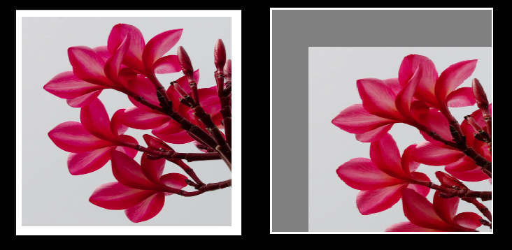
object-fit: contain;
object-position: right top; //Stay child Top right
Comparison before and after adding object-position: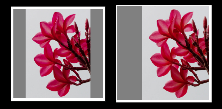
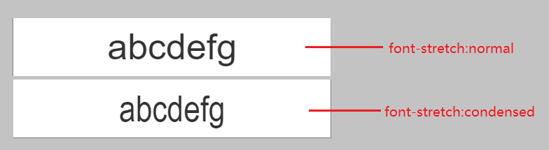
7. font-stretch
Defines a normal or stretched font appearance for the font, it just means that when there are multiple fonts to choose from, it will Choose the most suitable size for the font.
normal default fontsemi-condensed, condensed, extra-condensed, ultra-condensed smaller than default font
semi-expanded, expanded, extra-expanded, ultra-expanded larger than the default font
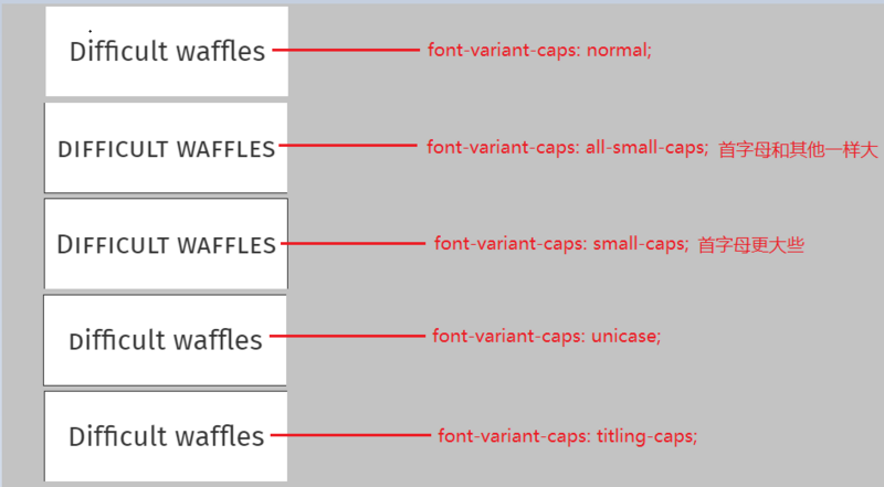
8, font-variant-caps
can control the use of special characters of uppercase letters.
normal Turn off all special character variants.
small-caps Allows the use of small caps (OpenType feature: smcp). Small caps are letters that use their uppercase form but are the same size as their lowercase counterparts.
all-small-caps Convert all uppercase and lowercase letters to small caps. (OpenType features: c2sc, smcp).
petite-caps allows the use of petite caps (OpenType feature: pcap).
all-petite-caps Convert all uppercase and lowercase letters to small caps. (OpenType features: c2pc, pcap).
unicase allows conversion of uppercase letters to small caps mixed with normal lowercase (OpenType feature: unic).
titling-caps Allow initial capitalization (OpenType feature: title). Uppercase variant characters are usually designed to be used with lowercase letters. In a title sequence, using all capital letters can create an overly strong visual effect. Capitalizing the first letter is used to deal with this situation.
9, font-variant-east-asian
Controls the use of alternative symbols for East Asian characters (such as Japanese and Chinese, Korean, etc.).
There are several values:
normal; ruby; jis78; jis83; jis90; jis04; simplified; traditional; full-width; proportional-width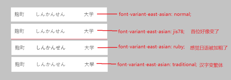
10, max-content / min-content / fill-available / fit-content
These values can be used in width, height, min-width, min -height, max-width and max-height properties.
display must be inline-block or block, otherwise the above values will not work.
fill-available
The element fills the available space. The reference base is how wide and tall the parent element is.
Similar to the div of the child element to fill the width of the parent element, fill-available can not only fill the width but also fill the height.
Code before the example
<div style='width: 300px; height: 100px; background-color:gray;'>
 <span style='display:inline-block;background-color: burlywood;'< /span>
 >This is the content of the child element</span
 >
</ div>
Different performance when fill-available is set on the span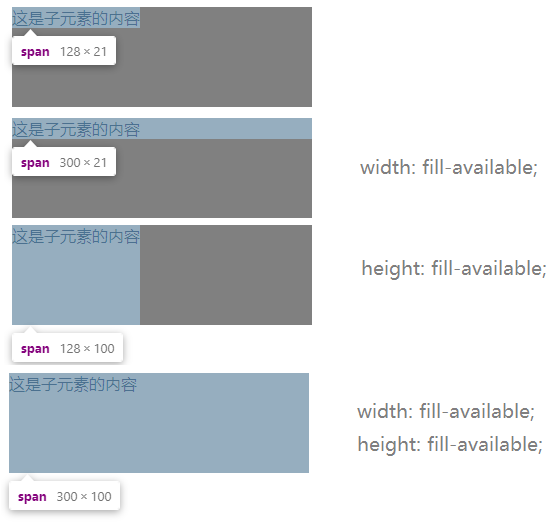
If there is an element inside, it is img? It is also inline-block, which should also satisfy the situation. 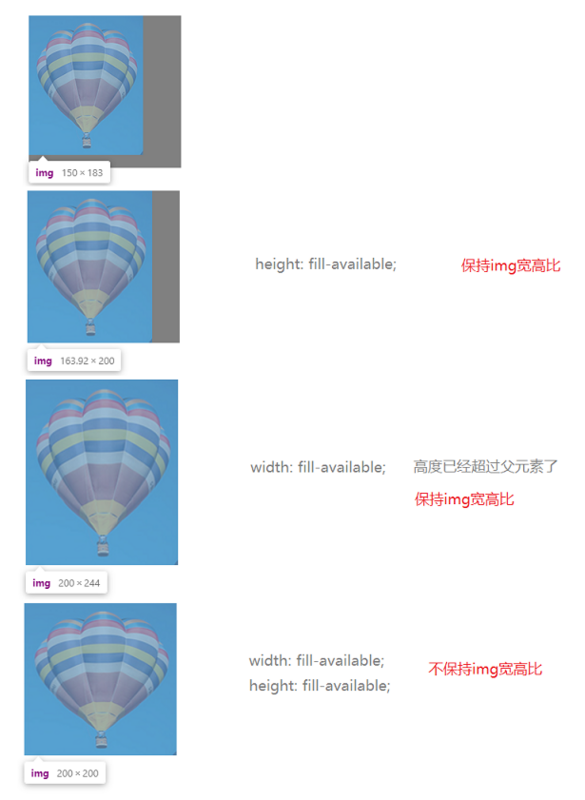
We can see that the difference between img and span is that when one of width or height is set, the entire image will be scaled according to its own proportion.
max-content
Its width or height will be automatically adjusted to just accommodate the element with the longest length (calculated when the text does not wrap) among the sub-elements.
The benchmark for reference is the width and height of the child element.
<div class='parent'>
 <div class='current' style='width: 200px; height: 300px; background-color: gray;'>
 <p> This is an ordinary p element line, the content is the text < ;/p>
 <img src='https://interactive -examples.mdn.mozilla.net/media/examples/balloon-small.jpg'/>
 </div>< /span>
</div>
When max-content is set for current div, it behaves differently. 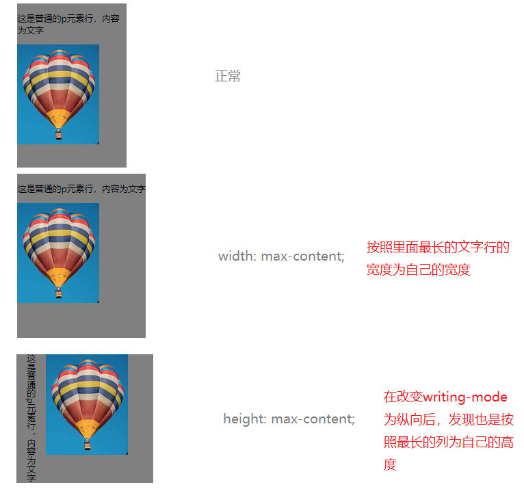
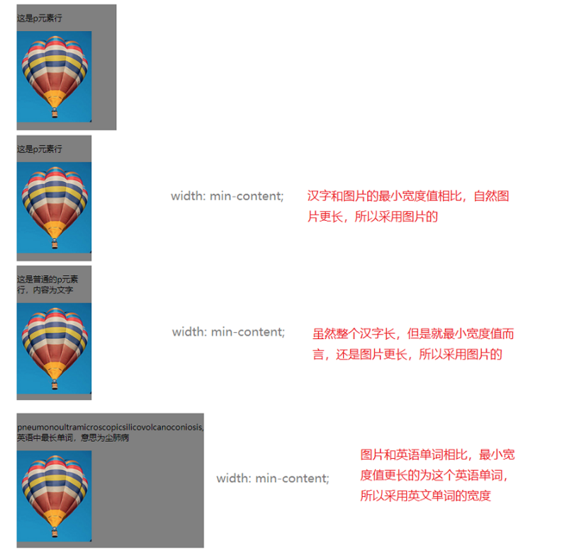
min-content
Its width or height will be automatically adjusted to just accommodate the element with the largest "minimum width value" among the sub-elements, and the remaining extra long ones will either wrap lines or Overflow
The benchmark for reference is the width and height of the "minimum width value" of the child element.
What is the "minimum width value"?
For example, the minimum width value of a picture is the original width and height of the picture; if it is a string of Chinese characters, the minimum width value is the width and height of a single Chinese character; if it is a string of English characters, the minimum width value is the longest word in it that.
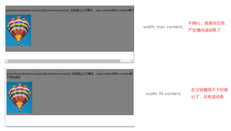
fit-content
means that the element is automatically stretched to the width of the content, and the difference from max-content is that it just fits the longest element among the child elements.
The difference is that max-content is calculated according to the text without wrapping, if it exceeds the parent element, it will not wrap, and a scroll bar will be generated directly; while fit-content will wrap after exceeding the parent element, and no scroll bar will be generated.
11, fit-content()
This is different from the above fit-content value, it is a function, used in the grid layout.
(omitted)
See grid layout for details.
12, resize
is relatively simple, you can check
Official documentation
13、scroll-behavior
When the user triggers a scrolling operation through the API, the CSS property scroll-behavior specifies the scrolling behavior for a scroll box, whether it arrives smoothly or immediately
You can view
official documents
14, max() / min()
max takes the maximum of the two; the min function takes the minimum between the two.
max, min can be used in any value such as <length>, <frequency>, <angle>, <time>, <percentage>, <number>, or <integer> place
width: max(50vw, 300px);
width: min( 50vw, 300px);
15、clamp()
clamp The function will take the middle value between the three defined values, the size is in the middle, not the position is in the middle,
clamp(MIN, VAL, MAX)
Same as max and min functions, it can be used in any settings where <length>, <frequency>, <angle>, <time> , <percentage>, <number>, or <integer>
font-size: clamp(1px, 3px, 2px);  //The middle value is 2px
font-size: clamp(1px, 3px, 5px span>); //The middle value is 3px
font-size: clamp(4px, 3px , 5px); //The middle value is 4pxwidth: clamp(< span >200rem, 25vw, 150px); //Take the middle value between these three< /pre>16, conic-gradient()
We know in the gradient, there are:
Linear gradient, linear-gradient, from one direction to another direction, the color transitions linearly.
Radial base gradient, radial-gradient, from a certain point, slowly radiating outward along the circle.
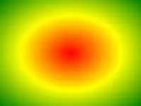
In addition, there is a gradient called 'tapered gradient'. It is a gradient that rotates in a fan shape around a center point (instead of radiating from the center point)
This is the difference between tapered and radial gradients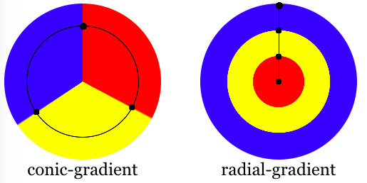
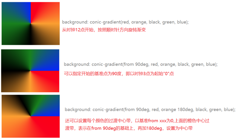
background: conic-gradient(red, orange, black, green, blue);Default clockwise from 12 o'clock to rotate
18, :out-of-range / :in-range
is relatively simple, you can check the official document
:out-of-range
:in-range
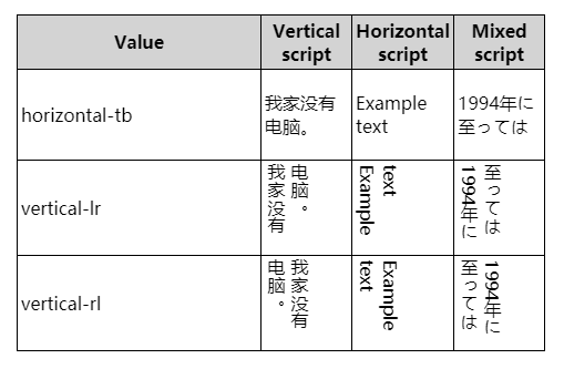
19, writing-mode
Defines the horizontal or vertical arrangement of text and the writing direction of text in block-level elements
horizontal-tb means horizontal writing, from top (top) to bottom (bottom)vertical-rl means vertical writing, from right (right) to left (left) (this is how ancient Chinese calligraphy was written)
vertical-lr means vertical writing, from left to right
Note there is no horizontal-bt, don't make up
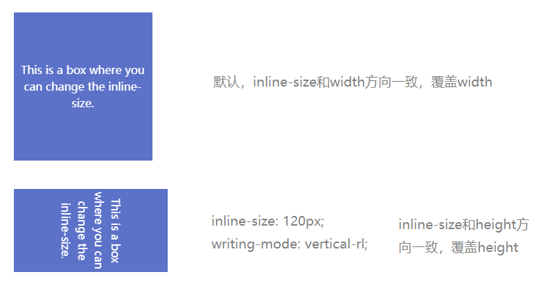
20, inline-size
have the same effect as the element's width and height, and will change the size of the box. But it will override width, height values.
The difference is that width is an absolute horizontal direction, and height is an absolute vertical direction;
The inline-size is relative to the horizontal direction, and the direction can be changed through the writing-mode mode
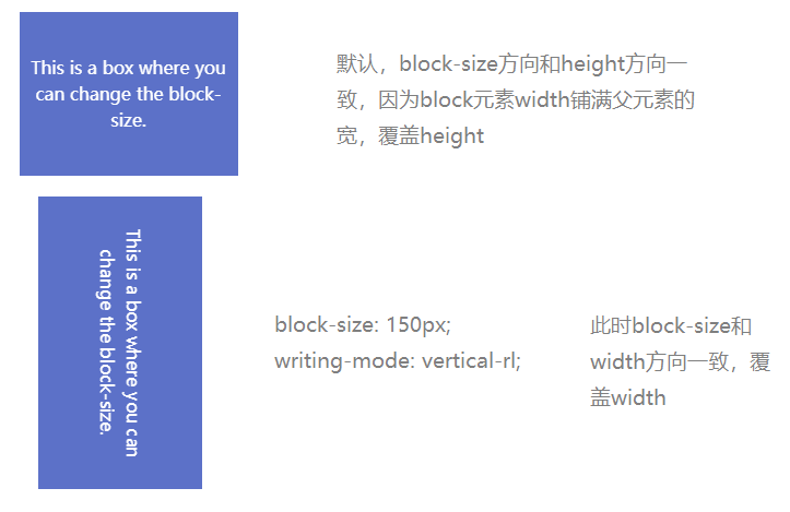
21, block-size
Similar to inline-size, but just the opposite of inline-size, block-size defaults to the value of the height direction.
-EOF-

1. Interviewer: Can you use pure CSS to determine the direction the mouse enters?
2. Second Battalion Commander, quickly pull out a CSS and draw me a tic-tac-toe game
3. CSS Glitch Art
Find this article helpful to you? Please share with more people
Focus on "Front-end Daquan" and add stars to improve front-end skills
Good article, Ireading❤️
Articles are uploaded by users and are for non-commercial browsing only. Posted by: Lomu, please indicate the source: https://www.daogebangong.com/en/articles/detail/Those%20uncommon%20but%20very%20useful%20css%20properties.html
 支付宝扫一扫
评论列表(196条)
测试