Editor's Note: The annual Double Eleven Global Carnival is here! I believe that everyone has seen the brand penetration of Double Eleven through various channels before, and there have been many guesses before. What are the brands playing on Double Eleven this year, and what is the thinking behind it? Today, for the first time, Ali's official designer revealed to everyone the mentality of Double Eleven's brand design.
When designers took on this task, they realized the enormity of the challenge. The high level of design shown in previous Double Eleven means that this year’s Double Eleven brand design is very difficult. The Double Eleven brand displayed today is not just about designing a logo (of course, experienced designers know that it is not easy to design a logo that connects all joints and runs through from top to bottom). It embodies business strategies and can effectively and interestingly complete the communication with consumers. Among them, the Logo is the gathering and refining of all brand strategies and ideas, and it is also the origin of the entire Double Eleven brand extension design. To understand the beginning and end of the Double Eleven brand, our story has to start with the Logo.
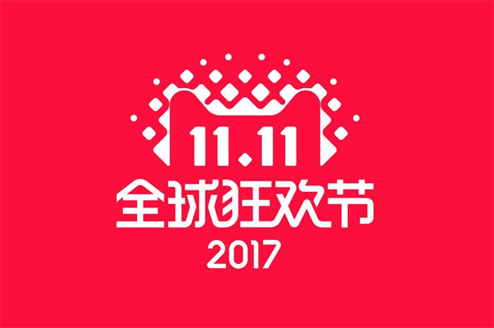
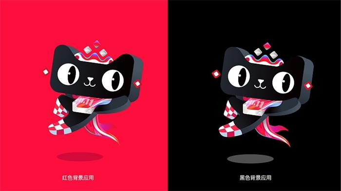
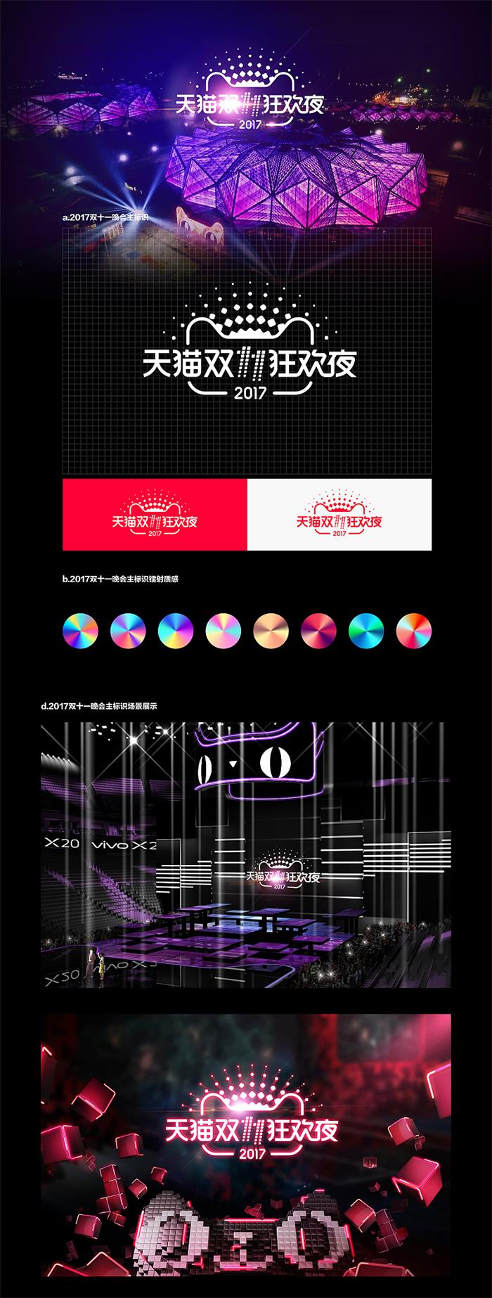
△ This year's Double Eleven Logo
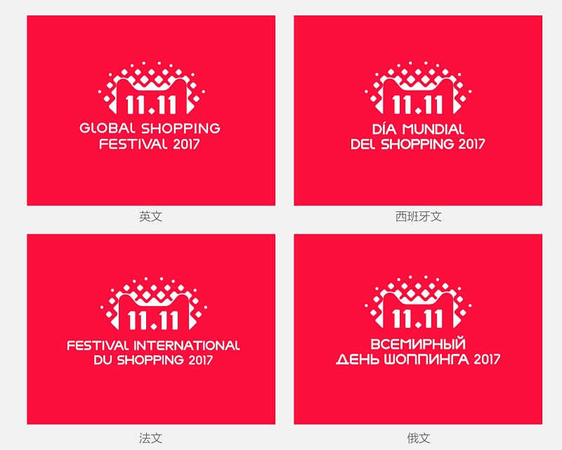
△ Multilingual version
When you put it together with previous Double Eleven Logos, what difference can you see?
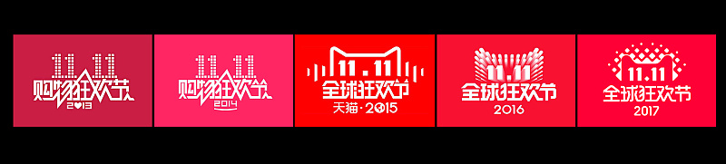
From the logo changes in recent years, it can be seen that Tmall Double Eleven, without the word shopping, is no longer limited to e-commerce promotions in concept. Especially in 2015, Tmall started to use the cat head symbol, and has continued the interpretation of the cat head since then, and on this basis, the Logo has slight changes every year. Every small detail change reveals the brand concept of Tmall Double Eleven this year.
2015 emphasizes globalization, using "rhythm" and "earth" to highlight "global carnival".
2016 emphasizes the super scale of the platform, using "convergence and integration" to express "full enjoyment".
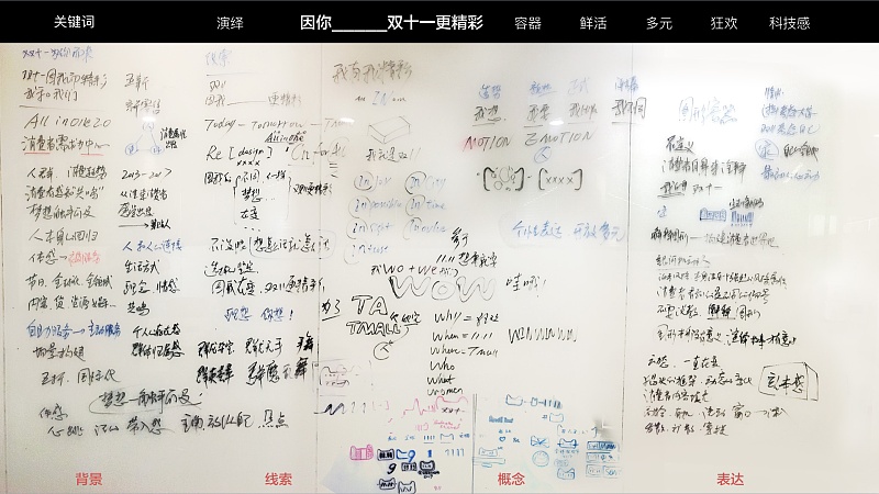
So, what is the brand concept of this year's Double Eleven? Where to start? What kind of leads will there be in the business? This is the first problem that designers have to solve.
Two dimensions lock the direction
1. From the inherited dimension
It is not difficult to see that no matter what the theme of each year is, the platform has always inherited the main line of "letting more people participate", among which "people" is the main line that remains unchanged.
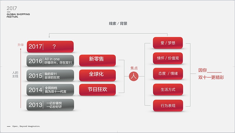
2. The dimension of business direction
new retail
Since last year, Alibaba has launched five new strategies (new retail, new manufacturing, new finance, new technology, new energy), the first of which is "new retail". As the biggest carnival day in the global retail industry, how can it not reflect the characteristics of "new retail". So what is new retail, there are various versions and sayings circulating on the Internet, we try to remove the foam on the surface, restore the essence, and refine it in one sentence:
The essence of new retail: people, goods, and places. With the individual needs of people as the core, the production, sales, distribution, operation, and service systems are rebuilt.
globalization
Since 2015, Ali has been launching a globalization strategy. The difference this year is that the previous globalization mainly refers to the convergence of global commodities and global brands. This year, we are more concerned about the integration of global consumers. Here, The core lies in people and in the integration of more different races and different cultural backgrounds.
festival carnival
From the first day of Double Eleven, "carnival" has been the main theme throughout, and with the deepening of the carnival, Double Eleven has become a festival for global consumers, and the festival means not only the overall atmosphere The carnival on the Internet, as well as the little happiness that belongs to each consumer, the protagonist is also a human being.
These three elements determine the direction of people-centered!
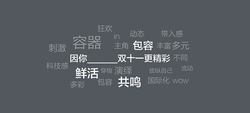
It is also the main line of inheriting "people". The difference this year is that in the past, we always emphasized our scale, the abundance of our products, and the convergence of global brands and global products to consumers from the perspective of a large platform. Today, we care more about everyone's consumption experience. A consumer should include behavior, lifestyle, attitude, emotion, feelings, values, love and dreams. This is a fresh and vital person. It is the resonance generated by the integration of these lively people that makes Double Eleven more exciting.
This is not just a kind of humanistic care, but more importantly, as a mission-driven company, we are serious about creating the ultimate consumption experience for every consumer. This is a larger pattern, the tolerance of all rivers. Therefore, our design must be inclusive enough. Our Logo is more like a container, which can accommodate symbols interpreted by different content. Through this brand symbol, more diverse content can be conveyed, so that the image of Tmall becomes flesh and blood, and uses fresh vitality to communicate with every consumer. Talk to the audience, let them feel their real existence.
Three key points of brand design: inclusiveness, freshness and resonance
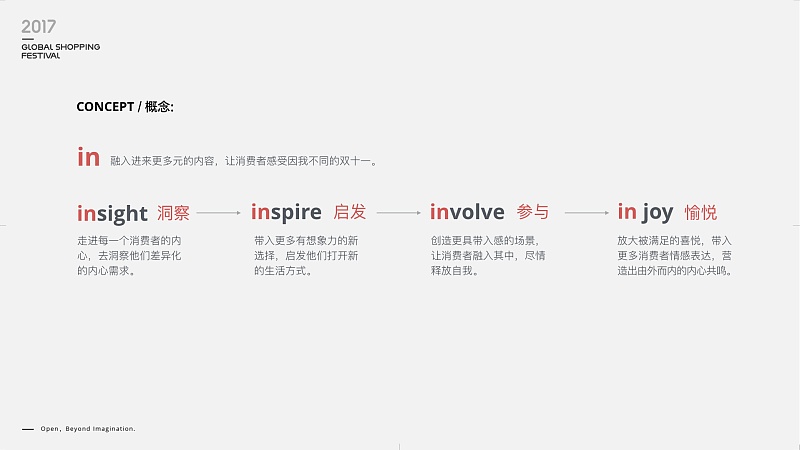
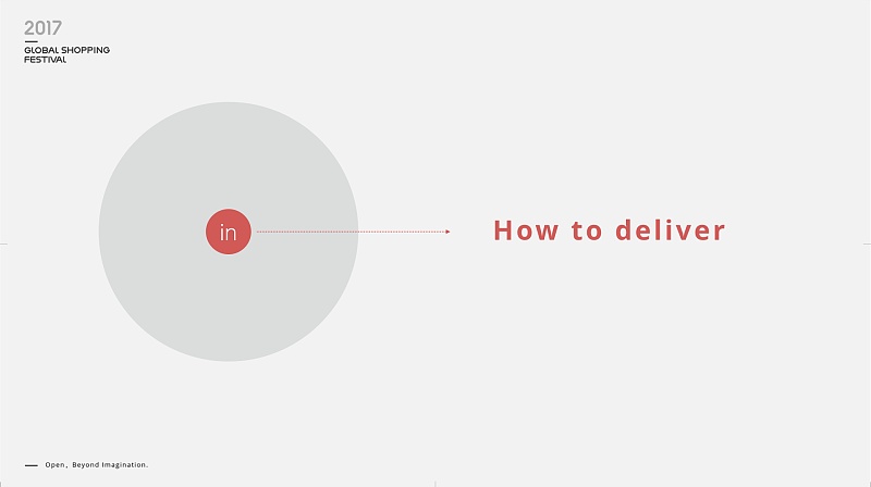
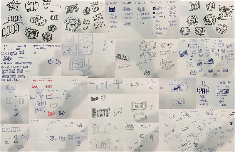
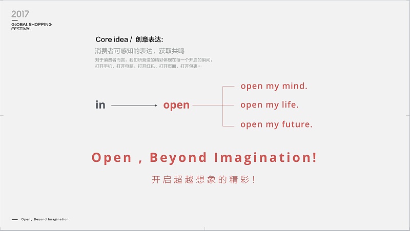
After the inspiration is determined, what should the Logo look like! What visual language do we use to communicate? Following the clues of thoughts, we still need to continue to dig deeper into insight and digging. insight into what? Insights What do people do when they fully open themselves up and feel happy and fulfilled?
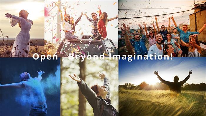
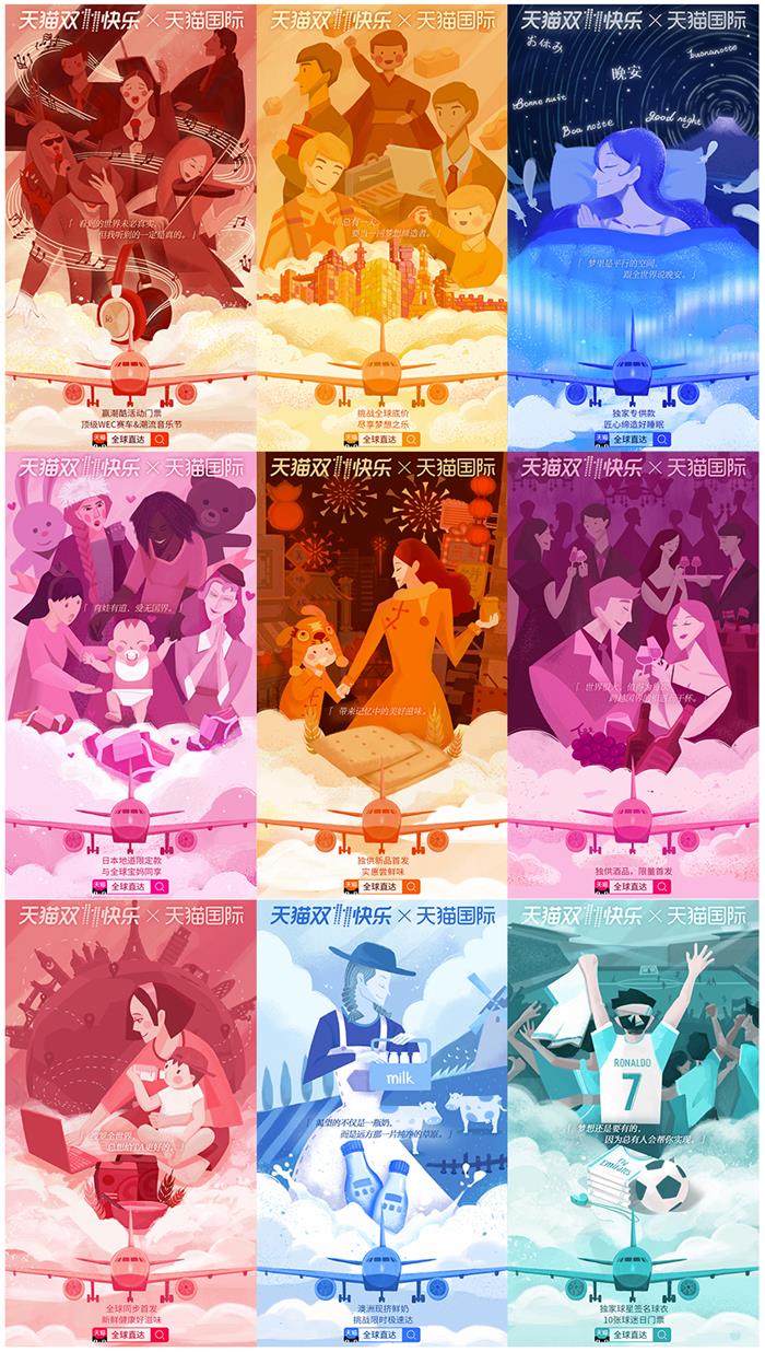
The designer finally chose the image of open arms—open arms to release yourself, embrace the present, and embrace the beauty of the world. It is a universal visual language that resonates without explanation. The designer combined the visual language of open arms with Tmall Double Eleven to build an inclusive brand symbol. At the same time, different joyful elements are performed in this graphic container!
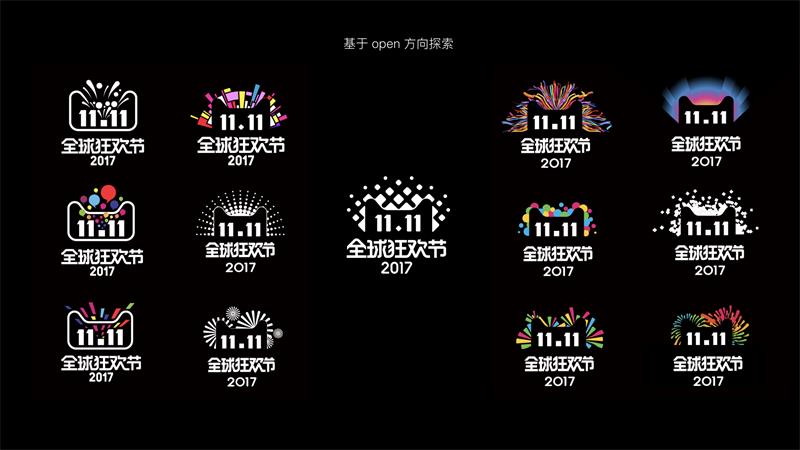
In the static version, all elements are abstracted and condensed into the most inclusive squares and circles, and the vitality and diversity are interpreted with the power of simplicity.
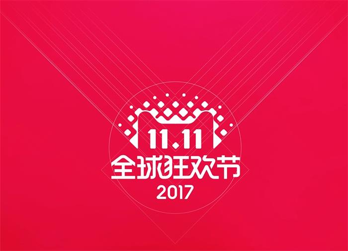
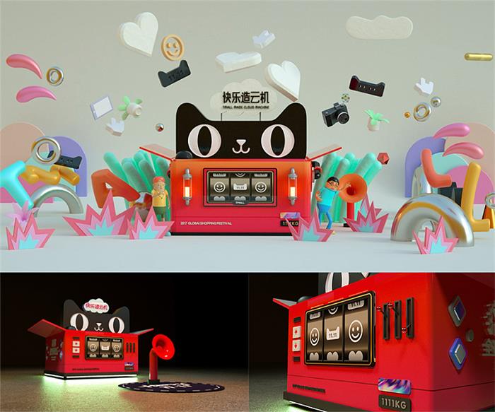
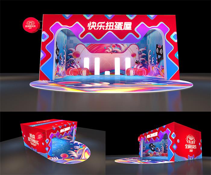
A good brand symbol needs to have good applicability, which is not only reflected in the combined style, but also needs to be able to be on the table and extend downward It has a strong appeal. At the communication level, it doesn't even need a copy to explain, and it can intuitively show the vitality, openness and inclusiveness of the platform. It is full of joyful atmosphere and very memorable. The brand side can also have a broader expansion space under our symbol.
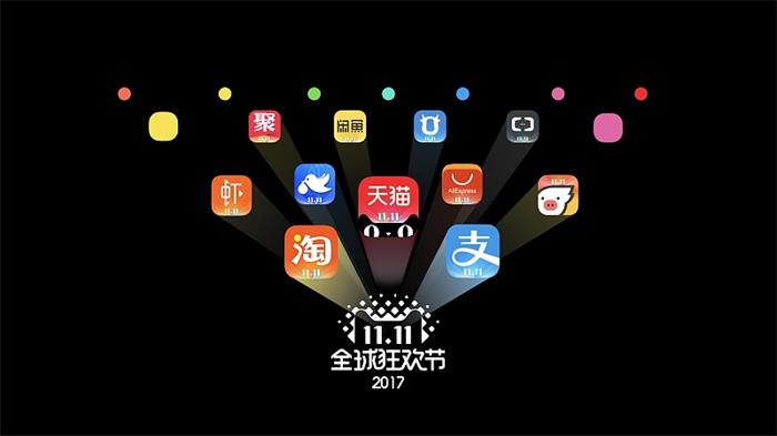
Tianhe Project (abbreviation of Tmall Brand Cooperation Plan):
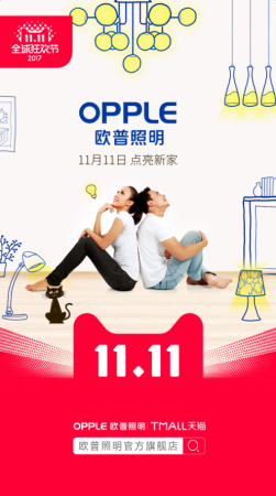
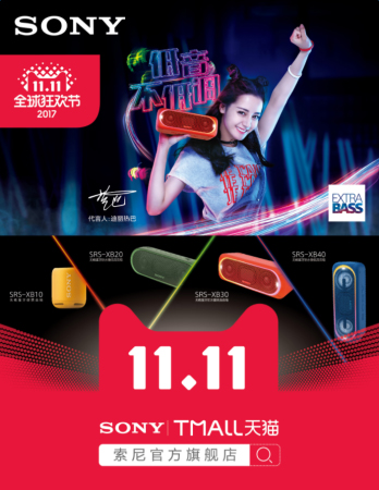
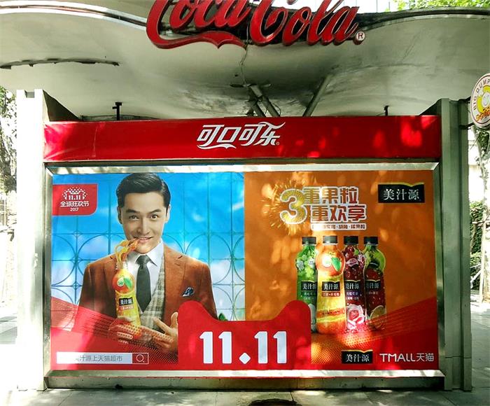
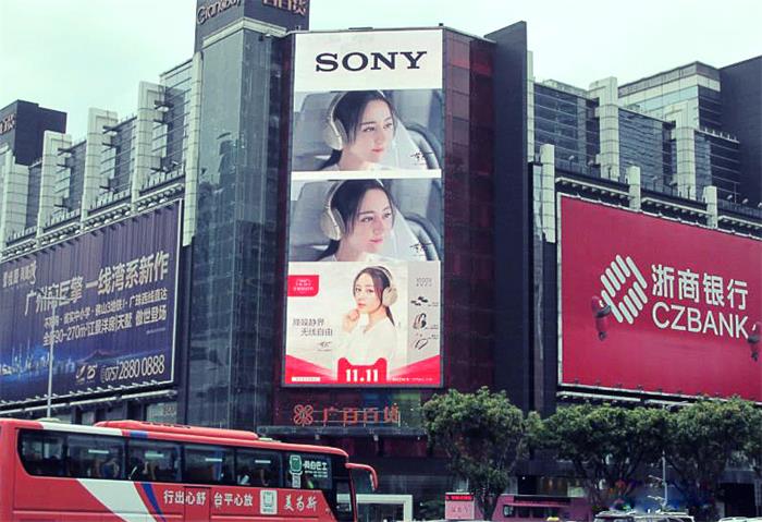
An important part of Double Eleven’s brand work is the visual style. Apart from the logo, what does the entire Double Eleven look like? What is the visual style like?
Previous Double Eleven styles:
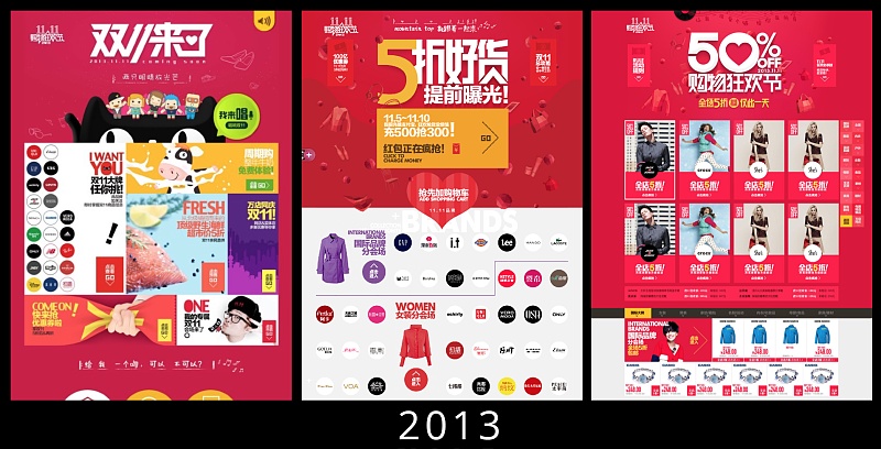
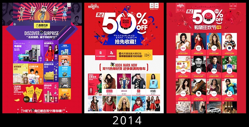
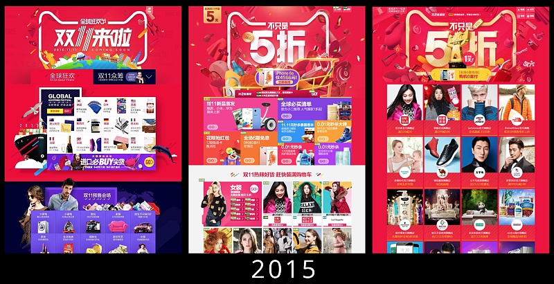
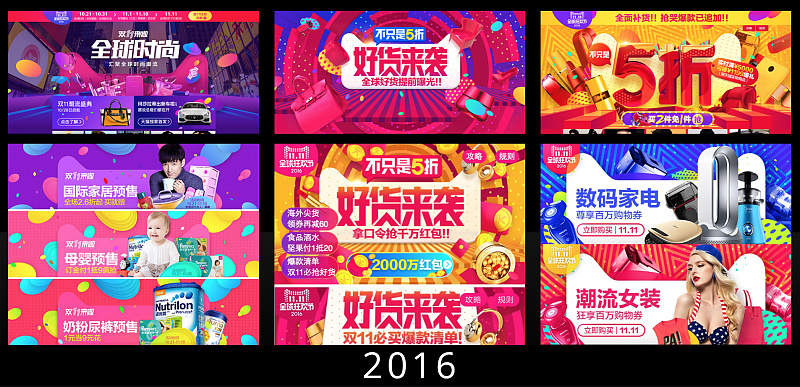
Aside from design elements and various expressive techniques, we can see that the visual style of Double Eleven has actually continued the line of pop art. In fact, this is relatively easy to understand. It is a carnival for the general public, so the tonality must be universal, and the concept of "art for the general public" advocated by Pop Art coincides with the brand spirit of Double Eleven.
Therefore, when setting the design style of Double Eleven this year, we kept the big keynote of pop. As the visual inheritance of the Double Eleven brand, there are certain challenges in it. First of all, the main theme of pop art has been widely used by e-commerce companies in recent years. The application of bright colors and vector flat elements makes users feel tired. Consumers also need some new visual stimulation. Under the premise, how to play something new? Where to find a breakthrough?
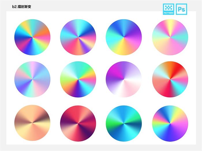
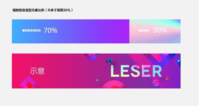
Designers still start with the core concept of "Open". The visual association of "Open" should be "colorful and colorful". Light inside the pop!" Sounds like a good idea, but how does the light behave...
"Laser + POP ART!" The designer has an idea at once, and creativity is often generated through new combinations of old elements.
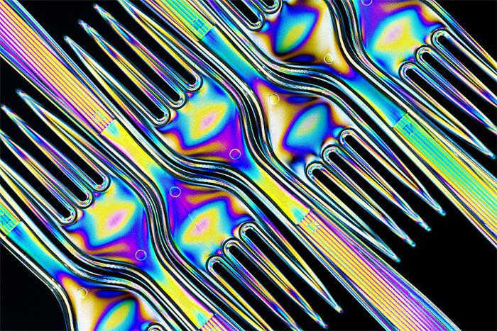
After determining the main idea of the visual style, it is repeated attempts. Because the designer found a problem, the laser element is very cool, but it is also difficult to control, so it is necessary to exercise restraint, and to be high must also be principled. There is a visual principle that the proportion of the laser does not exceed 30% of the screen. And on the app, we can feel this kind of joy, which is what a festival should be like.
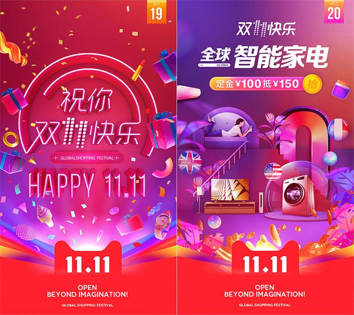
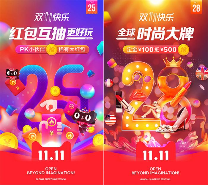
Communication atmosphere inside the park:
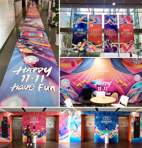
Tmall Double Eleven campaign period main venue:
Tmall Double Eleven Trending Ceremony:
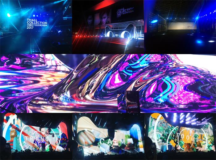
Tmall Double Eleven Carnival Night VI:
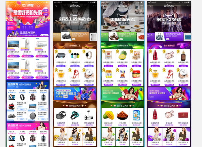
Full link "Open":
Double Eleven to the world:
Of course, the excitement of Double Eleven is far more than these, and you need to find your own excitement in the constant "Open". I wish you a happy Double Eleven!
Articles are uploaded by users and are for non-commercial browsing only. Posted by: Lomu, please indicate the source: https://www.daogebangong.com/en/articles/detail/This%20years%20Double%2011%20brand%20design%20the%20official%20first%20revealed%20the%20whole%20process%20behind%20it.html
 支付宝扫一扫
评论列表(196条)
测试