Early this morning, the screen was swiped by the information that the petals could not be opened. Many petal fans panicked about this sudden information. Can this still be a good Chinese New Year? Before, the color matching of the drawing was completely dependent on the petals. I want to say , It’s useless to panic. It’s better to master the knowledge of color in a down-to-earth manner. Learning the basics well is a good way to cope with all changes. There are also some designers who are just getting started. Let’s review the knowledge of color composition learned in college. There are many knowledge points, and the green onion is the focus here.
Classification of colors
Color is divided into achromatic and colored, and achromatic is known as black, white and gray.
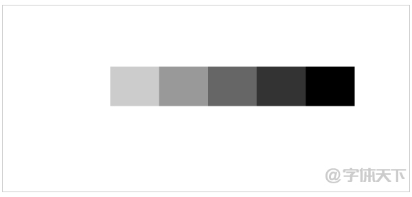
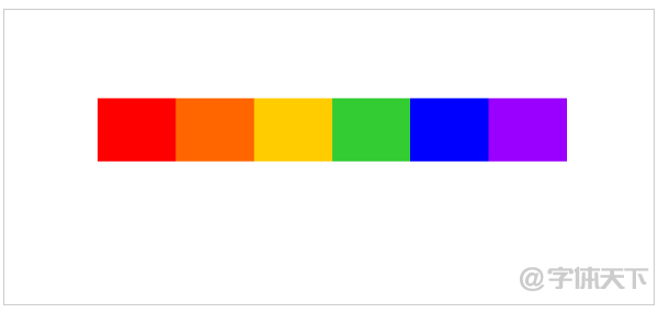
There are colors, all colors in the visible spectrum are chromatic, including the basic colors of red, orange, yellow, green, blue, and purple, as well as grays with a certain color tendency, such as blue-gray, red-gray, etc. Has a clear hue, purity, lightness.
Attributes of color
All colors have the basic characteristics of lightness, hue and purity.
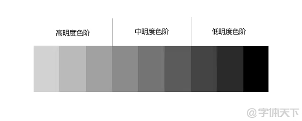
1. Brightness
Lightness refers to the lightness and darkness of a color, that is, the brightness and depth of a color.
2. Hue
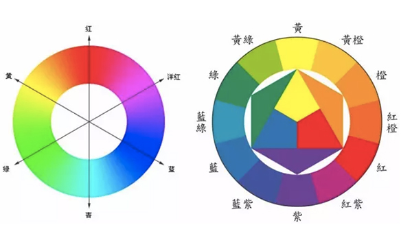
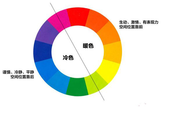
Hue, as the name suggests, is the appearance of the color, such as what we usually call red, orange, yellow, green, blue, purple, the names of these colors are actually the hue. All the colors we see are obtained from the three primary colors red, yellow and blue. One life is two, two is three, and three is all things. Many colors can be blended. This blended color forms a color circle, as shown in the figure:
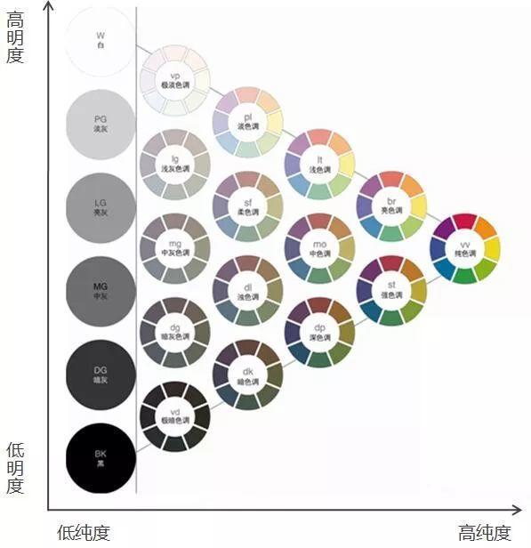
3. Purity
Purity refers to the vividness of color, also known as saturation. All kinds of monochromatic colors in the visible spectrum are the purest colors. Ultimate purity, when a color is mixed with any other color, the purity will decrease. Achromatic color has no hue, and the purity is 0, so the closer to achromatic color, the lower the purity of the color, and the closer to the color wheel, the higher the purity.
Color contrast and harmony
The green onion is about to hit the blackboard here, so don’t doze off. This is a color matching method that we often use in our designs.
1. Brightness contrast
Lightness is divided into three types according to the tone: low lightness tone, medium lightness tone, high lightness tone
2. Hue contrast
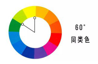
01), the comparison of the same color
The same color refers to the contrast in which the color circle is about 60 degrees apart, which is the weakest contrast in the hue.
02), adjacent color
Adjacent colors refer to contrasts that are about 90 degrees apart on the color wheel, and are often used in design.

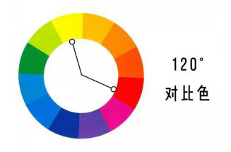
03), Contrasting color
Contrasting color refers to the contrast about 120 degrees apart on the color wheel, which is the stronger contrast in hue.
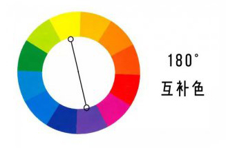
04), complementary colors
Complementary colors refer to the contrast about 180 degrees apart on the color circle, which is the strongest contrast in hue, and is characterized by eye-catching, full, exciting and appealing.
3. Purity comparison
Same as lightness, we mix a pure color and an achromatic color with the same lightness according to the arithmetic ratio, and divide 3 kinds of pure tone. High-purity base notes, medium-purity base notes, low-purity base notes.
4. The contrast of warm and cold colors
Color is an abstract concept, which itself does not have the attribute of cold or warm, but different colors will bring people different feelings of cold and warm, which is a kind of resonance generated by psychological experience.
The psychology of color
As a visual symbol, color influences our emotions unconsciously, and different colors trigger different emotions in people.
Red: excited, energetic, sexy, passionate, dynamic, stimulating, powerful
Pale pink: soft, romantic, sweet, cute, childish, delicate
Burgundy: rich, elegant, flavorful, ripe
Claret: Smart, exciting, fun, energetic
Orange: sweet, innocent, cheerful, lively, friendly
Bright yellow: sunshine, happiness, inducement, enthusiasm
Yellow-green: fruity
Beige: classic, earthy, neutral, warm
Coffee color: mellow and delicious
Dark purple: noble, gorgeous, powerful, elegant
Violet: nostalgic, endearing, fragrant, sweet
Orchid Violet: exotic, aromatic
Sky Blue: calm, cool, divine, loyal, dependable, authentic, confident
Vibrant Blue: Amazing, Vibrant, Cheerful, Eye-Catching
Navy Blue: Credible, authoritative, classic, conservative, traditional, confident, professional, calm
Light Green: fresh, cool, serene, majestic
Dark green: natural, trusting, uplifting, ruthless, quiet, traditional
Bright Yellow: sharp, bold, pop, kitschy, obnoxious
Black: darkness, silence, disappointment, mystery, death, composure, authority
White: purity, elegance, fashion
Gray: elegant, classic, timeless, refined, understated
Gold: warm, wealthy, expensive, radiant, majestic
The above are the basic knowledge of color, Scallion finally took everyone to draw it, and finally got an impression. Let's take the picture as an example to see how the masters use color.
Application of color
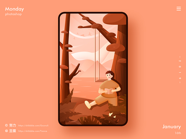
1. The application of similar warm colors
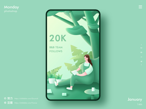
Application of similar color cool tone
2. The application of adjacent colors


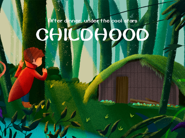
3. Application of contrasting colors

4. The application of complementary colors
The pictures of the above color application cases are from Zhuibo
Scallion has listed so many works of great gods for you, is it suddenly clear? If these are not enough, then Scallion has also prepared a professional color matching website for you, remember to bookmark it.
1. https://colordrop.io
2, https://uigradients.com
3, https://color.uisdc.com
Let's review it here, good night~~
Articles are uploaded by users and are for non-commercial browsing only. Posted by: Lomu, please indicate the source: https://www.daogebangong.com/en/articles/detail/This%20is%20the%20most%20complete%20basic%20knowledge%20of%20color%20%20essential%20for%20designers%20to%20get%20started.html
 支付宝扫一扫
评论列表(196条)
测试