Editor: Green Onion Author: Qian Hao Hawking
There are many methods of font design, and this time I will introduce one of the most simple and effective method of creating characters: the unified oblique line method, as the name implies, all oblique lines appearing in the glyphs must be maintained Consistent, this way of writing is very common in Japanese font design works. As can be seen from the figure below, it is only necessary to keep all the slashes at a uniform inclination, and the design sense of the designed glyphs will be formed naturally.

Basics
The most important thing about this method is the size of the inclination angle of the oblique line, so the simplest and most easy-to-operate inclination angle is 45°, which can be realized by holding down the Shift key. This is exactly the same as the rule of grid word making.

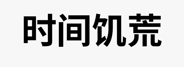
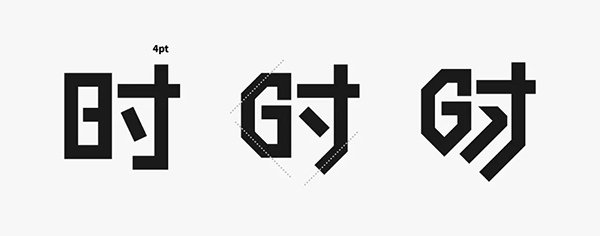
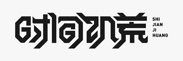
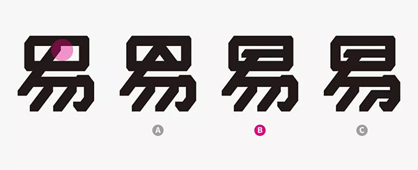
Let's take "Time Famine" as an example, and design with a slanted line with an inclination of 45°. When using this method to make characters, the slashed line must be highlighted. Type out the font first to observe the structure, and you can see that there are fewer strokes in the first two characters, that is, there are fewer oblique strokes. In order to emphasize the characteristics of oblique lines, their structure needs to be adjusted.
Start with the first two words that contain the "日" structure in common, and use the stroke method to design. Taking the character "Shi" as an example, the slash structure is added by obliquely cutting the shape of the "日" character. The last version of the character has extended the strokes to enhance the characteristics of the slashes. The stippling adjustment is to make the negative space of the strokes full .
Then follow these rules to make the remaining three characters together. Among them, the stroke width of the "日" glyph inside the enveloping structure "Jian" is fine-tuned, and attention is paid to how the negative space inside the glyph and the negative space between characters are processed to achieve the effect of fullness. Don't trim the shape during production, you can fill it with white shape first, which will facilitate later modification.
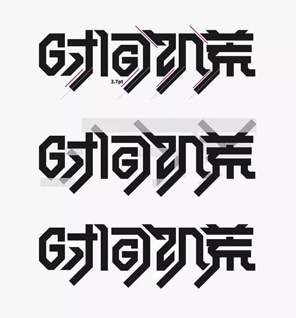
After the basic glyphs are created, in order to further enhance the characteristics of the oblique lines, the oblique lines at the top of the glyphs are also extended and the bottoms are aligned.
During the overall adjustment, the characters were adducted, and the character "Shi" was fine-tuned to enhance the fullness of the interior.

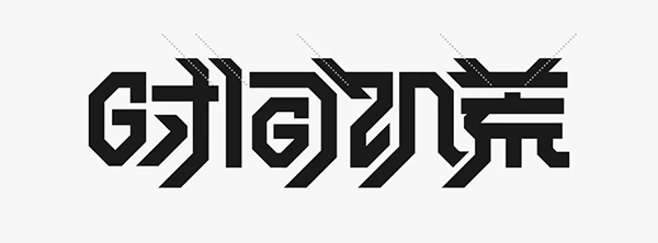
Finally, with a sans-serif western font, the design of this group of fonts is completed. It can be seen that the slash feature of the overall font is very strong, and some strokes have been adjusted to achieve the effect of uniform slashes. When making structural adjustments, we must pay attention to whether the recognition of the font is affected.
Upgrade
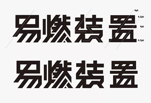
In addition to 45°, other angles can be selected for the inclination angle of the oblique line, so this will be flexibly set according to different glyphs. Here I choose a team "flammable device" in the recently relatively introductory variety show "This Is Hip-hop 2" as the content design.
First of all, it is necessary to determine the inclination angle of the oblique line, and roughly mark the strokes in these characters with oblique lines. The oblique lines with the same color mean the same inclination angle.
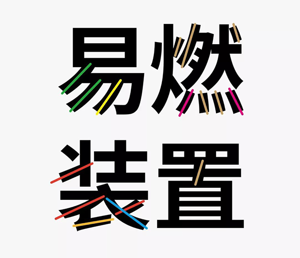
Arrange the extracted oblique lines into the same direction, and then select a suitable oblique line from them. Usually, the oblique lines with extreme values, that is, the oblique lines with the largest and smallest inclination angles, are not selected. Generally, a slanted line with a slightly larger inclination in the middle is used, because the designed glyph will be flatter if the inclination is too small. Of course, if you want to achieve this effect, it is another matter. But usually, I still want the designed font to be taller, so here I choose the slanted line of yellow inclination.

Observe the font structure before designing. We can start with the character "burning" with the most strokes, so as to determine the size of the font. It can be seen that the strokes of the word "burning" are very dense, so at this time, you can consider using simplified strokes for design, and the simplification should follow the principle of proximity. In the figure below, several parts with relatively dense strokes of the word are marked, and simplification can be considered in these places.
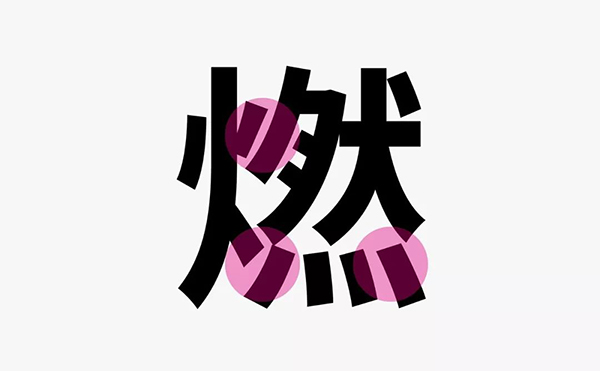
The basic glyphs are also made with the stroke method. Due to the large number of strokes, some individual strokes have been fine-tuned, and the several places mentioned above have been simplified. Among them, the adjustment of "灬" is for the negative space of the glyph. full. When designing, pay attention to whether the structure is correct.
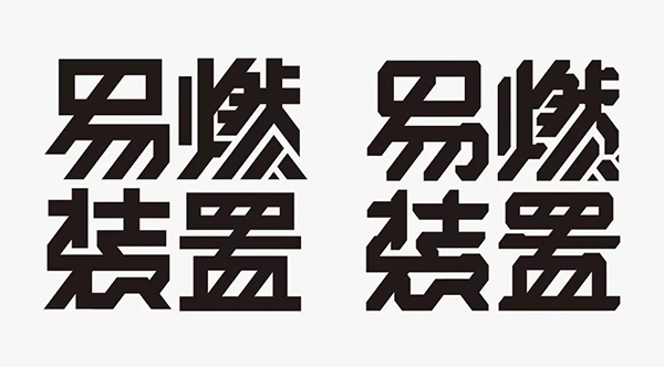
After the basic design of the character "Ran" is completed, the other three characters are completed. In order to further emphasize the characteristics of the oblique line, the structure of the characters "Yi" and "Ran" has been adjusted. Among them, the character "Zhi" has more horizontal strokes. , so the stroke width is adjusted. In order to ensure the consistency of the slashes, the word "zhuang" has simplified the processed glyph. Due to the repetition of some of the same structures, the character looks more uniform.
This basic glyph design is almost done, in order to further reflect the mechanical visual effect, it is necessary to modify the body posture on the basic glyph.

By referring to mechanical devices, the sense of mechanics is enhanced by increasing the edges and corners of strokes and body decoration.
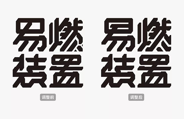
Visual comparison chart before and after adjustment.
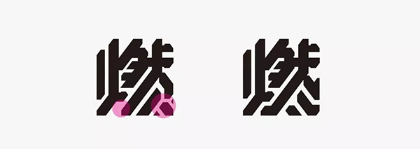
However, the strokes at the bottom of the word "burning" are a bit broken, and the negative space in some positions needs to be improved. Therefore, adjustments are made for these two problems.
The simplification of "Yi" is not ideal. Three adjustments were made, and finally the second font with fuller and more comfortable negative space was selected.
After fine-tuning before and after the comparison, the glyph grayscale has improved significantly.
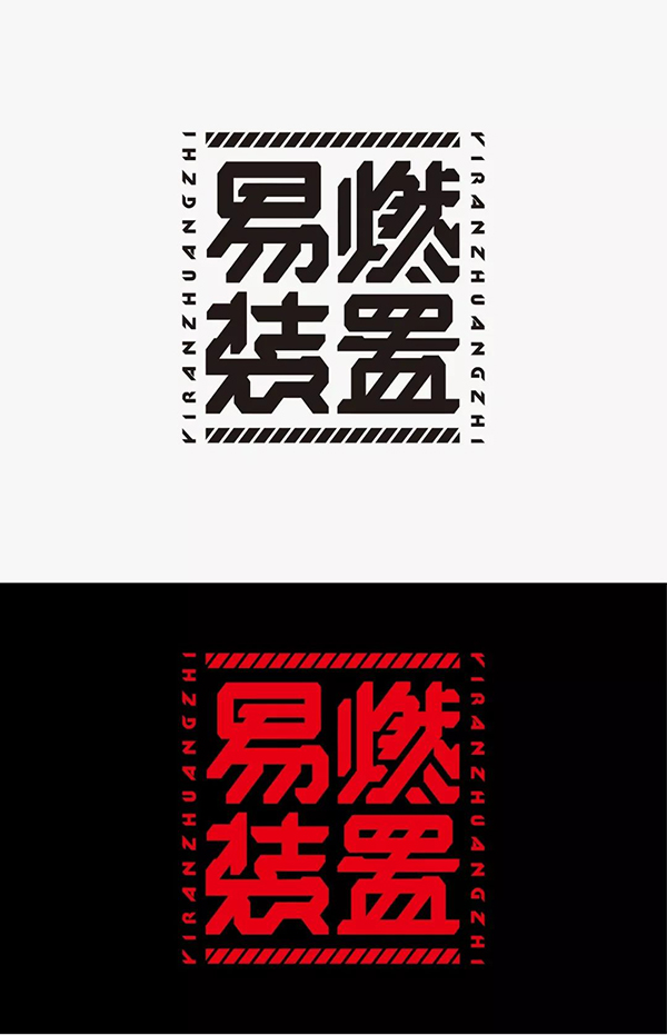
Add some auxiliary elements at the end to enhance the sense of form. And with black, red, to enhance the cool fashion sense.
Upgrade
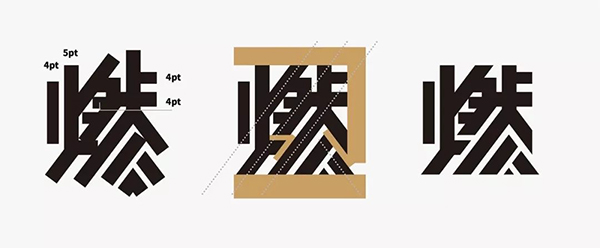
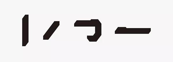
On the basis of the unified slash, some special processing methods can be added to break the inherent rules and enhance the agility of the font. Here we take "fraud" as an example. First, mark all the strokes of the slashes. Due to the small number of words, you can choose the same inclination and the largest number of these slashes as the inclination of the unified slash. The blue slash in the figure below.

In this way, the width and inclination of the strokes can be determined first. Note that when using the rectangle method to make characters, the oblique lines need to be appropriately thickened.
After the above preparations, you can start to make characters. Since there are more strokes in the upper part of the character "阴", the width of the strokes needs to be adjusted to achieve the coordination of black and white spaces.
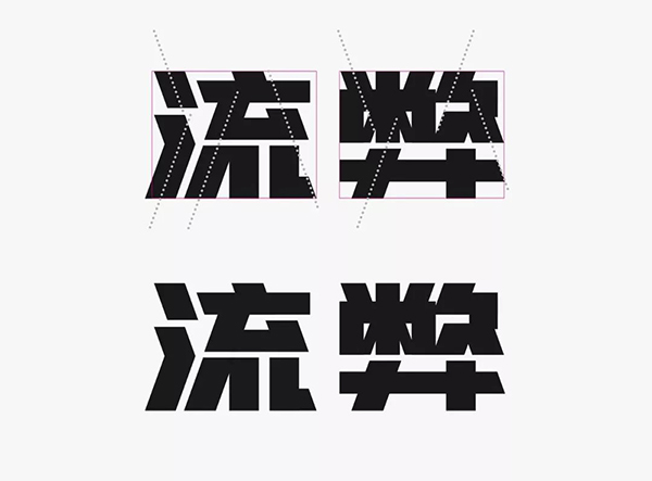
At present, the initially designed glyph does not have a strong unified slash feature. The following adjustments to the word "flow" are mainly to enhance the slash feature. The structure of the upper part of the character "酸" is still a bit crowded, and the internal oblique lines can be replaced by horizontal strokes, so this will introduce a second oblique line, and in order to enhance the complementary relationship between the strokes, it is made Similar to the treatment of broken pens, this adjustment makes the grayscale of the word "disadvantage" and the word "flow" much more coordinated.

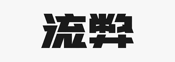
After further fine-tuning the details of the word "flow", the design of the font is completed.
When adding special slash strokes, the inclination angle of the slash should not be too much, which will destroy the regularity of the uniform slash, so that the characteristics of the uniform slash cannot be reflected. It is best to add the same inclination of the specific slash, as in the design of the glyph.

Ultimate
In addition to straight lines, special strokes can also be added with curves. Once there are curves, the difficulty of font design will increase.
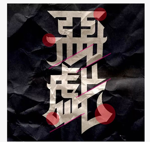
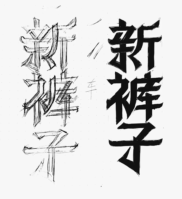
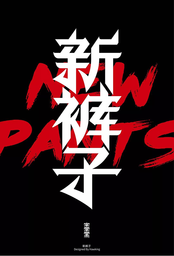
Taking "New Pants" as an example, in order to facilitate everyone to grasp the glyph features more accurately, a glyph work is provided as a reference. It can be seen that the work contains the characteristics of Gothic, let's analyze it first:
1. The structure is regular. It can be observed that the slashes used in the glyphs are all the same inclination, that is, the way of making characters with unified slashes.
2. Add a curved shape at the bottom of the glyph to break the inherent sense of regularity and emphasize the unique curved strokes.
3. The modeling features of strokes, the most characteristic of which is the way of handling vertical hooks.
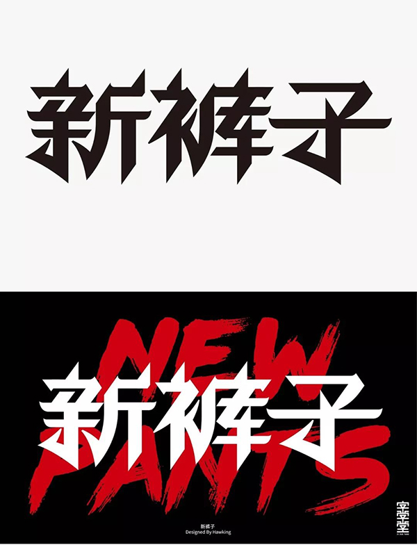
After we have roughly analyzed the work, we can start to write words.
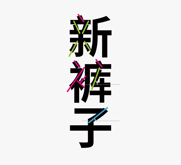
First of all, unify all the slashes. In the figure below, I marked all the slashes in the glyph. It is necessary to unify the inclination of these slashes. If the oblique line with the smallest inclination angle (blue) is used, the designed glyph will be relatively flat, which is not what I want; there are several oblique lines with very similar inclination angles (green), and this inclination angle can be selected The oblique lines are designed, and on the basis of not destroying the glyph structure in a large area, all the oblique lines can be unified.
In view of the complexity of the glyph, in addition to unifying the oblique lines, it is also necessary to integrate the curved shape at the bottom of the glyph, so first draw the draft of the figure below, you can see that it fully meets the characteristics of the reference glyph, and added your own understanding.
Let’s start with the word “pants” with many strokes. The glyphs produced according to the sketch are not very ideal. optimization and specification.
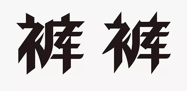
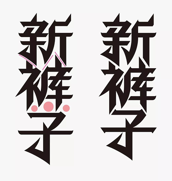
The character "Xin" is not very ideal either. The simplified connection method is a bit deliberate, and the simplified strokes are not compact enough, and the negative space is obviously out of balance. After switching to the processing method of the word "pants", the glyph appears more unified.

After vertical arrangement, in order to make the font more compact, the bottom of the word "pants" is adjusted to enhance the complementary relationship between the characters, but the negative space between the characters "zi" and "pants" is not compact enough, so the stroke shape is adjusted.
Then fine-tune the width of the strokes in dense strokes, and unify the bevel angle of the polyline strokes.
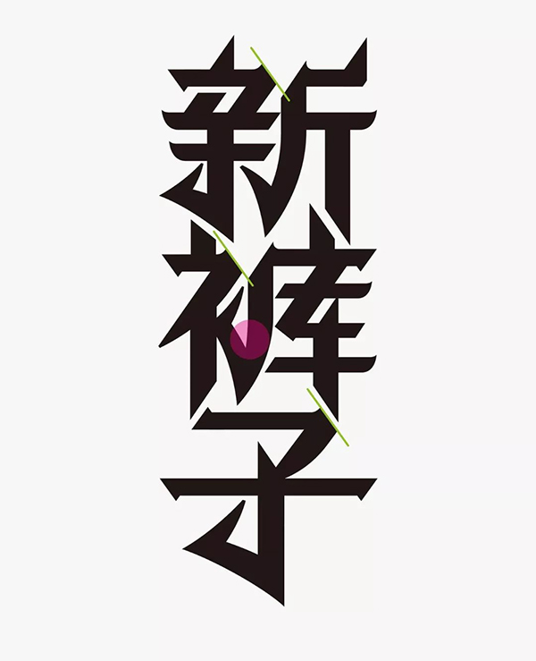
The final look of the design.
Another version is designed to facilitate the application of horizontal characters, pay attention to the fine-tuning of the word "zi". When adding curve-specific strokes, there must also be certain rules. For example, the curved strokes of the glyph are all concentrated in the lower half of the font, and the shape is similar, so that the glyph designed in this way is full of changes without losing a sense of regularity.
Summary

The principle of the method of "unifying slashes" is very simple. You only need to unify the strokes of the slashes that appear in the glyphs into one inclination. However, in order to meet this feature, sometimes the glyph structure is adjusted. It increases the difficulty of design, but the charm of this design method is that the designed glyphs are unique.
There are two ways to determine the inclination of the oblique line before designing: 1. Select the inclination angle of the middle value and the oblique line with a slightly larger degree as the inclination of the unified oblique line. 2. Choose the one with the same inclination angle and the largest number as the inclination of the unified oblique line.
The designed glyphs should highlight the characteristics of slashes, otherwise the meaning of using this method will be lost; the negative space of glyphs should be adjusted to be full; there must be certain rules when adding special strokes; do not blindly pursue the consistency of slashes and ignore the structure of fonts , to achieve both.
This method is the simplest way to make characters. The designed font will have a sense of design, but it is still difficult. Once you master it, it will help you!
Articles are uploaded by users and are for non-commercial browsing only. Posted by: Lomu, please indicate the source: https://www.daogebangong.com/en/articles/detail/This%20is%20probably%20the%20easiest%20way%20to%20make%20words.html
 支付宝扫一扫
评论列表(196条)
测试