
click on the arrow
"Blue Words"
, follow us! !
Short video about the book▲
After the book "Make Characters" was sold out on the Amen official account, many friends found me through various channels and asked how to buy this book? Is it out of print? Of course it can't be out of print! Sorry to keep everyone waiting for so long,This time it's here, it's really here! !
"Make Characters: Practical Font Design Method" has been launched on JD.com and Dangdang, and you can buy it now. In the Explosive Discount...you can also click on the text span>At the end of the "picture" jump to buy directly.
Opportunity
—
As early as 16 years ago, there was a publishing house, and they found me through the Zaku platform one after another, hoping to have opportunities for cooperation. However, since I was new to fonts at that time, and my self-awareness was still shallow, can be seen in my personal physical condition, I didn’t want to miss this opportunity and tried to cooperate with a certain publishing house. After listing the directory, there is no following for various reasons...
It has been settled for 2 years. During this period, I experienced some physical conditions. It was a very difficult journey. When the Electronic Industry Press found me, I agreed without hesitation. Because of Waterloo before, this time beforehand I communicated my personal situation with the publishing house very clearly, and they also attached great importance to it. I successfully passed the sample chapter and started writing the whole book.
Personal Status
—
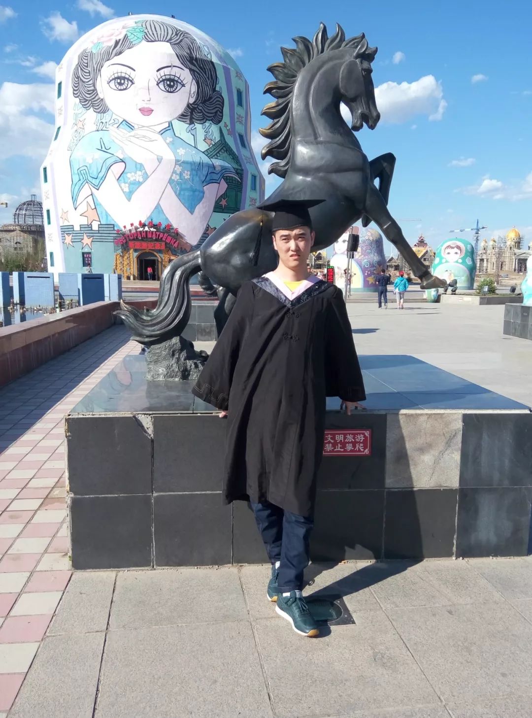
My name is Qian Hao, a Mongolian nationality, from Hulunbuir, Inner Mongolia. Those who play Zakuol must know my ID: Qianhao Hawking.
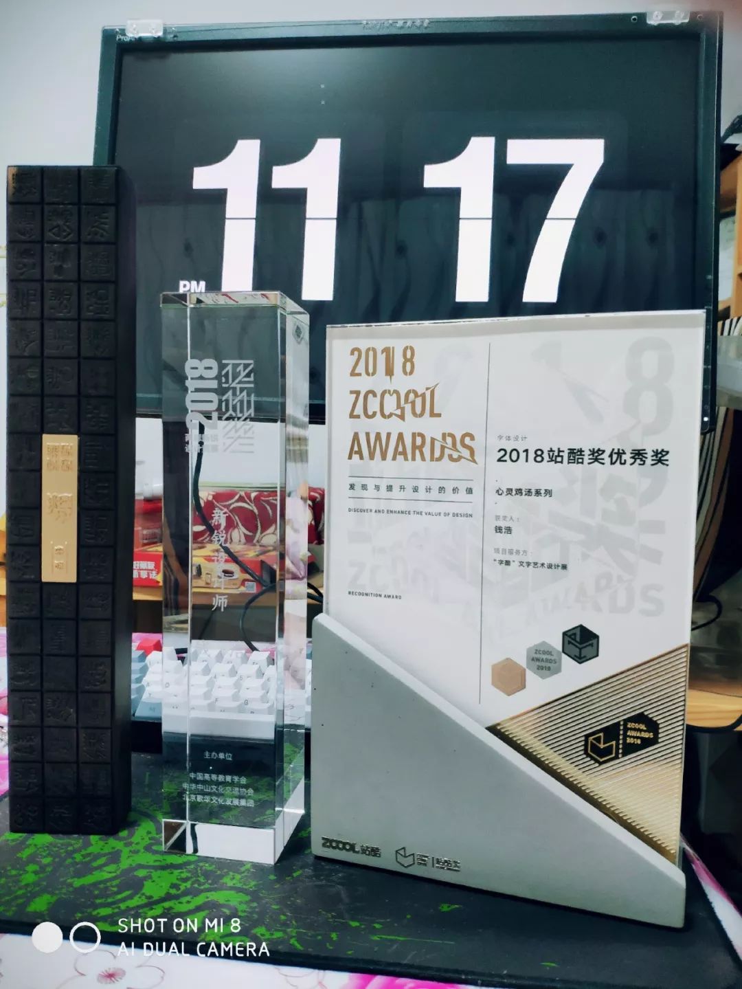
The 5th Hua Can Award "New Designer"
2018 "Third Prize" for Chinese characters across the Taiwan Strait
The 3rd "Ziku" Text Art Design Exhibition "Excellent Works"
The 5th HiiiTypography
Chinese and English Typeface Design Contest Finalists
My physical condition must be known to most people. I discovered that my body was abnormal in the third year of high school. I experienced some misdiagnosis by quack doctors. This road, in the past four years, with the aggravation of the disease, I know that my physical condition is different from ordinary people, and I need to work harder.

At that time, I found out that everyone who is a big fan has to have an English name, so I also pretended to be fake, what is the English name? I thought of Hawking. On the one hand, it was because of the similar physical condition, and more importantly, I hoped to motivate myself. Since then, I have continued to write, and I have gained a lot. Really honored to be able to live in the same era as him! ! At the same time, this also explains why such a cool ID is used.
It was not until my senior year that I was finally diagnosed with a rare disease: Limb-Girdle Muscular Dystrophy Type 2B (LGMD2B). It was the diagnosis result that I was most unwilling to accept at the time. In this case, I had to accept my fate, but I refused to admit defeat. I had to do a good job in the font design major I recognized. Since 2016, I have made a font work almost every day, and tried many times. Various forms of glyphs, a total of 200+ groups of works have been made in one year.
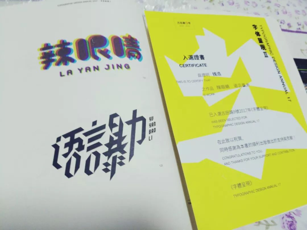
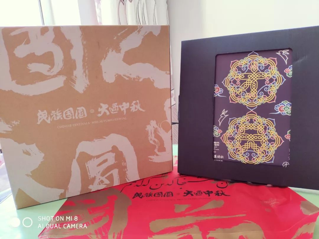
Because of unsteady walking in 2017, he fell down and suffered two fractures in his right calf, and he was bedridden to recuperate. During that time, his mentality exploded, and he woke up several times at 5 or 6 o'clock in the morning with a plastered heel. , because I seem to have seen my future life situation, it was difficult to accept for a while, and I couldn’t concentrate my experience on designing. The bones are growing well, but I have never given up on designing. Even though there is no commercial commission, I should not be idle, because I will think about many things when I am idle, and I must keep myself busy. At that time, I started to learn C4D, did some 3D vision, and started to try new font design forms. The posters of the "Chicken Soup for the Soul" series were created under this situation. I also produced one in 2-3 days. At that time, I just tried it out. I participated in some competitions with my mentality, and I was fortunate to be favored by the judges and teachers, and won a few small prizes.
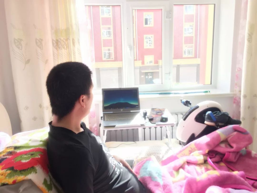
Fracture rehabilitation is a very painful thing. I have to break my leg every day. From being stiff to being able to bend, it took several months. I am still recovering today. I don’t know if it will be possible in the future. Stand up, but will keep going, hopefully it will happen.

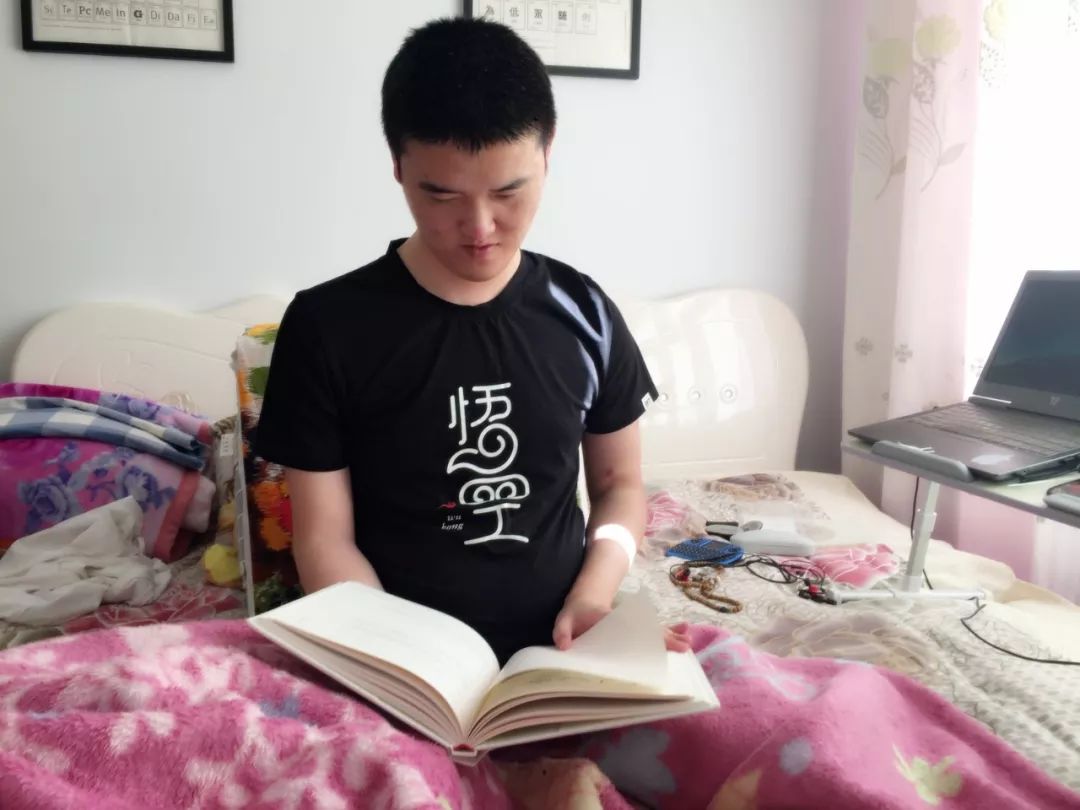
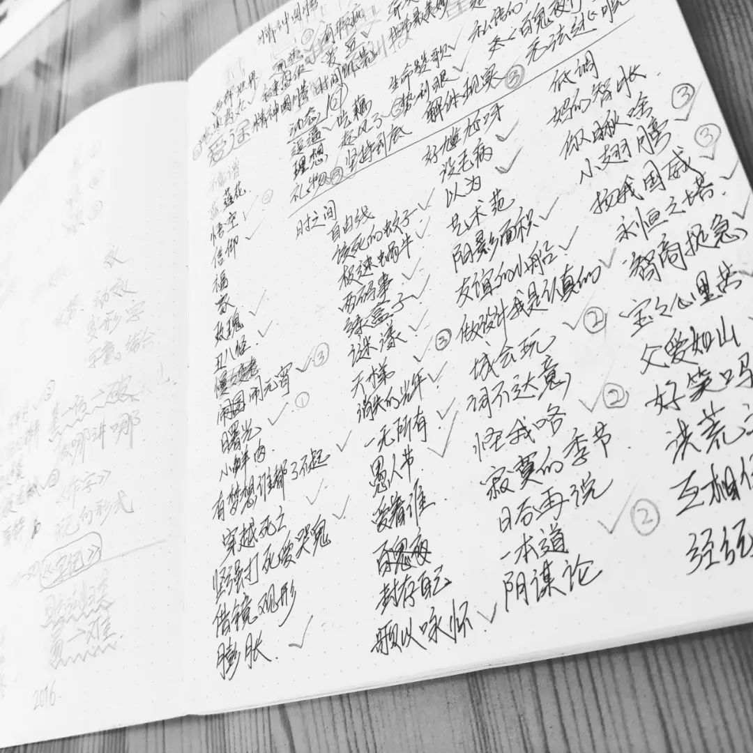
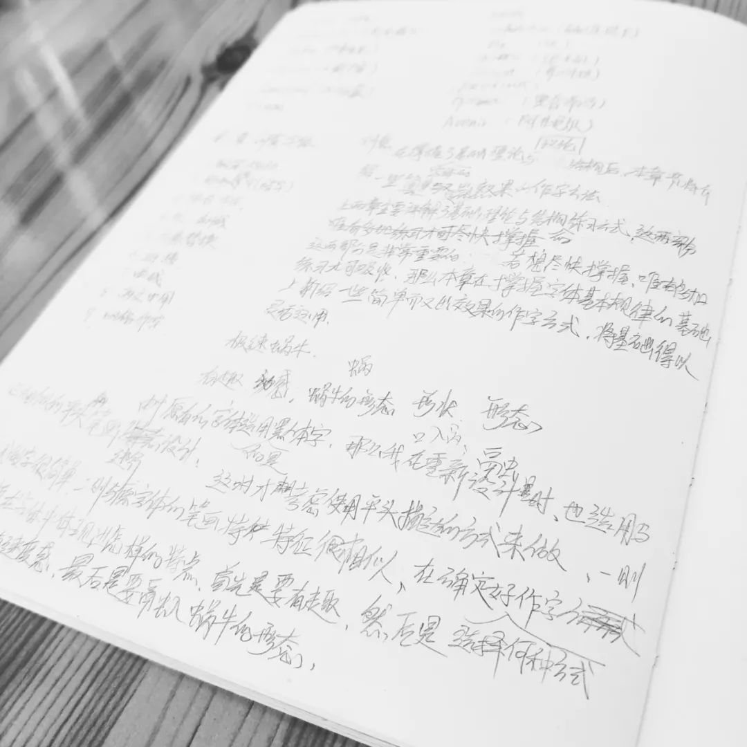
Content Targeting
—
Because this book is of great significance to me, I have written everything about fonts that I can master so far into this book. Because my works are relatively new and diverse, I divide them into 4 parts, from the basic knowledge of fonts to creative fonts, dynamic fonts, and font posters, from shallow to deep, and explain various methods of font design in detail through a large number of cases. It took more than a year to complete all the content.
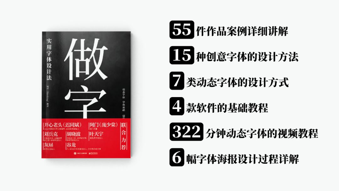
A total of 55 work cases, 15 creative font design methods, and 7 dynamic font design methods are included. In order to facilitate everyone to better understand and intuitively see the dynamic effects, another 322 minutes (about 5 and a half hours) hour) dynamic font video tutorial, in which the basic operation of the 4 design software involved is explained, and the improvement part is to select 6 font posters from the "Chicken Soup for the Soul" series of font posters that have won several design awards. The process is explained in detail. (Special reminder:There is a QR code on the inner page of the video tutorial, scan the code to watch!)
The book is rich in content and full of dry goods. Based on the principle of being easy to understand, I hope to help design beginners and graphic designers have a comprehensive understanding of various forms of font design and master various methods of font design.
Book Title
—
The title of a book is very important, It also consumes a lot of my brain cells, I thought about many titles, and originally named it "< /span>Zoziji" means "be yourself", which is also because of the relationship between my personal physical condition and the style of the work, I have been "being myself", which makes this design road very difficult. At that time It also coincides with the popularity of this word on the Internet. After entering the society, many people have gradually smoothed their edges and corners and become the type of person they least want to see. Few people are themselves. At that time, I felt that the title of the book was quite profound, so I continued to write it like this.
When the book was finished, when everyone re-discussed the title, they felt that the title was a bit difficult to understand and needed to be replaced with a more popular and easy-to-understand title. Everyone brainstormed and rethought many titles:
Writing Yourself: Dynamic Typography Tutorial (First)
Creative typography and dynamic design tutorial
Make Words: Creative Typography and Dynamic Design Course
Doing Words: Typeface Design Methodology
Doing Words: A Practical Typeface Design Method
Various styles of fonts
Words well
The Art and Technology of Typography
Memoirs of calligraphy
Type Art
Qian Hao's font design method
Practical Typography
In the end, most people think that "writing" is very suitable, easy to understand, simple but not simple. Since the method of font design is the main method in the book, the title of the book is finally decided as "Make Characters: A Practical Typeface Design Method".
Text layout
—
When typesetting the internal text, I was entangled in whether to make this book a reference book or a literary style. Due to the large content, the possibility of making a literary style is low, so it is designated as a reference book .
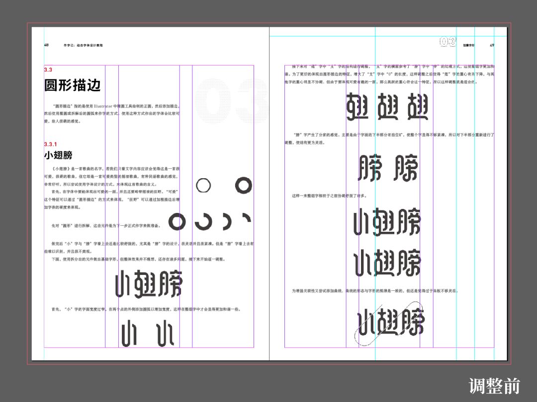
In the beginning, the publishers were not very well placed, so I had to do it myself to get enough food and clothing. I adjusted the column division method to 6 columns, re-adjusted the paragraph style, increased the size of the picture, and adjusted the text content and the picture to be side by side. This makes the two areas more distinct, and the overall visual effect is clear and comfortable. A lot, the more important thing is that the reading comprehension is smoother.
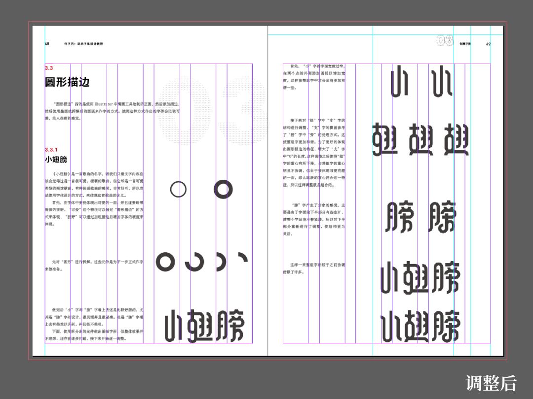
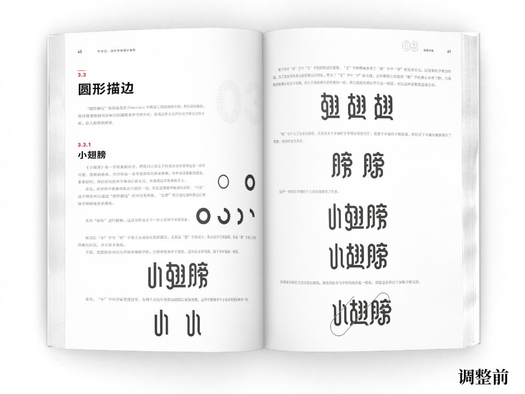
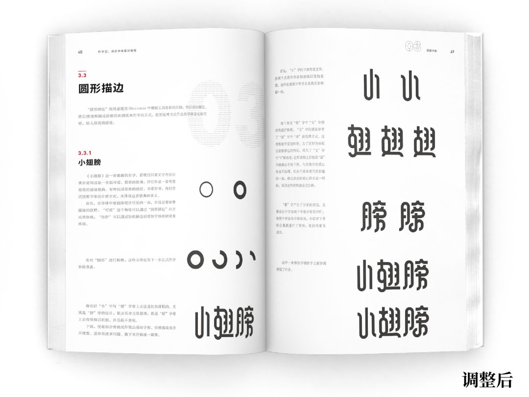
Due to the progress, I had a week to readjust the whole book, which also allowed me to master the basic operation of Id.
Recommended by design masters
—
This font book by Qian Hao is a font book that can really help you learn font design. Whether it is the basic concept of fonts or software operation, even ideas and ideas are written very carefully. It is very important for beginners to learn fonts systematically. A good reference book is also very important for mature designers to learn from.
—— Chi Tongbin (happy old man)
Director of CDS China Design Salon, founder of Jingyi Education
China is currently in an era of rapid growth in the value of design. What was ignored in the past, the value of design in creativity has been gradually valued in the past 10 years. Among them, font design is a very typical field, and font design companies have also been involved in the past In the past 10 years, it has started to make large-scale profits. This fact shows two points: first, font design has market value; second, using other people’s fonts does not infringe copyright. And Qian Hao’s font book is full of dry goods, which meets the needs of this era, and is worth reading and learning for every designer who is interested in font design.
—— Amen (Pang Shaotang)
Pangmen Zhengdao
I love fonts very much, but in front of Qian Hao, my "love" is obviously much dimmed.
A few years ago, I learned about Qian Hao’s experience from my big brother "Happy Old Man". Since then, I have paid special attention to him and his font works. His persevering and unremitting spirit is admirable and touching, and his works are also extremely delicate and attentive. Every word and every stroke has been worked hard, especially in the creativity of fonts. In terms of performance and performance, he is talented and persistent. Almost every one of his font experiments and font poster works is a brilliant masterpiece, which is amazing.
So, this must be a very important font design book, worth reading, and worth reading deeply. Thanks to Qian Hao for his generous sharing. These experiences and skills will undoubtedly bring a lot of inspiration and help to everyone and myself.
I wish Qian Hao can create more excellent works and bring us more surprises in the days to come, and also wish Qian Hao can continue to overcome difficulties and move forward all the way!
—— Liu Bingke
Font designer, Zaku recommended designer, founder of Font Help
For judging the pros and cons of design books, I always think that the book must have the author's unique insights and professionalism. However, Qian Hao’s book on font design methods provides professional explanations from the basics of text to creative fonts and even rare dynamic fonts. It summarizes the skills of font design from shallow to deep, and is suitable for both beginners and designers who are interested in fonts. It is very helpful. For basic designers, it also has expansive help in the creativity of font design. It is indeed a high-quality design book worth reading and studying! At the same time, you can also feel his tenacity and will from the book, and know how to realize and surpass yourself! Mixed feelings!
—— Hu Xiaobo
Type Designer, Brand Designer, Founder of Ziyou Space
Brother Qian Hao’s font creation has a very large “threshold”, which can be as hot as fire and as calm as still water, dare to rock and roll but can be standardized. Regardless of font theory or dynamic actual combat, he has shared sincerely and sincerely in this book.
—— Ye Tianyu
Founder of Magpie Creation
When I first met Qian Hao, I only knew that he was an excellent and hardworking font designer, but I never thought that God would treat him so unfairly. But what is touching is that he is not discouraged, and he still insists on what he loves day after day.
Perhaps there are many excellent designers, but not every designer can take his love as seriously as Qian Hao. I believe this spirit is the same whether it is writing, writing, or writing. I believe that readers can not only learn the knowledge of font design, but more importantly, feel the indomitable will and attitude towards life.
—— Gray day
Founder of Chiyun Society
From the heart, follow the words, the words are from the words, the words are honest, serious, and the author's dedication to design is worth learning.
—— Valley>
Founder of Babakoulong Culture Communication, signed designer of Hanyi
Cover Design
—
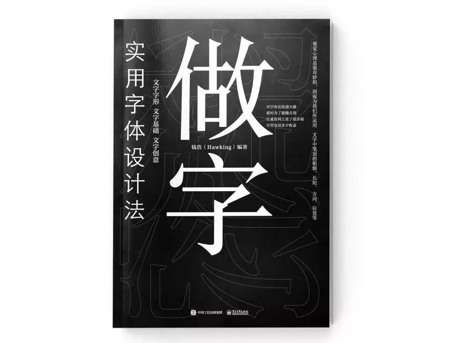
The style of the cover should be consistent with the work in the book, keeping it simple and clear. At first, the publishing house provided several cover designs, and everyone selected a more stable one. The title of the book is very clear, but the layout is a bit confusing, which is not very ideal.
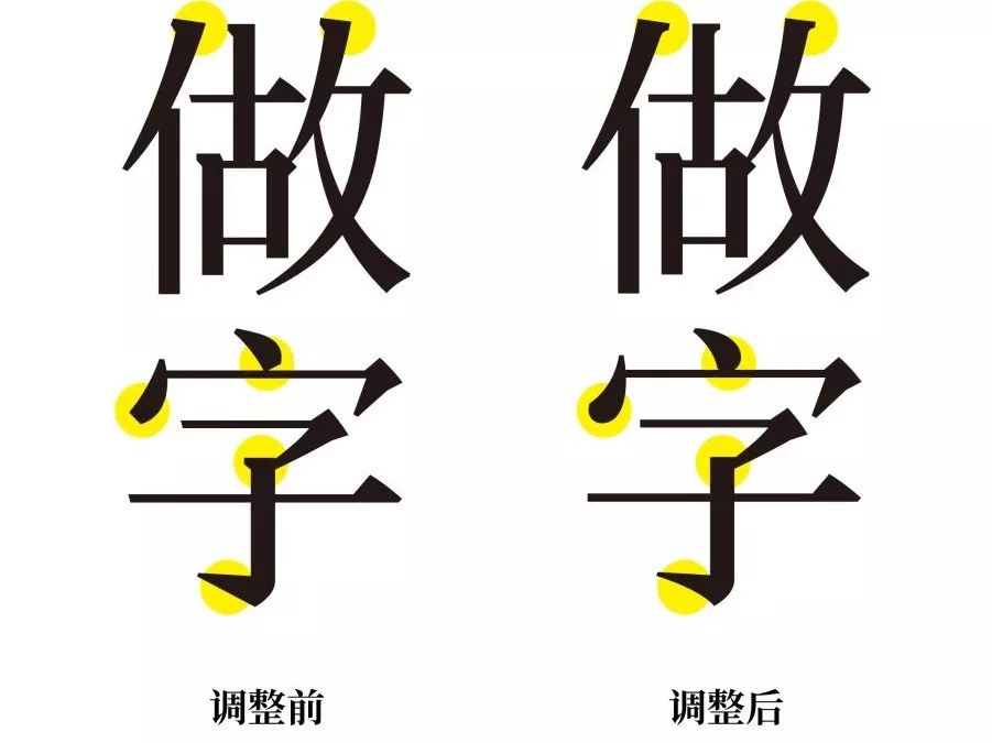
At that time, in order to improve efficiency, I adjusted and rearranged this version by myself.
First of all, redesign the main character, thinking about making a new Song typeface, but feel that it is difficult to make a high-quality Song typeface in a short period of time, and then choose a high-quality Song typeface (Han) from the font library Yixin Renwen Song), on the basis of fine-tuning, so that the font has a little temperature.
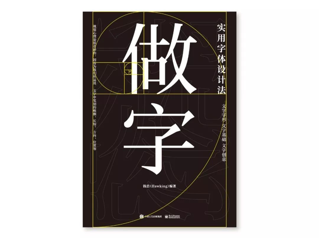
When typesetting, adjust the font to the high-quality Siyuan Song typeface, and use the golden section line to rearrange the content, and adjust the three versions as shown below.
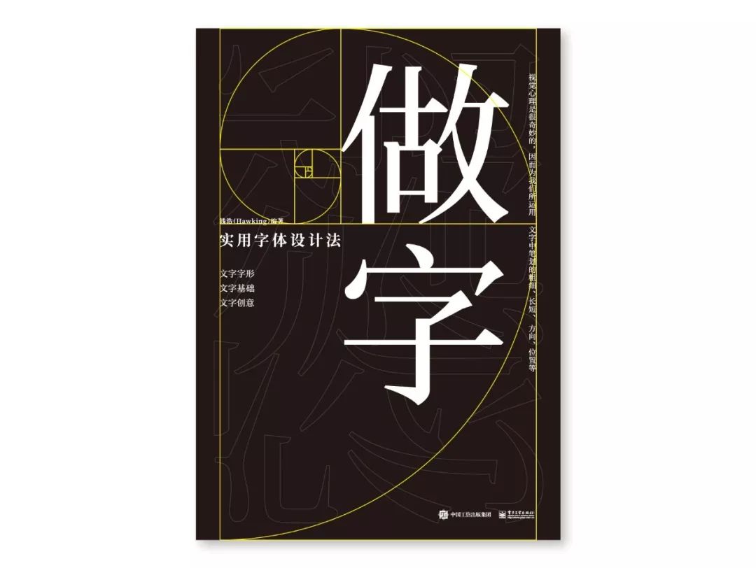
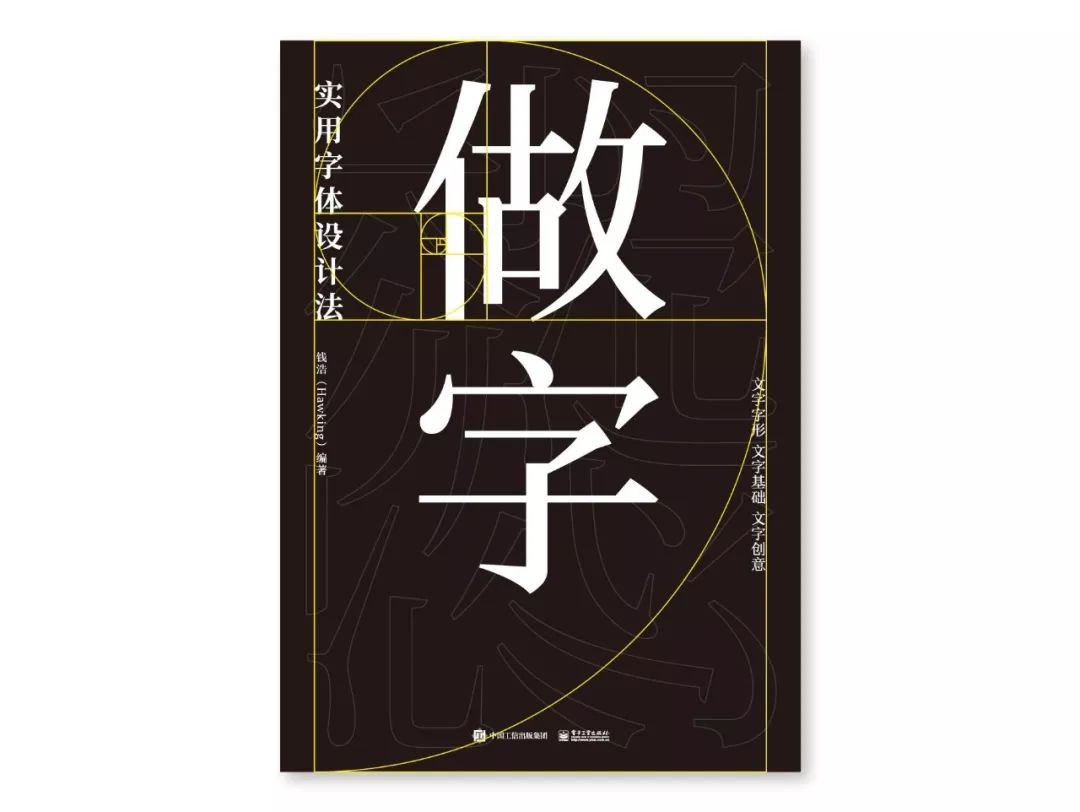
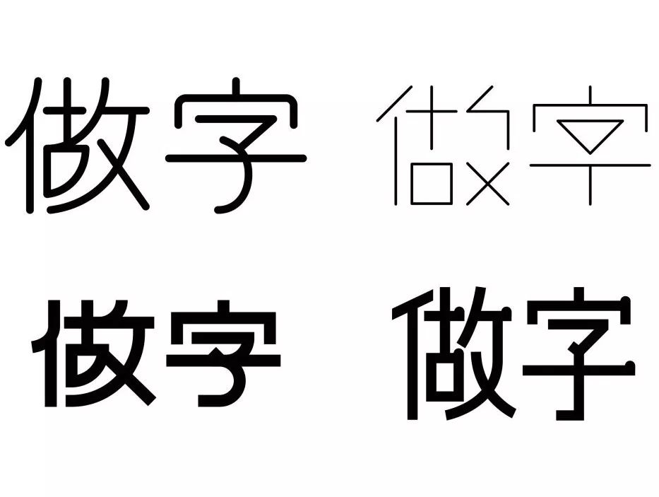
In fact, I have also made several simple fonts, which I plan to use in the design of the cover.
Then, using these fonts, I made several cover options.
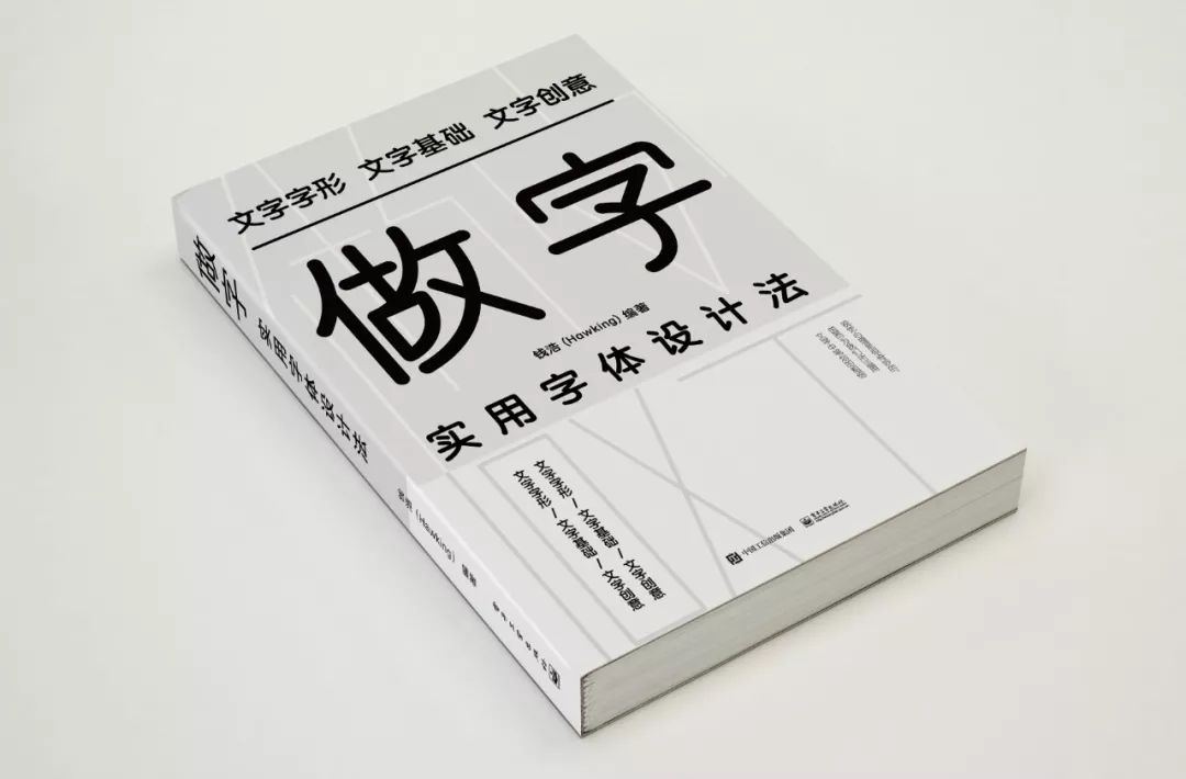
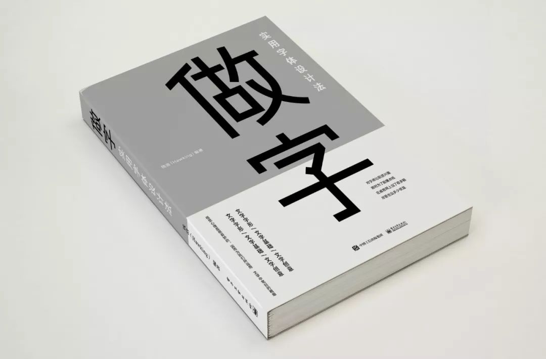
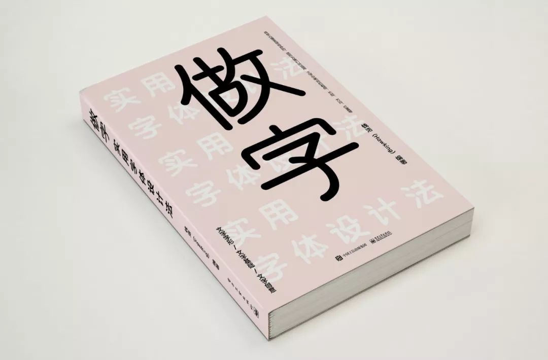
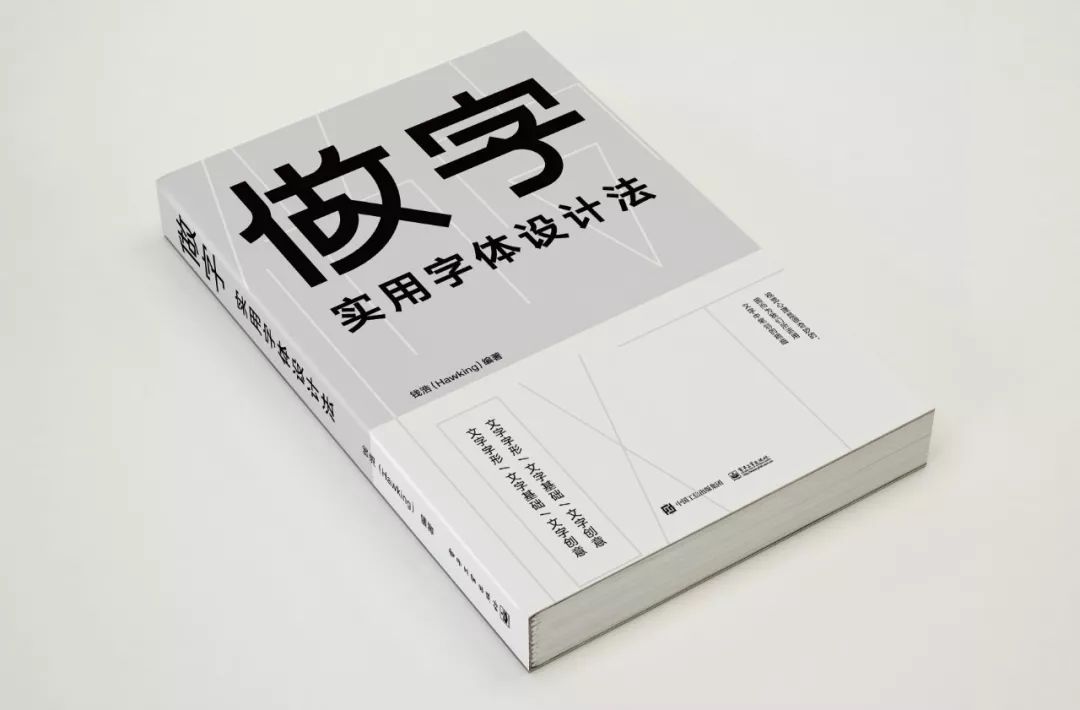
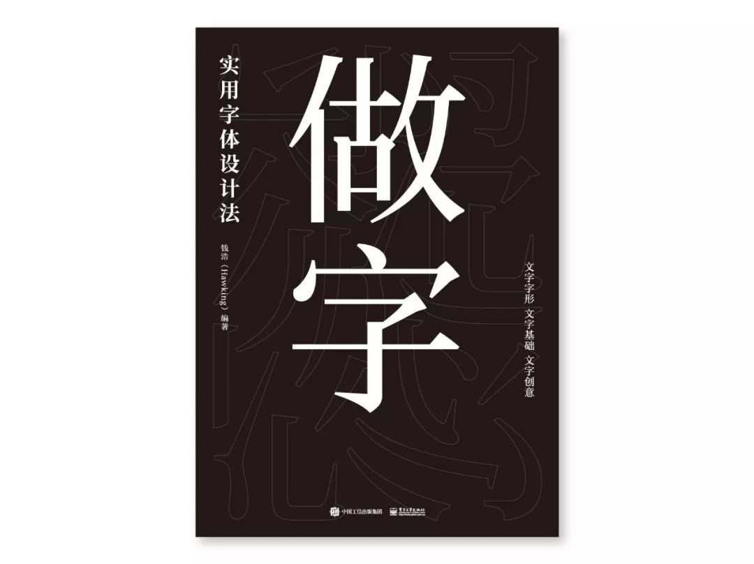
Everyone thinks that the few models I made are too literary and complicated, not as simple and clear as the original version. In the end, I chose the most concise version from the 3 versions I revised later.
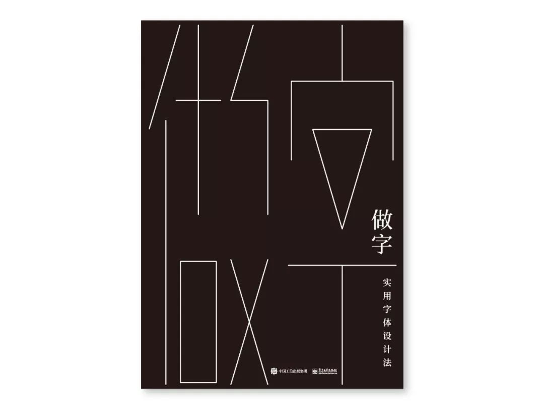
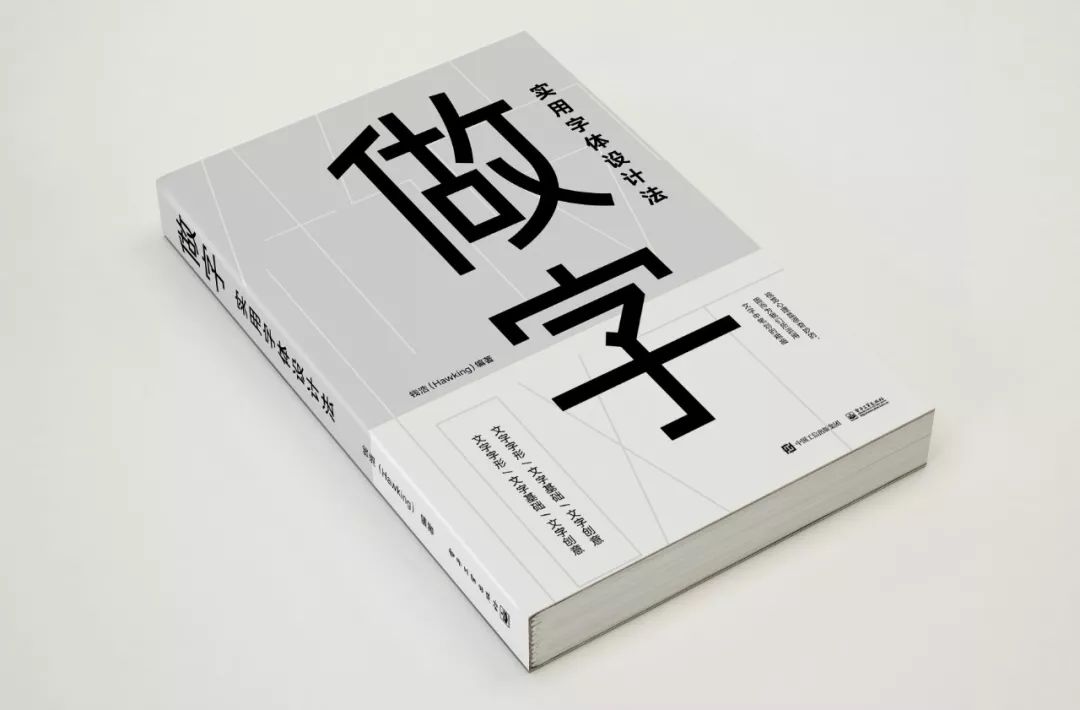
In order to enhance the sense of quality of the book, the cover is made into the form of inner and outer seals. Since I really like the extreme style of "writing" I designed, I adjusted it to a full-page design as the inner cover.
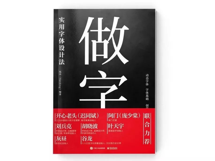
The girdle and cover are in red and black classic colors, and the font size is large and clear. In this way, the design of the inner and outer seals and the girdle seal is completed.
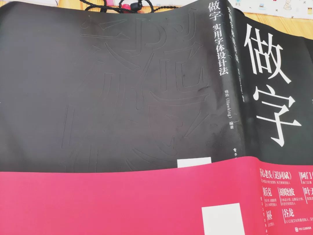
Proofreading and printing process
—
In this way, it entered the stage of the school team, and many editors participated in the school team. After three times of the school team, it was sent to me and made several revisions, so that the content of the whole book was completed.
Next, we will start discussing the printing process. Because the book cover is pure black, I originally wanted to use pure black special paper, so that the texture of the book will be good, but the printing factory does not have white ink and cannot print on black paper. Ideas are shelved.
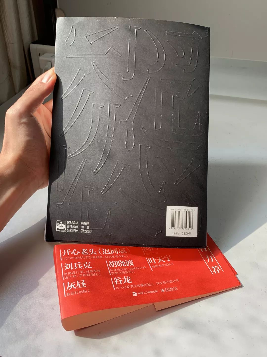
In the end, a special paper was still used for the outer cover. In order to reflect the quality, the frosted UV process was used for the title of the book. Whether to use the drum or the back cover, so the publishing house printed two samples separately and sent them to me for selection. Due to the large area of the drum, if it is used on the cover, the text will be uneven, and the effect will be a bit impetuous. The back cover basically has no text content. In this way, with the help of the touch of the hand and the content in the book, we can immerse ourselves in the world of font design.
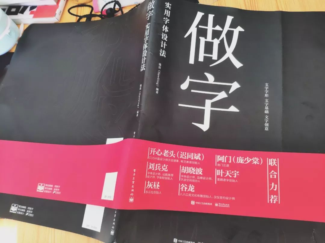
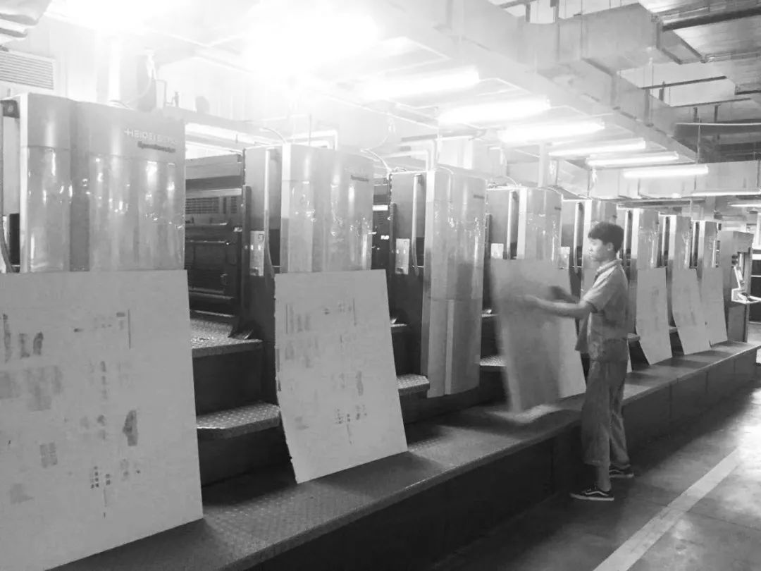
The ring lining is made of more expensive special paper with undulating and rough texture.100g pure paper is used for the inner page, which is thick and durable.
After the process discussion is completed, it can be printed in the factory. Due to the rush schedule, all the machines in the workshop were printing my book that day, and the editor was always following up. He took some photos at that time.
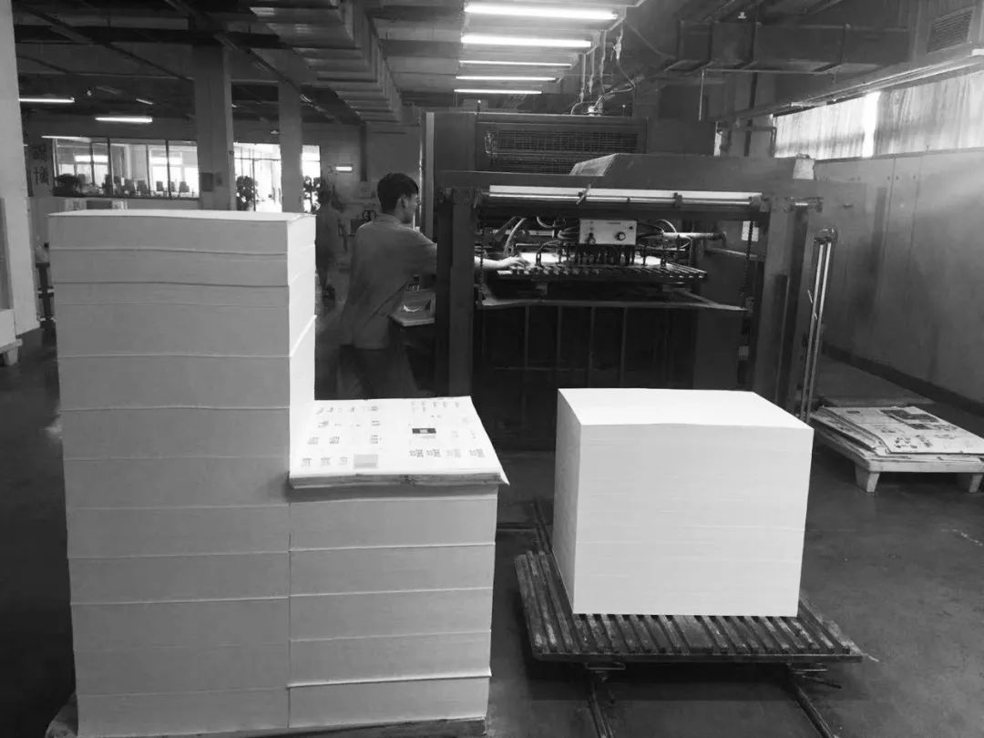
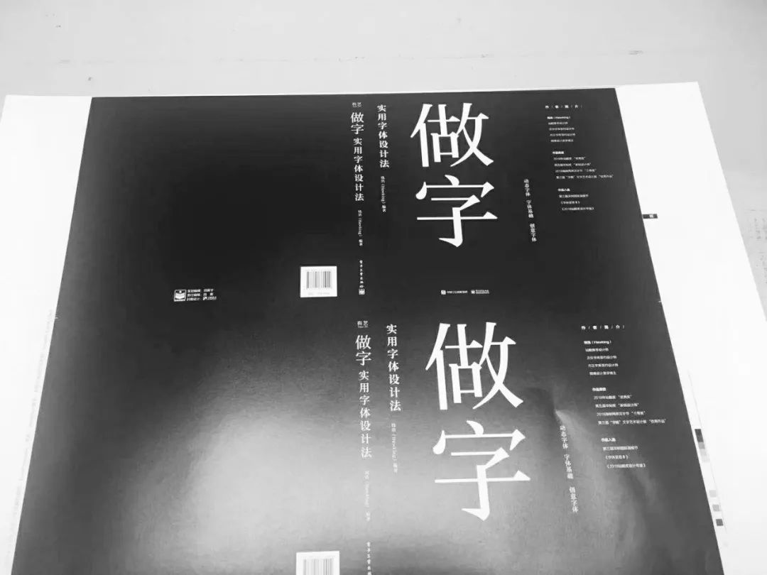
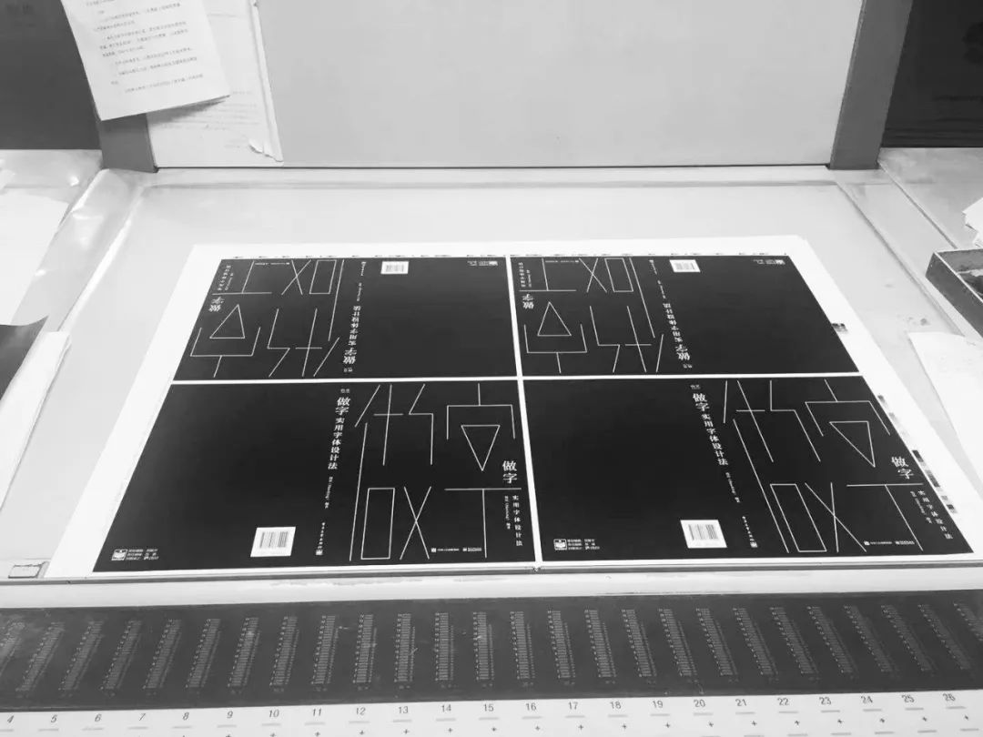
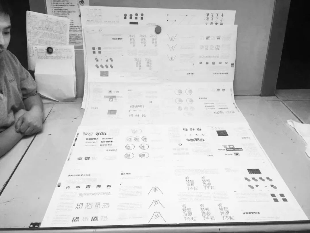
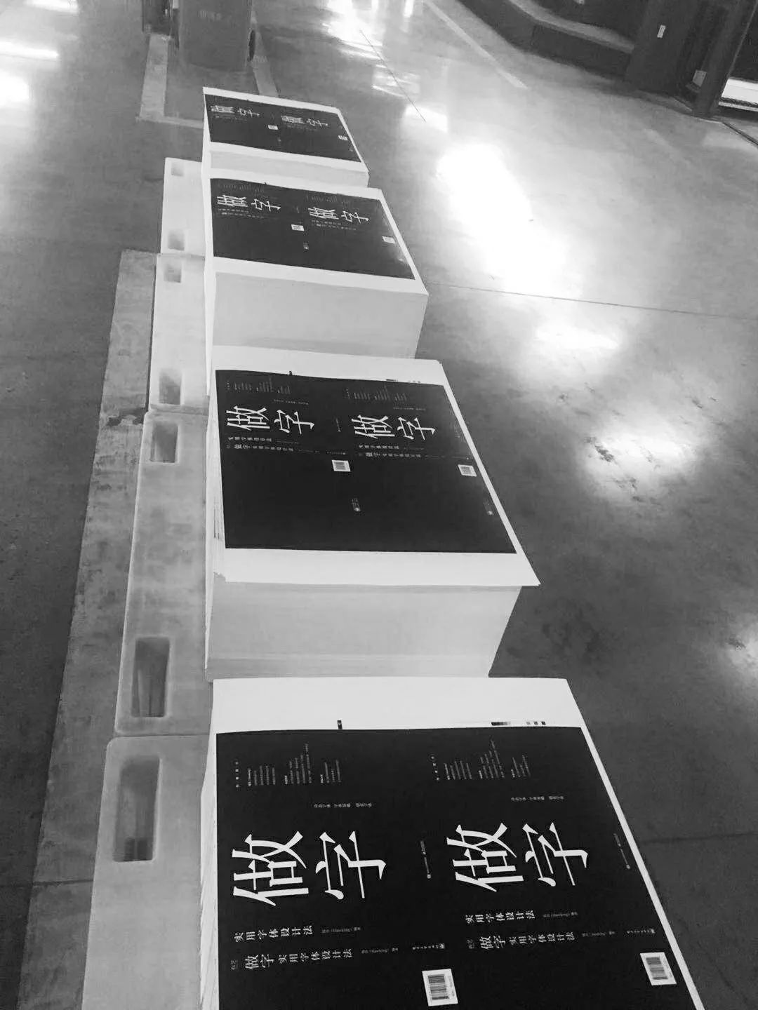
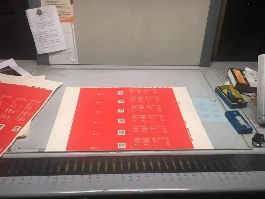
When proofreading the red girdle, the master of the printing factory and the editor checked the color together, and their eyes were almost blind~

So far, with the hard work of everyone, this book is finally finished, waiting to be bound into a volume!
Take a photo
—
Because this book is of great significance to me, I wanted to take better pictures, so I kept it to myself. In our small place, I went to a digital photography shop and asked a professional to take a set.
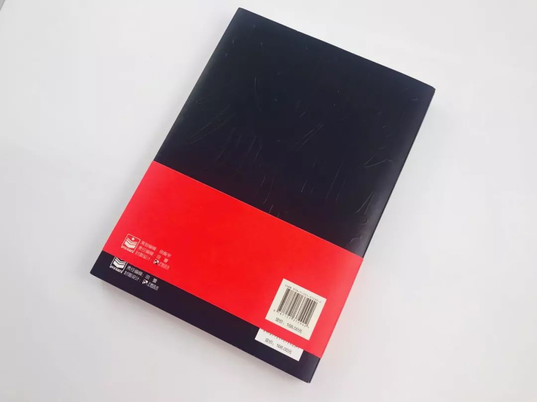
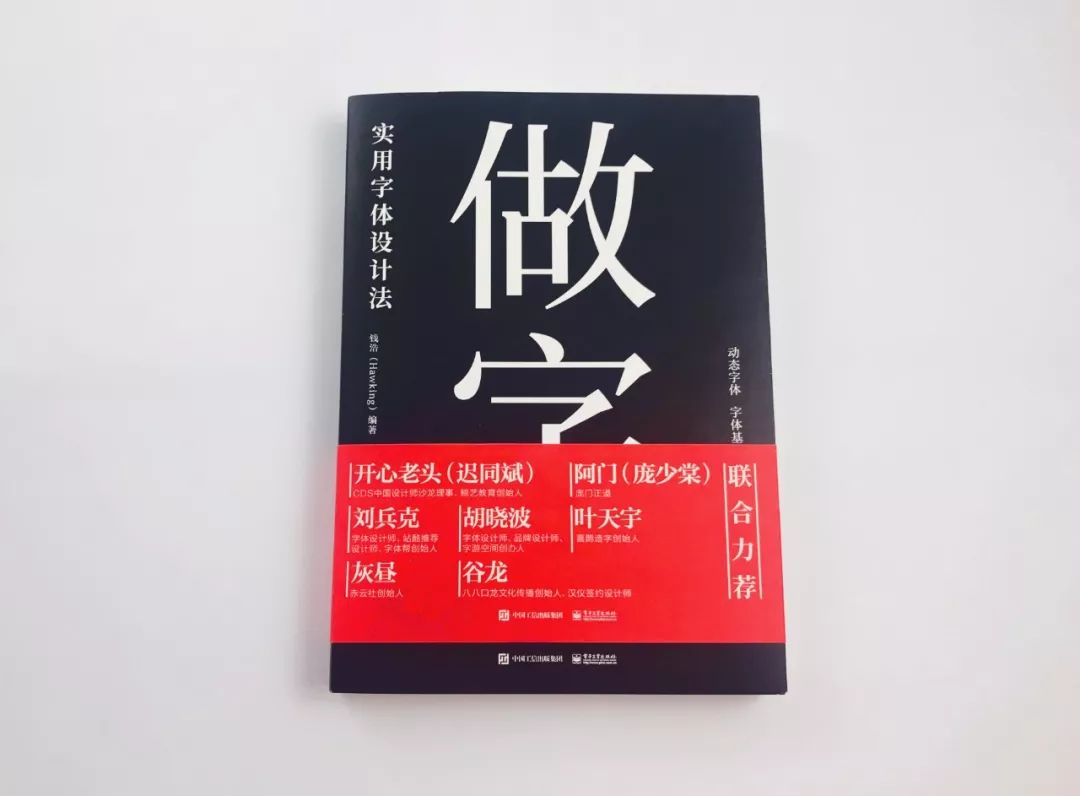
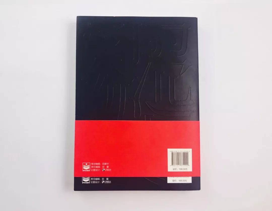
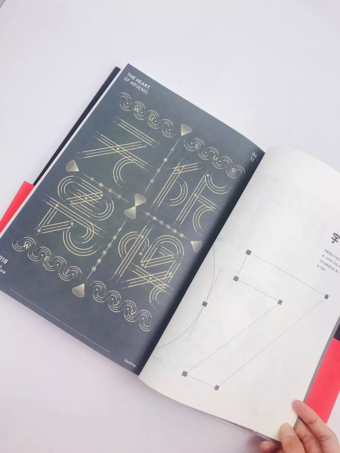
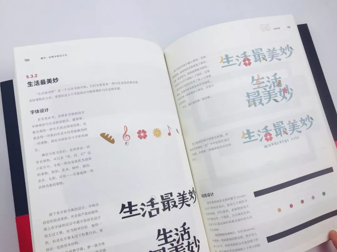
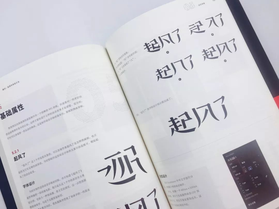
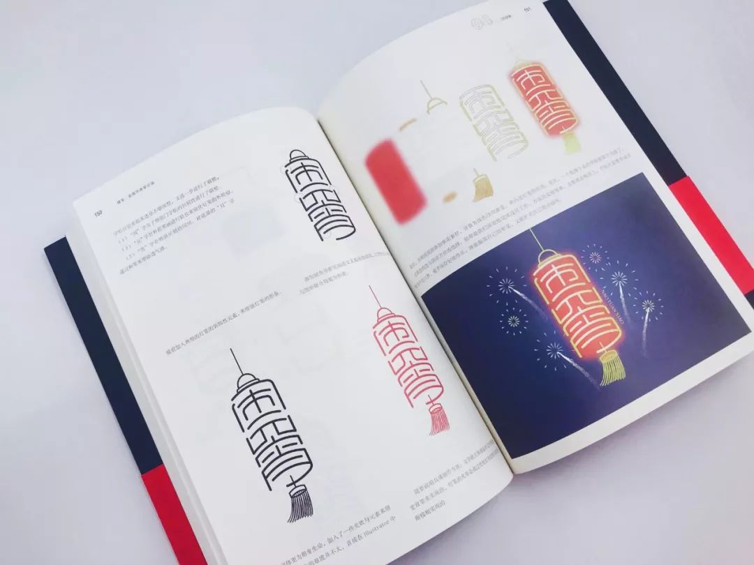
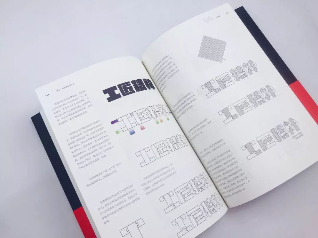
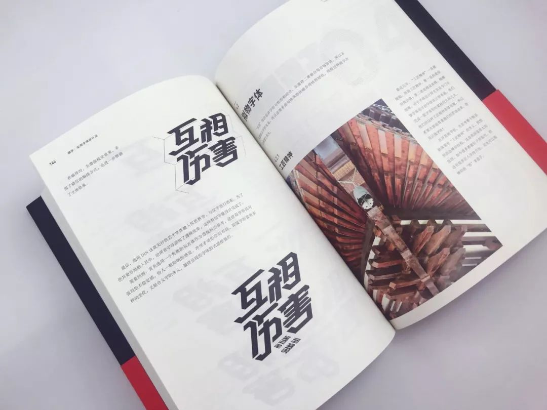
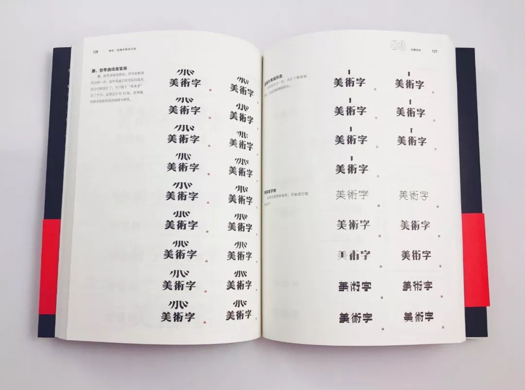
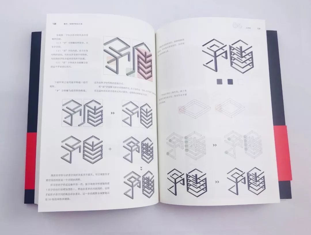
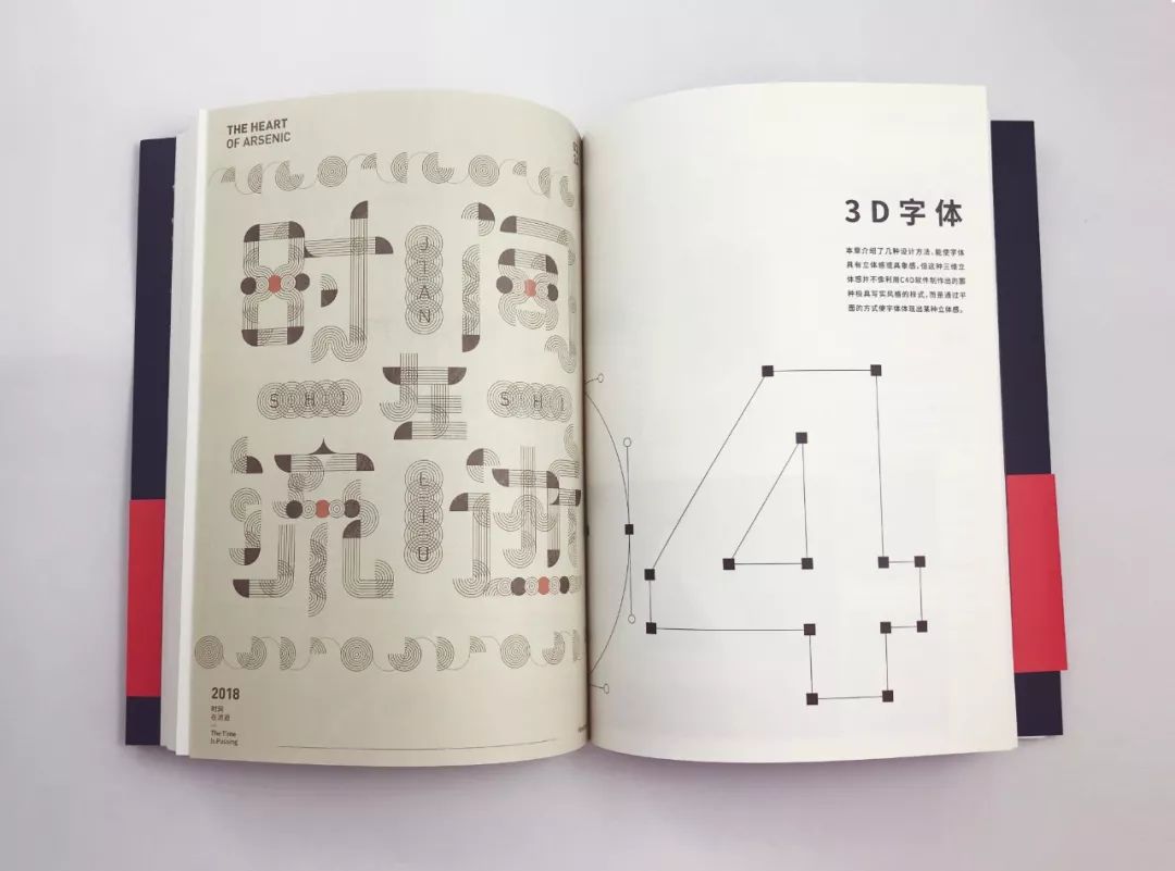
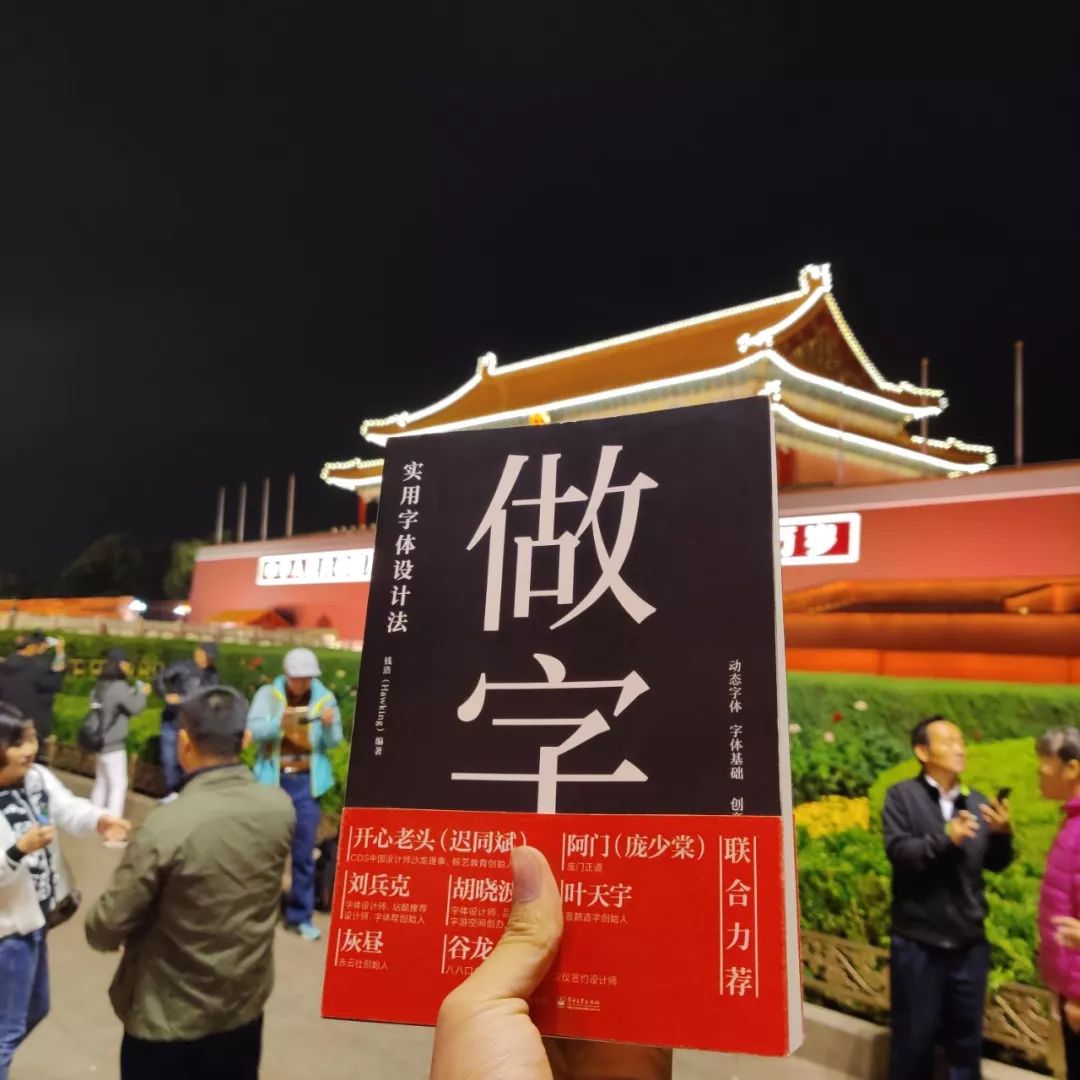
Buyer Show
—
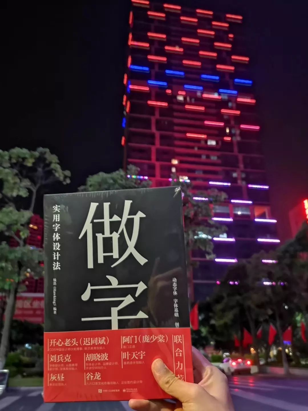
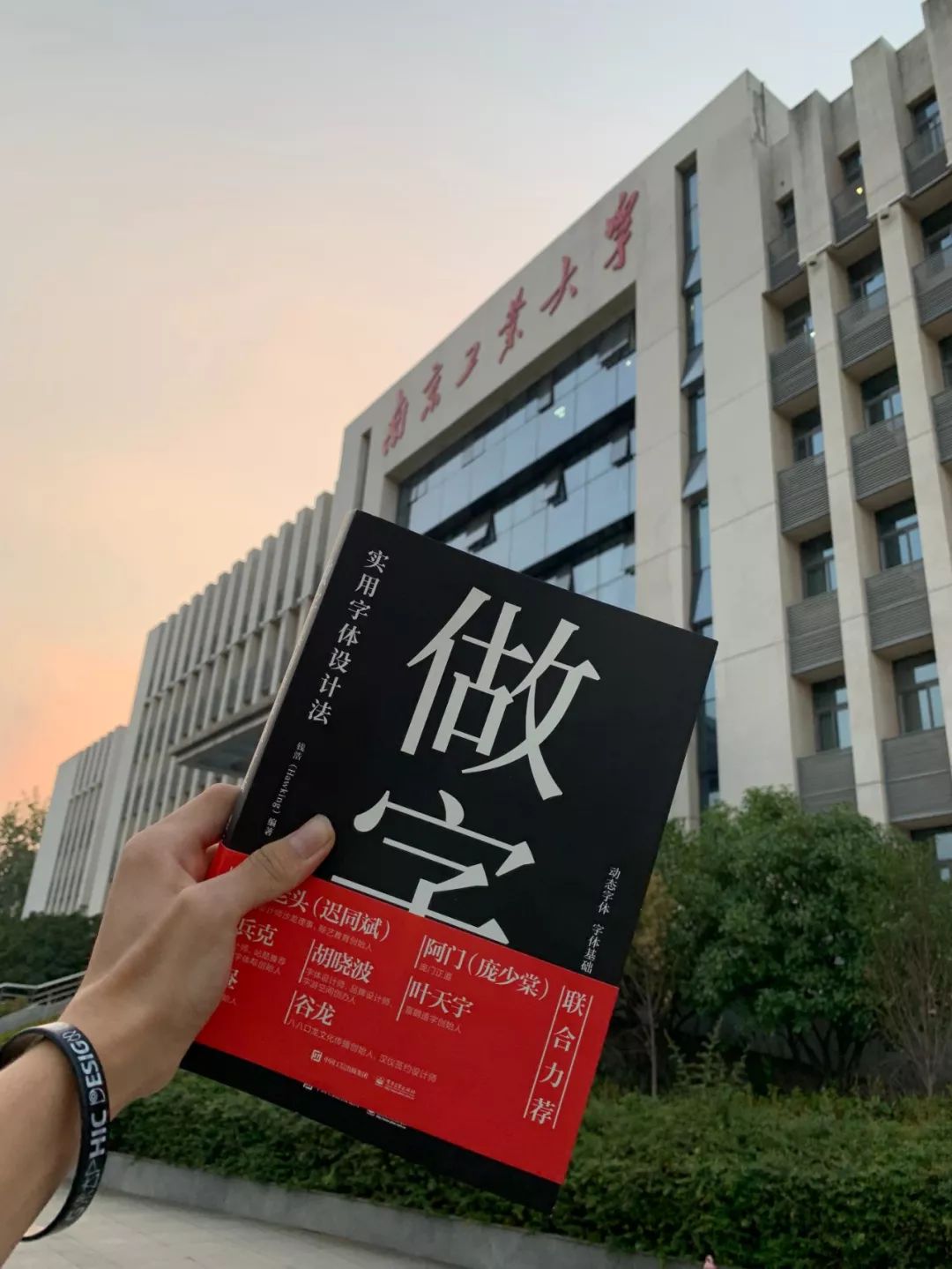
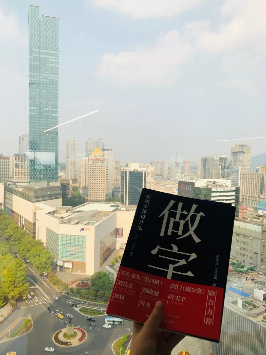
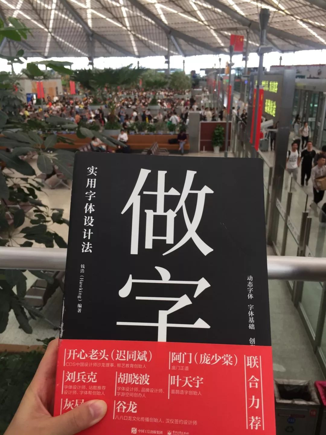
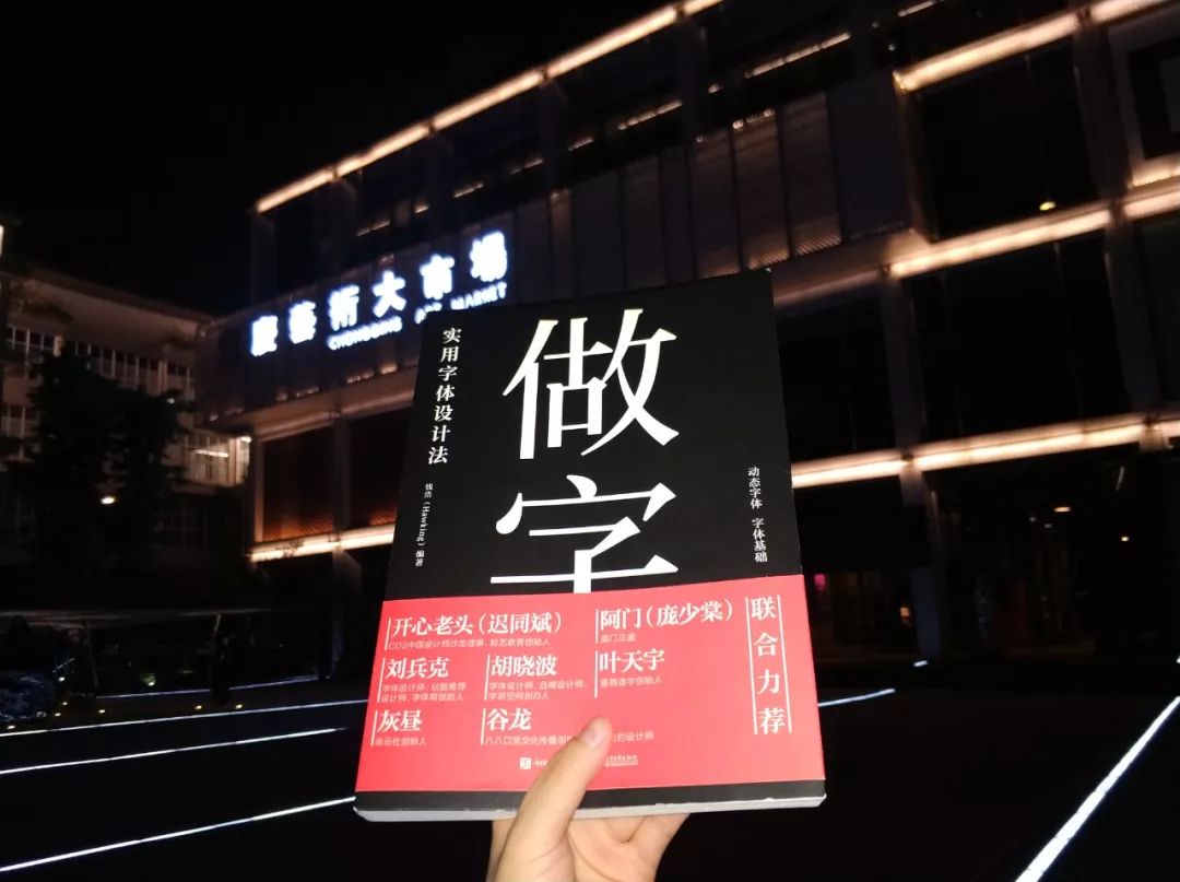
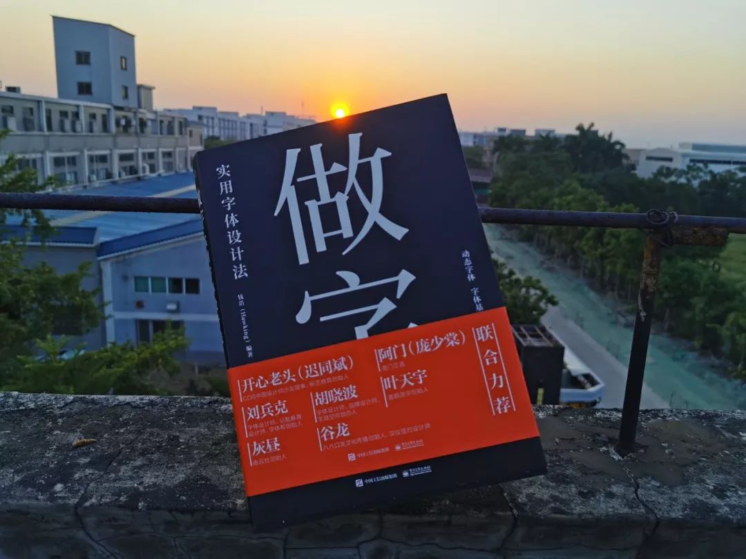
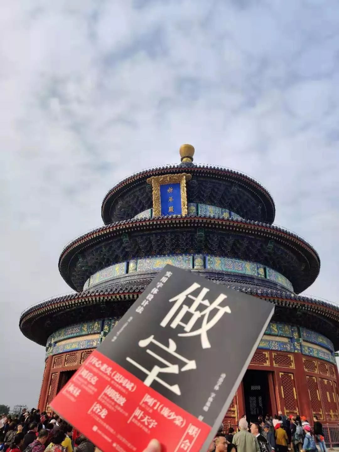
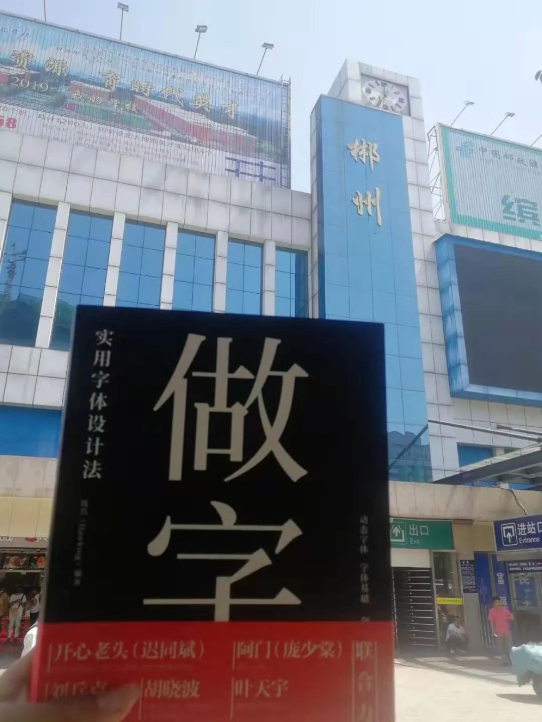
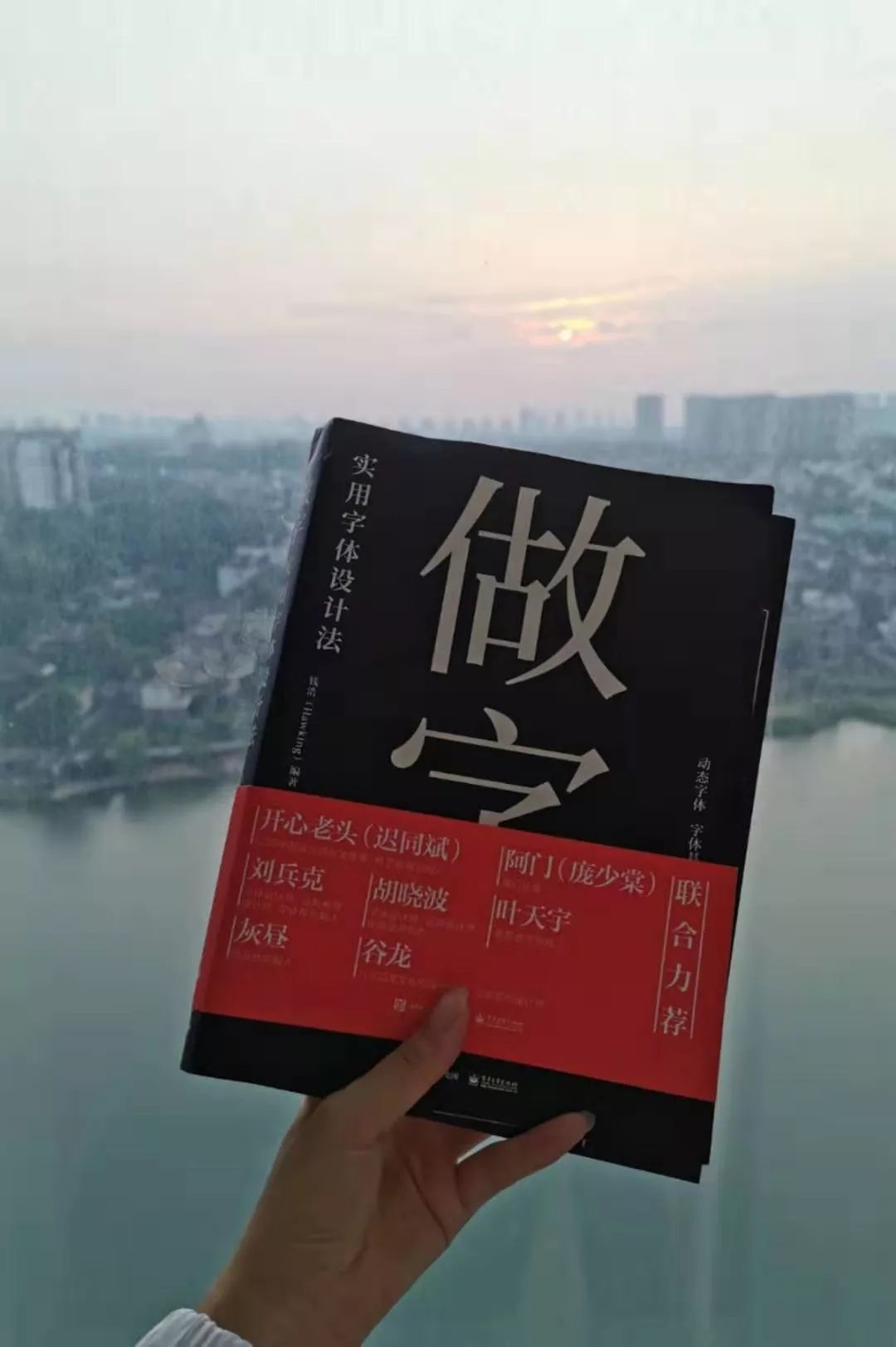
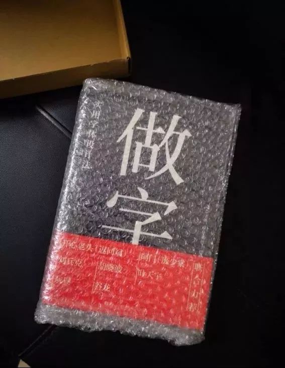
The first batch of release coincides with the National Day holiday. Many friends took it out for fun. Look where everyone has gone? The outside world is so big~ Thanks to these friends who brought it when they played?
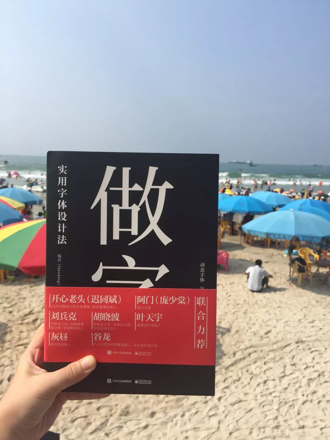
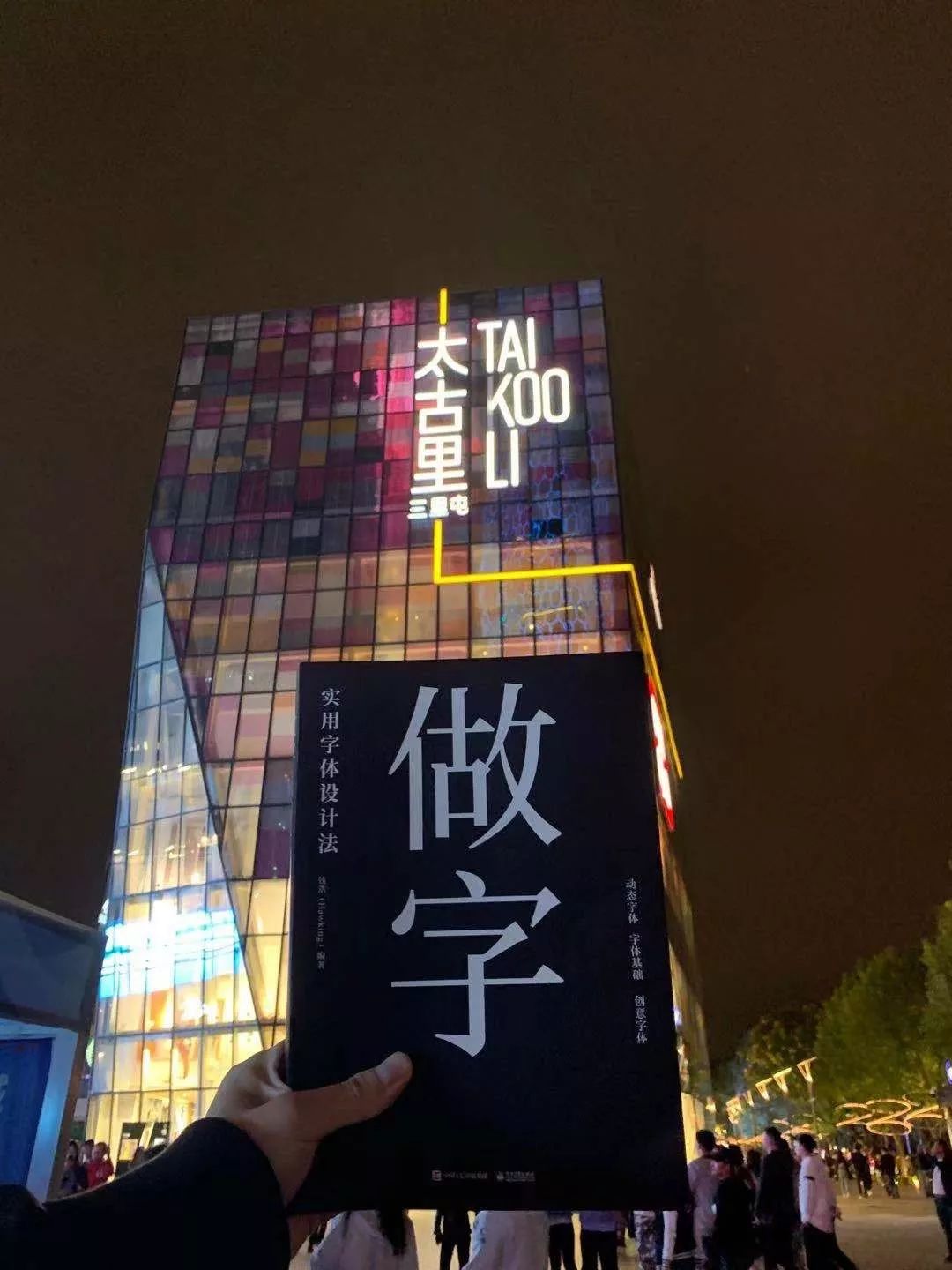
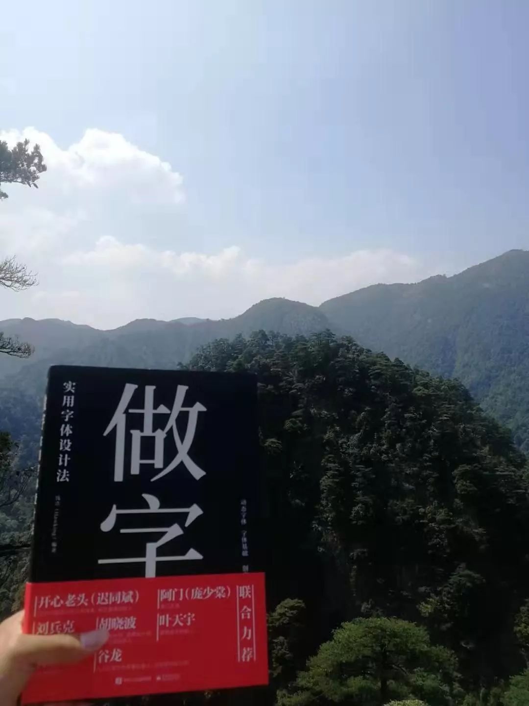

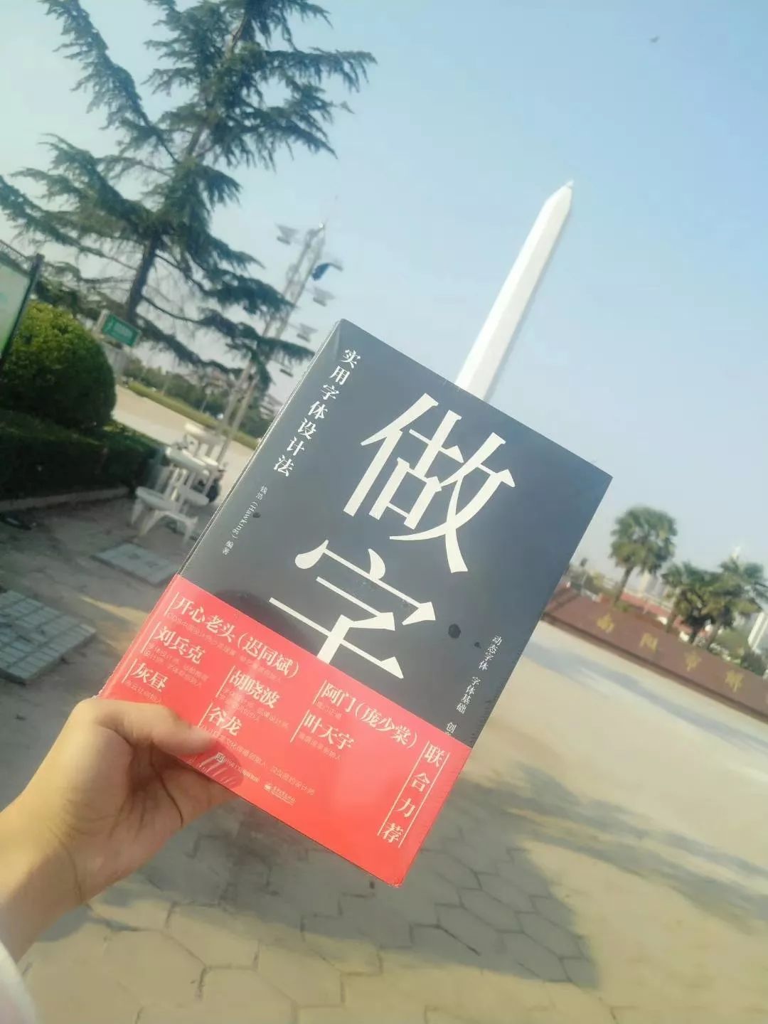
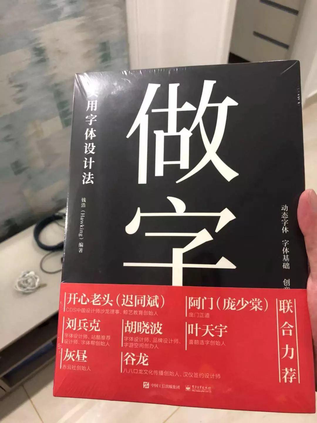
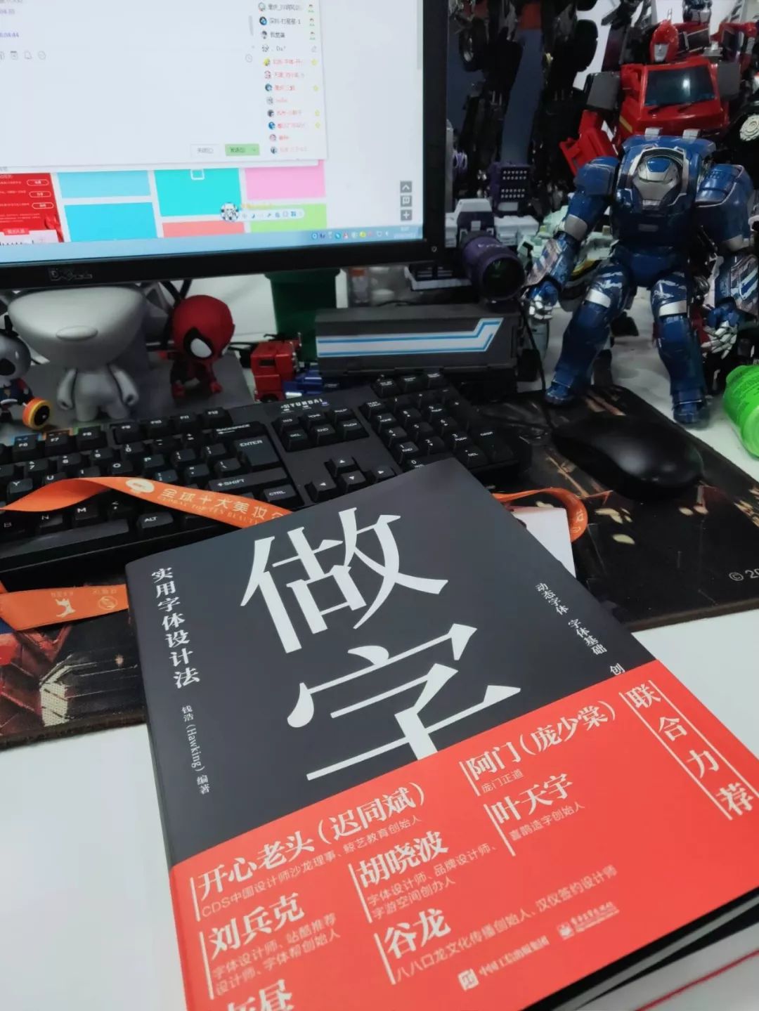
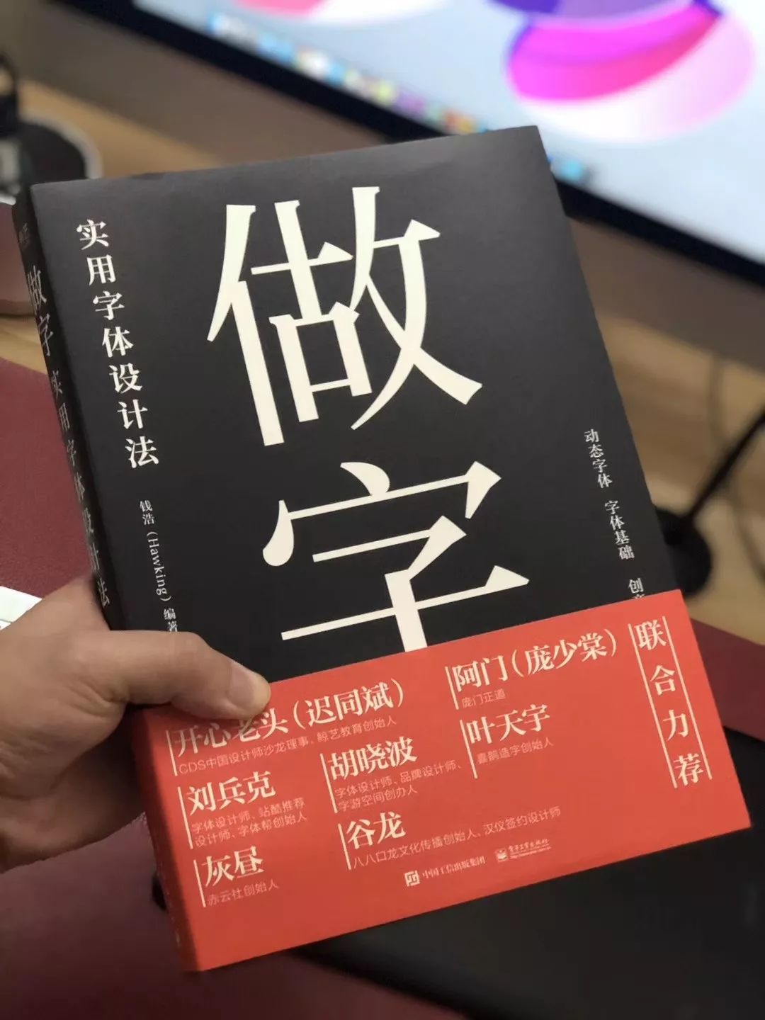
Signed Edition
—
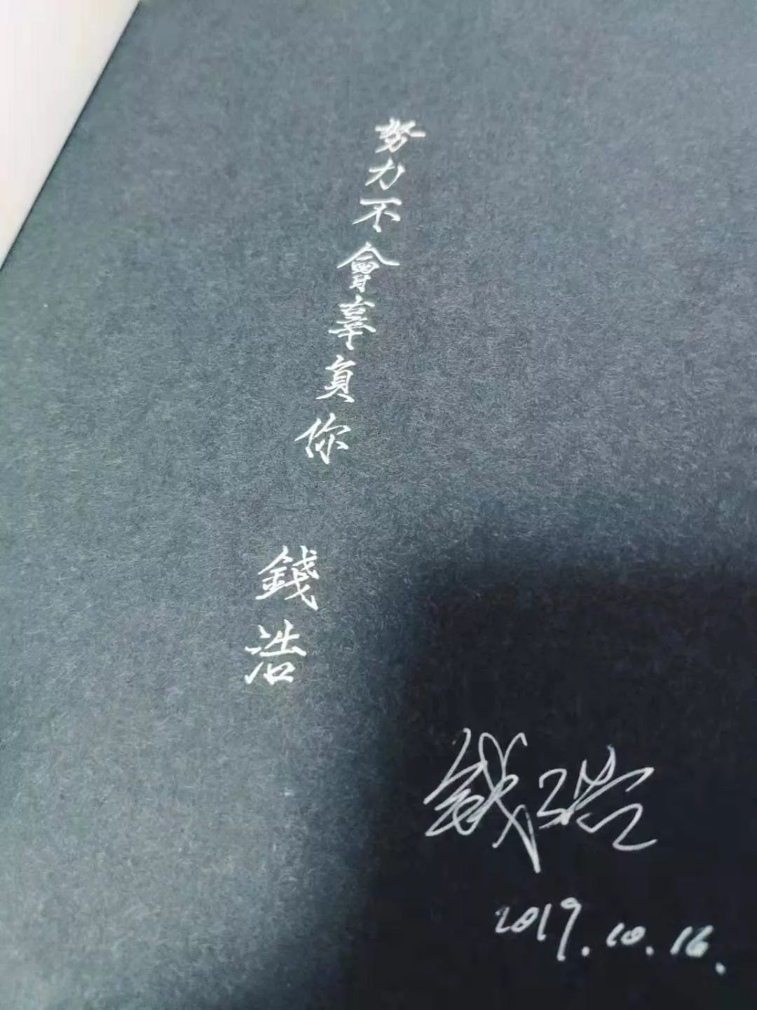
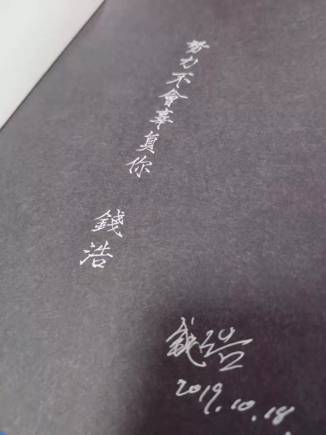
Recently, I have been practicing the thin gold body. Some friends want the signature of the thin gold body. They mailed the book separately to sign a few copies.

How to buy
—
JD.com and Dangdang.com’s double 11 discount promotion (every 100-50), the original price of the book is 168 yuan, and the single copy is 105.9 yuan during the event; if you buy two copies, the single copy is 80.9 yuan, the more you buy, the more the price Affordable! Get 2 copies now for the original price! ! Not to be missed! ! !


end
" Word School" has been created
A community for checking in, learning and sharing
Scan code to join for free
⇩

Articles are uploaded by users and are for non-commercial browsing only. Posted by: Lomu, please indicate the source: https://www.daogebangong.com/en/articles/detail/This%20could%20be%20the%20next%20Stephen%20Hawking%20in%20typography.html

 支付宝扫一扫
评论列表(196条)
测试