

hello , Hello everyone, I am Brother Li!
Welcome everyone The latest issue of the PPT beauty plan, this issue seems to be a bit difficult after reading everyone's homework.
So let me give Everyone try. First pick a student's homework, @Pearce, let's modify it.
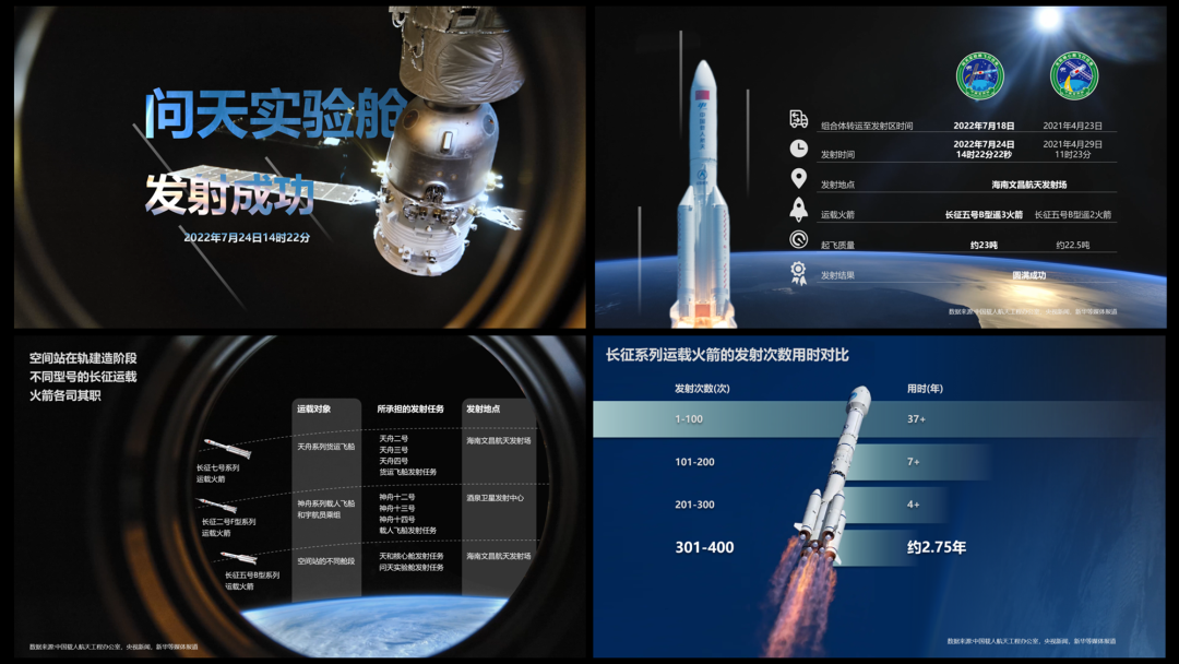
This set of PPT says The first is the Wentian Experimental Cabin, and the style and illustrations are not bad.
It is a comparison of typography issues Big, let's talk about it page by page.
First Look at the cover page:
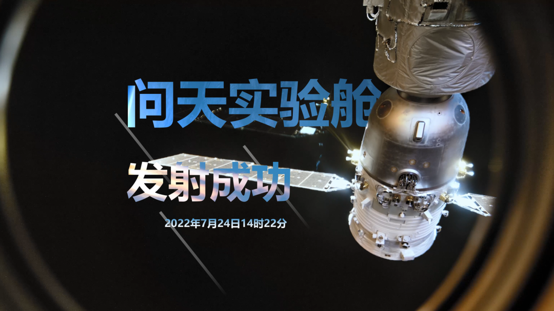
Questions It’s too obvious:First of all, the text is not aligned, and secondly, the color of the text is not good-looking, and the text is still Press the picture.
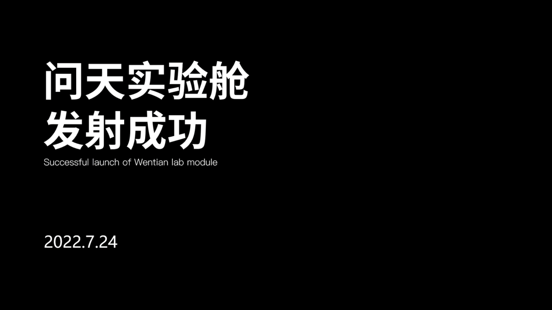
Let's fix it :
section One step, first align the text, and we will use left alignment.
section The second step, find pictures, find some pictures around the launch of the Wentian experimental cabin, here we find Such a picture.
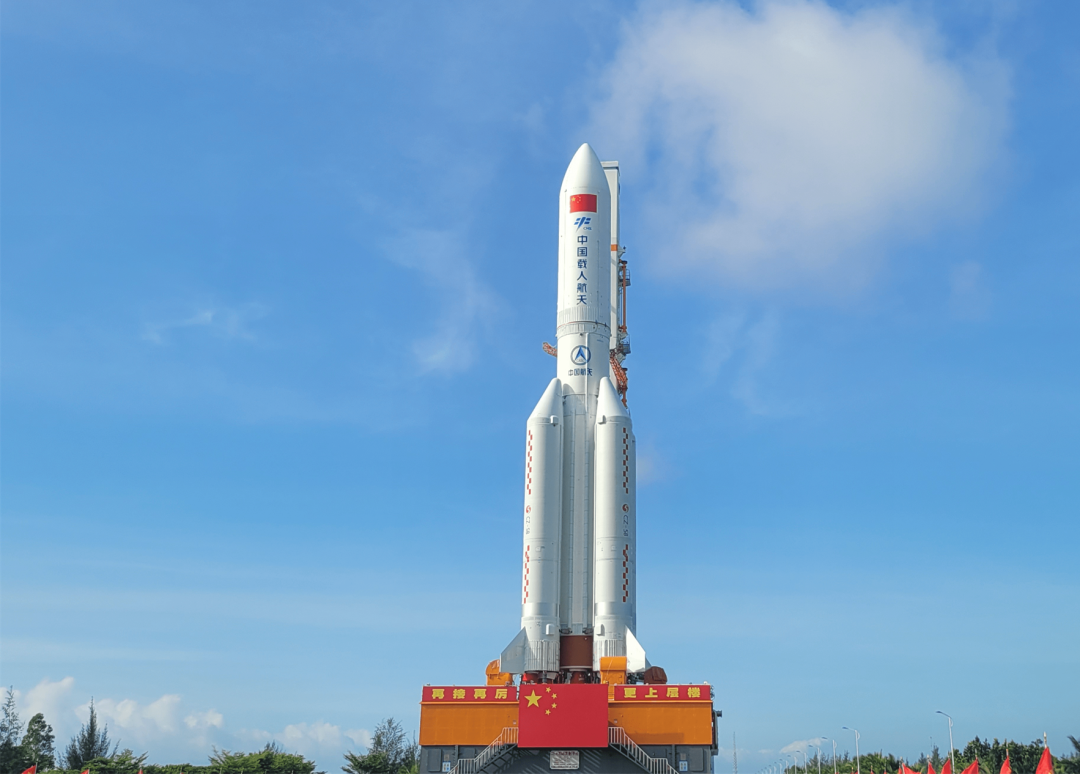
Simple image processing One click, crop, and then add some details, a good PPT page, and it's done.
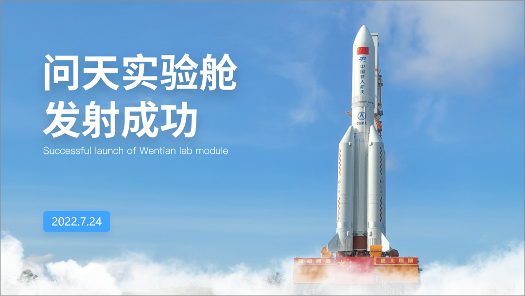
This blue sky feels a bit If you feel uncomfortable due to smog, you can use the "sky-changing method" to change the blue sky.
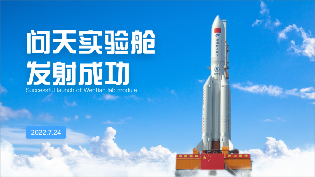
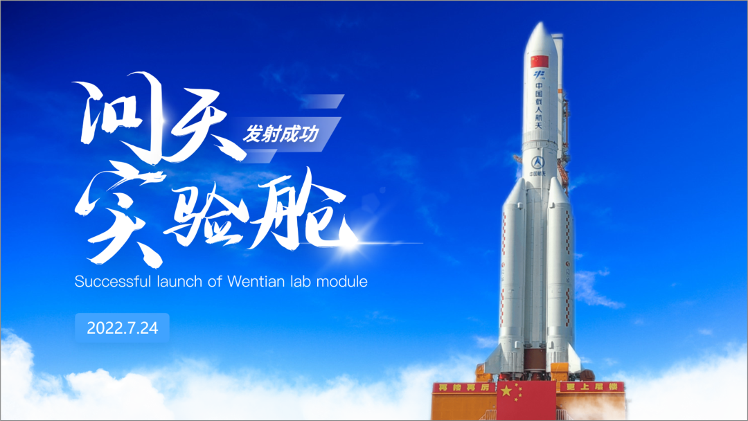
Of course , we can also come to a dark tone.
Find an Earth Picture, and then add an experimental cabin to build such a scene, I think this is good.
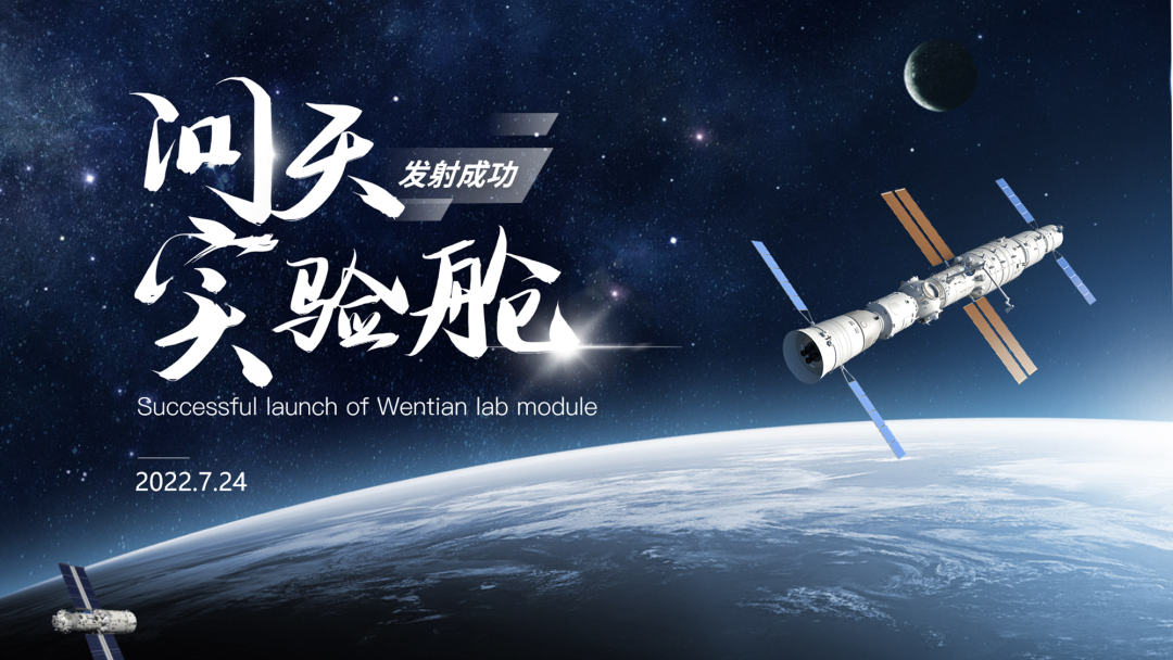
Change another picture , come to a center-aligned typesetting, which seems to be pretty good.
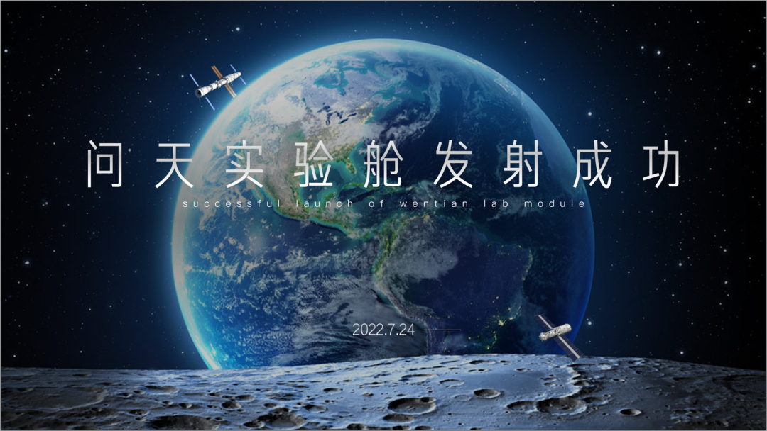
This is the cover page , it’s a bit more to expand, next, let’s see
section Two pages
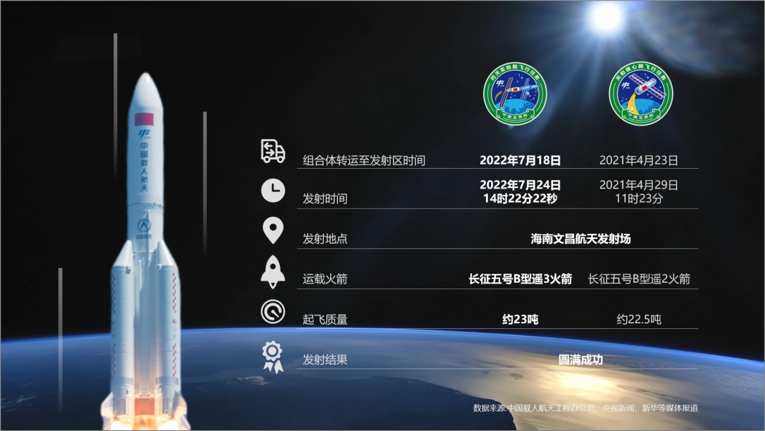
This page of PPT , First of all, the icons are not uniform, and there are aspects and linearity. In fact, the typesetting of the comparison feels a bit messy.
The original PPT is actually That's right, it's a comparison page, talking about the comparison between the Wentian experimental cabin and the Tianhe core cabin.
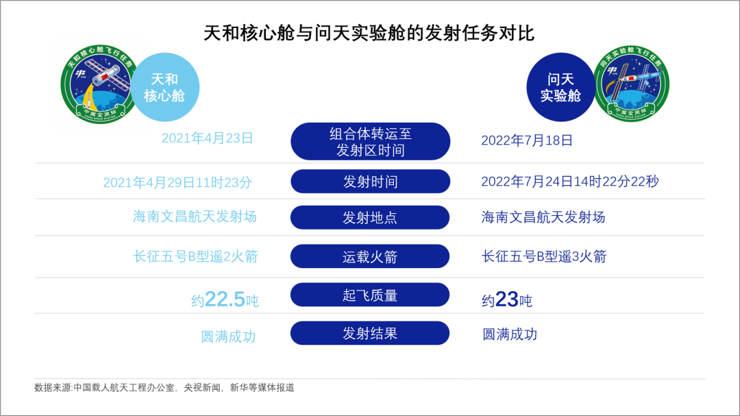
This is a comparison page, there are quite a lot of things to compare.
Just right For the comparison page, we use a table-like typesetting. I made two light tones, you can take a look.
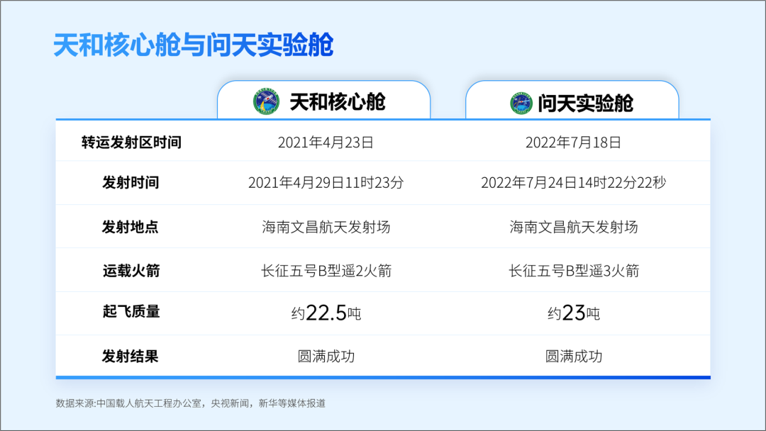
section Two, I used color blocks for typesetting, modular
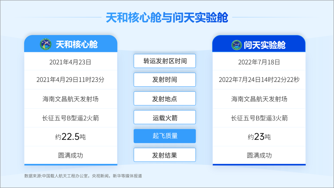
Let's have another dark mode It is best not to have large areas of white color blocks inside dark tones, and it is more comfortable to use white text directly.
Look at the effect.
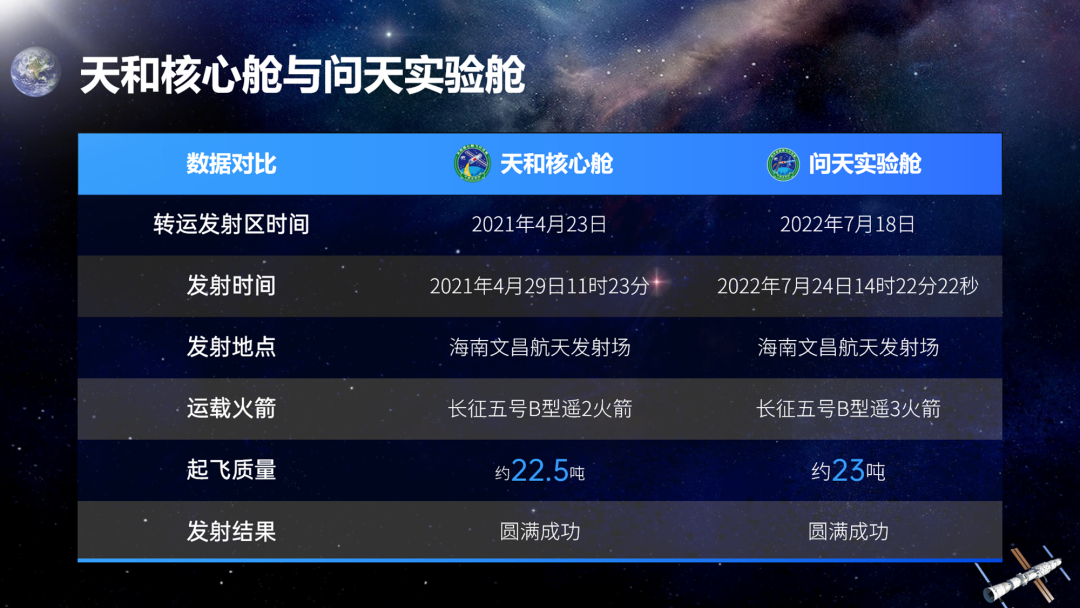
Let's move on Look, look at the third page
section Three pages
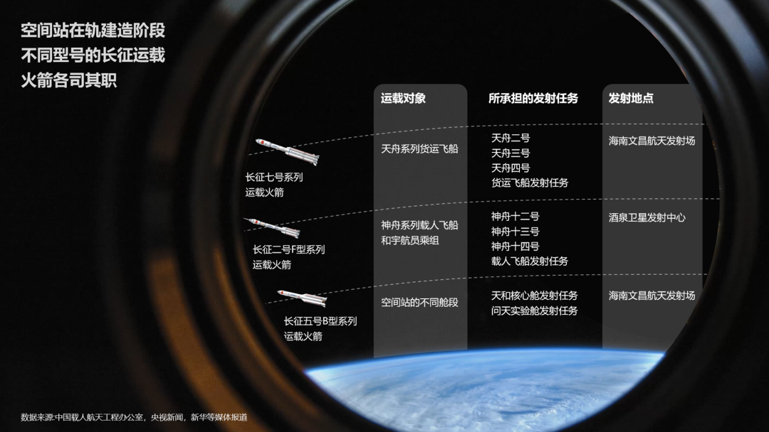
This page of PPT The idea is very good, but this typesetting does not want the audience to see the text clearly.
PPT The content is still the most important, and readability is still very important.
Actually The original PPT is like this, it seems to be a comparison table.
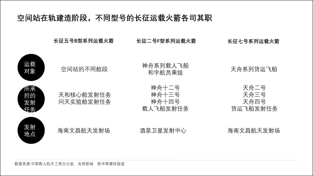
Just done above A form, right, there still needs to be some changes here.
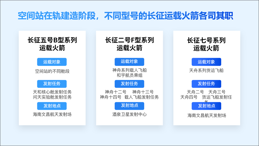
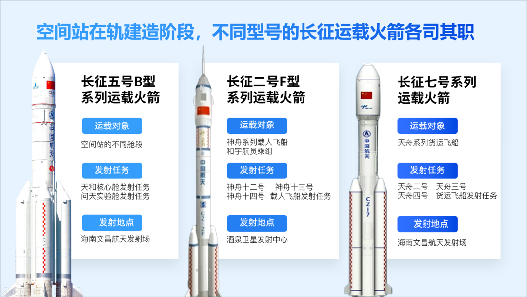
Find some corresponding Pictures, such as Long March 5, Long March 2, and Long March 7.
This is a dark color of.
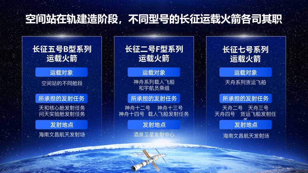
I have time It can be adjusted and adjusted, and it can be more refined.
Today's content, stop here.
Today is really a bit rushed , When I was writing the article in the morning, several customers called to discuss PPT customization, woohoo, so today's post is a bit late.
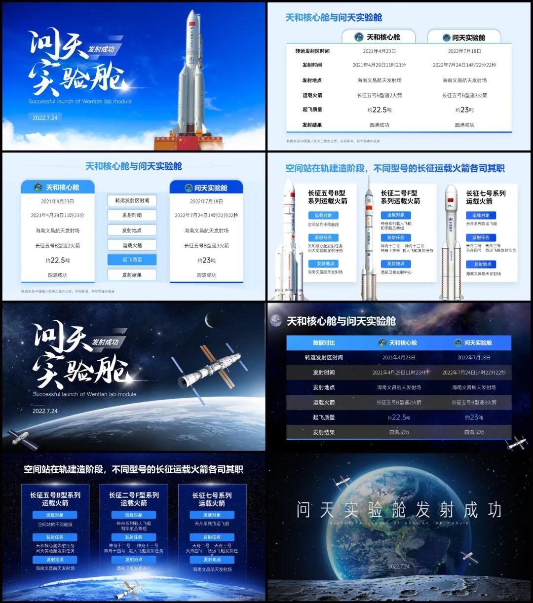
End of this article
If you also want to make a good-looking PPT, you can learn from Brother Li. There are a total of 40 video lessons in the column , very systematic and of super high quality.
There is also a Q&A community, and 5G PPT materials are also given away
Articles are uploaded by users and are for non-commercial browsing only. Posted by: Lomu, please indicate the source: https://www.daogebangong.com/en/articles/detail/This%20PPT%20is%20too%20difficult%20Let%20me%20modify%20it.html

 支付宝扫一扫
评论列表(196条)
测试