Finally finished adjusting the format of the thesis. Kobayashi, who was writing an English thesis for the first time, looked at his manuscript and always felt that something was missing.
Font! font! font!
Kobayashi suddenly realized, and fell into a deeper entanglement, Times New Roman, Garamond, Calibri, when submitting a manuscript to a journal, what font should I choose?
Image source: Nature index
Of course, Kobayashi is not the only one who has this kind of entanglement. Recently, an online report on the nature index discussed this annoying problem that has plagued many scientific research dogs.
Controversy has always been about the choice of fonts
Different from the clear format regulations when writing a graduation thesis, no journal tells you which fonts you should use and which fonts you should not use when writing English thesis.
Ever since, many students asked on Quora, "What is the most suitable font for academic papers?"

Image source: Quora
The large number of people asking questions undoubtedly reflects two problems. One is that the choice of fonts really troubles many scientific research dogs, and the other problem is that there is no definite answer on what is the best font for a paper.
The same scene happened on Twitter.
When Jesse Meyer, a postdoctoral researcher at the University of Wisconsin-Madison, tweeted about the topic, the comment section exploded.
Everyone’s choices mostly revolve around serif fonts and sans serif fonts, as for handwriting and fancy fonts, they are not within the scope of consideration of scientific research dogs.

Image source: thenextweb.com
Of all the fonts, the sans-serif Calibri is particularly controversial, with some calling it ugly.
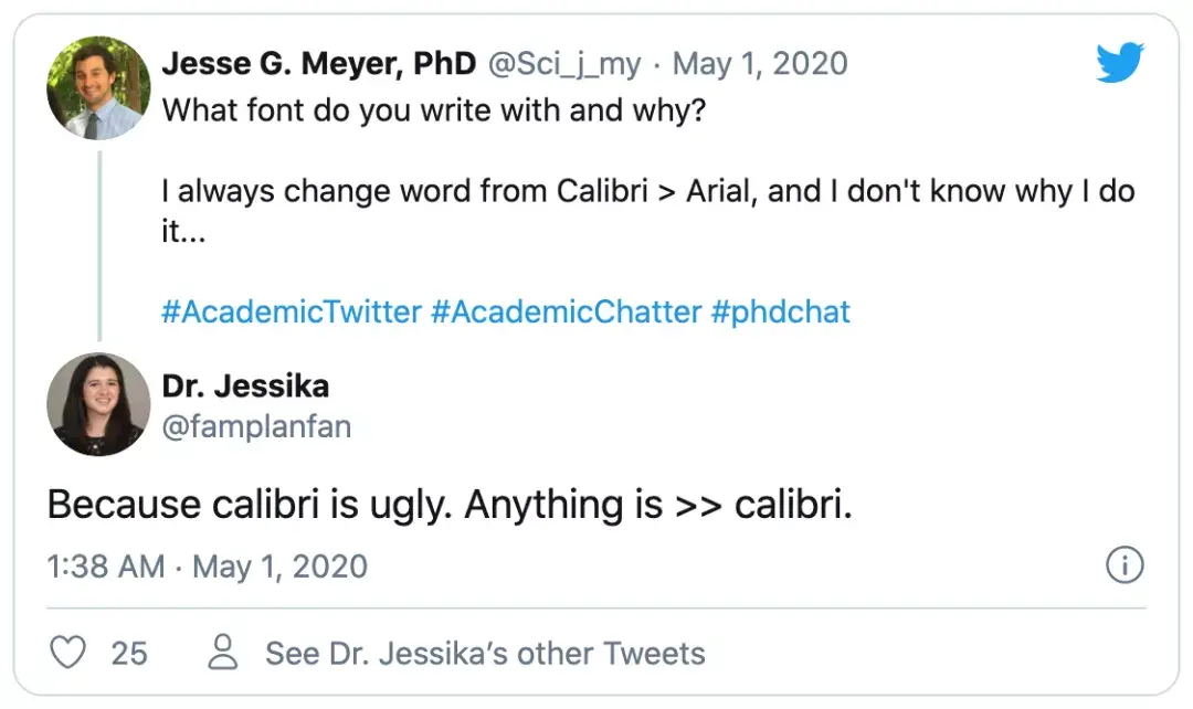
Image source: Twitter screenshot
There are also those who particularly hate it, thinking that anything written in Calibri is howling.
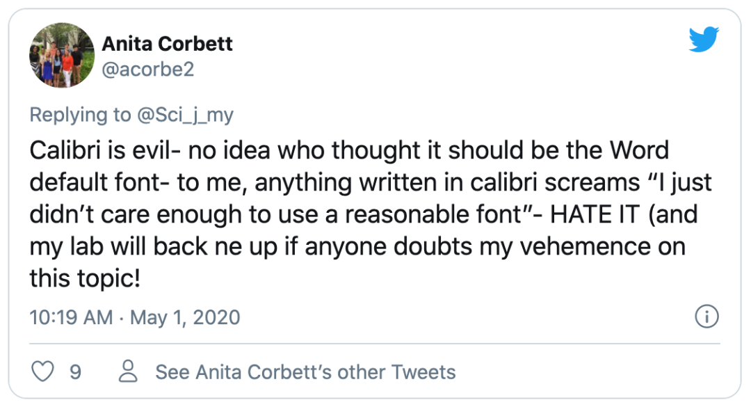
Image source: Twitter screenshot
Of course, Calibri is used by default to avoid fat friends who make irresponsible remarks on fonts.
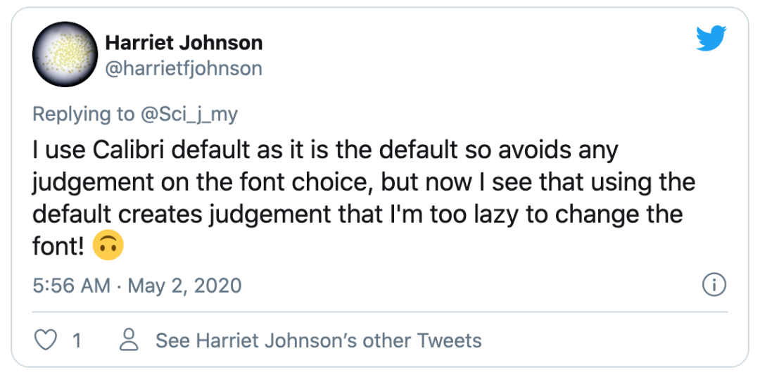
Image source: Twitter screenshot
As a lazy person, the author is naturally a loyal fan of the Calibri font, although I feel that Calibri is not so beautiful sometimes.
Is font choice really that important?
Having said that, journals reject manuscripts because of the fonts of the papers. This kind of thing will most likely not happen, so why are the majority of scientific research dogs so entangled in font selection?
This has to start with people's reading habits.
When we read, our eyes follow a natural pattern called the "scan path". Typically, our eyes move 7 to 9 letters across the page before stopping to process what we're reading.
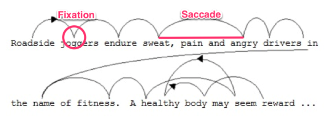
Image source: thenextweb.com
When we scan sentences, no useful visual processing takes place in our brains, and what information we get depends entirely on what we read when we pause, so using the right font and layout can directly affect the reader's reading experience.
In the past, as the carrier of text was more paper, researchers believe that serifs may increase the legibility of letters, because some Letters without serifs are more visually similar,so serifed fonts can help readers read faster.
Now, most researchers prefer to read electronic papers.
A 2015 study examining whether the font used in abstracts of papers affects reading speed found that readers read faster when sans-serif fonts were used.
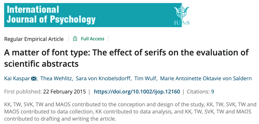
Image credit: Int J Psycho
But it is worth mentioning that faster reading speed did not increase readers' liking for the text, on the contrary, serif fonts not only improved the attractiveness, understandability and interest of the text, but also improved the scientific content. rendering effect.
In addition, typefaces can evoke strong emotional responses, bringing out the author's personality, whether serious or playful, to the point that readers, consciously or not, may connect font choices to the author's personality or intent.
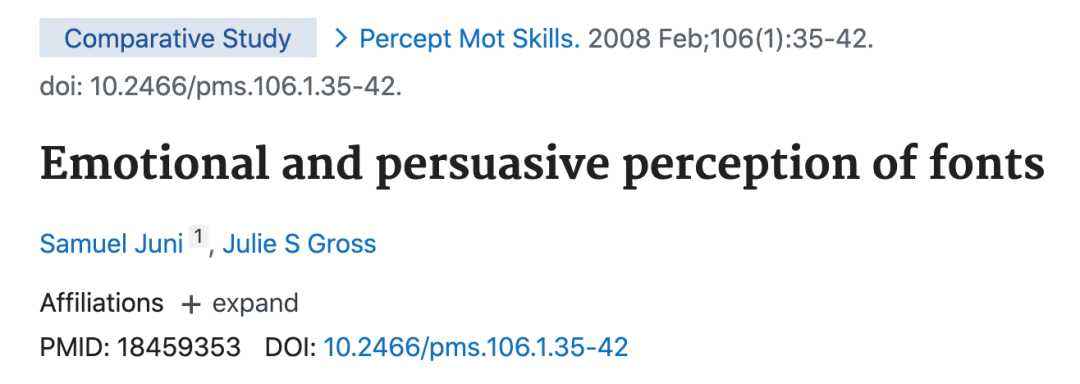
Image source: Perceptual and Motor Skills
As the French poet Paul Claudel said, "The secret of type is that it can speak." A thing that couldn't be more normal.
What is more important than fonts is reasonable typography
The above research shows that the choice of font may affect the reading experience of reviewers and editors, but a qualified research dog should pay more attention to "good paragraph structure, clear diagram design, and reasonable line spacing and paragraph spacing".
Psychologist Kevin Larson from the Massachusetts Institute of Technology explored the impact of text layout on readers' emotions in a study.
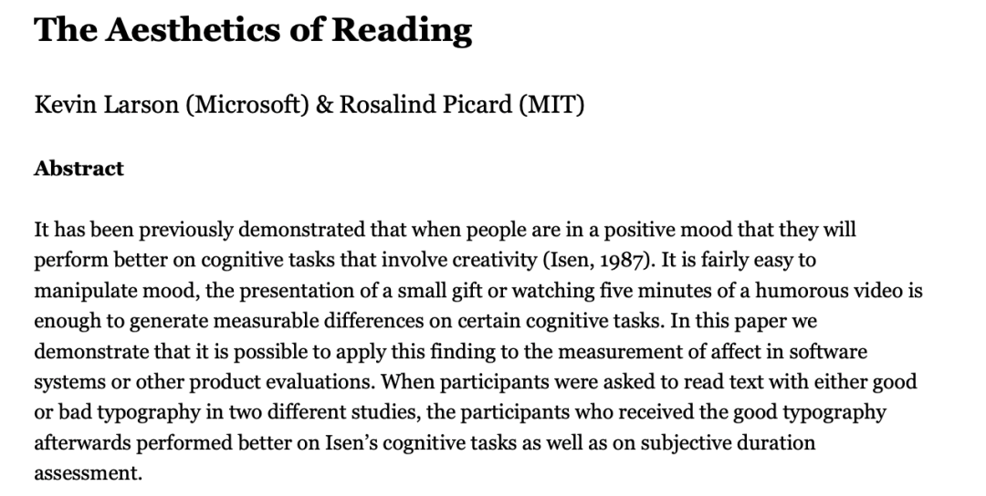
Image source: affect.media.mit.edu
For the study, the researchers divided 20 volunteers (10 men and 10 women) into two groups, and each group was shown a separate version of The New Yorker, in which the placement of images, fonts, and One layout is well designed, while another version has a poorly designed layout.
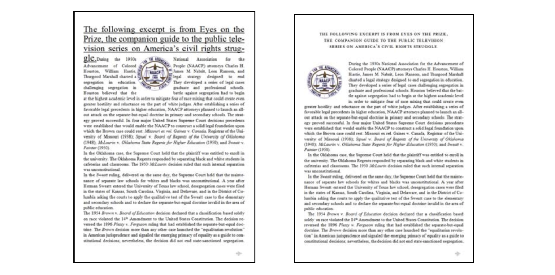
Image source: affect.media.mit.edu
The results show that readers feel sad when reading a poorly designed layout, while good layout design can make readers need less time to read and feel better when reading.
Thus, the researchers concluded that well-designed reading environments do not necessarily help readers better understand what they are reading, but they do make readers feel good.
Although there is no best font, you can have your favorite choice
It is said that text is not the first, and the same is true for fonts. Although there is no so-called best font for papers, everyone will have their own preferred choice.
A study showed that most people (32%)use Times New Roman as their default font, followed by Arial with about 10% choosing it as their default font .
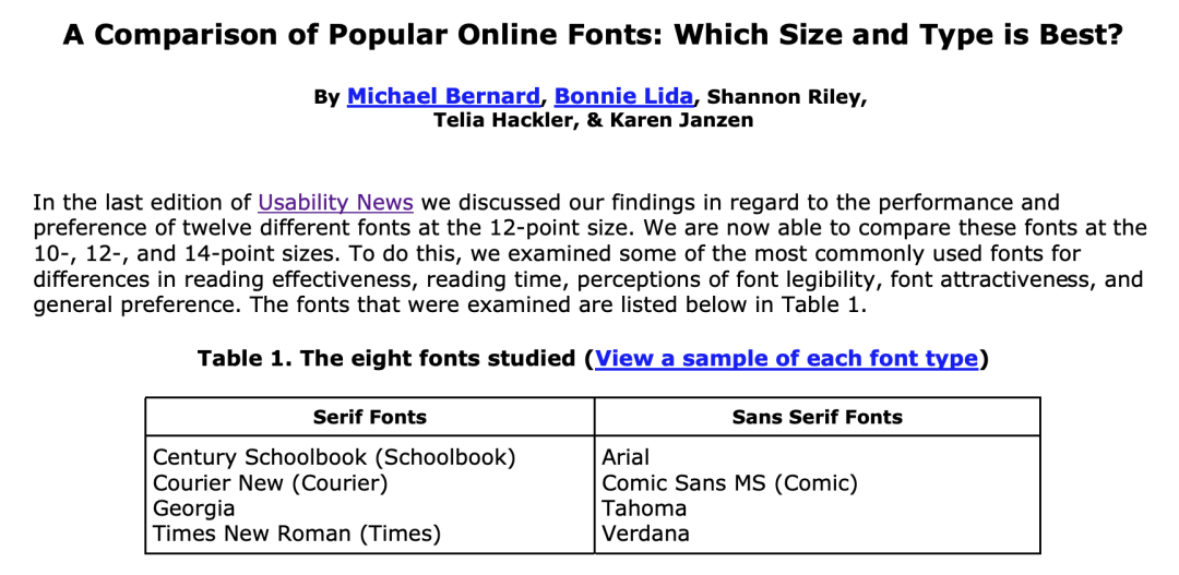
Image source: Usability News
The APA Publishing Handbook gives us some small suggestions, use serif fonts in the text, such as 12 point Times New Roman, use sans serif fonts in pictures >, such as Arial et al.
Image source: APA blog
But no matter how you choose the font, the font itself should not attract the attention of readers. After all, the reviewer or editor should pay attention to the argument of the paper, not the presentation form of the paper.
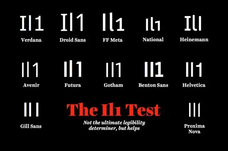
Image source: thenextweb.com
However, when you choose a font for your thesis, you should take a good look at whether it is easy to distinguish between "I", "l", and "1" in the thesis~
From Biologists
Articles are uploaded by users and are for non-commercial browsing only. Posted by: Lomu, please indicate the source: https://www.daogebangong.com/en/articles/detail/This%20Nature%20article%20tells%20you%20how%20important%20it%20is%20to%20choose%20the%20right%20font%20when%20writing%20a%20paper.html
 支付宝扫一扫
评论列表(196条)
测试