The article updated today is a way to make font design more design sense, I hope you like it! This article cites three more macroscopic methods, but there are not only these three methods. After another example, there will be a case demonstration to help everyone digest and understand.
Let’s enter the text below. There are three macroscopic methods: geometric placement, structural change, and adding latitude.
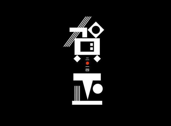
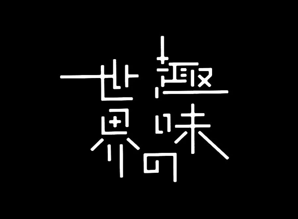
1. Geometry insertion
Although I call this method geometric placement, I don't specifically refer to geometric shapes such as triangles and circles, other shapes or symbols are also included.
Usually, the geometric placement method is to replace a certain stroke or a certain group of strokes in the font with shapes or symbols to make it look more design-like.

The word "Dream" on the right side of the picture above has been geometrically replaced with strokes to have a more design sense. Of course, the recognition has also become worse, but the "Dream" on the right side is used as the main theme of the poster. The image is more to convey a concept, so poor recognition has no effect.
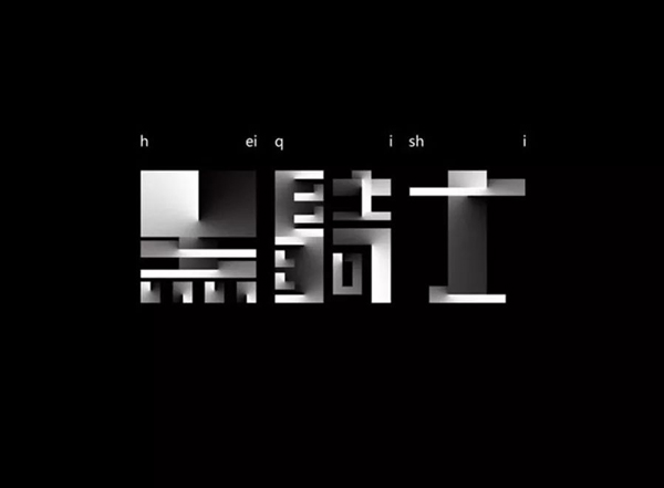
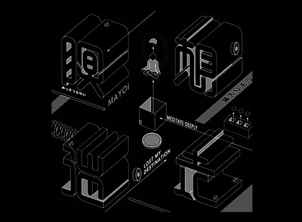
So let's take a look at the excellent works of the geometric placement method:
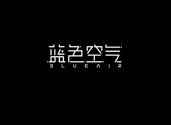
Second, structural changes
Structural change is to change the structure of the font. Simply put, it is to add and delete strokes in the font to make it more design.
Of course, the change of the structure is very difficult, if you don't master it well, you will make the font nondescript. In addition to the addition and deletion of strokes, structural changes also include changing the shape of the strokes, such as changing a dotted stroke to a vertical stroke, changing an oblique stroke to a horizontal stroke, and so on.
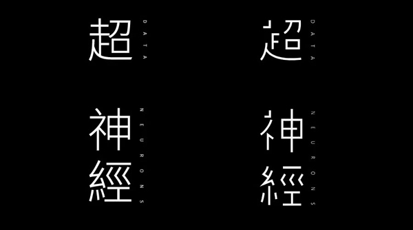
After the structure of the same font is changed, the design sense will be improved a lot.
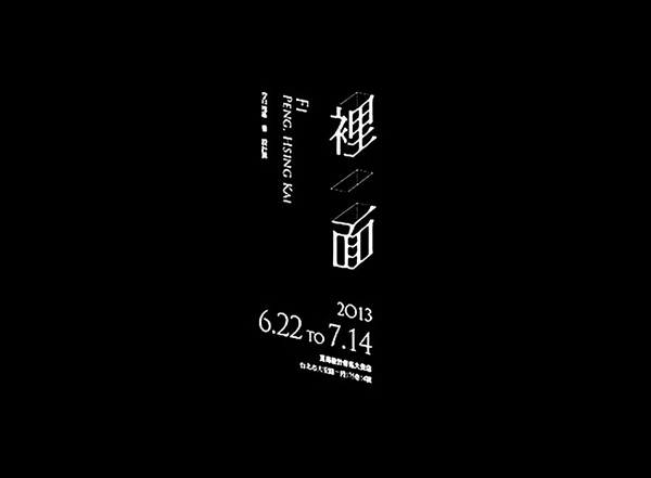
Let's take a look at the excellent works of structural change method
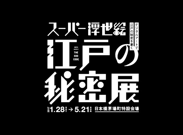
In fact, the three methods I mentioned can be used in combination. For example, the work in the above picture uses both geometric placement and structural changes. If you want, you can also add dimension changes.
3. Add latitude
The third method is to add dimensions, transforming the font from a two-dimensional plane to a three-dimensional level, adding an extra dimension to make it more spatial and three-dimensional, and converting two-dimensional to three-dimensional can also improve the sense of design.
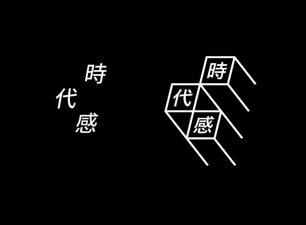
An ordinary bold font only needs to add some space lines to open up the three-dimensional effect, so as to have a more design sense.
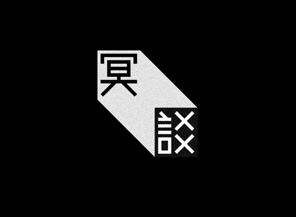
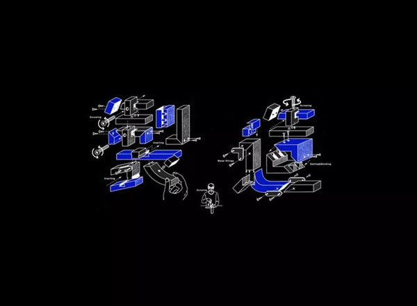
Let's take a look at the excellent works of adding dimension method
Case Design Process Demonstration
1. Geometry placement and structural changes
Because geometric insertion and structural change often appear together, they are grouped into one case for demonstration.
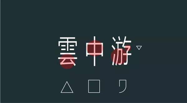
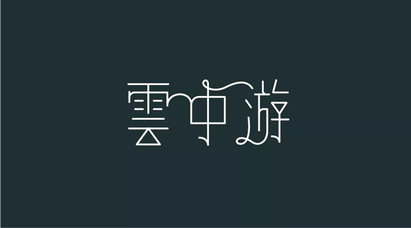
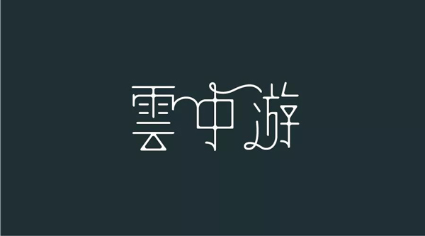
The first case is to make the three characters "Yunzhongyou", and first type the three characters in the form of fonts.

Yunzhongyou gives people a light feeling, so flat and wide fonts and even square characters express a little less temperament. On the contrary, thin and tall fonts can better express the feeling of lightness, so We slimmed down the font and loosened the spacing a bit to give it a lighter feel.

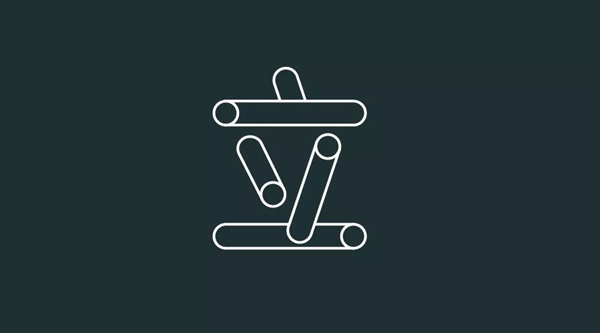
After doing this, observe the characters to see if the parts of the font can be replaced by geometric figures. The picture below shows the parts that can be replaced after observation.
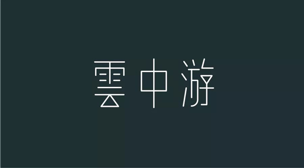
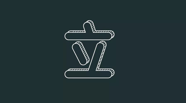
After this step, you can formally make characters. Build the skeleton of the character shape and replace it with geometric parts. The basic character shape is almost the same.
After the basic font is completed, we can use the second structure change method to process it to make it more artistic. The picture below is processed by the stroke connection method in the structure change.
It can also be chamfered where the strokes are cross-connected to make it more artistic, as follows.
2. Add latitude
It is easy to understand adding dimensions, which is to make flat things three-dimensional. So I will briefly talk about this case, taking the word "Li" as an example.

First of all, we need to build the skeleton of the font, the skeleton and structure. After finishing the structure, we can appropriately change the thickness of the stroke to a suitable size, as follows:

After adjusting the thickness of the strokes, it is necessary to add a three-dimensional feature. We can do processing at the end of the strokes, so that there is a relationship between strokes and strokes, as follows:
You can also directly add a face to the font to add a dimension, as follows
Simply speaking, any method can be used to increase the dimension, not only the two forms in this example, other methods such as adding text effects or rendering with 3D software are good choices.
Articles are uploaded by users and are for non-commercial browsing only. Posted by: Lomu, please indicate the source: https://www.daogebangong.com/en/articles/detail/These%20three%20ways%20to%20make%20your%20font%20design%20more%20design%20sense.html
 支付宝扫一扫
评论列表(196条)
测试