Hello, everyone.
Last week, a friend who worked in a hospital entered the finals of the Zhejiang Provincial Medical Case Teaching Competition. He said that the PPTs he revised last time helped him a lot. No, I have entered the finals, and there are a few PPTs that I want to help beautify again.
The following are the originals:
Not much to say, let's go directly to the beautification link.
Because it is a medical PPT, let's choose blue or light blue as the main color Color.

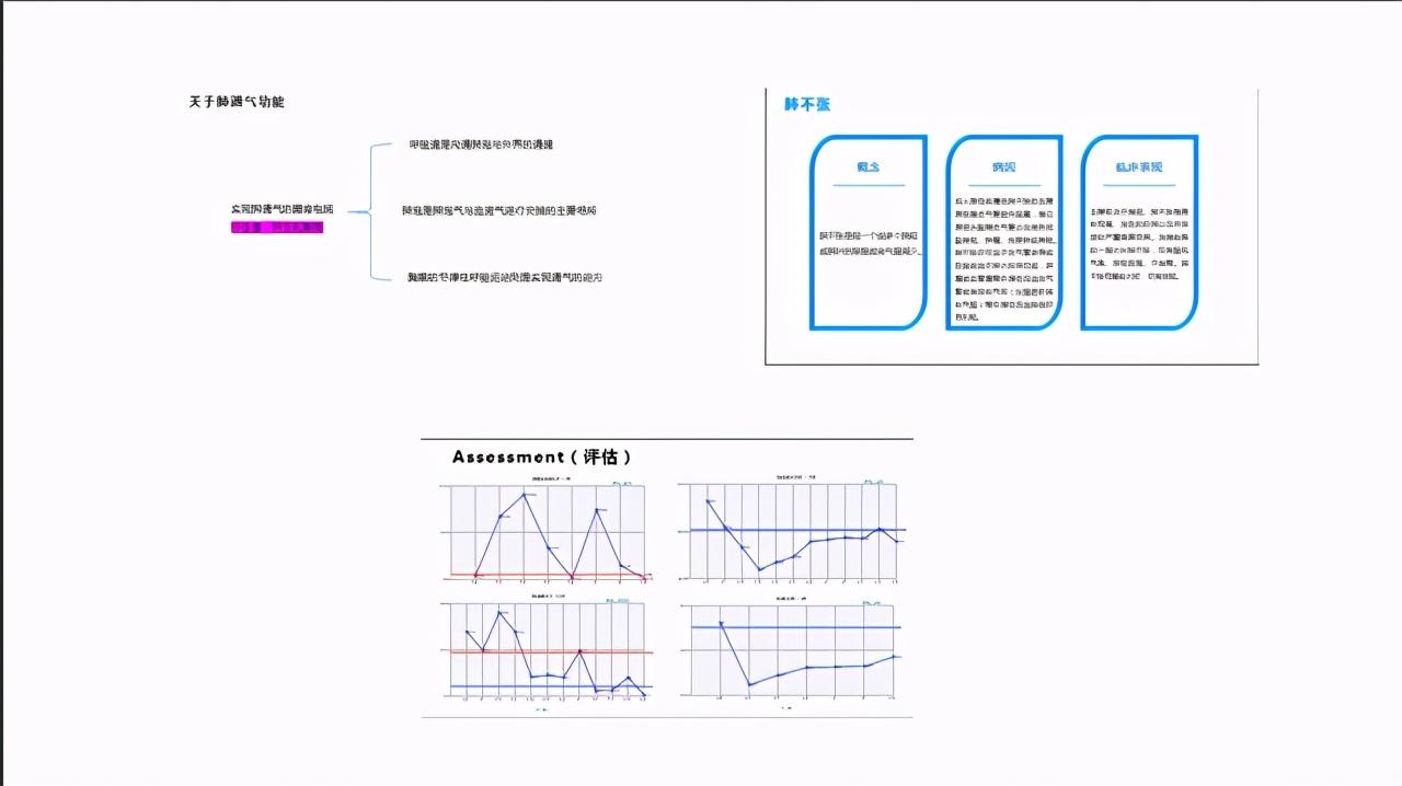
01: First

This slide is too simple, it is a typical "word version of PPT", except for a few words filled in purple, the page makes people unable to grasp any key points. A page design like this three arguments is actually very good for typesetting and beautifying.
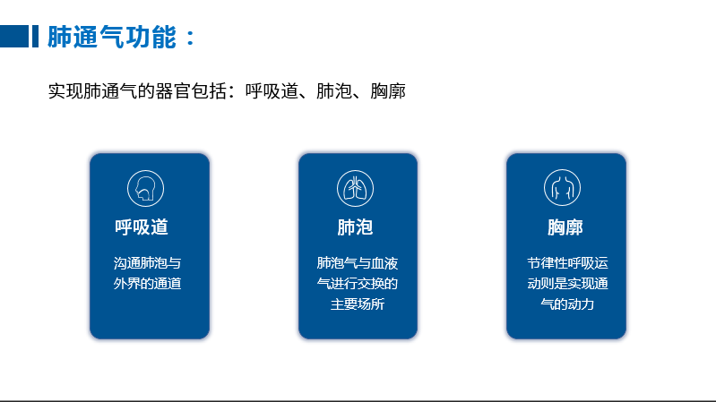
Such as: the most commonly used horizontal layout

After adding copy and icon:
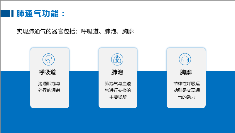
Of course, color blocks can also be used as a foil for shapes:
Or this:

The above methods are relatively conventional methods. Although there is nothing bad about them, they also lack a certain sense of novelty. Can there be a different method? The answer is of course yes.
Here's how to make it with the help of a trapezoid:

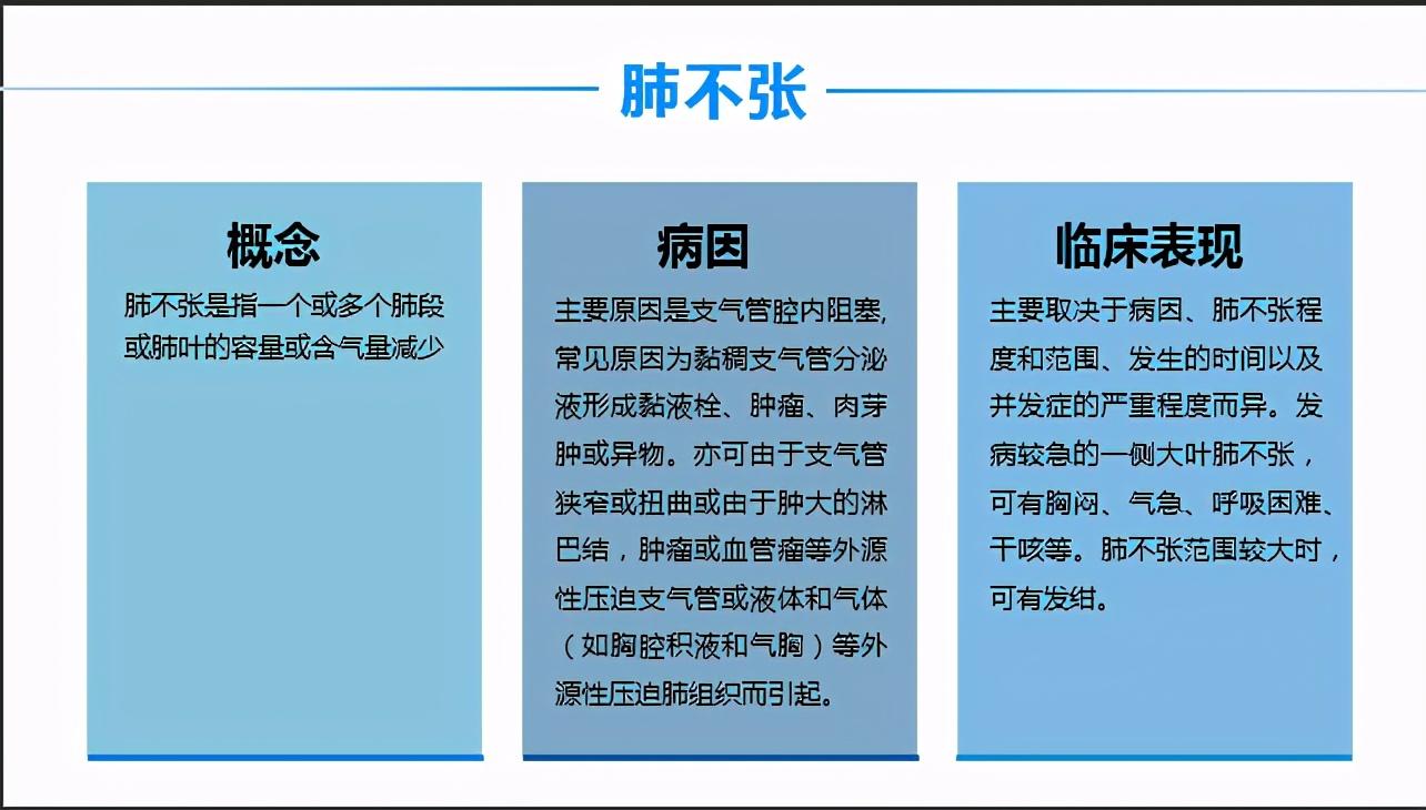
02: Second sheet:

In fact, this slide overall still meets the requirements of medical PPT (refreshing , clean), but there are also a few flaws: 1. The weight used for the shape and lines is too large, which overwhelms the "limelight" of the copywriting and shifts the visual center of gravity. 2. Because the number of words in the copy is different, the "tidy effect" is not achieved, how to solve it?
Here we use rectangles and lines.
In order to avoid too strong a sense of segmentation, you can choose light color blocks here, which is more refreshing.
If you can’t remember many details in the above typesetting, in fact, the simple text typesetting is also acceptable:

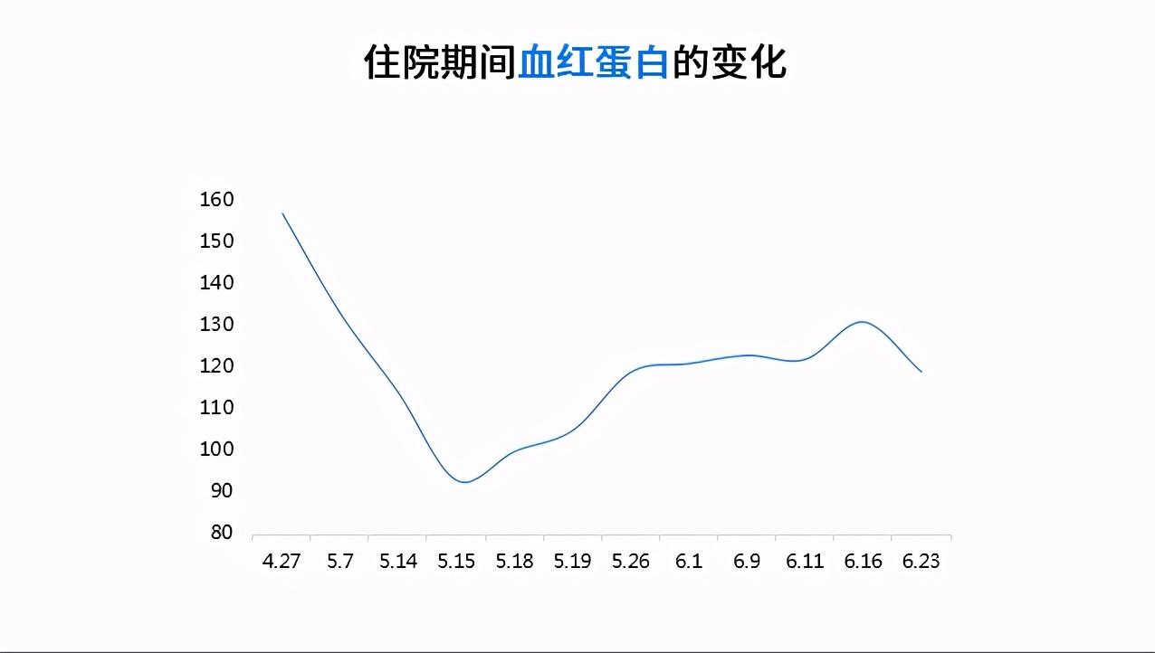
03: Third sheet:
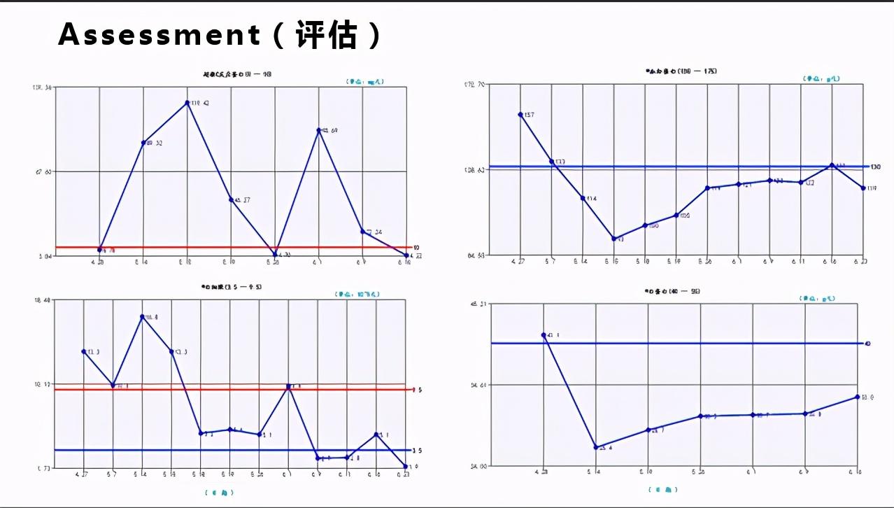
This PPT about charts, my first impression is that this broken line is too blunt. Let's take one of the tables as an example to beautify it.
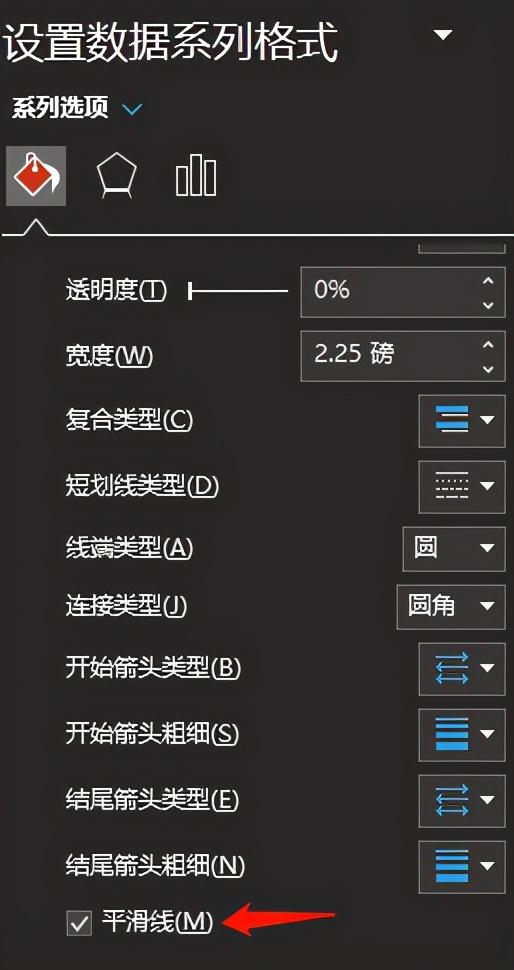
First of all, the broken line is too rigid, we can choose the curve. At the bottom of the chart series format, select Smooth Line.
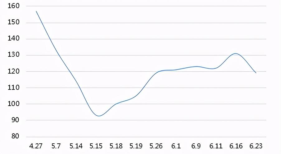
Just look at the effect: Does it look a lot better?
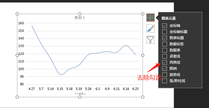
The next step is to beautify the chart, beautify the chart to follow "subtract first and then add" The principle, that is, first remove unnecessary or repetitive factors, and then add necessary factors.
The original chart already has coordinate axes, so we can delete the data labels and network lines.
Adding the title of the chart, we simply get such a chart:
Finally beautify it:
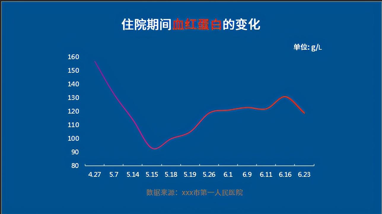
Look at the overall comparison effect:

Okay, the above is today's content, I hope you like it. If you want the source file, you can also leave a message "source file" in the comment area.
Articles are uploaded by users and are for non-commercial browsing only. Posted by: Lomu, please indicate the source: https://www.daogebangong.com/en/articles/detail/These%20medical%20PPTs%20are%20beautifully%20beautified.html
 支付宝扫一扫
评论列表(196条)
测试