When I recommended my commonly used fonts to everyone a few days ago, many readers asked me to recommend some English fonts.
No, here it comes~
English fonts in our PPT, in addition to being the carrier of information, are more of a decoration to enhance the design sense of the PPT.
Let me show you a few cases:


Is it very good? Adding some English fonts with a sense of design in the PPT is really not too good-looking.
So, what English fonts are worth recommending? I have selected a few for you.
1, Again
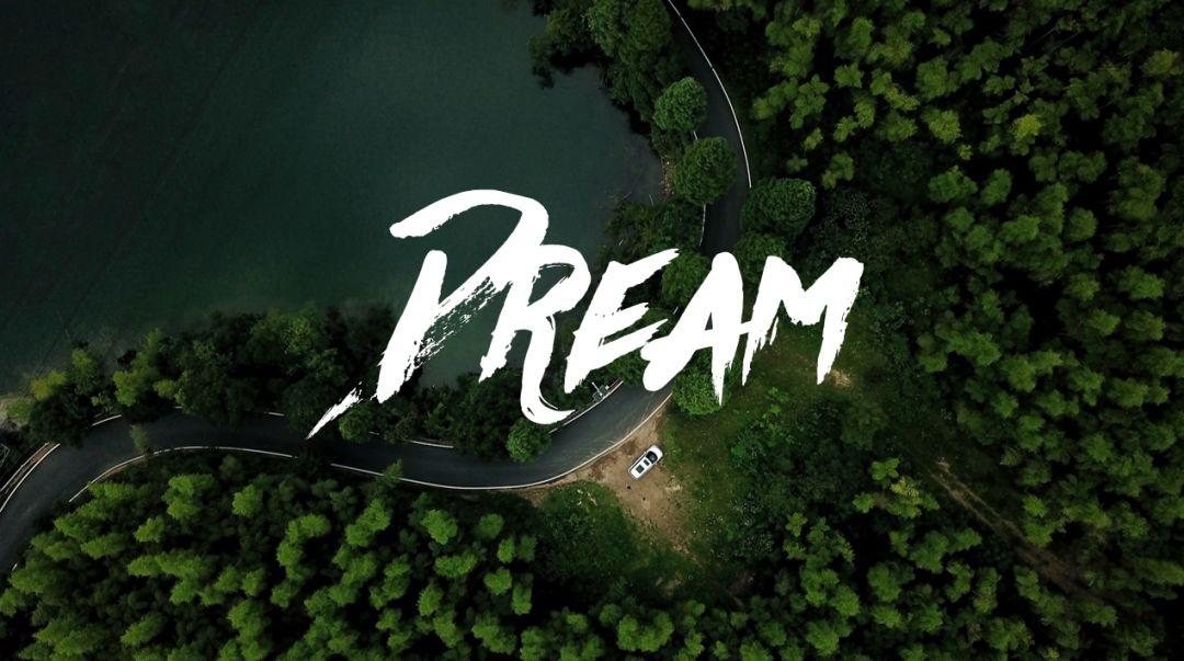
This is a calligraphy font in English, and there is a little brush effect at the end of the strokes.
On the whole, the strokes are strong and powerful, very imposing, suitable for the PPT cover.
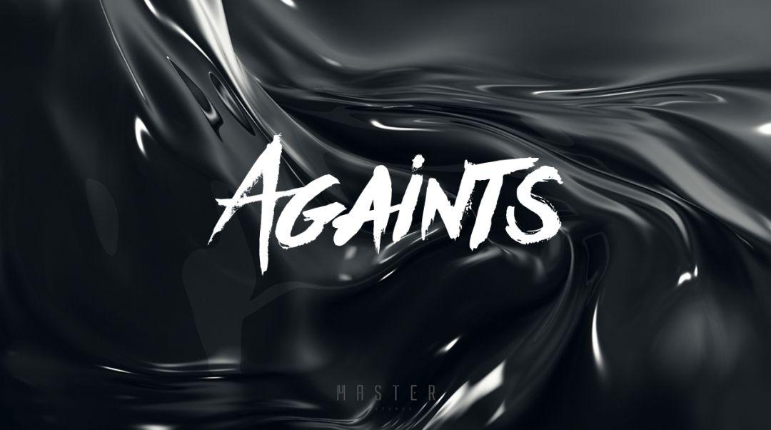
To give a simple example, typing any English word looks good.
2, Paralines
This is an English font with a unique personality and a strong sense of design. The strokes are the same as the stripes, with triple strokes.
And sharp edges and corners, a strong sense of technology.
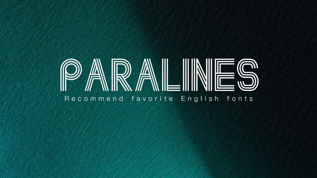
In terms of use, it can be used on cover pages or transition pages with less text.
Let's take a simple example:

3, POLYA Regular
As the name suggests, this is a poly-shaped font, which is composed of many lines and triangles, which is very distinctive.
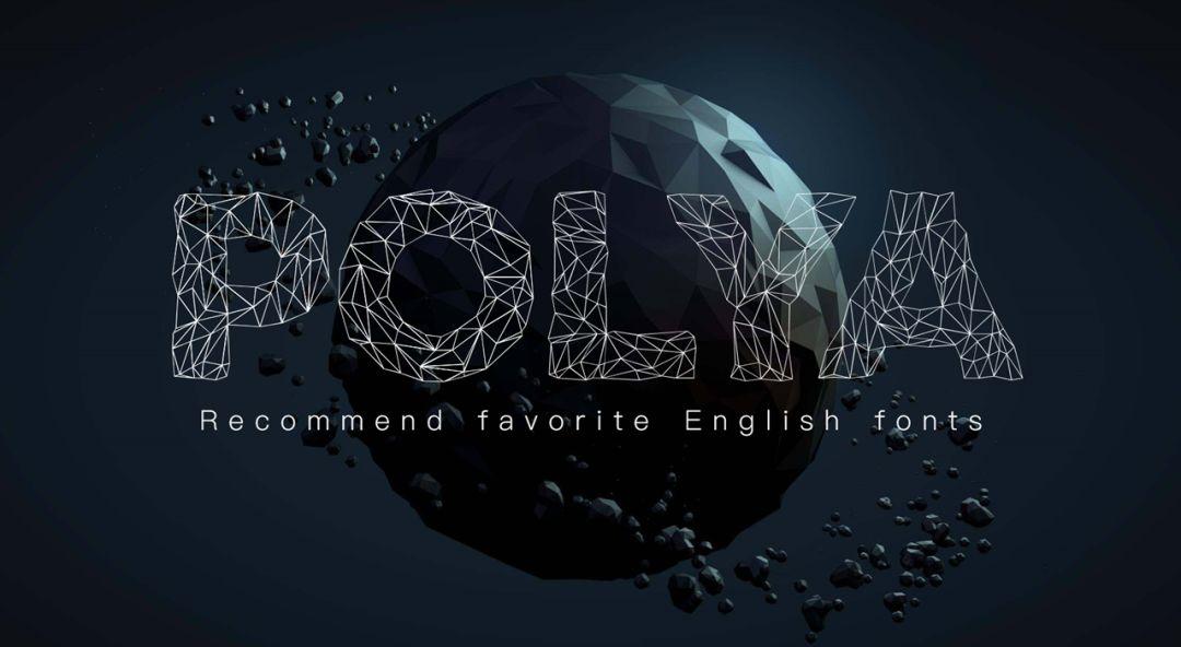
This font has a strong sense of design and is suitable for the cover.
Especially for some numbers, we use POLY font, which is very suitable.


4, Cinematografica
This is a font with very tall glyphs, allowing more letters to fit in a line of text.
And the font weight is relatively thin, which looks very refreshing, but there is no lack of design sense.

5, Bauhaus 93
This is a relatively abstract and rounded English font. The connection of the strokes is open, and there is a sense of technology.
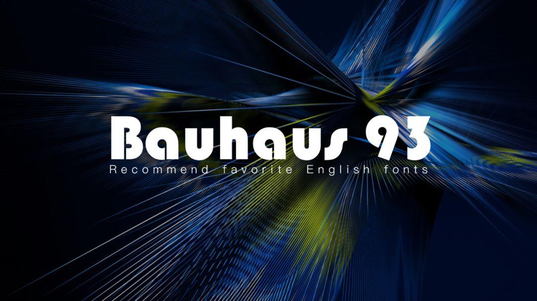
Take a simple example:

6, Gunship Shadow Ital
This font has its own outline, hollowed out in the middle, and has a slant, which has a sense of speed and power.
And it has a heavy metal atmosphere, which is a very easy-to-use English font.
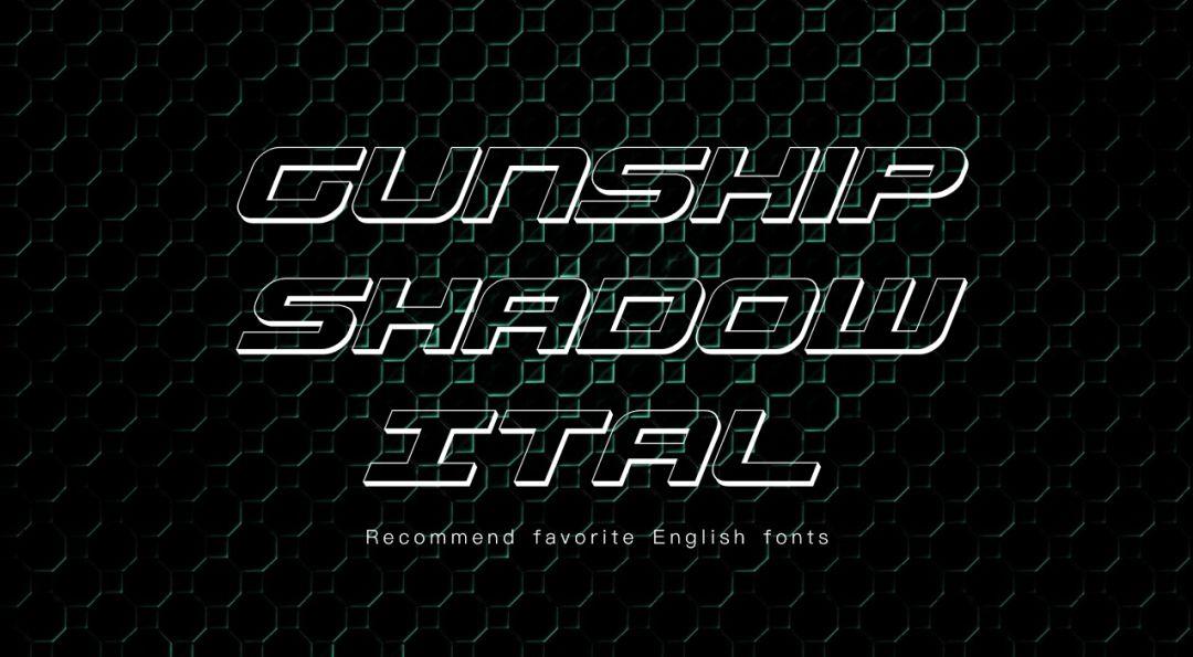
Take a simple example.
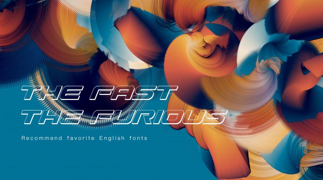
7, Asfalto
This is a special font called Asfalto, which has a strong "paint" texture.
It is suitable for use on some road pictures and wall pictures, which is very artistic.
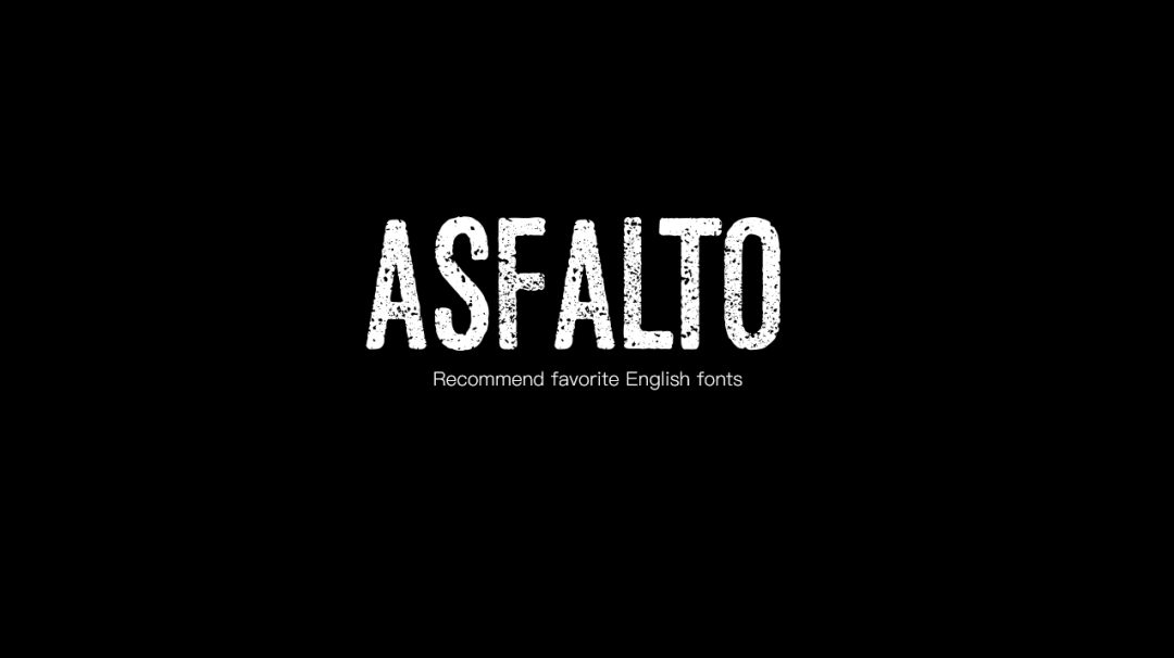
We have done some road PPTs before, and this font is very suitable.

8, BRUX
This is an English brush font, and every stroke has the texture of a calligraphy font.
The difference between this font and Againts is that every stroke of this font is correct.
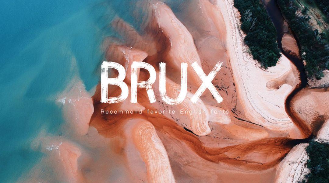
Take a simple example:
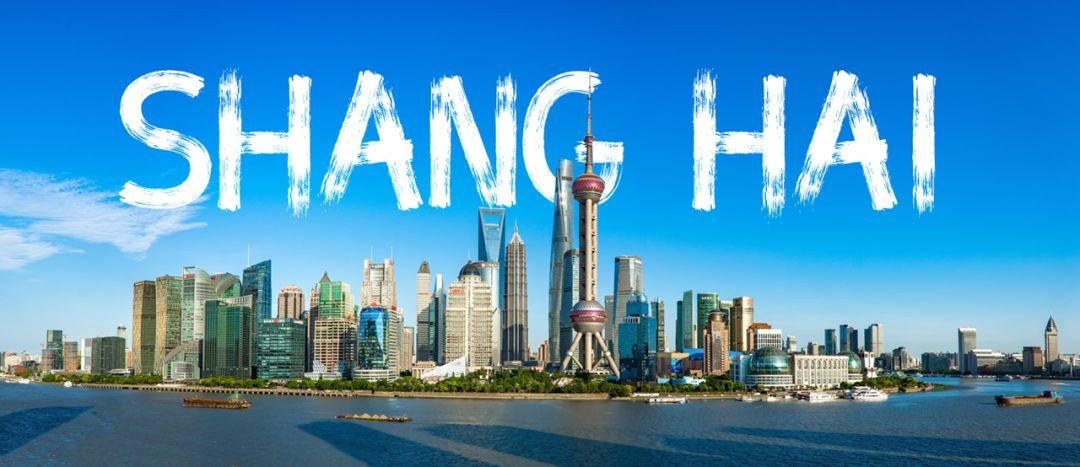
The above is the content shared with you today, I hope you like it.
Articles are uploaded by users and are for non-commercial browsing only. Posted by: Lomu, please indicate the source: https://www.daogebangong.com/en/articles/detail/These%20English%20fonts%20are%20also%20amazing%20It%20is%20very%20suitable%20for%20the%20production%20of%20PPT.html

 支付宝扫一扫
评论列表(196条)
测试