Although popular colors come and go, it is a good reference to find out what colors will be popular in the next six months, whether it is dressing yourself or designing. After the New York Fashion Week in the middle of this year, Pantone predicted the top 10 popular colors in autumn and winter based on this year's fashion trends and fashion trends.
According to Leatrice Eiseman, executive director of the Pantone Color Institute, the color trend for autumn and winter in 2017 is generally warmer, thanks to the gradual popularity of vibrant colors such as Grenadine Red and Autumn Maple . Comfortable colors are more likely to give people a sense of security in the cold autumn and winter. Among the 10 popular colors predicted by Pantone, gentle ballet shoe pink (Ballet Slipper), fresh lime gold (Golden Lime) and Bright Marina blues are such shades when paired with calm Neutral Grays, deep Deep Navy Poenys, Butterums and Aged Ports. (Tawny Port) can create stunning visual effects when combined.
These colors shined in the fashion week, and to some extent, they also proved their outstanding value in design. Next, it depends on how you use these colors in your design.
Grenadine
Pantone Shade: 17-1558
RGB: 218 65 61
HEX: DA413D
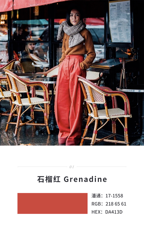
The dynamic garnet red not only makes the whole design more energetic, but also brings uplifting emotions and conveys a more confident feeling. Compared with pink, pomegranate red is more sexy and atmospheric, and more calm and comfortable than bright red.
Old Port Brown Tawny Port
Pantone shade: 19-1725
RGB: 92 44 53
HEX: 5C2C35
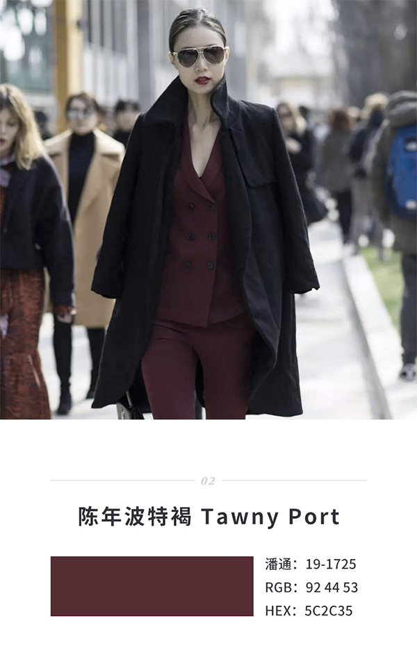
Aged port brown is undoubtedly a color named after wine, deeper than wine red, low-key, gloomy and flavorful. Using this brown color in your design can create a retro and calm feeling. As a background and light-colored elements, it can make the foreground content stand out, with good readability and recognition.
Ballet Slipper
Pantone shade: 13-2808
RGB: 235 206 213
HEX: EBCED5
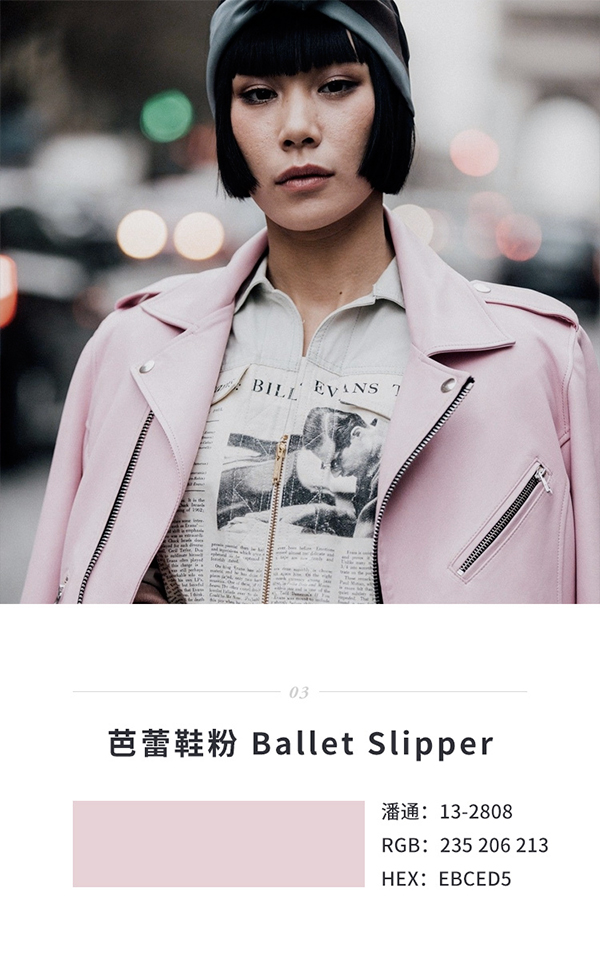
In recent years, shades of pink have been at the forefront of fashion. This ballet shoe pink is a bit heavier than the previous popular pinks, sweet but not greasy, just right. Ballet shoe powder can be used as a good carrier in the design to create an atmosphere.
Cream Rum Brown Butterum
Pantone shade: 16-1341
RGB: 198 143 101
HEX: C68F65
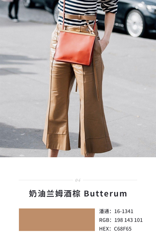
This color is also named after wine, and the name sounds very warm. The classic brown is not only suitable for the autumn and winter scenery, but also classic and elegant in tone.
Dark Peony Blue Navy Peony
Pantone shade: 19-4029
RGB: 34 58 94
HEX: 223A5E
As blue is far ahead in various researches, it will definitely appear in the list of popular colors. Deep peony blue has a deep tone and outstanding temperament. It is definitely a calming color. Using deep peony blue in the design can create a calm and elegant atmosphere.
Neutral Gray
Pantone shade: 17-4402
RGB: 142 145 143
HEX: 8E918F
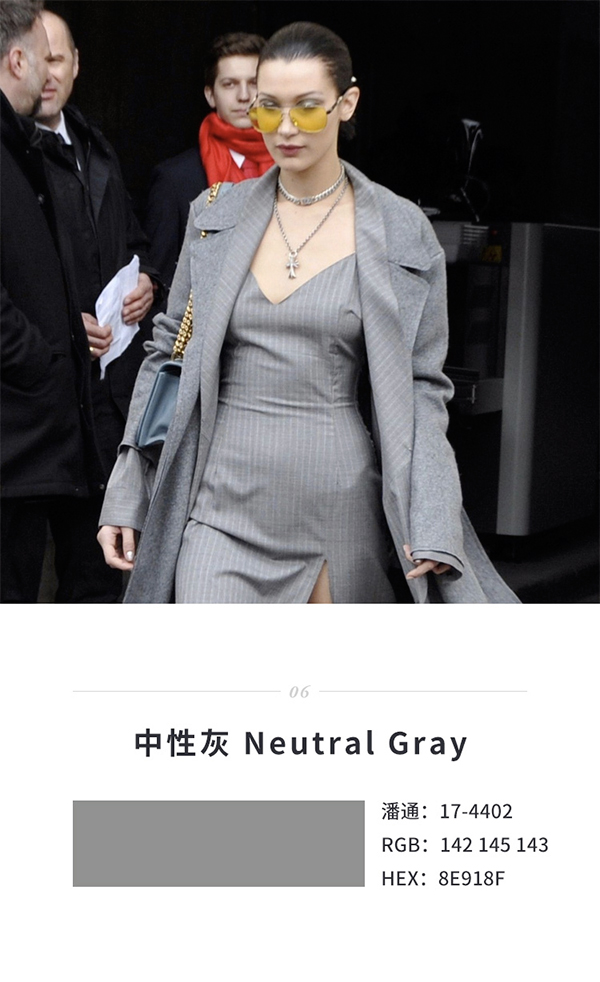
Black, white and gray are timeless classics, and neutral gray has been a frequent visitor to major shows in recent years. In design, neutral gray is often used to emphasize temperament and create an elegant and modern atmosphere.
Shaded Spruce
Pantone Shade: 19-4524
RGB: 0 88 94
HEX: 00585E
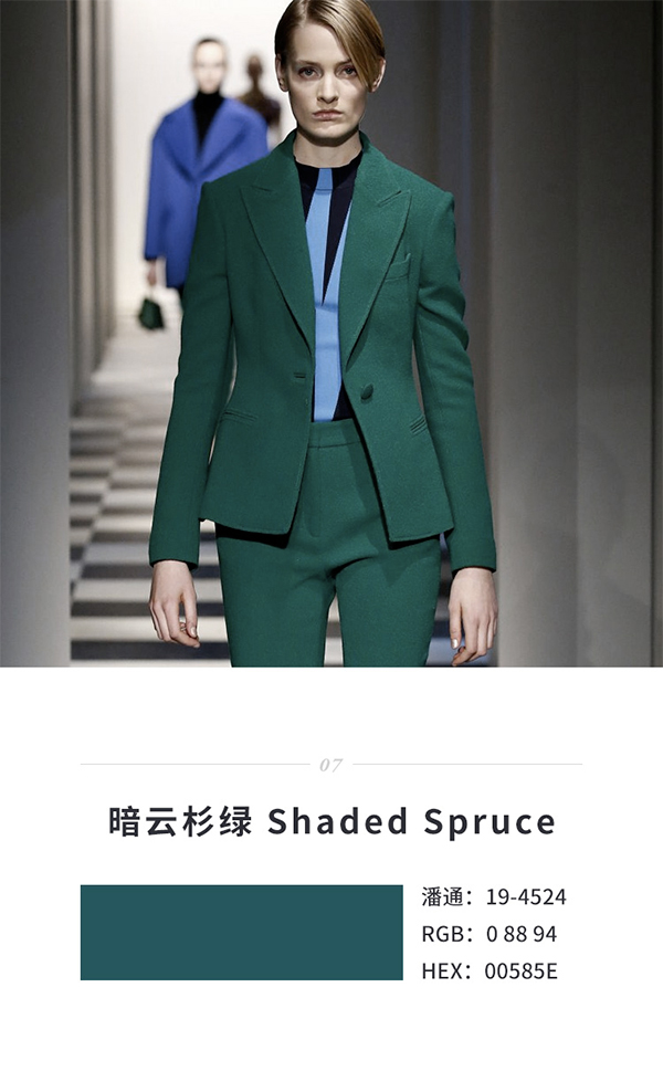
Compared with grass green, dark spruce green does not have such a strong neutral temperament, but it is very close to Mars green, full of vitality and fashion sense.
Golden Lime
Pantone shade: 16-0543
RGB: 154 151 56
HEX: 9A9738

The trend color of 2017 is vegetation green, and the most popular color in the world is Mars green. It is not surprising that lime gold appears among the autumn and winter fashion colors. The lime green between the vegetation green and the yellow green is more elegant, the color saturation is higher, and it is full of vitality. Similar to other greens, it has good compatibility with other colors.

Marina Blue
Pantone shade: 17-4041
RGB: 79 132 196
HEX: 4F84C4
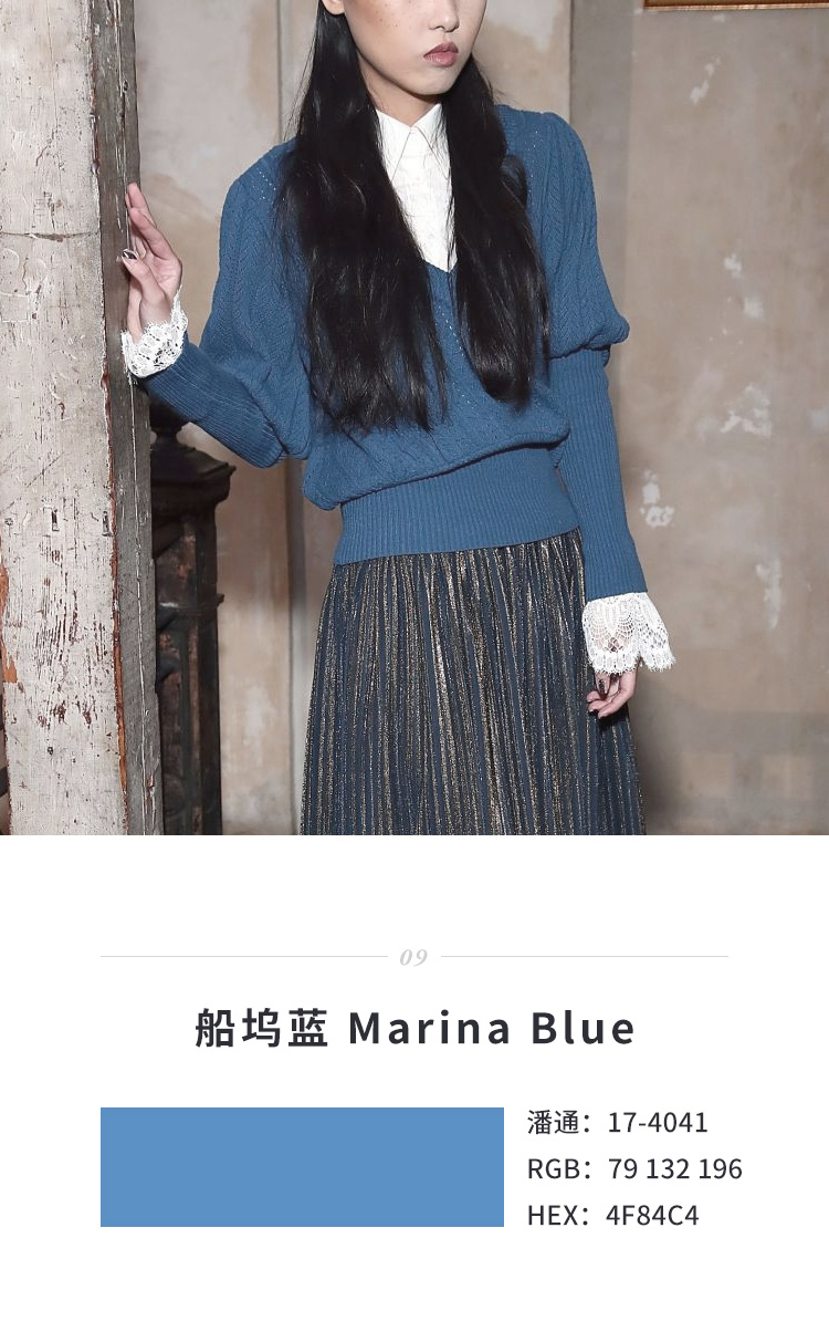
The cold dock blue is elegant and quiet, and the blue contains gray tones, giving people a calm and natural feeling. The saturation of dock blue is not high, and it is neutral. When it comes to color matching, it is very compatible.
Autumn Maple
Pantone shade: 17-1145
RGB: 196 98 21
HEX: C46215
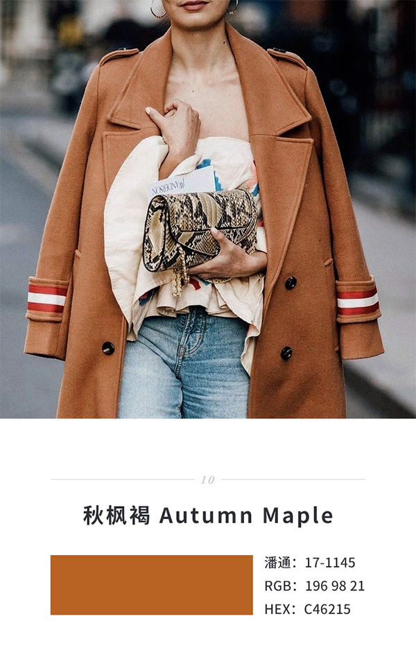
Of course, autumn and winter don’t have to be calm all the time. If you want to be more lively, this autumn maple brown is definitely eye-catching. It is also a warm tone, and the autumn maple brown is more bold and lively than the previous brown, which is enough to add a ray of fiery emotion to the cold season.
Articles are uploaded by users and are for non-commercial browsing only. Posted by: Lomu, please indicate the source: https://www.daogebangong.com/en/articles/detail/These%2010%20colors%20are%20Pantones%20forecasted%202017%20autumn%20and%20winter%20popular%20colors.html
 支付宝扫一扫
评论列表(196条)
测试