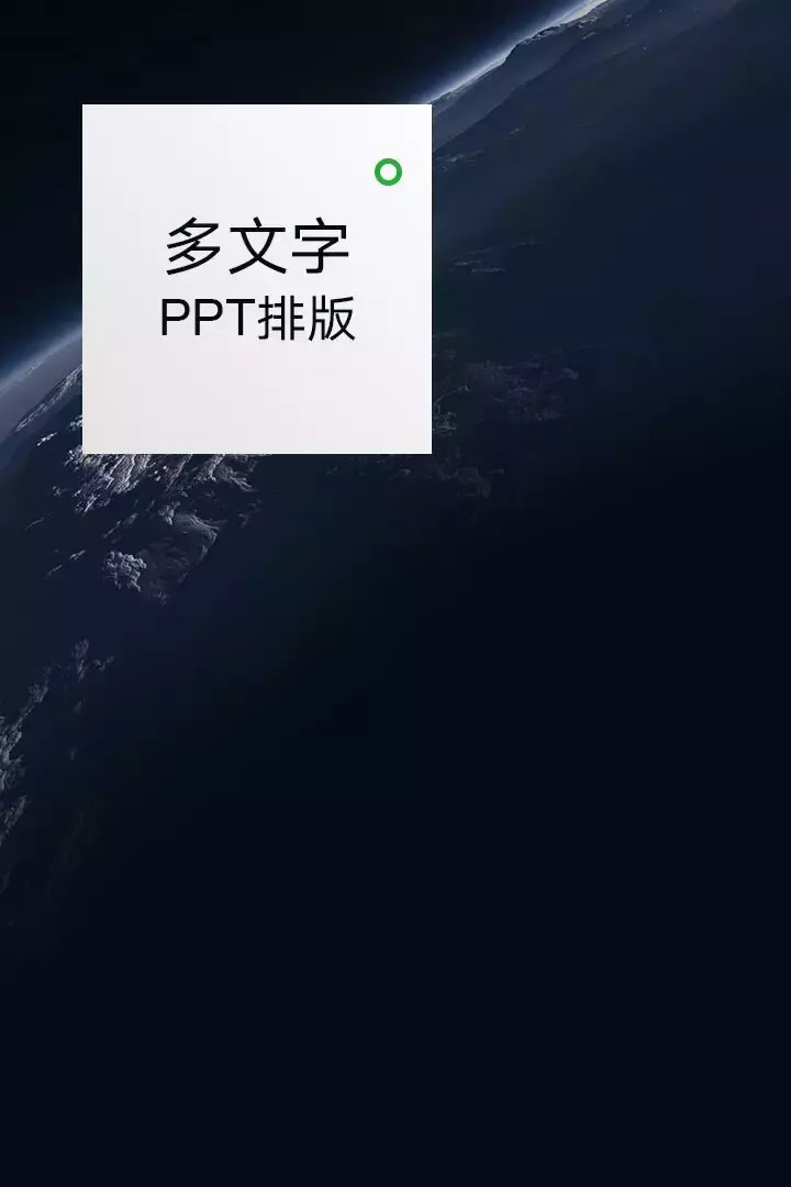
In the previous article, I have taught you how to make an excellent PPT cover:

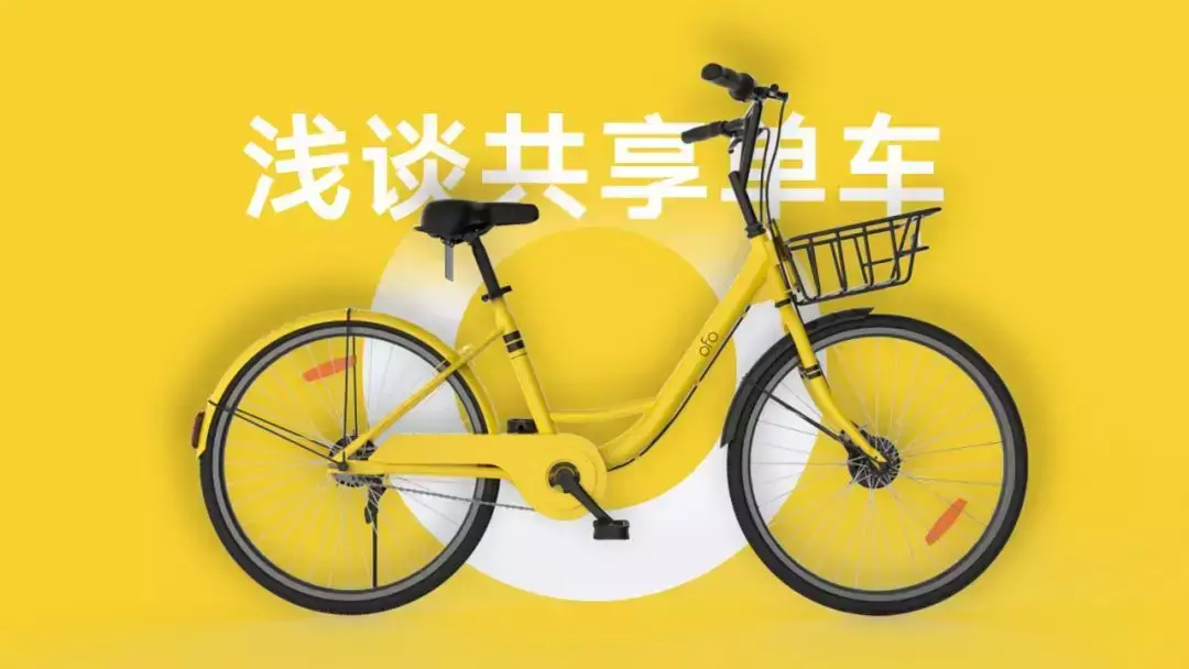
There is also a PPT page for logical diagrams:

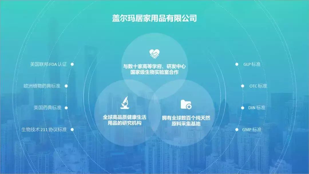
However, there are always some readers who are comparable to justify, private messages saying, these are too simple, do you dare to do a PPT with a lot of text?
But what I want to say is, do you think this kind of justify method can justify me? Ha ha, don't say it, it really excites me...
So, in this article, I will teach you how to handle PPT pages with a lot of text. Well, without further ado, let’s get right to the point.
Case 1
Let's take this as an example:
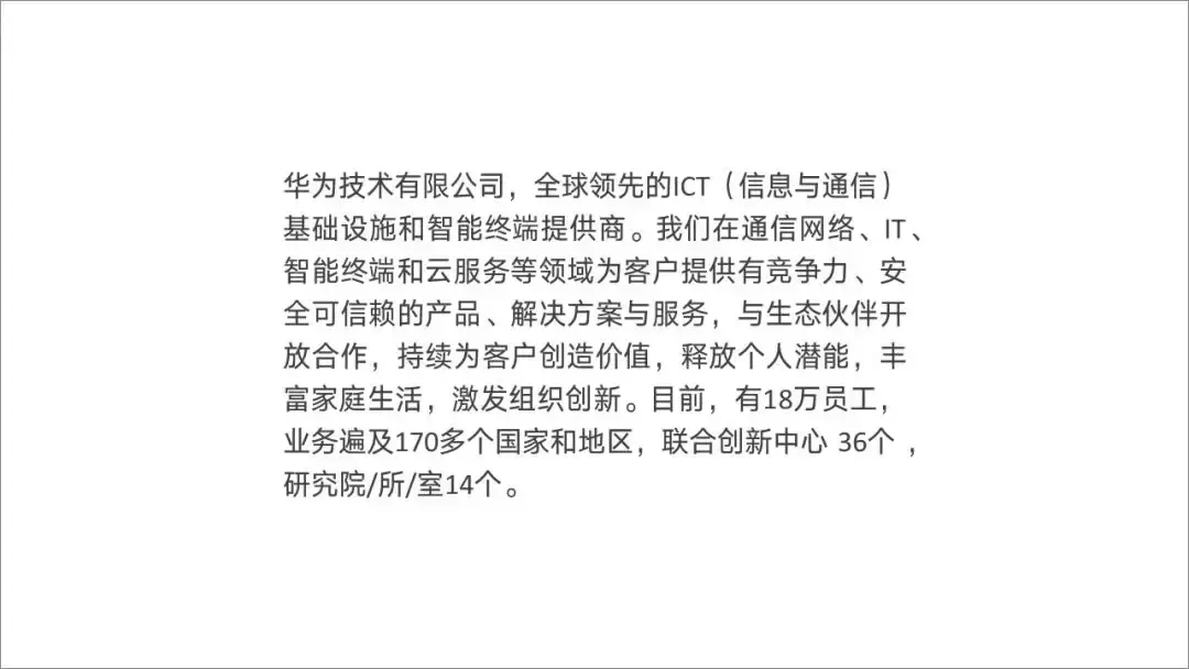
When we see a page of pure text ppt, it can actually be divided into 4 steps, namely:

Among them, the second step and the third step are generally carried out together, so in the dismantling of the following steps, it is good for everyone to understand.
Okay, let's go step by step.

First step
Find material
The content of this page is Huawei's company introduction, so in order to make the page look less monotonous, you can find some Huawei-related materials. The best place is on the official website .
I randomly found some:

Second & third steps
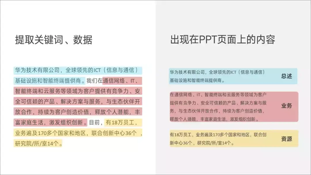
When combing the hierarchy, carry out information extraction
Obviously, this content is divided into 3 parts, one is a general overview of what the company does, the other is what you are doing specifically, and the third is what resources you have.
I will use different colors to distinguish them, so that everyone can understand:
Step 4
Match layout
Because the page element contains a picture + 3 paragraphs of content, we can choose the horizontal version or the vertical version, just choose one of them:
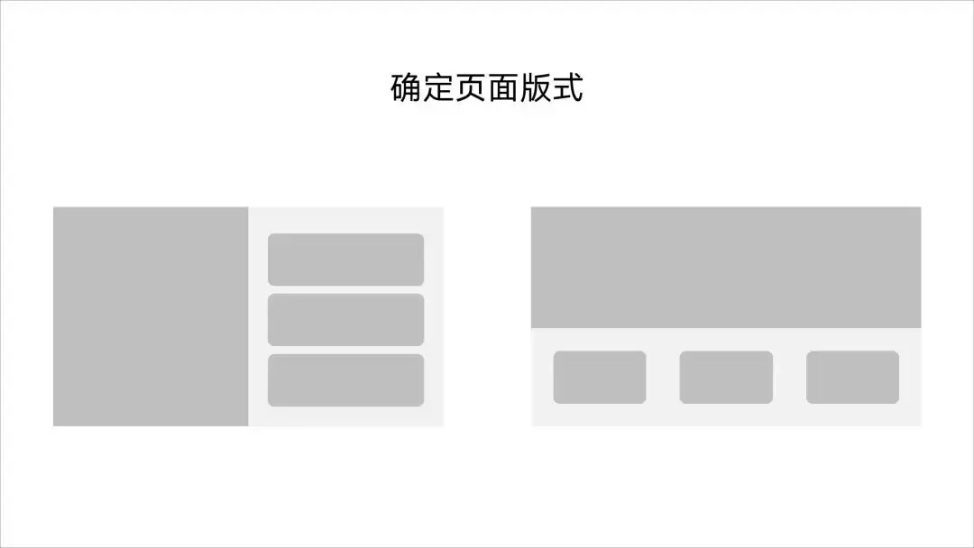
If we choose the vertical version, we fill in the content first, and it can be made like this:
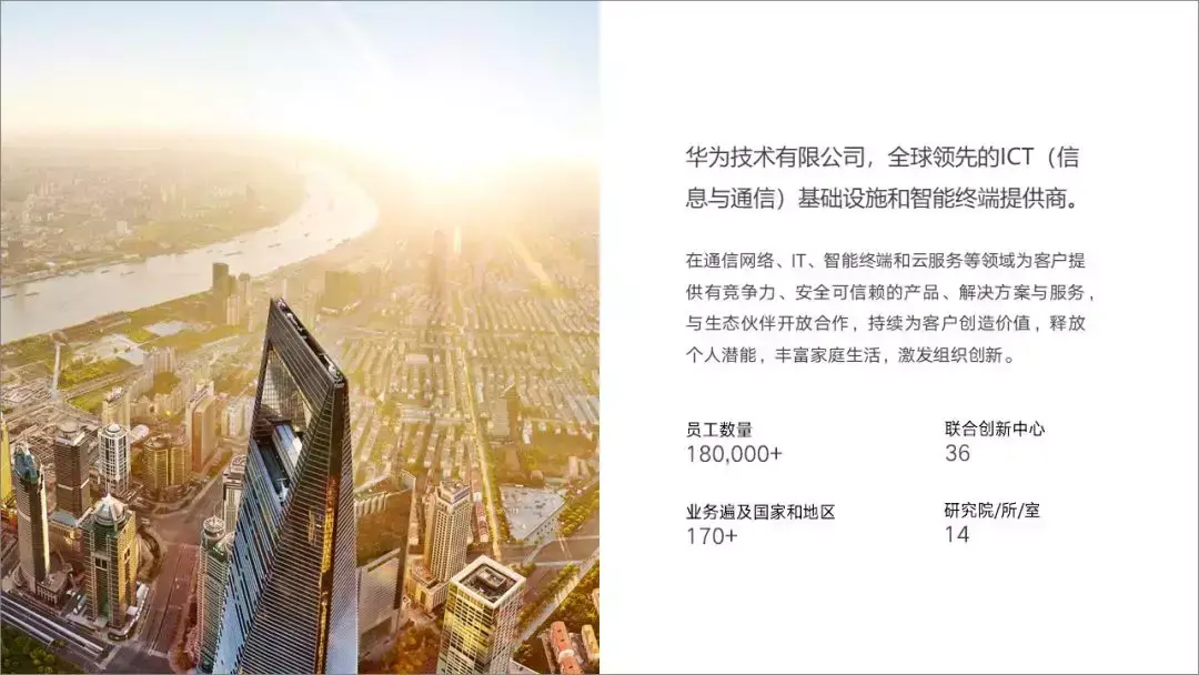
Although it is much clearer than the original text, some key points have not been highlighted, so we can further optimize the content based on the hierarchical relationship of the content .
We can do this:

Is it much clearer?
Case 2:
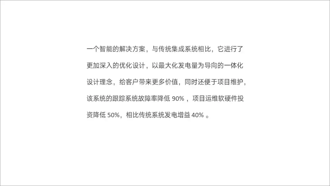
This time we will take such a page, the leader told you that he is going to give a speech:
We still continue to optimize the 4-step method:

First step
Find material
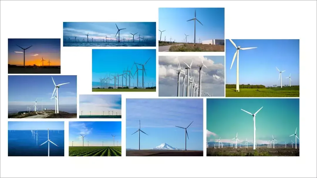
From the content, it can be seen that this is a project related to new energy power generation, so we can find some relevant materials:
Step 2&3
When combing the hierarchy, carry out information extraction
Because this is used by leaders to give speeches, some written language needs to be screened out. As for the method of information extraction, I personally prefer to carry out in the form of opinions and arguments.
For example, like this page:
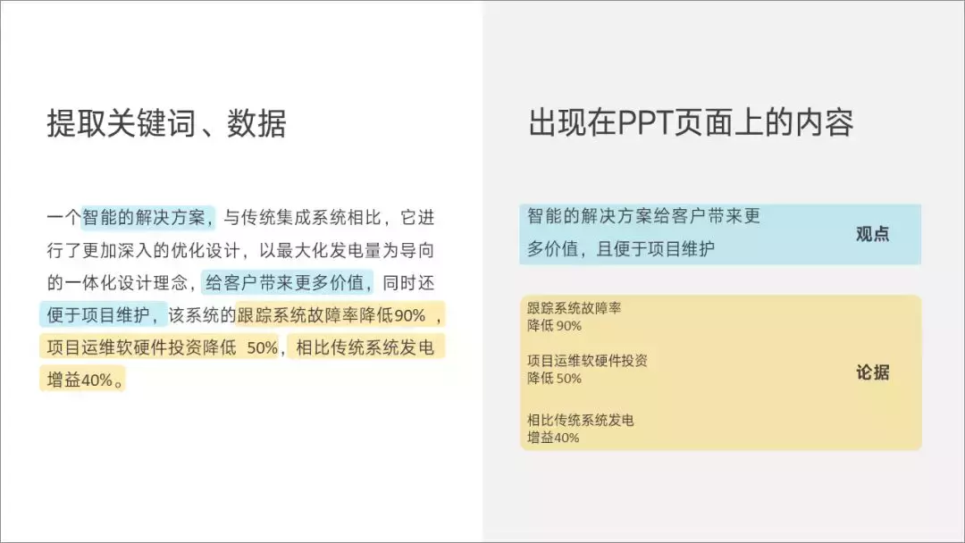
The argument is that the solution can bring value to customers, how to prove it? Some data-based arguments are needed to support it. do you understand?
Step 4
Match layout
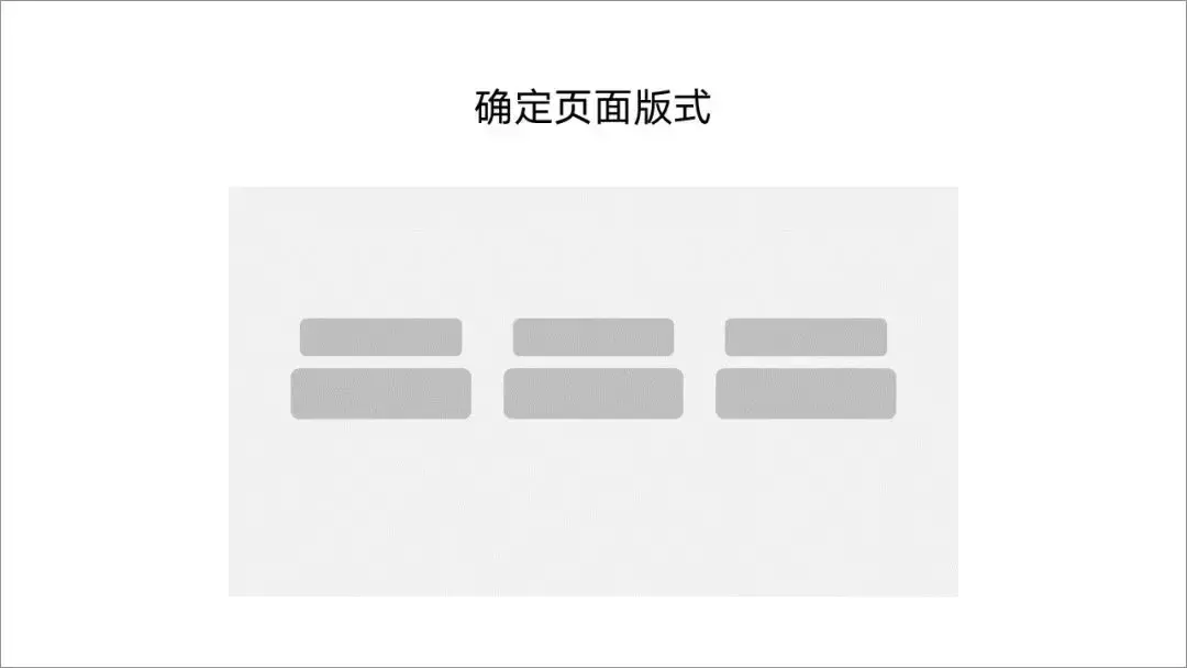
It is obvious here, the content of the page is a title + 3 arguments, you can consider choosing such a layout:
Let's fill in the text content, and it can be made like this:
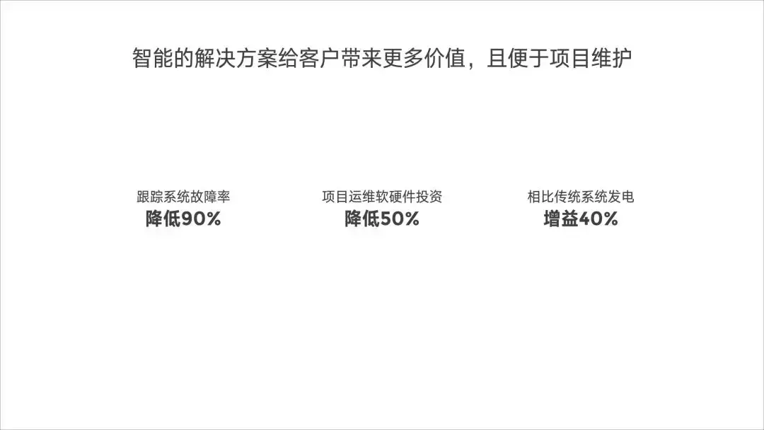
But obviously, the page is too monotonous, right? Moreover, there is a lack of scene sense related to new energy power generation, so we can consider adding a background image:
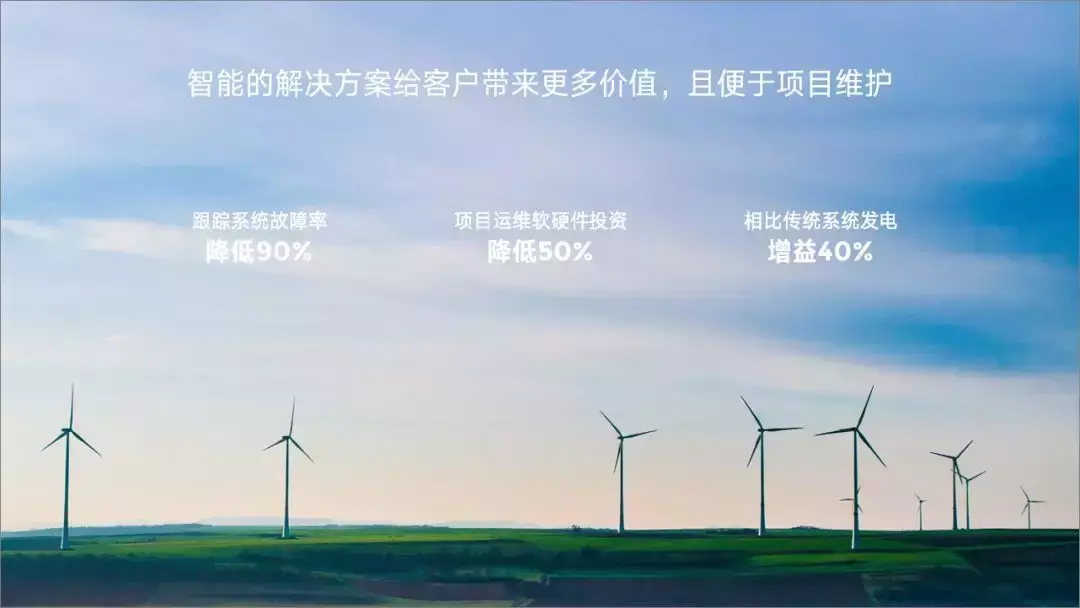
Seems a little better, right?
However, the color of the background picture is close to the color of the text, and the contrast is small. Therefore, in order not to affect the reading of the text, we can add a layer of blue to the background picture color gradient mask, like this:
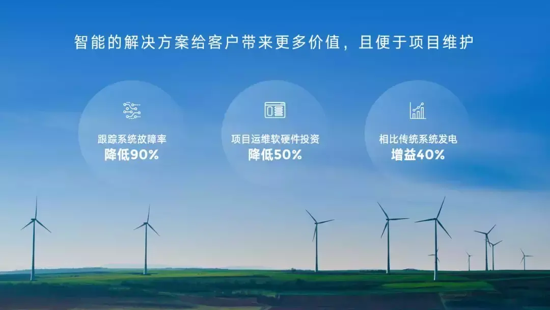
Not bad! ?
Do you understand? When we encounter a PPT with a lot of text next time, don't panic, just follow these 4 steps.

I believe that each of us can make a super Nice typography.
That's it, welcome to continue to message me!
If you want to learn more about PPT skills, click on my avatar and go to the homepage to browse past articles.
Finally, I specially prepared a PPT welfare resource for you, which contains:
60-page common PPT layout manual;
85-page original PPT design case manual;
45 pages of PPT learning courseware;
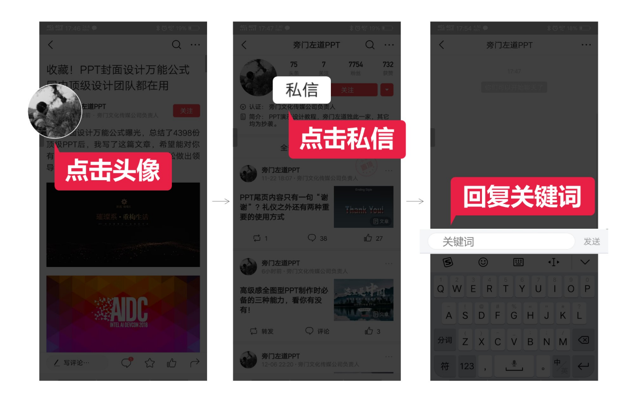
How to get it: Click on my profile picture, find the private message on the right side of the profile picture, and reply to [Welfare].
Articles are uploaded by users and are for non-commercial browsing only. Posted by: Lomu, please indicate the source: https://www.daogebangong.com/en/articles/detail/There%20are%20too%20many%20texts%20on%20the%20PPT%20page%20and%20the%20leader%20still%20wont%20let%20you%20delete%20it%204%20steps%20to%20teach%20you%20to%20get%20it%20done.html

 支付宝扫一扫
评论列表(196条)
测试