< span > This article is reproduced from Lu Junyi_Design Site, and a small part is added by Hiiibrnad. Original post by Dom Carter.
Font Details Video
Thanks to its clean and straightforward design, Helvetica is one of the most ubiquitous fonts on the planet. This Swiss style typeface was originally created by Max Miedinger< and Eduard Hoffmann Created in 1957 and performed in past time Several revisions have been made to make the design more capable of presenting its design motivation to achieve better performance. Yesterday, Helvetica was released professionally recast by Monotype, ready for the demands of the 21st century.
Helvetica Now is the successor to 1982< span class='Apple-converted-space'> Neue Helvetica The first update since its release, it took a total of 4 years All done with meticulous redrawing of every character. With legibility as the focus of design, Helvetica Now is designed to solve the challenges of branding in modern society and adapt to the needs of the digital age.
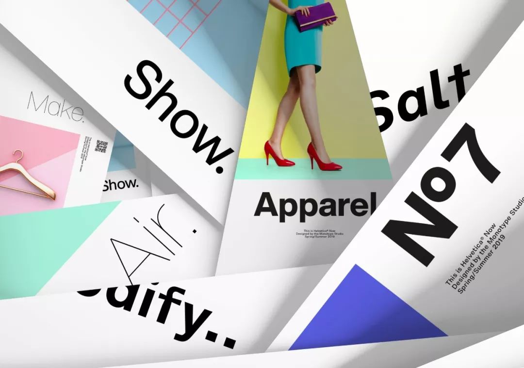
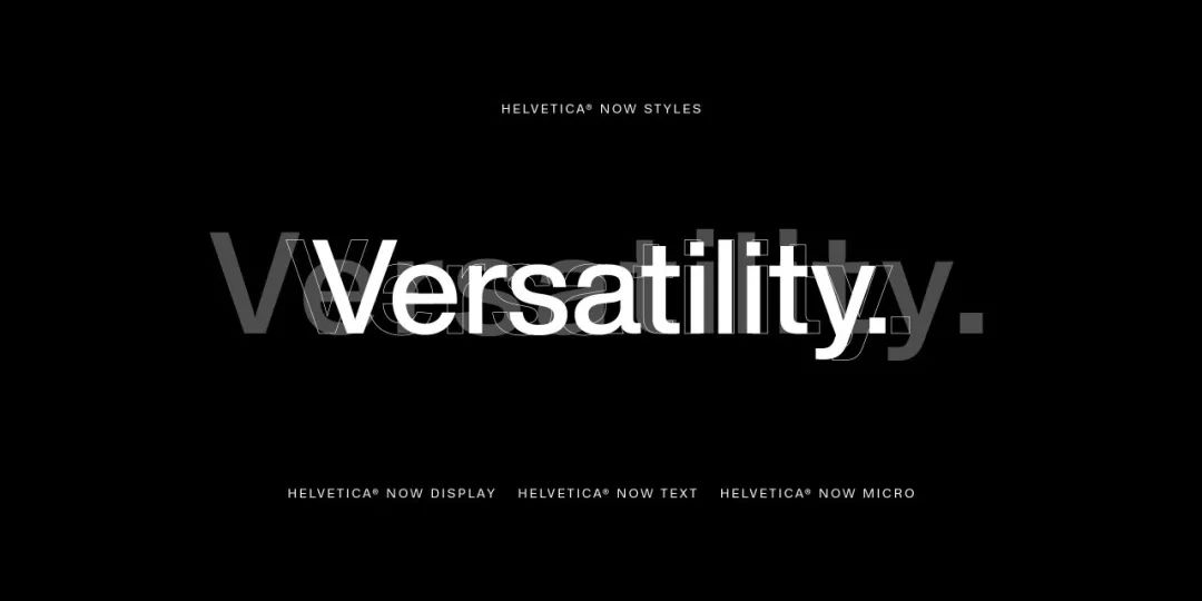
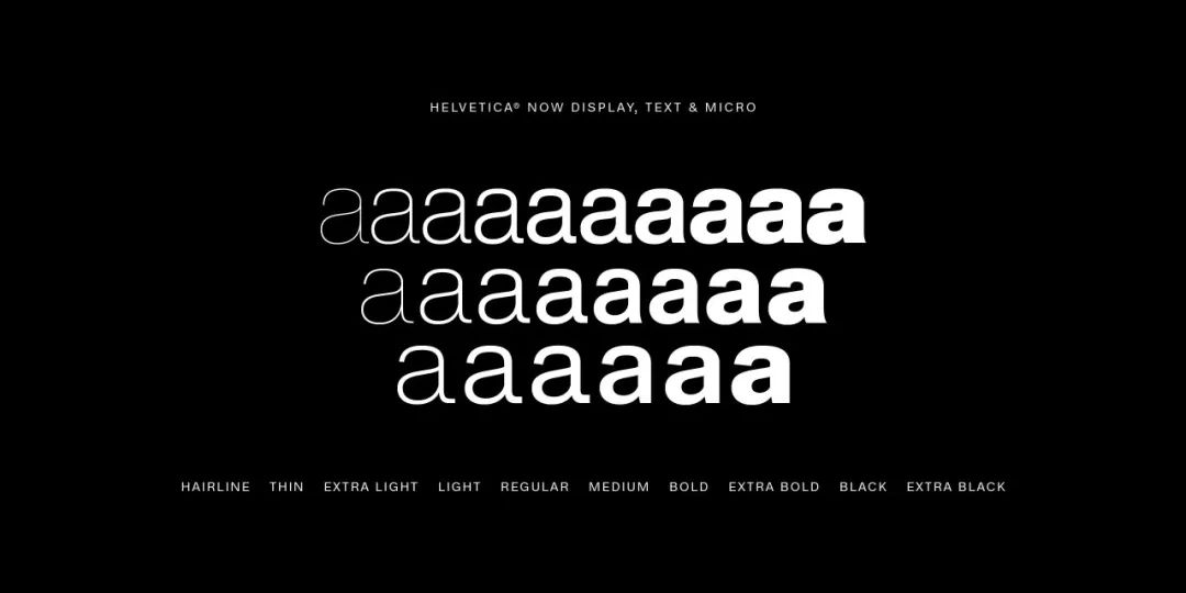
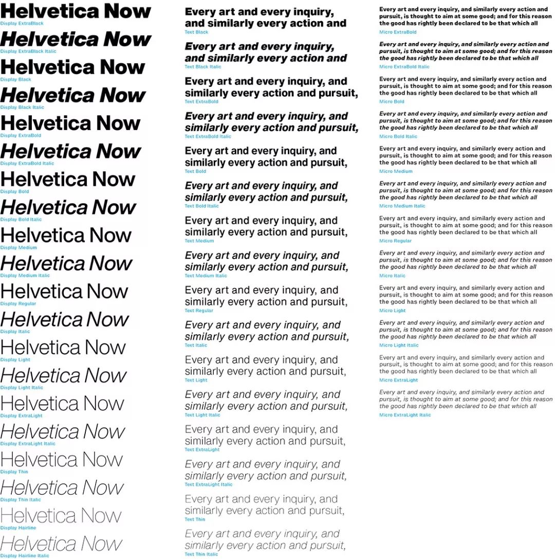
The brand-new Helvetica Now family consists of 48 fonts and is divided into 3 visual scales, Helvetica Now has designed character curves and character curves for each different visual scale Spatial relationships, just as "variable fonts" provide type designers with more options, Helvetica Now has helpful alternate characters that canhelp graphic designers deal with branding in modern society. Challenges posed.
Type Design Director at Monotype Charles Nix Said: "Today, we ask Helvetica to do a lot of work that it never had to do before. The previous version of the font was not designed to be used in graphics applications developed in the past 30 years, so the old version can no longer meet Many important situations in the design application."
“Helvetica Now addresses the legibility and style challenges that brands have faced over the years, knowingly or not, this time in the A whole new chapter has been added to Helvetica's story—expanding its appearance and utility while reviving its treasured legacy.
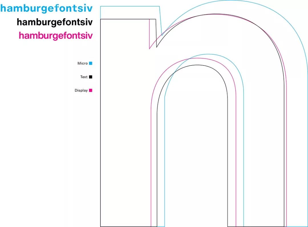
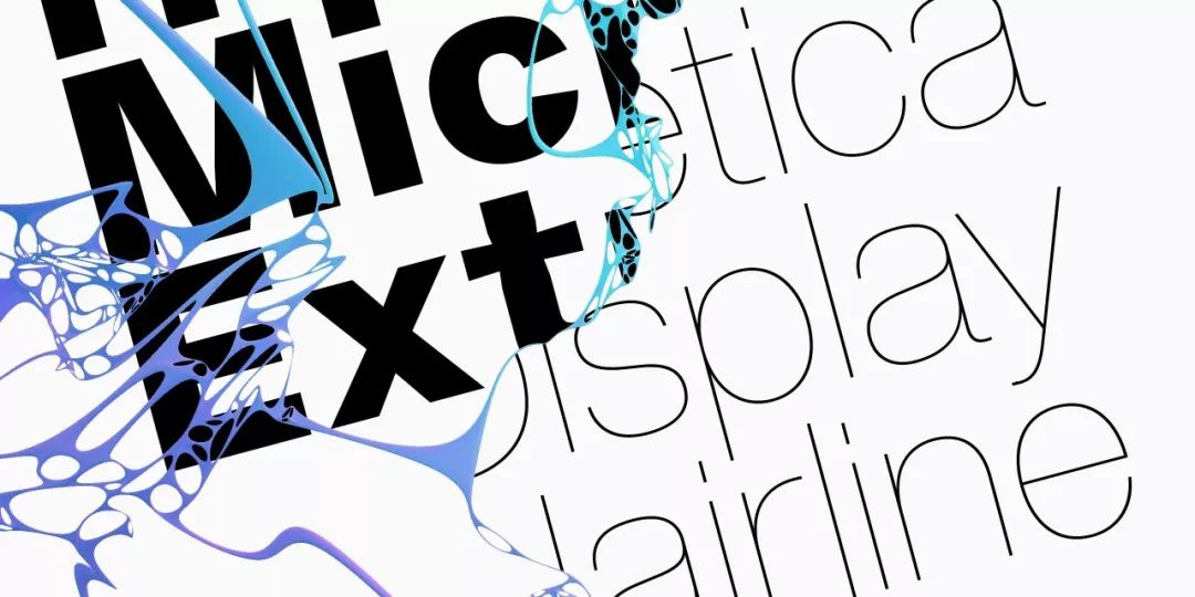
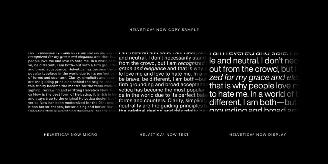
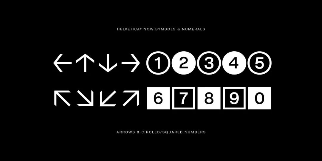
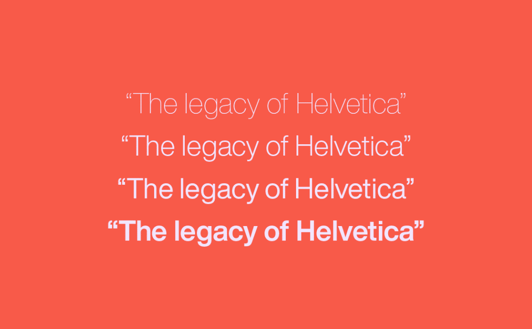
Helvetica Now divides the new font into three different visual scales: Micro (small size), Text (printing) and Display (digital display), which solves Helvetica’s ever-existing kerning and Legibility issues! For example: Helvetica Now Micro category has set more white space, wider typeface and larger X-height to ensure that it is clear and easy to read even in small font sizes.
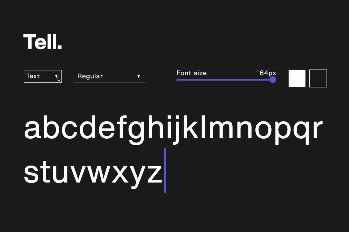
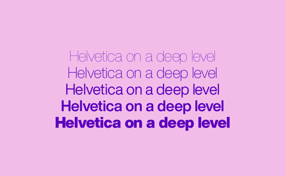
In this series, Helvetica Now Display provides a perfect solution for the presentation of large-scale and powerful information, thereby eliminating the troubles designers have been having to manually adjust word spacing and word spacing. Finally, Helvetica Now Text has a choice of multiple weights from thin (Thin) to extremely thick (Black) and carefully optimized kerning and space. It can be said that this version of Text is ideal for the increasing visual environment that needs to present a large amount of information choose.

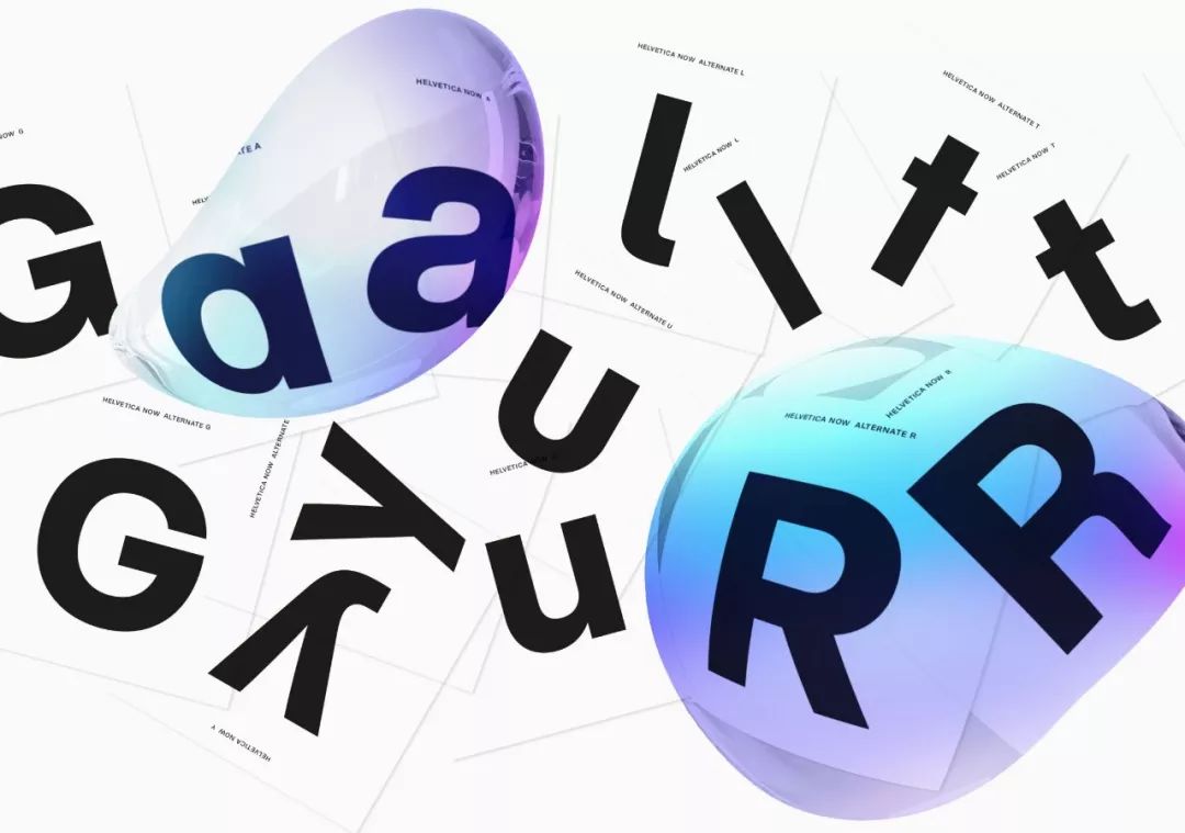
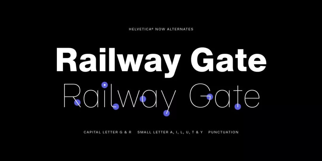
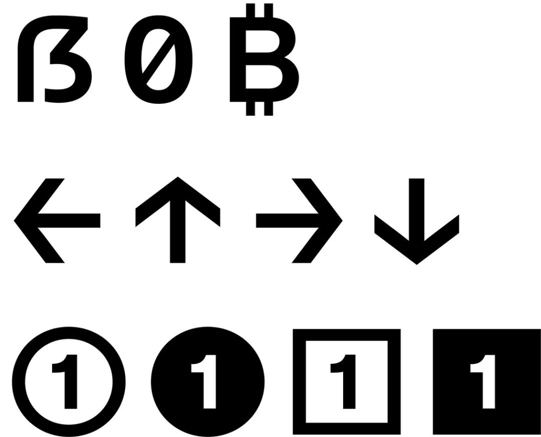
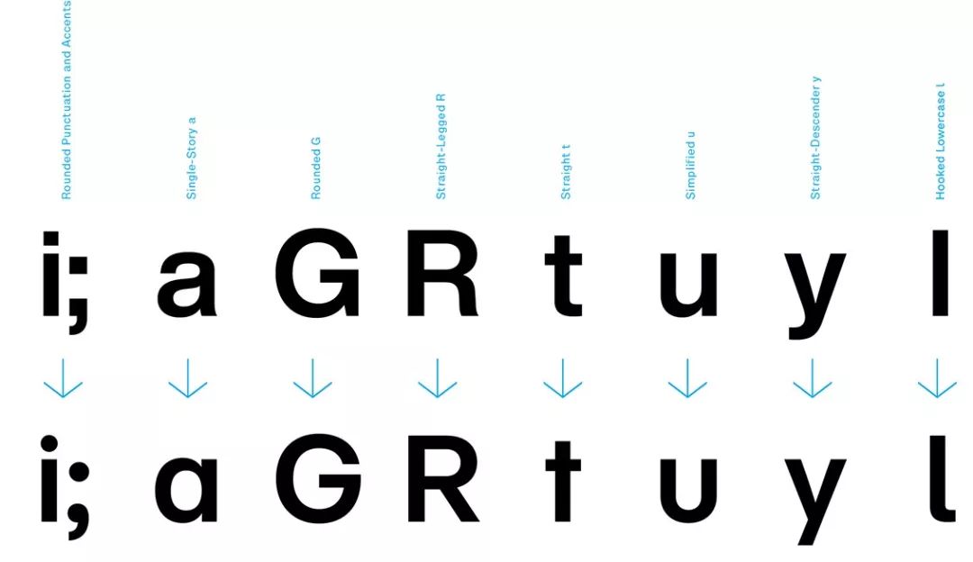
In addition to the above designs on size and scale, a series of new fonts that can be used for replacement have been added to Helvetica Now's font family, including the "a" of the single font and the straight font These replaceable fonts can be freely selected in every font weight and every visual style group, and even all the arrows of Helvetica have been updated in this Helvetica Now.
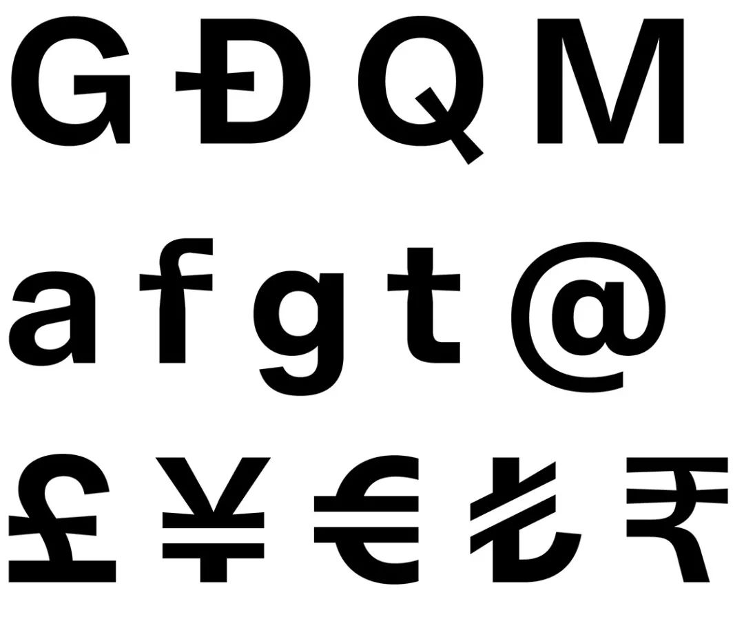
After redrawing, analyzing and testing about 40,000 characters,Monotype has successfully created a better reading experience for Helvetica, and also for contemporary designers Provides more space.
I think we've added a whole new chapter to this quintessential typeface, to make it very different from what it used to be, but at the same time retain as much of its heritage and value as possible. legacy."
"What we have created in the Helvetica Now family is to make it possible for people to see Helvetica can be completely different, so that it is closely related to the new era."
“When we were in design school, our instructors taught us that we could use any typeface we wanted, as long as it wasn’t Helvetica. But you can see basically They are all using Helvetica as the standard font, and the most basic things that can be seen all over the world have chosen Helvetica. If you are a creative worker, you want to enlarge, modify or change information in other ways through visual performance in your work , then Helvetica is definitely a font you want to avoid.
Demo Video
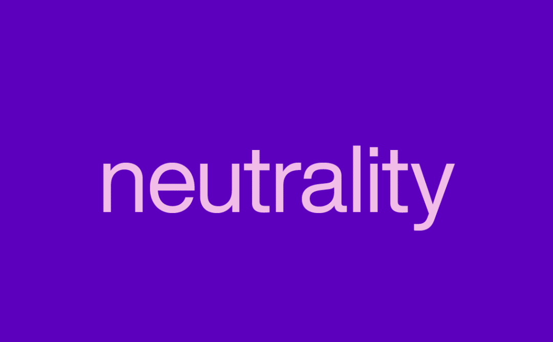
Those who are really subversive users of Helvetica will see these typefaces and say their neutrality is a sham.
Charles Nix
"But from another dimension, if you don't care about fonts, and fonts are just containers for information, then Helvetica may be your closest lover."

Helvetica Now is currently available in Monotype's cloud font
Full font family purchase: $/€299 EUR/USD or £249
Single word weight purchase: $/€35 EUR/USD or £30
Mona Font
"Whenever you're reading, there's a good chance it's a word from Mona - from the numbers on your alarm clock to your bedtime book; everywhere from the dashboard of your car to the airport. From large and small APPs, games, web pages, bulletin boards, logos, packaging... We are everywhere. Everything, Everywhere, Everyone. So, it has been several years. Times are constantly changing, but the fonts we design will never go out of style. "
—— Monotype
Monotype, headquartered in Woburn, Massachusetts, USA, is the world's leading provider of font design, font technical support and related consulting services, with a font library of more than 10,000 fonts and The world's best designers provide global customers with multilingual font solutions for various devices and applications. The Mona Corporation Type Library is home to some of the most popular typefaces in the world today, such as Helvetica®, and a hub for new trends in type design.
Design Team
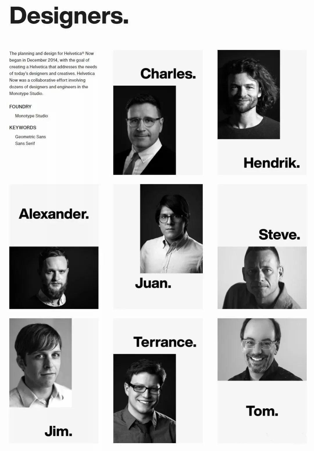
/members/

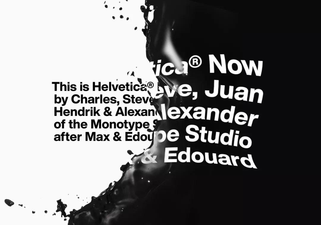
Charles Nix Love you . Leaving you, my heart began to hurt - so he went to do fonts.
▲He is a designer, a typographer, and an educator. Currently serving as the director of Mona Font. There are many popular fonts designed by him in the Mona font library, such as Walbaum, Hope Sans, etc., which have won awards in the 22nd annual TDC Type Design Competition. At the same time, he also designed custom fonts for Google and others.
< em>Font GuidelinesJan Hendrik WeberResponsible for overseeing the development of custom projects and the Mona library.

▲Creative guidance for monotype , providing clients with custom font recommendations and guidance on how to utilize fonts in their brands. He also created the Unitext font popular among many brands.

Juan Villanueva < /strong> is a Brooklyn-based type designer, type artist, and educator.
▲Born in Peru, raised in Clifton, NJ , and later studied graphic design, illustration, and animation at Montclair State University with a BA. Villanueva is also an outstanding graduate of the Type@Cooper extension program. Currently, he works at Monotype and designs typefaces and teaches typography at The City College of New York. He has also served as a professor of graphic design in the Summer Intensive Program at Cooper Union. He is also an active member of the American Graphic Design Association (AIGA), a board member of the New York Type Directors Club (NYTDC) and the Scribe Society (NYSS), and a judge of Hiii Typography 2018.
A genius in design and typography. Alexander Roth Crazy about language and glyphs.

▲Born in the former Soviet Union Socialist Republic of Tajikistan and raised in Germany. I have been fascinated by language and fonts since I was a child. Before joining the world-renowned font design company FontFont, he was a font technology intern and learned video production, animation, graphic design, font design, etc.

Creative Typography DesignerSteve Matteson, a pioneer in the study of legibility projects and a reliable advisor to young designers.
▲Creative Type Director of Monotype, yes Type designer, historian, letterpress typographer. More than 80 font families have been designed for Toyota, Microsoft, Google, etc., and of course the Mona font library is also included. He designed more than a dozen typefaces, including Frederic Goudy.
Type DesignerJim FordUsing his accumulated artistic experience, he balances custom font design with client needs.

▲There are many Mona fonts The man behind the distinctive designs, has worked with various brands and corporations on custom typography projects.

When making custom fonts,< strong>TerrancePay special attention to the technique. Customers include:Domino's, SAP, Barnes & Noble et al.
▲As the advanced font of Mona Font Works Designer, Terrance Weinzierl has been creating and revising typefaces for Mona and various brands since 2008. In addition to creating custom typefaces for Microsoft, Google, Barnes & Noble, Domino's, and SAP, he designs typefaces for video games, professional sports teams, and automakers.
Tom Rickner, the master of type design and type products. Leading a team of award-winning global font designers.

▲In the field of design and fonts 30 years. From editing bitmaps in the early days, to designing the first multiple master typefaces for Adobe, to designing TrueType GX variant fonts for Font Bureau, Apple... Tom has mastered almost every aspect of type design and type products.
References.
"Max Miedinger and Eduard Hoffmann would have designed this typeface in 1957 if they had known about lithography, small screens, browsers, digital design tools and UI designers."
Erik Spiekermann
Founder and Partner of Edenspiekermann
"I'm enjoying Helvetica Now, the addition of a lowercase 'i' with a dot and a larger 'R' with a straight foot might piss off those Helvetica purists, But I do enjoy the flexibility these add to the characters, and I think the design of the Micro group will be of great help in long text design.I hope I'll have this font soon!”
David Heasty
Triboro Partner
“Helvetica Now is something we’ve always wanted, but we’ve been afraid to ask.This new typeface for Helvetica will Some of the awkward situations faced offer elegant alternatives that take on a surprising and uplifting contemporary character.”
Abbott Miller
Pentagram Partner
“I will use my best efforts to use Helvetica Now as much as possible. This time, the update of the font does add more modernity to the shape while maintaining the characteristics and tradition of Helvetica. It's an incredible update, with typefaces like the 'a', 'i', 't' and 'y' all smartly designed.”
Andrew Szurly
Creative Director of Sole Kitchen
"I like these more weight choices and alternative font designs like 'R', although the new font may be very similar to the old font, but in the trained In the eyes, you can find those subtle changes.This is my favorite place!”< /span>
Chris Do
Founder of The Futur
"Digital typography as a tool has inspired me time and time again, and Helvetica Now offers a fresh perspective on design as it offers a meaningful space for both functionality and form." Expansion. I'm very excited to see how Helvetica Now will impact the vision of the industry."
Markus Hanzer
University teacher, brand designer
Introduction video for the full version of Helvetica Now
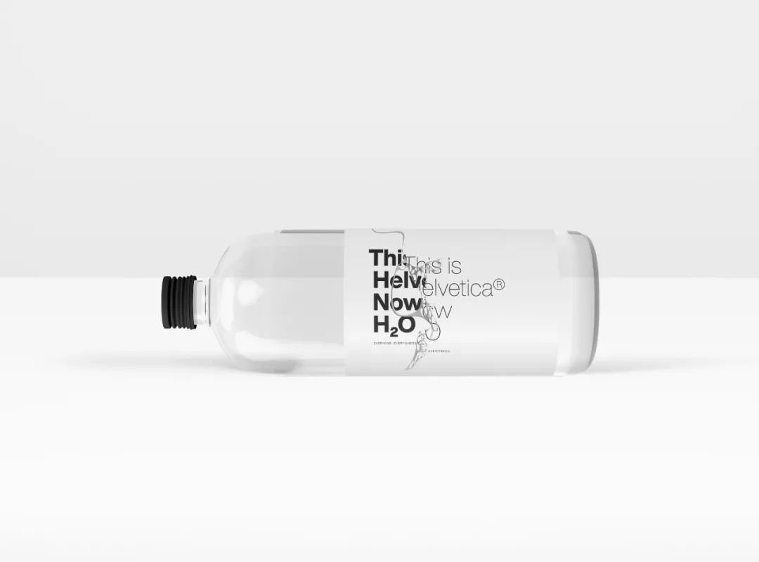
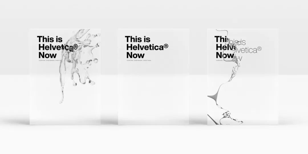
Helvetica Now's slogan:
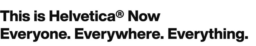
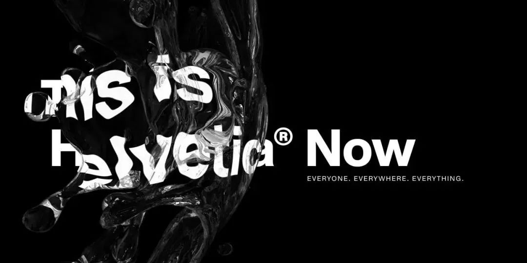
This is Helvetica® Now
Everyone. Everywhere. Everything.
© This article comes from Lu Junyi_Design site
- Original Author: Dom Carter -
- Text translation proofreading: Duan Zhihua -
Afterwards, Hiiibrand made a small supplement
Reproduction without permission is strictly prohibited
/ Previous Recommendations /
Award-winning work|"Destroy Helvetica"
Award-winning work|"Black Gold"
Posters and Fonts——Talk with 3 cutting-edge designers
Articles are uploaded by users and are for non-commercial browsing only. Posted by: Lomu, please indicate the source: https://www.daogebangong.com/en/articles/detail/The%20worlds%20most%20commonly%20used%20font%20Helvetica%20updated%20for%20the%20first%20time%20in%2037%20years.html
 支付宝扫一扫
评论列表(196条)
测试