Today's article belongs to the eye-opening category! Absolutely increase knowledge!
As a PPT designer, I often think about how PPT originated and what did the first PPT look like in the world? What is the role of the first PPT? Wait, I don't know if you have considered it, I personally have been thinking about this issue!

Fortunately, I found the world's first and earliest PPT!
Let's learn together let's go!
The earliest and the first PPT in the world. It’s a set of slides made by GE in 1958. Although I’m not a person who likes nostalgia, I have to say that when I saw this set of slides, I had some ideas about PPT design. Think differently.
Maybe, it will also inspire you. Okay, enough nonsense, let me show you what this set of slides looks like.
Click on my avatar, private message keyword [earliest PPT] the earliest in the world, the first full version of PPT to share with you!
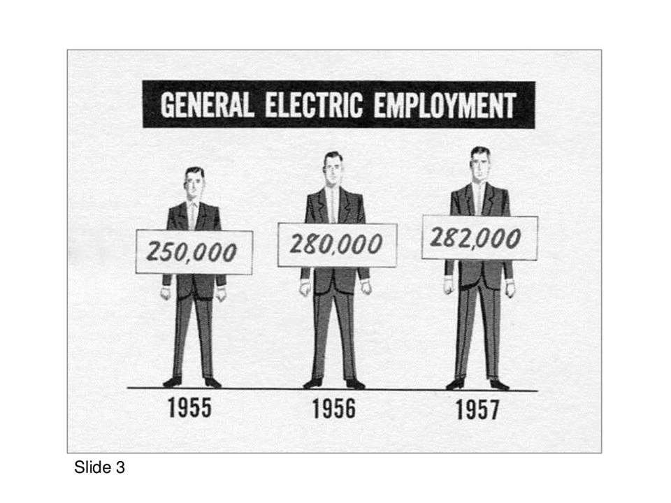
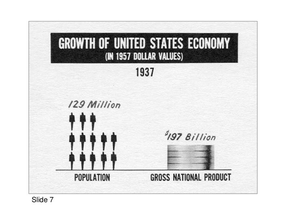
Here is the slide from 1958:


Here is the slide from 1959:
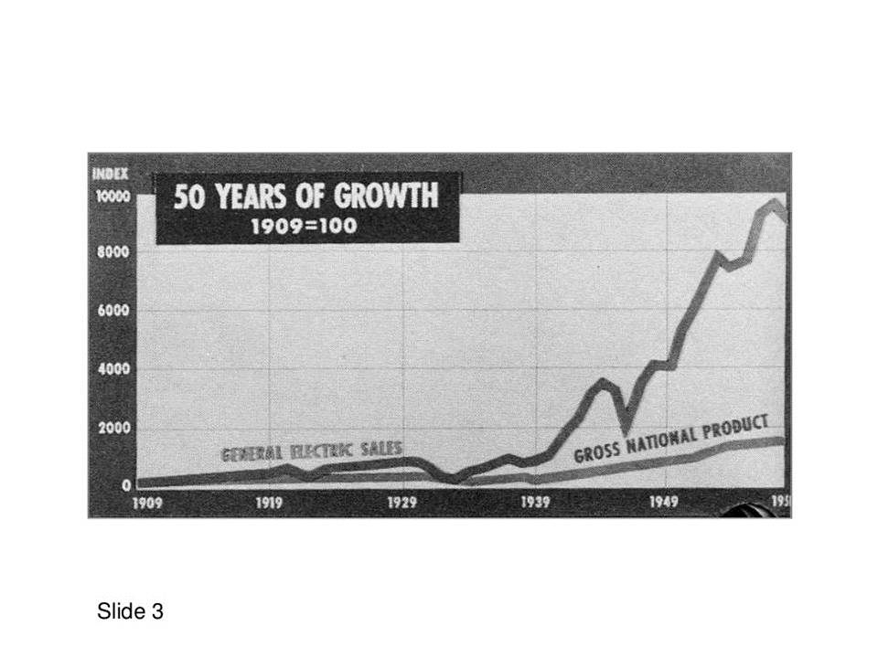
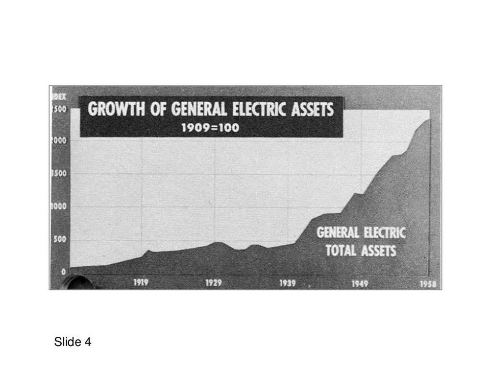

As you can see, although there was no PowerPoint software in 1958, the practice of presentation and reporting had already taken place. As I said above, this set of slides gave me some intriguing associations. So, what is it? Just share it with you.
1. The so-called presentation is nothing more than conveying the picture in your mind to others.
If you want to impress your audience, the best way to do it is to put them in a scene. And if you feel that you lack language skills and cannot use language to express the sense of picture, then please draw the sense of picture on the page in advance, and it is best to show it to the audience.
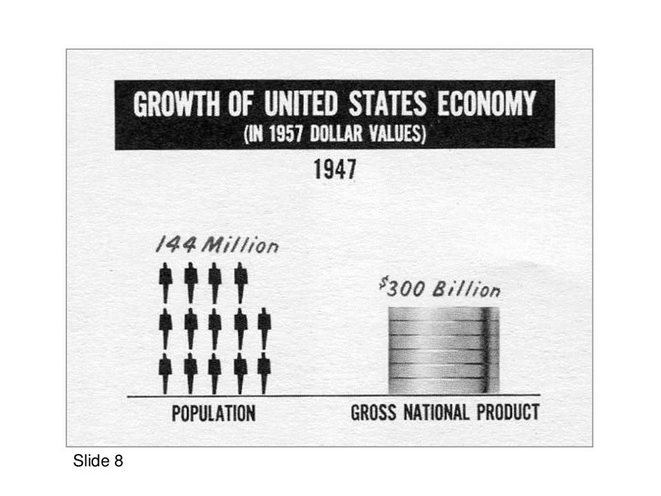
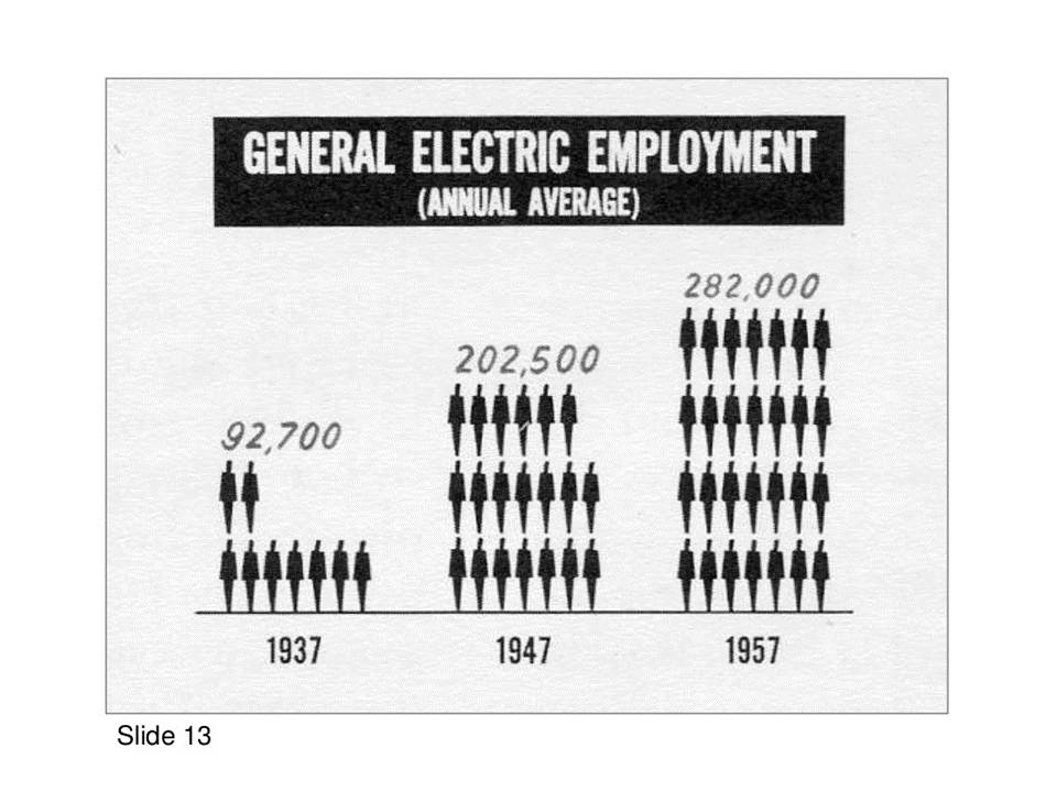
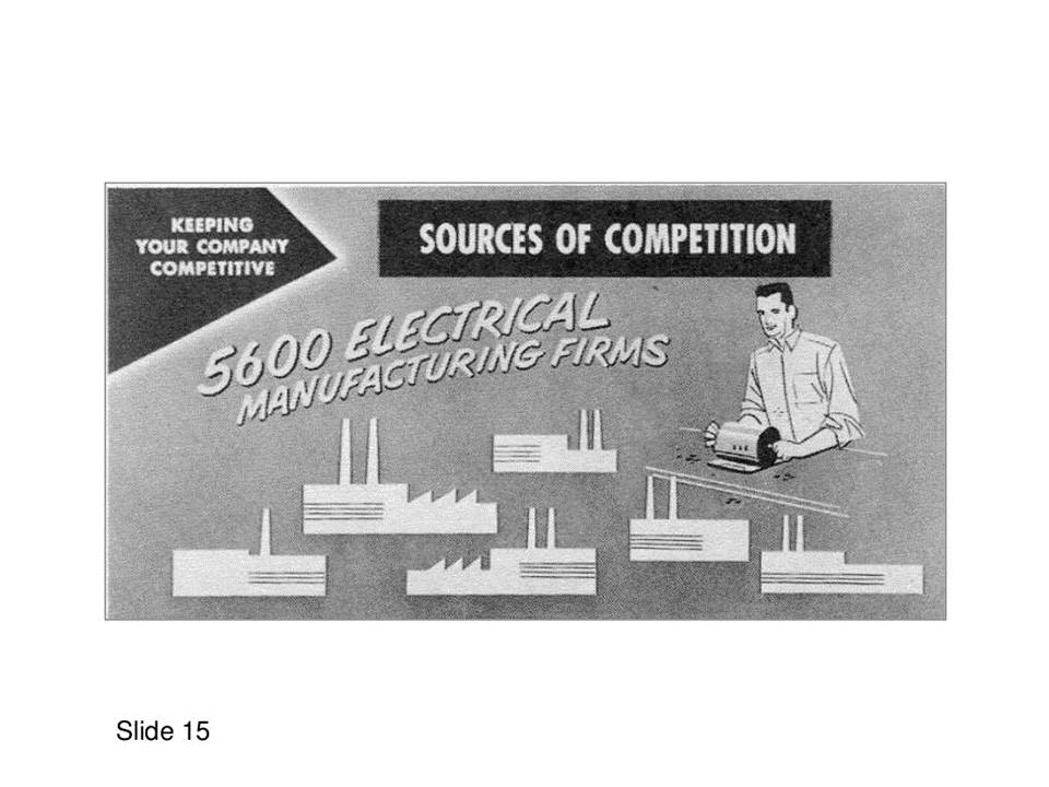
As you can see, these pages are all drawn with brushes, and the small icons of some characters are not exactly the same in size and shape. But even so, it doesn't matter too much, as long as it can create a very vivid picture, it is enough.
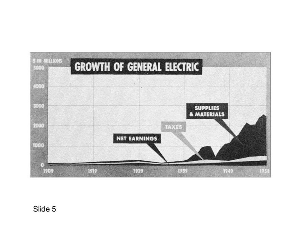
Especially this page, which shows the historical process, is too vivid. The road in the middle is layered to place the corresponding time, which has a sense of perspective.

2. On one page of PPT, keep one point of view.
You may have heard this before, but I have to say that many people seem to like to fill the page with content. In visual psychology, there is a concept called information overload. When multiple ideas appear on a page, in fact, it will slow down the reading speed.
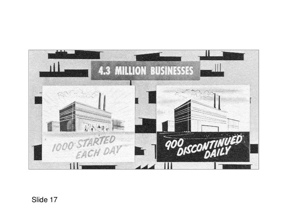
As you can see, even in the age of 60 years ago, when there was no electronic slideshow, and one extra page required paying for an extra paper, one page of PPT was not enough. Still retaining a point of view, make a presentation. What's more, it's free now? Adding a page of PPT does not charge much.


3. In order to reduce the difficulty of reading, it is recommended to maintain a unified design style.
In the slides, keep the font and format uniform.In fact, not only simply consider the aesthetics, but also consider the difficulty of the audience to understand the information .
When the font and layout on the page are kept uniform, others don't have to spend more effort to find where the title is when viewing each slide. What changes have taken place in the glyph of this font and other factors.
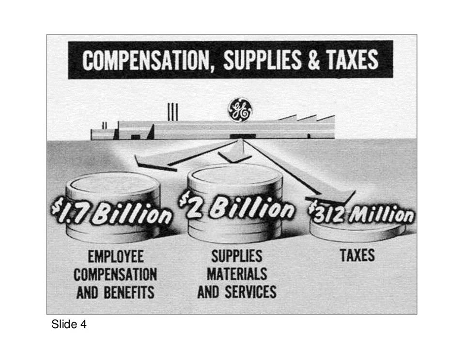
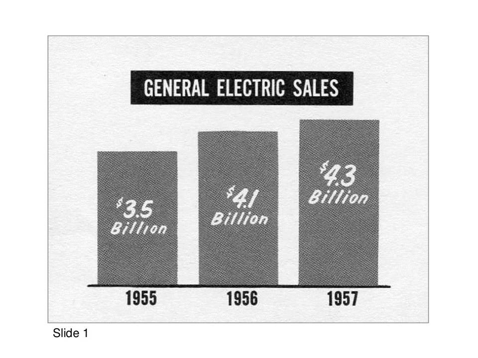
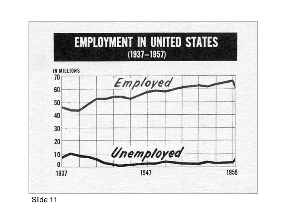
Everyone can take a look at the layout of these PPT pages, is it clear at a glance? It can be very intuitively clear that the upper part of the page is the opinion, and the lower part is the argument.

Of course, there are still many pages in this set of slides, and I won’t go into details here. In short, although compared with 1958, the PPT design style has undergone many changes, such as From skeuomorphism to flatness, some basic design concepts have already been formed.
And these are the key to the difference between presentation design and other graphic design types, such as poster design and album design.
Okay, I wanted to write some basic design concepts, but at the end, I didn't grasp the mood well, as if I sublimated the theme a little bit.

I wonder if today’s article has improved your knowledge? Let me open my eyes, at least for me! I hope it can inspire you too. If you feel good, remember to like and comment~ Let me know that this kind of article is still read by someone~

Click on my avatar, private message keyword [Earliest PPT] The earliest in the world, the first full version of PPT is shared with you!
Don't forget to like and comment!
Articles are uploaded by users and are for non-commercial browsing only. Posted by: Lomu, please indicate the source: https://www.daogebangong.com/en/articles/detail/The%20worlds%20first%20PPT%20file%20exposure%20From%20the%20United%20States%20simple%20but%20amazing.html
 支付宝扫一扫
评论列表(196条)
测试