
Utopia
Not long ago, at Founder Type's autumn and winter new product release conference, Yang Linqing, a well-known domestic designer who has long been committed to the study of Chinese and Western fonts, teamed up with the world's largest Chinese font brand "Founder Type" to release the world's first Chinese font design cheats ——"Chinese Font Application Manual I".
The editor-in-chief and designer of this book, Mr. Yang Linqing, is a well-known designer who has officially won the honor of "the most beautiful book in China" for many times. "Chinese Font Application Manual I" reorganizes and analyzes 422 fonts produced by Founder Type from 1986 to 2017 from the user's point of view, and transforms the complex types of fonts into an objective, clear, intuitive, and easy-to-use system.
According to the different needs of various types of characters, we arrange reference texts and design paradigms, so that everyone can have a deeper understanding of each font and make good use of each font. This may also be the reason why many readers can't wait to want II after receiving "Chinese Font Application Manual I"?
Indispensable in your design book list
A Guide to Thinking & Doing
?

Font is closely related to the attributes, layout, presentation medium and reading experience of the content. If you don’t know a font and apply it subjectively and casually, it will violate the original design intention of the font.
——Yang Linqing, the author of this book and a well-known domestic designer
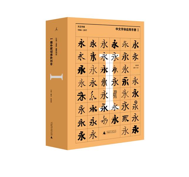
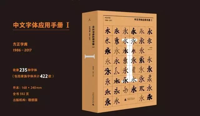
Chinese Font Application Manual I:Fangzheng Typeface (1986-2017)
"Chinese Font Application Manual I: Founder Font Library (1986-2017)" is the first Chinese font application reference book since the founding of New China. This book aims to guide readers to use fonts correctly. An essential reference for getting started in the design of animation, network and other industries.
High-quality paper printing, presenting the real effect of various fonts in different font sizes and application occasions; concise information summary, brand-new terminology combing, opening up the communication bridge between font designers and users; scientific human nature Index settings to help users quickly locate the required fonts.
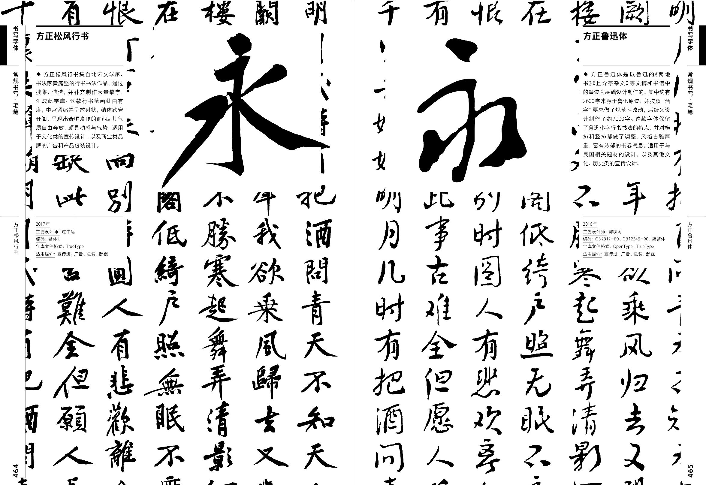
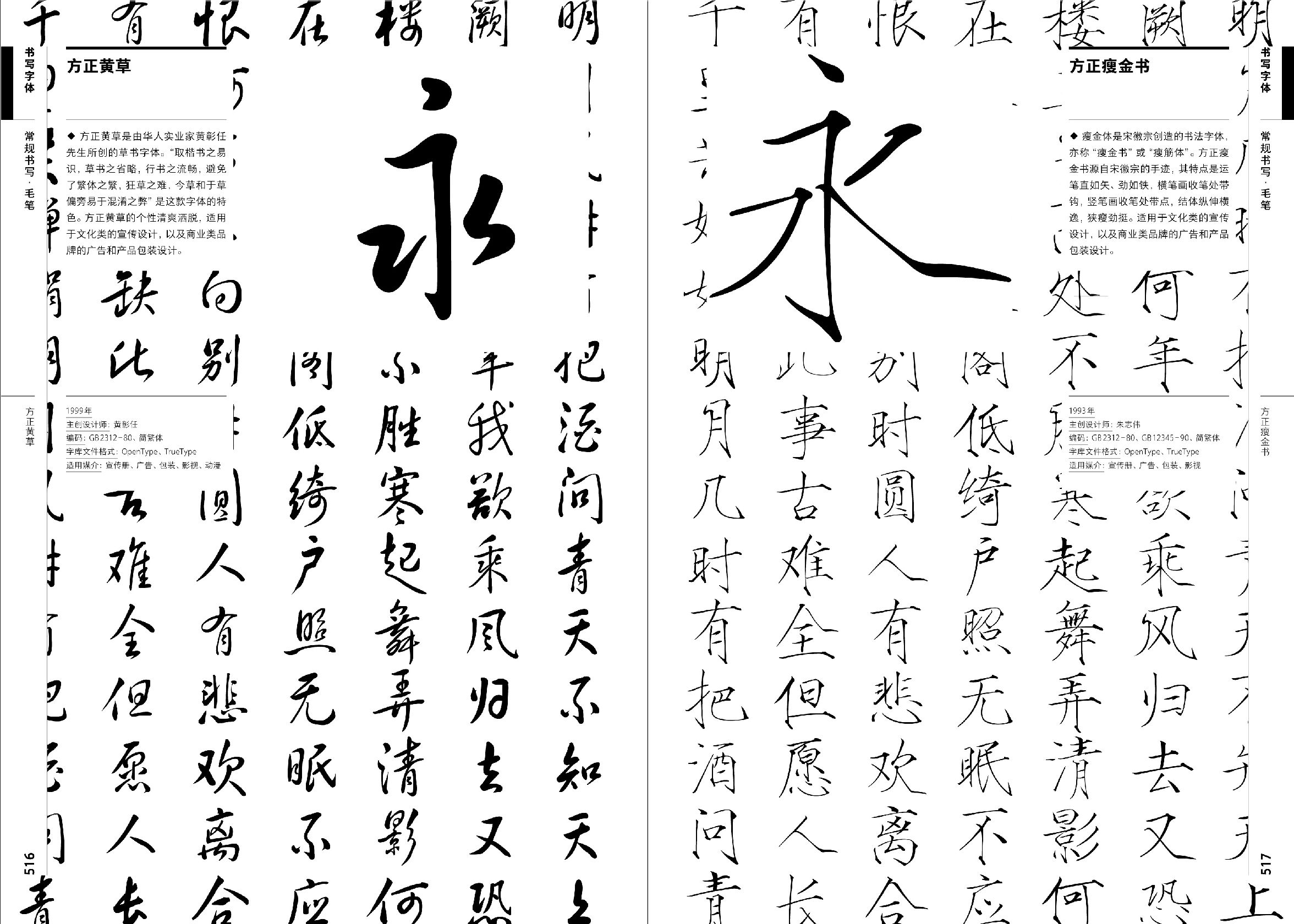
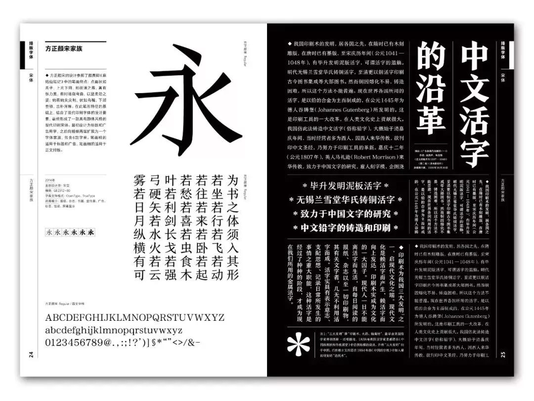
Fang Zheng Songfeng Xingshu and Fang Zheng Lu Xun style
The typeface that has been honed through thousands of years is now conveniently entered into the computer system, but users often do not understand the design intent of the typeface. At present, there are many chaos in the application of typeface in the domestic design industry. Fonts, graphics, and images are the three core elements of graphic design, and fonts are the origin of them. How to use fonts correctly is an important knowledge.
Yang Linqing teamed up with Founder Type to reorganize and analyze the 422 fonts produced by Founder Type from 1986 to 2017 from the user's point of view, turning the complex font types into an objective, clear, intuitive, and easy-to-use system .
The layout and design of this book can only achieve 70%. Unlike other book designs, it cannot achieve the ultimate visual presentation of fonts. It is necessary to follow the objective truth, but also to attract others, and avoid subjectivity and extremes.
is neither the default state of the font nor excessively designed. The purpose is to help and guide users to draw inferences on this basis. The remaining 30% should be left to the user, the benevolent see benevolence, and the wise see wisdom. This book is only a guide, trying to establish a path between the user and the font.
——Yang Linqing
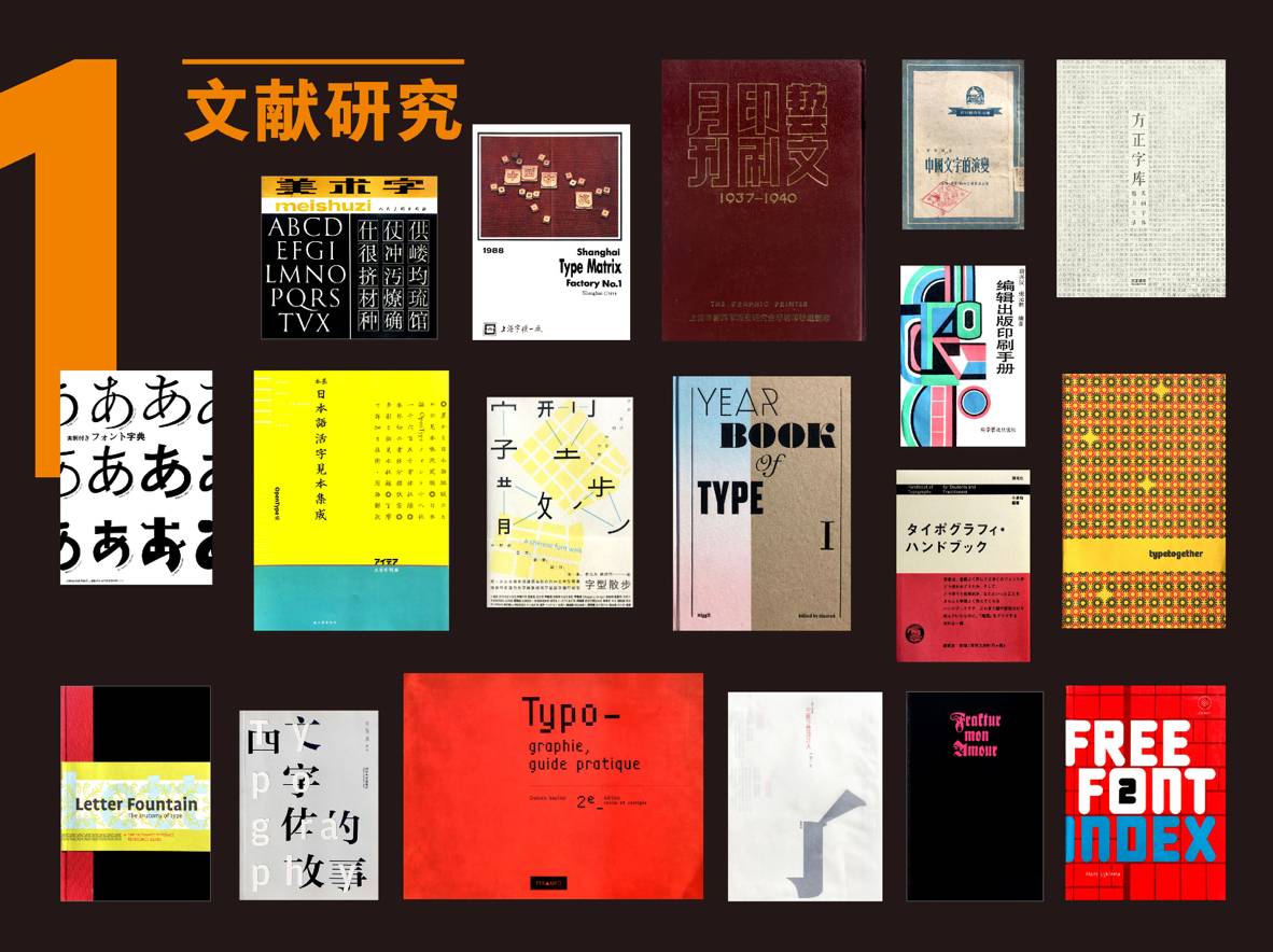
During the compilation process of the book, the editor conducted in-depth research and analysis on a large number of Chinese documents, Japanese documents, and Western documents. For example: Chinese references "The Evolution of Chinese Characters", "Editing and Publishing Printing Manual", etc.; Western references "Stories of Western Fonts", "YEARBOOKOFTYPE", etc.
According to the application purpose, the existing fonts of Founder Type are divided into three categories: typesetting fonts, creative fonts, and writing fonts, so that more people can be very clear in terms of application purposes. So that anyone not only a designer can understand "how to use" and "what to use" this font when applying it.
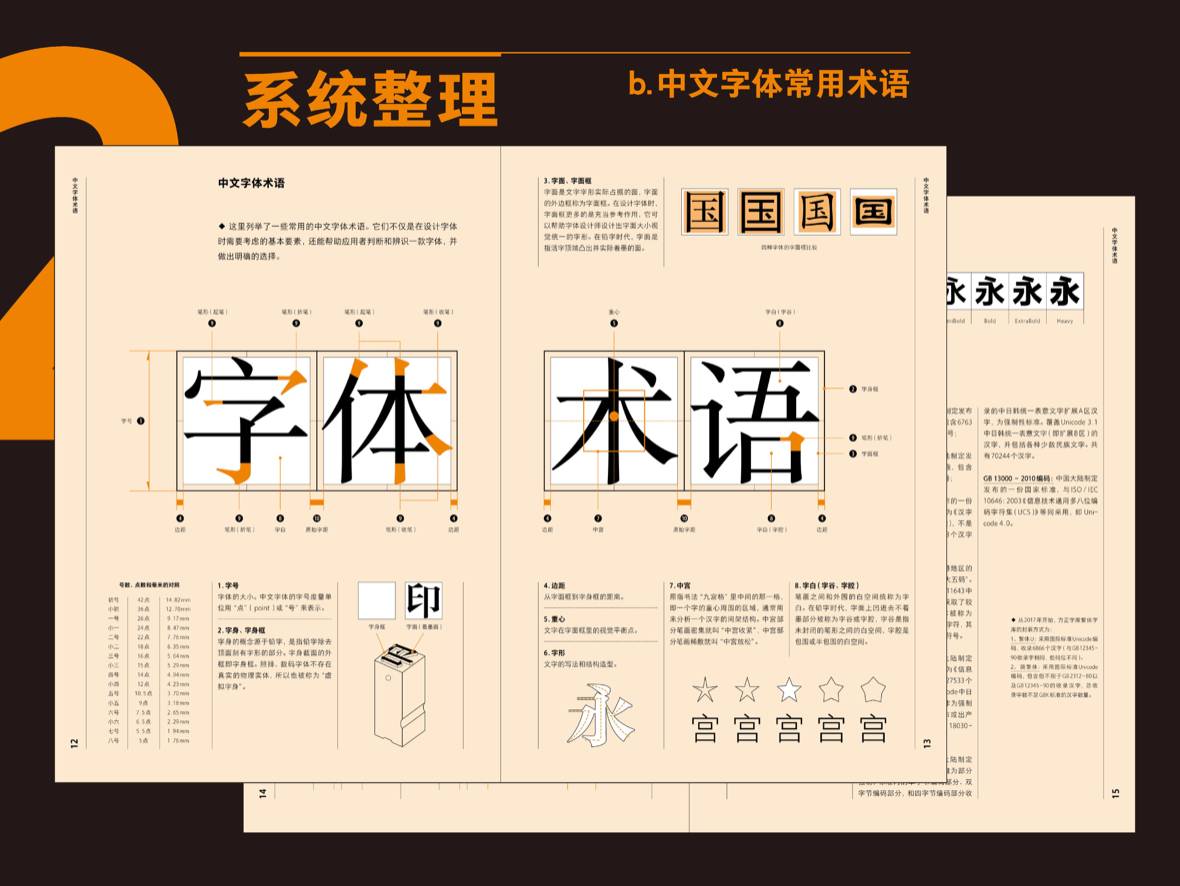
The book analyzes the commonly used terms of fonts in detail, which is convenient for beginners to understand fonts.

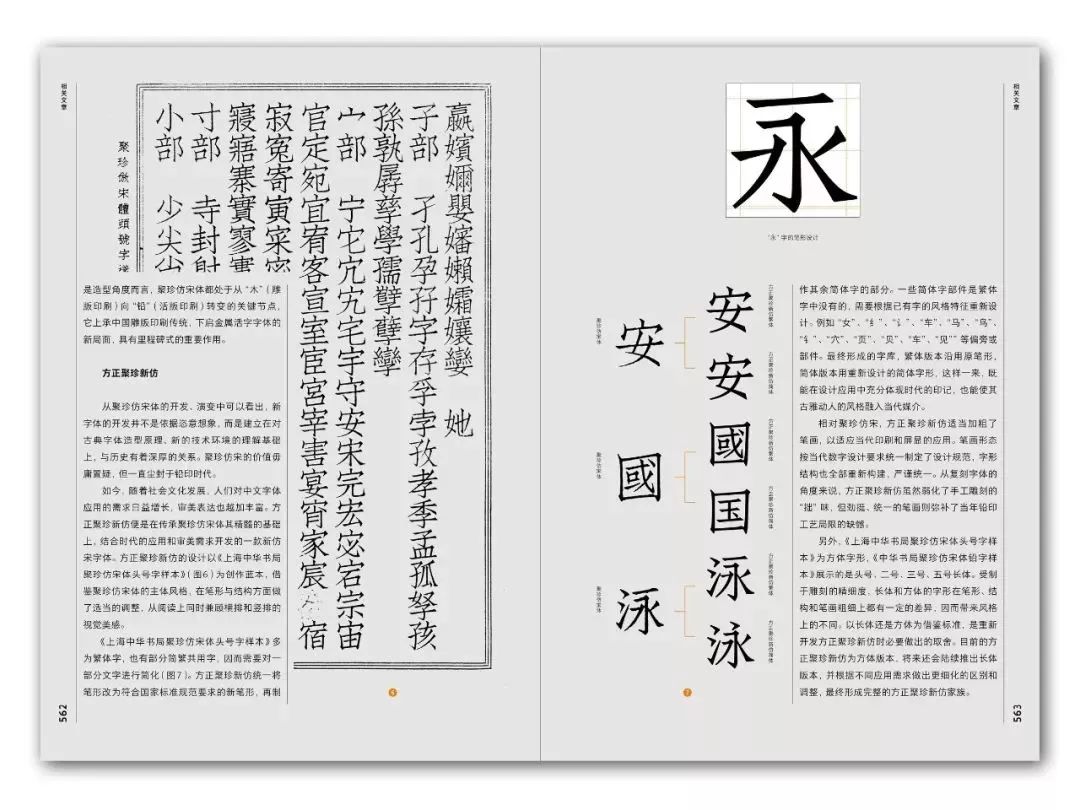
For each font, it covers font name, design description, year of production, chief designer, font code, font file format, applicable media, related links, Western style and other related information, and introduces all aspects of the font in detail.
Multiple times won the "Most Beautiful Book in China"
Why did Yang Linqing write such a book
Speech: Yang Linqing
?

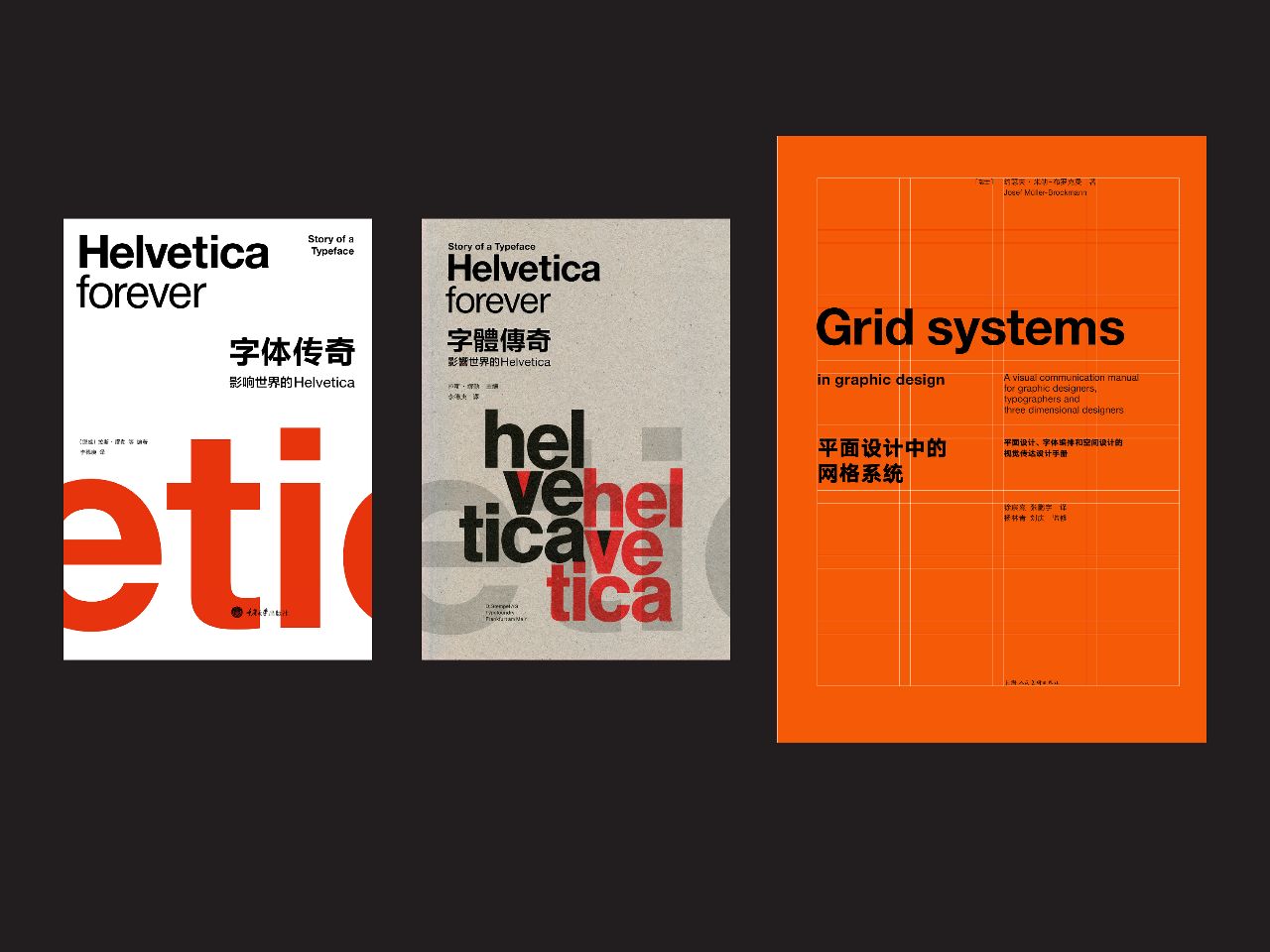
Yang Linqing graduated from the Department of Visual Communication Design, Academy of Fine Arts, Tsinghua University in 1999, and worked in Beijing Jingren Studio after graduation. In 2002, he studied in Paris, France, and in 2006 he graduated from the Paris National School of Decorative Arts (ENSAD), majoring in editorial design. After returning to China in 2007, he established Yang Linqing Studio in Beijing. In 2017, he founded Suntree Publishing and Design Agency, engaged in the planning, editing and design of contemporary publications, and devoted himself to the research of media application of Chinese and Western fonts and graphic information communication. He once planned and participated in the publication of the Chinese version of "Font Legend - Helvetica Influencing the World" and "Grid System in Graphic Design".
One of the reasons for making "Chinese Font Application Manual I"
Number of fonts
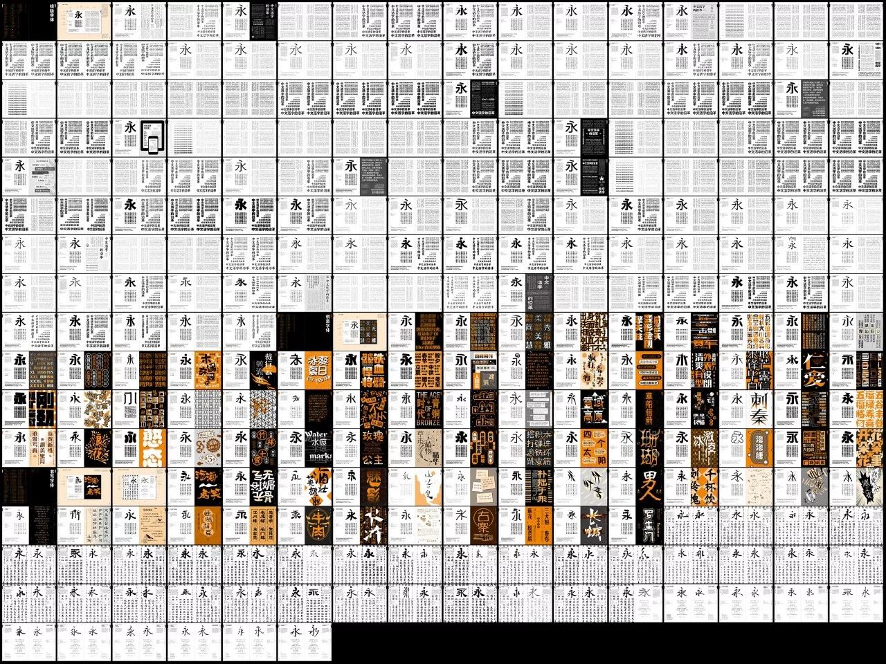
This book makes an arrangement of the fonts produced by Founder Typeface every year from 1986 to 2017, which is equivalent to a data table. There are a lot of empty spaces in it, because in some years only one typeface was released, and in some years a typeface was not released, it was very difficult for Founder Typeface. In that era, from 1986 to 2008, I could feel the difficulty of font production. With the breakthrough of technological evolution, it has been showing a very high upward trend since 2009. This trend, especially the cumulative number of fonts produced each year this year, is about 50, including more than 100 family fonts.
 Founder Yellow Grass and Founder Thin Gold Book
Such an amazing speed does not include other fonts. But while the number of fonts is increasing, it also brings us a problem in application: How do we know these fonts? How do we go about understanding these fonts? What can they be do for our design and culture in the future?
We are not only for the purpose of expressing design, but also for the communication of pure culture, and even cross-cultural communication. As a basis for him, how do we face such a future situation. So this is the first reason, what he faced was the need to start sorting out. Because so far there is no such book that can sort out so many fonts. However, "Chinese Font Application Manual I" has collected a total of 422 fonts from Founder from 1986 to the first half of 2017. We need to make a systematic analysis of these 422 fonts. tidy.

The second reason for making "Chinese Font Application Manual I"
Word Environment
I'm a book designer and have done a lot of books. I went to the bookstore and picked up a book to read,But I found that our word environment is chaotic, especially in the book where the body text is most reflected, and it is also a very important carrier in our culture.
I listed three fonts, which may be very clear for font designers to translate, but for us graphic designers, some subtle things are difficult to identify. The three fonts are Song typeface, but the three fonts are all related to the purpose of its generation. , the purpose of the design, the content he wants to express, the medium of presentation, and his arrangement are actually different. On the surface, we all seem to be in Arial, whether we can all use it in books, or use it in a certain place.
The third-generation newspaper Song Boya Song designed by Mr. Zhu Zhiwei, the so-called Bao Song is designed for newspaper printing and reading. His fonts are relatively wide, flat and square, with not too much difference between horizontal and vertical thickness, and the hollow space is very relaxed, and the characters are very wide and thin. In this case, it is suitable for use in newspapers, because it is suitable for the printing relationship between the rotary machine and newsprint, so that the characters can be read, and the horizontal linearity is very clear, and at the same time, the fragmented text on the newspaper can be guaranteed. It can be very firm and very strong, which is convenient for us to read quickly.
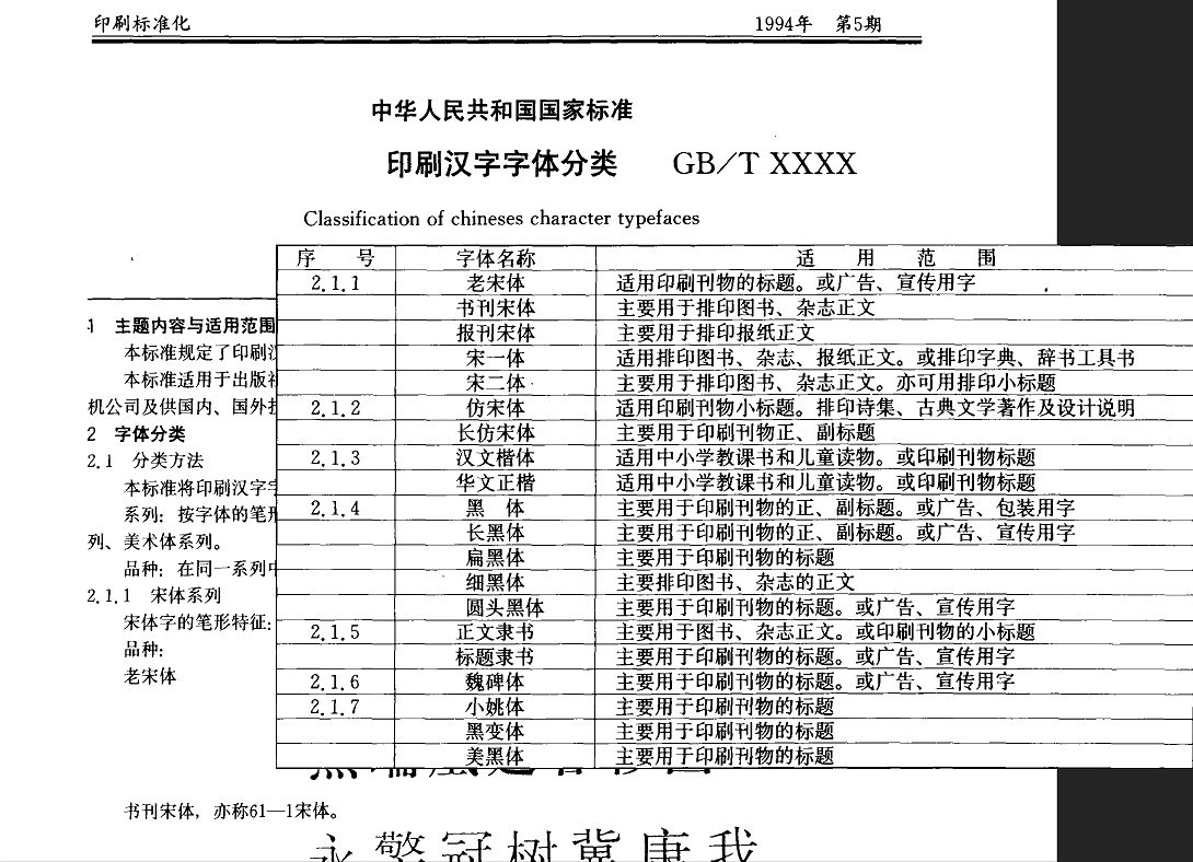
As for Shu Song, as the name suggests, this is a font used in books. The font is thicker and thinner, more relaxed, and the font shape is not so square. It is suitable for long rows on books, that is, a line of characters is relatively long. It is also a kind of reading time that is more in line with the book. Moreover, it is printed on paper with a flatbed machine, which makes our text very readable and highly recognizable. And the book needs to be read for a long time, you have to sit down and read it very quietly, although it is suitable for a long line of words, it is not suitable for short text layout.
The last is Song Yi, this font is used for dictionary Song. The thickness of this dictionary Song is the same as that of Boya Song, and there is not much change. Shu Song, which has changed the most, is because he is highly recognizable when reading, while Song Yi is thin overall. The reason why he has such a font is because he is suitable for small font sizes and used in dictionaries. If it is used in a large font size, the entire text is very gray. It is only used in dictionaries, so it is also called Dictionary Song. It is used in dictionaries and can only be presented in small font sizes. Because dictionaries are often made of very thin paper when printing, it needs to be opaque on thin characters and make small characters easy to read. This kind of query using tools is why Song Yi was born.
These three fonts appear to be Arial, but in fact their application purposes are completely different. This is the 1994 People's Republic of China national standard Chinese character font classification, in which there is a place where each font is written (at that time because the number of fonts was limited, they all came from In the thousand-character era, at that time, we were eager to digitize the fonts of the thousand-character era, and we have not yet used so many technologies to improve fonts). So such a list includes all body fonts, which will say what kind of text this font is used for, what kind of carrier it is used for, books, newspapers or publications, Each font has its own clear mission.
No one font can solve all problems, each font has its own powerful mission. Only when designers follow this mission and understand their design intentions, can they draw inferences from one instance and use fonts better and more uniquely.
——Yang Linqing
So fonts are closely related to the properties of content, layout, presentation medium, and reading experience. If we don't know a font, we use it in any place from an emotional or subjective point of view, which is actually against the original intention of the font.
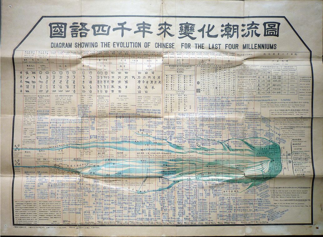
Bringing this time back to 90 years ago, this is a picture written during the period of the Republic of China called "The Trend Map of the Four Thousand Years of Mandarin", which was held in Philadelphia in 1926, the year before the 150th anniversary of the founding of the United States. , soliciting Chinese education products. What does this picture say?
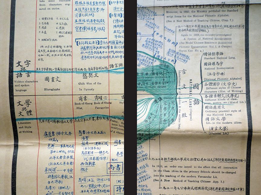
He used this chart to design the entire Chinese text four years ago. When I saw this chart, I was very surprised as a designer. The design is great, but the content is even better. The whole table condenses up and down China four years ago, the national language is the text, and the trend chart of the change of Chinese characters.
The line in the middle is divided into upper and lower parts. The upper part is the evolution of the form of characters, and the upper part is the language of characters, starting from oracle bone inscriptions, to scriptures, big seal script, small seal script, clerical script, regular script, and today's Song style, including the Hei style of the Republic of China period. The next section is called Literature and Style. I cut off the two ends of this table. Literature and style are used for the style of writing. Are we talking about a novel, a thesis, or a news report? What is its style? These two things end up with individual Chinese characters Philology, individual archaic writing is the history of literature.

These two things are the exterior and interior of each other, and nothing exists apart from our culture. When I saw this picture, I was absolutely sure that this kind of cognition of fonts should not only stay in the form, but also go deep into the deep cognition of our own culture. I think that the two can be well combined stand up. Today we have technology and computers are very convenient, but it is difficult for us to understand that there are so many things that influence or affect our design.
The environment we are facing today seems to be more complicated than a hundred years ago, today we are not only faced with paper media, but also with screen display.Among so many complicated media, we need to integrate these It is very difficult to use words well.
The third reason for making "Chinese Font Application Manual I"
Copyright Awareness
We used to say that there were too few fonts. At that time, it was indeed restricted by technical standards, piracy, and the data of typefaces at that time. In this case, we use very little, but today we have more and more characters. It is not easy for them to make more characters. We need to respect the fruits of their labor.
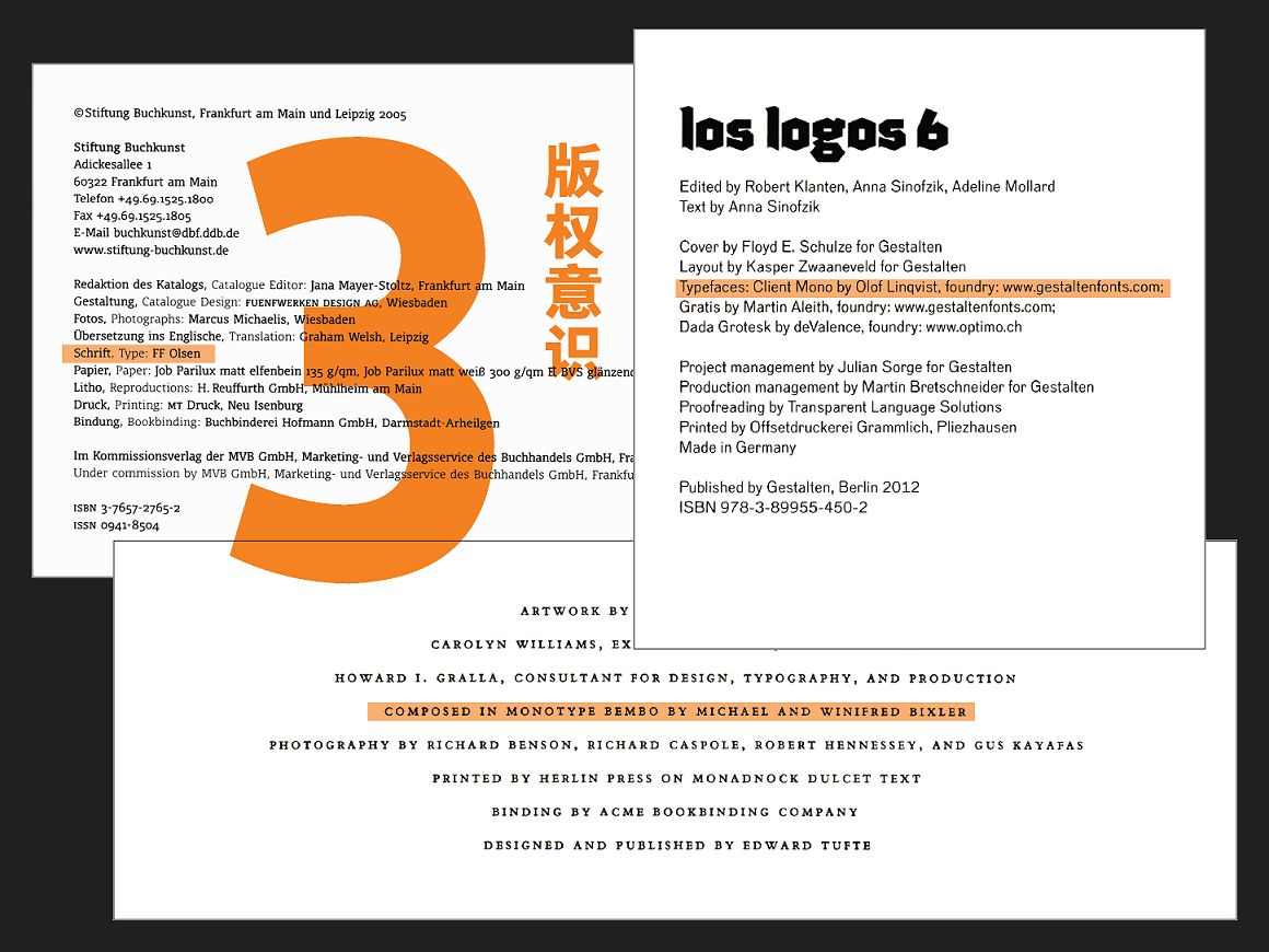
I picked these three from any foreign book. On the copyright page, there will be a description of the font application of this book: what kind of font is used, and which font manufacturer is used. Why describe? Of course you need you to buy it.
This is also a warning to designers: we need to design sparingly, just like paper; we need to save, not just use any fonts indiscriminately. Use this font to say the reason, and your customer will buy, not only to buy, but also to leave his name. I think this is a very good state, and it is something that will come to the Chinese world in the future.
Yang Linqing participated in the publication of works
After the publication of the Chinese version of "Legend of Fonts - Helvetica Influencing the World" and "Grid System in Graphic Design", I believe that Teacher Yang Linqing's new book will not disappoint you.
The study of characters in design is relatively lacking in our education. In fact, in the entire field of graphic design education in the West, the most important thing is text education, which tells us how to recognize information symbols, how to become a good driver and constructor, and establish effective communication methods between content and readers. Not only the relationship between reading and being read, but also understanding, dissemination, participation, communication and interaction.
——Yang Linqing
"Chinese Font Application Manual I"
Font layout display
?
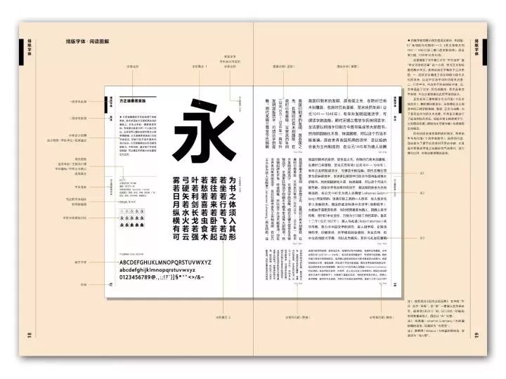
The biggest challenge in how to display fonts is what kind of sample text to use to reflect these fonts. Different types of fonts are matched with different presentation methods to fully demonstrate the character and characteristics of each font.
The display text follows the principle of neutrality, and contains Chinese characters, numbers and Western characters, and discards too individual paragraphs, so as to better reflect the value of the font. (The following is the typesetting font)
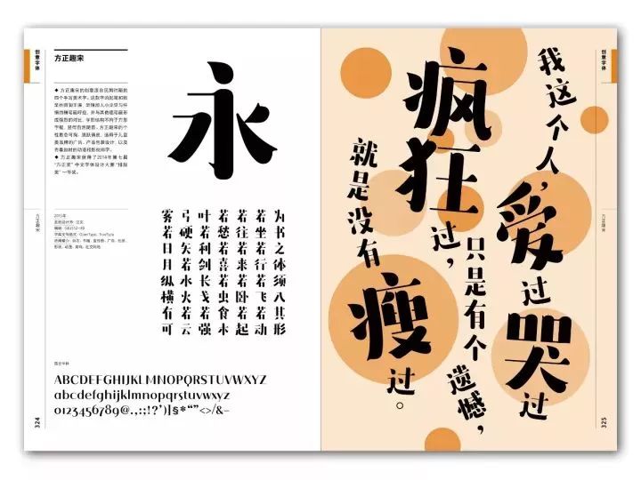
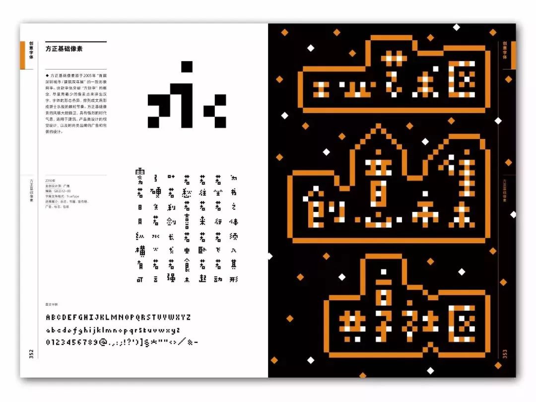
The text should be close to the personality and characteristics of the font, and let everyone understand the temperament or expression of the font through vision. (The following is a creative font)
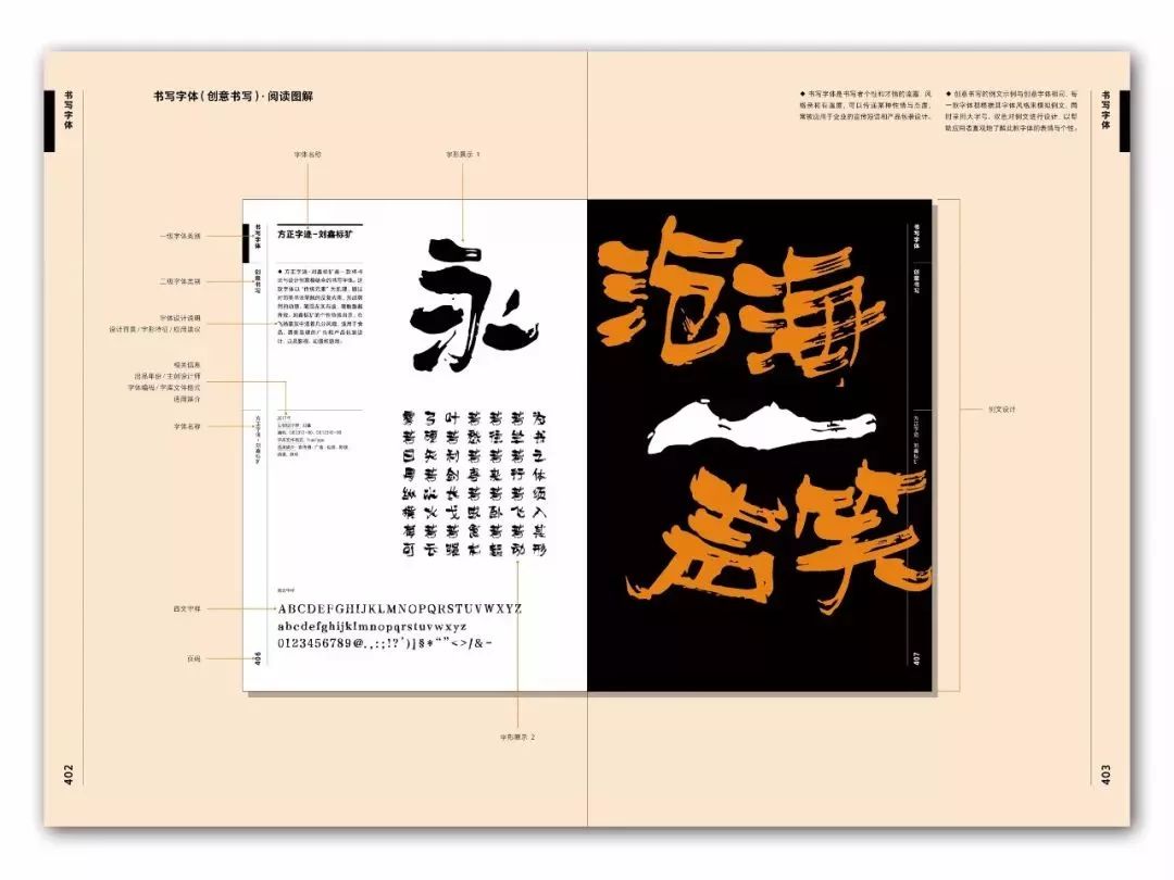
Creative writing selects a specific display text according to the temperament of the font. The conventional writing · brush selects "Shui Tiao Ge Tou · When Will the Moon Come" as the display text, and the conventional writing · hard pen selects Xu Zhimo's poem "Occasionally" as the display text; at the same time , The brush display uses large vertical characters, and the hard pen returns to the size of handwriting, allowing readers to feel the charm of writing in the purest way. (The following is the writing font)
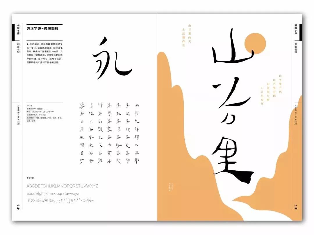
Through high-quality paper printing, it presents the real effect of various fonts in different font sizes and application occasions. Through such a layout design (pictured below), you can clearly and directly see the layout texture of each type of font, allowing readers to quickly and well enter the purpose of use.

·Layout Texture·

?
《Chinese Font Application Manual I》
Yang Linqing editor + design
(Click to read the original text to buy)
Original price 188 current price 141
◆Includes 422 fonts produced by the world-renowned Chinese font company "Founder Typeface" in the past 30 years ◆Divided into three categories according to application purposes: typesetting fonts, creative fonts, and writing fonts ◆Each type of font matches the example text according to its attributes, and Scene presentation of the appearance of each font ◆New combing of Chinese font terminology in the digital age to help identify, judge and select fonts ◆5 index methods provide convenient query paths for users and researchers
Commercial cooperation or contribution
Please send an email to: chenteng@imaginist.com.cn
Repost: Contact background | Buy books: Click "Read the original text"
Articles are uploaded by users and are for non-commercial browsing only. Posted by: Lomu, please indicate the source: https://www.daogebangong.com/en/articles/detail/The%20worlds%20first%20Chinese%20font%20design%20cheat%20book%20from%20the%20winner%20of%20Chinas%20Most%20Beautiful%20Book.html
 支付宝扫一扫
评论列表(196条)
测试